
Tags
FUIButton
Intro
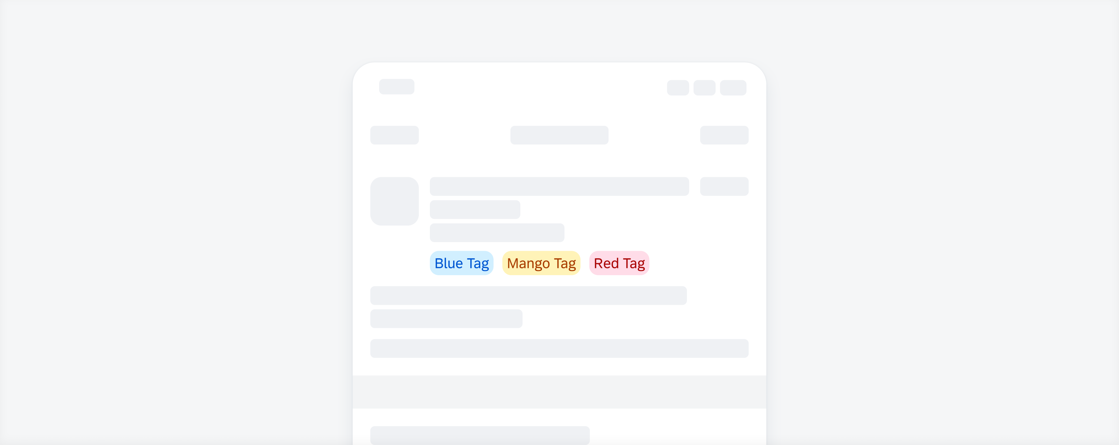
Tags are used to display quick and useful bits of information to the user, such as keywords, labels, categories, or statuses.
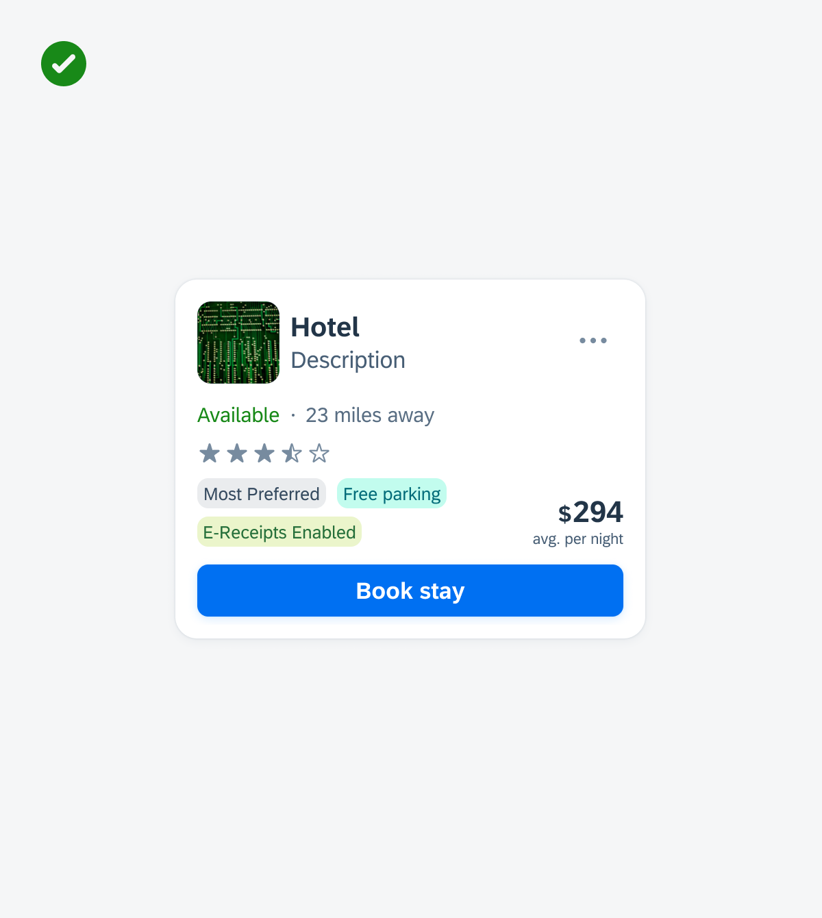
Examples of different buttons
Tags display complementary information that relates to the object. They use a different visual representation than plain text and serve as independent bits of information. When incorporating tags into your app, it is crucial to keep the following aspects in mind:
- Keep tag labels concise.
- It is recommended to maintain wording to a maximum of two words per tag.
d
Positive example for showing concise tags in a tag row in a card
- Don’t write full sentences within a tag.
- Don’t place icons or images within a tag.
- Don’t overload the user by including an excessive number of tags or very long text values.
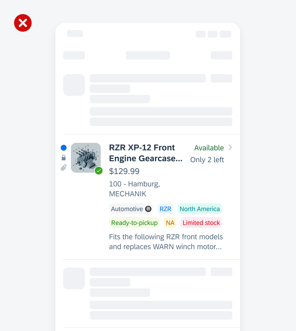
Negative example for listing an excessive number of tags in an object cell and placing icons in a tag
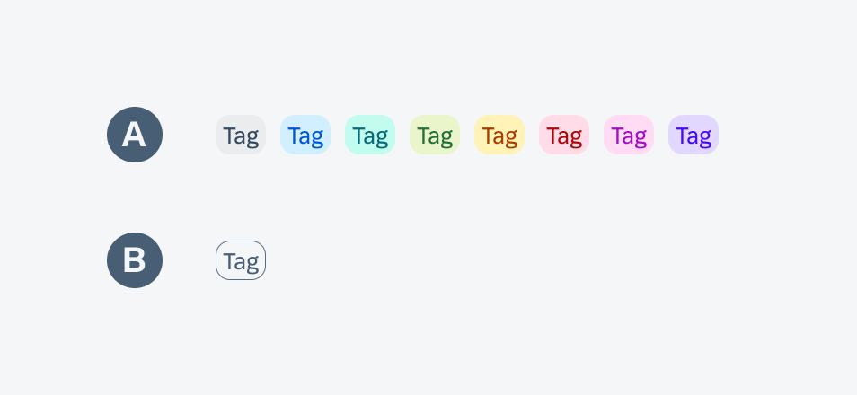
A. Container
The are two styles available for containers: filled and outlined.
B. Label
The label indicates keywords or other bits of information.
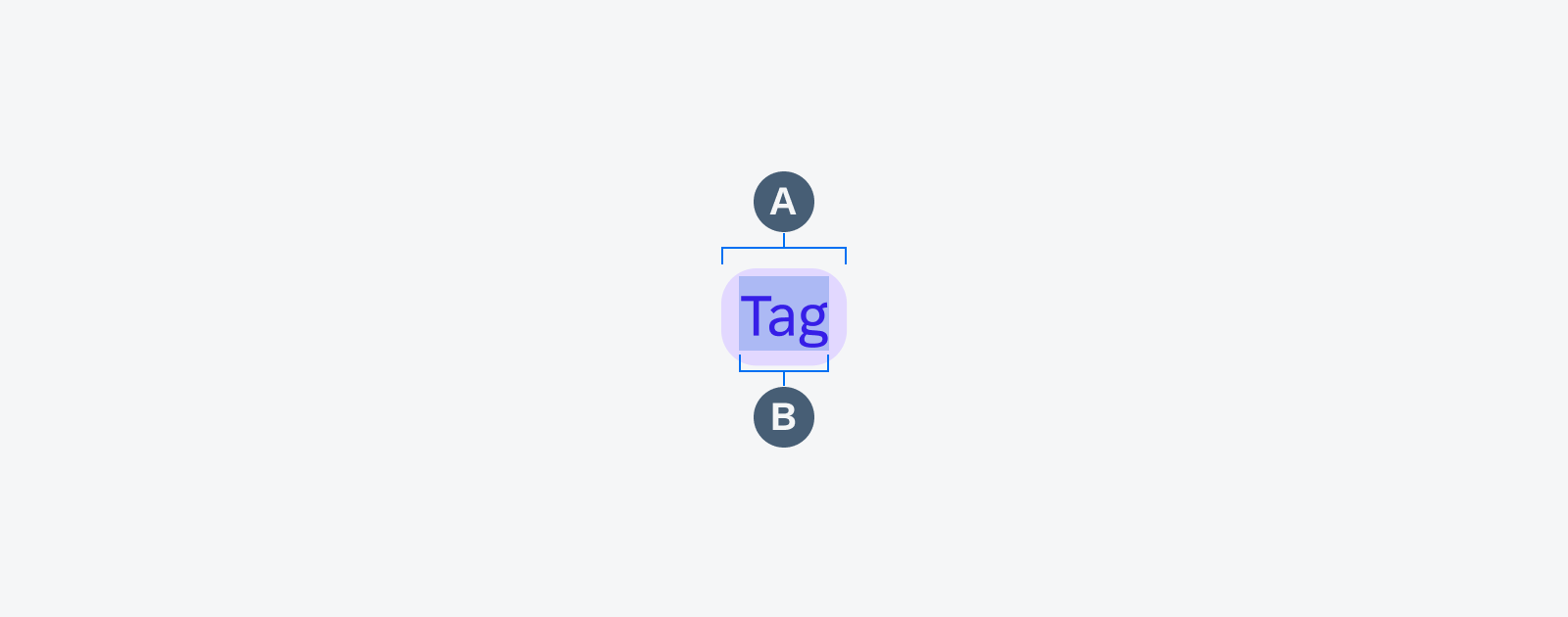
Anatomy of a tag
Style
A. Filled
The default tag has a filled background.
B. Outlined
Optionally, the tag can have a transparent background with an outline.
Active, tapped, disabled, keyboard-focused, VoiceOver-focused buttons
Color
Default vs. Accent
The default tag color is grey, but it can also be displayed in many different colors of the accent color palette.
 Your feedback has been sent to the SAP Fiori design team.