
Navigation Bar
FUINavigationBar
Intro
The navigation bar is an integral part of the screen that indicates the position of the user within the app and contains the page-level control actions.
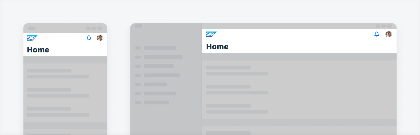
Examples of a navigation bar on compact (left) and regular (right)
Use a navigation bar to represent the navigation hierarchy of the current page to the user. The title text should be concise and no longer than 37 characters long (including spaces). If there is no subtitle used, the title can first wrap up to two lines and is then truncated.
You can use up to three actions within the right side of the navigation bar in compact width (iPhone) and up to four actions in regular width (iPad).
If your app needs more actions, only display the most important actions and use an overflow menu to the right to accommodate the additional actions.
- Keep the default title and large title text short and concise.
- The title text should be no longer than 37 characters long (including spaces).
- The title can first wrap up to two lines and is then truncated if there is no subtitle used.
- If the navigation bar has a title and a subtitle, re recommend to limit the title to 24 characters (including spaces).
- Use an overflow button or a pull-down button if there are too many page-level actions.
- Ensure consistency of the position of the “Close”, “Cancel” and “Back” buttons. Generally, they are on the left side of the navigation bar.
- If the text of the “Back” button is too long, the text can be omitted.
- In compact width (iPhone), try to use symbol buttons if possible. Use label buttons if there is no suitable or understandable icon for the action.
- Don’t show more than three buttons on the right side in compact width layout (iPhone).
- Don’t provide multiple similar actions on the navigation bar. For example, if a “Back” button and a “Save” button trigger the same action, one button is enough.
- Don’t truncate the text on label buttons on the navigation bar. Choose more concise words if possible. The user won’t be able to read the full label of the buttons.
- Don’t wrap the title if there is also a subtitle used.
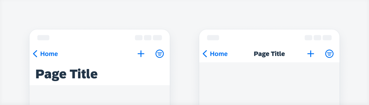
A. Left Accessory
The left accessory typically contains the “Profile” button, the “Back” button, or the “Cancel” button. In addition, it shows where the user comes from and offers an action for users to navigate back.
B. Large Title
The large title is the large version of the title and is hidden when the default title is shown. See also in Behavior and Interaction section.
C. Title
The title is the heading of the entire page. The navigation bar can have a default small title or a large title. It is possible to have in addition to the main title an optional subtitle. The default title is hidden when the large title is visible.
D. Right Accessory
The right accessory typically contains page-level actions.
E. Search Bar
The search bar inside the navigation can be persistent. Generally, it is used as a global search.
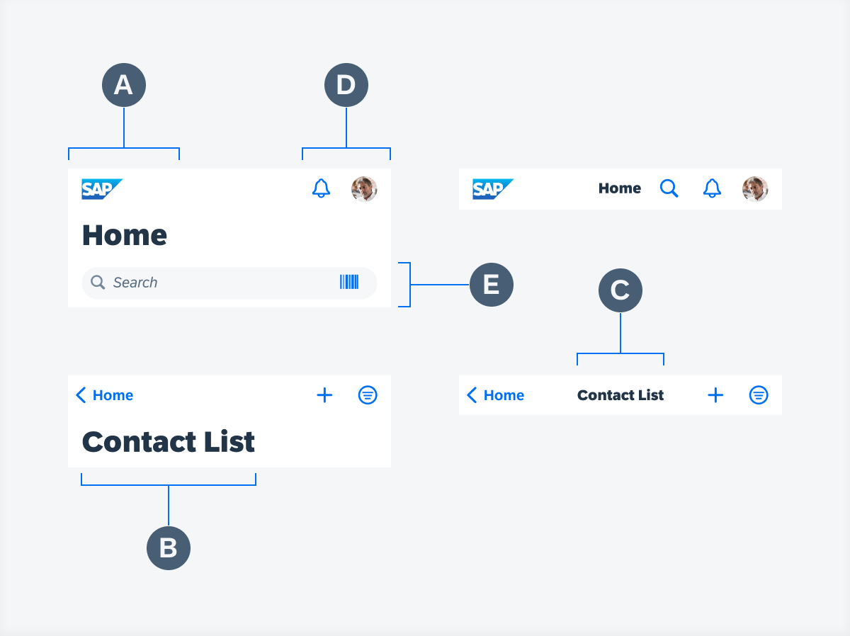
Navigation bar anatomy
Visibility of Default Title and Large Title
When using a large title, the default (small) title is hidden. The default title appears when the large title is scrolled out of the screen.
When using the object header component, keep in mind to use the navigation bar without an additional title to avoid redundant titles, so that the object header’s title can transition into the navigation bar on scroll.
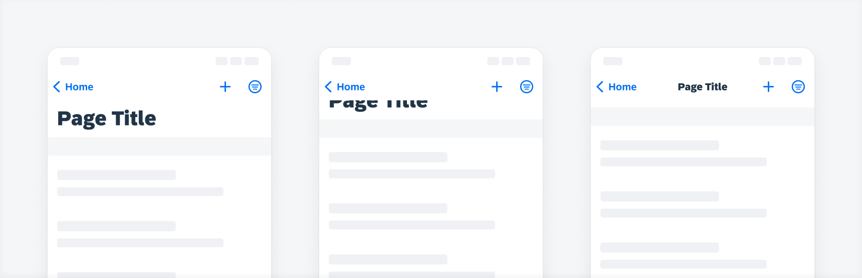
Large title is hidden underneath the navigation bar and the default title appears
History Stack via Long-Press on Back Button
Tapping the back button and holding it (or “long-press”) opens a contextual menu with previously visited pages (also called history stack). It is a breadcrumb-like vertical navigation that helps users to jump back to the very first page.
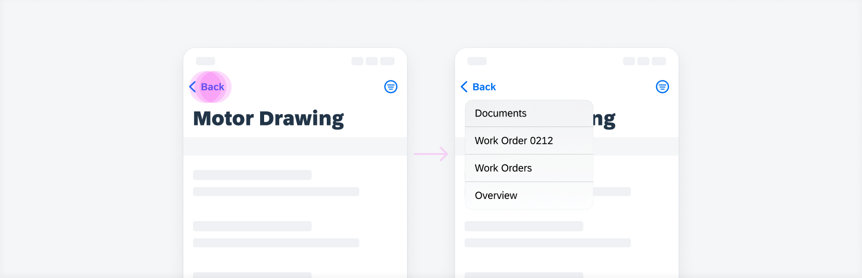
Long-press on back button (left) opens a menu with previously visited pages (right)
The navigation bar spacing follows the global layout margins of the iOS size classes. The number of buttons on the navigation bar can be different for iPhone and iPad, depending on your app design decision. In addition, some buttons from a toolbar on an iPhone app version can be moved to the navigation bar on an iPad version. Additionally, some buttons on the navigation bar can be moved to a sidebar.
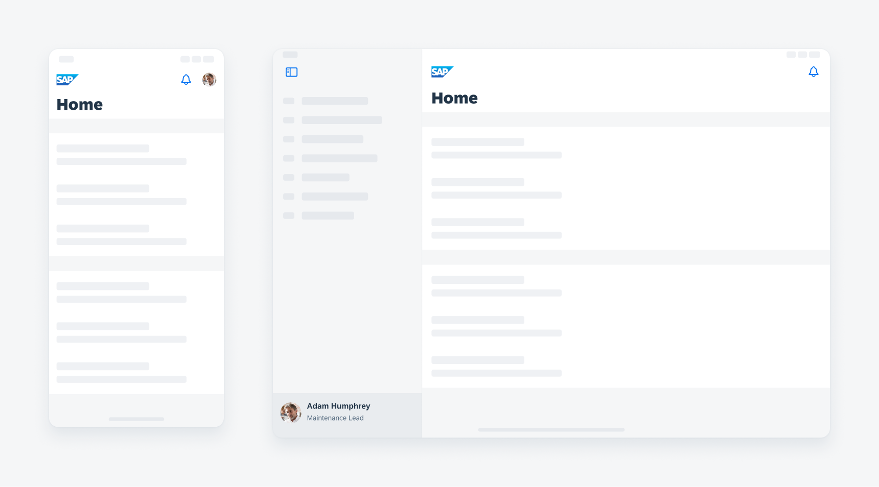
UI elements like the avatar are moved from the navigation bar (left) to the sidebar on iPad (right)
Large Title
The use of a large title is optional. The large title emphasizes the page content and its purpose.
Screens with a large title (left) and without a large title (right)
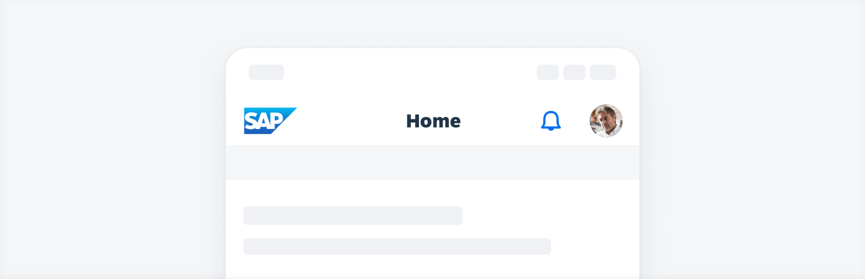
Logo
On the home page of your app, an app logo can be placed on the left side of the navigation bar. We recommend that the logo should be not higher than 24pt.
In exceptional cases, the logo can be larger, but must not exceed 30pt in height. The special cases are, for example, logos that look distorted when they have a height of only 24pt. Here the responsible app designer has to decide which height is visually best for the logo. Note, however, that the logo does not exceed 30pt in height, otherwise it will be cut off.
Make sure you scale it correctly so that the logo is not distorted.
Screen with a logo within the navigation bar
Screen without a Navigation Bar
Some screens may not need a navigation bar because page information and the page-level actions are already provided in the content area.
Screen without a navigation bar
Search Field within Navigation Bar
If the search field is an important part of your app, the navigation bar on iPad can include a search field. In this case there is no large title, but a left-aligned default title. You can decide if you want to use this variant or have the search field below the title.
On iPhone, always use the variant with search field below the navigation bar.
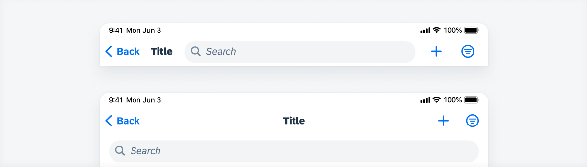
Search field within navigation bar (top) and search field below navigation bar (bottom)
Development: FUINavigationBar
SAP Fiori for Android: Top App Bar
Related Components/Patterns: Buttons, Search Bar
 Your feedback has been sent to the SAP Fiori design team.