
Colors
Intro
The right choice of colors is an important aspect that should be considered in watch apps. It communicates the meaning and relationship of content, providing users with guidance to help them complete their tasks.
The color palette for SAP Fiori for watchOS is based on the color parameters from the Horizon visual theme. The colors displayed below are the main reference colors.
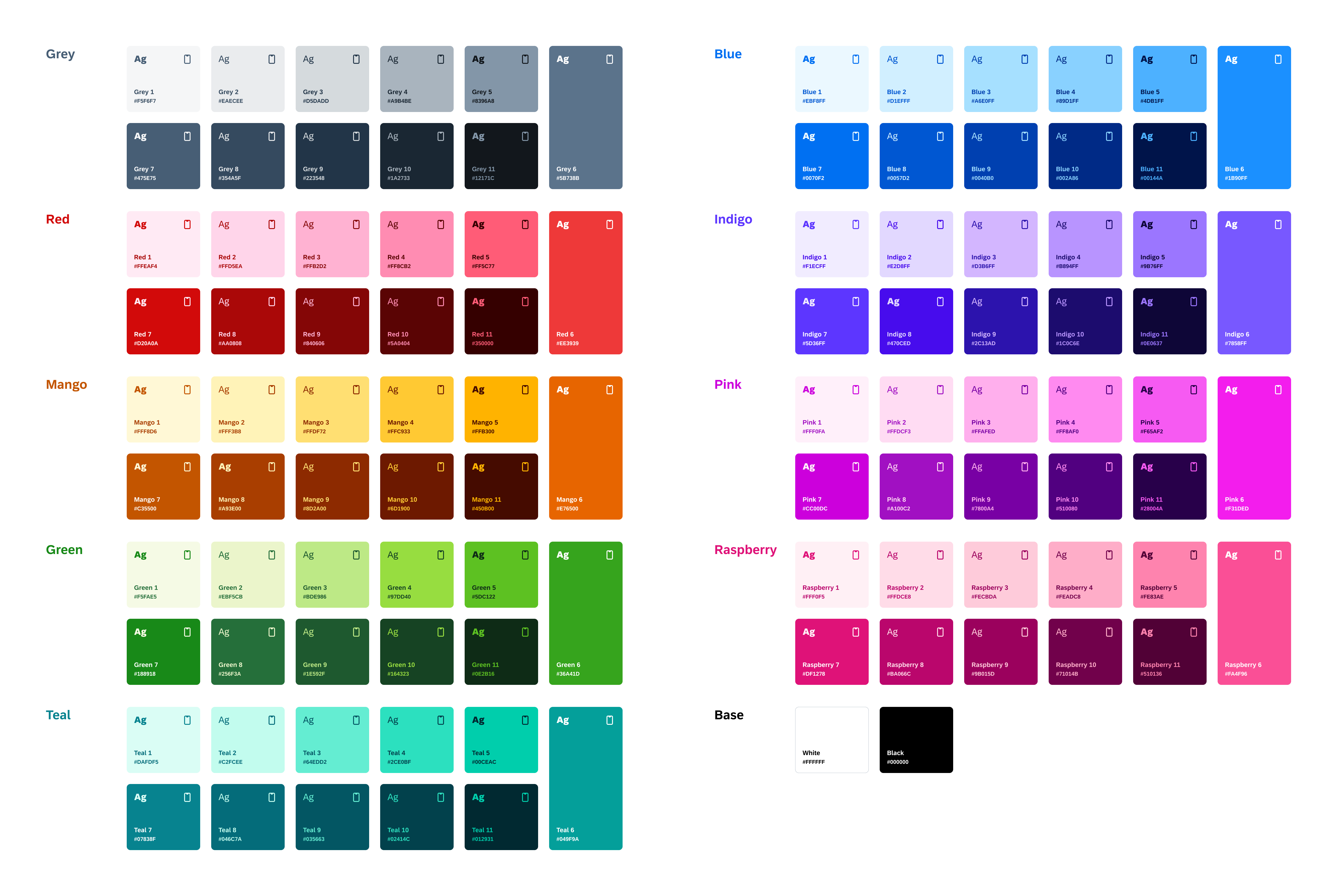
Horizon color palette
Compared to mobile apps, colors in watch apps are generally brighter and less saturated. Additionally, watch apps are only available in dark mode to save battery life and accommodate different light conditions, like lower light or direct sunlight.
We recommend using the dedicated color palette to provide optimal readability and accessibility for users – which is even more important in critical situations due to the smaller screen size and rather short looks at glanceable content on watches.
Core Colors
The current color palette is derived from the main control parameters from the Horizon theme. The following table shows the main reference colors for SAP Fiori for watchOS apps.
| Color Value | Name | Usage | |
| #000000 | Primary Background | Watch background or label color for tint buttons | #F2F4FC; 14% Transparency | Secondary Background | Background color for cards or actions |
| #F2F4FC; 20% Transparency | Tertiary Background | Background color for secondary buttons next to a primary button | |
| #222223 | Quaternary Background | Background for opaque buttons or cards | |
| #F5F6F7 | Primary Label | Titles or primary text content | |
| #D5DADD | Secondary Label | Subtitles, secondary text content or section header text | |
| #A9B4BE | Tertiary Label | Footer text, status, tertiary text content or placeholder text | |
| #8396A8 | Quaternary Label | Symbols or icons | |
| #89D1FF | Tint | Tappable elements | |
| #4DB1FF | Tint Tap State | Tap state of tappable elements | |
| #FF5C77 | Negative Label | Negative or destructive actions or labels | |
| #EE3939 | Negative Label Tap State | Negative or destructive actions in tap state | |
| #FFC933 | Critical Label | Attention needed elements or labels | |
| #FFB300 | Critical Label Tap State | Attention needed elements in tap state | |
| #BDE986 | Positive Label | Positive priority elements or labels | |
| #5DC122 | Positive Label Tap State | Positive priority elements in tap state | |
| #5B738B, 50% Transparency | Separator | Non-interactive element, decorative elements, separators, hairlines or divider lines | |
| #8396A8 | Separator (Opaque) | Higher contrast border or text field borders | |
Accent Colors
Accent colors are used to emphasize key parts of the UI or to highlight information. The following table shows the main accent colors for SAP Fiori for watchOS apps.
| Color Value | Name | ||
| #FFC933 | Mango | #FF5C77 | Red |
| #B894FF | Indigo | ||
| #4DB1FF | Blue | ||
| #64EDD2 | Teal | ||
| #BDE986 | Green | ||
| #FF8AF0 | Pink | ||
| #FEADC8 | Raspberry | ||
| #A9B4BE | Grey | ||
SAP Fiori for Wear OS: Colors
Material Design: Wear OS Colors
 Your feedback has been sent to the SAP Fiori design team.