
Layout
Intro
When designing for small screens, it is important to keep content within the layout legible, aligned, organized, and accessible. The following article presents some best practices that offer guidance for the design of a watch app layout, such as rules for handling different screen sizes, margins, and touch targets.
As the screen on the watch is very small, we recommend using the full width of the screen for interactive UI elements. The frame of the watch automatically creates a visual padding around the content, so you do not need to add additional padding.
Allow enough space for interactive UI elements within the layout and try to avoid placing more than three components next to each other. More specifically, do not place more than three symbol buttons and no more than two text buttons side by side.
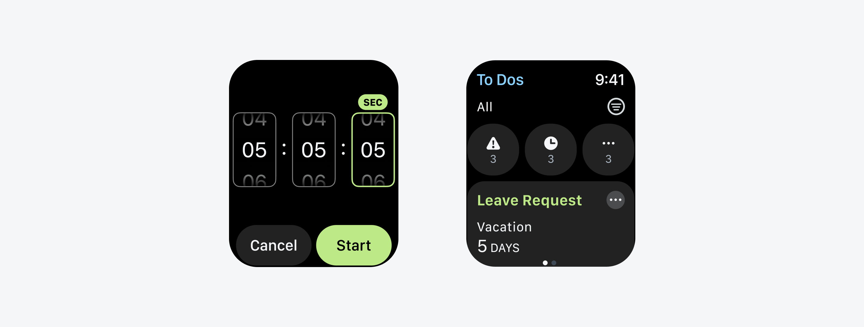
Two text buttons (left) and three symbol buttons (right) next to each other
Users want to see the most relevant content or actions at a glance, rather than having to scroll. Therefore, in some cases, it makes sense to place two text buttons with a short label next to each other if they are equally important to the user.
Automatic rotation of the layout is rather uncommon on the watch, especially since the display usually turns off when users turn their wrist – but in some use cases it makes sense to autorotate the layout. SAP software is often used in areas where workers point a QR code at a reader, for example, in logistics. In this case, the display should stay on and rotate to the desired position.
Apps for watchOS always have a rectangular layout. When designing your app, keep in mind the different screen sizes of the Apple Watch. Currently there are screens with 28, 40, 41, 42, 44, and 45 mm. Always start designing with the smallest screen size. Then, optimize your design for larger screen sizes, such as the 45mm screen.
Align the text of the UI elements with the leading edge of the navigation bar title or “Back” button.
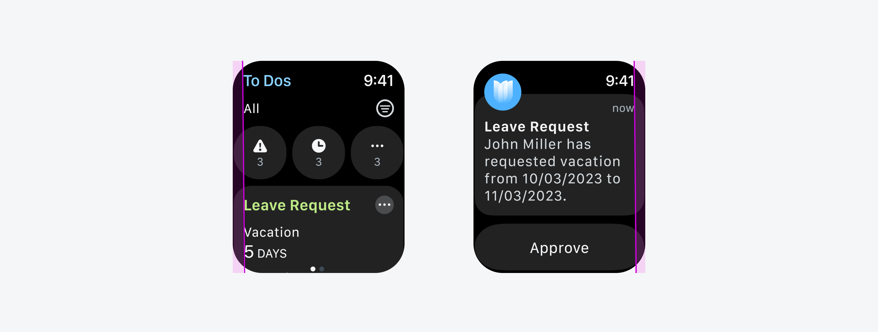
Text alignment within the layout
Even if you design a rectangular layout for your watch app, the rounded corners of the Apple Watch may cut off some UI elements. Therefore, the content should always be placed within the given margins and should not extend beyond them. If you are using the Design Kit for SAP Fiori for watchOS, the margins are already set. We recommend that you do not change the default margins.
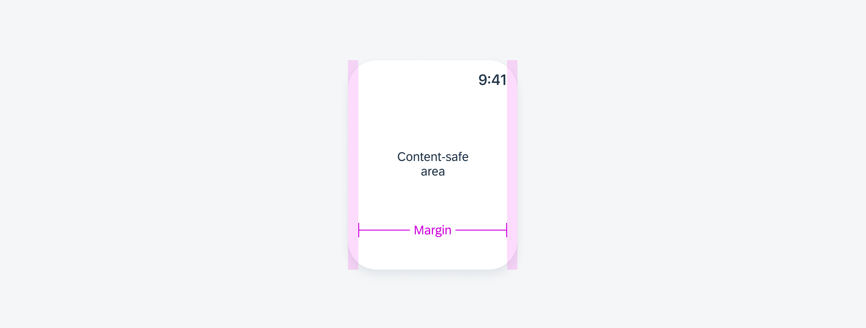
Minimum margins
To support adequate selection time and to avoid “fat finger errors” on the watch, interactive elements must have a touch target of at least 40pt x 40pt. Especially on small screens, it can be more difficult to select the desired UI element.
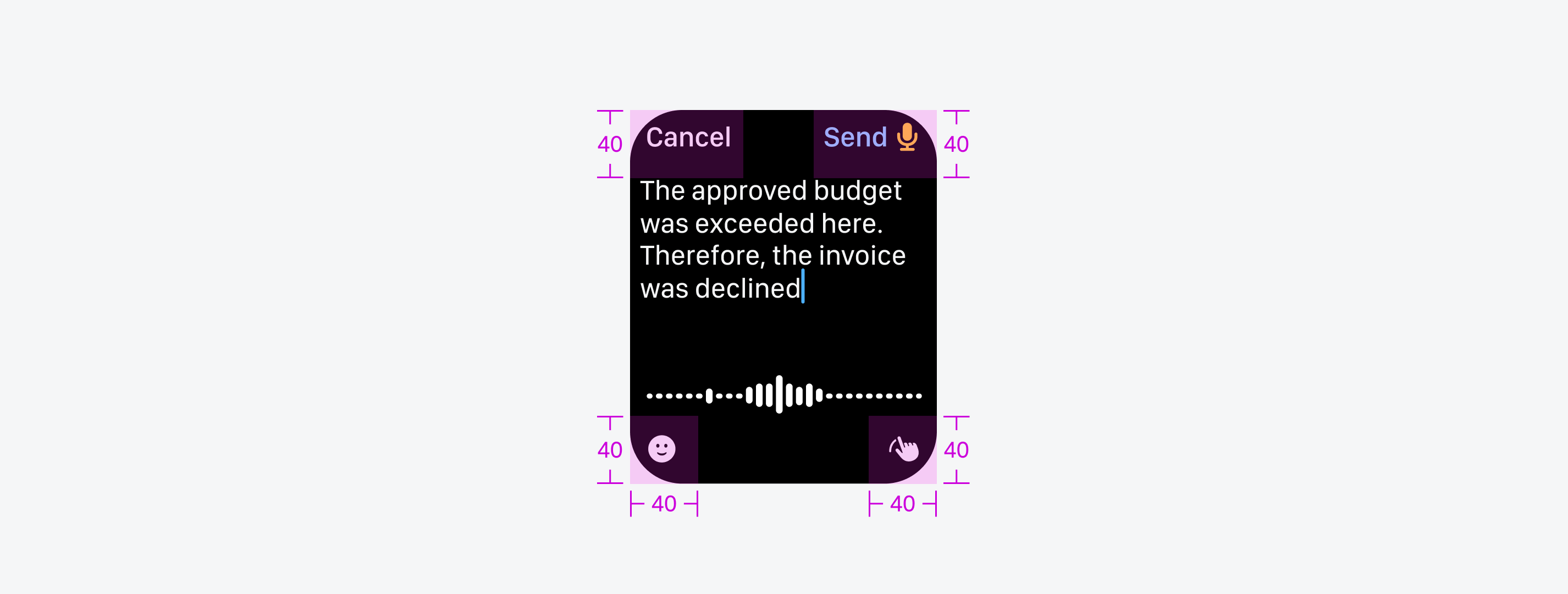
Minimum touch targets
Resources
SAP Fiori for Wear OS: Layout
Human Interface Guidelines: Layout, Supporting Multiple Watch Sizes
 Your feedback has been sent to the SAP Fiori design team.