
Widgets
FUIKPIView, FUIKPIUnitItem, FUIKPIProgressView, FUITimelinePreviewView, FUIObjectCell, FUIObjectCollectionViewCell
Intro
Widgets display key information in a glanceable format on a user’s device.

Small widgets on an iPhone (left), medium widget (middle), and large widget (right
- Only use SAP icons and SDK components so that the widget looks consistent with the app.
- For legibility, consider displaying widget content with a 16pt margin for texts and 8pt tight margins for images and glyphs.
- Use SAP icons or SF symbols on the header instead of the app logo.
- Don’t use the logo on the header. Instead, show the logo only if your app curates content.
- Don’t forcefully repeat information or expand the widget’s content size to fill more space for medium or large widgets.
A. Header
The header of a widget consists of the following variants:
- Left accessory (optional): icon
- Main content: title, subtitle (optional)
- Right accessory (optional): SAP logo, tag, counter
- KPI
- Image
- Customized
- Empty state
- Authentication
B. Body
The body of a widget visualizes the main content through the use of the following components:
- Table view
- Chart card (line, bar, multi-bar)
C. Footer
The footer can be used to display the following:
- Buttons (1 symbol, 1 label, 2 symbols, 2 labels)
- Label
D. Background
The background has the following variants:
- Default
- Customized
- Image
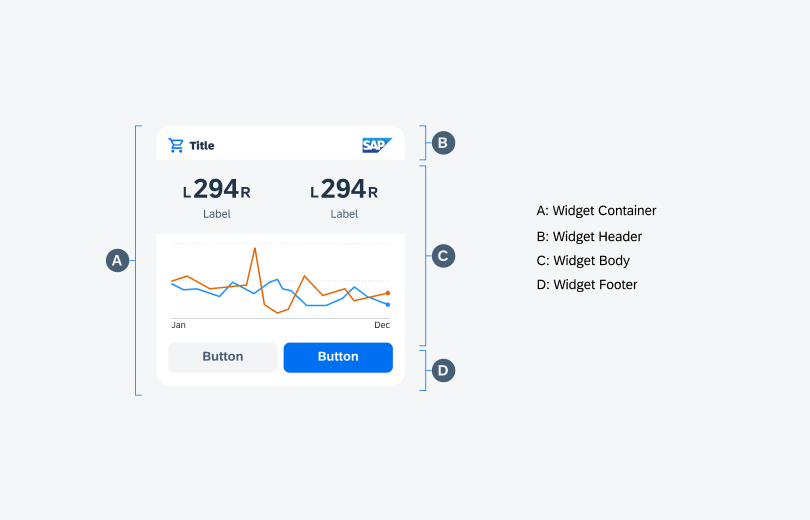
Anatomy of a widget
KPI View
KPI widgets use SAP BTP SDK for iOS KPI and KPI header components. They can be used to represent numerical values such as dates, amounts, etc.
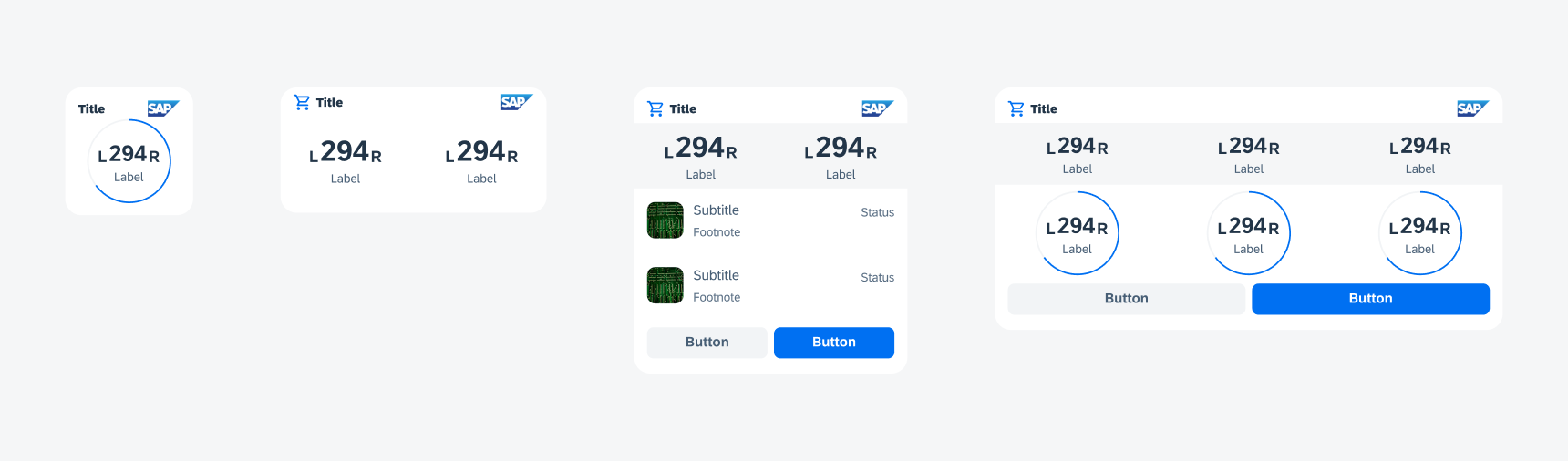
KPI widgets
Table View
Table view widgets use SAP BTP SDK for iOS object cell components. Table widgets can be used to display information with an object image, headline, and subtitle.
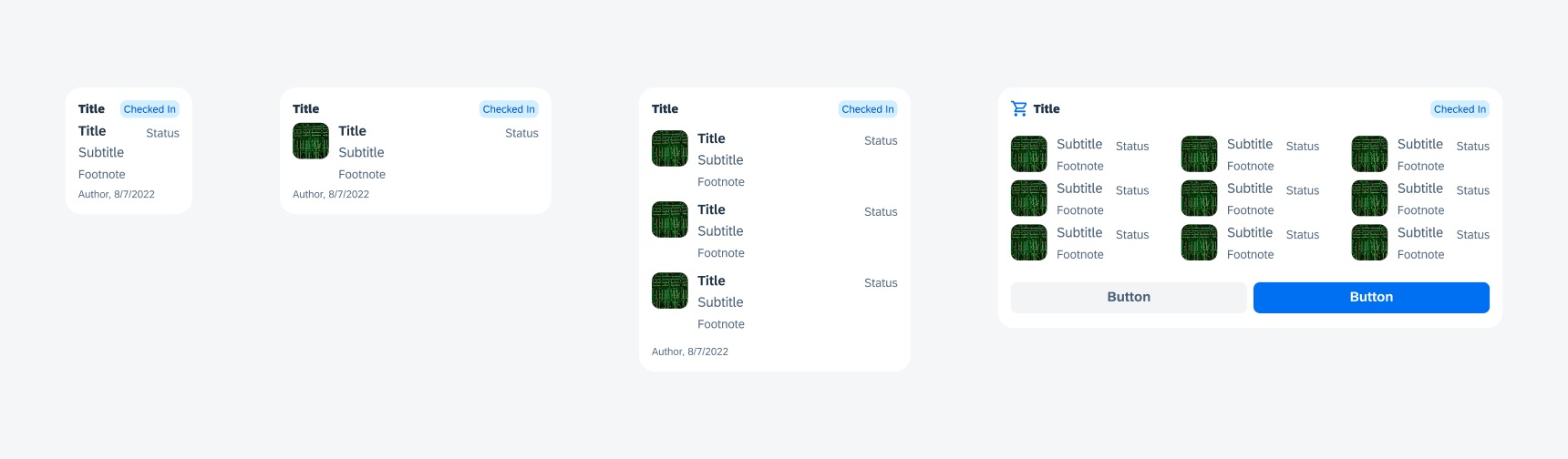
Table view widgets
Chart View
Chart view widgets use SAP BTP SDK for iOS chart cards to display any graphical information. Use line and donut charts in the widgets to avoid overcrowding and allow users to get information at a glance.
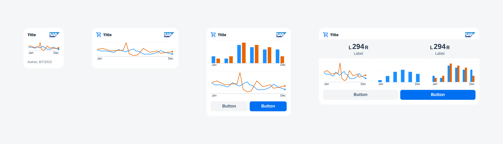
Chart view widgets
Starting with iOS 17, iPadOS 17, or macOS 14, widgets can include buttons and toggles to offer specific app functionality without launching the app. For example, an approval widget allows users to approve a request with a button. On a locked device, buttons and toggles are inactive and the system doesn’t perform actions unless a user authenticates and unlocks their device.
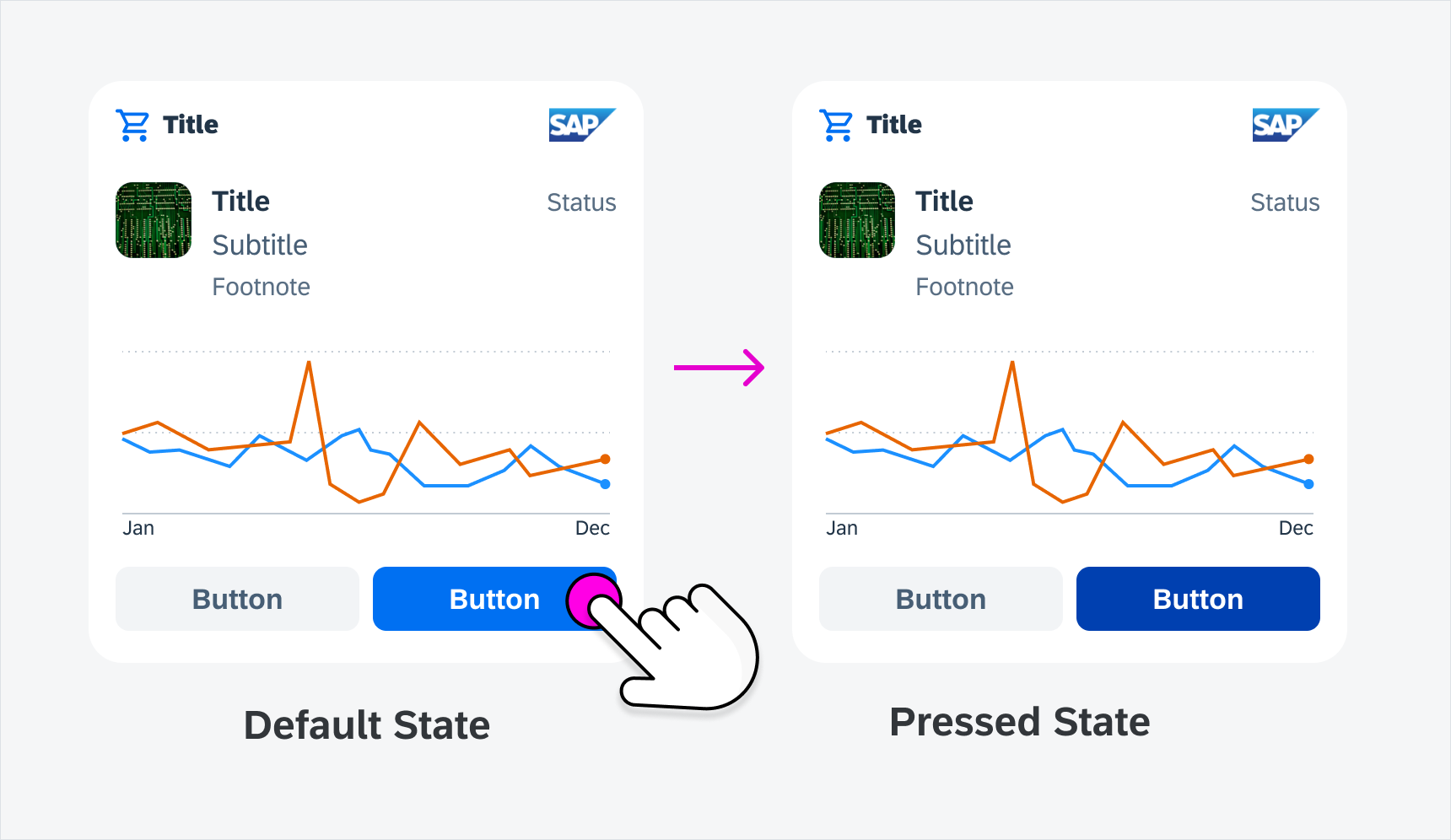
Pressed State (Content)
Selecting a row or column in the widget changes the background color to give users immediate feedback on what exactly has been selected.
Pressed state on content
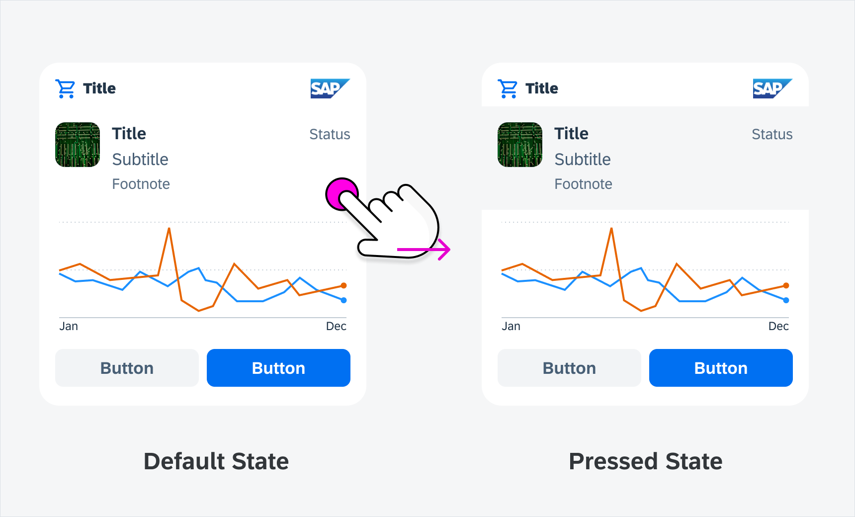
Pressed State (Button)
Selecting a button only changes the button’s state to pressed state.
Pressed state on a button
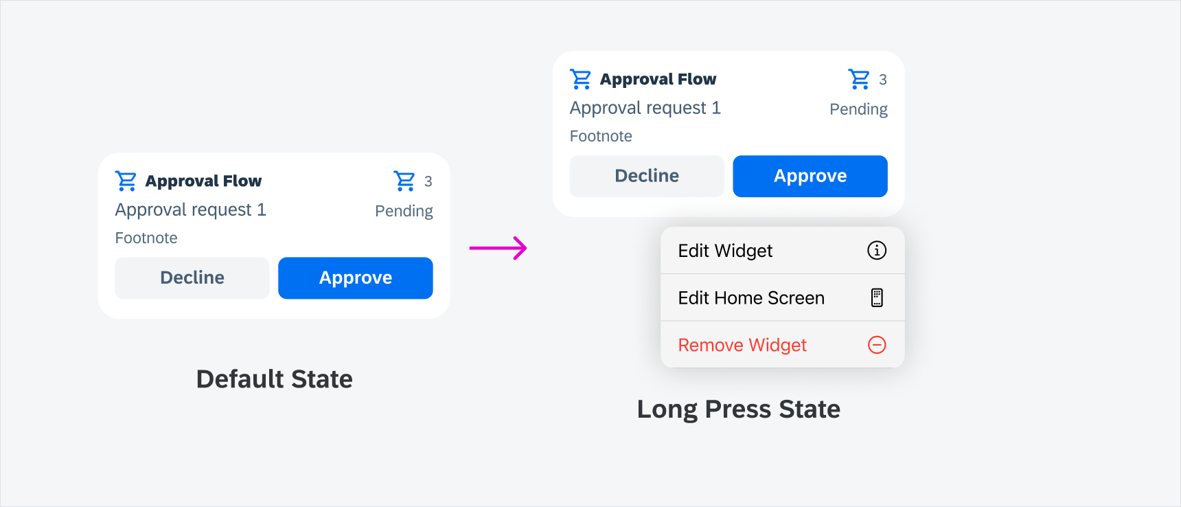
Long Press State
Long press anywhere on a widget opens the native iOS contextual menu that enable users to edit or remove the widget.
Pressed state on a button
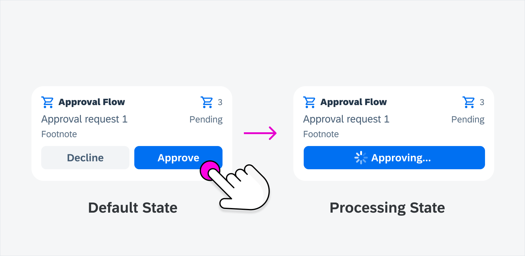
Processing State
When a request is being processed after a user’s action, such as tapping on a button, the tapped button expands to the full width of the container, and shows a circular indicator in front of the button text. The text changes to present continuous tense followed by an ellipsis “…” to indicate the processing state.
Processing state in interactive widgets
Success State
The processing state automatically transitions to the success state once processing is finished in interactive widgets. The in-place loading indicator transforms into a success icon, and if there are more items in the list, the widget is replaced with the next item.
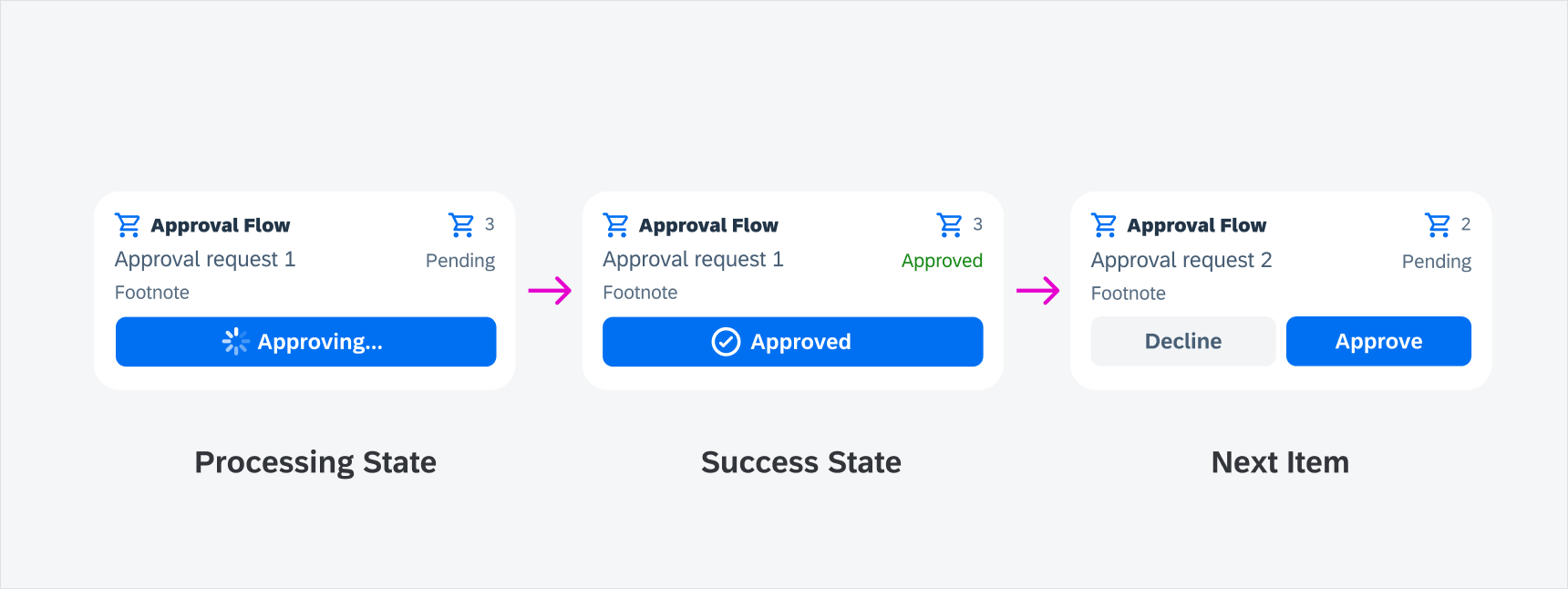
Success state in interactive widgets
Fail State
There is no required success state in interactive widgets. The processing button changes back to the button’s default state.
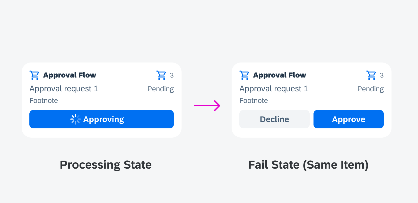
Fail state in interactive widgets
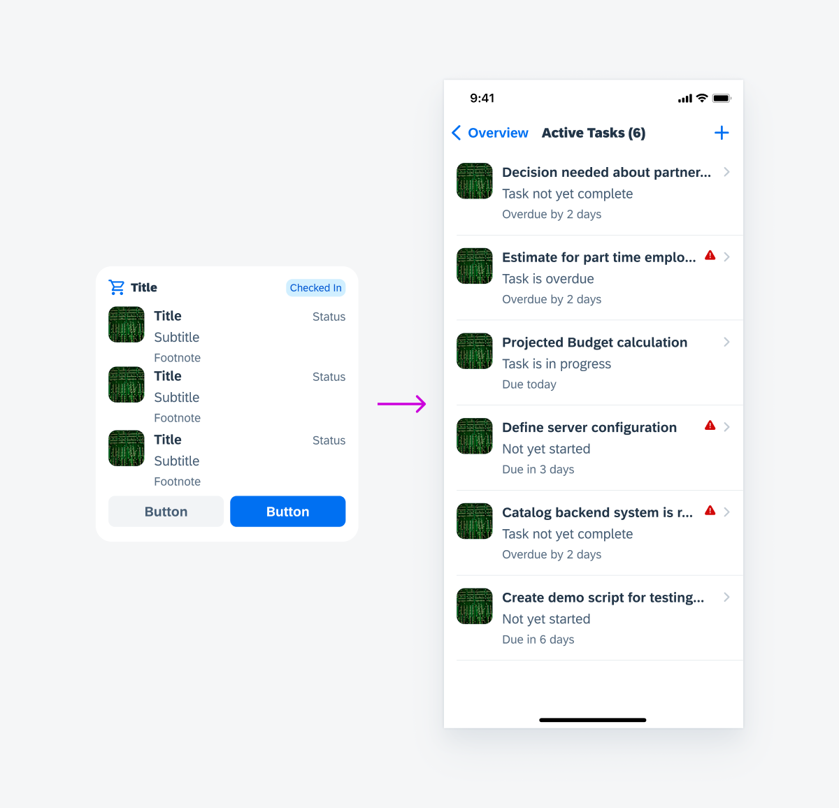
Tapping on Widget
Tapping on a widget navigates the user to the app and opens the corresponding page, such as a list report page type.
Navigation by tapping on a widget
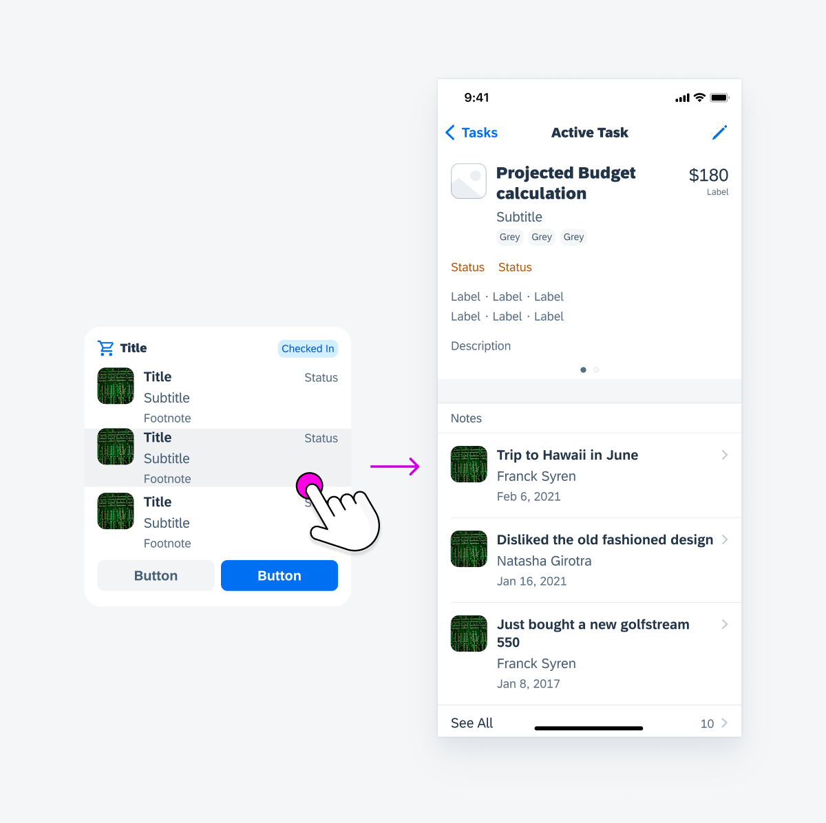
Tapping on Row or Column
Tapping on a row or a column in the widget body, such as an object cell, navigates the user to an object details page that corresponds with the cell’s subject.
Navigation by tapping on a row or column
Empty State
If there is no content to display, the empty state message on a widget lets the user know what’s happening, why it’s happening, and what to do about it.
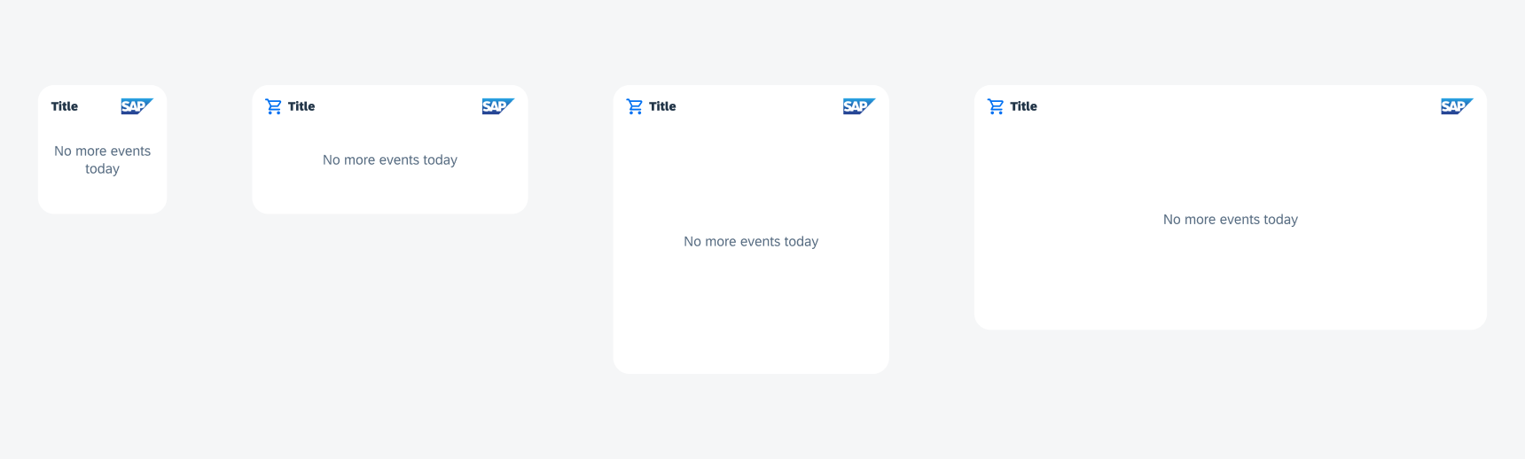
Empty states in widgets
Development: FUIKPIView, FUIKPIUnitItem, FUIKPIProgressView, FUITimelinePreviewView, FUIObjectCell, FUIObjectCollectionViewCell
SAP Fiori for Android: Widgets
Human Interface Guidelines: Widgets
 Your feedback has been sent to the SAP Fiori design team.