OCR Scan

The OCR scan takes advantage of mobile technology to provide users a more efficient way to input data. The scanner identifies specific text from an object or document based on app specific data structure, and pre-fills the form.

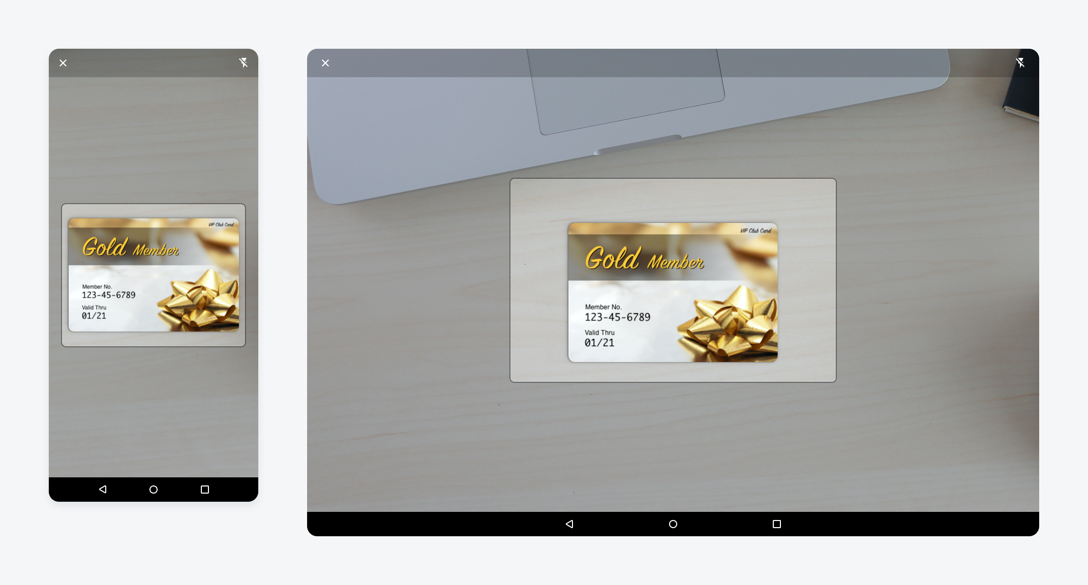
Mobile OCR scan screen (left); tablet OCR scan screen (right)

Anatomy

The OCR scanner comes as a full-screen modal that includes an app bar, scan window, and alignment guide.

A. App Bar

The app bar provides persistent access to two main actions:

  • “Close” icon on the left to exit the scanner view
  • Flash toggle button on the right to turn the camera’s flash on/off for clearer view of target content.

B. Scan Window

The scan window occupies the rest of the screen with a half transparent overlay. Users can see through the overlay to adjust the camera to the right point.

C. Alignment Guide

The alignment guide is a frame that assists users to adjust the camera to the right angle and distance. The OCR scanner processes the content inside the alignment guide area. The shape of the frame could be customizable based on the target scanning object, for example, a business card or receipt.

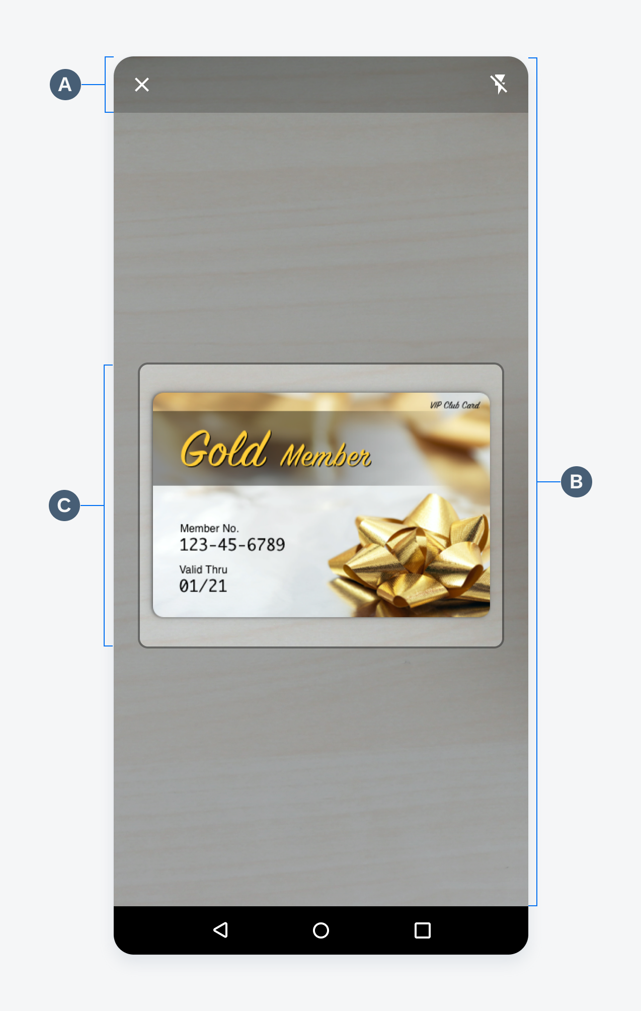
OCR Scan screen anatomy

Behavior and Interaction

Trigger

OCR scan usually serves as an alternate way to create. A common trigger is a menu option to create through scan when users tap on the “Add” or “More” icon in the app bar.

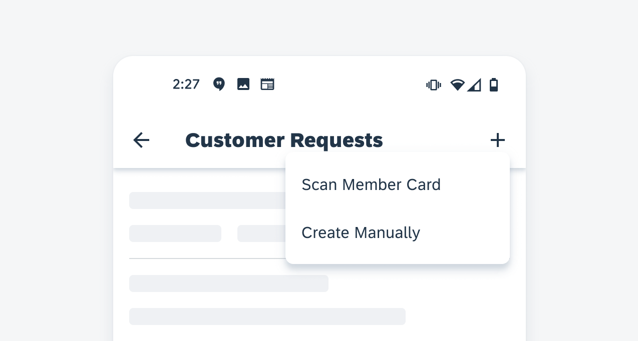
Launch the OCR scan through the menu

Scanning

The scanner launches in a full-screen modal. The camera view is presented in the scan window. Users can adjust the camera position until the target content is inside the alignment guide. Once the content is available, the OCR scanner starts processing the text and pre-fills form fields based on the result.
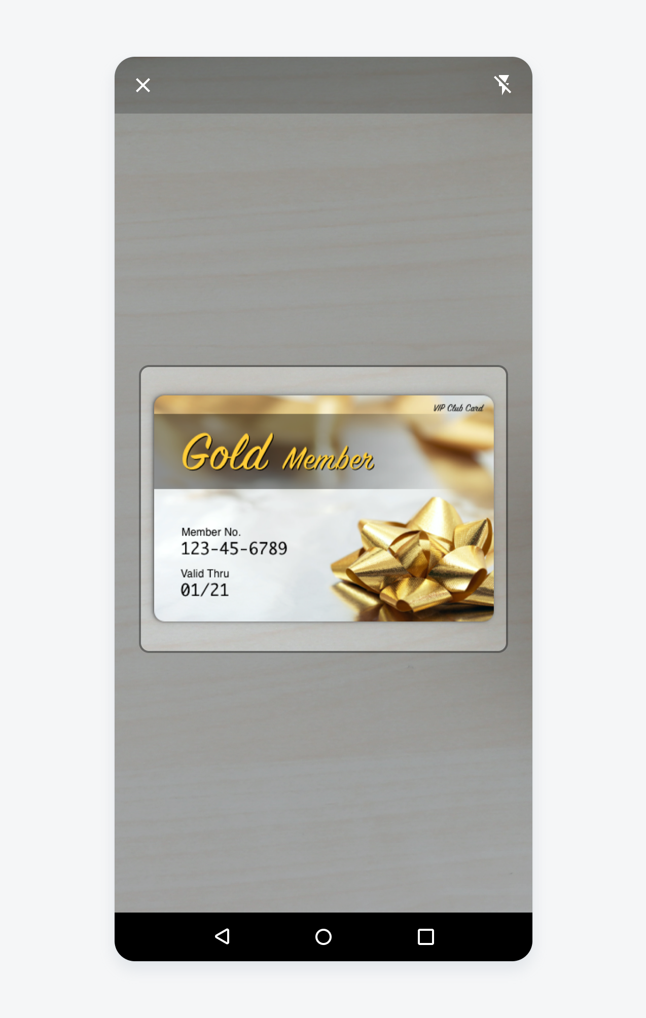
Scanning view
Scanning view

Confirmation

After the OCR scanner has picked up the text content, it automatically transitions to the create pattern with pre-filled content. Users can compare the pre-populated fields with text on the object and edit the result if needed. There might be additional fields that are not available through scanning. Users can manually complete those fields and finish the create process.

Information gathered through the OCR Scan are automatically entered

Chart Types

SAP Fiori for Android supports different chart types. Each chart type visualizes data differently and emphasizes various aspects of the data. Choose a chart type based on the data type and purpose of the chart to best fulfill users’ needs.

Line chart (left), column chart (center left), stacked column chart (center right), horizontal bar chart (right)

Variations

Line Chart

The line chart represents data points using dots connected by lines to show peaks and falls of the data set. This chart type is useful for showing changes in values (continuous or discrete) over time. We support up to four series of data on one chart.

Do

Use a line chart to display a trend in the data, because the connections between the data points provide an overall shape to the dataset.

Don't

Don’t use a line chart when the dataset is missing several values, because breaks will appear in the line; use a column chart instead.

Column Chart

Column charts use vertical bars to display discrete data. The height of each bar represents the value of that data point based on the scale of the y-axis. With their side-by-side arrangement of columns, this type of chart can be used to compare values across categories and show changes over time. We support up to four series of data on one chart.

Do
  • Use a column chart for comparing non-time series data.
  • Can be used instead of a line chart for time series data when it is either 1) more important to see individual data points than the overall trend or 2) the data set has missing values which would create gaps and make a line chart less effective.
  • Use abbreviations of x-axis labels when possible. Due to limited screen space, x-axis labels may be truncated. To make the chart meaningful for users, please choose short labels that could differentiate each data set.
Don't

Don’t use a column chart to visualize extremely large data sets, users may get lost in scrolling. Filter down the data to a reasonable range that users can analyze in a column chart or use line chart instead if the purpose is to show the overall shape of data.

Stacked Column Chart

A stacked column chart is best used for part-to-whole comparisons over time or across categories. Like the column chart, stacked column chart uses the height of each bar to represent the value of each data point. But instead of the side-by-side arrangement, it stacks data series on top of each other to form one column.

Types

There are two types of stacked column chart:

Regular Stacked Column Chart

A regular stacked column chart displays the numeric value of each data point. Thus, the height of the column represents the whole of this group or category. The columns usually vary in height, representing the trend of the whole. A regular stacked column chart supports both positive and negative data.

100% Stacked Column Chart

In the 100% stacked column chart, the height of individual bar represents the percentage of that data point in relation to the whole instead of the actual value. Thus, the total height of each column will always be 100%. It is best used to show how proportions change over time or across categories, such as population distribution across countries. A 100% stacked column chart cannot be used to present negative data.

Regular stacked column chart
100% stacked column chart

Horizontal Bar Chart

A horizontal bar chart uses horizontal bars to express the value of a variable. Much like the column chart, horizontal bar chart’s bar length represents the value of the data point based on the scale of the x-axis. Data in a horizontal bar chart can be sorted from the highest to the lowest value and vice versa. Up to four series of data are supported.

Do
  • Use it to compare the differences between nominal variables and to sort data in a way that is meaningful for the user. 
  • Use it as an alternative for sequential data whose y-axis label width is too long for column chart. 
  • Make sure that the chart plot remains above the fold to prevent the user from vertically scrolling to see the x-axis. 
Don't

Don’t use it for negative values in horizontal bar chart. Column chart is better suited for that.

Donut Chart

Donut charts are best used to show proportions of categorical data for a part-to-whole analysis. A donut chart takes one data set and visualizes the ratio of the data in a circular form. The arc length of each segment represents the proportion of each category, while the full circle represents the sum (equal to 100%). We recommend showing both the actual value and the percentage of each category for easy comparison, though the actual choice depends on the data type and context. 

A donut chart follows the same layout as other chart types: the legend and summary at the top and the chart at the bottom. However, there is one exception: when the screen is in landscape orientation, the donut chart should be displayed on the right with the legend and summary on the left to better utilize the space.

Donut chart in landscape
Do
  • Limit the number of categories in one donut chart. We recommend having no more than eight segments in one chart. Focus on the categories with the biggest values, while grouping the rest of the data points into the “Others” category. Use a column chart or horizontal bar chart instead of showing all data points is important. 
  • Rank the data from largest to smallest (with the “Others” group at the end) and display them clockwise for easier data consumption. Do with caution: you can choose a different order if the sequence of categories has a semantic meaning, for example, Strongly Agree, Agree, Neutral, Disagree, Strongly Disagree. 
Don't

Don’t use multiple donut charts for one dataset to show trends over time or compare proportions across different areas. It is difficult to compare between two donut charts and it takes up too much screen space. Use a  100% stack column chart instead.

Scatter Chart

Scatter chart is a collection of points where each point represents two values from two variables. Scatter charts show the correlation between these two variables to convey a trend.

Scatter chart
Scatter chart
Do
  • Do use to view the correlation between two variables. If there are more than two variables, use a bubble chart instead. 
  • Do use to visualize many data points to view a trend. A large data set will provide a clearly defined trend.
Don't

Don’t use to visualize chronological or continuous data. Use a line chart or bar chart instead.

Behavior and Interaction

Horizontal Bar Chart

Single Selection

Users can tap on a horizontal bar to view the exact value of the selected data point in the summary section. All other bars will fade when one data set is selected. Tap on the selected data set again to deselect. 

Vertical Scroll

Due to the limited screen size of mobile devices, users can vertically scroll to reveal the horizontal bars found below the chart plot fold.

Single-selecting horizontal bar chart
Vertical scrolling in a horizontal bar chart

Label Expansion

Labels can take up the majority of the screen real estate however if the y-label is at its maximum, users can tap on the y-axis labels to further expand and reveal the entirety of the labels.

Label expansion in a horizontal bar chart

Line Chart

The line chart allows user to select a single point or a range of points by tapping and dragging.

Selection

When the user selects an item in the chart plot, the ruler indicates the selections’ position on the x-axis. To reposition ruler, the user drags accordingly to move to another point.

Multi Selection

Users can select a data range by tapping and holding with one finger and subsequently tapping another point on the chart plot. Users can also perform this interaction by tapping on the chart plot with both fingers at the same time. While holding the position, users can adjust the data range by sliding their fingers across the chart plot. Doing so, the data will be updated on the summary section in response to the user’s input.

Single selecting in a line chart
Multi-selecting in a line chart

Column Chart

Selection

User can tap on a column (or a cluster of columns for multi-series) to view the exact value of selected data point(s) in the summary section. All other columns will fade out when one data set is selected. Tap on the selected data set again to deselect.

Horizontal Scroll

Due to the limited screen size of mobile devices, we limit the number of columns displayed on one screen, so the text labels and columns are legible.

Single selecting in a column chart
Horizontal scrolling in a column chart

On mobile devices, the limit for one-series data is 12 columns. For more than 12 data points, the first 12.5 columns will be shown, and user can scroll horizontally to see the rest of data points. A gradient at the end of chart plot area indicates users can scroll to see more columns. 

For multi-series data set on mobile, the limit is 6 clusters of columns. The horizontal scroll starts at the middle of the seventh data point. The limit doubles on tablet devices (24 for one-series, 12 for multi-series).

Default column chart (left), scrolled column chart (right)

Donut Chart

Selection

Each segment of the donut chart is interactive. The user can tap on one segment to select and tap again to deselect. The selected segment will be highlighted, while unselected ones are faded out. The user can select one or more segments in one donut chart. The value of selected segments will be shown in the summary area and the total value will be updated to reflect the total of selected segments.

Clear Selection

At any point in time, the user can tap outside the donut chart area (not in the legend and summary area) to clear the selection. This will bring the donut chart to the default state where all values are displayed in the summary area and no segments are selected.

Single selection in a donut chart
Clearing a selection in a donut chart

Scatter Chart

Selection

Users can tap on a point to view the exact value of that selection in a popover. All other points will fade when one selection is made. Tap on the selected point again to deselect.

Focus

If a scatter chart has multiple series, the user can tap on the legend to focus on one series. During this focus mode, the user will only be able to select data points within that series.

Selecting a point in scatter chart
Tapping on a legend item focuses on a series

Chart Overview

A chart represents data in certain graphical patterns, which gives users visual insights of the data set(s). A full-width chart page allows users to view the trend of data, check specific data points, or compare different data sets. To see the specific details of different chart types, see chart types.

Line chart in mobile (left) and tablet (right)

Anatomy

A. Chart Title

The chart title displays the name of the chart with a timestamp. The name should communicate the content of the chart, so users know what to expect from this chart. The timestamp shows when the chart was updated or refreshed.

B. Chart Summary and Legend

The chart summary area starts with the legend of the chart, followed by a customizable summary of the chart data. When one data point is selected in the chart plot, the value of selected data is shown in the summary area.

C. Chart Plot

The chart plot displays the chart x and y-axes as well as the visual representation of the data points, for example, bars, columns, lines, and so on.

Anatomy of a chart floorplan

Chart Title

The chart title displays the name of the chart and an optional timestamp for the chart data. By default, the chart summary provides high-level details from the chart data – for instance, total sales in dollars ($) for the year. The following content types are found in the chart title section:

A. Title

The chart title should reflect the quantitative (measure) and categorical (dimension) criteria data being displayed with the chart — for example, “Total Sales ($) by Month”. The chart title is updated when the user changes the options in the filter menu and when the user drills into or out of the chart plot.

B. Time Stamp

The time stamp label can be included to indicate the last time the chart was updated.

Anatomy of the chart title

Chart Summary and Legend

The chart summary contains summary information for the chart data series. It also serves as the legend for multiple series of data. Charts can display up to four data series at one time; if the data set contains more than four series, the user should be able to select which series to display using the filter menu. 

A. Summary Title

The summary title should be concise yet descriptive, including the unit(s) of measure if applicable, for example, $, °C. When users drill into their data, the summary name acts as a visual reference to reinforce the user’s location within the data set. For example, if a user drills down from a 12-month view for 2018 to explore data for April, the summary section title would change from “YTD ($)” to “April Total ($)”.

B. Legend Item

The legend item consists of colored nodes and text that explains the meaning of the data points found in the chart plot. When there are two or more series, the legend items vertically stack from most recent to least recent.

C. Data Summary

The data summary displays the average value by default. When a data point is selected, its values is displayed to the right of the average values. If a range is selected, the summary displays the values for that range. The alignment of summary title and data summary can be configured based on data type. We recommend right alignment for numeric data.

D. Trend (Optional)

The trend is identified by an up/down icon, text, and the use of semantic colors that is displayed next to the summary value as the user selects a range.

Anatomy of summary and legend


Chart Plot

This contains the visual representation of the chart data, including the chart items , such as lines, columns, bars, etc., x and y axes, title, labels, and gridlines. Users can select data points by tapping on the chart plot area and they can horizontally scroll to view more of the data set. See chart types for the specific behaviors of each chart type. The chart plot should always include the following: 

A. Y-Axis Title

The y-axis title is placed at the top of the chart plot and is left-aligned with the y-labels. The title should be clear and concise.

B. Ruler (for Line Chart)

The ruler is a vertical axis that appears when the user selects a point on the chart to better illustrate a point’s x and y location.

C. Grid Lines

The grid lines refer to the horizontal lines that run across the width of the chart plot area and are used to indicate the y-position of a data set. There are two types of grid lines: the base line (the minimum value in a data set) and the standard line (any value above or below the baseline). Both lines types are distinguished by their visual treatment, baselines are solid and standard lines are dotted.

D. X-Axis Title

The x-axis title is placed at the bottom of the chart plot and is center-aligned with the device screen. The title should be clear and concise.

Anatomy of a chart plot


Empty State

The empty state for charts is a way to provide guidance, context, and delight during moments where the user may experience connectivity issues or if the app displays an empty data set. The illustration works along with a solution-oriented message to express SAP Fiori’s brand identity. The empty state consists of the following:

A. Image

The image section displays an image provided by SAP Fiori Moments that expresses our brand values. Visit SAP Fiori Moments’ Guidelines to download illustration assets.

B. Title

The title is a single line of text to help the user understand the empty state. Keep the messaging clear and concise and the voice and tone consistent with SAP Fiori Moments’ guidelines.

C. Description

The description is a small multi-line text that provides more detail than the title. The description allows for more text but the message should be concise. 

Anatomy of the chart empty state

Adaptive Design

The chart empty state utilizes a responsive layout to scale the empty state view at different widths. The content is reduced or added according to the size of the view. For example, the chart header and chart card display a single-line title, whereas the full-screen chart displays an illustration, title, and description. This is to reduce visual noise in instances where there are multiple charts on the same page without data. 

Different types of chart empty states

Resources

Related Components/Patterns: Chart Types, Chart Card 

SAP Fiori for iOS: Chart Overview 

Development: Line Chart, Column Chart, Horizontal Bar Chart, Donut Chart, Scatter Chart