Timeline View

The timeline view displays a list of items such as tasks, events, or meetings in chronological order. The information in the timeline view is presented as tappable cells that show the most important information about the object. The timeline view may be filtered or searched.
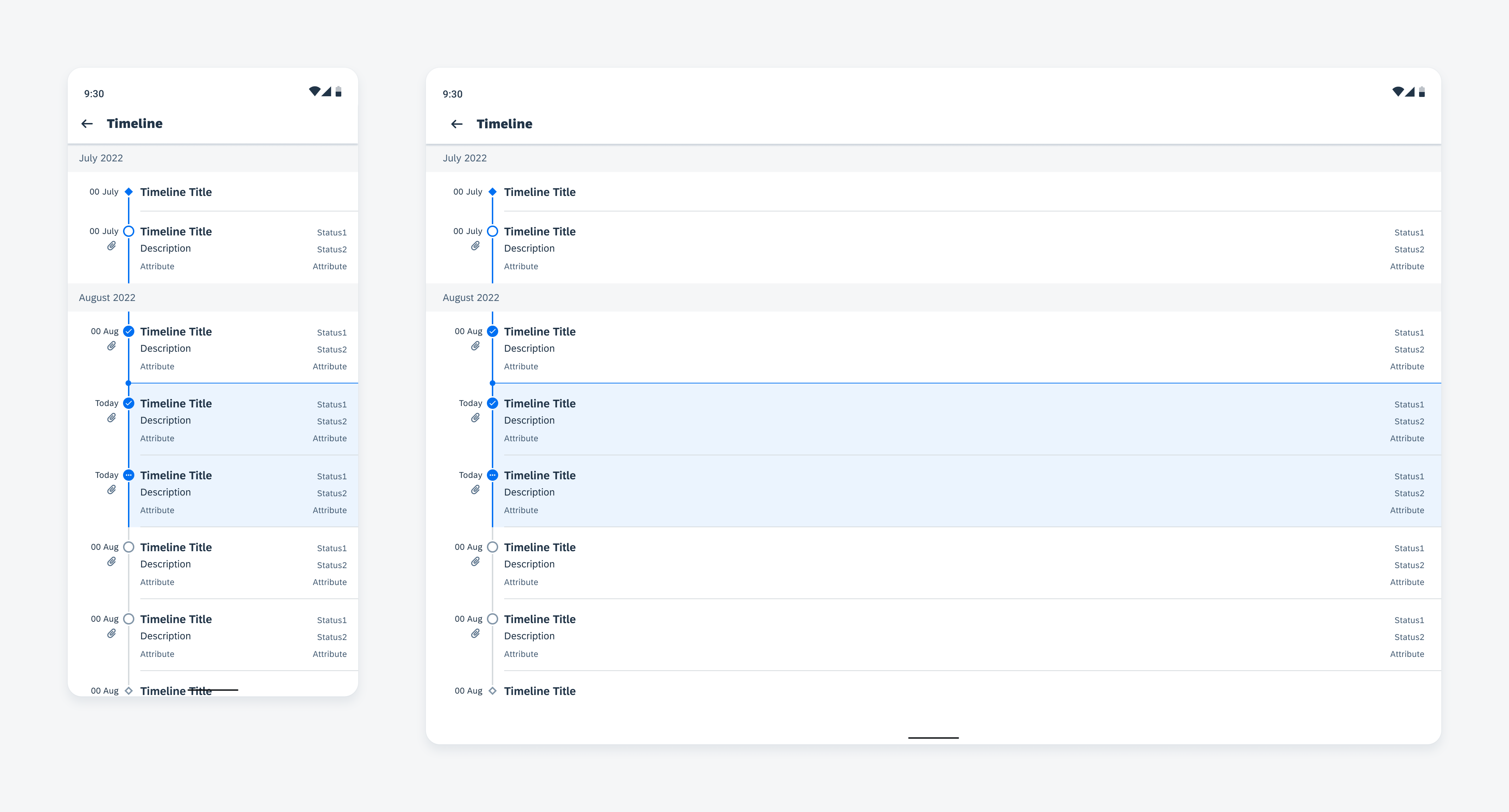
Timeline on mobile (left) and tablet (right)

Usage

Do
  • Use the timeline cells to show a brief and concise overview of the object.
  • Use the timeline view to organize objects based on due date or time.
  • Use the timeline view to indicate the status of different objects.
Don't

Don’t show all the object’s details in the timeline cell. To view details, the user can tap to drill down into the cell’s details.

Anatomy

Timeline View

The timeline view contains a chronological axis with timestamps on the left and timeline cells to the right of the axis.

The timeline can be filtered and searched using the local search behavior. See Filter and Search for more details.

A. Header

The header shows the parent time unit (month, day, etc.) of the timeline cells with a customizable format.

B. Now Indicator

The now indicator indicates today’s timeline cell(s). It appears on top of the first cell with current tense or the cell with future tense that is closest to now.

C. Timeline Start / End Cells (Optional)

Differentiated by a diamond shaped node, a start or end node indicates the beginning or end of the timeline.

D. Timeline Cells

The timeline cells provide concise key information about timeline objects. These may be tappable to drill down into full details.
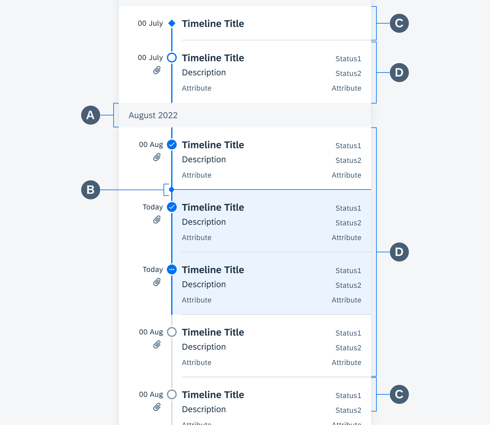
Timeline view anatomy

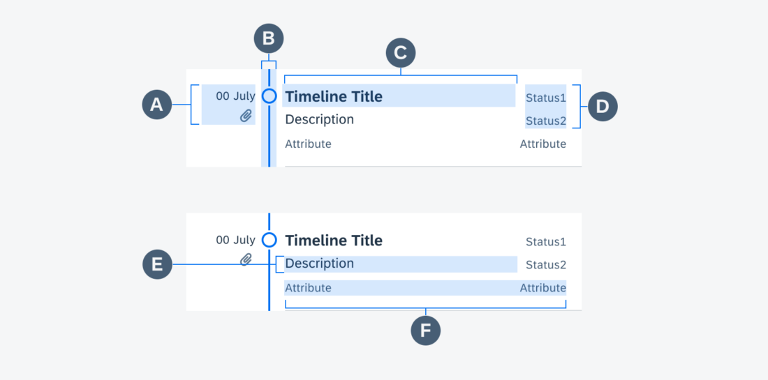
Timeline Cell

The timeline cell contains the title of the object along with other key information. Designed for flexibility, information may be hidden or formatted according to the user’s needs. These cells may also be made tappable to allow the user to navigate to the object details.

A. Timestamp Column

The timestamp column displays the timeline cell timestamp. The timestamp may have a flexible format. Underneath the timestamp, a non-interactive icon may be displayed to indicate more information upon drill down.

B. Node and Node Line

The nodes and node lines indicate the status and tense of the timeline view object by using color, shape, and icons. See variations below for details.

C. Timeline Title

The timeline title provides a concise overview of the timeline object. The timeline title may wrap to two lines before truncating.

D. Status Stack

The status stack provides 2 statuses of the timeline object.

E. Description

The description may wrap to three lines before truncating.

F. Attributes

The two attributes provide additional information about the timeline object. Attributes cannot exceed one line.

Timeline cell anatomy


Behavior and Interaction

The navigation to a timeline view depends on the application’s information architecture and navigation paradigm.

Users can scroll through the timeline to view any number of objects in the past, present, or future. The header is fixed to help users keep track of their place on the timeline. Users may tap on a timeline cell to drill down into the object’s details on another page.
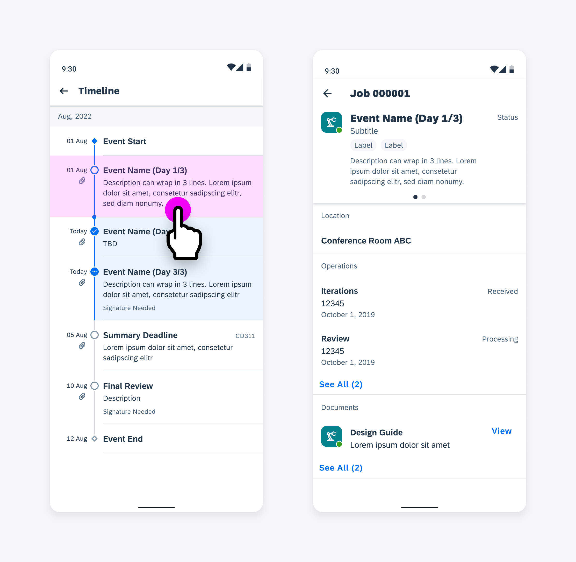
User taps on a timeline cell to navigate to full details

Variations

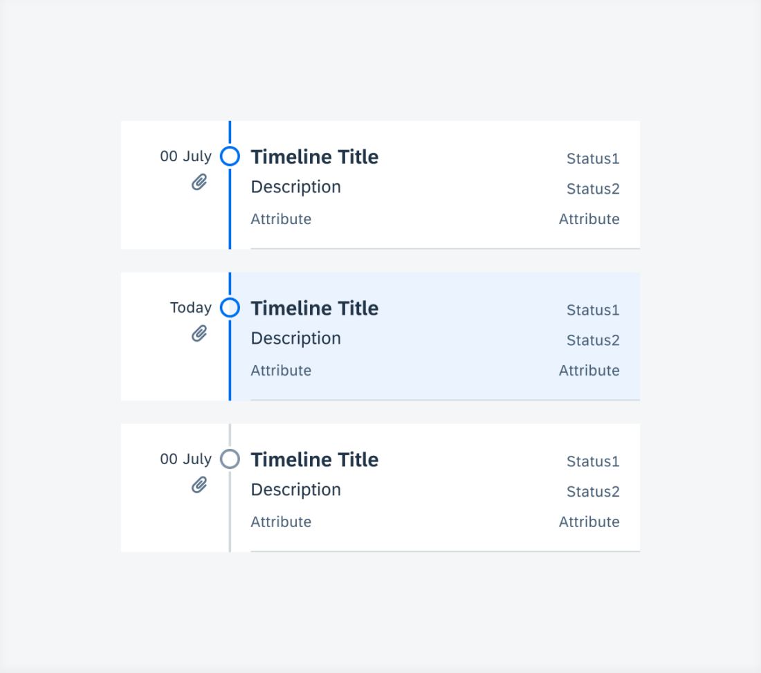
Through shape and color, timeline cell nodes and the node line indicate the state and status of timeline objects.

Past objects are indicated by a blue node and blue node line.

Current objects are indicated by a blue cell background, a blue node, and blue node line.

Future objects are indicated by a gray node and gray node line.

From top to bottom: past tense, current tense, and future tense

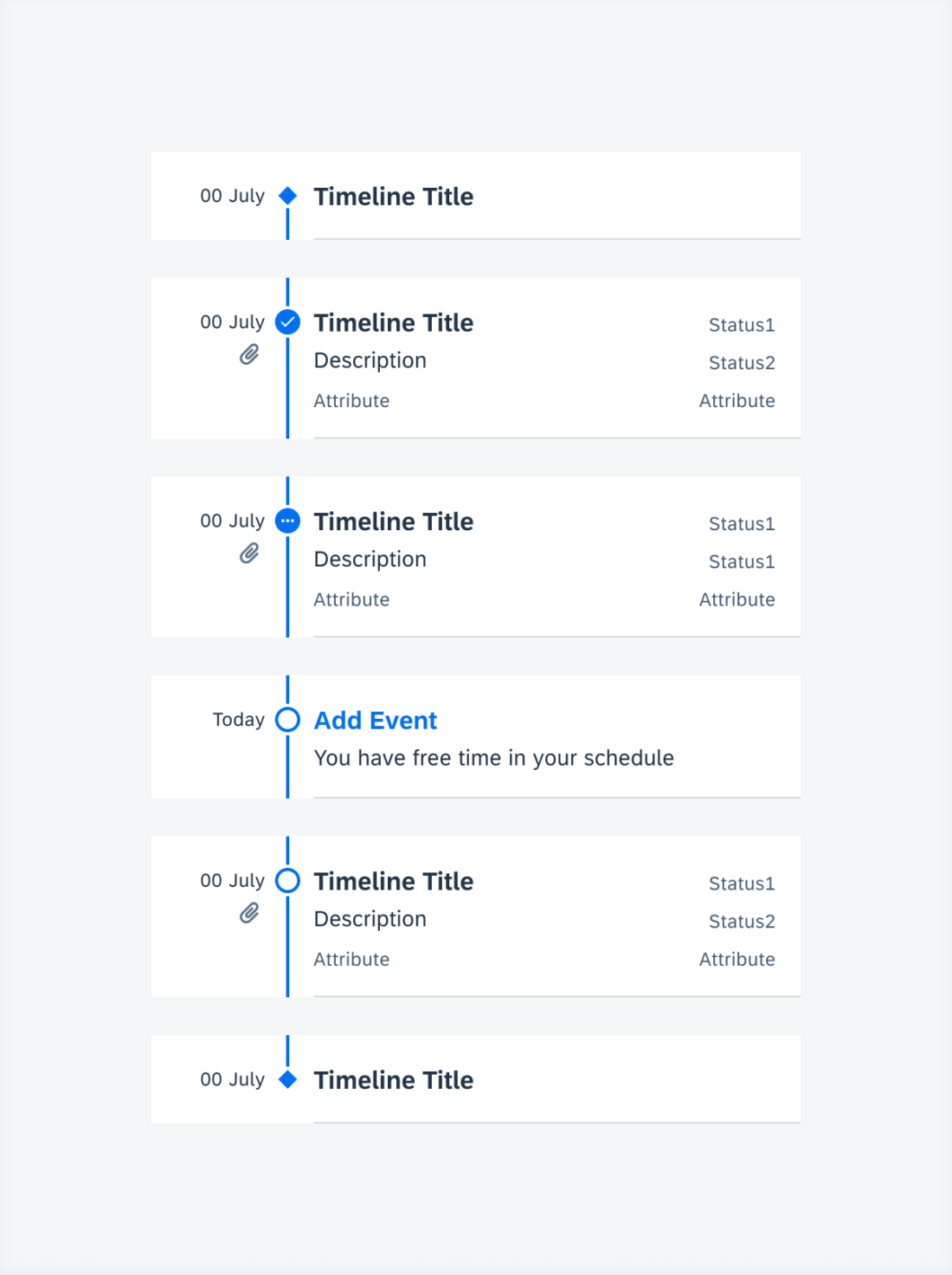
Icons within the node indicate whether an object is open, in-progress, or completed.

From top to bottom: start status, completed status, in-progress status, empty status, open status, and end status

Adaptive Design

Mobile

Because of the smaller real estate on mobile, the titles, descriptions and supporting texts within the timeline cell may be truncated. The timeline view may also share the screen with another content type such as a map view. Therefore, the bottom sheet can be used to display the timeline view.
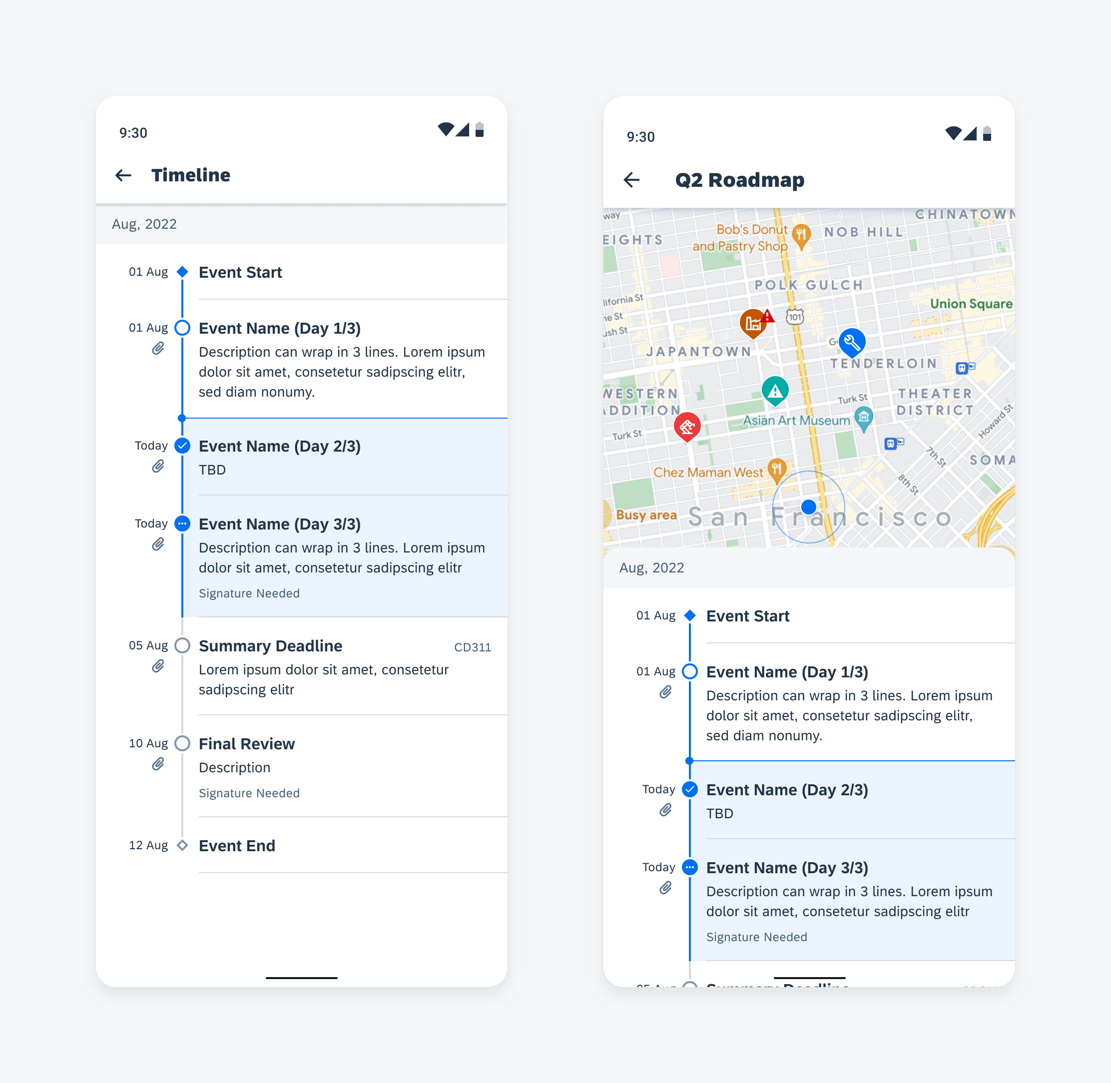
Timeline view (left) and timeline bottom sheet (right) on mobile

Tablet

The timeline view can fit on tablet in different ways. If the timeline is the only content on the screen, it will be center-aligned. However, if the timeline shares the screen with other content, a side sheet can be used to display the timeline.
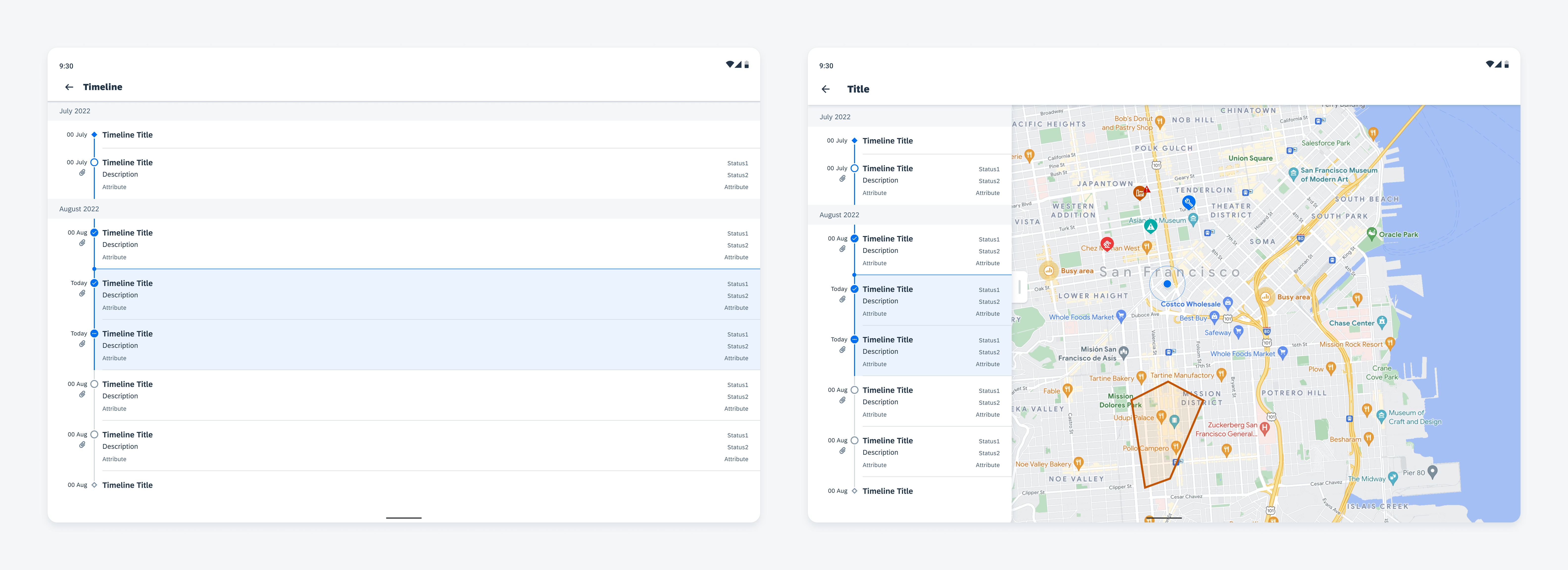
Timeline view (left) and timeline side sheet (right) on tablet

Resources

Development: TimelineView

SAP Fiori for iOS: Timeline

Related Components/Patterns: Object Cell

Timeline Preview

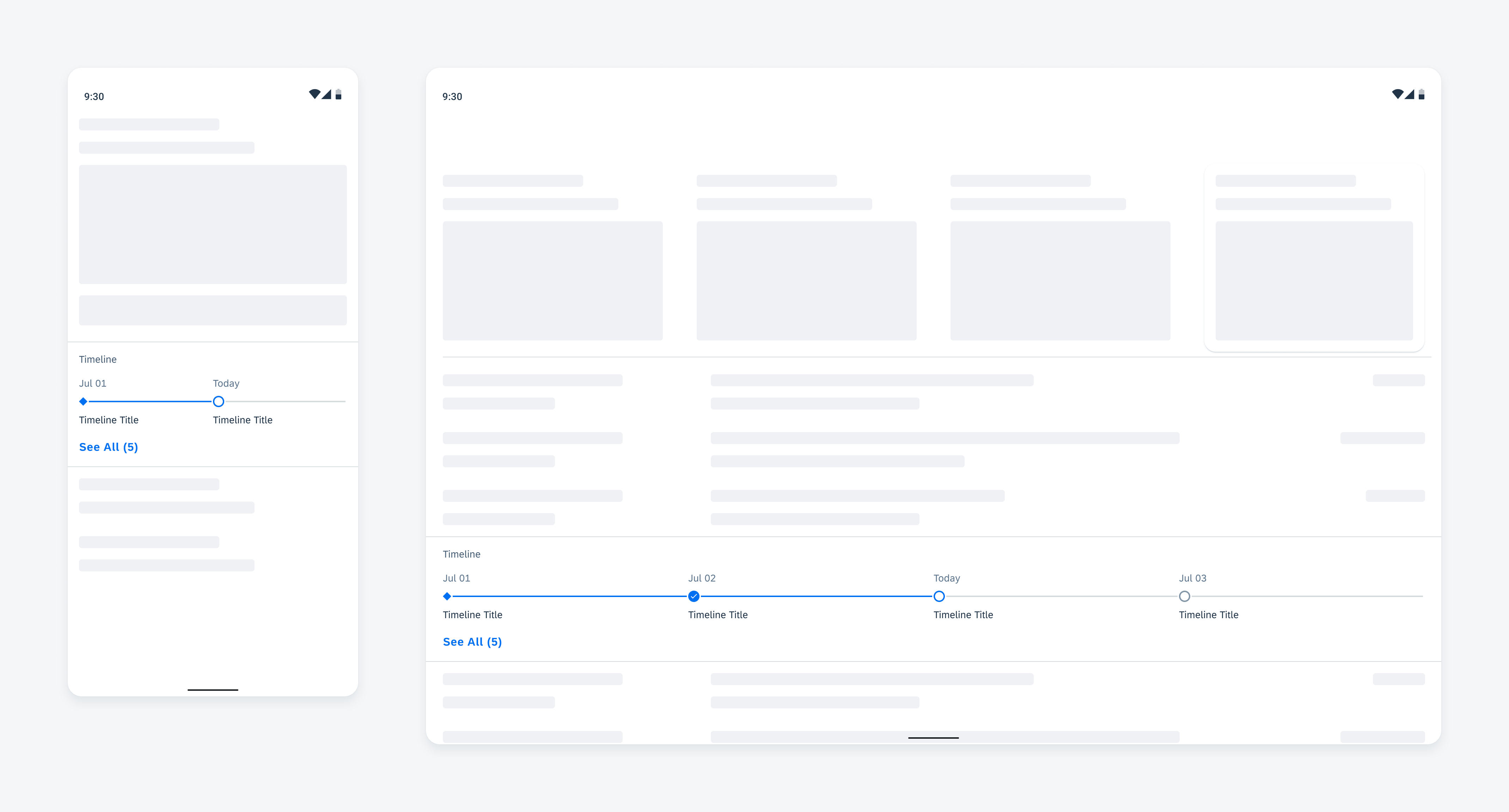
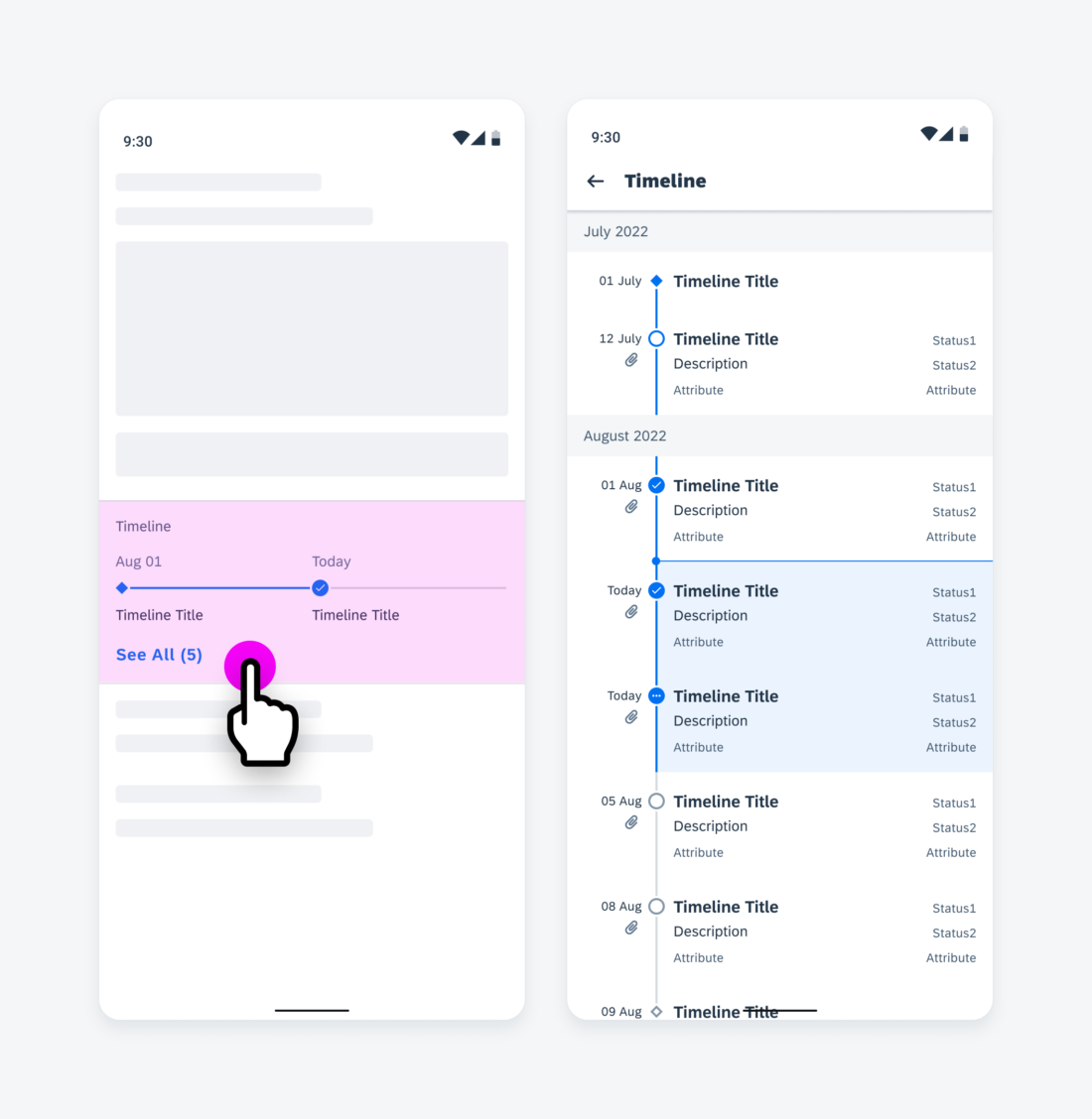
The timeline preview gives users a brief glimpse of upcoming objects, events, or recent posts in chronological order using a horizontal timeline.

Timeline preview on mobile (left) and tablet (right)

Usage

Do
  • Use the timeline preview component to display read-only objects and their respective timestamps.
  • Use the timeline preview as an overview and allow the user to navigate to the timeline view for details.
  • Use the timeline preview component to indicate the status of objects via the nodes and node lines.
Don't
  • Don’t use the timeline preview to show detailed or extended descriptions of objects.
  • Don’t use the timeline preview to show objects or tasks which require direct interactions with them.

Anatomy

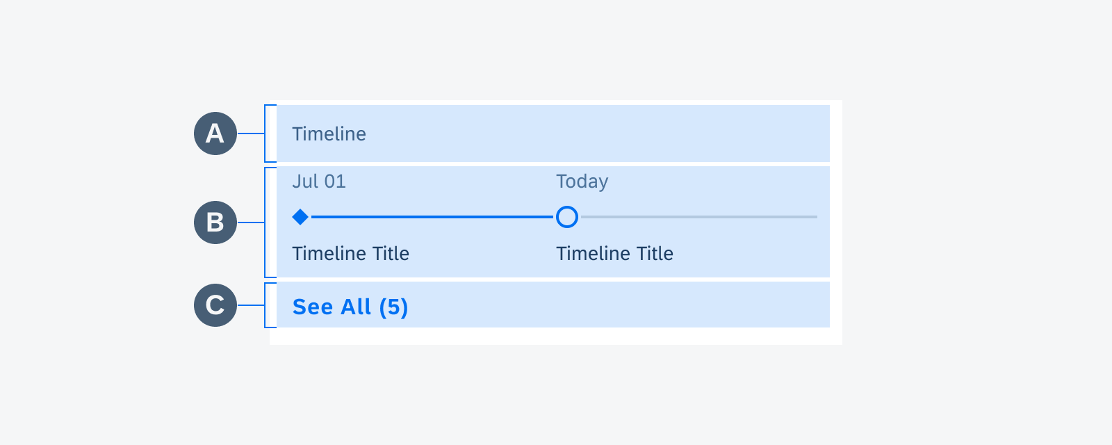
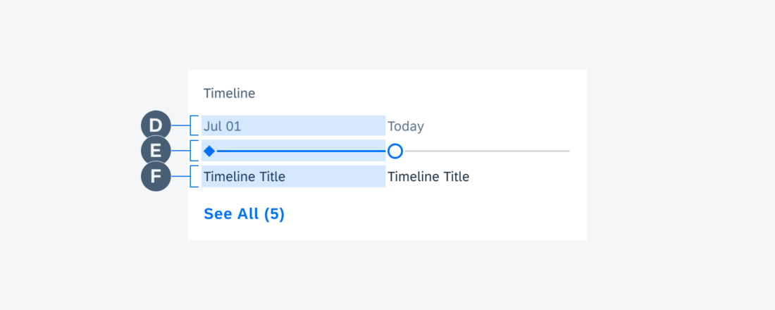
A. Header 

The header provides an overview of the timeline preview.

B. Timeline Preview Object

A timeline preview object is a reduced representation of the timeline view objects. This includes reduced content such as the timestamp, node, and object title.

On mobile devices, the timeline preview displays two timeline preview objects.

On tablets, the timeline preview displays four timeline preview objects.

C. “See All” Button

See All (#)” indicates the total number of objects in the timeline view.

Timeline preview anatomy

D. Timestamp

The timestamp displays the time or date of the timeline object. The format can be customized. If the object is current, the timestamp should indicate that the event is occurring “Today”.

E. Node and Node Line

The node and the node line indicate the status and the relative tense (past, current, or future) of the object.

F. Object Title

The object title provides the name of the object. The title should be succinct but may wrap up to two lines.

Timeline preview anatomy

Behavior and Interaction

The nodes and node lines use color, shape, and icons to indicate the status and tense of the timeline preview object.

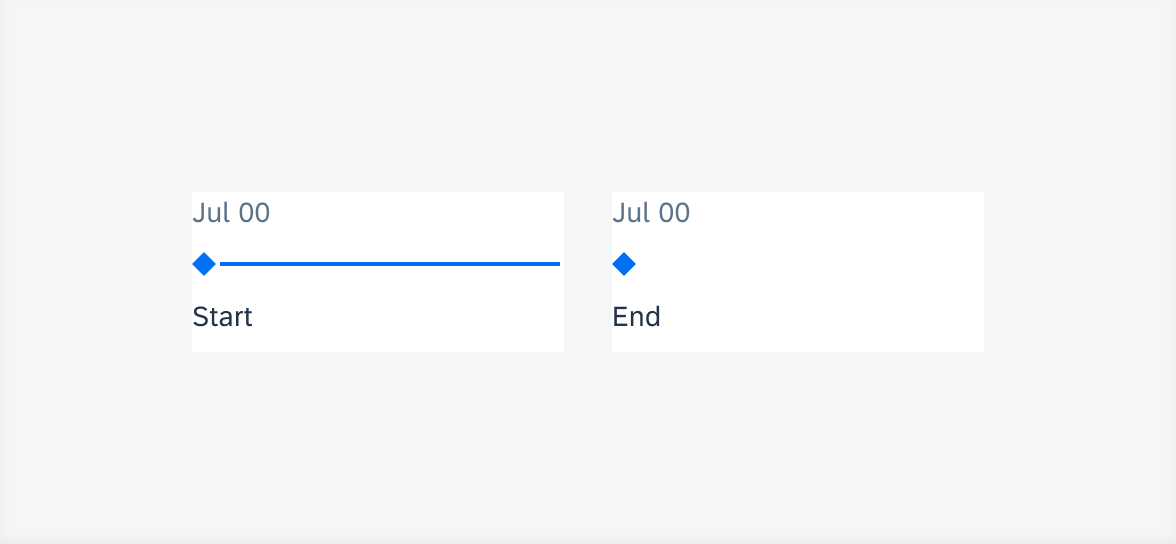
Start and end objects have diamond-shaped nodes. They are the first or the last object of the whole timeline preview project.

From left to right: A past event with start status, a future event with end status

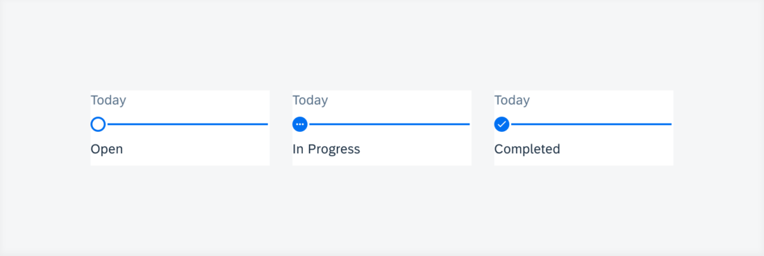
All other objects have circle-shaped nodes. For open status, the node is an open circle. For in-progress status, the node contains three ellipses. For completed objects, the node contains a checkmark.

To ensure flexibility, colors and node icons may be customized together according to the user’s needs.

From left to right: open status, in progress status, completed status

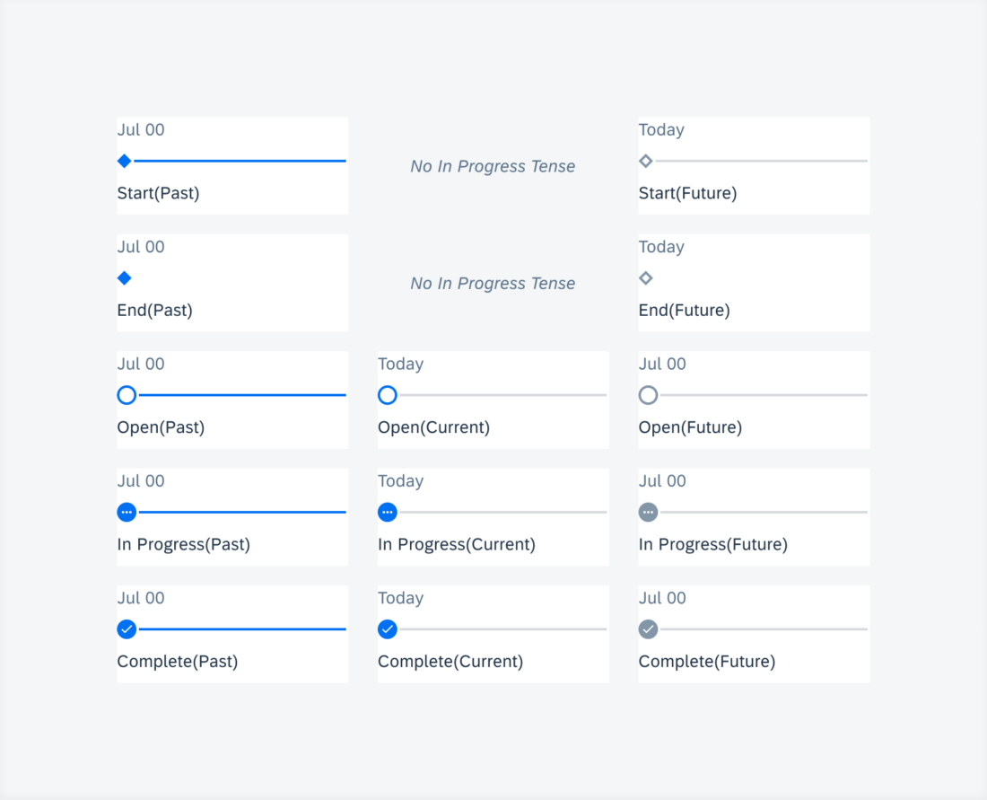
Besides the shape-based node status, colors are used to indicate past, current, and future events.

From left to right: past tense, current tense, future tense; from top to bottom: start status, end status, open status, in progress status, complete status

The objects in the timeline preview are read-only, and tapping anywhere within the timeline preview navigates the user to the full timeline view.

Tapping in the timeline preview navigates to timeline view

Adaptive Design

On mobile devices, the timeline preview displays two objects.

On tablets, the timeline preview displays four objects.

Timeline preview on mobile (left) and tablet (right)

Resources

Development: TimelinePreviewView

SAP Fiori for iOS: Timeline Preview

Related Components/Patterns: Object Cell
Sort By Multiple Criteria

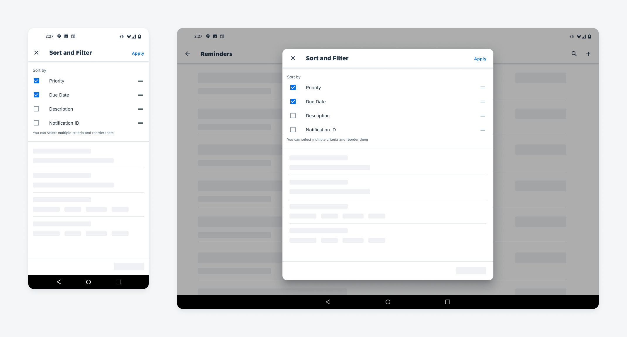
The sort by multiple criteria pattern is an enhancement to the sorting features in the sort and filter. It allows users to select more than one sorting criterion and set the order in which these criteria will be applied. This advanced sorting feature allows users to prioritize the list of objects to their specific needs so they can find the most important options easily.

Sort by multiple criteria on mobile (left) and tablet (right)

Anatomy

Sort by multiple criteria is formed by a group of checkbox cells with the reorder feature.

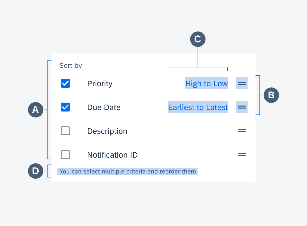
A. Sorting Criteria 

The Sort by label indicates the purpose of this selection. The available sorting criteria are presented as a list of checkbox cells. The use of checkboxes hints to users that they can select more than one option.

B. Drag Handle

Each option will have a drag handle. Users can tap on the drag handle or long press on the cell to reorder their selection.

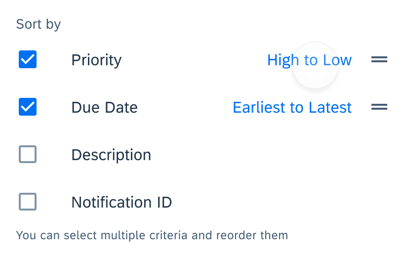
C. Sort Order (Optional)

An optional feature that allows user to set the sorting direction for each sorting criteria they selected. Users tap on the text button to toggle between ascending or descending. When possible, describe the sort order in context, for example use “High to Low” and “Low to High” for price instead of “Ascending” and “Descending”.

D. Helper Text (Optional)

An optional helper text can be used to provide guidance on how this control works. A brief hint would be helpful to users who may be unfamiliar with this control. If the control is in an error state, an error message will appear in the place of the helper text.

Anatomy of Sort by multiple criteria

Behavior and Interaction

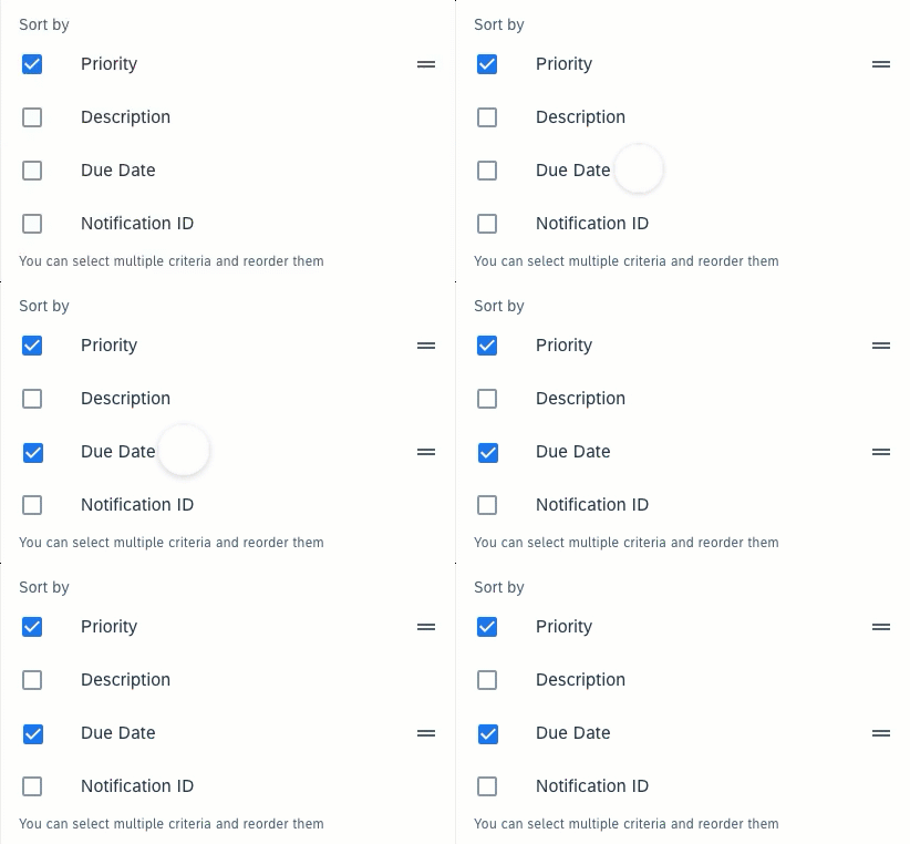
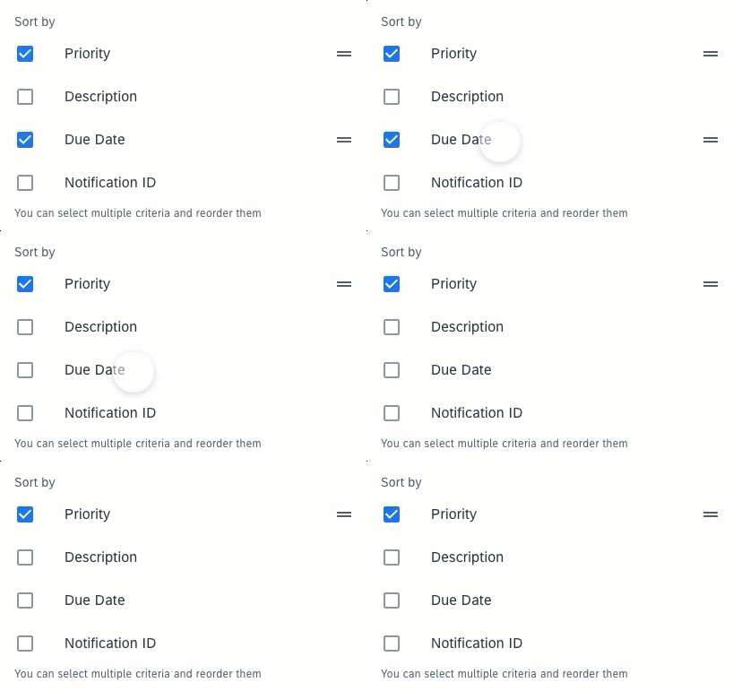
Select

The selected option remains in the same place. A drag handle will appear in the selected option to enable reordering.

Select interaction
Select interaction

Deselect

Users can tap on a selected checkbox cell to deselect. The deselected checkbox will remain in the same place. The drag handle will disappear.

Deselect interaction

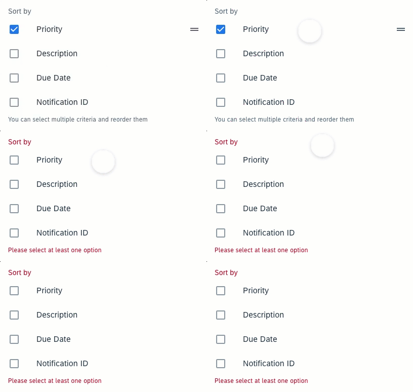
If all options are deselected, an error message will show up to remind users that at least one sorting criterion needs to be selected in order to show the list of objects. 

Error interaction
Error interaction

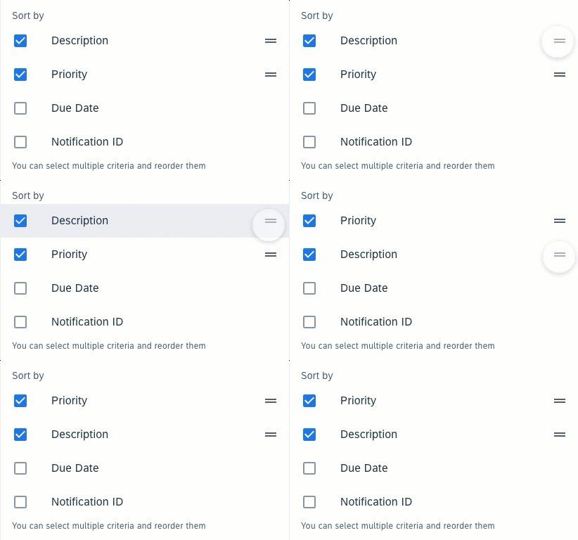
Reorder

Users can drag and drop each selected option to reorder the list. The drag state is triggered by tapping on the drag handle or long pressing the checkbox cell.

Reorder interaction
Reorder interaction

Toggle Sort Order

Users tap on the text button to toggle between ascending and descending sort orders.

Tap to toggle sort order

Resources

Development: MultiSort

Filter Feedback Bar

The filter feedback bar is a horizontal scroll area containing interactive chips that provide users quick access to filter controls. The bar appears below the app bar and above the list of objects. The interactive chips in the filter feedback bar indicate which filters have been applied and what filters are available.

Filter feedback bar on a compact (left) and expanded screen (right)

Usage

Do
  • Use the filter feedback bar to provide direct access to frequently used filters.
  • Use the filter feedback bar when filter options are relatively simple and straightforward.
  • Use the filter feedback bar when users want to modify applied filters often.
Don't
  • Don’t use the filter feedback bar if users require a large number of filters.
  • Don’t use the filter feedback bar if filter options are difficult to represent by chips, for example, when filter options have very complex names and structures.

Anatomy

The filter feedback bar sits between the app bar and content area.

Filter Feedback Bar

A. Active Filters

Active filters indicate the sort (if it is a non-default sort) and filters currently applied to the list. They are represented by chips in the selected state. The active filters are always on the left side of inactive filters, with sort (if applicable) at the very left.

B. Inactive Filters (For Fast Filters)

Inactive filters are available filter options that are not currently applied to the list. Only fast filters will be shown as inactive filters. They are represented by chips in the non-selected state.

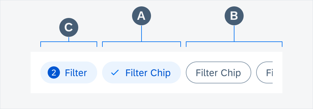
C. Filter Counter Chip (Optional)

The filter counter chip is an optional chip that can be added after the user activates the filter chip. It should be placed in front of the first filter chip to display the total number of active items in the filter. Once the filter is applied, the total number of items in the list is returned.

Filter feedback bar anatomy

Filter Chip

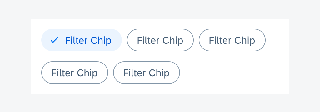
A. Container

A filter chip container defines the boundary of each chip. All chip elements are wrapped in a filter chip container. The width of the container depends on the length of its content. Each container is a touch target.

B. Leading Icon (Optional)

A check mark appears when a filter chip is selected and disappears when it’s deselected.

C. Text

A text describes what each filter chip stands for. Text labels should be concise.

D. Trailing Icon (Optional)

A filter chip with a down arrow trailing icon indicates that an extended action is available. On mobile devices, the extended action is represented by a bottom sheet, while on tablet devices, it is represented by a dialog.

Filter chip anatomy
Filter chip anatomy

Behavior and Interaction

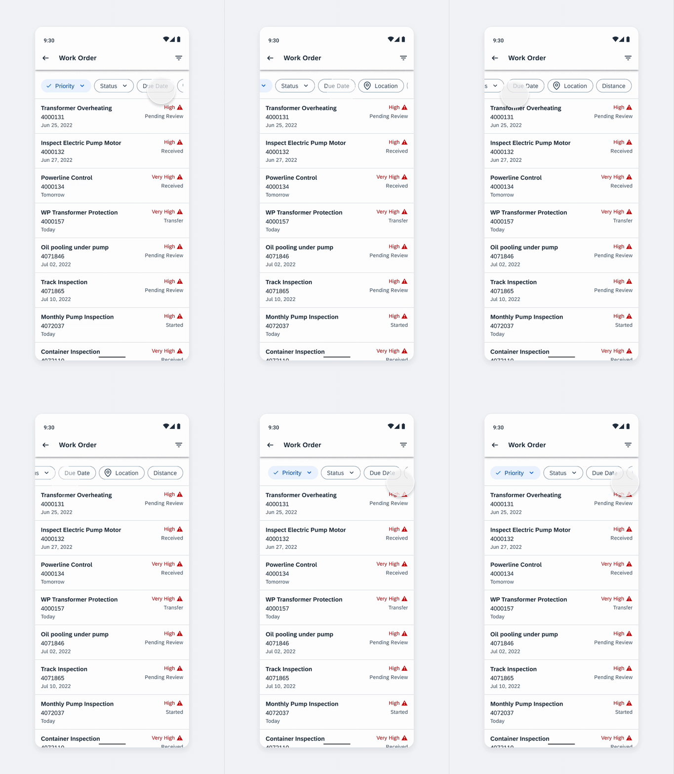
Horizontal Scroll

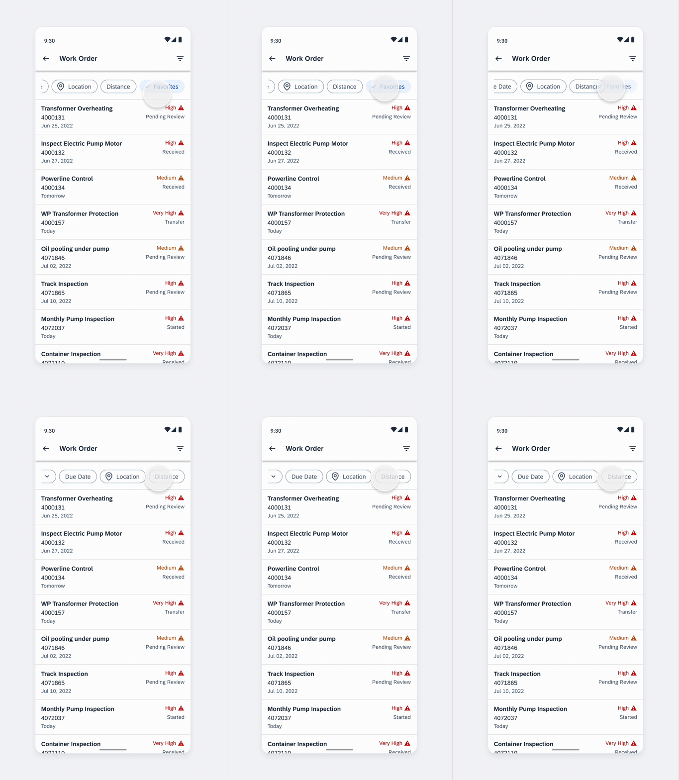
All filter options in the filter feedback bar are displayed in one row. Users can scroll horizontally to view all filters.

Horizontal scroll
Horizontal scroll

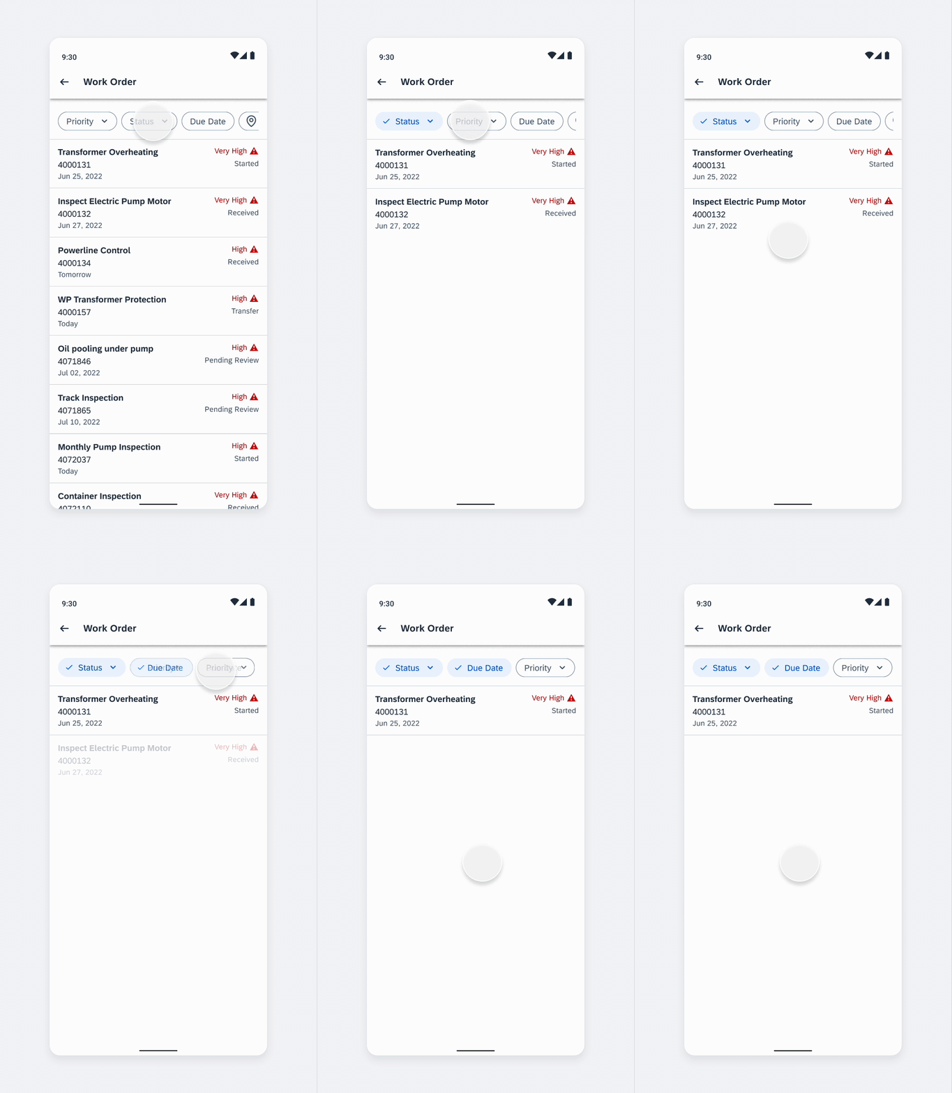
Applying Fast Filters

Users can apply a fast filter simply by tapping the chip. This will change the chip to the selected state and become an active filter. The active filter will move to the left of any inactive filters. Each time a fast filter is applied, the list below will be refreshed to show the filtered result.

Applying fast filters

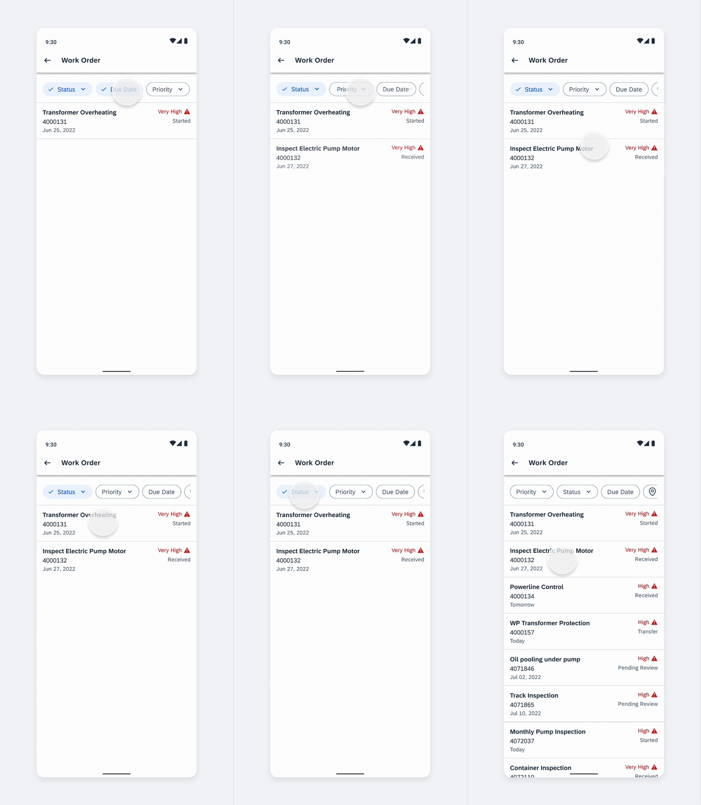
Removing Fast Filters

Users can remove a fast filter simply by tapping the chip. This will change the chip to non-selected state and back to an inactive filter. The inactive filter will move back to its original position as the fast filter. Users can only remove one fast filter at a time, and the list below will be refreshed to show the updated result.

Removing fast filters

Applying Filters from the Filter Dialog

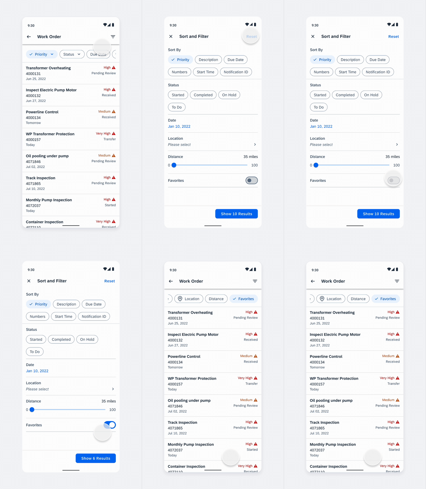
In the filter dialog, users can apply multiple filters at a time. All applied filters will be displayed in the feedback bar as active filters. An active chip from the filter dialog (no fast filter) will be added at the same position as it is in filter form.

In general, the active filters take the selected filter’s name or value directly. If the value or name is not clear enough, we recommend using both the label and value in the active filter. For example, a location value could represent arrival or departure, adding “Arr:” or “To:” and “Dep:” or “From:” to the location value would help users identify what the location stands for. By default, we recommend adding “Sort By:” to the sort value in the filter feedback bar for clarity.

Applying filters from the Filter dialog

Removing Filters from the Filter Dialog

Users can remove an applied filter from the filter dialog directly by tapping the chip in the filter feedback bar. If that option is not defined as a fast filter, it will disappear from the filter feedback bar. The user can also remove a filter by deselecting it in the filter dialog as the standard behavior of the filter dialog.

Removing applied filters from the Filter dialog

Variations

Wrapped View

A group of filter chips is typically displayed horizontally under the title. The title describes the meaning or purpose of the group. More than one row of chips can be wrapped to the next row, or overflow to the right with horizontal scroll to show more. Choose the layout that provides the best readability for your use case.

Filter feedback bar wrapped view

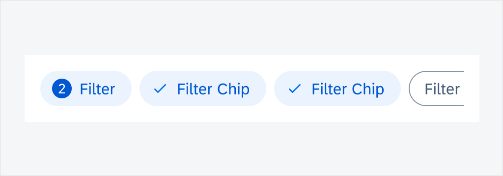
Filter Counter Chip

A filter counter chip is an optional chip that can be added after the user activates the filter chip. It should be placed in front of the first filter chip to display the total number of active items in the filter. Once the filter is applied, the total number of items in the list is returned.

Tapping on the filter counter chip navigates the user to the Sort and Filter page.

Active filter counter chip

Selection View

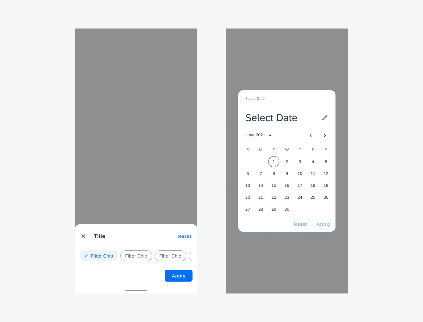
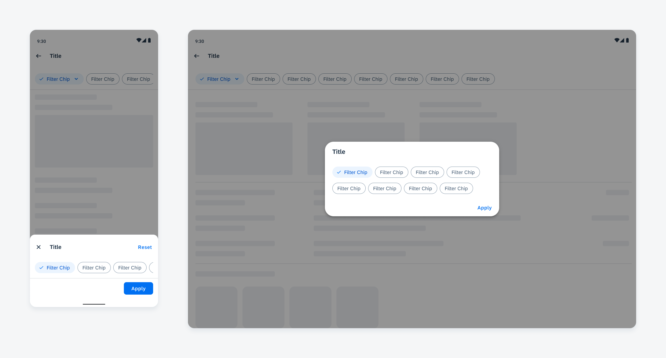
A filter chip with a down arrow trailing icon indicates that an extended action is available. On compact screens, the selection view is represented by a bottom sheet or dialog, while on medium and expanded screens, it is represented by a dialog.

Selection view with bottom sheet (left) and dialog view (right)

Fast Filters

Fast filters are pre-defined filter options that remain visible in the filter feedback bar even when they are not applied. With fast filters, users can apply filters to the list directly in the page instead of opening the filter dialog. The fast filter options are defined by the app team. To make fast filters most effective, we recommend only including the most frequently used filters as fast filters.

Filter Feedback Bar with Fast Filters

With fast filters, the filter feedback bar is visible by default with all fast filters as inactive filters. Users can apply fast filters directly or through the filter dialog. All applied filters will be shown in the filter feedback bar as active filters.

Filter Feedback Bar without Fast Filters

When no fast filters are defined, the filter feedback bar is hidden by default. The default sort does not show up in the filter feedback bar. After the user has applied a filter or changed the sort option through the filter dialog, the filter feedback bar will appear to show the active filters.

Adaptive Design

The selection view adapts to different screen sizes. On compact screens, the selection view appears as a bottom sheet or dialog. On medium and expanded screens, the selection view appears as a dialog. The other features remain the same on both device types.

Filter feedback bar selection view on a compact screen (left) and medium and expanded screen (right)

Resources

Development: FilterFeedbackBar

SAP Fiori for iOS: Filter Feedback Bar