
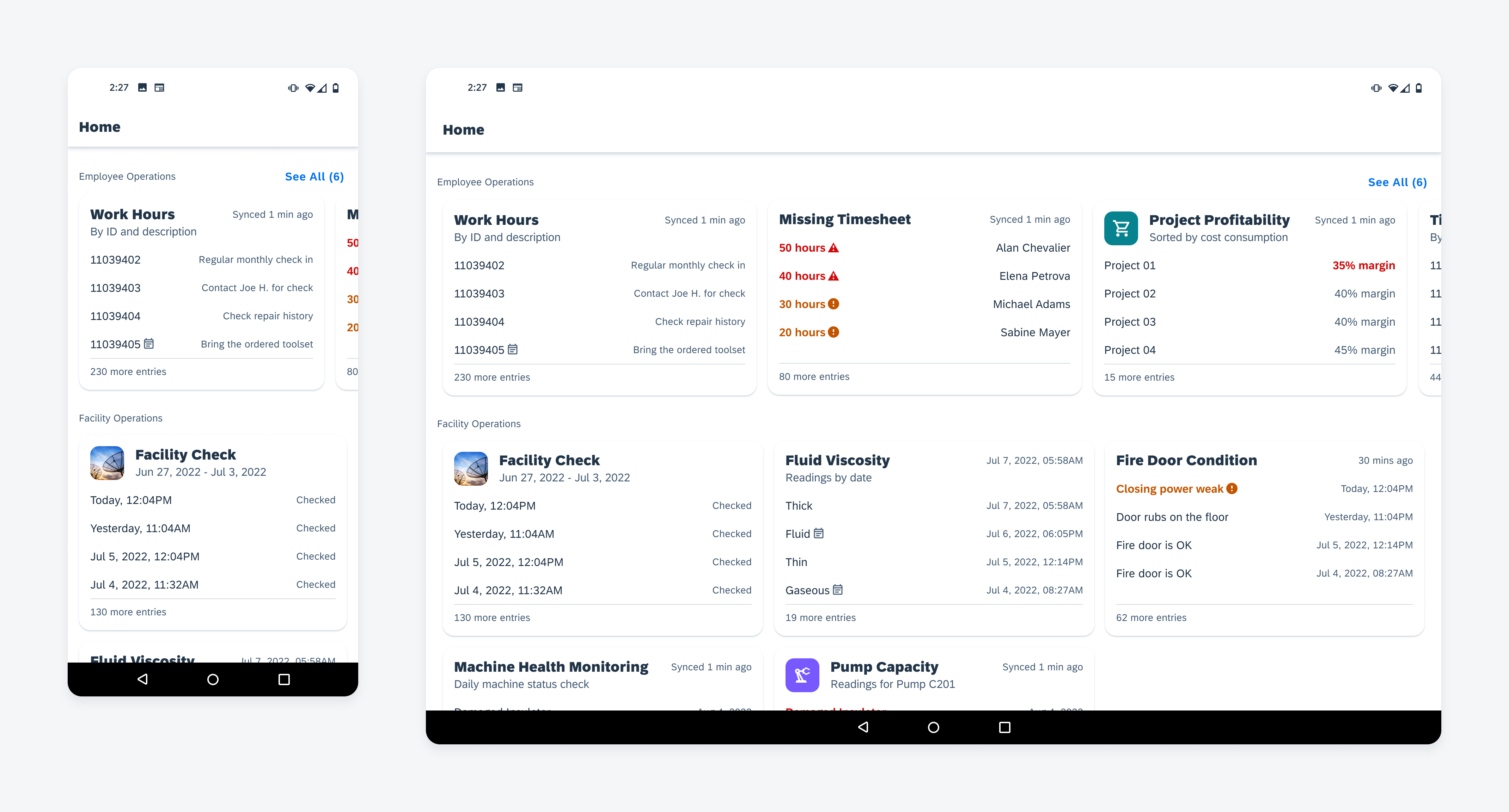
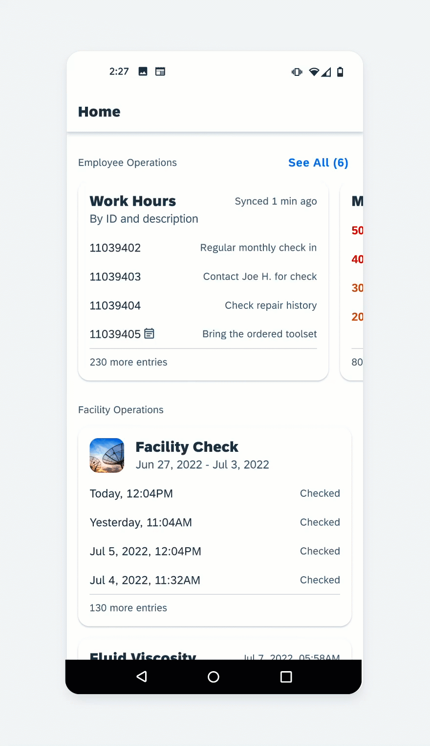
Theming
Theming refers to using a color palette and a logo to define a system-wide appearance for an application. It’s achieved by applying colors to major UI elements, such as text and background, with the intention to create visual harmony. It gives users a holistic visual experience throughout the application. This visual experience can be leveraged to enhance readability in certain lighting environments and to express your unique product branding across platforms. By applying brand-specific colors to the themeable elements, you provide users with a visual connection between the application and your brand.
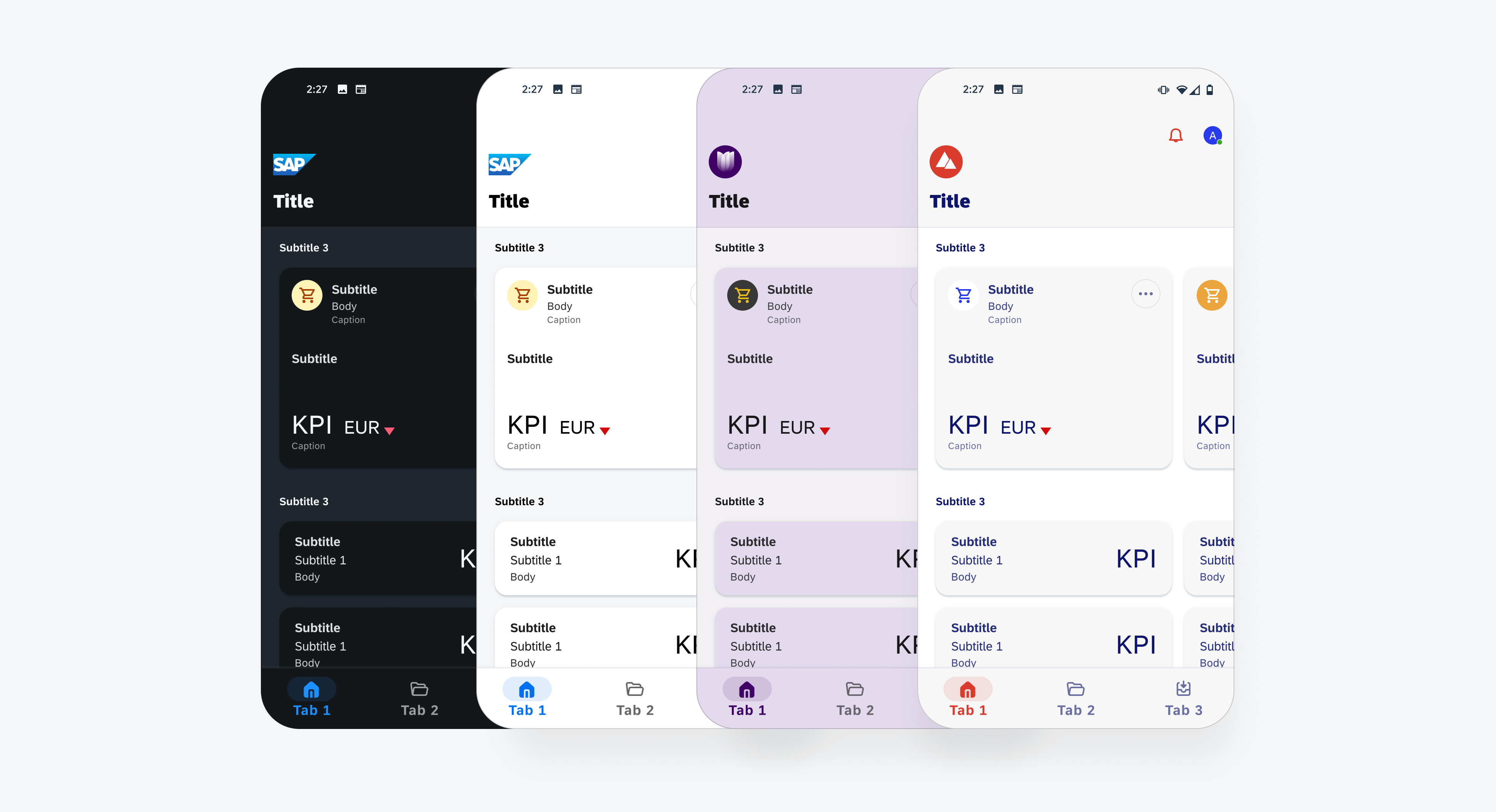
Example of different themes
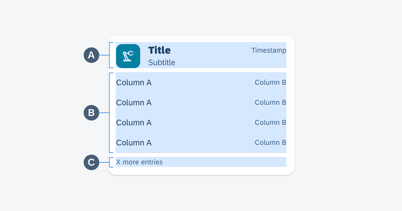
Themeable Elements
A customized theme is comprised of multiple visual elements. To create a brand theme, use the UI theme Designer powered by SAP and customize the following themeable elements:
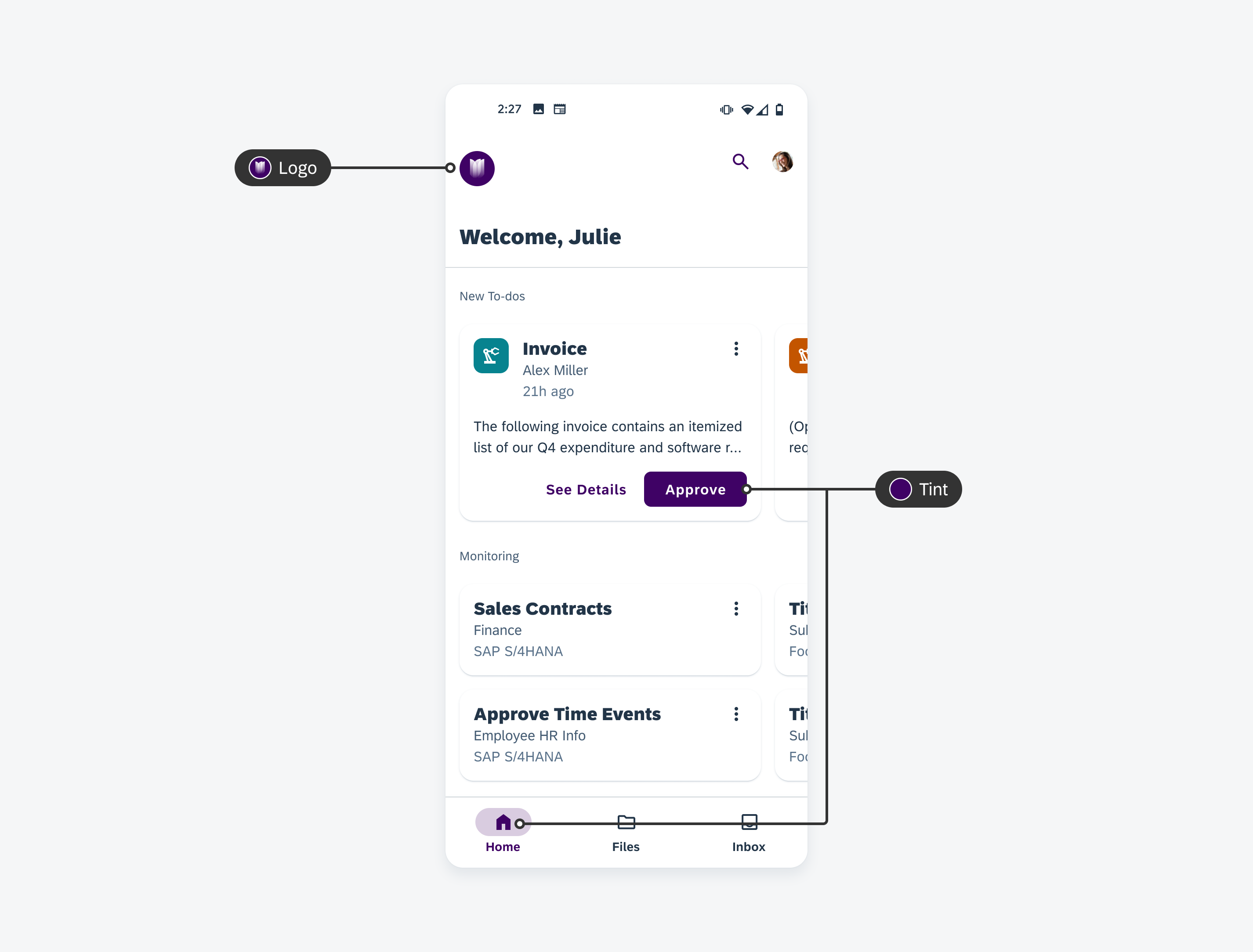
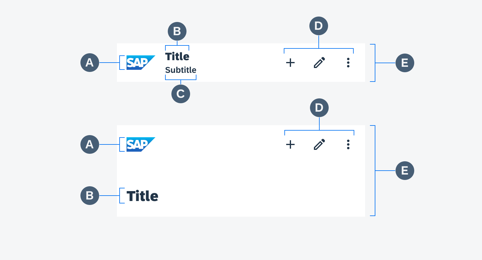
Logo
A logo is the visual symbol used to express a product’s distinct identity.
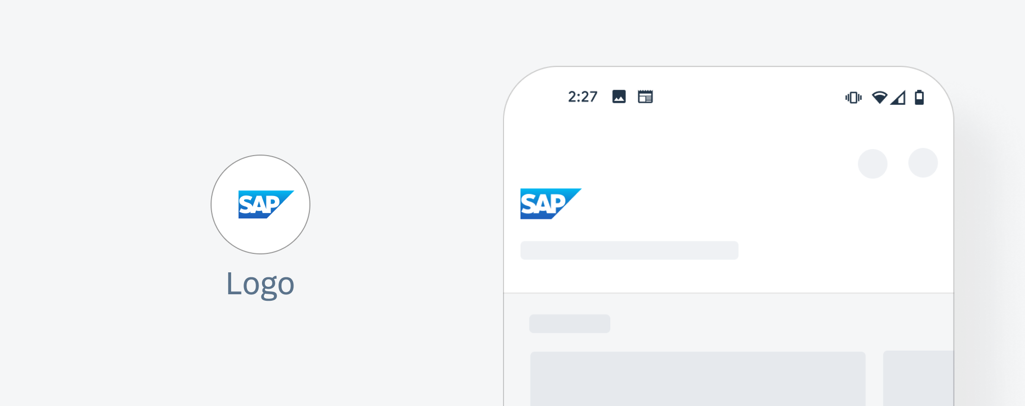
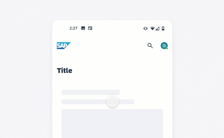
Themeable element: logo
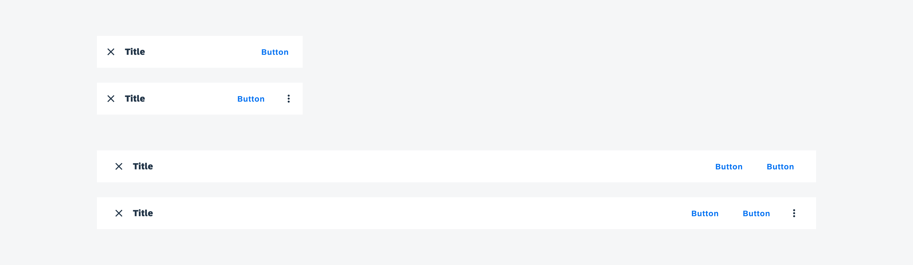
Tint Colors
Tint colors are the ones applied to any interactive elements to indicate interactivity or a call to action. It can be used on a button, an icon, a tab, etc.
Semantic Colors
Semantic colors refer to the tint color applied to UI elements to communicate a state, priority, or destructive or confirmational action.
Accent Colors
Accent colors are decorative colors applied to selected areas of the UI in order to bring more colors to the UI.
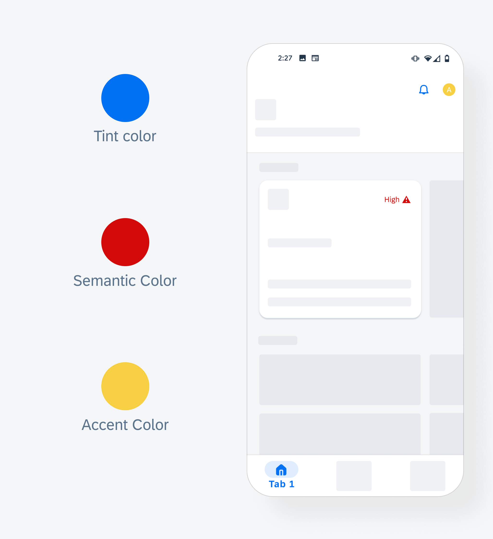
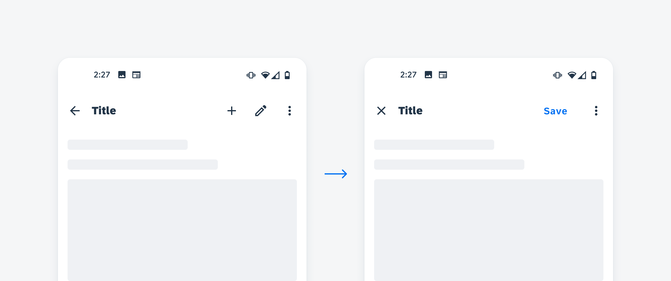
Themeable elements: tint color, semantic color, accent color
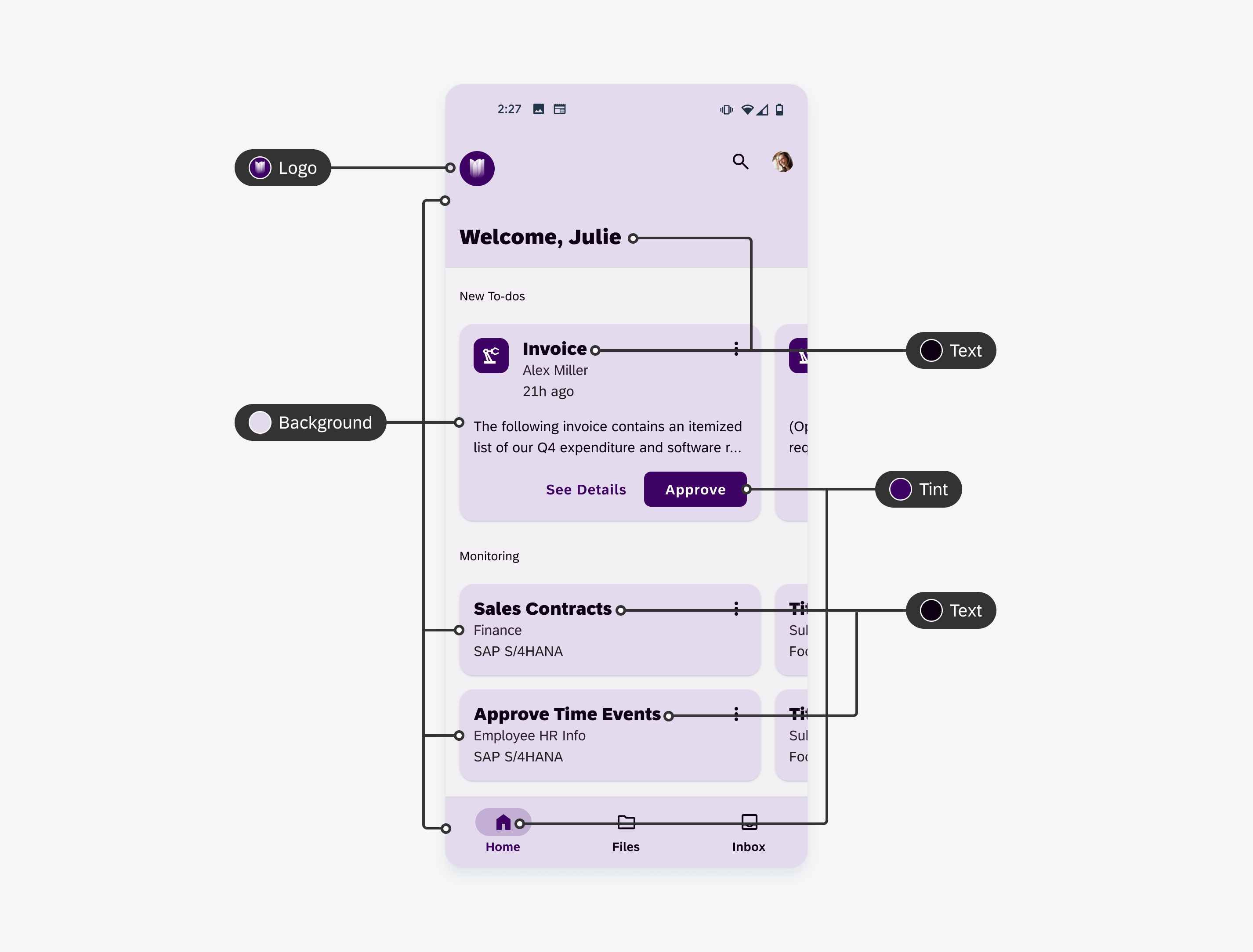
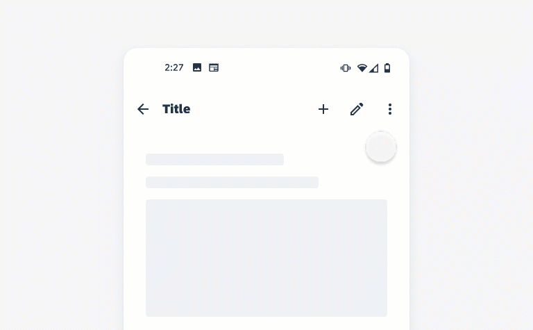
Text Colors
Text colors apply to any content written in text, including numbers and symbols.
Surface
Surface color comprises of the backgrounds of elevated components such as cards, app bars, bottom navigation, etc.
Background
Background refers to the main app background that appears behind scrollable content.
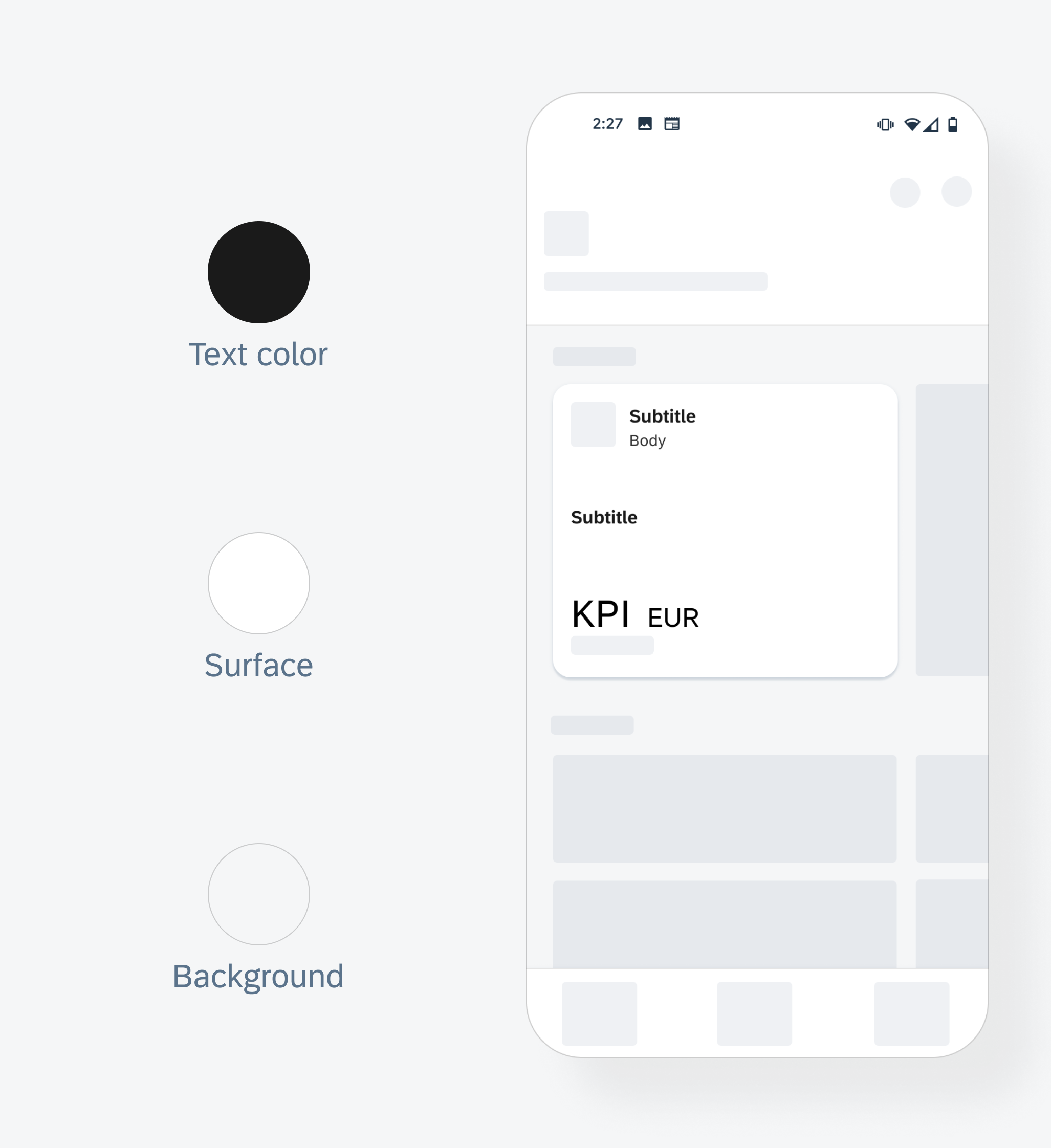
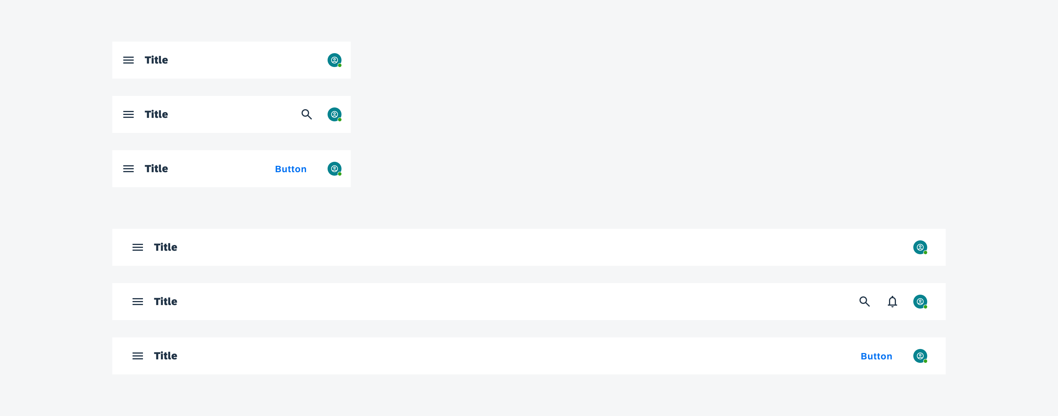
Themeable elements: text color, surface and background
Scenarios
The UI theme designer can achieve various levels of customization. Theming can be as minimal as only changing the logo or can be as comprehensive as changing all color parameters. The following examples detail possible theming scenarios from a basic theme all the way to a comprehensive theme.
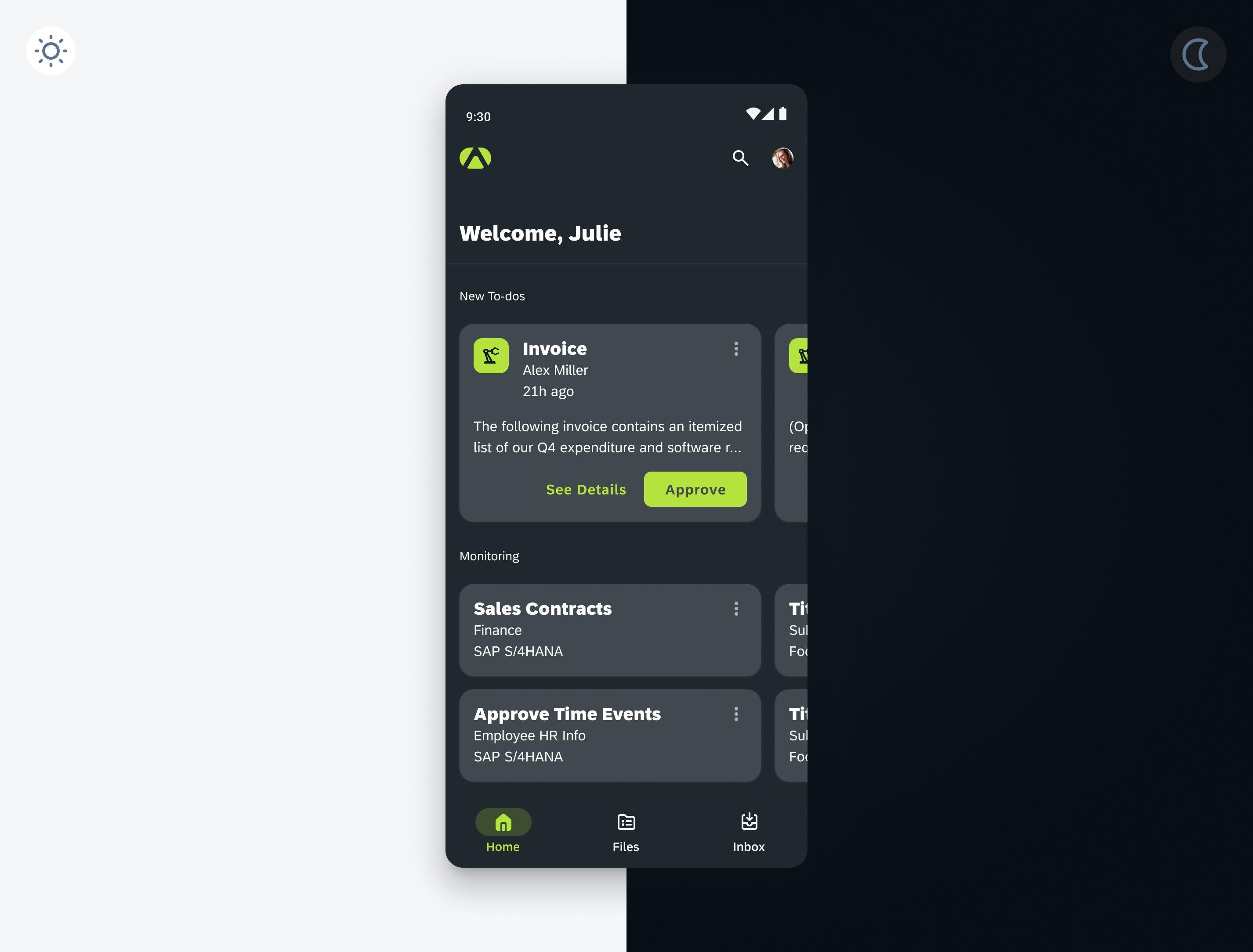
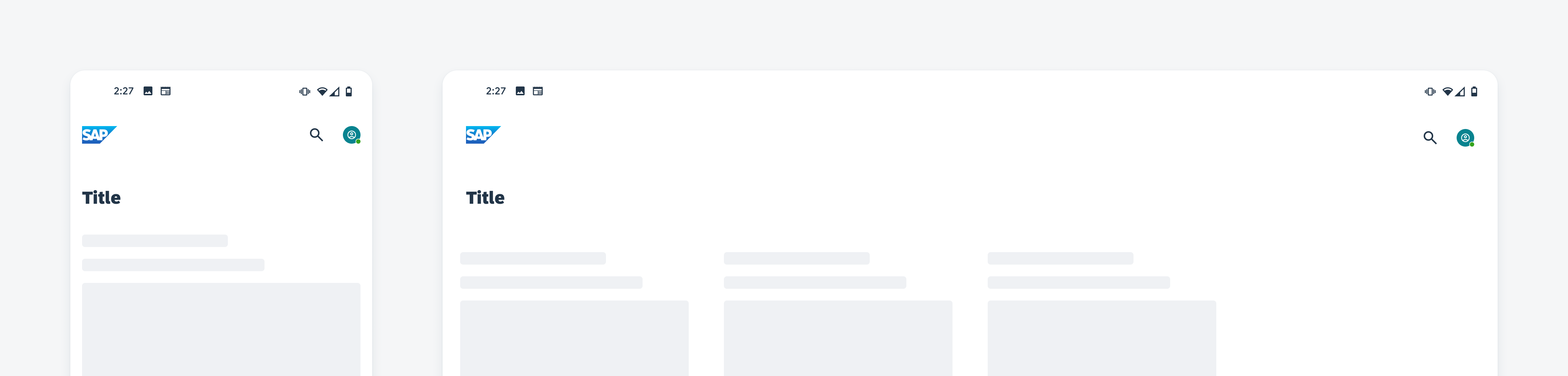
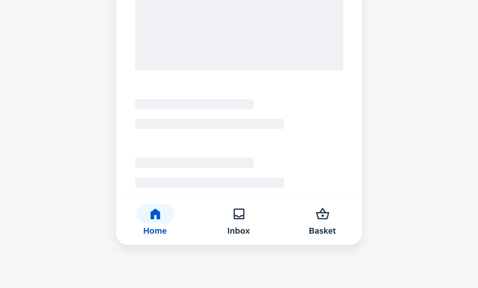
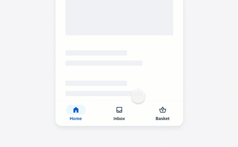
Basic Scenario
The main branding elements are your logo and primary branding tint. Your app colors can use the existing default text, background, semantic colors, and accent colors from the preliminary baseline theme (Horizon theme for SAP Fiori). This approach is enough to communicate your brand without having to do any major visual overhaul to the baseline theme. The UI theme designer can accommodate simple theme changes like applying your logo and applying your main brand tint.
Themeable Elements
The following elements are themed in this simple scenario:
- Logo
- Tint
Screen showing basic theme scenario
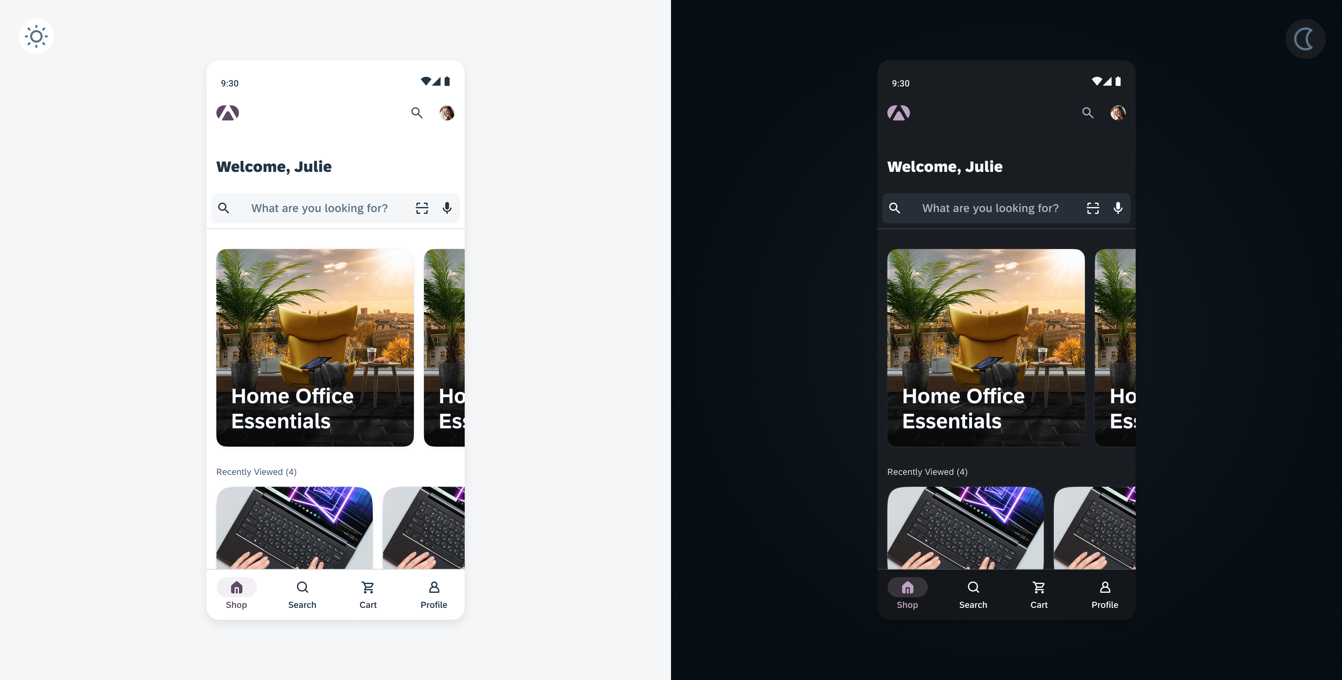
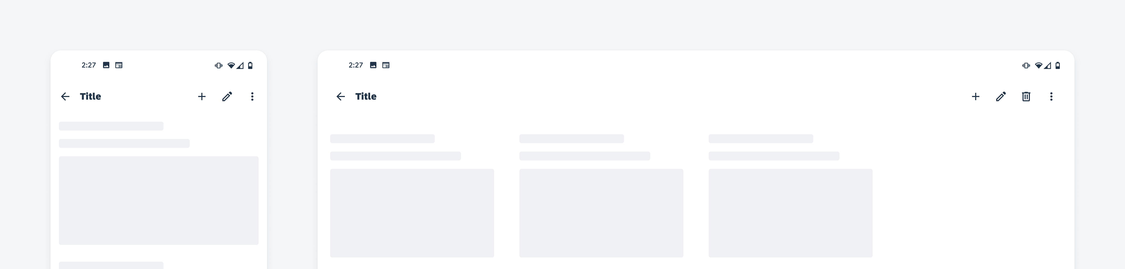
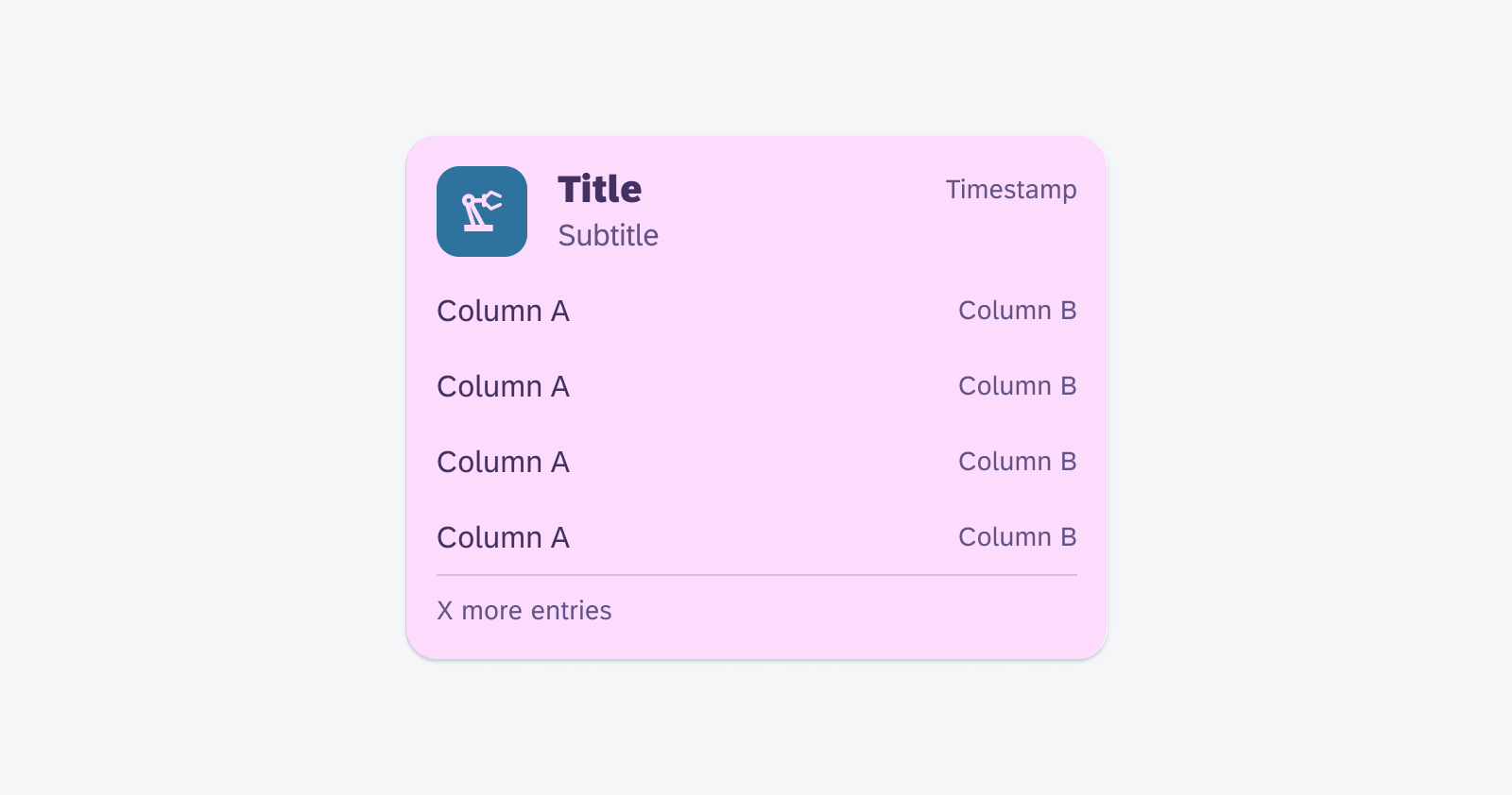
Detailed Scenario
Your main branding elements consist of a logo, tint, text, and backgrounds therefore require a full theme overhaul to achieve the look and feel of your brand. This means that more customization is needed from our preliminary baseline theme (Horizon theme for SAP Fiori). The UI theme designer allows for granular control over the overall theme resulting in a faithful representation of your brand.
Themeable Elements
The following elements are themed in this detailed scenario:
- Logo
- Tint
- Text
- Background
- Semantic colors
- Accent colors
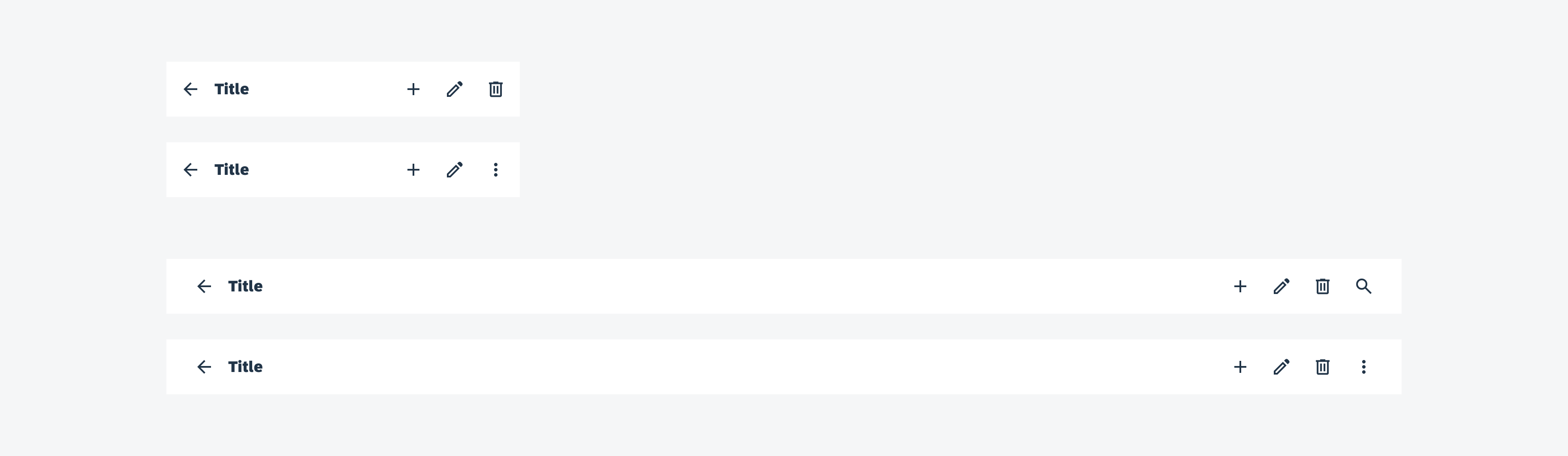
Screen showing detailed theme scenario
Theming Strategy
Theming strategy is your product’s approach to a distinct theming plan to express your branding’s visual experience, support various lighting situations, or fit a user’s phone’s system configuration. A product could support a single theme or multiple themes depending on your company’s branding identity and/or the end user’s lighting environments.
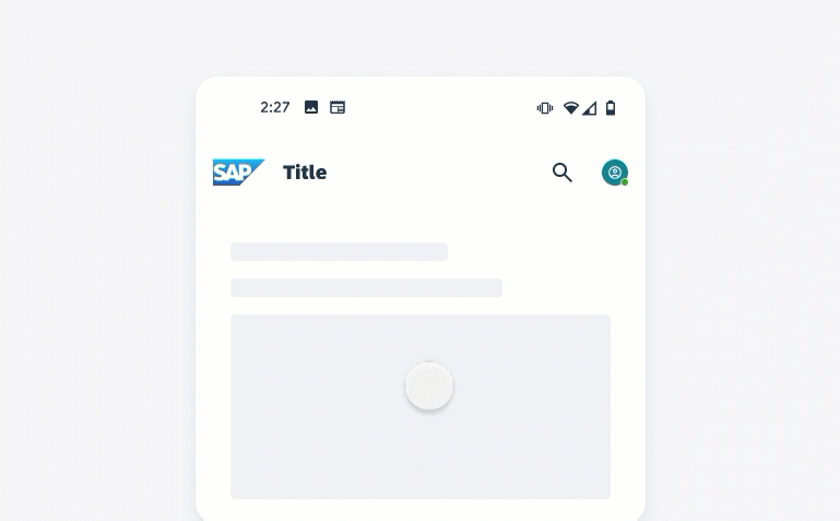
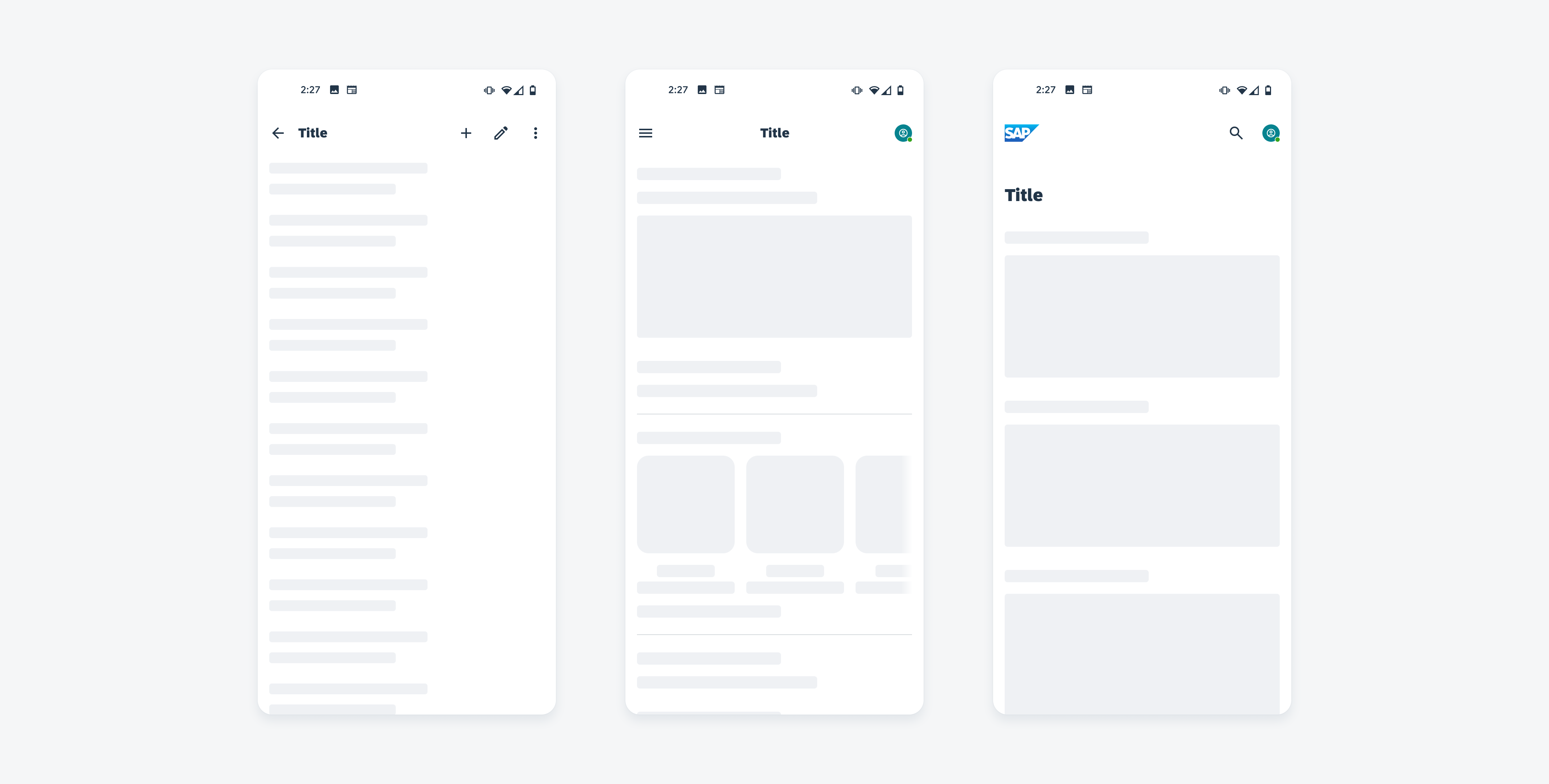
Single-Theme Strategy
Your theming strategy should be based on your company’s branding or user needs. For example, if your company is using a light theme, it communicates a lighter approach to the visual design while also easing the lighting on the eyes within indoor or outdoor settings with bright lighting. The opposite is true for darker themes where the theme communicates a more serious tone while also being easier on the eyes in workplace settings with dimmed office lighting or outdoor night–time settings.
Single-theme strategy
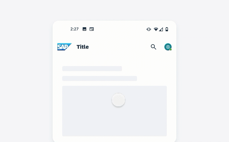
Two-Theme Strategy
Your product could use a two–theme strategy to reflect the changing conditions of the end user’s lighting environment or to match an end user’s theme system settings. A two–theme strategy is the industry standard and is helpful if your product wants to provide themes for both bright and dim lighting environments. When applying the two–theme strategy, make sure that all foreground colors have been considered on either theme.
Two-themed strategy
Resources
SAP Fiori for iOS: Theming
SAP Fiori for Web: Theming
Development: Theming and Styling
Development: UI Theme Designer
 Your feedback has been sent to the SAP Fiori design team.