
Data Table Card
Fiori: DataTableCard
Intro
The data table card provides a preview of historic data in a table format. Currently, data table cards display up to four rows and two columns that can be customized to fit a variety of use cases. This card can also be used as an entry point to a connected data table.
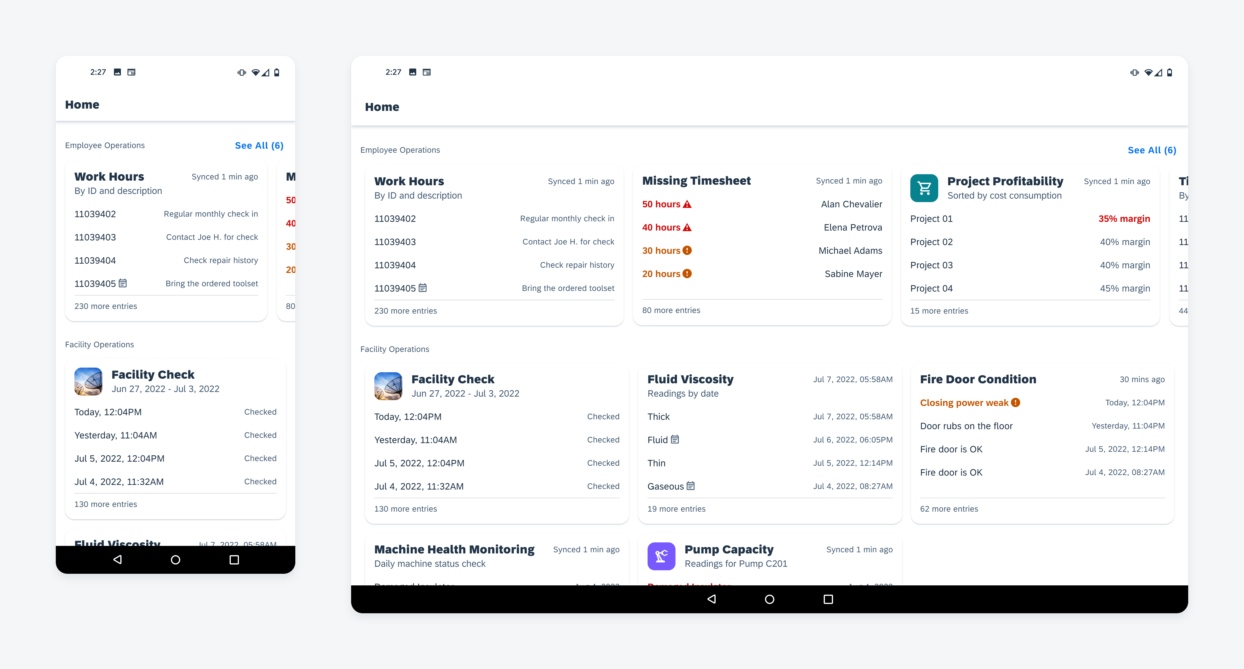
Collection of data table cards on mobile (left) and tablet (right)
Usage
- Use the data table card when the user needs to track the current and historical development of data over time.
- Use the data table card when comparing two columns of data parameters.
- Use the data table card as an entry point to a fullscreen data table, or another defined location.
- Don’t use the data table card when the user needs to compare more than two attributes across the data set.
- Don’t use the data table card when the user needs to take actions at a card level. Consider using the object card or the list card for inline and footer actions.
Anatomy
A. Title Area
The title area has a title, a subtitle, a timestamp, and a photo thumbnail. A title is required and can wrap up to two lines. The thumbnail, subtitle, and timestamp are optional.
B. Entries
We recommend including four entries maximum. To accommodate various use cases, you can configure entries to adjust text size, weight, and color. As default, each entry allows two lines at maximum, truncating after two lines. The icon is optional.
C. More Entries
The “more entries” section helps indicate there are more items in the data set. If there are no additional entries, “No more entries” is displayed.
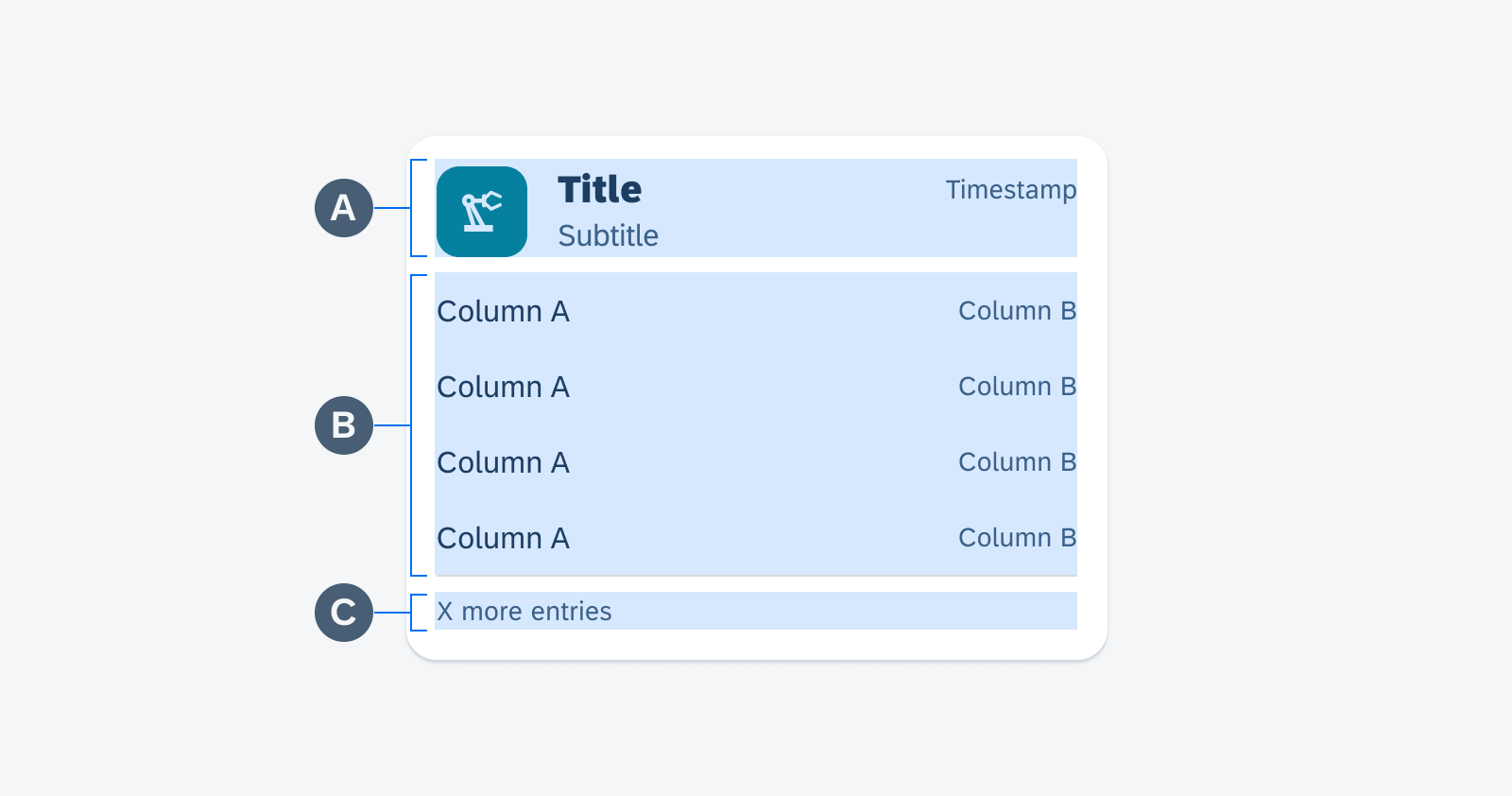
Anatomy of the data table card
Behavior and Interaction
Touch Target
The data table card only has one action, meaning that the whole card is a touch target.
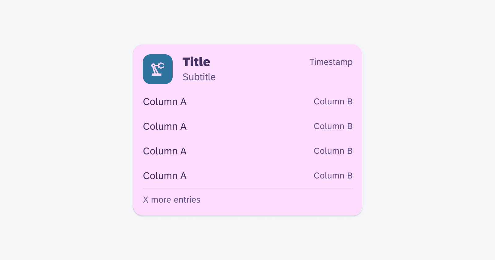
Touch target of the data table card
Navigation
When tapped, the data table card navigates to a full screen data table or to another defined location.
Tap on the card area navigate to a data table or a defined location
Adaptive Design
The data table cards on mobile follow a vertically stacked single-column layout. The tablet displays a two or three-column grid layout. When utilizing cards with auto-adjusted height, there is also the option to display a masonry layout on the tablet.
The card carousel follows the same number of columns as the grid with adjusted card width, so an additional card is visible and cut off at the end. The slice of a card at the end indicates horizontal scrolling. In a masonry layout, there is no horizontal scrolling.
Collections of data table cards on mobile (left) and tablet (right)
Variations
Data table card entries can be customized to adjust the section’s visual treatment, providing flexibility for different use cases. The icon can also be changed from the default “event note” icon. When displaying a status, we recommend adding an additional visual element to convey the semantic meaning, such as adding an icon, boldening the text, or changing the text color.
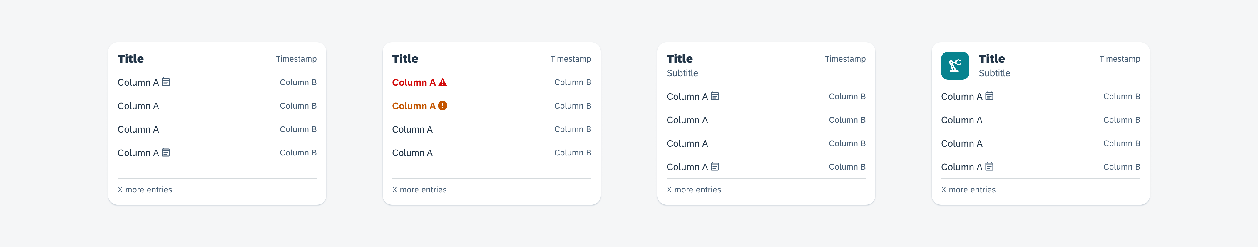
Data table card variations from left to right: Data table card with the title only (left), data table card with semantic values (center left), data table card with subtitle (center right), and data table card with thumbnail (right)
Resources
Development: DataTableCard
SAP Fiori for iOS: Analytical Data Table Card
Related Components/Patterns: Cards Overview, Data Table
 Your feedback has been sent to the SAP Fiori design team.