
- SAPUI5 Version 1.122
- SAPUI5 Version 1.120
- SAPUI5 Version 1.118
- SAPUI5 Version 1.116
- SAPUI5 Version 1.114
- SAPUI5 Version 1.112
- SAPUI5 Version 1.110
- SAPUI5 Version 1.108
- SAPUI5 Version 1.106
- SAPUI5 Version 1.104
- SAPUI5 Version 1.102
- SAPUI5 Version 1.100
- SAPUI5 Version 1.98
- SAPUI5 Version 1.96
- SAPUI5 Version 1.94
- SAPUI5 Version 1.92
- SAPUI5 Version 1.90
- SAPUI5 Version 1.88
- SAPUI5 Version 1.86
- SAPUI5 Version 1.84
- SAPUI5 Version 1.82
- SAPUI5 Version 1.80
- SAPUI5 Version 1.78
- SAPUI5 Version 1.76
- SAPUI5 Version 1.74
- SAPUI5 Version 1.72
- SAPUI5 Version 1.70
- SAPUI5 Version 1.68
- SAPUI5 Version 1.66
- SAPUI5 Version 1.64
- SAPUI5 Version 1.62
- SAPUI5 Version 1.60
- SAPUI5 Version 1.58
- SAPUI5 Version 1.56
- SAPUI5 Version 1.54
- SAPUI5 Version 1.52
- SAPUI5 Version 1.50
- SAPUI5 Version 1.48
- SAPUI5 Version 1.46
- SAPUI5 Version 1.44
- SAPUI5 Version 1.42
- SAPUI5 Version 1.40
- SAPUI5 Version 1.38
- SAPUI5 Version 1.36
- SAPUI5 Version 1.34
- SAPUI5 Version 1.32
- SAPUI5 Version 1.30
- SAPUI5 Version 1.28
- SAPUI5 Version 1.26
- Latest SAPUI Version 1.124
- SAPUI5 Version 1.122
- SAPUI5 Version 1.120
- SAPUI5 Version 1.118
- SAPUI5 Version 1.116
- SAPUI5 Version 1.114
- SAPUI5 Version 1.112
- SAPUI5 Version 1.110
- SAPUI5 Version 1.108
- SAPUI5 Version 1.106
- SAPUI5 Version 1.104
- SAPUI5 Version 1.102
- SAPUI5 Version 1.100
- SAPUI5 Version 1.98
- SAPUI5 Version 1.96
- SAPUI5 Version 1.94
- SAPUI5 Version 1.92
- SAPUI5 Version 1.90
- SAPUI5 Version 1.88
- SAPUI5 Version 1.86
- SAPUI5 Version 1.84
- SAPUI5 Version 1.82
- SAPUI5 Version 1.80
- SAPUI5 Version 1.78
- SAPUI5 Version 1.76
- SAPUI5 Version 1.74
- SAPUI5 Version 1.72
- SAPUI5 Version 1.70
- SAPUI5 Version 1.68
- SAPUI5 Version 1.66
- SAPUI5 Version 1.64
- SAPUI5 Version 1.62
- SAPUI5 Version 1.60
- SAPUI5 Version 1.58
- SAPUI5 Version 1.56
- SAPUI5 Version 1.54
- SAPUI5 Version 1.52
- SAPUI5 Version 1.50
- SAPUI5 Version 1.48
- SAPUI5 Version 1.46
- SAPUI5 Version 1.44
- SAPUI5 Version 1.42
- SAPUI5 Version 1.40
- SAPUI5 Version 1.38
- SAPUI5 Version 1.36
- SAPUI5 Version 1.34
- SAPUI5 Version 1.32
- SAPUI5 Version 1.30
- SAPUI5 Version 1.28
- SAPUI5 Version 1.26
Card
ui5-card | v.10
Intro
Cards are containers for different types of app content. They provide an entry-level view of the most pertinent app data for a given topic or issue.
Cards allow users to get direct insights without leaving the current screen. A card can also offer further navigation options or actions.
Card with interactive header – live example
Card with icon and button in header – live example
There are some predefined elements for the card header like an image (avatar component), a counter or a button, whereas the card content area can be filled with any component(s). It is also possible to show the card header only, or no header at all.
Card example with list items – live example
Card example with table – live example
Card example with image – live example
Card examples with header only – live example
When to Use
Use cards:
- As an entry point to an app.
- If you want the user to focus on a single object or topic, or on a group of objects.
Don’t use cards:
- For decoration only.
Anatomy
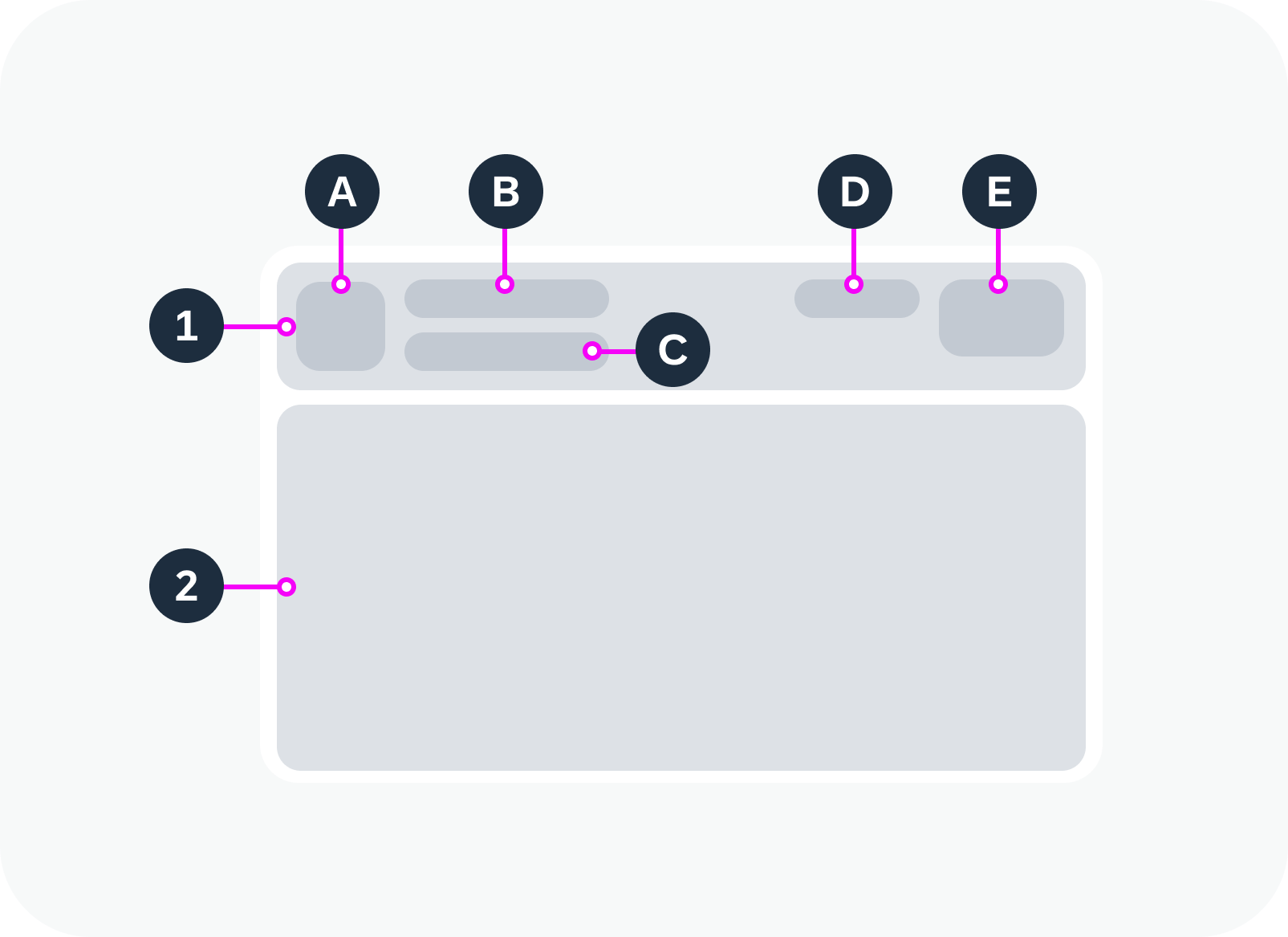
A card comprises two components: a header area and a content area. Both areas are optional.
1. Card Header
The card header consists of the following elements:
- Avatar (optional): An image.
- Title: Describes the card content.
- Subtitle (optional): You can use the subtitle to qualify the title, offer an explanation, or show a status. The use of the subtitle can differ, depending on the card type.
- Counter (optional): Displays how many items are on the card in relation to the total number of relevant items.
Format: [Items on Card] of [Total Items]
Example: 5 of 40 - Button (optional): An action.
2. Card Content
You can use other web components inside the content area, such as a list, table, timeline, or the components of a form. The structure of the card depends on the type of information it contains.
Anatomy of a card
Behavior and Interaction
You can opt to make the header interactive and specify a click event.
Within the card content area, all the interactions depend on the components used.
Card with a static header and header action button – live example
Card with an interactive header – live example
Globalization and Localization
When designing an application, bear in mind that cards can also be used with right-to-left languages, such as Arabic or Hebrew. In this case, the UI of the card header is mirrored in both display and edit modes.
The globalization and localization behavior for the component within the card content area is defined by the guideline of corresponding component itself.
 Your feedback has been sent to the SAP Fiori design team.