
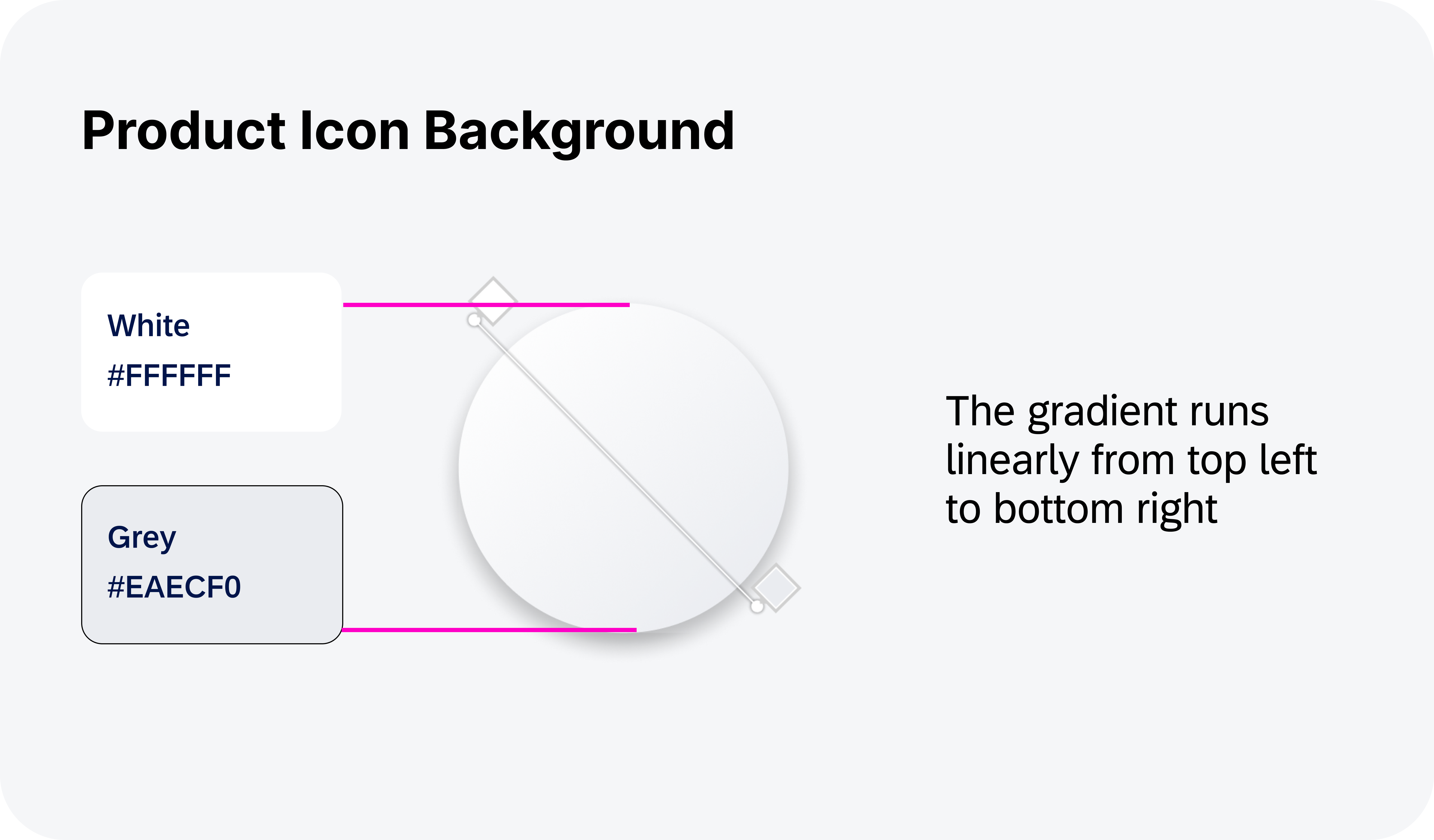
Elevation
Elevation refers to the perceived virtual height or distance from the background to a component’s surface. This concept is a combination of techniques and visual cues, such as tonal color, shadows, and scrims, that allows for a layered yet cohesive visual experience.
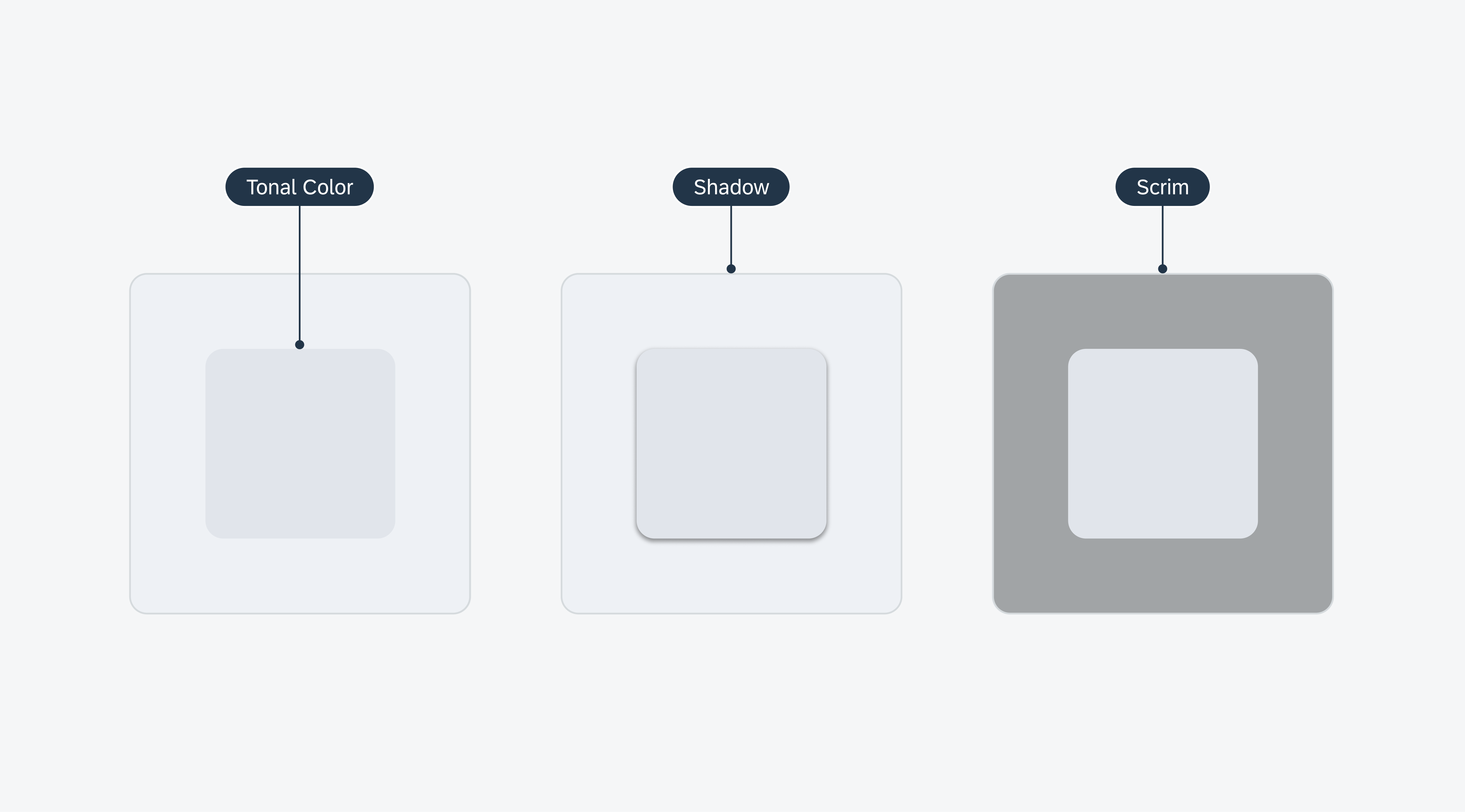
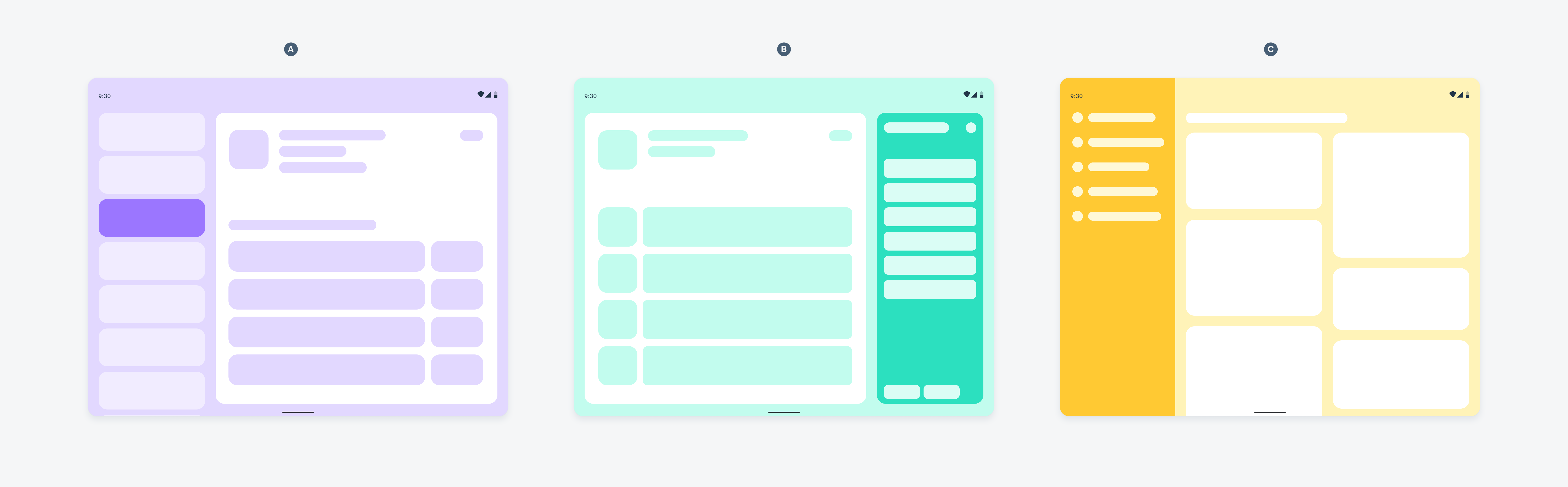
Examples of elevation using tonal color (left), shadow (middle), and scrim (right)
Tonal Color
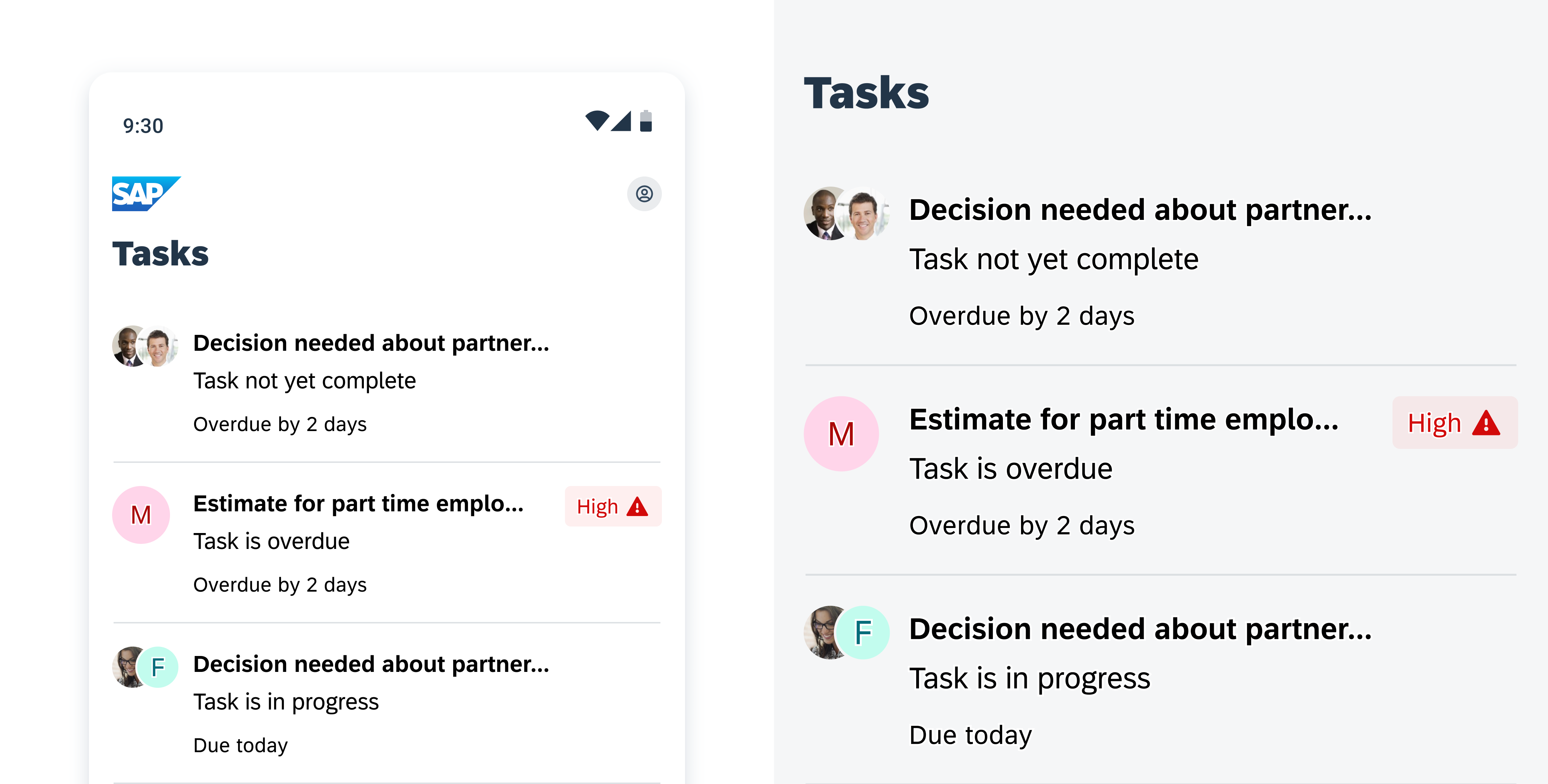
Material 3’s tonal color is essential for conveying materiality and depth using distinct shades across the UI. This approach also helps define a component’s tactile area and visual emphasis relative to other containers and surfaces, providing a visually balanced user experience. Tonal color is further defined by the surface and surface container color roles.

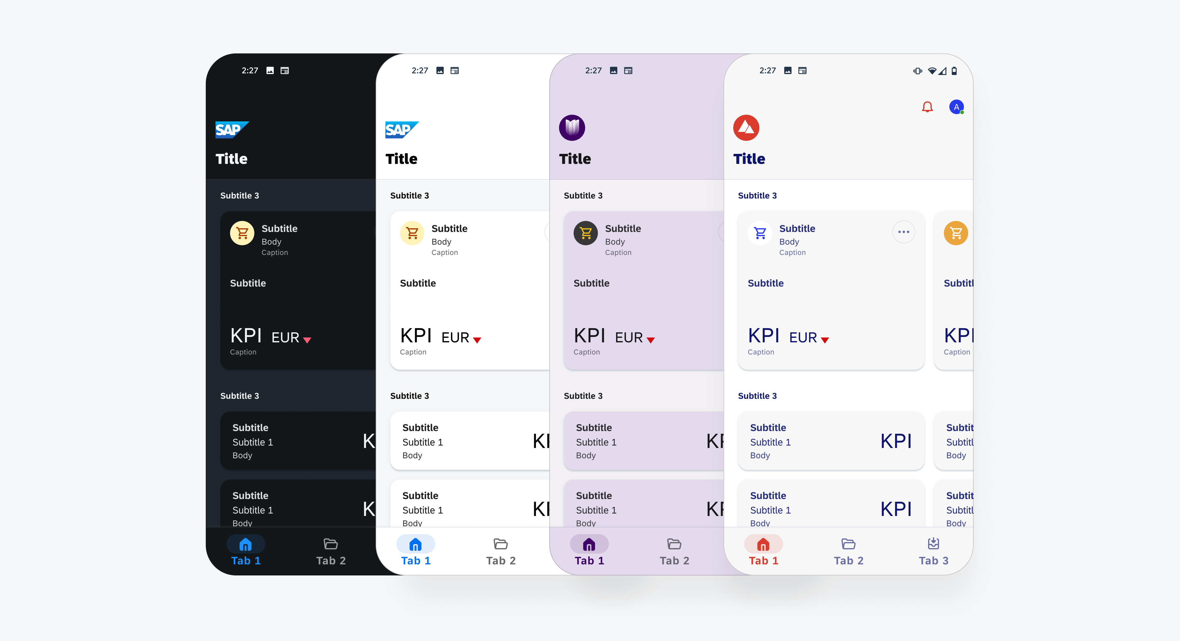
Tonal color is used to define different component’s tappable area
Surface
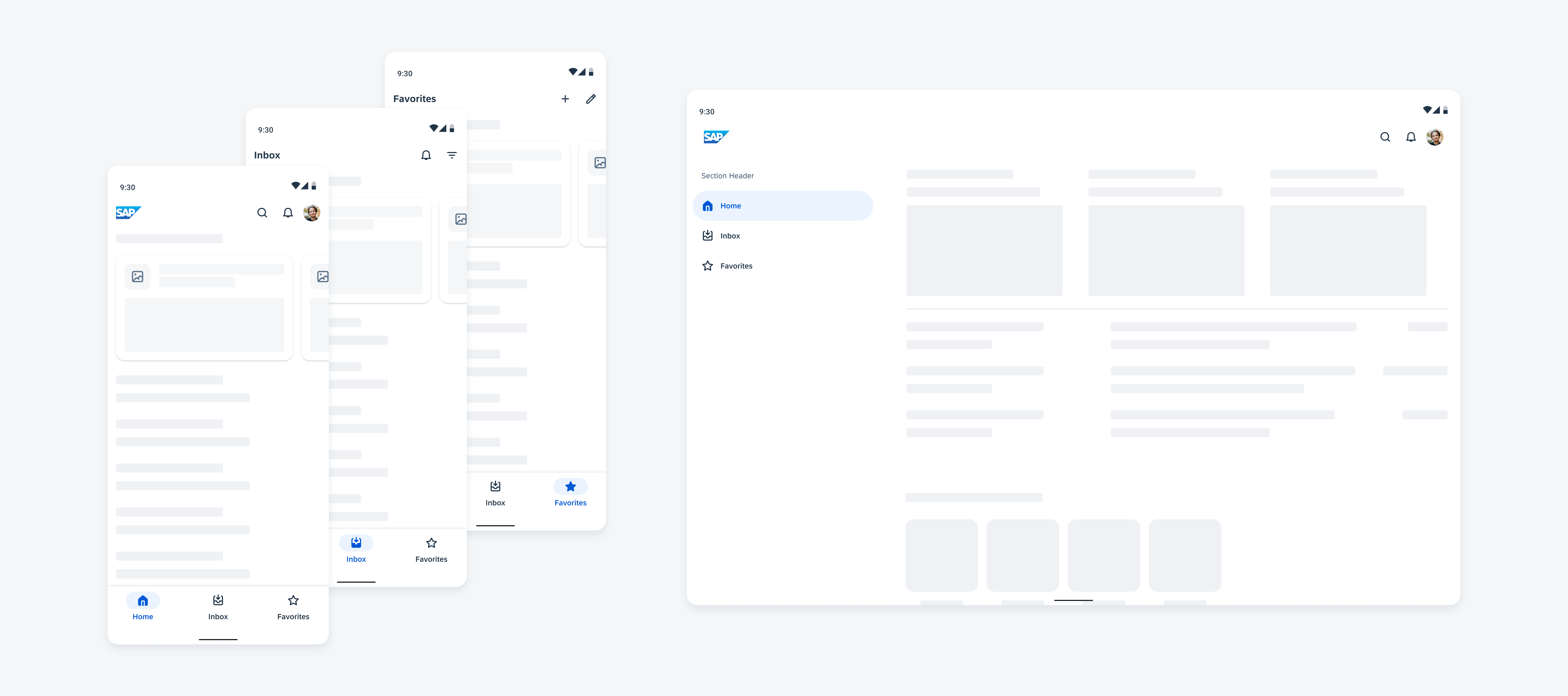
The surface color role is the default tonal value that defines the overall background for surface containers and foreground elements. It is also used on navigational components such as the navigational rail and top app bar, which allow them to blend against the overall background.

Tonal color is used to define different component’s tappable area
Surface Container
The surface container color role comprises five tonal colors defining the components’ elevation on the screen. The higher the surface container, the more prominent it appears on the screen. The surface container color roles can also be paired with shadows to further emphasize a container.

Surface container color roles are used to provide contrast and definition between different containment areas
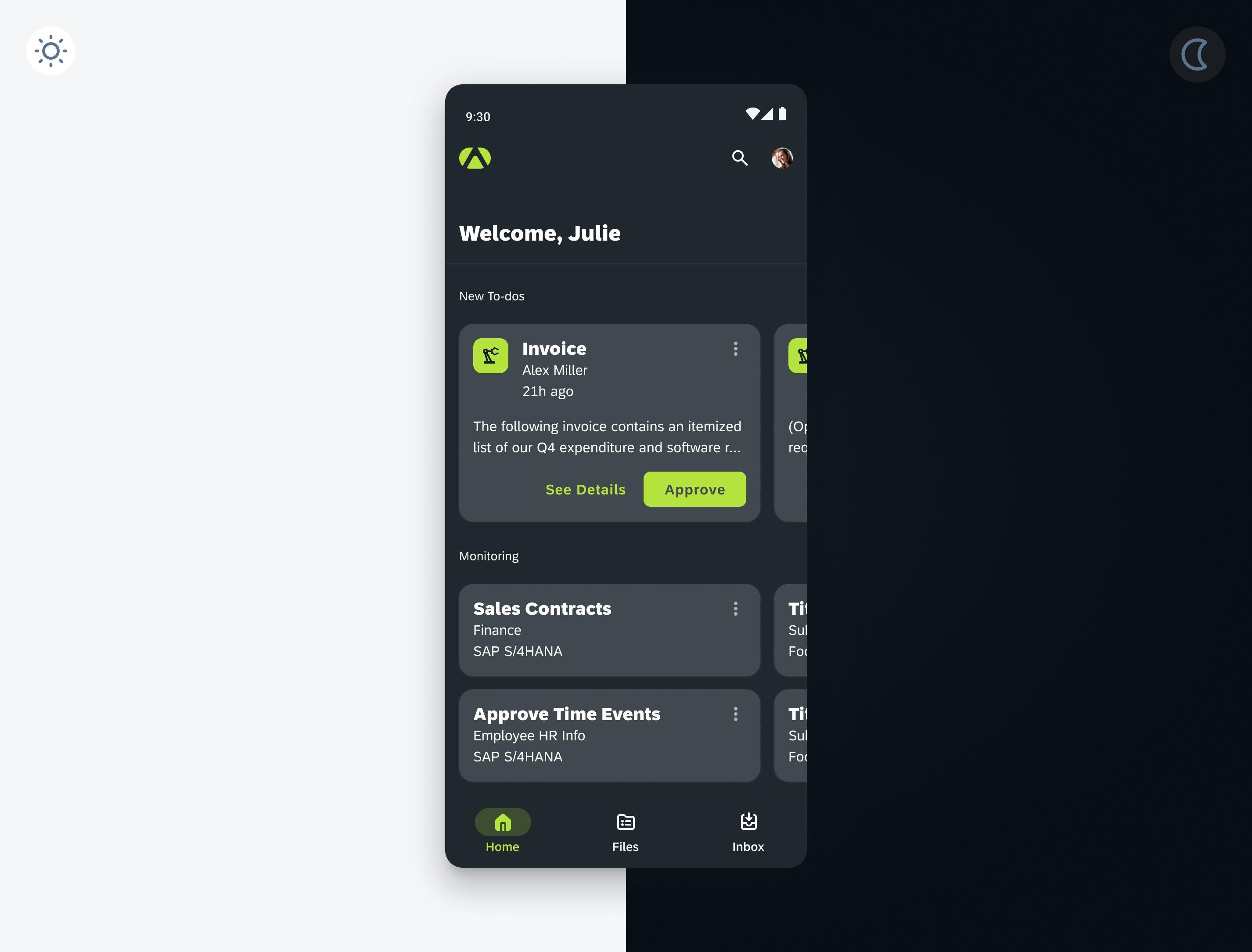
Shadows: Adding Depth and Focus
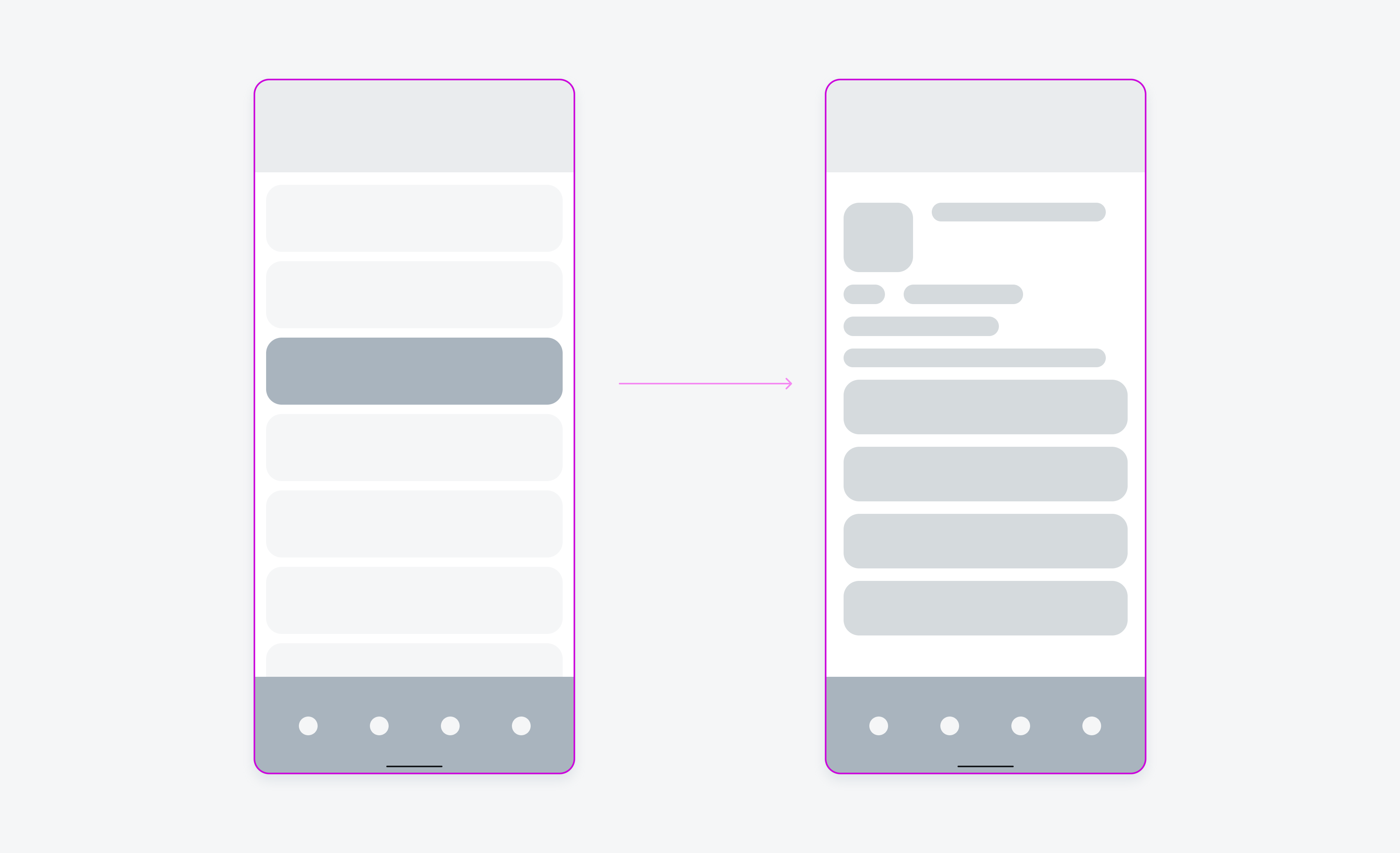
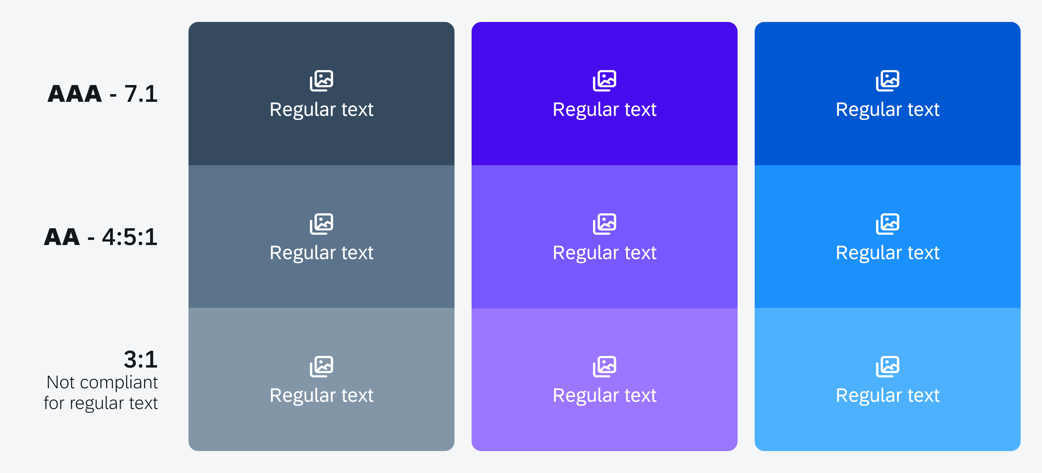
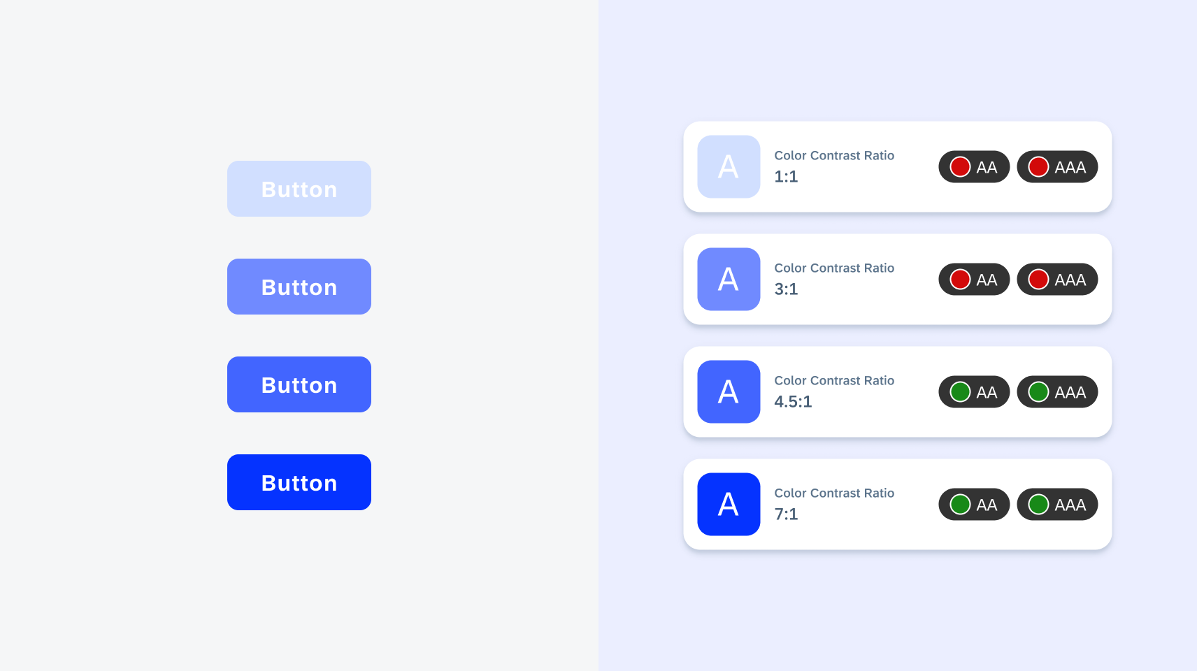
Shadows are an essential technique for making key interface elements stand out and appear interactive, such as cards, modals, and other actionable components. Shadows can also be used to add further emphasis to a component in areas that are visually busy such as against an image or a background that is using the same color role.
Shadows can be used to supplement components in instances where contrast is not met. For example, a button over an image (left) or a button over a background with similar contrast (right)
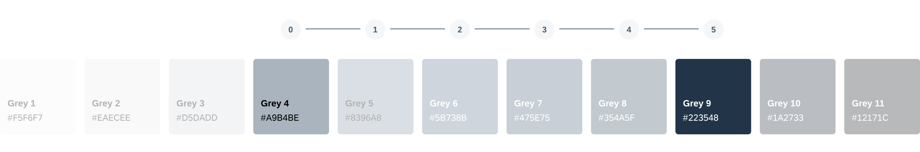
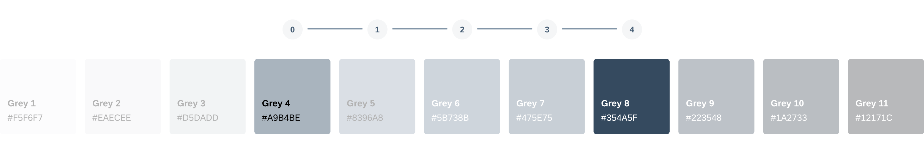
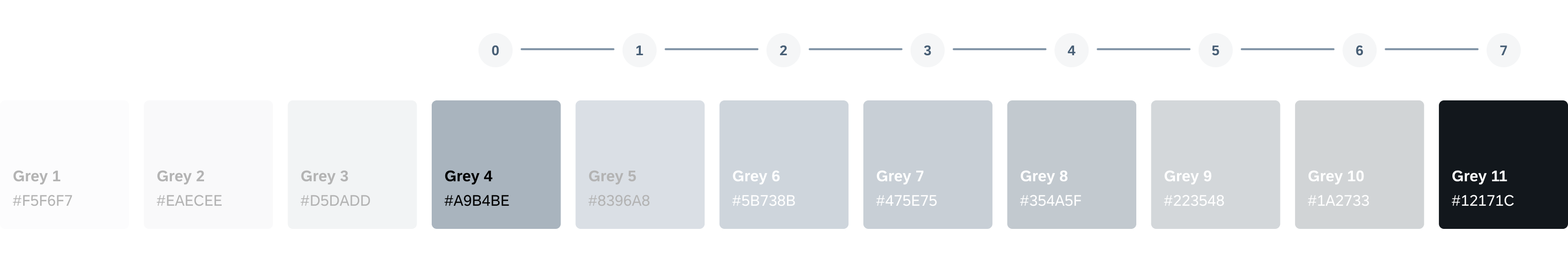
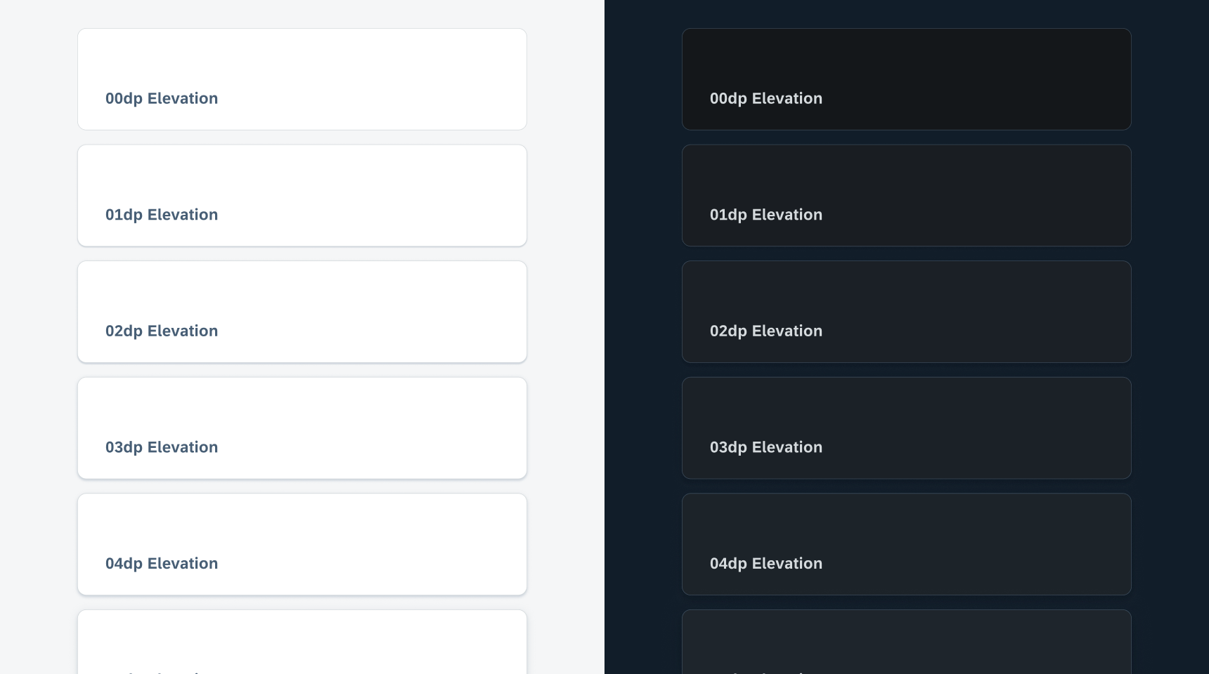
Elevation Levels
SAP Fiori for Android provides five distinct elevation levels (0-4) to establish visual hierarchy within the UI. Higher levels are typically used for prominent content, guiding users’ attention to the most critical interactive areas.
| Name | Usage | Light Mode | Dark Mode |
| Level 0 | Filter Chip (Flat) / Full-screen Dialog / List Item / Input Chip / Navigational Rail / Tabs / Side sheet (Docked) / Slider (Track) / Top App Bar | ||
| Level 1 | Banner / Bottom/ Sheet (Modal) / Elevated Button / Elevated Card / Extended FAB (Lowered) / FAB (Lowered) | ||
| Level 2 | Bottom App Bar / Dropdown Menu / Menu / Navigation Bar / Select Menu / Rich Tooltip / Top App Bar (Scrolled) | ||
| Level 3 | FAB / Extended FAB / Modal Date Picker / Docked Date Picker / Modal Date Input / Dialog / Search Bar / Search View / Time Picker / Time Input | ||
| Level 4 | (Not assigned as resting level) | ||
| Level 5 | (Not assigned as resting level) |
Scrim
Scrims are transparent underlays that help bring focus to components. They are underlaid to create contrast between the background and the components. Examples of components that use scrims include side navigation, bottom sheet, and modals.
Scrim provides focus and elevation for components like bottom sheet
Resources
SAP Fiori for iOS: Elevation
Android Developers (Elevation)
Related Components/Patterns: Color, Accessibility
 Your feedback has been sent to the SAP Fiori design team.