
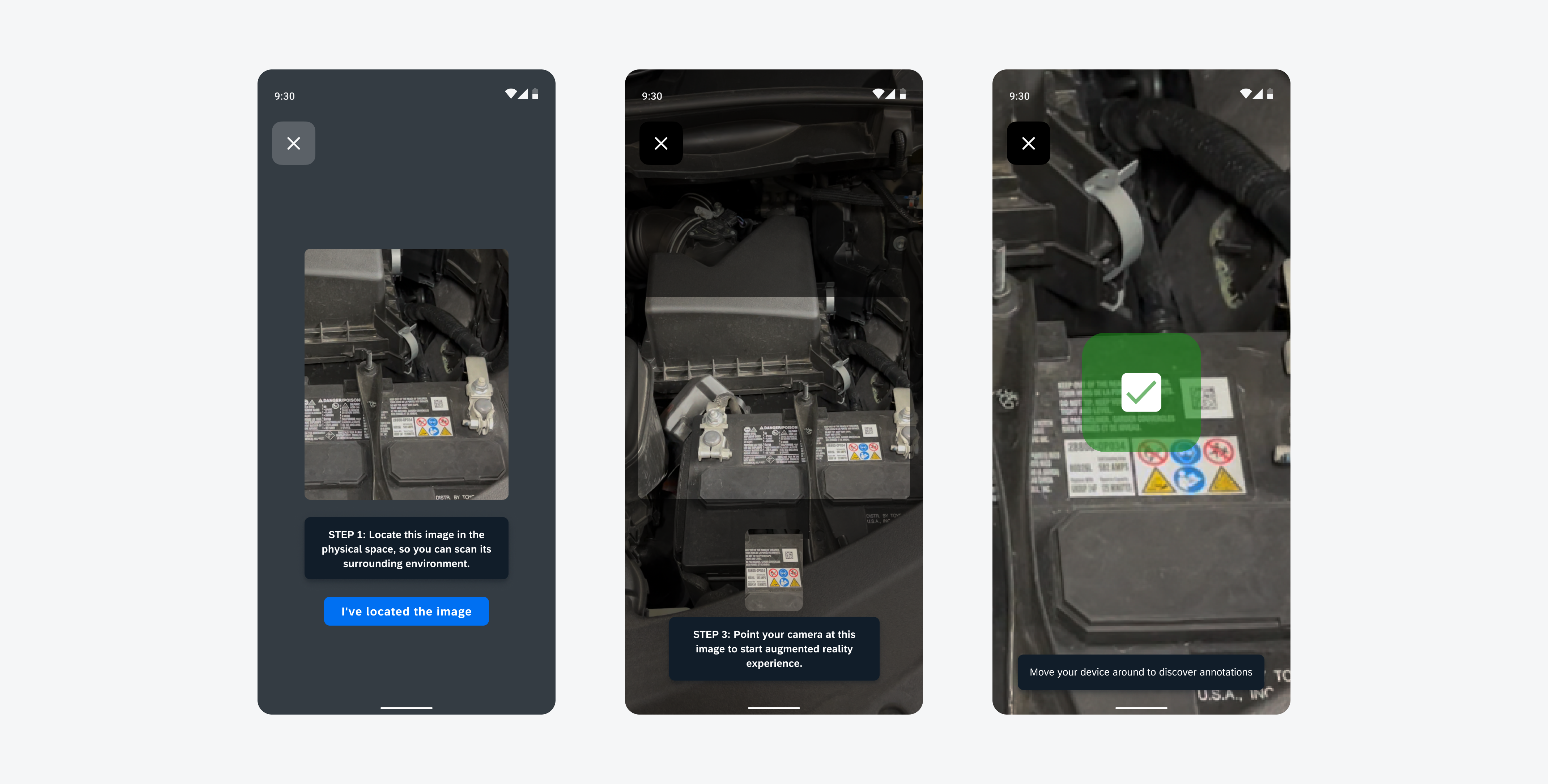
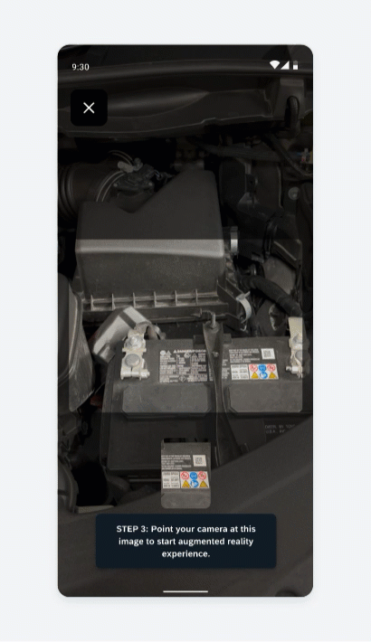
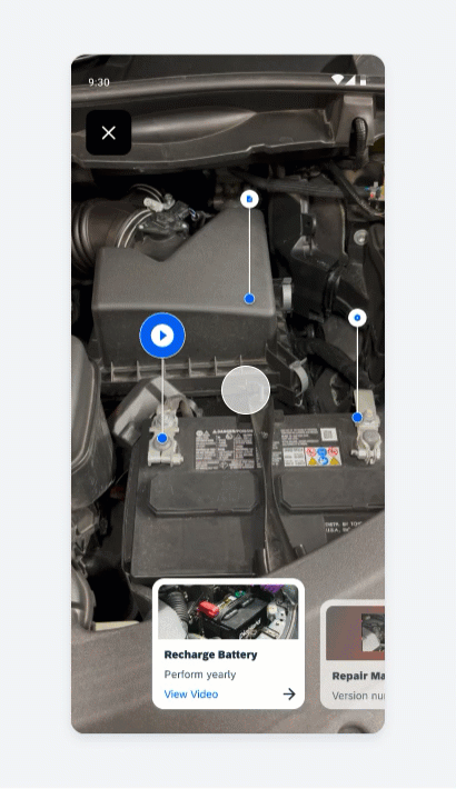
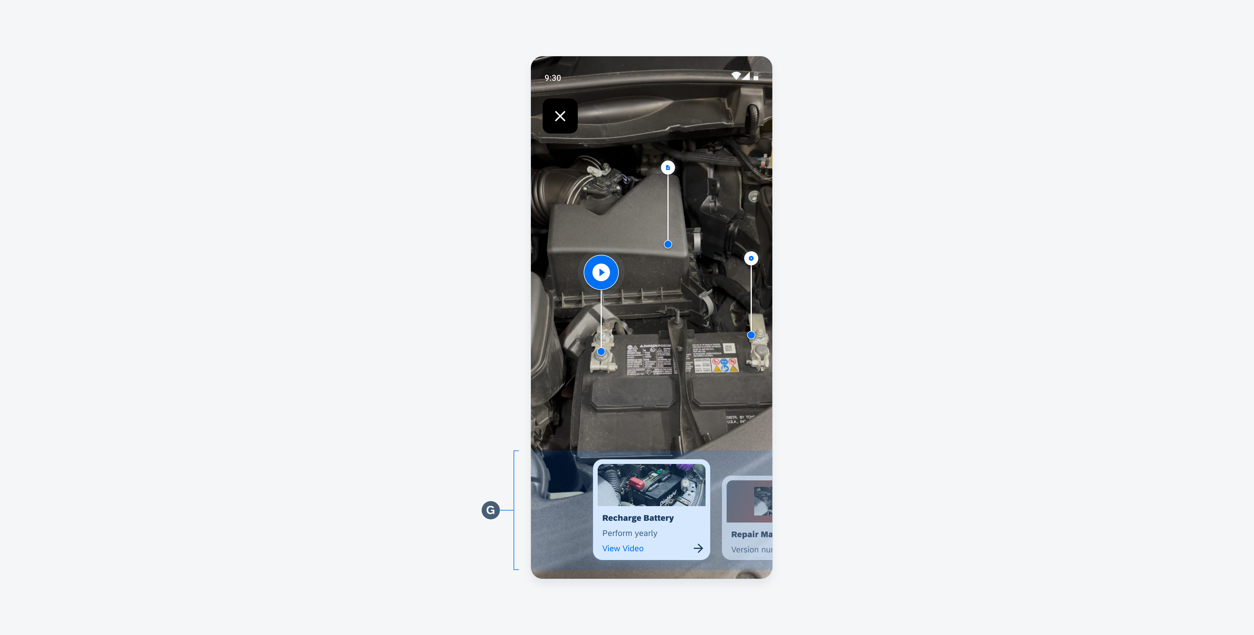
AR Card
The AR card displays key information related to a single AR marker annotation. A user can tap the card to display additional information in a full-screen view. The user can also swipe between the cards.
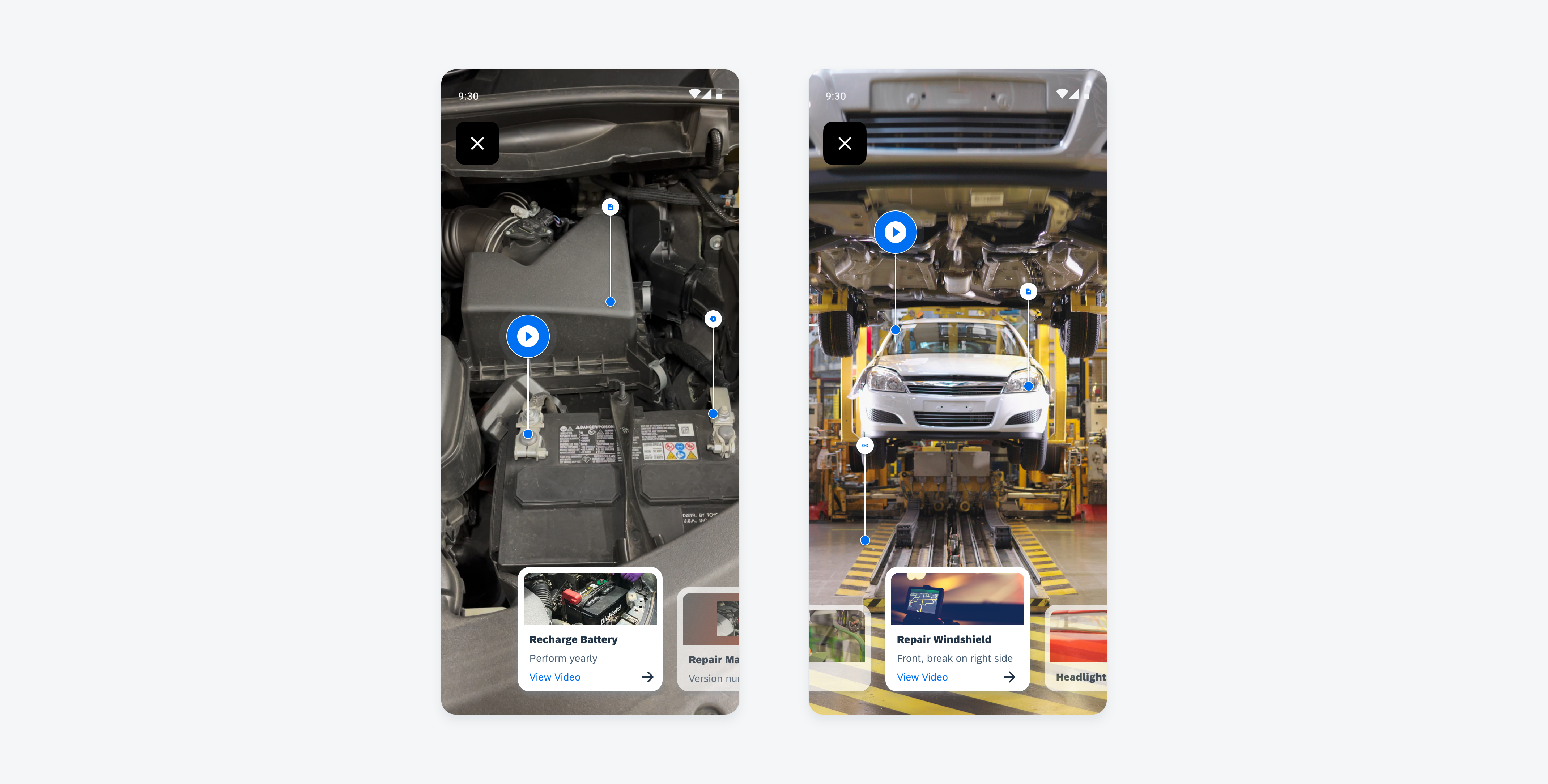
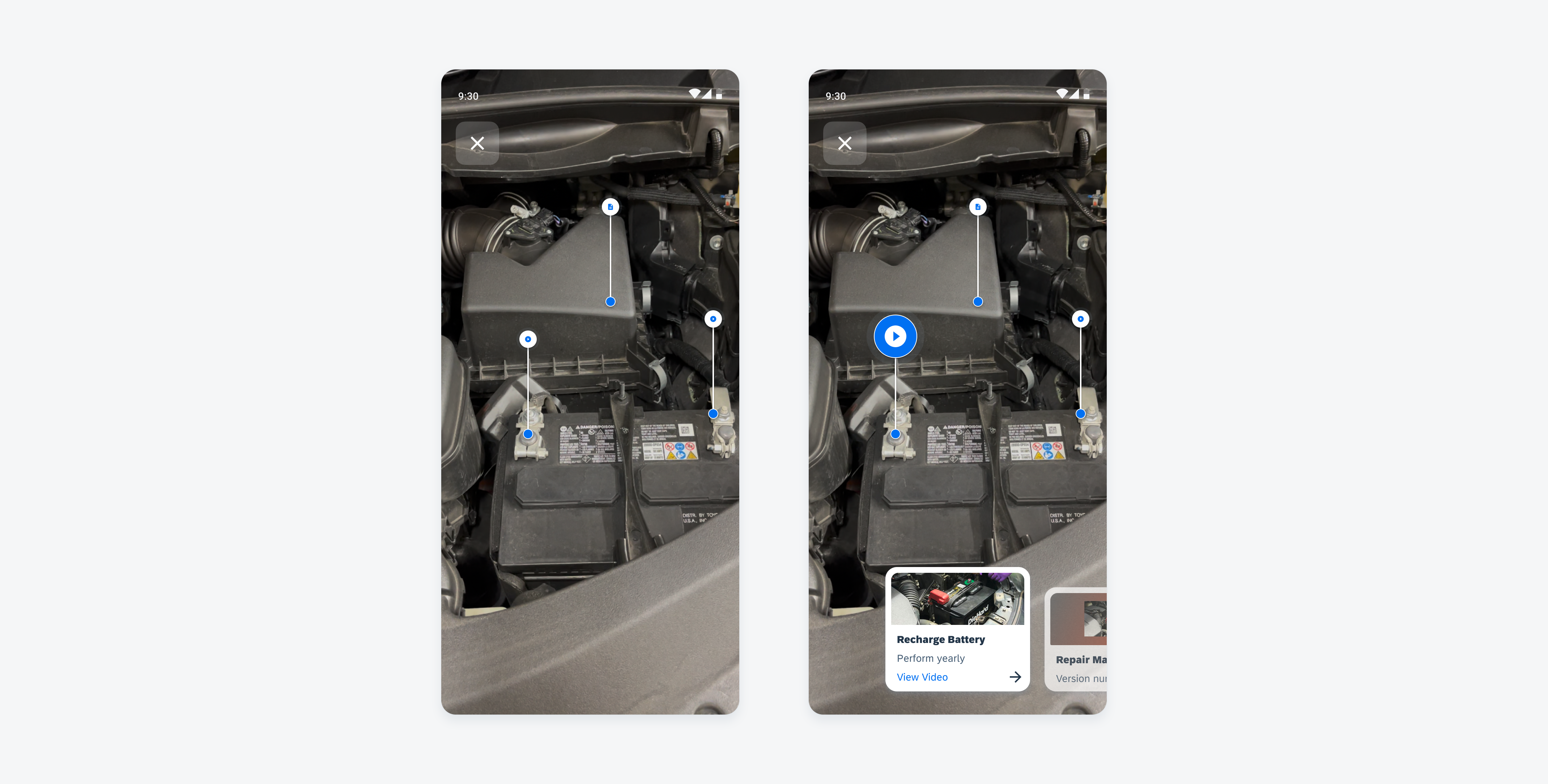
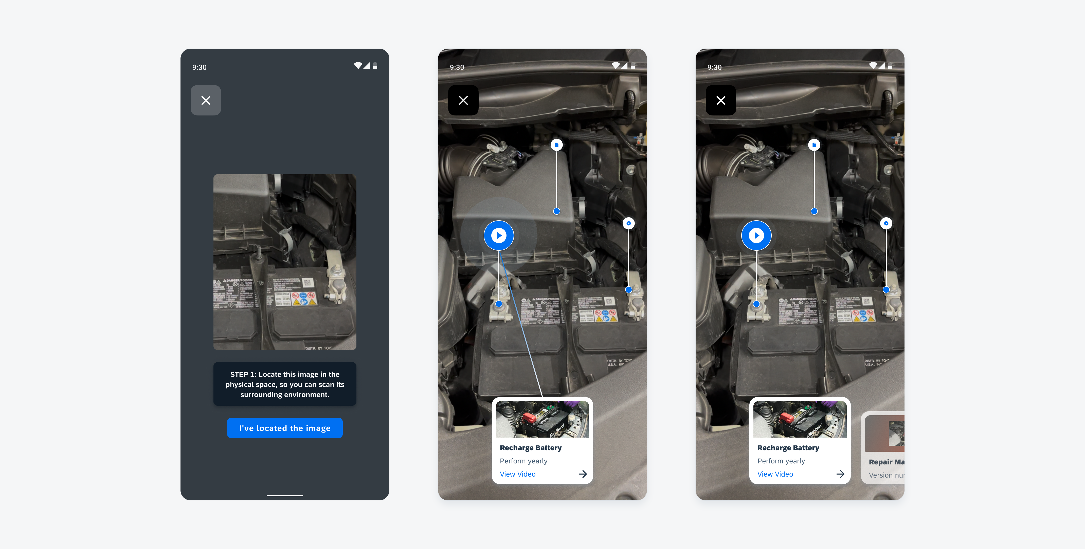
AR cards with image preview
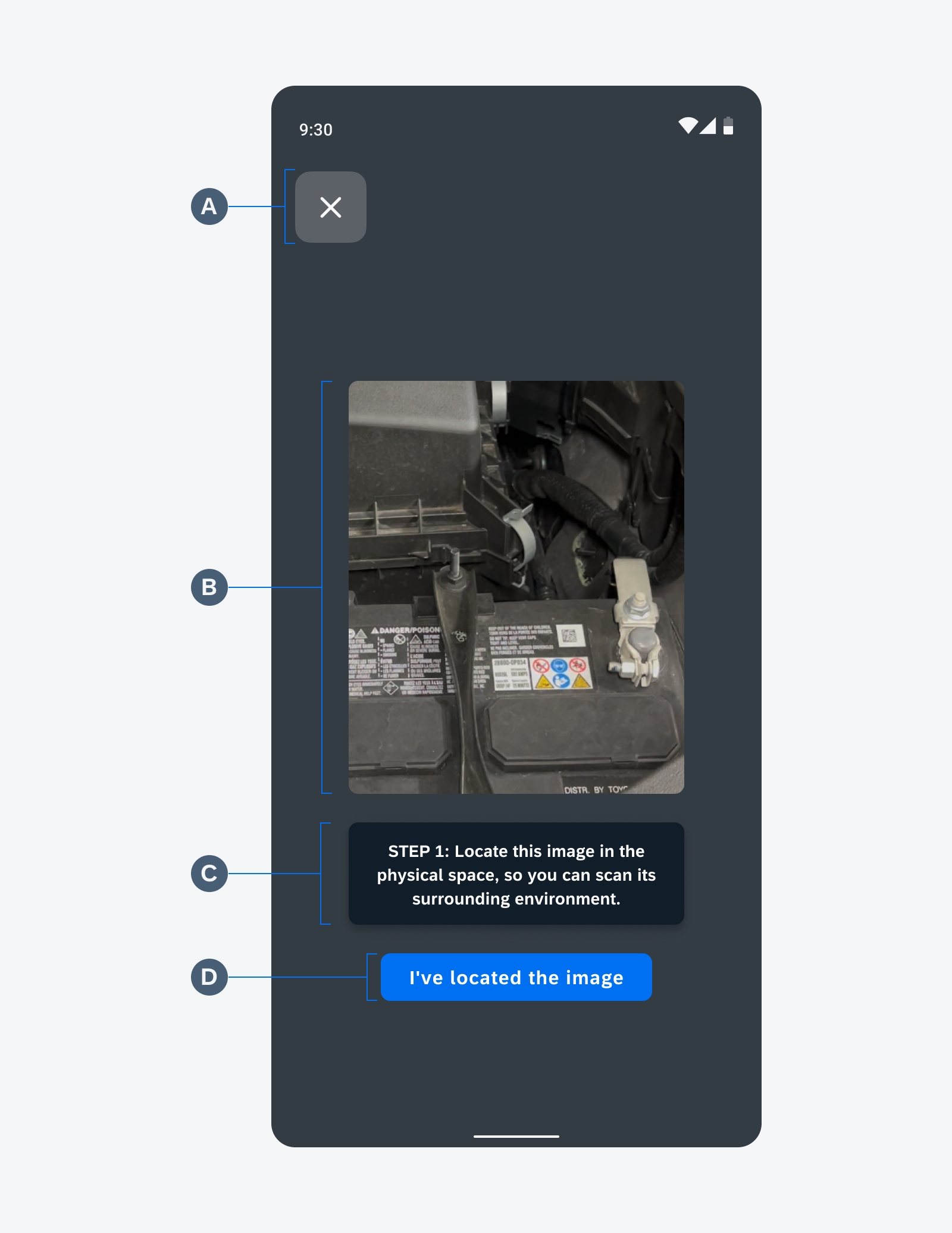
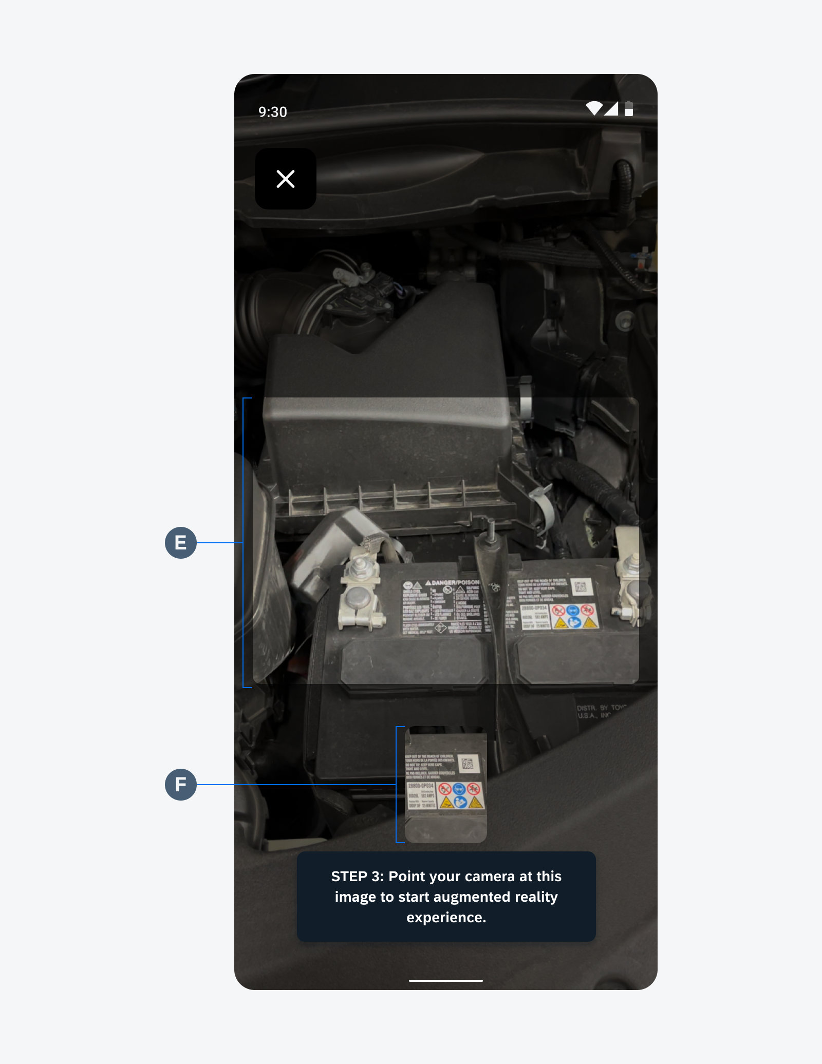
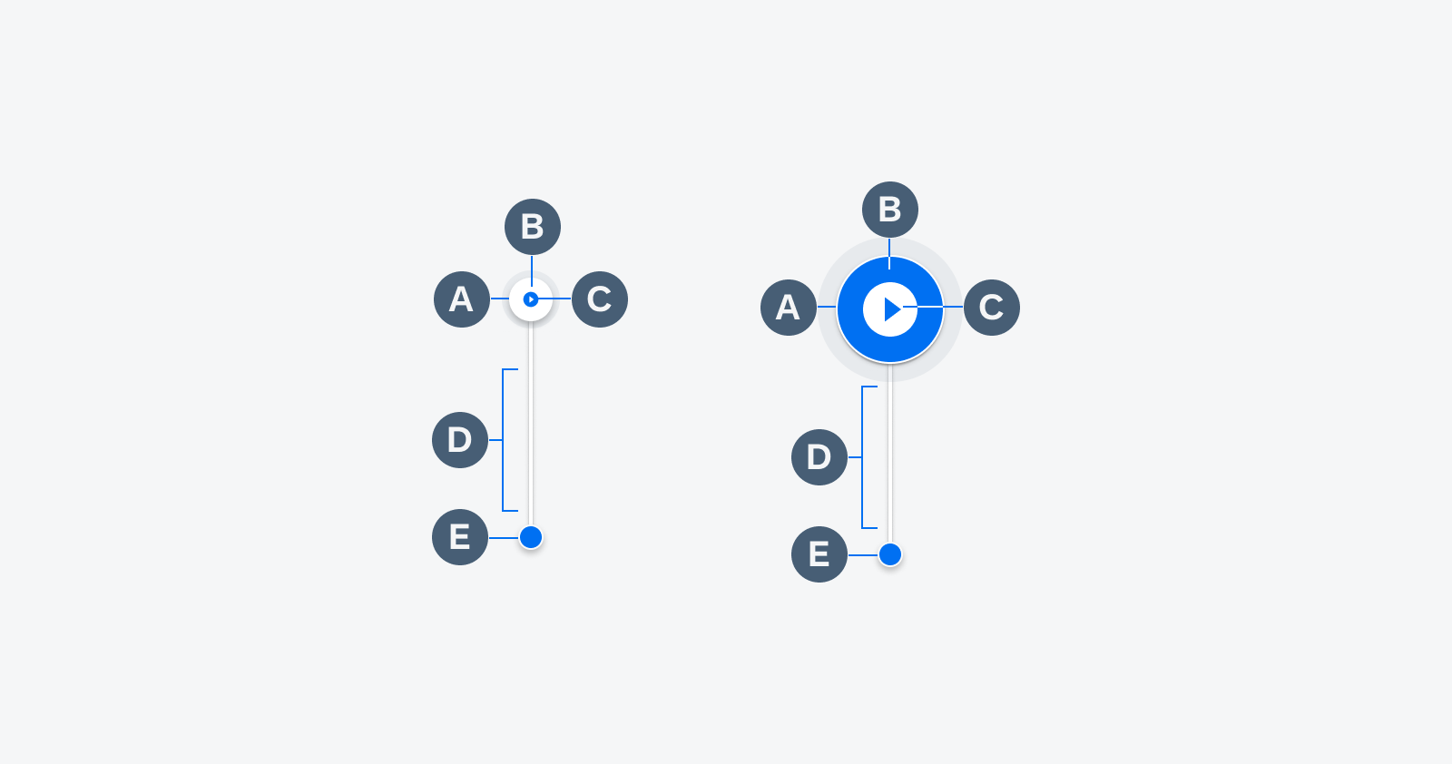
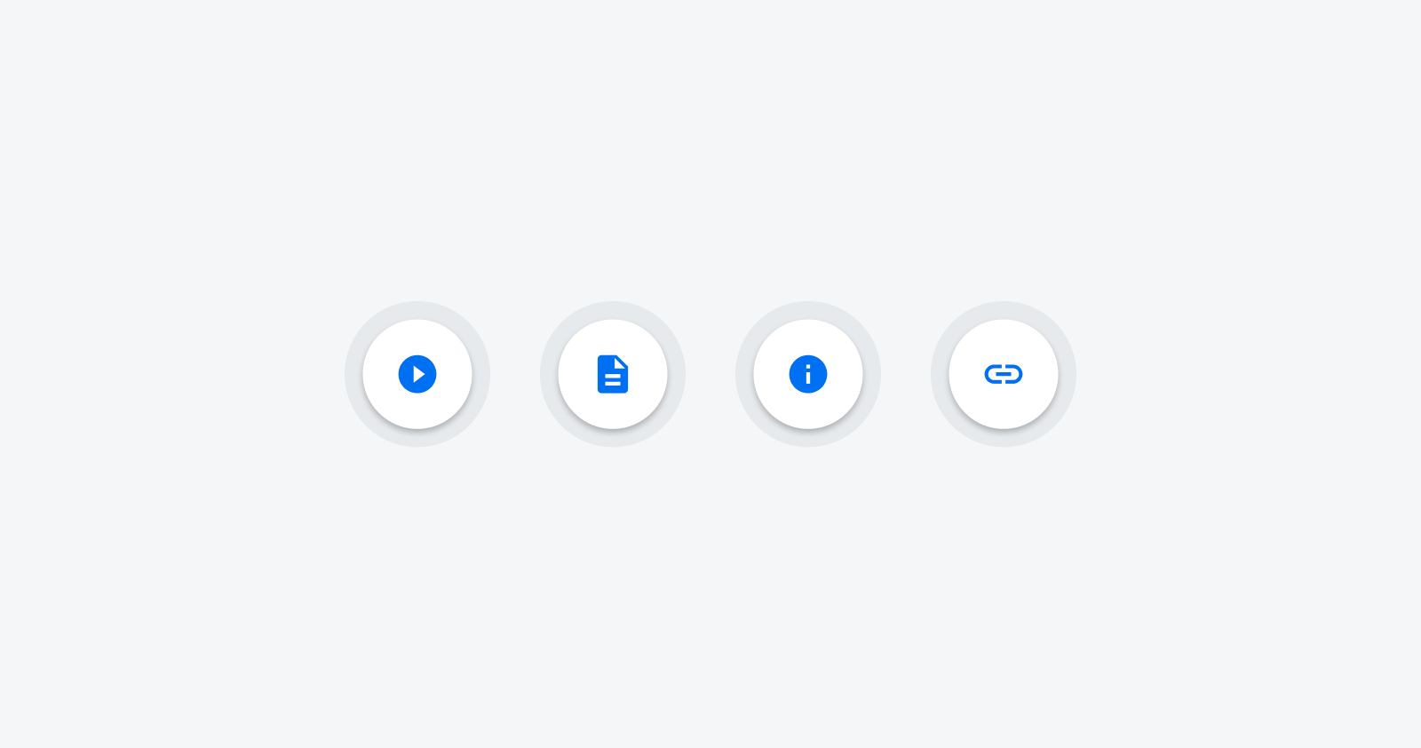
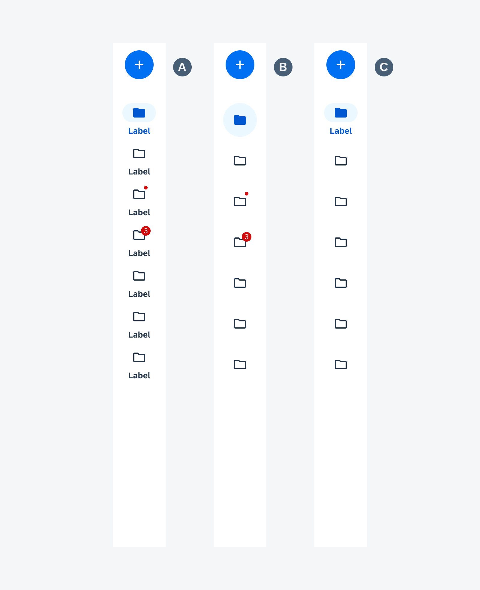
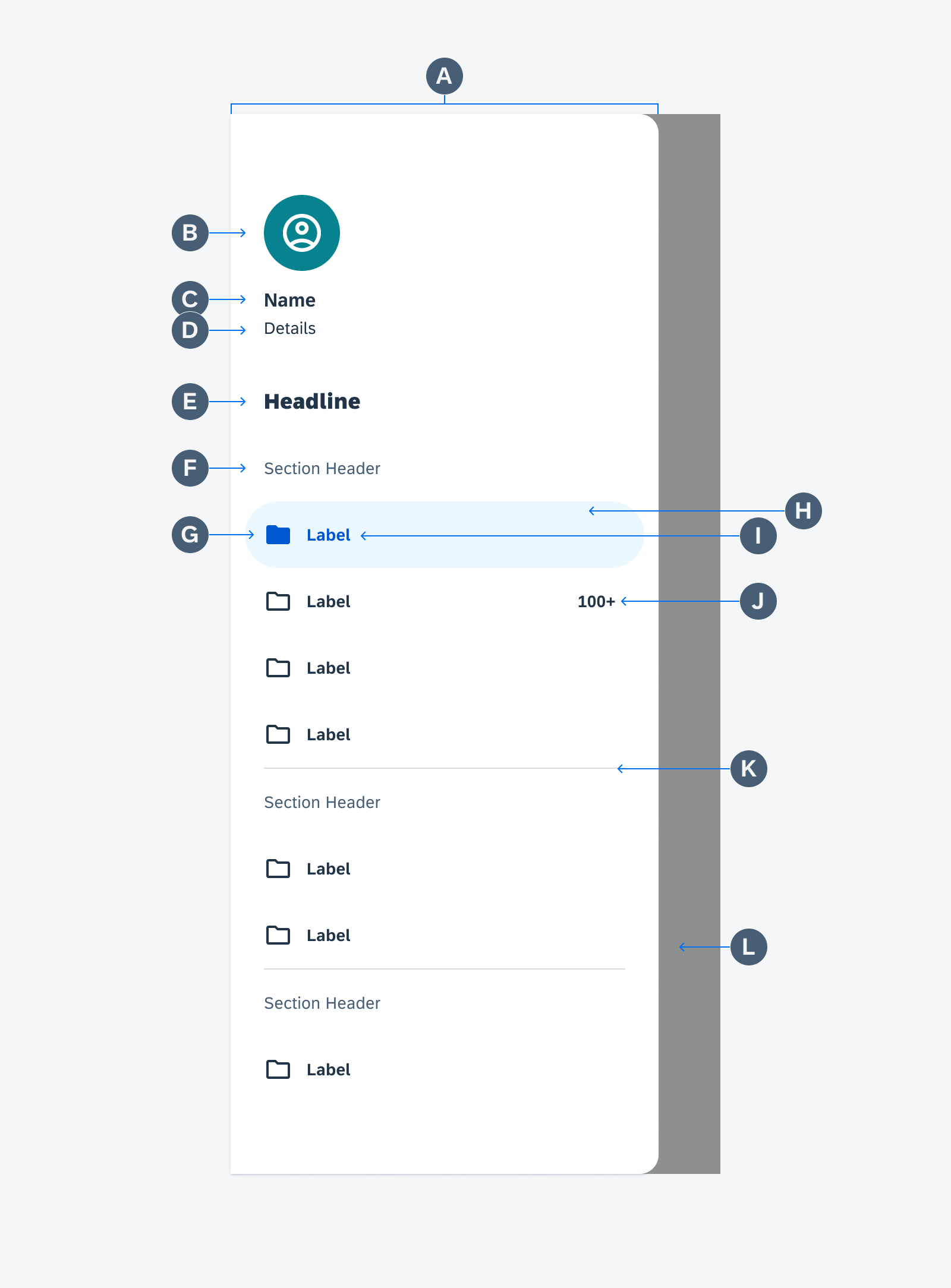
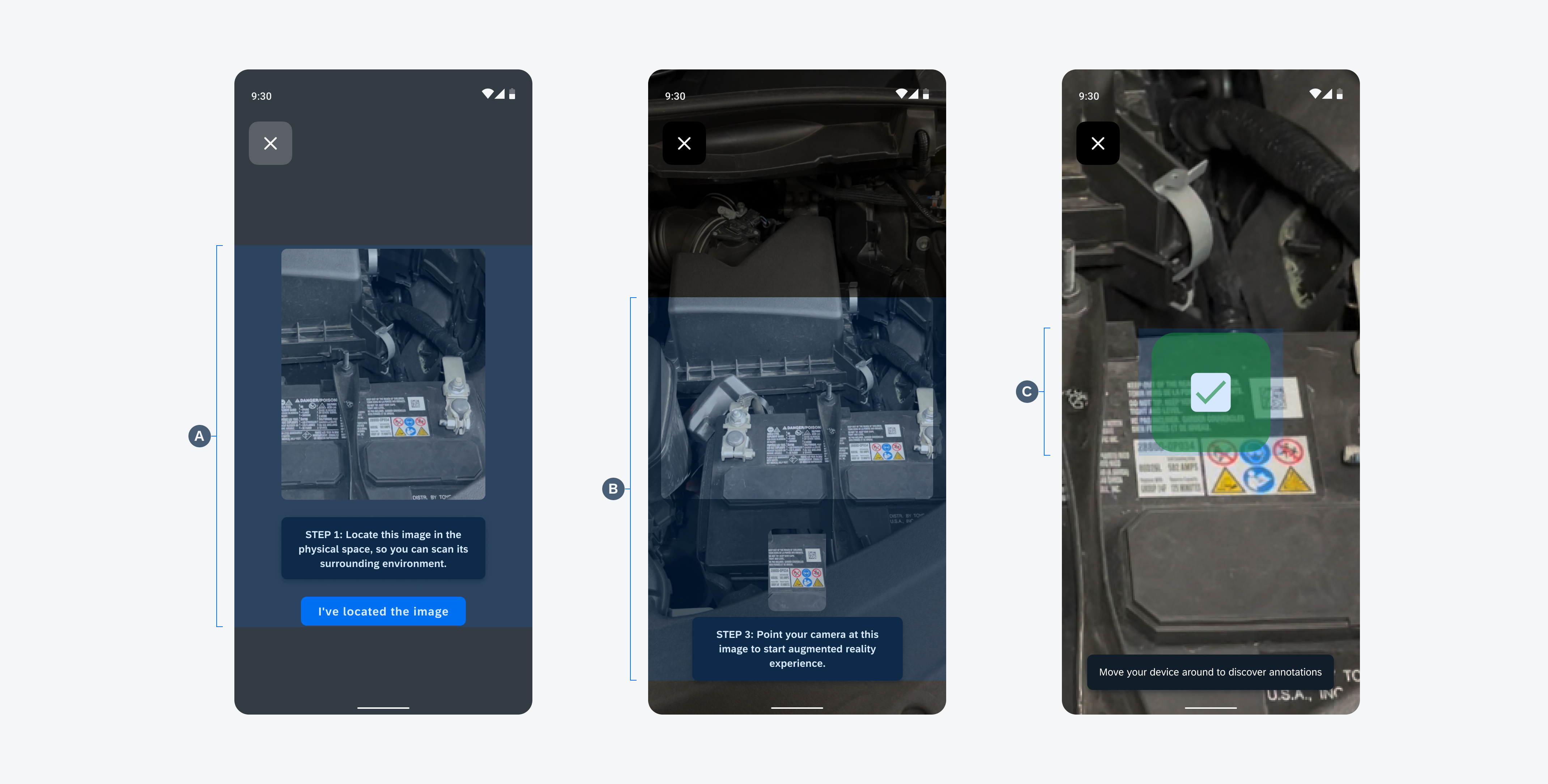
Anatomy
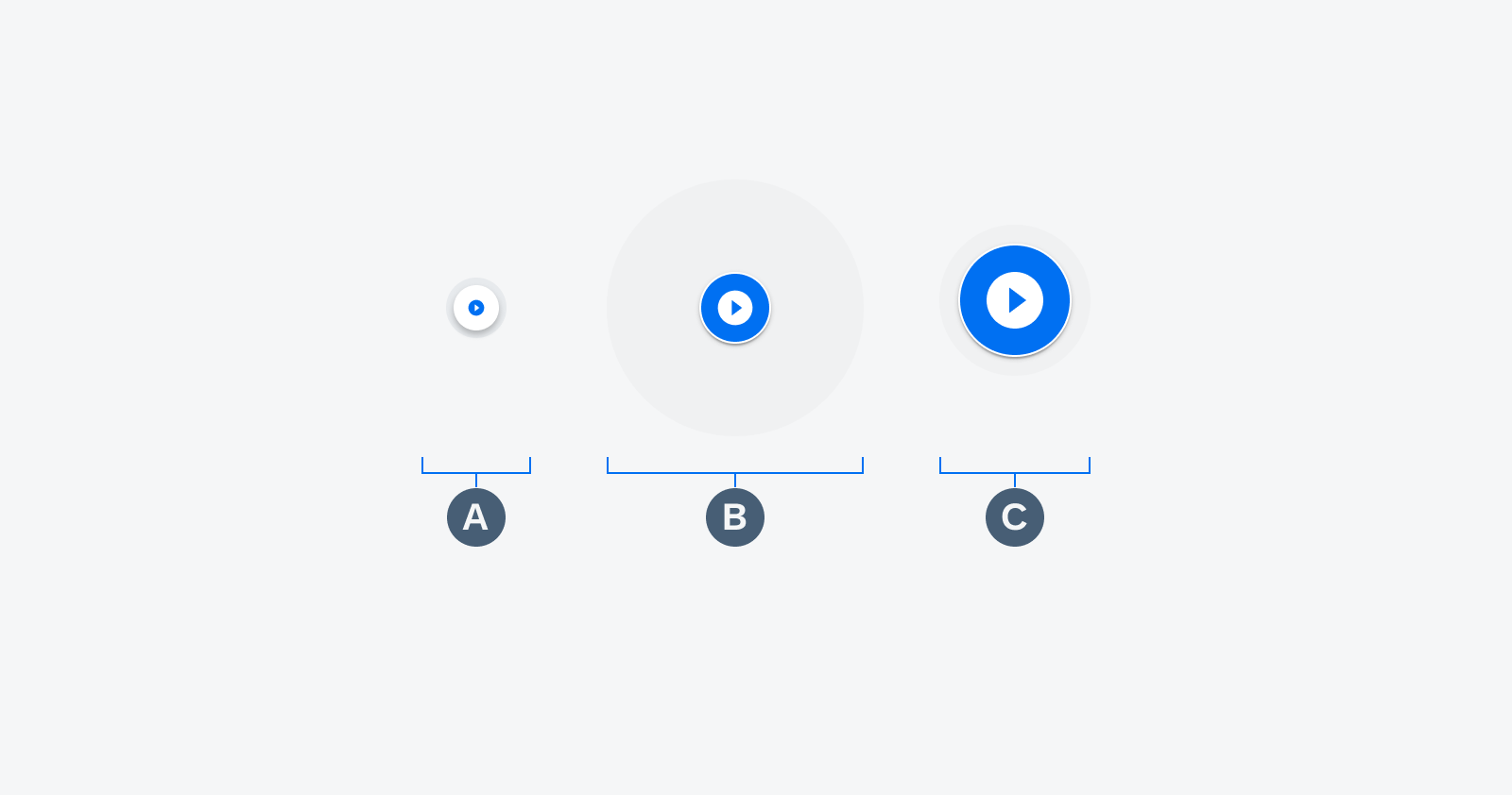
The AR card includes variations of the following three elements. The content should match with the information connected to the AR marker in the screen view. AR cards have a focused and unselected state.
A. Image Preview
The image preview can display a thumbnail of an image, video, document, barcode, or an app logo with the icon displayed on the marker.
B. Content Area
The content area consists of the title and the description. There is a maximum of two lines of content.
C. Action Button (Optional)
A user can view more card details by tapping on the action button. The action button is hidden in the unselected state.
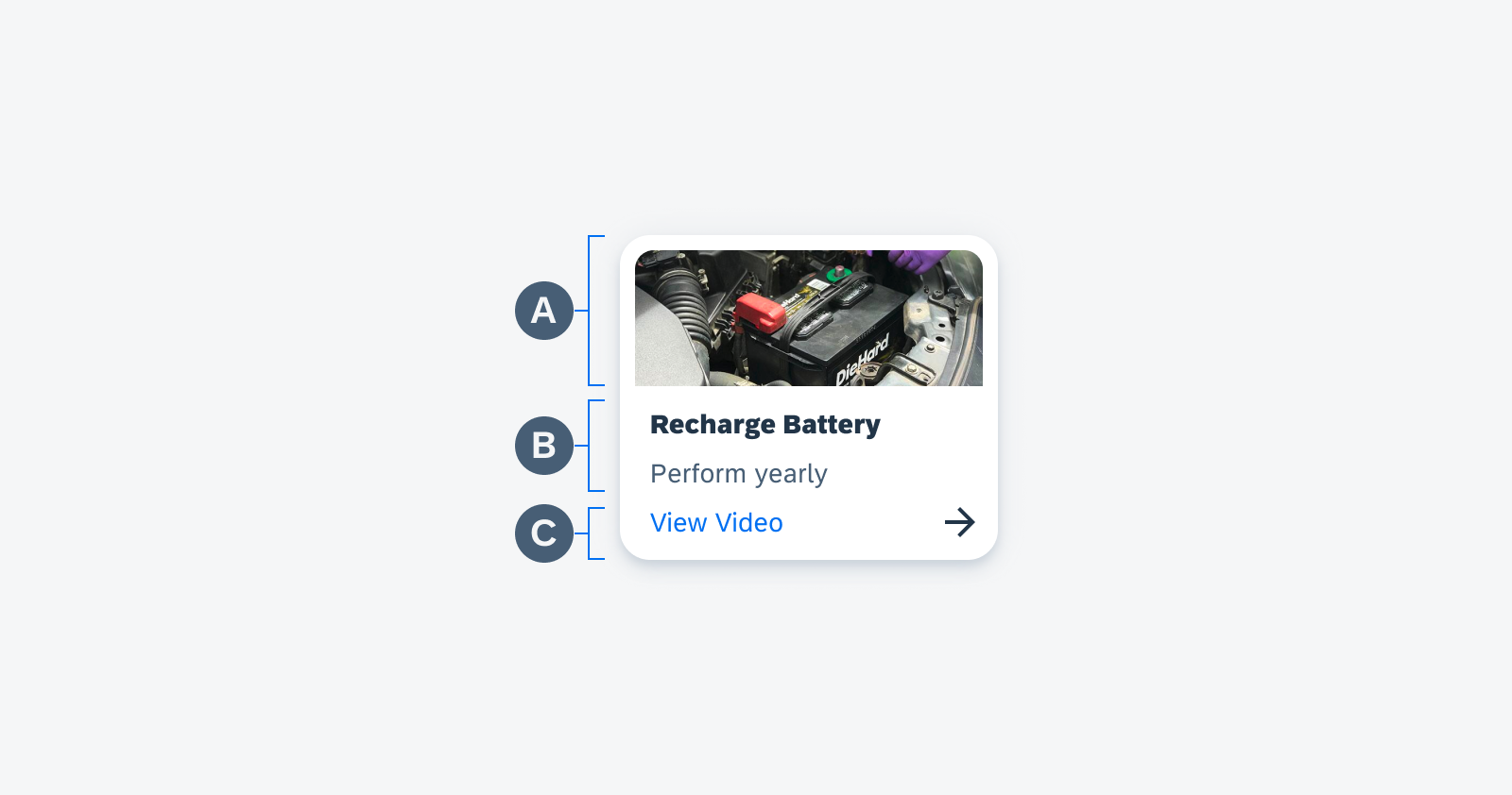
AR card anatomy
Behavior and Interaction
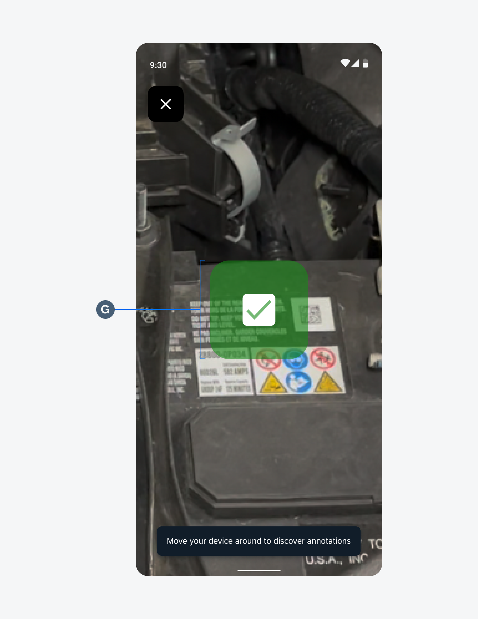
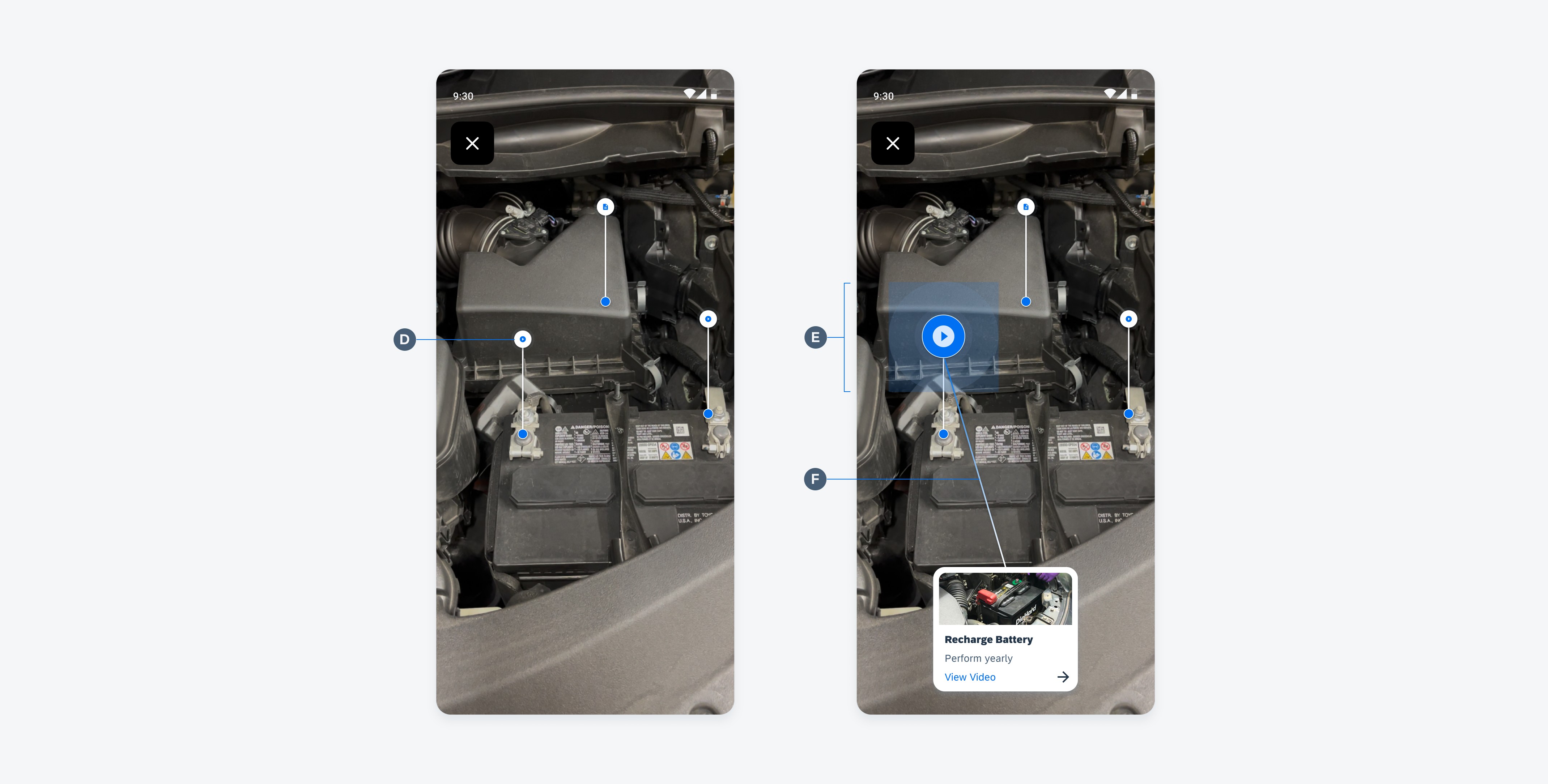
Swipe Cards
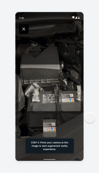
To focus on a particular card, the user can swipe the cards horizontally. When a card is in focus, the line guidance will show, and the correlating annotation marker will pulse to allow the user to visually see which card is connected to which marker.
If the AR marker is out of the focused screen view, the line guidance will help the user navigate to where the marker is located
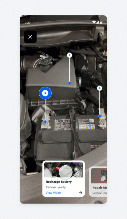
Horizontal swiping to change focused card
Variations
The AR card’s content is designed to be flexible and accommodate different use cases. The content included in the AR card will depend on the needs of specific users and requirements.
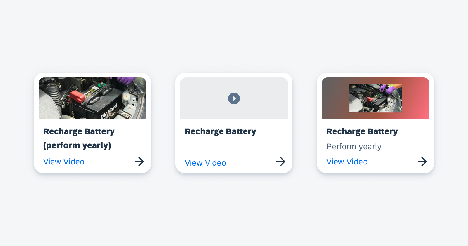
Media card (left), AR card without image preview (middle), and media card with background blur (right)
Resources
Development: ArSceneRepository, navigation_ar_stickers_edit_mode
SAP Fiori for iOS: AR Cards


 Your feedback has been sent to the SAP Fiori design team.