
AR Cards
Intro
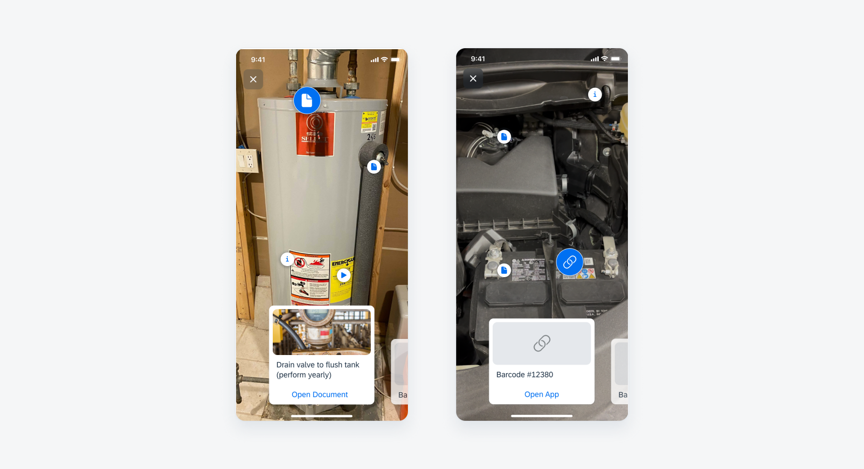
The AR card displays key information of a marker annotation with a thumbnail image, icon, or app of an object. Users can tap on it to navigate to the full-screen view of the card and users can also swipe between the cards.
AR card with image preview (left) and AR card with icon (right)
AR cards may include variations of the following elements. The content should match with the information connected to the marker in the screen view. AR cards have a focused and unselected state.
A. Image Preview
The image preview can display a thumbnail of an image, video, document, barcode, or an app logo with the icon displayed on the marker.
B. Content Area
The content area can display the title and subtitle.
C. Action Button
The action button is optional. The action button is hidden in the unselected state.
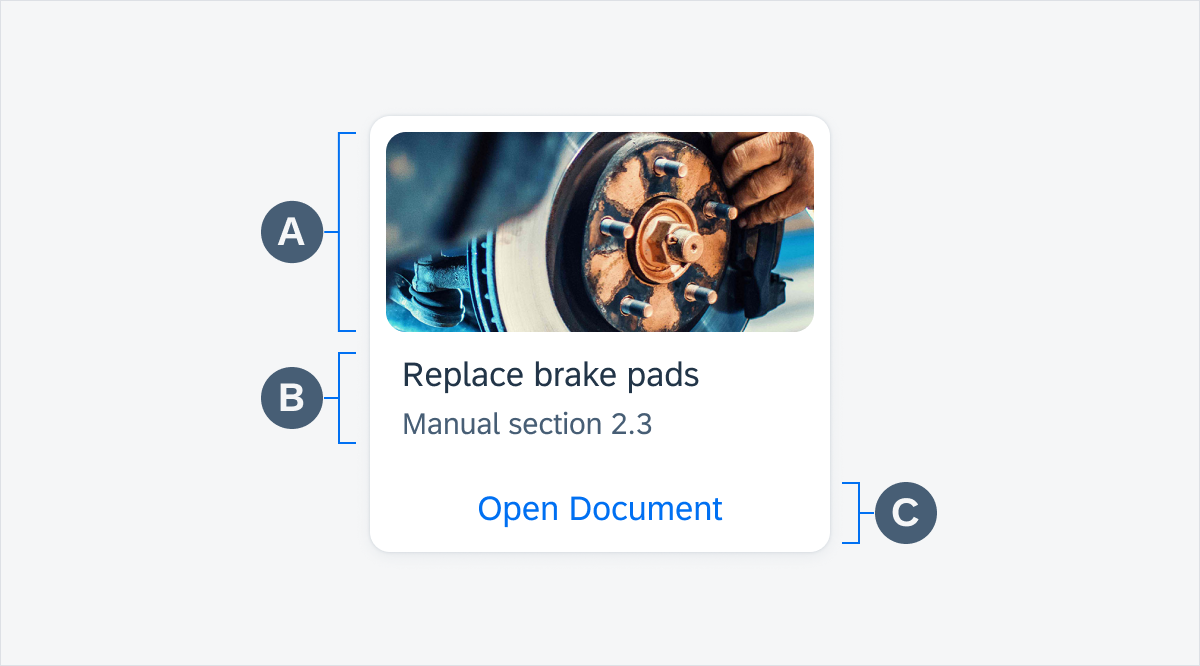
AR card anatomy
Change to Focused State
To view a card in the focused state, the user can swipe the cards horizontally. When the user is swiping cards, the marker pulse animates with a delay after the card is in the focused state to give enough time to the user to navigate the marker on the screen.

Horizontal swiping to change focused card
The content within the AR card is designed to be flexible so as to accommodate different use cases. The content you choose to include will depend on the needs of your specific user and the requirements.
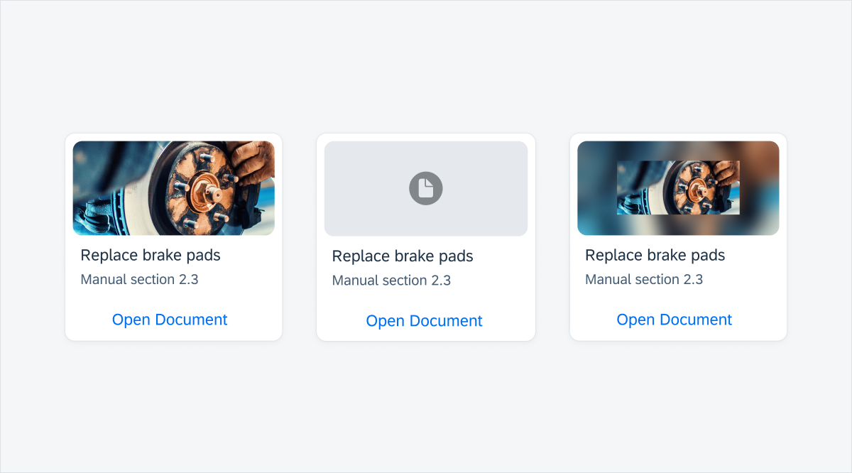
Media card (left), AR card without image preview (middle) and media card with background blur (right)
SAP Fiori for Android: AR Card
Related Components/Patterns: Cards Overview, AR Markers, AR Annotations
 Your feedback has been sent to the SAP Fiori design team.