
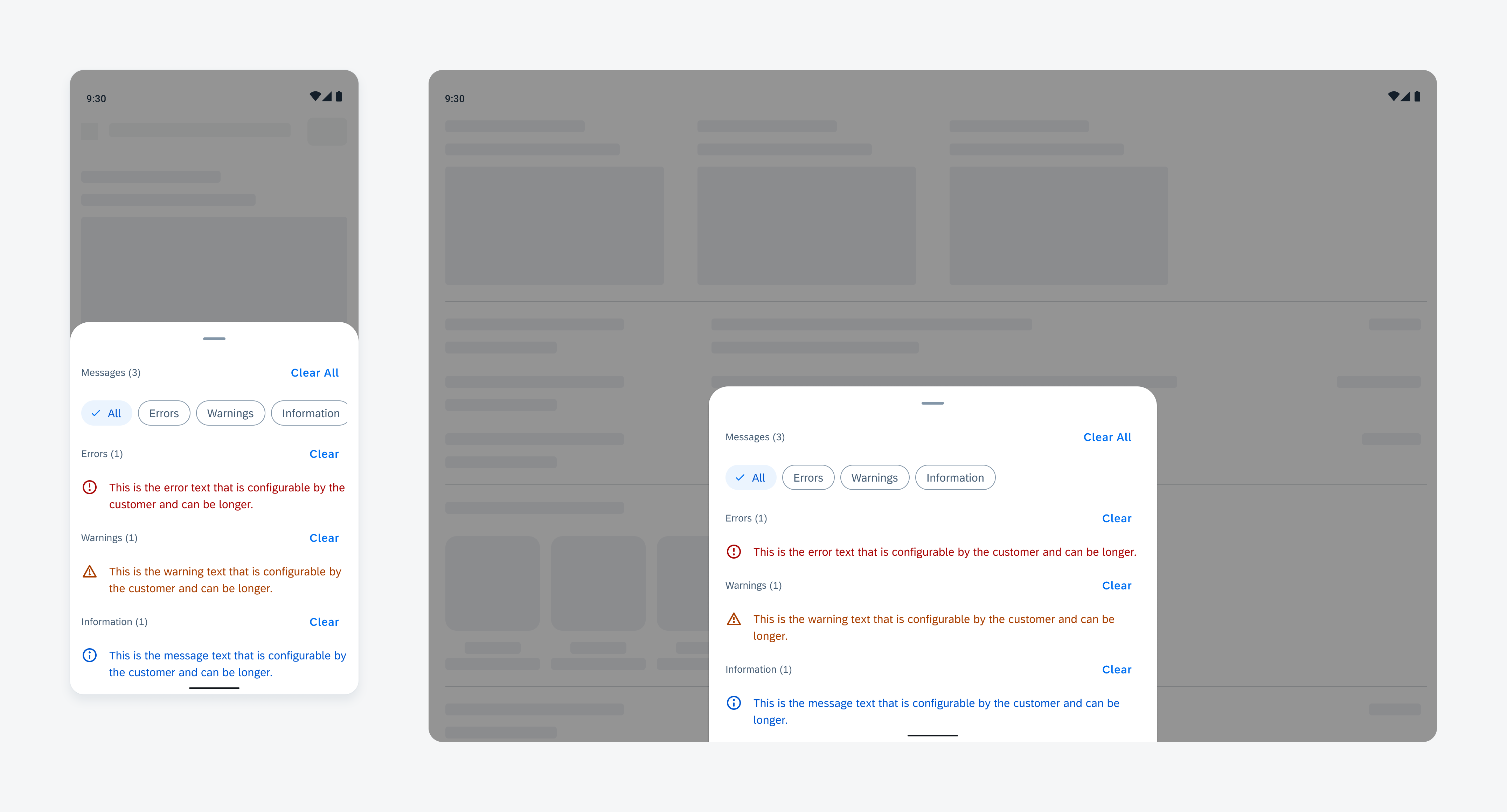
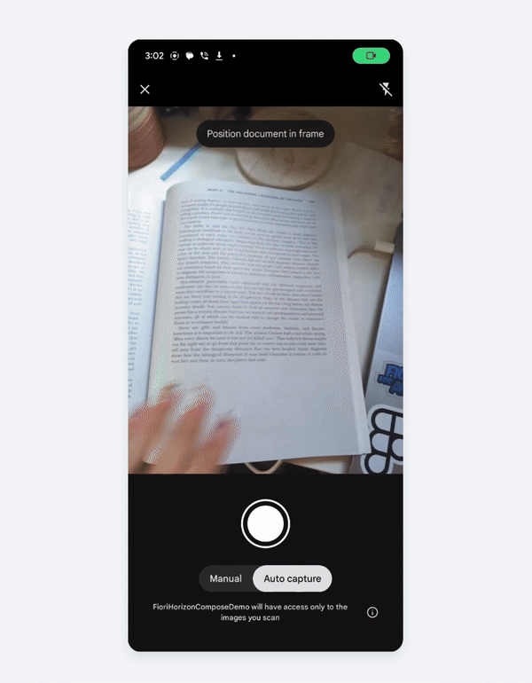
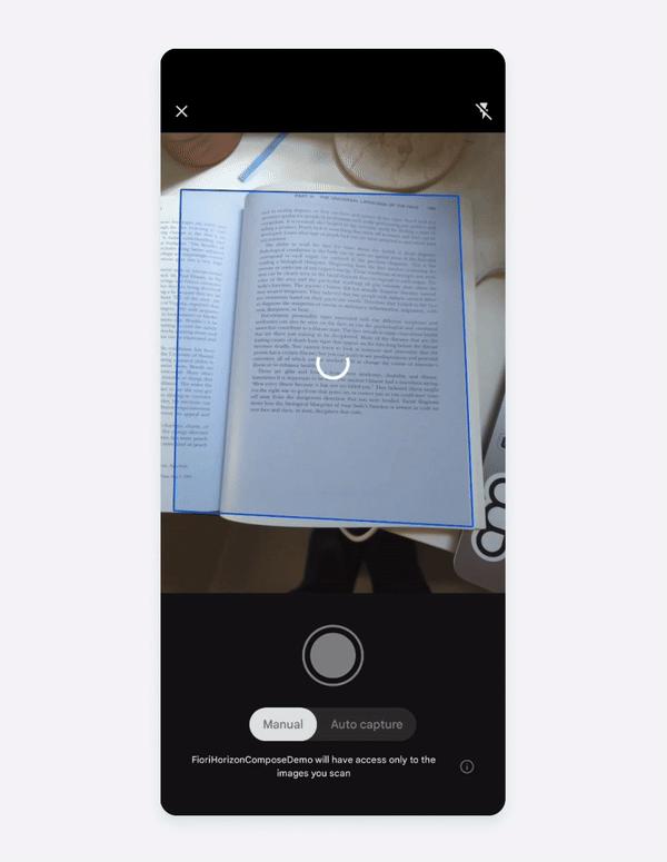
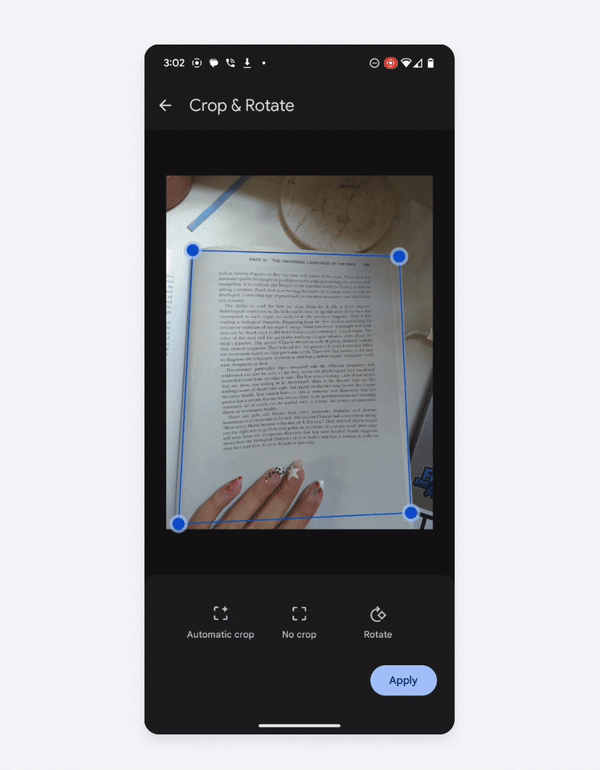
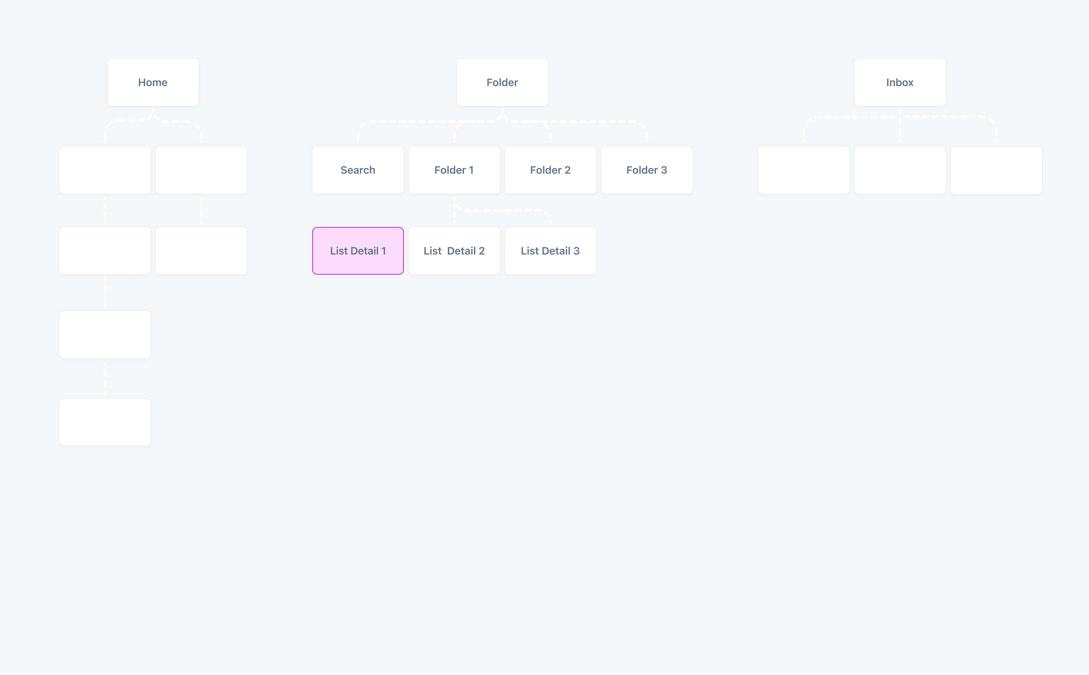
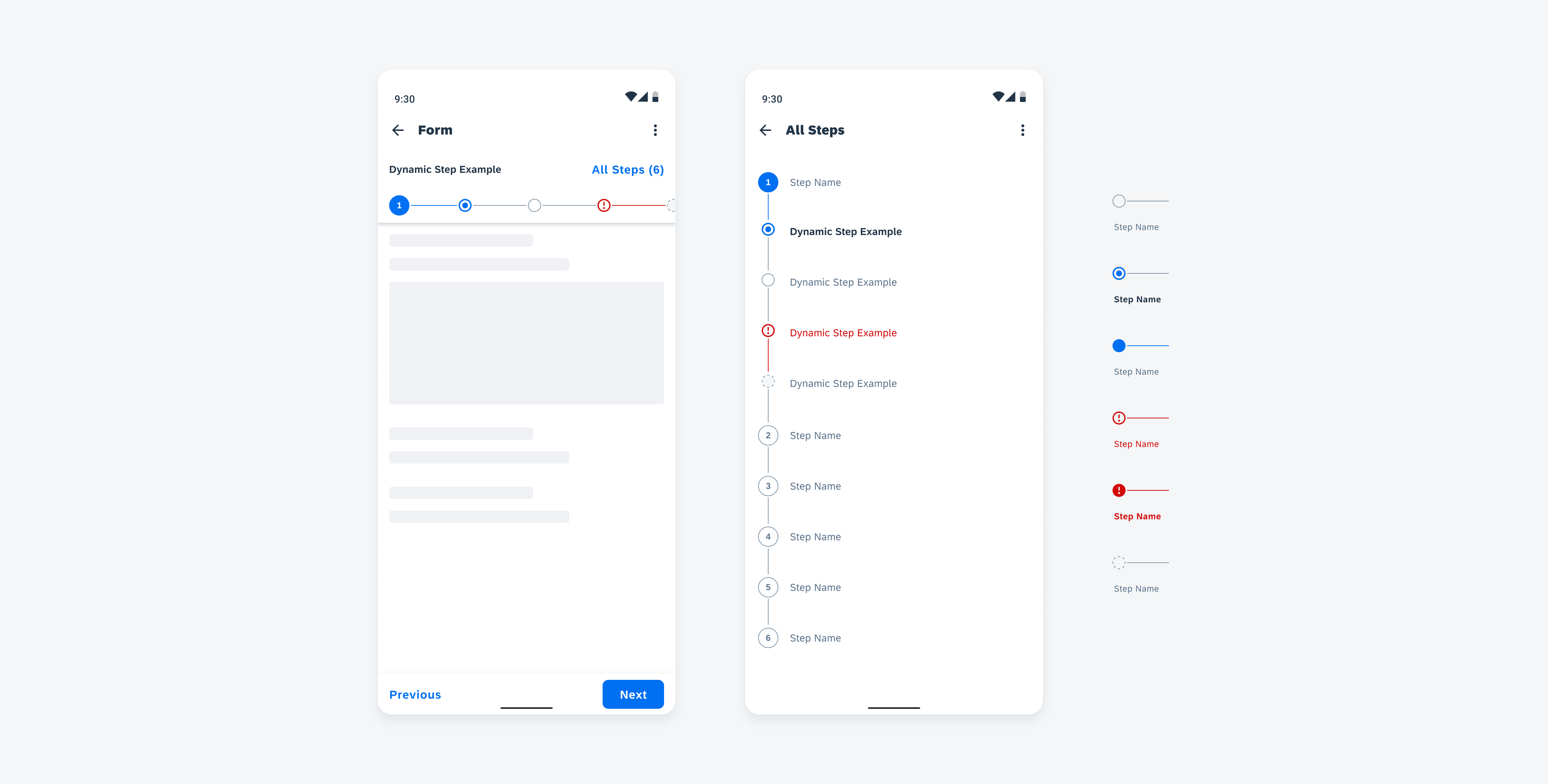
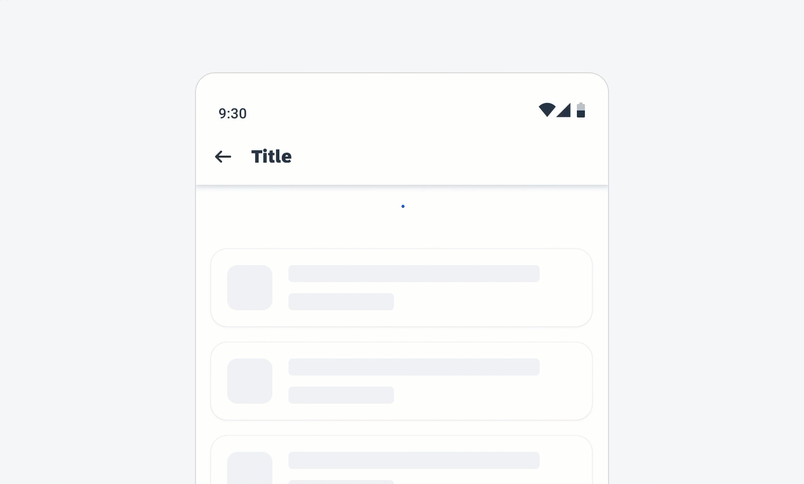
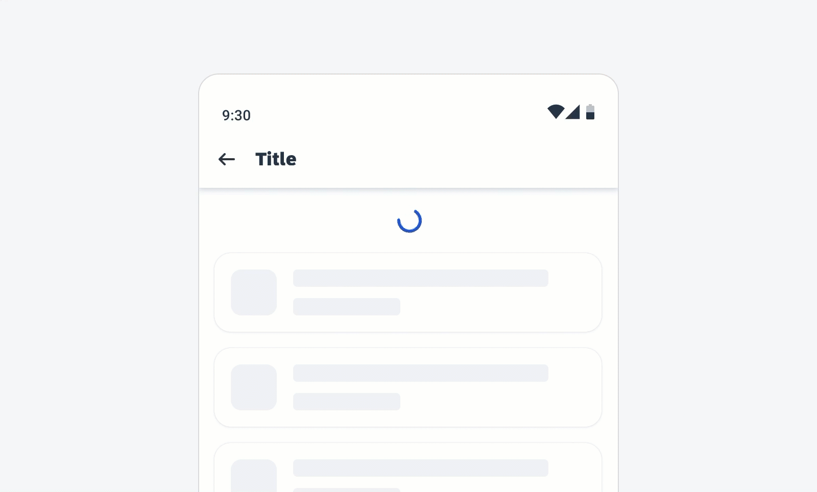
Native File Viewer
The native file viewer is an extension of the attachment control that allows users to view video, audio, and text media, as well as preview file types.
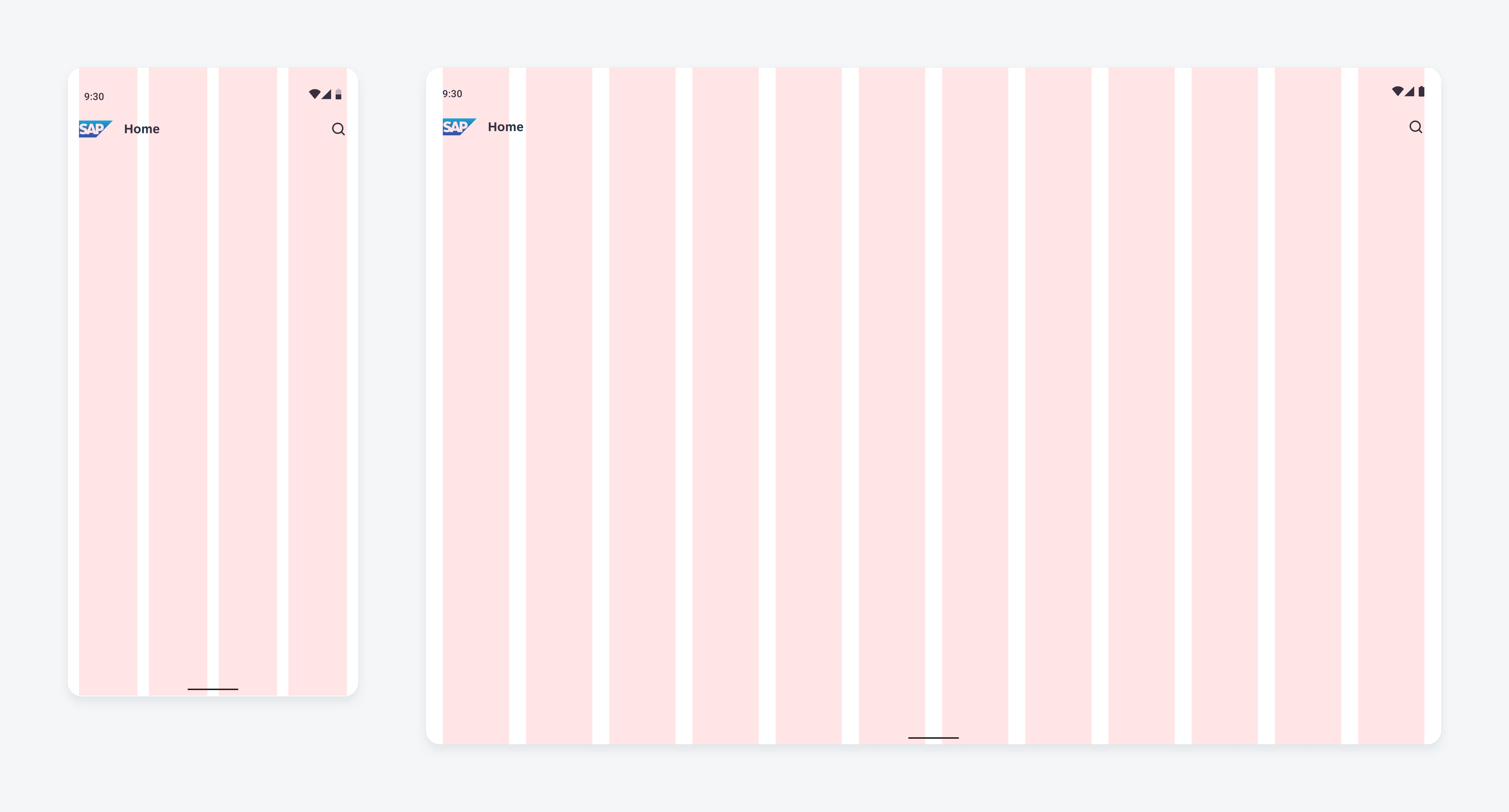
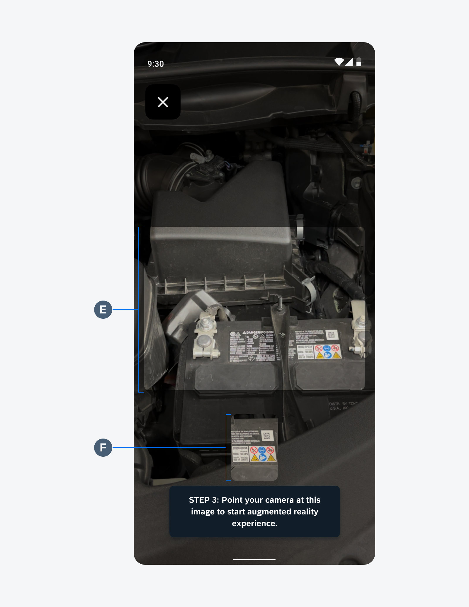
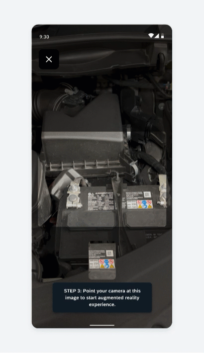
Native file viewer in compact (left) and expanded (right) size classes
Usage
Use the native file viewer to provide a preview of text, video, audio, and text media, as well as preview file types.
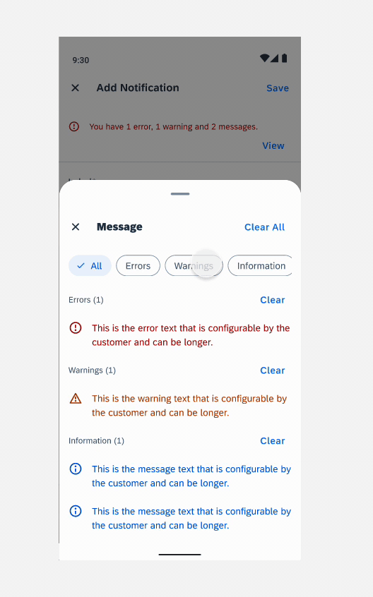
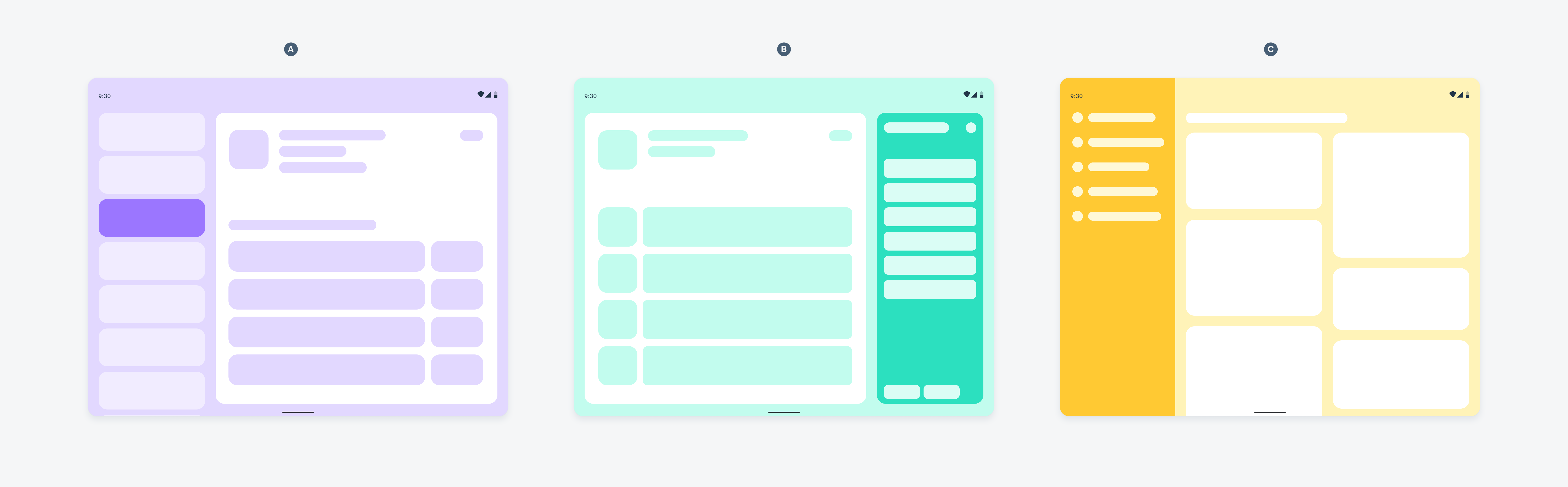
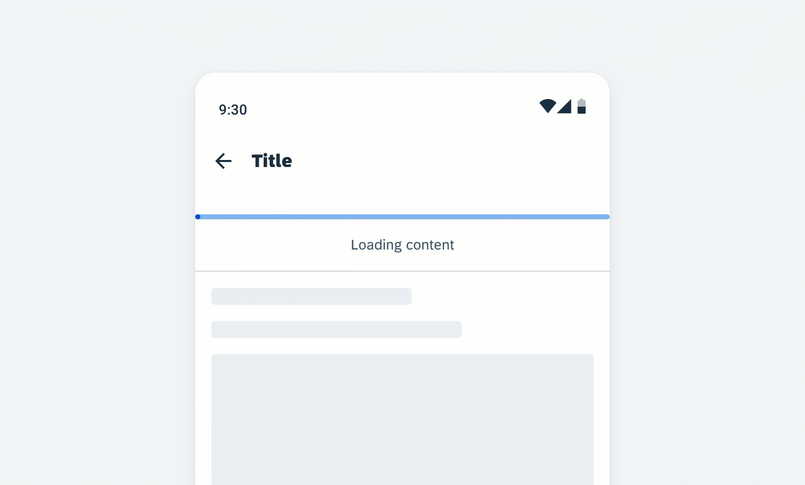
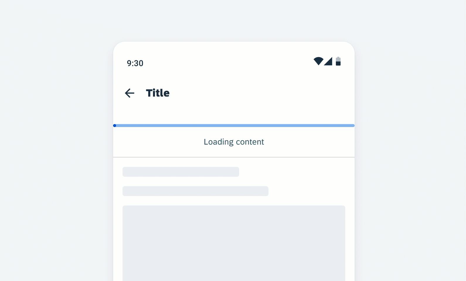
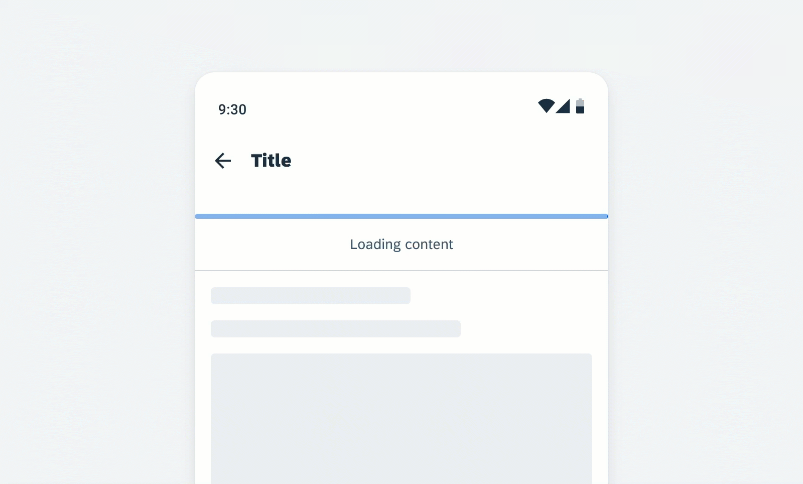
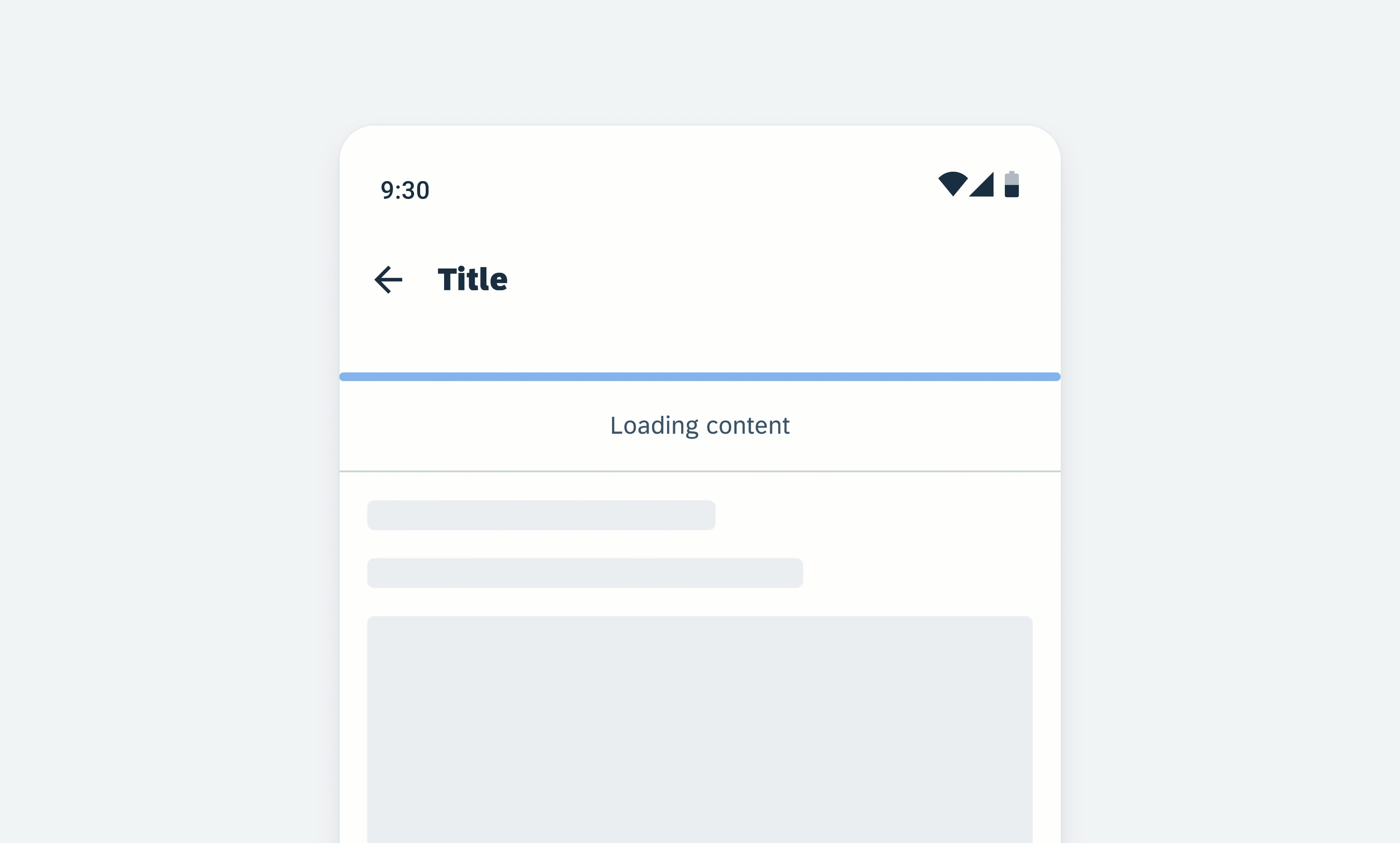
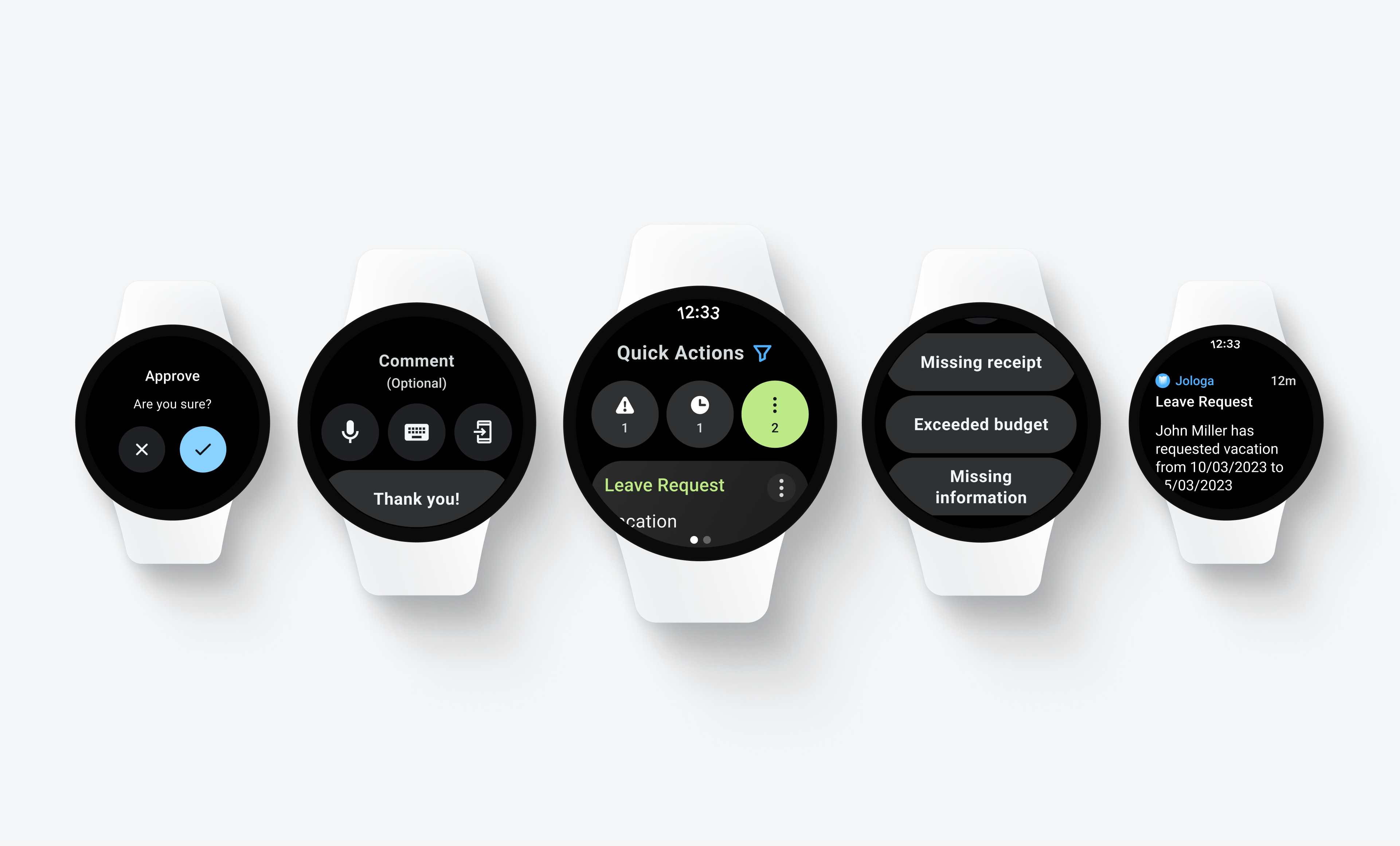
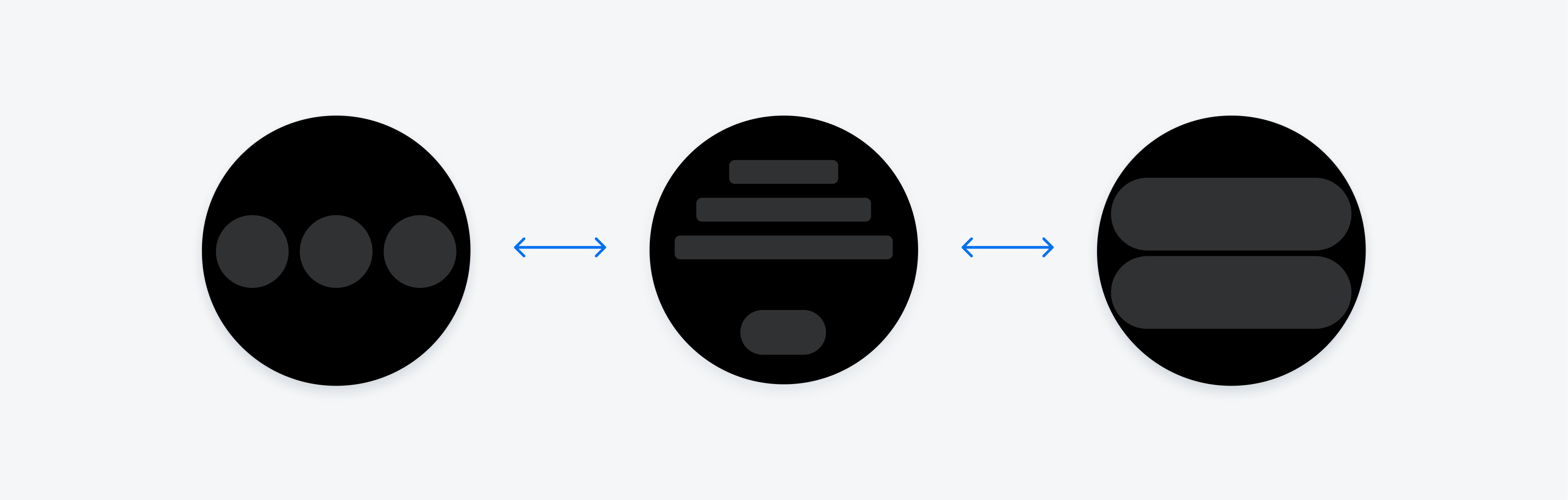
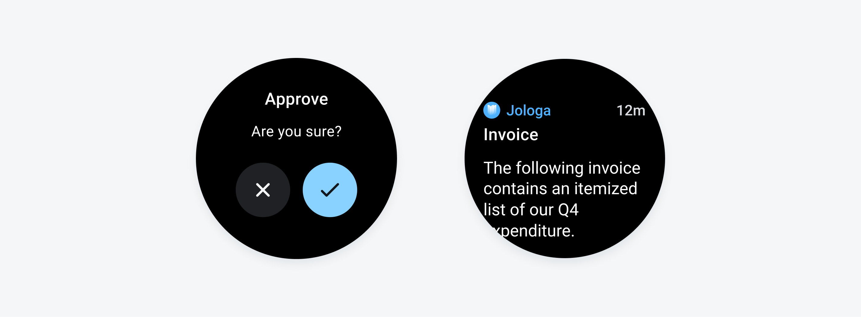
Different file viewer variations
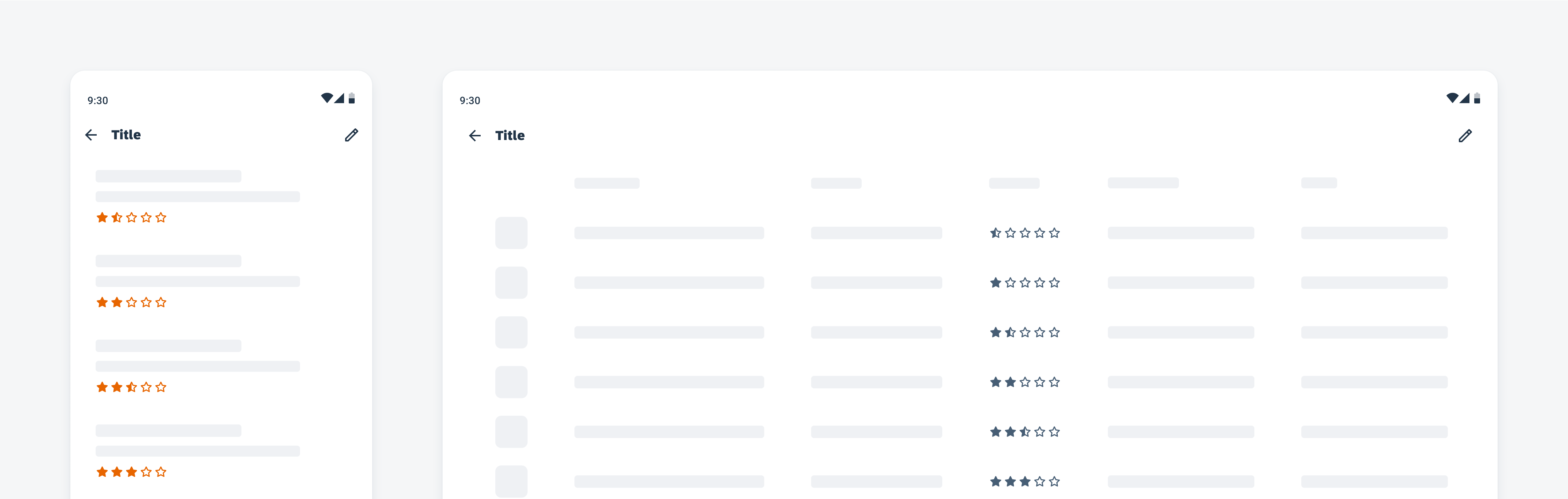
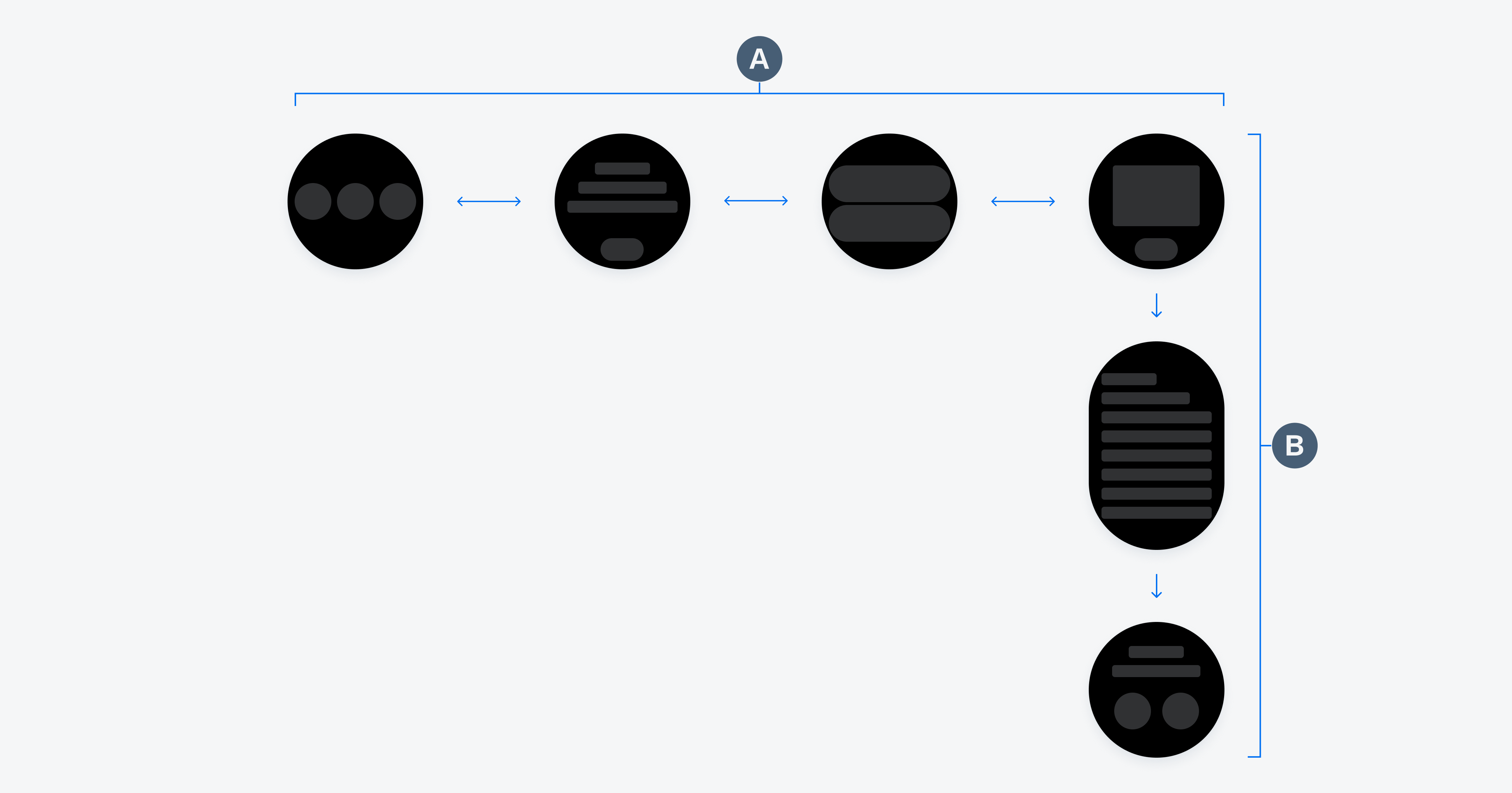
Anatomy
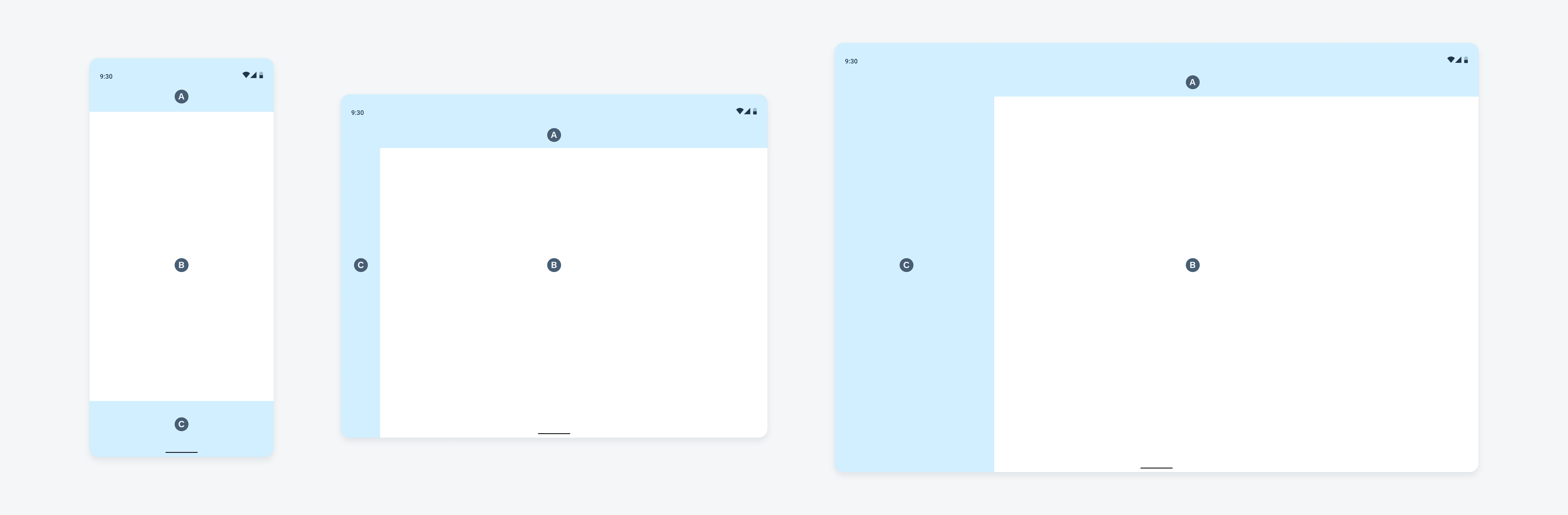
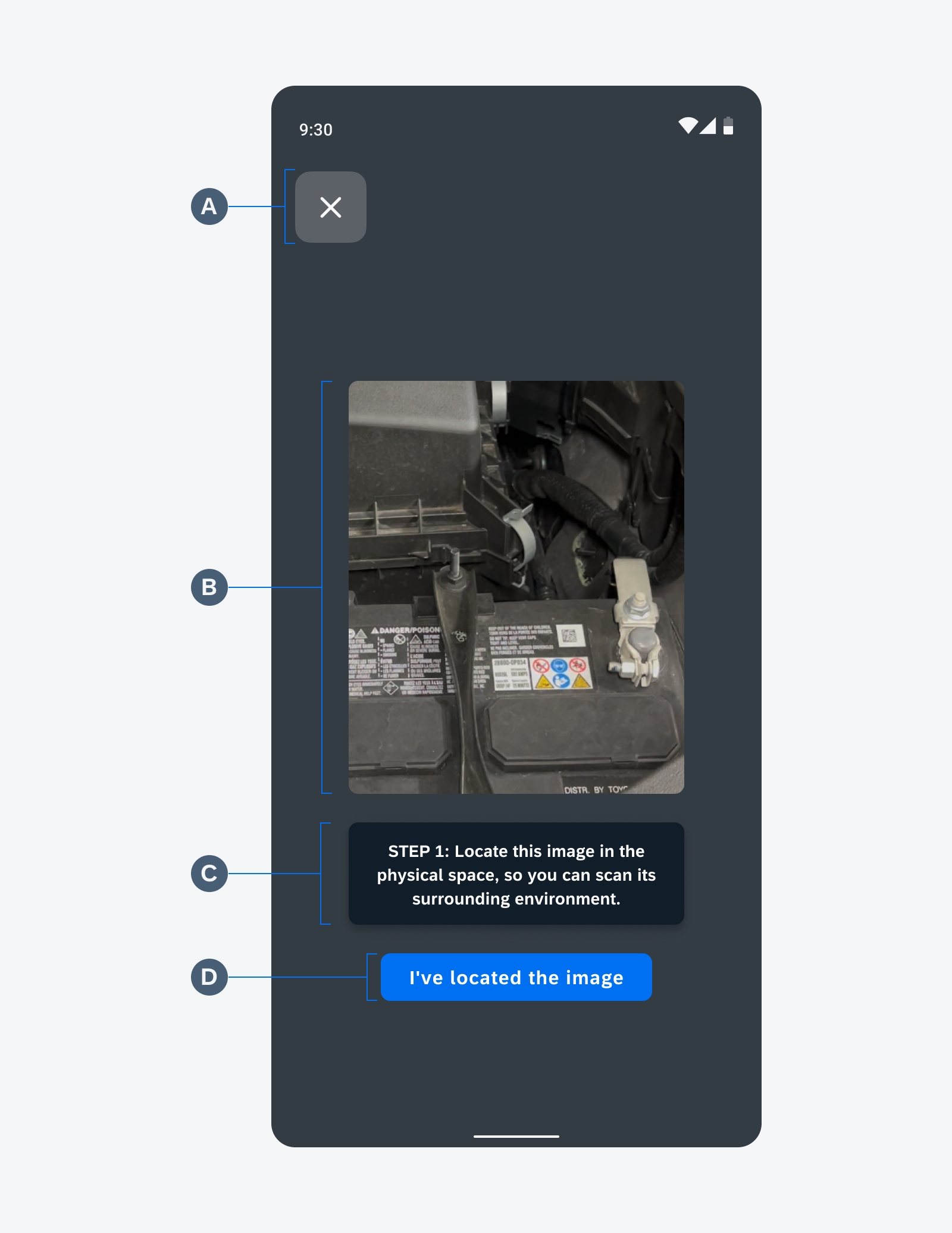
A. App Bar
The native Android app bar allows the user to close the native file viewer.
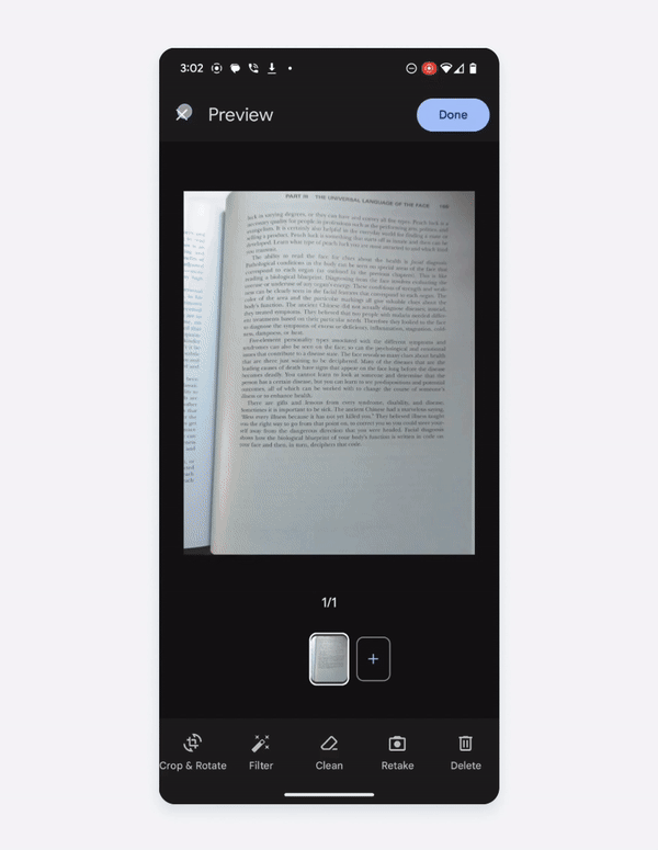
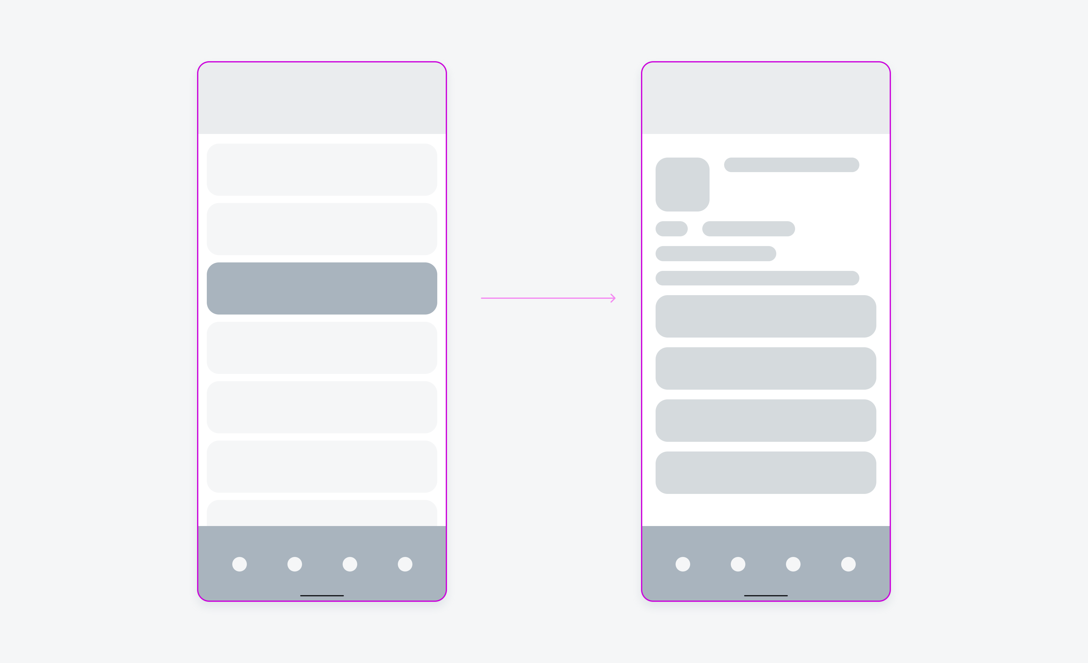
B. Native File Viewer
The file viewer displays a variety of file types such as PDF, ZIP, video, text, and image file types. It allows users to interact and preview the attached file types.
Anatomy of native file viewer
Behavior and Interaction
Tap
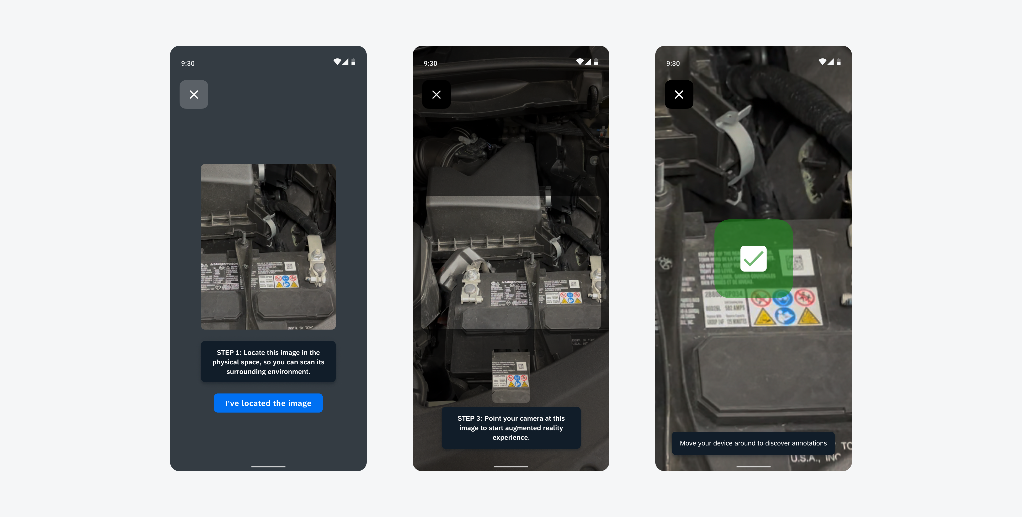
Tapping on the screen hides the navigation bar, which allows the user to view content free of distractions.
Tap behavior on text PDF viewer
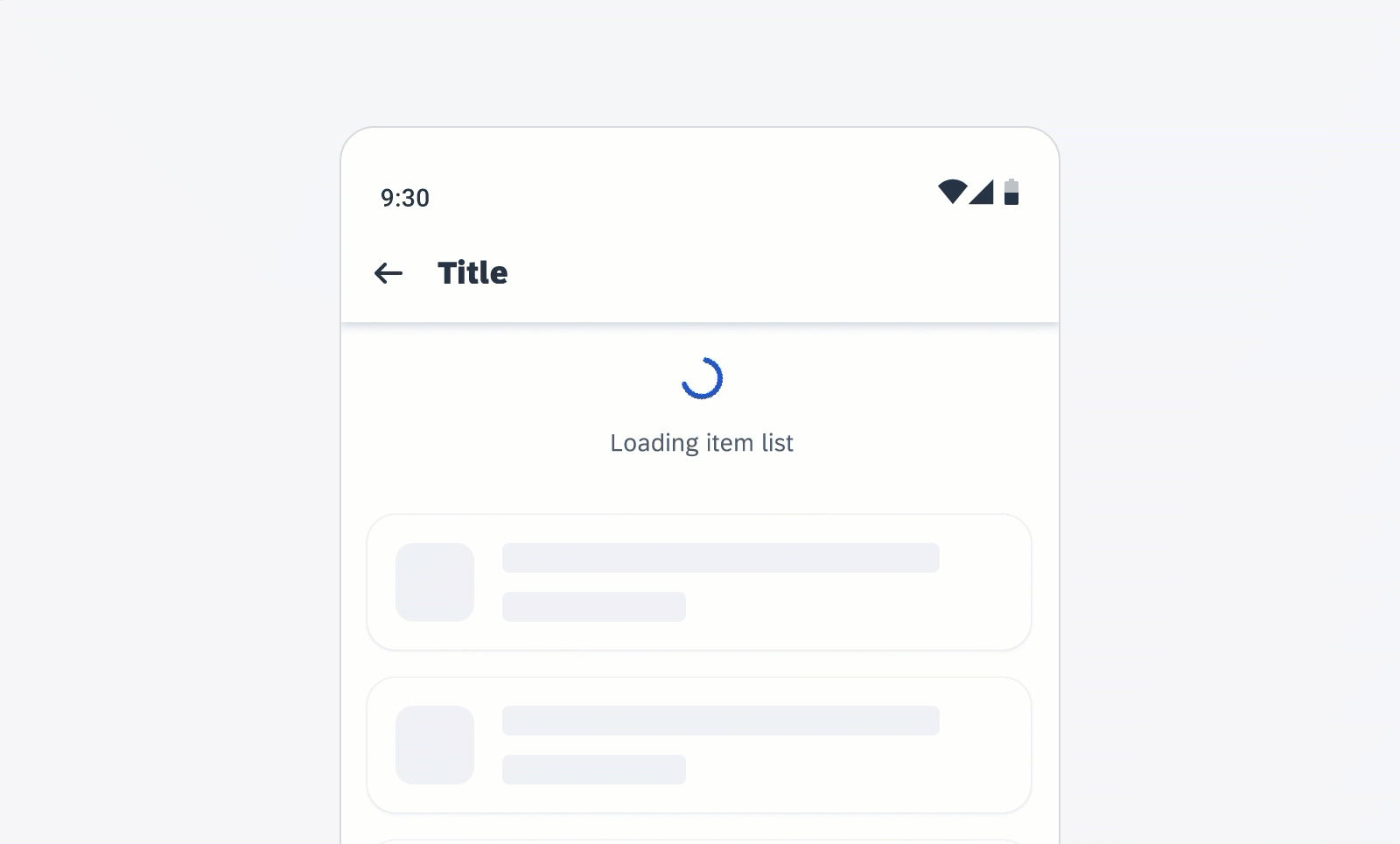
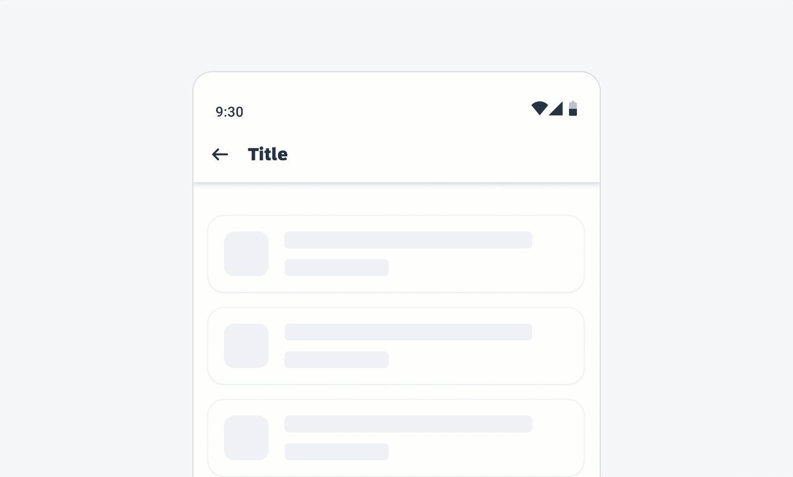
Scrolling
Scrolling is supported for file types whose content can scroll vertically. When the content of a text or PDF file extends beyond the fold, the user can scroll to preview that file’s contents.
Scrolling behavior on PDF file viewer
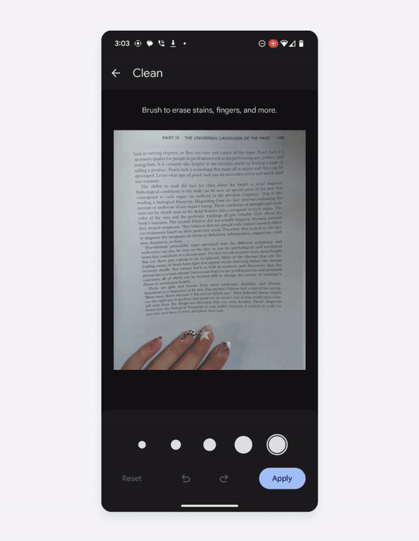
Pinch to Zoom
Pinch to zoom allows users to zoom in and out to further inspect textual or graphical content.
Pinch to zoom on text viewer
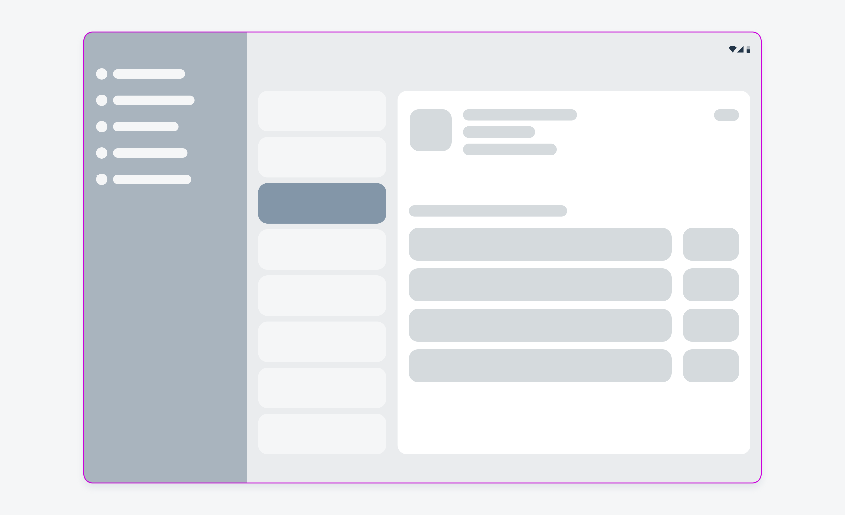
Adaptive Design
Compact & Expanded Screen Sizes
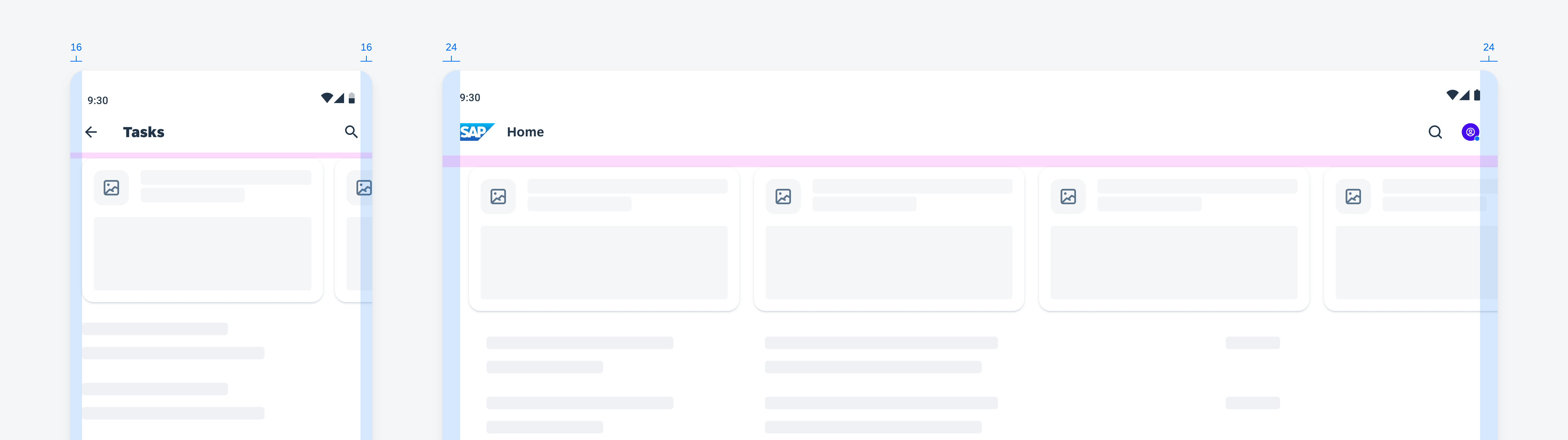
Depending on screen size, the native file viewer scales proportionately to maintain the content’s aspect ratio. On compact and tablet screen sizes, content is displayed in proportion with the overall device size.
Example of compact and expanded text file viewer
Variations
Because the native file viewer displays different file types, the viewer is flexible in how media and content is displayed. The following are the native file viewer variants:
Text Viewer
The text viewer displays textual file types such as .docx, .rtf, and .txt. Text files are displayed edge-to-edge based on the device width. If content exceeds the fold, text will scroll vertically.
Text viewer
Image Viewer
The image viewer displays image file types such as .svg, .jpg, .jpeg, and .png. Images are displayed edge-to-edge based on the device width. Since image media may have different aspect ratios, the video viewer’s aspect ratio is variable depending on the source video’s format.
Image viewer
Video Viewer
The video viewer displays video file types such as .mov, .mp4, and .mpeg. Videos are displayed edge-to-edge based on the device width. Since video media may have different aspect ratios, the video viewer’s aspect ratio is variable depending on the source video file’s dimensions. In addition, a media player toolbar is displayed at the bottom of the page.
Video viewer
Audio Viewer
The audio viewer displays audio file types such as .mp3, .wma, and .wav. Since audio files have no dimensions, the file viewer will display an icon within a container. This container will have a locked aspect ratio of 16:9.
Audio viewer
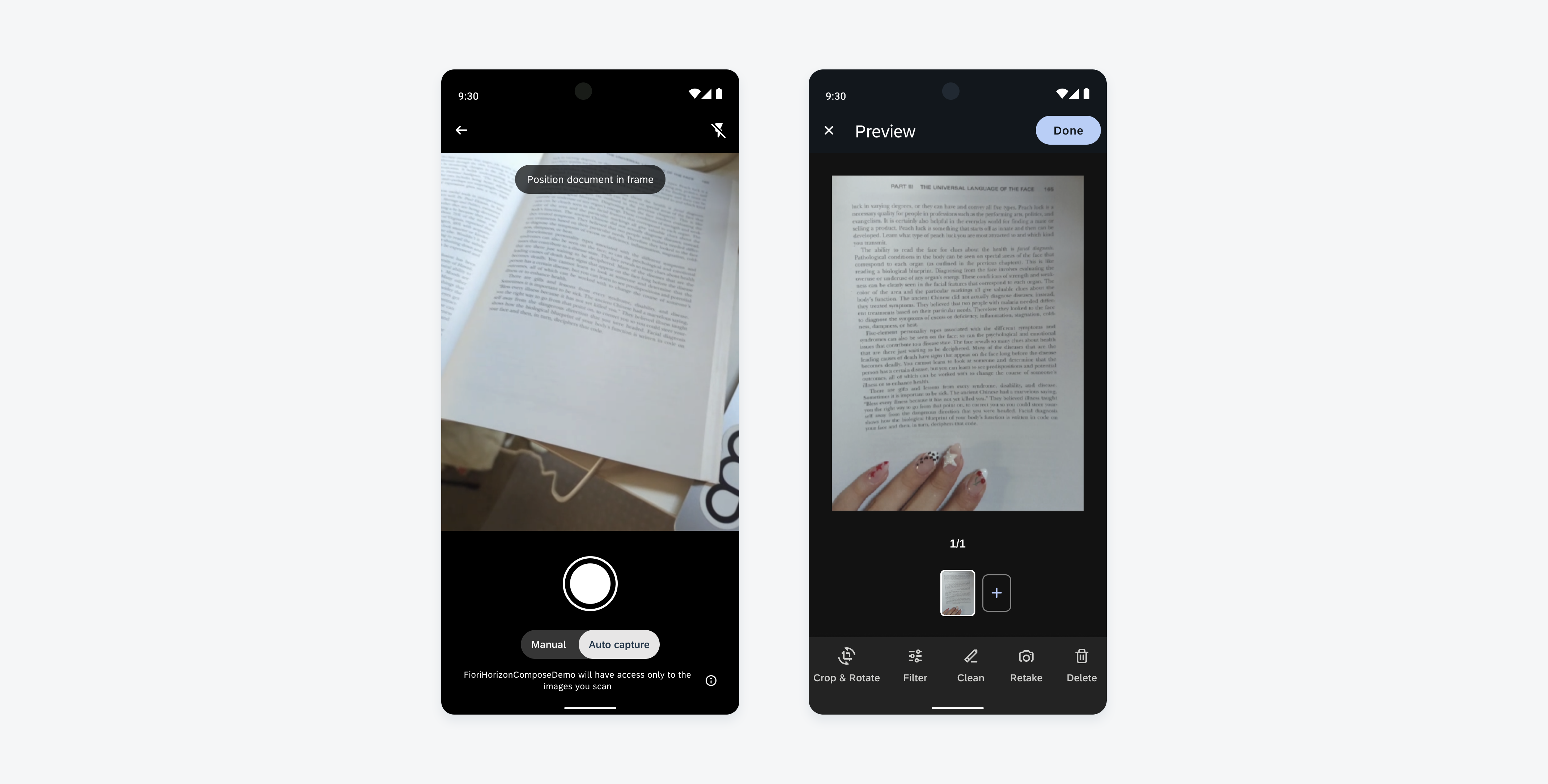
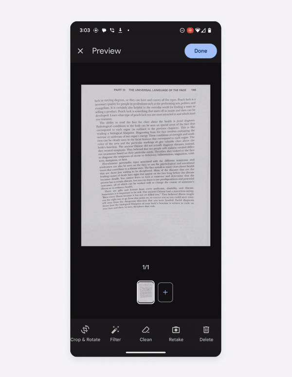
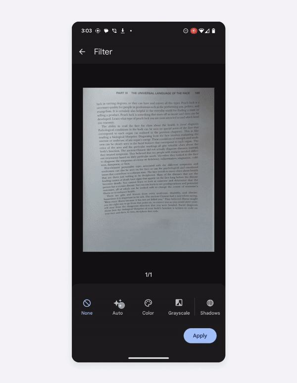
PDF Viewer
The PDF viewer variant is a subset of the text viewer; however, it displays a PDF file type instead. The PDF content is displayed through white canvases against a gray background that mimics the pages within a document.
PDF viewer
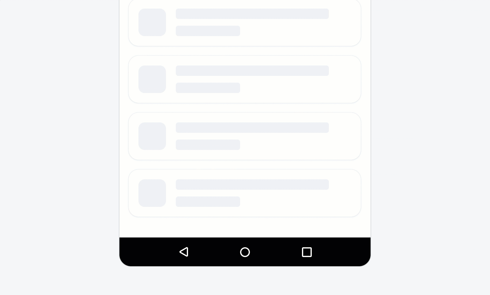
ZIP Viewer
The zip variant is a standalone viewer for ZIP files. When the user opens the ZIP file, the ZIP contents are displayed as a list of files and/or subfolders.


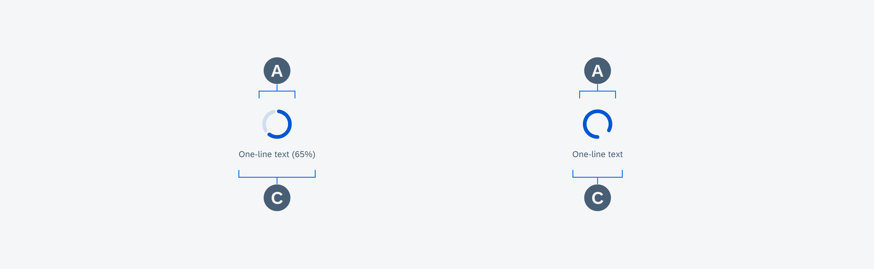
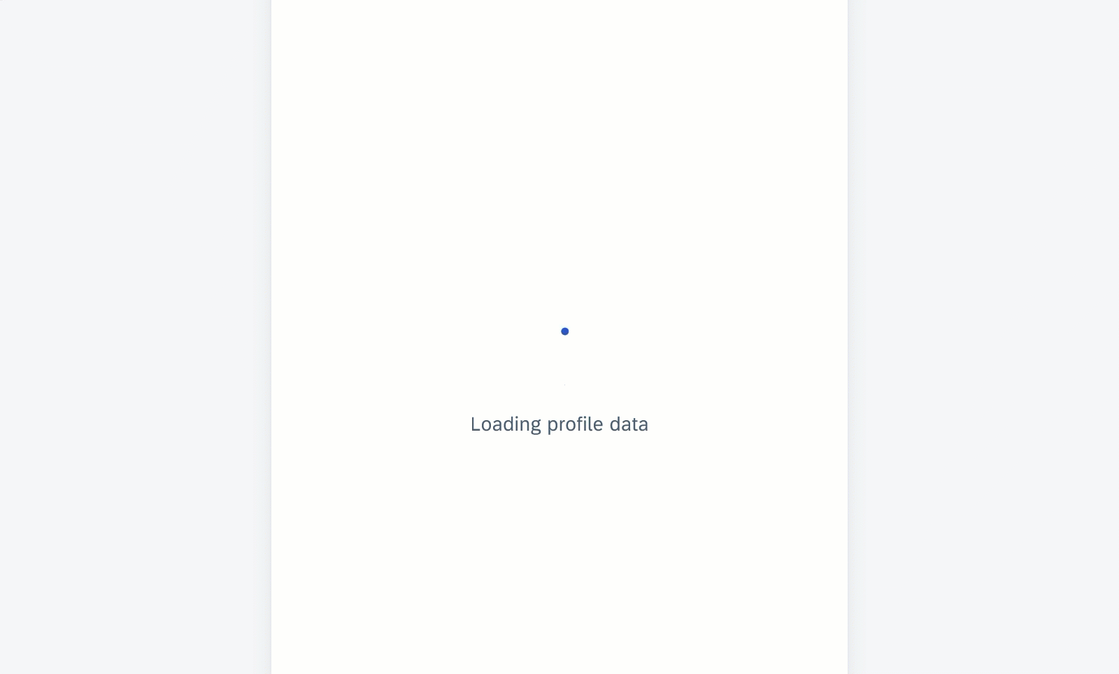


 Your feedback has been sent to the SAP Fiori design team.