Navigation
Intro
Navigating on the watch should be quick and easy. To help users find their way around, it is important to keep the number of taps to complete an action and the overall app hierarchy to a minimum.
Choose a suitable navigation concept for your watch app if it has more than one screen. Hierarchical or page-based navigation are best used for watch apps.

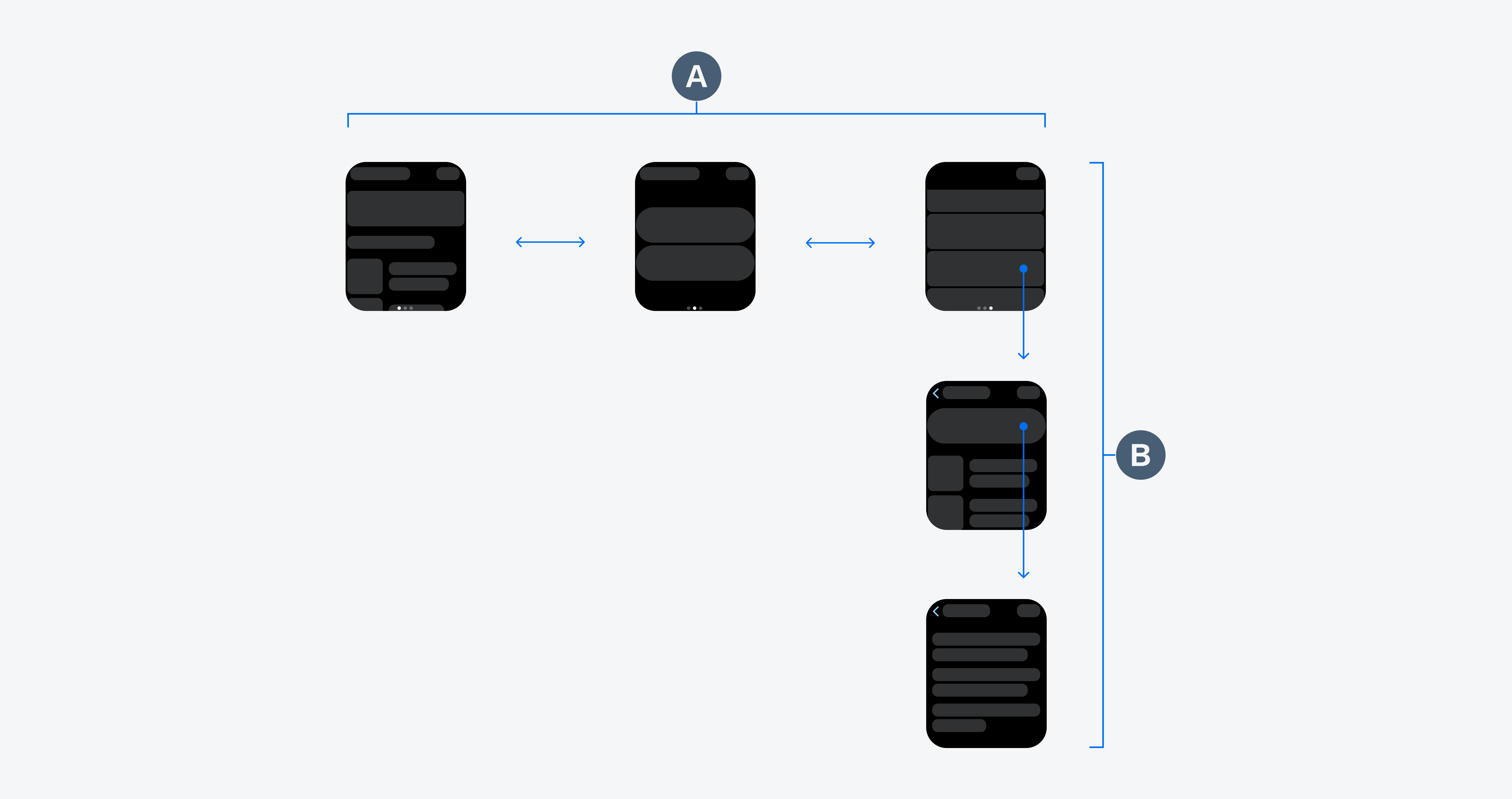
Page-based navigation (A) and hierarchical navigation (B)
Build the navigation of your app hierarchically to ensure clarity for parent-child relationships of pages. In watch apps with hierarchical navigation, the home screen should already provide relevant actions or important information for the user. To access more detailed information about an object, enable users to drill down into available content subcategories by tapping on the object or by tapping on an overflow menu. Try to use no more than two to three hierarchy levels within your watch app.

Hierarchical navigation for accessing more detailed information
Page-based or flat navigation displays a flat collection of information that users can view one by one. Page-based navigation is best used for watch apps that are based around multiple content categories. Users can navigate between the screens by swiping left or right. The page-based navigation pattern does not represent hierarchical or non-sequential page relationships.
The number of available pages should always be visible and can be displayed using a page control. The current page should be visually highlighted with a solid dot.

Page-based navigation for different content categories
SAP Fiori for iOS: Navigation
SAP Fiori for Wear OS: Navigation
Human Interface Guidelines: Explore Navigation Design for iOS, Page Controls

 Your feedback has been sent to the SAP Fiori design team.