
- Version 1.118
- SAPUI5 Version 1.116
- SAPUI5 Version 1.114
- SAPUI5 Version 1.112
- SAPUI5 Version 1.110
- SAPUI5 Version 1.108
- SAPUI5 Version 1.106
- SAPUI5 Version 1.104
- SAPUI5 Version 1.102
- SAPUI5 Version 1.100
- SAPUI5 Version 1.98
- SAPUI5 Version 1.96
- SAPUI5 Version 1.94
- SAPUI5 Version 1.92
- SAPUI5 Version 1.90
- SAPUI5 Version 1.88
- SAPUI5 Version 1.86
- SAPUI5 Version 1.84
- SAPUI5 Version 1.82
- SAPUI5 Version 1.80
- SAPUI5 Version 1.78
- SAPUI5 Version 1.76
- SAPUI5 Version 1.74
- SAPUI5 Version 1.72
- SAPUI5 Version 1.70
- SAPUI5 Version 1.68
- SAPUI5 Version 1.66
- SAPUI5 Version 1.64
- SAPUI5 Version 1.62
- SAPUI5 Version 1.60
- SAPUI5 Version 1.58
- SAPUI5 Version 1.56
- SAPUI5 Version 1.54
- SAPUI5 Version 1.52
- SAPUI5 Version 1.50
- SAPUI5 Version 1.48
- SAPUI5 Version 1.46
- SAPUI5 Version 1.44
- SAPUI5 Version 1.42
- SAPUI5 Version 1.40
- SAPUI5 Version 1.38
- SAPUI5 Version 1.36
- SAPUI5 Version 1.34
- SAPUI5 Version 1.32
- SAPUI5 Version 1.30
- SAPUI5 Version 1.28
- SAPUI5 Version 1.26
- Latest SAPUI5 Version 1.120
- Version 1.118
- SAPUI5 Version 1.116
- SAPUI5 Version 1.114
- SAPUI5 Version 1.112
- SAPUI5 Version 1.110
- SAPUI5 Version 1.108
- SAPUI5 Version 1.106
- SAPUI5 Version 1.104
- SAPUI5 Version 1.102
- SAPUI5 Version 1.100
- SAPUI5 Version 1.98
- SAPUI5 Version 1.96
- SAPUI5 Version 1.94
- SAPUI5 Version 1.92
- SAPUI5 Version 1.90
- SAPUI5 Version 1.88
- SAPUI5 Version 1.86
- SAPUI5 Version 1.84
- SAPUI5 Version 1.82
- SAPUI5 Version 1.80
- SAPUI5 Version 1.78
- SAPUI5 Version 1.76
- SAPUI5 Version 1.74
- SAPUI5 Version 1.72
- SAPUI5 Version 1.70
- SAPUI5 Version 1.68
- SAPUI5 Version 1.66
- SAPUI5 Version 1.64
- SAPUI5 Version 1.62
- SAPUI5 Version 1.60
- SAPUI5 Version 1.58
- SAPUI5 Version 1.56
- SAPUI5 Version 1.54
- SAPUI5 Version 1.52
- SAPUI5 Version 1.50
- SAPUI5 Version 1.48
- SAPUI5 Version 1.46
- SAPUI5 Version 1.44
- SAPUI5 Version 1.42
- SAPUI5 Version 1.40
- SAPUI5 Version 1.38
- SAPUI5 Version 1.36
- SAPUI5 Version 1.34
- SAPUI5 Version 1.32
- SAPUI5 Version 1.30
- SAPUI5 Version 1.28
- SAPUI5 Version 1.26
Carousel
ui5-carousel | v1.0
Intro
The carousel allows users to browse through a set of items by swiping right or left. The component is mostly used for showing a gallery of images, but can hold any other HTML element. It can display a single content element or show several content elements at once. Users can cycle through the content using navigation buttons and the paginator.
Carousel – live example
When to Use
Use the carousel:
- To let users browse through a set of items by paging back and forth.
- To display items sequentially.
- To display items side by side.
Don’t use the carousel:
- If the items you want to display need to be visible at the same time.
-
If the items you want to display are very similar.
Anatomy
1. Container: Holds the content, navigation buttons, and page indicator.
2. Navigation buttons: Allow users to page backward and forward between items. You can place the navigation buttons either in the content area or on each side of the page indicator.
3. Page indicator: Indicates the current page in the sequence. If there are fewer than 9 pages, the page indicator is visualized as a series of dots by default. For more information, see Show/Hide Page Indicator and Page Indicator Style.
4. Content: Can contain any component.
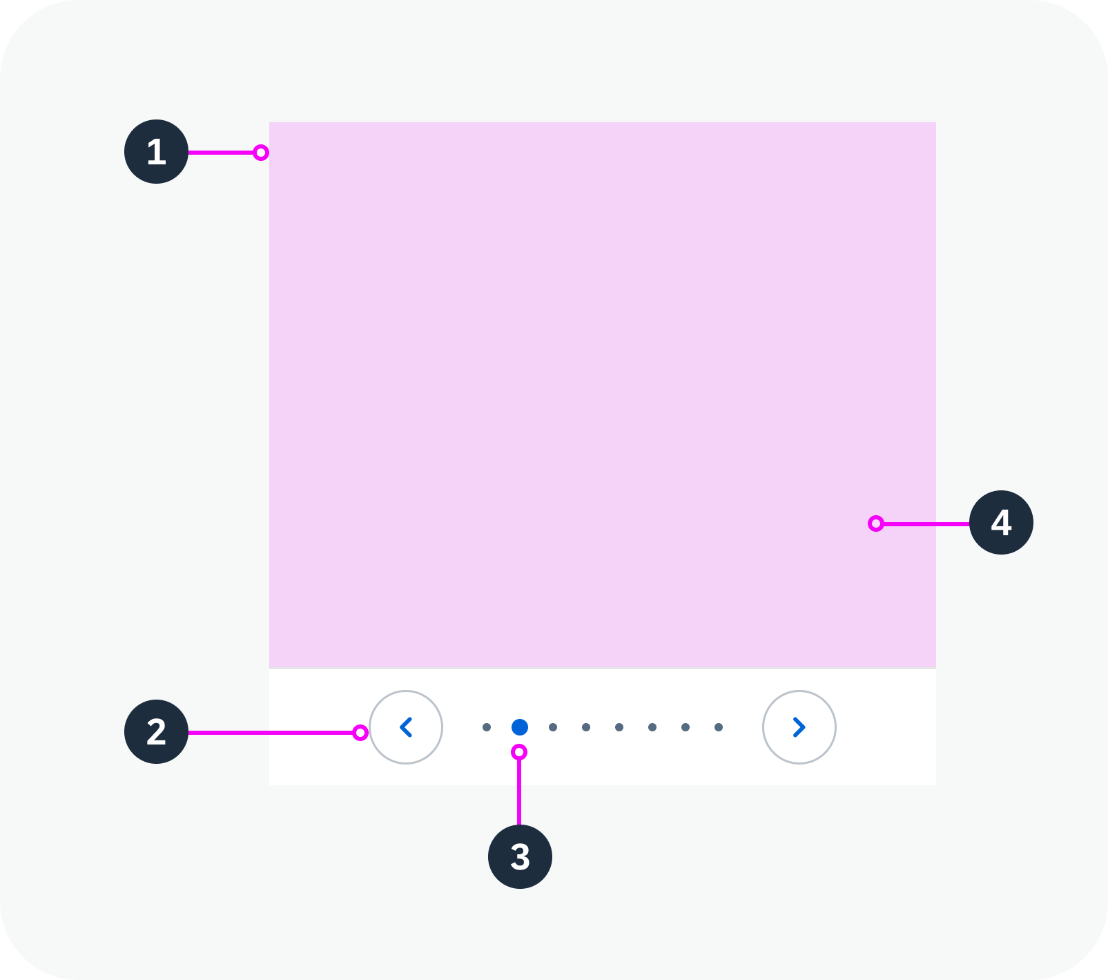
Anatomy of a carousel
Variants
You can adapt the following carousel parameters:
- Position and visibility of the navigation buttons
- Visibility of the page indicator
- Style of the page indicator
- Looping behavior
- Number of items per page
Navigation Buttons
You can configure the navigation buttons in three ways:
- Show in the content area
- Show with the page indicator
- Hide completely
By default, navigation buttons are never shown on touch devices.
In the Content Area
If you place the navigation buttons in the content area, they are initially hidden. They only become visible when the user hovers over the carousel content.
Navigation buttons on top of the content – live example
With the Page Indicator
The navigation buttons appear on each side of the indicator.
Navigation buttons with the page indicator
Hidden
You can opt to hide the navigation buttons on all types of device. In this case, desktop users navigate through the pages using the keyboard.
Hidden navigation buttons
Show/Hide Page Indicator
By default, the page indicator is located below the content. You can also hide it.
Page indicator below the content
Hidden page indicator
Page Indicator Style
You can display the page indicator as a series of dots or numerically.
Dot Style
The page indicator shows a horizontal series of dots, each of which represents a page in the carousel. The dot for the current page is highlighted.
By default, the page indicator uses the dot style if there are fewer than 9 pages.
Page indicator – dot style
Numeric Style
The numeric page indicator shows the current page and the total number of pages (for example, “2 of 4”).
By default, the page indicator switches to the numeric style if there are 9 pages or more.
Page indicator – numeric style
Cyclic
You can set the carousel to loop. Navigating forward on the last page then returns the user to the first page, and vice versa.
Non-cyclic carousel
Cyclic carousel
Multiple Items Per Page
You can display multiple items at once. The page navigation buttons then have the following effect:
- Previous Page: The previous item slides into view on the left. The right-most item slides out of view on the right.
- Next Page: The next item slides into view on the right. The left-most item slides out of view on the left.
Carousel with multiple items per page – live example
Behavior and Interaction
Click
Carousel – live example
Hover
If navigation arrows are placed in the content area: When the user hovers over the page, the navigation buttons appear.
Navigation in the content area – navigation buttons appear on hover – live example
Touch Enablement
On touch devices, the carousel component makes use of the swipe gesture to page through the items. The navigation buttons are not displayed on touch devices.
Responsive Behavior
Responsive Behaviour
- If the width and height of the carousel is set to 100% (default), the component content area is adjusted automatically, depending on the amount of space available.
- On touch devices, swipe gestures are used to navigate through the pages.
- The paging indicator wraps if it is too long to fit onto one line.
Content Density
The content inside the carousel can appear in two different sizes:
- The cozy size uses component dimensions large enough to enable fingertip interaction. This factor is ideal for devices operated by touch.
- The compact size reduces the component dimensions, allowing more information to be displayed on the UI. This factor is ideal for devices operated by mouse and keyboard.
The page indicator (when activated) shows on all form factors.
Carousel in compact mode
Carousel in cozy mode
Globalization and Localization
When using the carousel, bear in mind that it may be used with languages that read and write from right to left.
The arrow navigation and looping behavior (if activated) adapt accordingly.
 Your feedback has been sent to the SAP Fiori design team.