
- SAPUI5 Version 1.122
- SAPUI5 Version 1.120
- SAPUI5 Version 1.118
- SAPUI5 Version 1.116
- SAPUI5 Version 1.114
- SAPUI5 Version 1.112
- SAPUI5 Version 1.110
- SAPUI5 Version 1.108
- SAPUI5 Version 1.106
- SAPUI5 Version 1.104
- SAPUI5 Version 1.102
- SAPUI5 Version 1.100
- SAPUI5 Version 1.98
- SAPUI5 Version 1.96
- SAPUI5 Version 1.94
- SAPUI5 Version 1.92
- SAPUI5 Version 1.90
- SAPUI5 Version 1.88
- SAPUI5 Version 1.86
- SAPUI5 Version 1.84
- SAPUI5 Version 1.82
- SAPUI5 Version 1.80
- SAPUI5 Version 1.78
- SAPUI5 Version 1.76
- SAPUI5 Version 1.74
- SAPUI5 Version 1.72
- SAPUI5 Version 1.70
- SAPUI5 Version 1.68
- SAPUI5 Version 1.66
- SAPUI5 Version 1.64
- SAPUI5 Version 1.62
- SAPUI5 Version 1.60
- SAPUI5 Version 1.58
- SAPUI5 Version 1.56
- SAPUI5 Version 1.54
- SAPUI5 Version 1.52
- SAPUI5 Version 1.50
- SAPUI5 Version 1.48
- SAPUI5 Version 1.46
- SAPUI5 Version 1.44
- SAPUI5 Version 1.42
- SAPUI5 Version 1.40
- SAPUI5 Version 1.38
- SAPUI5 Version 1.36
- SAPUI5 Version 1.34
- SAPUI5 Version 1.32
- SAPUI5 Version 1.30
- SAPUI5 Version 1.28
- SAPUI5 Version 1.26
- Latest SAPUI Version 1.124
- SAPUI5 Version 1.122
- SAPUI5 Version 1.120
- SAPUI5 Version 1.118
- SAPUI5 Version 1.116
- SAPUI5 Version 1.114
- SAPUI5 Version 1.112
- SAPUI5 Version 1.110
- SAPUI5 Version 1.108
- SAPUI5 Version 1.106
- SAPUI5 Version 1.104
- SAPUI5 Version 1.102
- SAPUI5 Version 1.100
- SAPUI5 Version 1.98
- SAPUI5 Version 1.96
- SAPUI5 Version 1.94
- SAPUI5 Version 1.92
- SAPUI5 Version 1.90
- SAPUI5 Version 1.88
- SAPUI5 Version 1.86
- SAPUI5 Version 1.84
- SAPUI5 Version 1.82
- SAPUI5 Version 1.80
- SAPUI5 Version 1.78
- SAPUI5 Version 1.76
- SAPUI5 Version 1.74
- SAPUI5 Version 1.72
- SAPUI5 Version 1.70
- SAPUI5 Version 1.68
- SAPUI5 Version 1.66
- SAPUI5 Version 1.64
- SAPUI5 Version 1.62
- SAPUI5 Version 1.60
- SAPUI5 Version 1.58
- SAPUI5 Version 1.56
- SAPUI5 Version 1.54
- SAPUI5 Version 1.52
- SAPUI5 Version 1.50
- SAPUI5 Version 1.48
- SAPUI5 Version 1.46
- SAPUI5 Version 1.44
- SAPUI5 Version 1.42
- SAPUI5 Version 1.40
- SAPUI5 Version 1.38
- SAPUI5 Version 1.36
- SAPUI5 Version 1.34
- SAPUI5 Version 1.32
- SAPUI5 Version 1.30
- SAPUI5 Version 1.28
- SAPUI5 Version 1.26
Panel
ui5-panel | v1.0
Intro
The panel is a responsive container for grouping and displaying information. You can use it to structure content on a page. To save space, you can make the content area collapsible.
Expandable panel – live example
When to Use
Use the panel:
- To group information.
- To give users the option of hiding this information.
- To show additional information on demand.
Don’t:
- Nest panels.
- Stack too many panels on one page.
Anatomy
- Header area: By default, the header is clickable and can be used to toggle between the expanded and collapsed state.
-
- Icon: Used to expand and collapse the content area. The icon rotates when the panel is expanded (arrow points down) or collapsed (arrow points right).
Note: If the panel is fixed, no icon is shown.
- Icon: Used to expand and collapse the content area. The icon rotates when the panel is expanded (arrow points down) or collapsed (arrow points right).
-
- Title: Title bar with a header text or custom header.
-
- Custom header (optional): Title, buttons or any other HTML elements.
- Content area: The content area can contain any component or set of components.
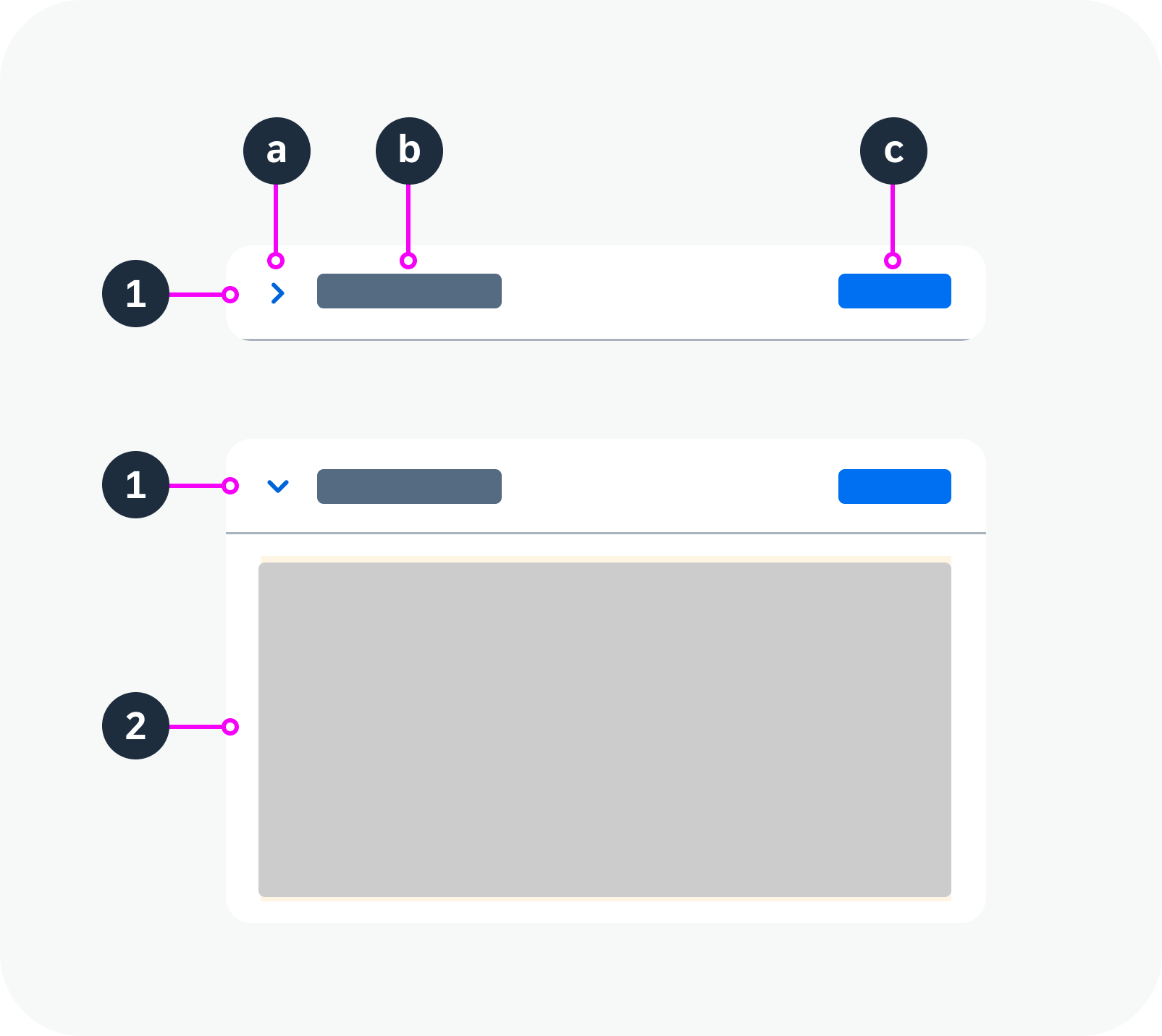
Anatomy of a panel
Variants
Standard Panel
By default, the panel is expandable.
Clicking anywhere on the title bar expands or collapses the content area.
Panel with list – live example
Panel with Custom Header
Use this variant if you want to add actions to the panel header.
If a panel has a custom header, the arrow icon must be used to expand and collapse the panel. Clicking on other parts of the header has no effect on the expand/collapse behavior.
Panel with custom header – live example
Fixed Panel
Use this variant if you want the content to be visible at all times.
Fixed panel – live example
Behavior and Interaction
See the variants for the standard panel and panel with custom header.
Responsive Behavior
If the width of the panel is set to 100% (default), the panel and its contents are resized responsively, depending on its parent container.
If the panel has a fixed height, it will take up the designated space even if the panel is collapsed.
Truncation
When the space for the header title is not enough, the title truncates. The content wraps.
 Your feedback has been sent to the SAP Fiori design team.