
- Version 1.118
- SAPUI5 Version 1.116
- SAPUI5 Version 1.114
- SAPUI5 Version 1.112
- SAPUI5 Version 1.110
- SAPUI5 Version 1.108
- SAPUI5 Version 1.106
- SAPUI5 Version 1.104
- SAPUI5 Version 1.102
- SAPUI5 Version 1.100
- SAPUI5 Version 1.98
- SAPUI5 Version 1.96
- SAPUI5 Version 1.94
- SAPUI5 Version 1.92
- SAPUI5 Version 1.90
- SAPUI5 Version 1.88
- SAPUI5 Version 1.86
- SAPUI5 Version 1.84
- SAPUI5 Version 1.82
- SAPUI5 Version 1.80
- SAPUI5 Version 1.78
- SAPUI5 Version 1.76
- SAPUI5 Version 1.74
- SAPUI5 Version 1.72
- SAPUI5 Version 1.70
- SAPUI5 Version 1.68
- SAPUI5 Version 1.66
- SAPUI5 Version 1.64
- SAPUI5 Version 1.62
- SAPUI5 Version 1.60
- SAPUI5 Version 1.58
- SAPUI5 Version 1.56
- SAPUI5 Version 1.54
- SAPUI5 Version 1.52
- SAPUI5 Version 1.50
- SAPUI5 Version 1.48
- SAPUI5 Version 1.46
- SAPUI5 Version 1.44
- SAPUI5 Version 1.42
- SAPUI5 Version 1.40
- SAPUI5 Version 1.38
- SAPUI5 Version 1.36
- SAPUI5 Version 1.34
- SAPUI5 Version 1.32
- SAPUI5 Version 1.30
- SAPUI5 Version 1.28
- SAPUI5 Version 1.26
- Latest SAPUI5 Version 1.120
- Version 1.118
- SAPUI5 Version 1.116
- SAPUI5 Version 1.114
- SAPUI5 Version 1.112
- SAPUI5 Version 1.110
- SAPUI5 Version 1.108
- SAPUI5 Version 1.106
- SAPUI5 Version 1.104
- SAPUI5 Version 1.102
- SAPUI5 Version 1.100
- SAPUI5 Version 1.98
- SAPUI5 Version 1.96
- SAPUI5 Version 1.94
- SAPUI5 Version 1.92
- SAPUI5 Version 1.90
- SAPUI5 Version 1.88
- SAPUI5 Version 1.86
- SAPUI5 Version 1.84
- SAPUI5 Version 1.82
- SAPUI5 Version 1.80
- SAPUI5 Version 1.78
- SAPUI5 Version 1.76
- SAPUI5 Version 1.74
- SAPUI5 Version 1.72
- SAPUI5 Version 1.70
- SAPUI5 Version 1.68
- SAPUI5 Version 1.66
- SAPUI5 Version 1.64
- SAPUI5 Version 1.62
- SAPUI5 Version 1.60
- SAPUI5 Version 1.58
- SAPUI5 Version 1.56
- SAPUI5 Version 1.54
- SAPUI5 Version 1.52
- SAPUI5 Version 1.50
- SAPUI5 Version 1.48
- SAPUI5 Version 1.46
- SAPUI5 Version 1.44
- SAPUI5 Version 1.42
- SAPUI5 Version 1.40
- SAPUI5 Version 1.38
- SAPUI5 Version 1.36
- SAPUI5 Version 1.34
- SAPUI5 Version 1.32
- SAPUI5 Version 1.30
- SAPUI5 Version 1.28
- SAPUI5 Version 1.26
List
ui5-list | v1.0
Intro
You can use the list component to display different types of list item. Each list item can include an image, text, icon, or other HTML content. List items can also be grouped.
The list component comes with built-in selection and deletion modes, as well as configurable separators.
List – live example
When to Use
Anatomy
List
- Header: The first item of the list serves as a header. The header contains the title of the list.
- Footer: If the footer element is used, the footer is the last item in the list.
- Separator: The list item separators are customizable.
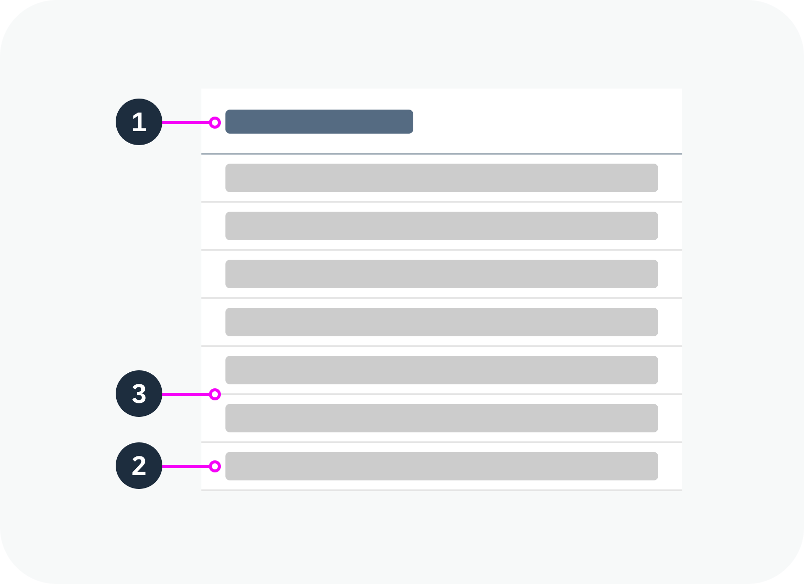
Anatomy of a list
Standard List Item
The standard list item is the simplest type of list item. It provides elements for the most common use cases, such as image, text, and icon.
- Image
- Text
- Icon / additional text:
a. Icon: You can use theiconEndproperty to place an icon at the end of an item.
b. Additional text: You can use theadditionalTextproperty to display an additional text at the end of a row. TheadditionalTextStateproperty applies a semantic state to this text.
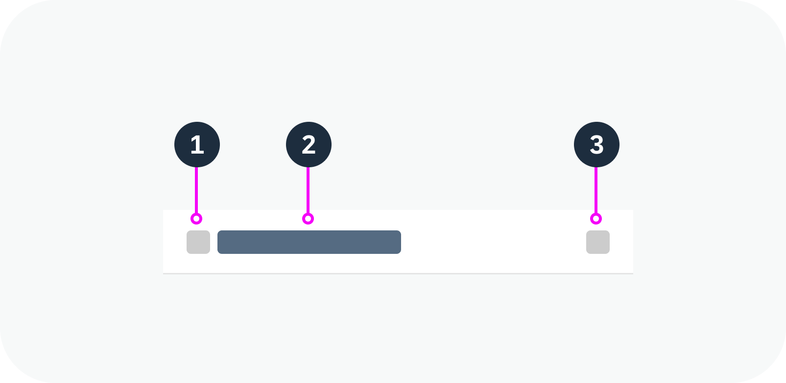
Anatomy of a standard list item
Custom List Item
You can use the custom list item component within the list in the same way as a standard list item. The custom list item component accepts arbitrary HTML content to allow full customization.
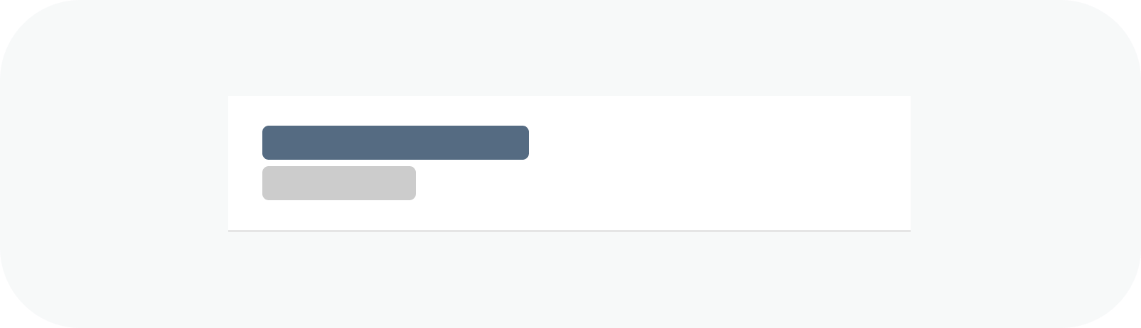
Anatomy of a custom list item
Group Header List Item
The group header list item is a special list item, used only to separate other list items into logical groups.
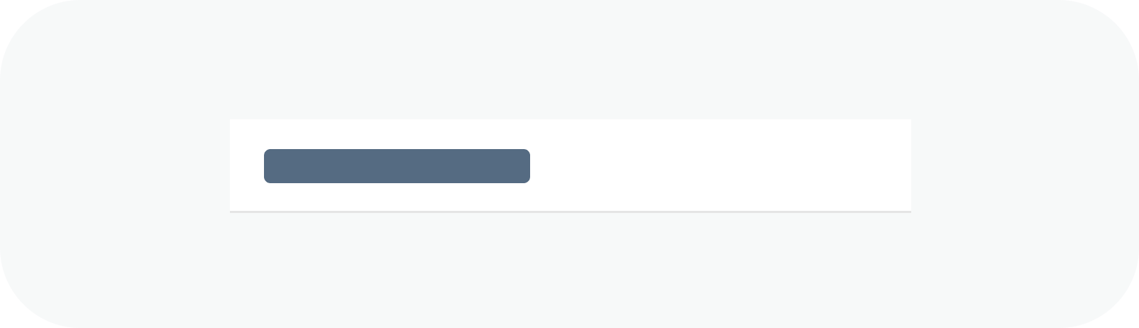
Anatomy of a group header list item
Variants
The following list variants are available to support different use cases:
Standard List
Use this variant as a starting point.
Standard list – live example
Growing List (Scroll)
Use this variant if there are too many list items to show in the visible space. You can display a More button or let the user scroll within the list to show more items. By default, growing is switched off.
Growing list with scrollbar – live example
List with Image Content
You can use the imageContent slot to add an image or avatar to the item.
List items using the image content slot to display avatars
List Item Separators
By default, horizontal separators are displayed between all list items. Alternatively, you can remove all separators, only show separators between items (inner separators).
List item separation types
List with Group Headers
Use this variant if you want to group items in the list.
List with group headers
Single Selection Mode
Allows users to select only one item at a time.
Single selection mode – live example
Multiple Selection Mode
Allows users select more than one item at once using the checkboxes on the left.
Multiple selection mode – live example
Delete Mode
Use this variant to show an icon for deleting or removing an item.
Delete mode with ‘X’ icon – live example
Busy List
Use this variant to indicate that the list is fetching data.
Busy list – live example
List with No Data
Use this variant to show a text when the list is empty.
List with no data
Behavior and Interaction
See the examples for the following variants:
Responsive Behavior
Wrapping and Truncation
By default, texts in a list item are truncated if there isn’t enough space.
 Your feedback has been sent to the SAP Fiori design team.