
- SAPUI5 Version 1.122
- SAPUI5 Version 1.120
- SAPUI5 Version 1.118
- SAPUI5 Version 1.116
- SAPUI5 Version 1.114
- SAPUI5 Version 1.112
- SAPUI5 Version 1.110
- SAPUI5 Version 1.108
- SAPUI5 Version 1.106
- SAPUI5 Version 1.104
- SAPUI5 Version 1.102
- SAPUI5 Version 1.100
- SAPUI5 Version 1.98
- SAPUI5 Version 1.96
- SAPUI5 Version 1.94
- SAPUI5 Version 1.92
- SAPUI5 Version 1.90
- SAPUI5 Version 1.88
- SAPUI5 Version 1.86
- SAPUI5 Version 1.84
- SAPUI5 Version 1.82
- SAPUI5 Version 1.80
- SAPUI5 Version 1.78
- SAPUI5 Version 1.76
- SAPUI5 Version 1.74
- SAPUI5 Version 1.72
- SAPUI5 Version 1.70
- SAPUI5 Version 1.68
- SAPUI5 Version 1.66
- SAPUI5 Version 1.64
- SAPUI5 Version 1.62
- SAPUI5 Version 1.60
- SAPUI5 Version 1.58
- SAPUI5 Version 1.56
- SAPUI5 Version 1.54
- SAPUI5 Version 1.52
- SAPUI5 Version 1.50
- SAPUI5 Version 1.48
- SAPUI5 Version 1.46
- SAPUI5 Version 1.44
- SAPUI5 Version 1.42
- SAPUI5 Version 1.40
- SAPUI5 Version 1.38
- SAPUI5 Version 1.36
- SAPUI5 Version 1.34
- SAPUI5 Version 1.32
- SAPUI5 Version 1.30
- SAPUI5 Version 1.28
- SAPUI5 Version 1.26
- Latest SAPUI Version 1.124
- SAPUI5 Version 1.122
- SAPUI5 Version 1.120
- SAPUI5 Version 1.118
- SAPUI5 Version 1.116
- SAPUI5 Version 1.114
- SAPUI5 Version 1.112
- SAPUI5 Version 1.110
- SAPUI5 Version 1.108
- SAPUI5 Version 1.106
- SAPUI5 Version 1.104
- SAPUI5 Version 1.102
- SAPUI5 Version 1.100
- SAPUI5 Version 1.98
- SAPUI5 Version 1.96
- SAPUI5 Version 1.94
- SAPUI5 Version 1.92
- SAPUI5 Version 1.90
- SAPUI5 Version 1.88
- SAPUI5 Version 1.86
- SAPUI5 Version 1.84
- SAPUI5 Version 1.82
- SAPUI5 Version 1.80
- SAPUI5 Version 1.78
- SAPUI5 Version 1.76
- SAPUI5 Version 1.74
- SAPUI5 Version 1.72
- SAPUI5 Version 1.70
- SAPUI5 Version 1.68
- SAPUI5 Version 1.66
- SAPUI5 Version 1.64
- SAPUI5 Version 1.62
- SAPUI5 Version 1.60
- SAPUI5 Version 1.58
- SAPUI5 Version 1.56
- SAPUI5 Version 1.54
- SAPUI5 Version 1.52
- SAPUI5 Version 1.50
- SAPUI5 Version 1.48
- SAPUI5 Version 1.46
- SAPUI5 Version 1.44
- SAPUI5 Version 1.42
- SAPUI5 Version 1.40
- SAPUI5 Version 1.38
- SAPUI5 Version 1.36
- SAPUI5 Version 1.34
- SAPUI5 Version 1.32
- SAPUI5 Version 1.30
- SAPUI5 Version 1.28
- SAPUI5 Version 1.26
Wrapping and Truncation
Intro
Wrapping and truncation define how text behaves when the length of the text exceeds the available space. The responsive behavior is device-independent and is the same on all form factors. Different controls make use of wrapping and/or truncation. This article provides an overview of best practices.
Variants
Wrapping
Wrapping automatically moves text at the end of a line to a new line to keep the text within a preset space. When a word no longer fits at the end of a line, either the whole word shifts down to the next line, or only certain syllables.
Wrapped text in a message strip
Truncation
Truncation shortens a word or text by cutting it off. Excess text is no longer visible. Usually, a truncation indicator appears at the end of the truncated text (…), but this depends on the browser support.
Truncated text in a dialog header
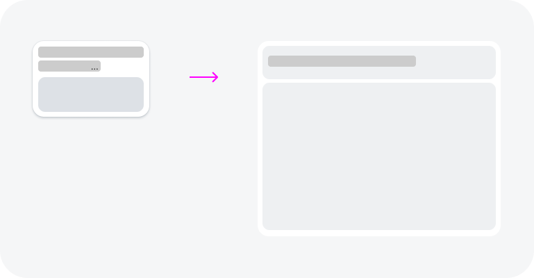
Combination of Wrapping and Truncation
Wrapping and truncation can be combined. For example, a text might wrap over two lines and then truncate.
Card title wraps over 3 lines and then truncates
Usage
Always check the responsive behavior of text, even if the text appears to fit at first glance. Issues often arise when text is translated into another language, or when the text container is resized. Choose the most appropriate text display variant for your use case.
In general, wrapping is the default way to design the responsive behavior of text. Always consider using wrapping unless there are specific requirements otherwise.
Use wrapping if:
- The information is crucial for the user.
- The user is required to read the full text (for example, in consent forms).
- You are uncertain about how important the text is for the user.
- You want to display numbers in a piece of continuous text.
- The text for a list item is crucial for the user.
- You are displaying a label, object status, link, or title. For these components, use a short, precise text.
Use truncation if:
- The component is designed to save vertical space, and only allows one line of text with a limited width (for example, the title of a toolbar).
- The text contains only secondary information. For example, the text in a table cell could use truncation if the corresponding column is resizable or uses a custom display concept to provide an additional interaction.
Use a combination of wrapping and truncation if:
- The text is a teaser or serves as an appetizer for a longer text, such as an article. In this case, you can define the maximum number of lines shown.
- The component is designed to save vertical space, and only allows a limited number of lines, with a limited width (for example, tiles with two lines for the title).
Don’t use wrapping, truncation, or a combination of both if:
- You want to show a standalone numeric value, such as 1,000.00 EUR.
- The text is inside another UI element that is not intended to wrap (such as a button).
Displaying Truncated Text
It is important to provide users with a quick way to see the full text with a single interaction. This can be achieved with the existing interactions for a component, via navigation to a detail view, or by implementing a custom display concept.
Built-In Display Mechanism
The component already has an interaction mechanism that reveals the full text.
Full text is visible in the dropdown list – live example
Display via Detail View
The full text becomes visible once the user navigates to the detail view in the user flow. Typically, the user navigates to a different screen or opens a popover or dialog.
The full card title is visible after navigating to the detail page
Custom Display Concept: Expandable Text
If the component has no built-in mechanism or navigation option to display the full text, implement a custom solution using expandable text.
Expandable text allows the user to display the full text with a single interaction on an additional element, such as a link. The text can be expanded in place or displayed in a separate popover.
Example 1: Expanded text in place (live example)
Clicking the link expands/collapses the text
Example 2: Full text in a popover (live example)
Clicking the link opens/closes a popover with the full text
Usage Overview
| Pattern | Use Case | Guideline |
| Built-in display mechanism | The truncated text is located inside a component for which a built-in display mechanism is available. | This is an automatic display mechanism. No other solution is needed when the full text is readily available via a single interaction within the component. |
| Display via detail view | The truncated text is part of an interactive element, and the full text is available after navigating to the detail view in the user flow. For example, the full text can be viewed on a detail dialog or on a follow-on page. | This optional display mechanism needs to be evaluated by the application team to determine if it sufficiently meets the needs of their users based on specific use cases.
No other solution is required if:
However, consider using an additional custom display concept if:
|
| Custom display concept: expandable text | There is no built-in mechanism or navigation option to display the full text.
or The truncated text is a longer text. |
Allow users to expand the truncated text with a single click on an additional element, such as a text link.
This custom solution must be implemented by the application team. |
 Your feedback has been sent to the SAP Fiori design team.