
- Version 1.118
- SAPUI5 Version 1.116
- SAPUI5 Version 1.114
- SAPUI5 Version 1.112
- SAPUI5 Version 1.110
- SAPUI5 Version 1.108
- SAPUI5 Version 1.106
- SAPUI5 Version 1.104
- SAPUI5 Version 1.102
- SAPUI5 Version 1.100
- SAPUI5 Version 1.98
- SAPUI5 Version 1.96
- SAPUI5 Version 1.94
- SAPUI5 Version 1.92
- SAPUI5 Version 1.90
- SAPUI5 Version 1.88
- SAPUI5 Version 1.86
- SAPUI5 Version 1.84
- SAPUI5 Version 1.82
- SAPUI5 Version 1.80
- SAPUI5 Version 1.78
- SAPUI5 Version 1.76
- SAPUI5 Version 1.74
- SAPUI5 Version 1.72
- SAPUI5 Version 1.70
- SAPUI5 Version 1.68
- SAPUI5 Version 1.66
- SAPUI5 Version 1.64
- SAPUI5 Version 1.62
- SAPUI5 Version 1.60
- SAPUI5 Version 1.58
- SAPUI5 Version 1.56
- SAPUI5 Version 1.54
- SAPUI5 Version 1.52
- SAPUI5 Version 1.50
- SAPUI5 Version 1.48
- SAPUI5 Version 1.46
- SAPUI5 Version 1.44
- SAPUI5 Version 1.42
- SAPUI5 Version 1.40
- SAPUI5 Version 1.38
- SAPUI5 Version 1.36
- SAPUI5 Version 1.34
- SAPUI5 Version 1.32
- SAPUI5 Version 1.30
- SAPUI5 Version 1.28
- SAPUI5 Version 1.26
- Latest SAPUI5 Version 1.120
- Version 1.118
- SAPUI5 Version 1.116
- SAPUI5 Version 1.114
- SAPUI5 Version 1.112
- SAPUI5 Version 1.110
- SAPUI5 Version 1.108
- SAPUI5 Version 1.106
- SAPUI5 Version 1.104
- SAPUI5 Version 1.102
- SAPUI5 Version 1.100
- SAPUI5 Version 1.98
- SAPUI5 Version 1.96
- SAPUI5 Version 1.94
- SAPUI5 Version 1.92
- SAPUI5 Version 1.90
- SAPUI5 Version 1.88
- SAPUI5 Version 1.86
- SAPUI5 Version 1.84
- SAPUI5 Version 1.82
- SAPUI5 Version 1.80
- SAPUI5 Version 1.78
- SAPUI5 Version 1.76
- SAPUI5 Version 1.74
- SAPUI5 Version 1.72
- SAPUI5 Version 1.70
- SAPUI5 Version 1.68
- SAPUI5 Version 1.66
- SAPUI5 Version 1.64
- SAPUI5 Version 1.62
- SAPUI5 Version 1.60
- SAPUI5 Version 1.58
- SAPUI5 Version 1.56
- SAPUI5 Version 1.54
- SAPUI5 Version 1.52
- SAPUI5 Version 1.50
- SAPUI5 Version 1.48
- SAPUI5 Version 1.46
- SAPUI5 Version 1.44
- SAPUI5 Version 1.42
- SAPUI5 Version 1.40
- SAPUI5 Version 1.38
- SAPUI5 Version 1.36
- SAPUI5 Version 1.34
- SAPUI5 Version 1.32
- SAPUI5 Version 1.30
- SAPUI5 Version 1.28
- SAPUI5 Version 1.26
Typography – Horizon
Intro
SAP Fiori uses SAP’s proprietary typeface 72, with a fallback to a sans-serif system font if 72 can’t be loaded.
Designing 72 from the ground up made it possible to meet SAP Fiori’s typographic requirements, including:
- Legibility enhancements: Optimize for screen use.
- Font styles: Support a robust typographic hierarchy.
- Brand voice: Be credible and humane.
- Character set: Accommodate complex content.
- Language support: Support Windows Glyph List.
- Accessibility: Improve character recognition.
Typography with 72
“72” replaces the default system fonts to improve the typographic system for SAP Fiori applications. The design has been meticulously crafted to portray a look and feel that is more trustworthy, friendly and modern, communicating the visual language of SAP Fiori. The metrics of the system fonts have been kept, to ensure compatibility within all controls. Improvements of the individual characters have been made, which also means that less screen width is required, resulting in reduced truncation issues. With all these enhancements, along with the humanist influences within the fine details, 72 greatly improves the legibility of SAP Fiori applications.
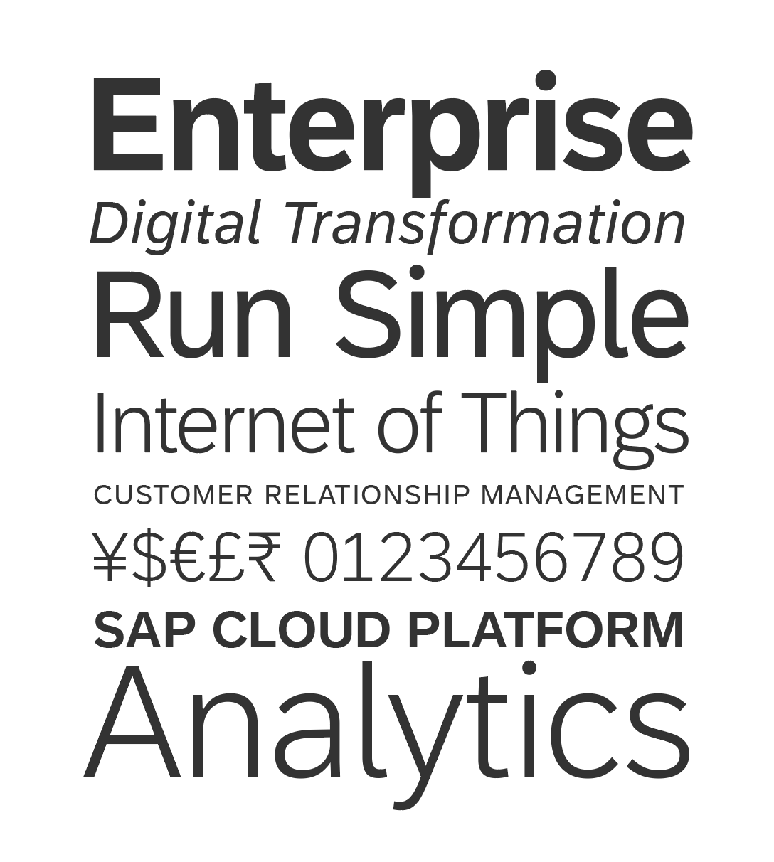
72, a bespoke typeface created for SAP
Language Support and Fallback to System Font
Language coverage is one of the most important requirements of a typeface, depending on the number of countries in which your applications need to be available. Beyond the languages the font supports, fallback solutions need to be considered. If the defined fonts cannot be displayed when an application initially loads, a fallback font is defined in the style sheet. Defining a fallback to a sans-serif system font that is readily available on every user’s device is a simple solution to load applications in any language. The font stack that is used within the CSS includes 72 with a fallback to system fonts such as Arial and Helvetica in combination, or Roboto for Android.
Here is an example of how theme parameters are used to specify a font stack. Notice that there are two versions of the 72 font; the first is a smaller subset to help improve performance and the second is the full version:
sapFontFamily: “72”, “72full”, Arial, Helvetica, sans-serif;
The fallback system fonts also have the advantage of zero loading time, ensuring that there is always a consistent font available that works with the fresh, clean, and minimalist SAP Fiori style. The font stack used comes with a full Unicode solution when special characters are needed. For all the languages that SAP Fiori will need to support, system fonts are available. 72 is integrated into the control set, making customization easy. The font stack can also be modified to achieve an individual result.
Accessibility
Optimized for screen consumption, 72’s design enhancements increase legibility, readability and ultimately, accessibility. A wider apex and open counters help with character recognition at smaller sizes. Differentiation of character details, such as the number “1” and the lower case “l” versus the capital “I”, makes the characters easier to distinguish and improves the overall reading experience.
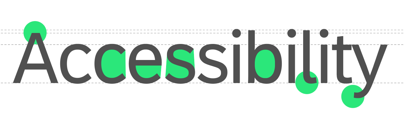
Example of improved accessibility features
Headlines and Font Styles for UI Controls
- Headlines 1 to 6: Titles are defined in several sizes and styles that help to visually identify the context of application pages or grouped content within the user interface. Examples of headlines include the page title, object header title, list, form, table, chart, timeline, and feed titles. Headlines generally use the 72 Bold font weight by default and 72 Black for the main titles in the Horizon theme, but this is flexible depending on the control component or product application context.
- Small text: Used for exceptional use cases within controls, such as time stamps or a unit of measurement. We do not recommend using small text size as the main UI text size within controls.
- Medium text: Default text size used in controls, such as buttons, inputs, tables, or a tree.
- Large text: Stand-out text controls, such as the author name in a feed, or the file name for a collection of uploaded files.
- Key performance indicators or custom display sizes: KPI numbers or custom display text sizes may have individually-specified sizes and font weights depending on the control component or application context. Consider visual accessibility and the typographic hierarchy before choosing any custom size or font weight. Light font weights are recommended only for large sizes that are clearly visible and should never be used for small textual information or labeling. If a UI is specially designed to be visible on very large displays from far away, consider emphasizing key information using a bold font weight.
These recommended sizes and weights are offered by default, however, SAP product lines have the flexibility to define their own type scale.
Header Scale
UI Control Text Sizes
72 Font Styles
Additional Styles
SAP can now benefit from the additional font styles that have been added to 72, such as 72 Semibold. These font styles help to expand the possibilities of how to best visualize the information hierarchy within products and websites.
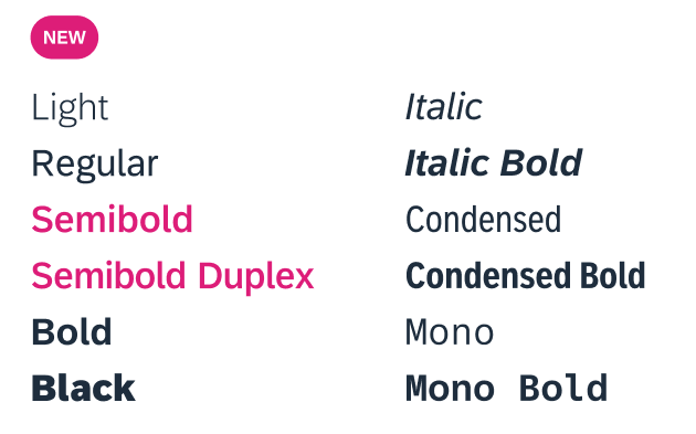
New font styles
72 Semibold Duplex
72 Semibold Duplex also enables additional accessibility improvements by providing a visual weight distinction to the regular font weight without any visual jump in the width of the letters. This helps bring more interactive affordance to the text used for general actions and also helps bring a more consistent weight when paired with the new stronger weight of the icon style for the Horizon theme.
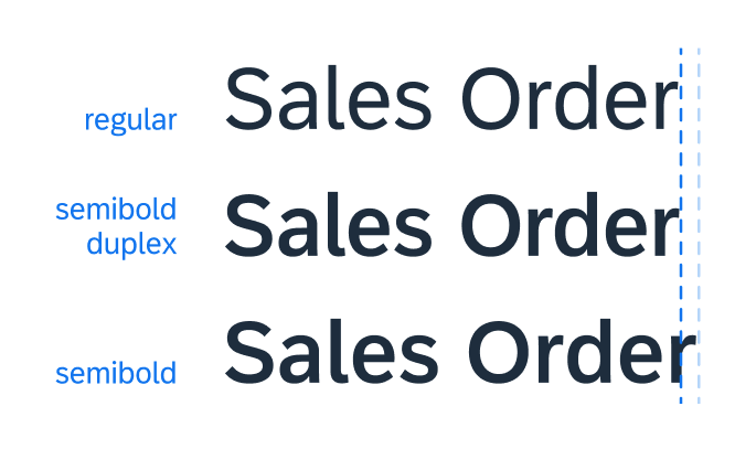
72 Semibold Duplex
Line Heights
In general, no line height is applied to text, since the line height affects the padding and leads to misaligned content.
If a more generous line height is required for long continuous text, a consistent line height of 1.5 is recommended:
- Normal line height: This is the default auto line height used in bread and butter controls (such as buttons, inputs, lists, and tables with no wrapping text).
- 1.5 line-height: Line height recommended by WCAG accessibility guidelines for long continuous or wrapped text (for example, text area or feed list item).
Related Links
Overview of “72“, SAP’s proprietary typeface.
72 is now available to download as part of the UI kit.
GitHub repository of SAP themes, including downloadable font files.
 Your feedback has been sent to the SAP Fiori design team.