
- SAPUI5 Version 1.122
- SAPUI5 Version 1.120
- SAPUI5 Version 1.118
- SAPUI5 Version 1.116
- SAPUI5 Version 1.114
- SAPUI5 Version 1.112
- SAPUI5 Version 1.110
- SAPUI5 Version 1.108
- SAPUI5 Version 1.106
- SAPUI5 Version 1.104
- SAPUI5 Version 1.102
- SAPUI5 Version 1.100
- SAPUI5 Version 1.98
- SAPUI5 Version 1.96
- SAPUI5 Version 1.94
- SAPUI5 Version 1.92
- SAPUI5 Version 1.90
- SAPUI5 Version 1.88
- SAPUI5 Version 1.86
- SAPUI5 Version 1.84
- SAPUI5 Version 1.82
- SAPUI5 Version 1.80
- SAPUI5 Version 1.78
- SAPUI5 Version 1.76
- SAPUI5 Version 1.74
- SAPUI5 Version 1.72
- SAPUI5 Version 1.70
- SAPUI5 Version 1.68
- SAPUI5 Version 1.66
- SAPUI5 Version 1.64
- SAPUI5 Version 1.62
- SAPUI5 Version 1.60
- SAPUI5 Version 1.58
- SAPUI5 Version 1.56
- SAPUI5 Version 1.54
- SAPUI5 Version 1.52
- SAPUI5 Version 1.50
- SAPUI5 Version 1.48
- SAPUI5 Version 1.46
- SAPUI5 Version 1.44
- SAPUI5 Version 1.42
- SAPUI5 Version 1.40
- SAPUI5 Version 1.38
- SAPUI5 Version 1.36
- SAPUI5 Version 1.34
- SAPUI5 Version 1.32
- SAPUI5 Version 1.30
- SAPUI5 Version 1.28
- SAPUI5 Version 1.26
- Latest SAPUI Version 1.124
- SAPUI5 Version 1.122
- SAPUI5 Version 1.120
- SAPUI5 Version 1.118
- SAPUI5 Version 1.116
- SAPUI5 Version 1.114
- SAPUI5 Version 1.112
- SAPUI5 Version 1.110
- SAPUI5 Version 1.108
- SAPUI5 Version 1.106
- SAPUI5 Version 1.104
- SAPUI5 Version 1.102
- SAPUI5 Version 1.100
- SAPUI5 Version 1.98
- SAPUI5 Version 1.96
- SAPUI5 Version 1.94
- SAPUI5 Version 1.92
- SAPUI5 Version 1.90
- SAPUI5 Version 1.88
- SAPUI5 Version 1.86
- SAPUI5 Version 1.84
- SAPUI5 Version 1.82
- SAPUI5 Version 1.80
- SAPUI5 Version 1.78
- SAPUI5 Version 1.76
- SAPUI5 Version 1.74
- SAPUI5 Version 1.72
- SAPUI5 Version 1.70
- SAPUI5 Version 1.68
- SAPUI5 Version 1.66
- SAPUI5 Version 1.64
- SAPUI5 Version 1.62
- SAPUI5 Version 1.60
- SAPUI5 Version 1.58
- SAPUI5 Version 1.56
- SAPUI5 Version 1.54
- SAPUI5 Version 1.52
- SAPUI5 Version 1.50
- SAPUI5 Version 1.48
- SAPUI5 Version 1.46
- SAPUI5 Version 1.44
- SAPUI5 Version 1.42
- SAPUI5 Version 1.40
- SAPUI5 Version 1.38
- SAPUI5 Version 1.36
- SAPUI5 Version 1.34
- SAPUI5 Version 1.32
- SAPUI5 Version 1.30
- SAPUI5 Version 1.28
- SAPUI5 Version 1.26
Action Sheet
sap.m.ActionSheet
Intro
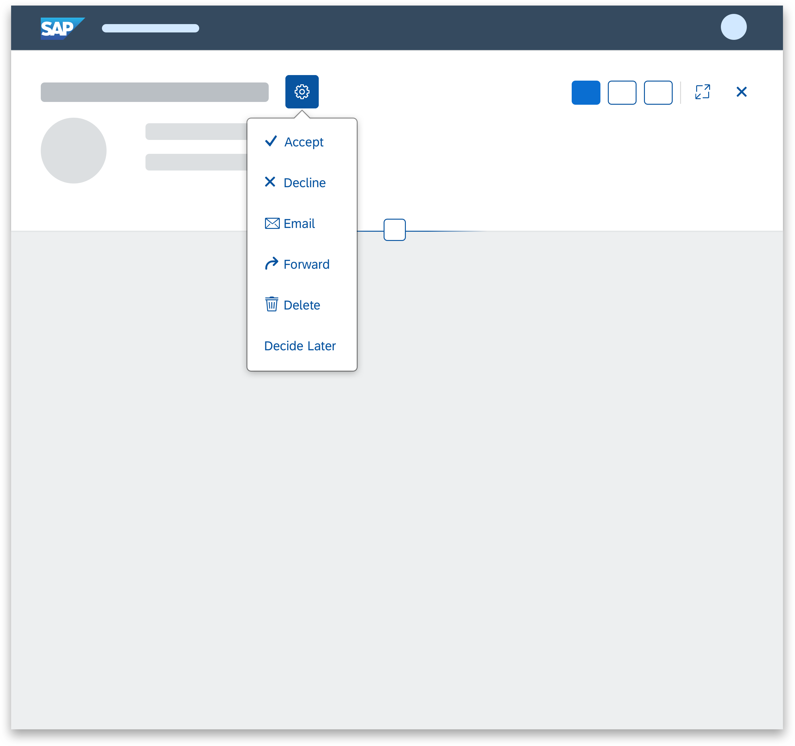
An action sheet consists of a list of options a user can select from to complete an action. Actions can be clustered if there is not enough space on the screen.

Example of an action sheet popover
Usage
Use the action sheet if:
- You need an option that provides more than one action.
- It is really important that the user stays in context on a phone.
- You only have a small number of actions.
Do not use the action sheet if:
- The menu provides only one option. In this case, consider using a button instead.
- You need to show a hierarchical menu. In this case, use the menu button instead.
- Your users would benefit more from a split button, which offers an easy-to-access default action, with the option to include additional actions.
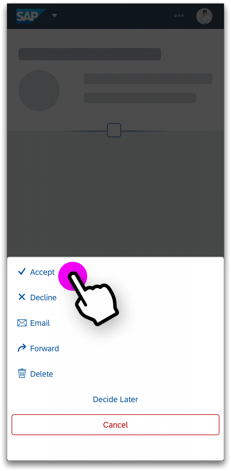
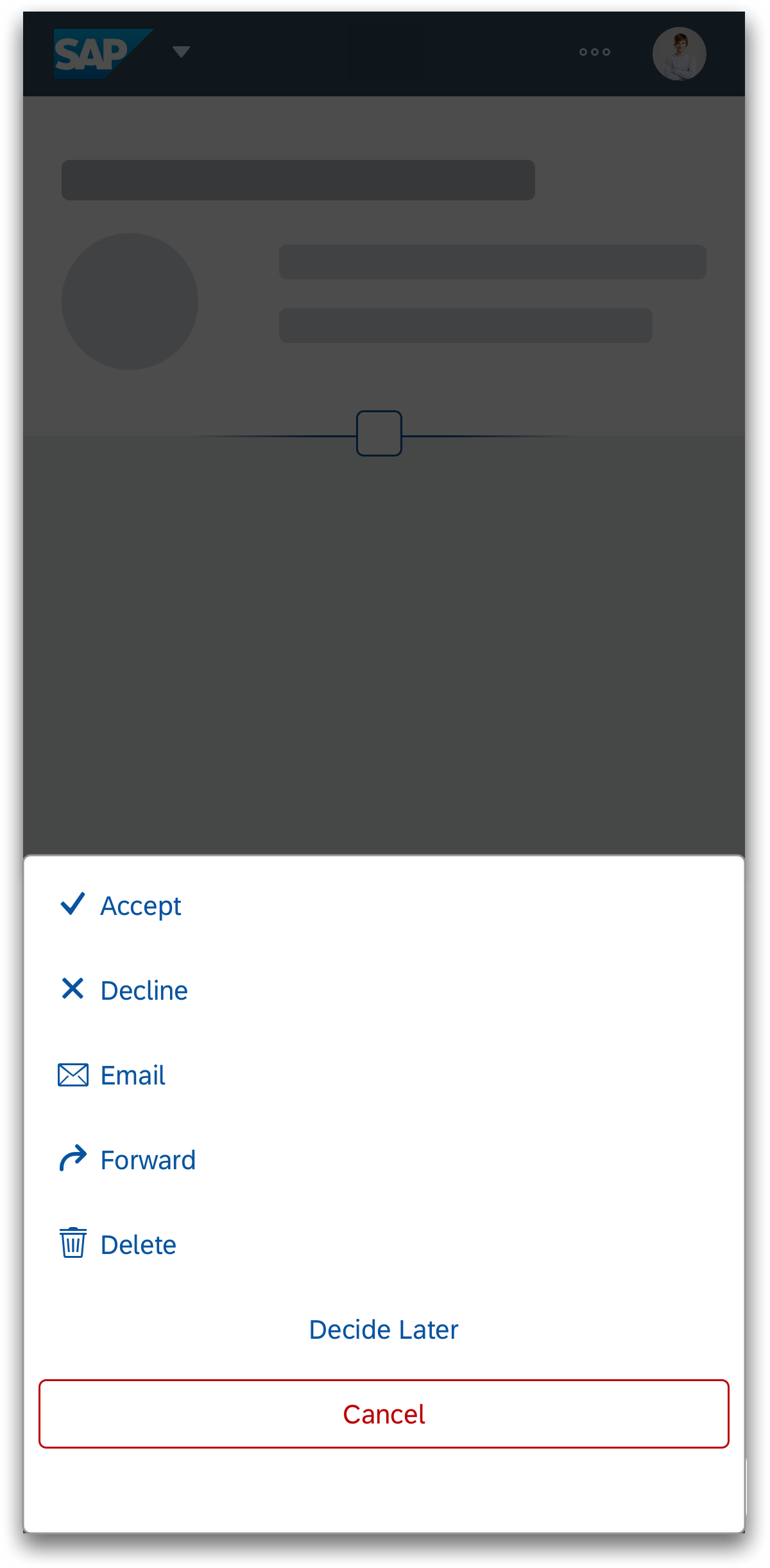
Size S (Smartphone)

Action sheet dialog
Size M (Tablet)
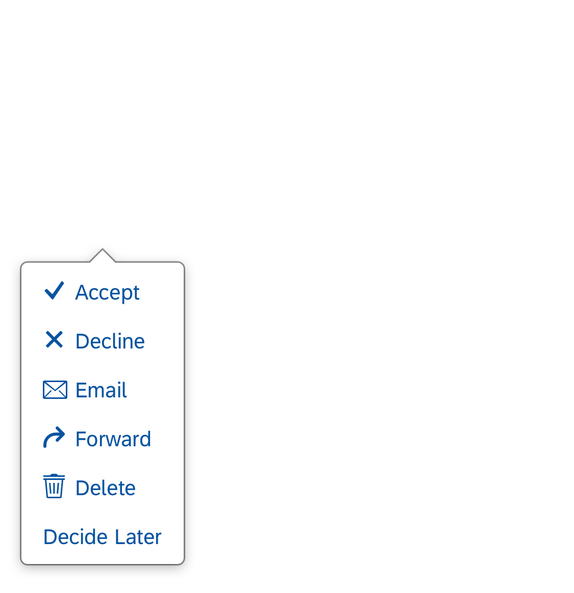
Action sheet popover
Size L (Desktop)

Action sheet popover
Layout
All elements in the action sheet are left-aligned. Actions are always arranged in order of importance, from top to bottom. The Cancel button uses a negative button type and is centered to differentiate it from the other app actions. The cursor/focus area for buttons within the action spans the full width of the action sheet (which in turn depends on the longest button).

Action sheet popover
Action sheet popover
Behavior and Interaction
Clicking
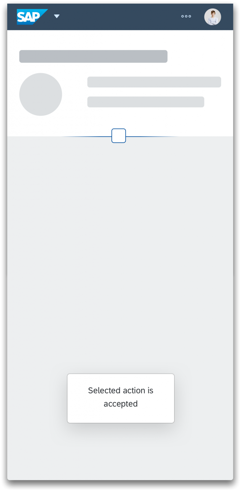
A click on the overflow icon (“…”) opens either a popover or a dialog. The user can trigger an action or close the action sheet by clicking anywhere on the screen. On a smartphone, the dialog can be closed only with the Cancel button.
If the user triggers an action, the action sheet closes automatically and the system provides a message toast.
Guidelines
- Never use only icons in the action sheet. Display text only or a combination of icon and text.
- On smartphones, provide a Cancel button to enable the user to close the dialog without triggering an action.
- Avoid scrolling in action sheets. If you include too many buttons in an action sheet, users have to scroll to see all the actions in the list. Not only does it take users longer to distinguish between actions, but they also find it difficult to scroll without clicking a button by mistake.
Action sheet dialog
Resources
Want to dive deeper? Follow the links below to find out more about related controls, the SAPUI5 implementation, and the visual design.
Elements and Controls
- Button (guidelines)
- Icon (guidelines)
- Popover (guidelines)
- Dialog (guidelines)
- Message Toast (guidelines)
 Your feedback has been sent to the SAP Fiori design team.