
- Version 1.118
- SAPUI5 Version 1.116
- SAPUI5 Version 1.114
- SAPUI5 Version 1.112
- SAPUI5 Version 1.110
- SAPUI5 Version 1.108
- SAPUI5 Version 1.106
- SAPUI5 Version 1.104
- SAPUI5 Version 1.102
- SAPUI5 Version 1.100
- SAPUI5 Version 1.98
- SAPUI5 Version 1.96
- SAPUI5 Version 1.94
- SAPUI5 Version 1.92
- SAPUI5 Version 1.90
- SAPUI5 Version 1.88
- SAPUI5 Version 1.86
- SAPUI5 Version 1.84
- SAPUI5 Version 1.82
- SAPUI5 Version 1.80
- SAPUI5 Version 1.78
- SAPUI5 Version 1.76
- SAPUI5 Version 1.74
- SAPUI5 Version 1.72
- SAPUI5 Version 1.70
- SAPUI5 Version 1.68
- SAPUI5 Version 1.66
- SAPUI5 Version 1.64
- SAPUI5 Version 1.62
- SAPUI5 Version 1.60
- SAPUI5 Version 1.58
- SAPUI5 Version 1.56
- SAPUI5 Version 1.54
- SAPUI5 Version 1.52
- SAPUI5 Version 1.50
- SAPUI5 Version 1.48
- SAPUI5 Version 1.46
- SAPUI5 Version 1.44
- SAPUI5 Version 1.42
- SAPUI5 Version 1.40
- SAPUI5 Version 1.38
- SAPUI5 Version 1.36
- SAPUI5 Version 1.34
- SAPUI5 Version 1.32
- SAPUI5 Version 1.30
- SAPUI5 Version 1.28
- SAPUI5 Version 1.26
- Latest SAPUI5 Version 1.120
- Version 1.118
- SAPUI5 Version 1.116
- SAPUI5 Version 1.114
- SAPUI5 Version 1.112
- SAPUI5 Version 1.110
- SAPUI5 Version 1.108
- SAPUI5 Version 1.106
- SAPUI5 Version 1.104
- SAPUI5 Version 1.102
- SAPUI5 Version 1.100
- SAPUI5 Version 1.98
- SAPUI5 Version 1.96
- SAPUI5 Version 1.94
- SAPUI5 Version 1.92
- SAPUI5 Version 1.90
- SAPUI5 Version 1.88
- SAPUI5 Version 1.86
- SAPUI5 Version 1.84
- SAPUI5 Version 1.82
- SAPUI5 Version 1.80
- SAPUI5 Version 1.78
- SAPUI5 Version 1.76
- SAPUI5 Version 1.74
- SAPUI5 Version 1.72
- SAPUI5 Version 1.70
- SAPUI5 Version 1.68
- SAPUI5 Version 1.66
- SAPUI5 Version 1.64
- SAPUI5 Version 1.62
- SAPUI5 Version 1.60
- SAPUI5 Version 1.58
- SAPUI5 Version 1.56
- SAPUI5 Version 1.54
- SAPUI5 Version 1.52
- SAPUI5 Version 1.50
- SAPUI5 Version 1.48
- SAPUI5 Version 1.46
- SAPUI5 Version 1.44
- SAPUI5 Version 1.42
- SAPUI5 Version 1.40
- SAPUI5 Version 1.38
- SAPUI5 Version 1.36
- SAPUI5 Version 1.34
- SAPUI5 Version 1.32
- SAPUI5 Version 1.30
- SAPUI5 Version 1.28
- SAPUI5 Version 1.26
Tab Bar
ui5-tabcontainer | v1.0
Intro
The tab bar comprises a series of tabs that each link to a different content area or view. You can use the tab bar to navigate between subpages for an object, as a filter, or to visualize process steps.
Tab bar – live example
When to Use
Use the tab bar:
- To display multiple subpages for a business object on one page.
- To let users switch easily between subpages.
- To visualize clear-cut process steps.
- To offer prominent, one-click visual filters above a set of items.
Don’t use the tab bar:
- To show only a single tab.
Anatomy
Tab Bar
- Main bar: Contains two types of element:
- Tab: The clickable item inside the tab container.
- Tab separator: Visual indicator used to separate the tabs.
- Overflow menu: Contains any remaining tabs that can’t be displayed in the available space.
- Content area: Contains the content for the selected tab.
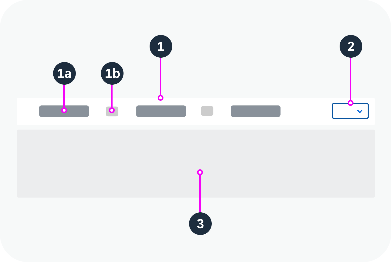
Anatomy of the tab bar
Tab
- Icon: Icon for the tab.
- Text: Text for the tab.
- Additional text: Supplementary text for a tab, such as a count.
- Subtabs: A tab can contain subtabs. For details, see Hierarchies.
The visual representation of the tab adapts automatically, depending on the elements it contains.
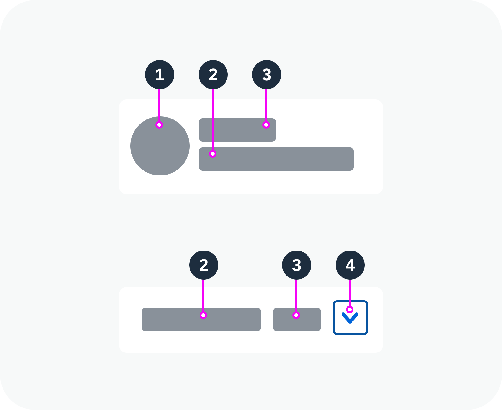
Anatomy of a tab
Variants
You can use different tab bar variants, depending on your use case:
Text Tabs
Text tabs allow longer labels, which are not truncated. They can also display a count after the text to indicate number of items on the tab page.
Tab bar with text tabs – live example
Icon Tabs
These round tabs can be populated with any icon. Labels are optional. If you decide to use labels, use them for all tabs. You can use additional text as needed.
Tab bar with icon tabs – live example
Filter Tabs
When used as a filter, the tab bar can contain a tab for displaying all items (optional), in addition to the individual tabs for each filter attribute. We strongly recommend showing the count as an additional text for every tab.
Tab bar with filter tabs – live example
Process Tabs
You can also use the tab bar to depict a process. In this case, each tab stands for one step.
Tab bar with process tabs – live example
Behavior and Interaction
Selection
Only one tab can be selected at a time. Selecting a new tab deselects the tab that was displayed previously.
Tab selection – live example
Hierarchies
The tab bar supports hierarchies, allowing you to group multiple tabs under a main tab. The label of the main tab then serves as the heading for the group. An arrow indicates that a tab has subtabs.
If the parent tab has its own content, it is separated into two interactive areas, like a split button:
- Clicking the left area (text) displays the content for the parent tab.
- Clicking the right area (arrow) opens a menu with the subtabs.
Parent tabs with own content – live example
If the parent tab doesn’t have its own content, it has only one interactive area. Clicking the main tab opens the menu with the available subtabs.
Parent tabs without own content – live example
Responsive Behavior
Overflow
If there isn’t enough space to show all the tabs on the main bar, an overflow menu appears automatically, containing all the remaining tabs.
You can set the overflow mode, depending on your use case:
- End (default): The overflow only appears at the end of the tab bar. Use this mode if the order of the tabs isn’t relevant.
- Start and End: The overflow menu can appear dynamically either on one or on both sides of the tab bar. Where the overflow appears depends on which tab is activated. Use this mode if the tabs need to stay in the same order.
You can also replace the buttons for the overflow menus with custom buttons.
 Your feedback has been sent to the SAP Fiori design team.