
- SAPUI5 Version 1.122
- SAPUI5 Version 1.120
- SAPUI5 Version 1.118
- SAPUI5 Version 1.116
- SAPUI5 Version 1.114
- SAPUI5 Version 1.112
- SAPUI5 Version 1.110
- SAPUI5 Version 1.108
- SAPUI5 Version 1.106
- SAPUI5 Version 1.104
- SAPUI5 Version 1.102
- SAPUI5 Version 1.100
- SAPUI5 Version 1.98
- SAPUI5 Version 1.96
- SAPUI5 Version 1.94
- SAPUI5 Version 1.92
- SAPUI5 Version 1.90
- SAPUI5 Version 1.88
- SAPUI5 Version 1.86
- SAPUI5 Version 1.84
- SAPUI5 Version 1.82
- SAPUI5 Version 1.80
- SAPUI5 Version 1.78
- SAPUI5 Version 1.76
- SAPUI5 Version 1.74
- SAPUI5 Version 1.72
- SAPUI5 Version 1.70
- SAPUI5 Version 1.68
- SAPUI5 Version 1.66
- SAPUI5 Version 1.64
- SAPUI5 Version 1.62
- SAPUI5 Version 1.60
- SAPUI5 Version 1.58
- SAPUI5 Version 1.56
- SAPUI5 Version 1.54
- SAPUI5 Version 1.52
- SAPUI5 Version 1.50
- SAPUI5 Version 1.48
- SAPUI5 Version 1.46
- SAPUI5 Version 1.44
- SAPUI5 Version 1.42
- SAPUI5 Version 1.40
- SAPUI5 Version 1.38
- SAPUI5 Version 1.36
- SAPUI5 Version 1.34
- SAPUI5 Version 1.32
- SAPUI5 Version 1.30
- SAPUI5 Version 1.28
- SAPUI5 Version 1.26
- Latest SAPUI Version 1.124
- SAPUI5 Version 1.122
- SAPUI5 Version 1.120
- SAPUI5 Version 1.118
- SAPUI5 Version 1.116
- SAPUI5 Version 1.114
- SAPUI5 Version 1.112
- SAPUI5 Version 1.110
- SAPUI5 Version 1.108
- SAPUI5 Version 1.106
- SAPUI5 Version 1.104
- SAPUI5 Version 1.102
- SAPUI5 Version 1.100
- SAPUI5 Version 1.98
- SAPUI5 Version 1.96
- SAPUI5 Version 1.94
- SAPUI5 Version 1.92
- SAPUI5 Version 1.90
- SAPUI5 Version 1.88
- SAPUI5 Version 1.86
- SAPUI5 Version 1.84
- SAPUI5 Version 1.82
- SAPUI5 Version 1.80
- SAPUI5 Version 1.78
- SAPUI5 Version 1.76
- SAPUI5 Version 1.74
- SAPUI5 Version 1.72
- SAPUI5 Version 1.70
- SAPUI5 Version 1.68
- SAPUI5 Version 1.66
- SAPUI5 Version 1.64
- SAPUI5 Version 1.62
- SAPUI5 Version 1.60
- SAPUI5 Version 1.58
- SAPUI5 Version 1.56
- SAPUI5 Version 1.54
- SAPUI5 Version 1.52
- SAPUI5 Version 1.50
- SAPUI5 Version 1.48
- SAPUI5 Version 1.46
- SAPUI5 Version 1.44
- SAPUI5 Version 1.42
- SAPUI5 Version 1.40
- SAPUI5 Version 1.38
- SAPUI5 Version 1.36
- SAPUI5 Version 1.34
- SAPUI5 Version 1.32
- SAPUI5 Version 1.30
- SAPUI5 Version 1.28
- SAPUI5 Version 1.26
Text Area
ui5-textarea | v1.0
Intro
The text area is an input component that allows the user to enter several lines of text.
Basic text area – live example
When to Use
Use the text area:
- If users need to enter more than one line of text.
Don’t use the text area:
- If you only want users to enter a single line of text. Use the input component instead.
Anatomy
- Input field: Container in which a user enters text.
- Text: Placeholder or typed text. The placeholder is an optional prompt text that is displayed when the input field is empty.
- Scrollbar
- Counter: If you have set a character limit without restricting text input, the counter indicates how many characters are left, or how many characters exceed the limit.
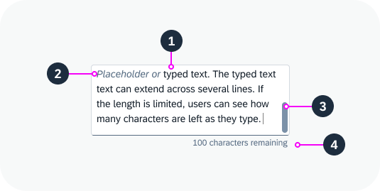
Anatomy of the text area
Variants
Text Area with Character Limit
You can set a character limit for the text. In this case, you have two options for handling the text input:
Text is cut off after the character limit
Once the character limit has been reached, users can no longer type or enter additional text. Pasted text is cut off. This is the default setting.
No text entry after 20-character limit is reached – live example
Text can exceed the character limit
You can allow the user to enter text that exceeds the character limit. We strongly recommend using this variant because it offers users much better orientation:
- A character counter indicates how many characters are can still be entered, or how many characters are over the limit.
- If the text exceeds the limit, you can show a warning state and a message that explains the limit.
- If users type or paste a longer text, they can see the full text while they decide on how to best shorten it.
Text entered can exceed 20-character limit – live example
Text Area with a Label
You can add a label to the text area.
Text area with a label – live example
Behavior and Interaction
Fixed Height
You can configure the height of the text area to fit the space available on your UI. If the text doesn’t fit into the available space, a scrollbar appears.
Text area with a fixed height
Growing Behaviour
The text area component offers a growing property. If growing is active, the input container grows and shrinks automatically as the user types.
You can configure the minimum and maximum number of lines to be shown. If the text exceeds the maximum number of lines, the text area stops growing and a scrollbar appears.
Growing behavior (minimum 2 lines, maximum 5 lines) – live example
Text Area Counter
If you have set a character limit for the text area but don’t restrict text entry, a character counter is displayed below the text.
If the text is over the limit:
- The user can continue typing.
- The counter indicates how many characters are over the limit.
- We recommend changing the text area to a warning state and displaying an appropriate message.
If the text is pasted into the field, any excess characters are selected automatically.
Show a warning state when the text exceeds the character limit
Responsive Behavior
You can set the maximum number of lines to be shown. The amount of text depends on the size of the screen. On smaller screens, the user can scroll down the text area to see the entire text. To indicate that the text continues, the component shows only half of the last line. This also applies for mobile devices.
 Your feedback has been sent to the SAP Fiori design team.