
- Version 1.118
- SAPUI5 Version 1.116
- SAPUI5 Version 1.114
- SAPUI5 Version 1.112
- SAPUI5 Version 1.110
- SAPUI5 Version 1.108
- SAPUI5 Version 1.106
- SAPUI5 Version 1.104
- SAPUI5 Version 1.102
- SAPUI5 Version 1.100
- SAPUI5 Version 1.98
- SAPUI5 Version 1.96
- SAPUI5 Version 1.94
- SAPUI5 Version 1.92
- SAPUI5 Version 1.90
- SAPUI5 Version 1.88
- SAPUI5 Version 1.86
- SAPUI5 Version 1.84
- SAPUI5 Version 1.82
- SAPUI5 Version 1.80
- SAPUI5 Version 1.78
- SAPUI5 Version 1.76
- SAPUI5 Version 1.74
- SAPUI5 Version 1.72
- SAPUI5 Version 1.70
- SAPUI5 Version 1.68
- SAPUI5 Version 1.66
- SAPUI5 Version 1.64
- SAPUI5 Version 1.62
- SAPUI5 Version 1.60
- SAPUI5 Version 1.58
- SAPUI5 Version 1.56
- SAPUI5 Version 1.54
- SAPUI5 Version 1.52
- SAPUI5 Version 1.50
- SAPUI5 Version 1.48
- SAPUI5 Version 1.46
- SAPUI5 Version 1.44
- SAPUI5 Version 1.42
- SAPUI5 Version 1.40
- SAPUI5 Version 1.38
- SAPUI5 Version 1.36
- SAPUI5 Version 1.34
- SAPUI5 Version 1.32
- SAPUI5 Version 1.30
- SAPUI5 Version 1.28
- SAPUI5 Version 1.26
- Latest SAPUI5 Version 1.120
- Version 1.118
- SAPUI5 Version 1.116
- SAPUI5 Version 1.114
- SAPUI5 Version 1.112
- SAPUI5 Version 1.110
- SAPUI5 Version 1.108
- SAPUI5 Version 1.106
- SAPUI5 Version 1.104
- SAPUI5 Version 1.102
- SAPUI5 Version 1.100
- SAPUI5 Version 1.98
- SAPUI5 Version 1.96
- SAPUI5 Version 1.94
- SAPUI5 Version 1.92
- SAPUI5 Version 1.90
- SAPUI5 Version 1.88
- SAPUI5 Version 1.86
- SAPUI5 Version 1.84
- SAPUI5 Version 1.82
- SAPUI5 Version 1.80
- SAPUI5 Version 1.78
- SAPUI5 Version 1.76
- SAPUI5 Version 1.74
- SAPUI5 Version 1.72
- SAPUI5 Version 1.70
- SAPUI5 Version 1.68
- SAPUI5 Version 1.66
- SAPUI5 Version 1.64
- SAPUI5 Version 1.62
- SAPUI5 Version 1.60
- SAPUI5 Version 1.58
- SAPUI5 Version 1.56
- SAPUI5 Version 1.54
- SAPUI5 Version 1.52
- SAPUI5 Version 1.50
- SAPUI5 Version 1.48
- SAPUI5 Version 1.46
- SAPUI5 Version 1.44
- SAPUI5 Version 1.42
- SAPUI5 Version 1.40
- SAPUI5 Version 1.38
- SAPUI5 Version 1.36
- SAPUI5 Version 1.34
- SAPUI5 Version 1.32
- SAPUI5 Version 1.30
- SAPUI5 Version 1.28
- SAPUI5 Version 1.26
Date Range Picker
ui5-daterange-picker | v1.0
Intro
The date range picker allows users to enter a date range by either typing two dates the input field or selecting a date range in the calendar.
The date range picker can also be used to enter a single date.
Basic date range picker – live example
When to Use
Use the date range picker if:
- Users need to enter a date range and you know that the keyboard is not the primary device used for navigating the app.
Don’t use the date range picker if:
- Users need to enter a date and a time. In this case, use the date picker or time picker instead.
- Selecting ranges is not the user’s primary goal. In this case, use the simple date picker.
- If the keyboard is the primary device used for navigating the app, use two input fields. This allows the user to jump quickly from field to field.
Anatomy
- Date input field: Field for typing in dates directly. It contains a mask.
- Text: A placeholder or the selected/typed text.
- Date range picker button: Button that opens the calendar.
- Calendar: See the calendar guideline for more details.
- Current date
- Selected date range
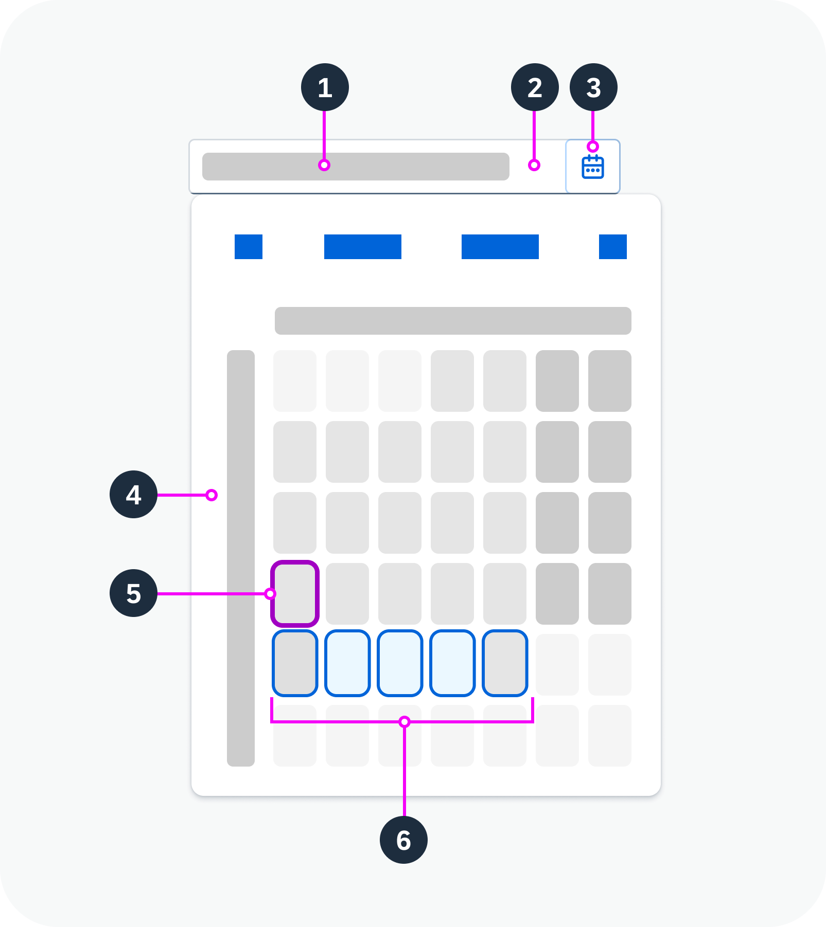
Anatomy of the date range picker
Variants
Restricted Date Range
You can set minimum and maximum dates. In this case, the user can only select dates within the approved range.
Predefined Date Range
You can set a predefined date range that is selected by default when the user opens the calendar. The user can still change the dates.
Date Display in the Input Field
You can specify the format of the dates in the input field. Supported formats are based on the Unicode Locale Data Markup Language (LDML) date format notation.
You can also specify the symbol that separates the start and end dates.
Minimum/maximum dates, specific date format – live example
Predefined date range, custom delimiter – live example
Behavior and Interaction
Selection
Date range: After selecting a start date, hovering over another date turns the dates in between to light blue, indicating that they are in the selected range. When the user selects an end date, the calendar closes and the range appears in the date input field.
Single date: To enter a single date, the user can type one date into the input field, or select the same day as the start and end date in the calendar.
Shortcuts
The following shortcuts are available for entering specific dates:
- “today”
- “yesterday”
- “in x days”
- “x days ago”
- “yesterday – today”
- “x days ago – in x days”
Restricted Date Range
If minimum and maximum dates have been set, selection and navigation to dates outside this range is disabled.
Formatting
If the user types the date in the input field, it must fit the required date format. For example, if the format pattern is “yyyy-MM-dd”, a valid user input would be “2023-07-30”.
Related Links
Implementation
- Date Range Picker
(UI5 web component documentation) - Date Picker
(UI5 web component documentation)
 Your feedback has been sent to the SAP Fiori design team.