
Updated: July 16, 2024
Latest SAPUI Version 1.124
- SAPUI5 Version 1.122
- SAPUI5 Version 1.120
- SAPUI5 Version 1.118
- SAPUI5 Version 1.116
- SAPUI5 Version 1.114
- SAPUI5 Version 1.112
- SAPUI5 Version 1.110
- SAPUI5 Version 1.108
- SAPUI5 Version 1.106
- SAPUI5 Version 1.104
- SAPUI5 Version 1.102
- SAPUI5 Version 1.100
- SAPUI5 Version 1.98
- SAPUI5 Version 1.96
- SAPUI5 Version 1.94
- SAPUI5 Version 1.92
- SAPUI5 Version 1.90
- SAPUI5 Version 1.88
- SAPUI5 Version 1.86
- SAPUI5 Version 1.84
- SAPUI5 Version 1.82
- SAPUI5 Version 1.80
- SAPUI5 Version 1.78
- SAPUI5 Version 1.76
- SAPUI5 Version 1.74
- SAPUI5 Version 1.72
- SAPUI5 Version 1.70
- SAPUI5 Version 1.68
- SAPUI5 Version 1.66
- SAPUI5 Version 1.64
- SAPUI5 Version 1.62
- SAPUI5 Version 1.60
- SAPUI5 Version 1.58
- SAPUI5 Version 1.56
- SAPUI5 Version 1.54
- SAPUI5 Version 1.52
- SAPUI5 Version 1.50
- SAPUI5 Version 1.48
- SAPUI5 Version 1.46
- SAPUI5 Version 1.44
- SAPUI5 Version 1.42
- SAPUI5 Version 1.40
- SAPUI5 Version 1.38
- SAPUI5 Version 1.36
- SAPUI5 Version 1.34
- SAPUI5 Version 1.32
- SAPUI5 Version 1.30
- SAPUI5 Version 1.28
- SAPUI5 Version 1.26
- Latest SAPUI Version 1.124
- SAPUI5 Version 1.122
- SAPUI5 Version 1.120
- SAPUI5 Version 1.118
- SAPUI5 Version 1.116
- SAPUI5 Version 1.114
- SAPUI5 Version 1.112
- SAPUI5 Version 1.110
- SAPUI5 Version 1.108
- SAPUI5 Version 1.106
- SAPUI5 Version 1.104
- SAPUI5 Version 1.102
- SAPUI5 Version 1.100
- SAPUI5 Version 1.98
- SAPUI5 Version 1.96
- SAPUI5 Version 1.94
- SAPUI5 Version 1.92
- SAPUI5 Version 1.90
- SAPUI5 Version 1.88
- SAPUI5 Version 1.86
- SAPUI5 Version 1.84
- SAPUI5 Version 1.82
- SAPUI5 Version 1.80
- SAPUI5 Version 1.78
- SAPUI5 Version 1.76
- SAPUI5 Version 1.74
- SAPUI5 Version 1.72
- SAPUI5 Version 1.70
- SAPUI5 Version 1.68
- SAPUI5 Version 1.66
- SAPUI5 Version 1.64
- SAPUI5 Version 1.62
- SAPUI5 Version 1.60
- SAPUI5 Version 1.58
- SAPUI5 Version 1.56
- SAPUI5 Version 1.54
- SAPUI5 Version 1.52
- SAPUI5 Version 1.50
- SAPUI5 Version 1.48
- SAPUI5 Version 1.46
- SAPUI5 Version 1.44
- SAPUI5 Version 1.42
- SAPUI5 Version 1.40
- SAPUI5 Version 1.38
- SAPUI5 Version 1.36
- SAPUI5 Version 1.34
- SAPUI5 Version 1.32
- SAPUI5 Version 1.30
- SAPUI5 Version 1.28
- SAPUI5 Version 1.26
Menu
ui5-menu | v1.0
Intro
A menu offers the user a list of alternative actions. The actions can also be grouped in submenus.
Menu – live example
When to Use
Do
Use the menu:
- If you need to offer more than one action.
- If users need to stay in a certain context.
- If there are only a small number of actions.
Don't
Don’t use the menu:
- To provide only one option. Use a button instead.
- If users would benefit more from a split button, which offers an easy-to-access default action, with the option to select other actions.
Anatomy
Menu
- Menu: Container that is shown as an overlay.
- Menu item: List item inside the menu that represents an action.
- Separator (optional): Horizontal line that groups the menu items visually.
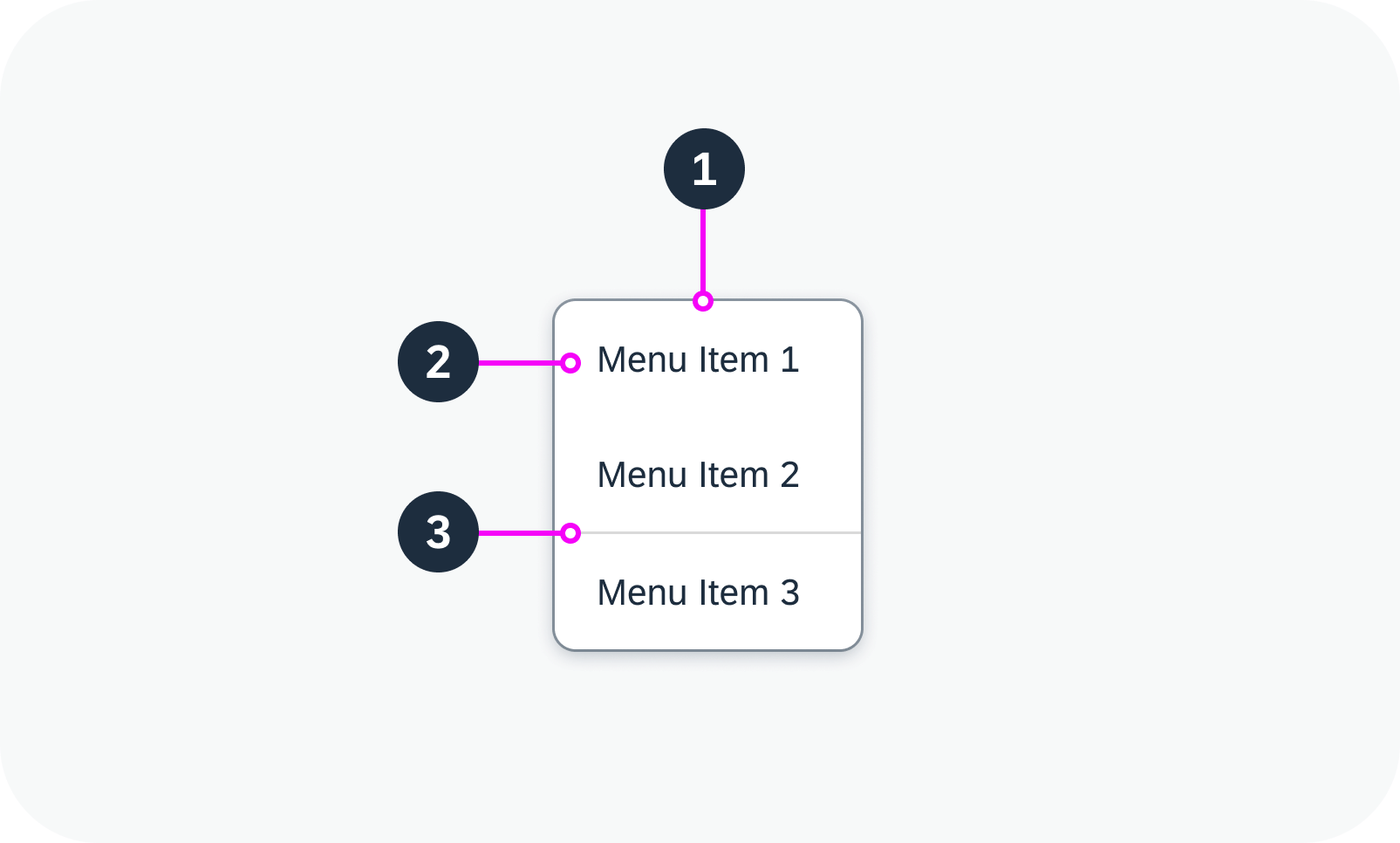
Anatomy of a menu
Menu Item
- Text: Describes the action that is triggered by the menu item. The text is mandatory.
- Icon (optional): Visualizes the action that is triggered by the menu item.
- Additional text (optional): Provides additional information relating to the menu item (such as shortcuts).
- Navigation indicator: Indicates that a submenu is available for the menu item.
The visualization of the menu item adapts automatically, depending on which elements are included.
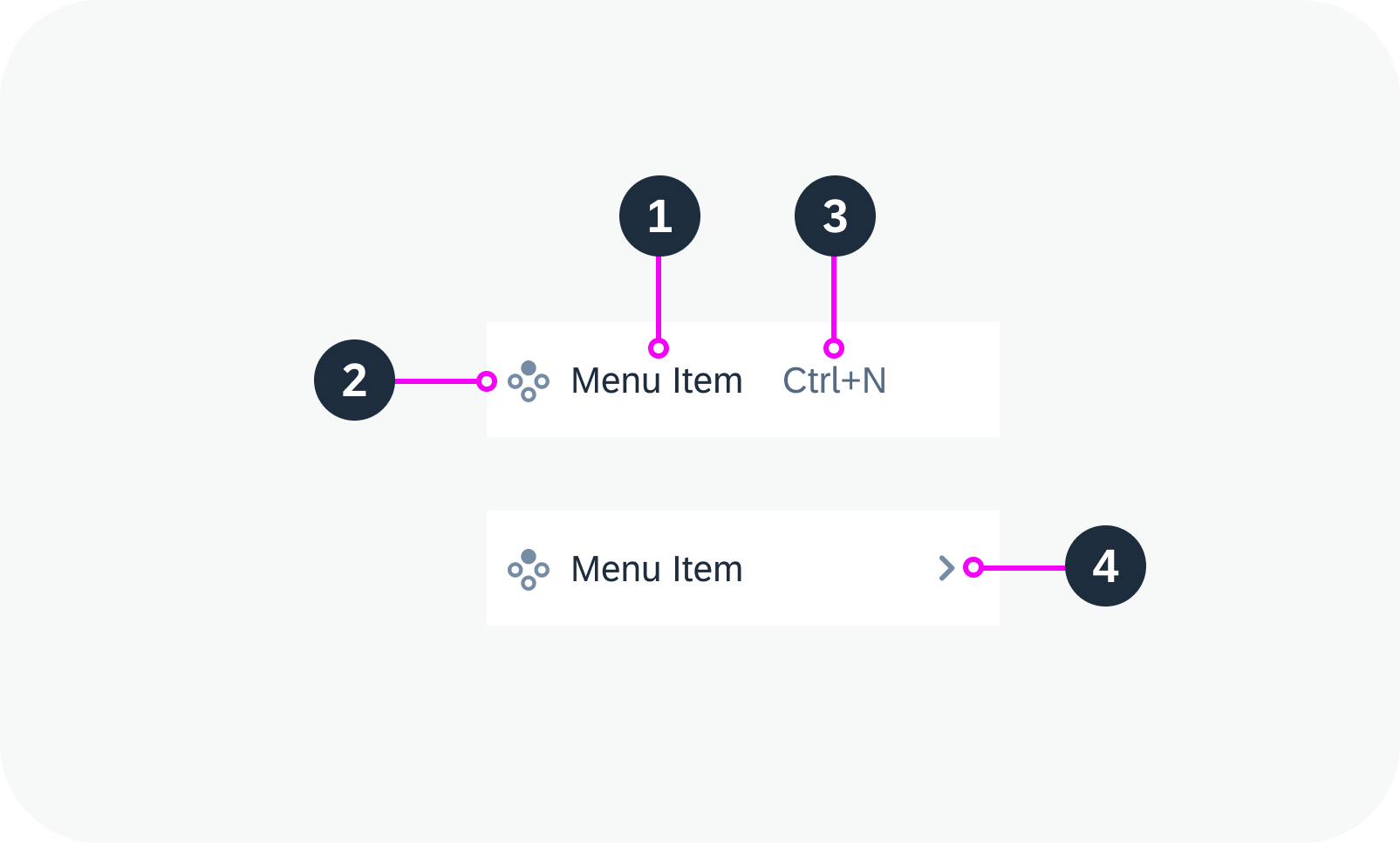
Anatomy of a menu item
Variants
The menu can be basic, with only a single list of options, or can contain menu items with submenus.
The elements within a menu item can be combined in various ways. The minimal variant is to show only a text. If a menu item has subitems, an additional text won’t be shown, since the space is needed for the navigation indicator.
Variants Without Icons
- Text only
- Text and additional text
- Text and navigation indicator (subitems)
Menu item variants without icons – live examples
(from top to bottom: text only, with additional text, with navigation indicator)
Variants with Icons
- Icon and text
- Icon, text, and additional text
- Icon, text, and navigation indicator (subitems)
Menu item variants with icons – live examples
(from top to bottom: icon and text only, with additional text, with navigation indicator)
Behavior and Interaction
Initially, the menu is closed and therefore not visible.
- Clicking the reference control opens the menu (for example, a menu button).
- Clicking a menu item without submenu indicator triggers the respective action.
- Clicking a menu item with a submenu indicator opens the submenu next to the main menu. The cursor can now be moved to the submenu while all other levels remain open. For each submenu, the same navigation principles apply as for the main menu. Multiple submenus are possible.
- Clicking outside the component closes the menu.
 Your feedback has been sent to the SAP Fiori design team.