
- SAPUI5 Version 1.122
- SAPUI5 Version 1.120
- SAPUI5 Version 1.118
- SAPUI5 Version 1.116
- SAPUI5 Version 1.114
- SAPUI5 Version 1.112
- SAPUI5 Version 1.110
- SAPUI5 Version 1.108
- SAPUI5 Version 1.106
- SAPUI5 Version 1.104
- SAPUI5 Version 1.102
- SAPUI5 Version 1.100
- SAPUI5 Version 1.98
- SAPUI5 Version 1.96
- SAPUI5 Version 1.94
- SAPUI5 Version 1.92
- SAPUI5 Version 1.90
- SAPUI5 Version 1.88
- SAPUI5 Version 1.86
- SAPUI5 Version 1.84
- SAPUI5 Version 1.82
- SAPUI5 Version 1.80
- SAPUI5 Version 1.78
- SAPUI5 Version 1.76
- SAPUI5 Version 1.74
- SAPUI5 Version 1.72
- SAPUI5 Version 1.70
- SAPUI5 Version 1.68
- SAPUI5 Version 1.66
- SAPUI5 Version 1.64
- SAPUI5 Version 1.62
- SAPUI5 Version 1.60
- SAPUI5 Version 1.58
- SAPUI5 Version 1.56
- SAPUI5 Version 1.54
- SAPUI5 Version 1.52
- SAPUI5 Version 1.50
- SAPUI5 Version 1.48
- SAPUI5 Version 1.46
- SAPUI5 Version 1.44
- SAPUI5 Version 1.42
- SAPUI5 Version 1.40
- SAPUI5 Version 1.38
- SAPUI5 Version 1.36
- SAPUI5 Version 1.34
- SAPUI5 Version 1.32
- SAPUI5 Version 1.30
- SAPUI5 Version 1.28
- SAPUI5 Version 1.26
- Latest SAPUI Version 1.124
- SAPUI5 Version 1.122
- SAPUI5 Version 1.120
- SAPUI5 Version 1.118
- SAPUI5 Version 1.116
- SAPUI5 Version 1.114
- SAPUI5 Version 1.112
- SAPUI5 Version 1.110
- SAPUI5 Version 1.108
- SAPUI5 Version 1.106
- SAPUI5 Version 1.104
- SAPUI5 Version 1.102
- SAPUI5 Version 1.100
- SAPUI5 Version 1.98
- SAPUI5 Version 1.96
- SAPUI5 Version 1.94
- SAPUI5 Version 1.92
- SAPUI5 Version 1.90
- SAPUI5 Version 1.88
- SAPUI5 Version 1.86
- SAPUI5 Version 1.84
- SAPUI5 Version 1.82
- SAPUI5 Version 1.80
- SAPUI5 Version 1.78
- SAPUI5 Version 1.76
- SAPUI5 Version 1.74
- SAPUI5 Version 1.72
- SAPUI5 Version 1.70
- SAPUI5 Version 1.68
- SAPUI5 Version 1.66
- SAPUI5 Version 1.64
- SAPUI5 Version 1.62
- SAPUI5 Version 1.60
- SAPUI5 Version 1.58
- SAPUI5 Version 1.56
- SAPUI5 Version 1.54
- SAPUI5 Version 1.52
- SAPUI5 Version 1.50
- SAPUI5 Version 1.48
- SAPUI5 Version 1.46
- SAPUI5 Version 1.44
- SAPUI5 Version 1.42
- SAPUI5 Version 1.40
- SAPUI5 Version 1.38
- SAPUI5 Version 1.36
- SAPUI5 Version 1.34
- SAPUI5 Version 1.32
- SAPUI5 Version 1.30
- SAPUI5 Version 1.28
- SAPUI5 Version 1.26
Gantt Chart
sap.gantt.GanttChartContainer
Intro
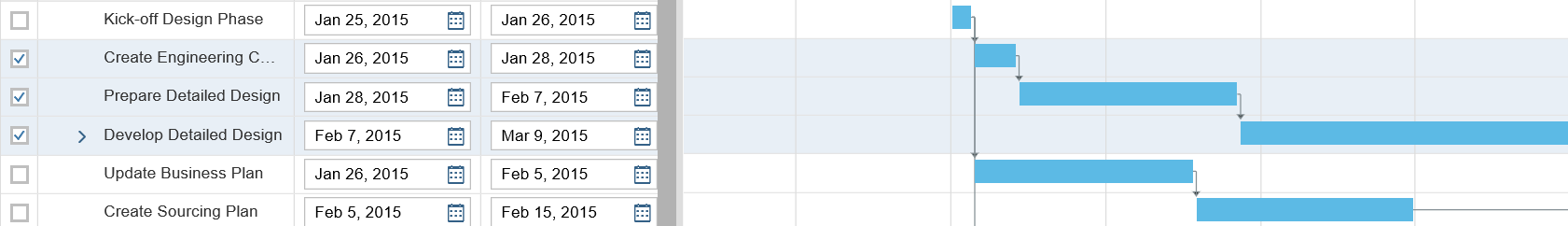
The Gantt chart enables you to present time-dependent data in an intuitive graphical manner, from a hierarchical and/or resource-oriented viewpoint. It shows the user the sequence in which various activities occur and the dependencies between these activities. The user can easily see the start and end of a particular activity.
The Gantt chart control provides the basis for creating such a Gantt chart and is a generic tool. Applications can consume the control in order to implement their use cases, and if necessary, they may even enhance the control.
It consists of three areas: a chart area, a table area, and a global toolbar.
Another feature is the option to have a split screen that includes two or more views next to one another, each view consisting of one table and one chart. These views can be arranged vertically or horizontally, and they share a common (global) toolbar.
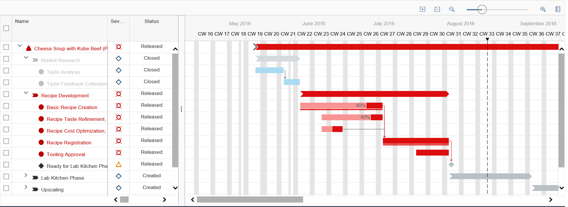
Gantt chart control – Overview
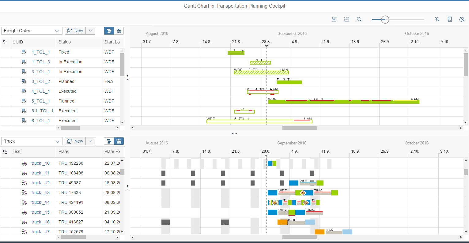
Gantt chart control – Dual view
Usage
Use the Gantt chart if:
- You want to build an interactive and complex planning application involving activities, resources, hierarchical project structures, relationships, and other basic shapes such as diamonds, utilization line charts, or bar charts.
- You want to build a simple application which may be read-only or which does not have a table component.
- You want to build a simple application that is also capable of evolving into a more powerful application later on.
Do not use the Gantt chart if:
- Your application needs to run on a smartphone. Consider using the planning calendar control instead.
- You need to show less than 100 rows. You can still use a Gantt chart, but consider using the planning calendar control instead.
- You want to show only a simple graphical representation based on rectangles (in other words, without relationships, milestones, and so on). Consider using the planning calendar control instead.
Responsiveness
The Gantt chart is responsive in principle. It can be displayed in a small window (size M) and preserve its layout without needing to create multiple levels of scrollbars nested in one another in the browser window. However, the control is not available in smartphone size (size S).
The Gantt chart control can be used to display data in tablet (size M).
Types
Like all SAP Fiori controls, the Gantt Chart is shown in compact mode on a desktop and in cozy mode on tablets.
For desktop devices, you can fit even more rows onto the screen by using the condensed mode together with the compact mode. This renders less white space for each item.
The condensed content density must always be set in addition to the compact mode. Do not use the condensed mode on its own. Do not mix condensed with cozy. Doing so could lead to unpredictable or unwanted results, such as cozy-sized controls in condensed-sized containers, missing padding, and so on.
Note that neither compact mode nor condensed mode support touch interaction. Even on a desktop with a touch screen, users will have difficulty selecting rows or using controls inside the cells with their fingers.
Furthermore, condensed mode is not available for Internet Explorer 9. If you plan to use condensed mode, please provide a fallback.
For more information on cozy and compact modes, see content density.
Layout
The buttons contained in the optional global toolbar can control the behavior of the entire Gantt chart across multiple views. Each view can contain a local toolbar. This local toolbar is optional and is located above the tree table.
The buttons contained in the local toolbar can only control the behavior of its corresponding view. Each view can contain a tree table to the left and a chart to the right. However, the tree table is optional and the chart area can stand on its own.
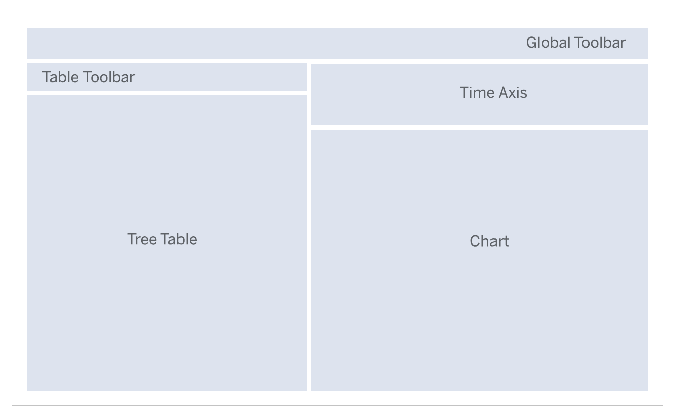
Schematic visualization of the Gantt chart
Components
The Gantt chart consists of three areas: a global toolbar, a table area, and a chart area. There can be more than two table and chart areas in a split-screen layout.
Global Toolbar
The global toolbar provides standard functions, which are required by several applications. However, app teams can add extra functions. The user can also hide certain standard functions.
The following standard functions are available:
- Legend (see details below)
- Settings (see details below)
- Zooming (see details below)
- View combination switch: This dropdown menu is shown only if the consuming application provides more than one view combination.
- View arrangement: Hide one of multiple views; add views; switch between vertical and horizontal alignment of the views. This can be skipped by the consuming application.
- Overflow behavior: The global toolbar has the same overflow behavior as the SAPUI5 toolbars. For more information, see toolbar overview.
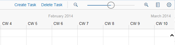
Gantt chart global toolbar
Legend
For the legend, we provide two templates to address fast implementation in most use cases:
- List template: Displays a list of shapes and their corresponding texts. You can also add a checkbox before each shape, which allows the application to control if the shape will be displayed in the chart.
- Dimension template: Shows a matrix of shapes and their corresponding texts for varied combinations of two dimensions.
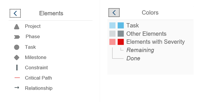
List legend and dimension legend
Settings
Users can configure the display of the Gantt chart using the Change Settings button ( ). The control offers some standard settings (such as Indicate Current Time, Show Cursor Line, Show Divider Lines, Show Ad Hoc Lines, and Synchronize Time Scroll). The app team can also add their own settings to the settings dialog, giving users more options to control the behavior of the Gantt chart.
You can hide the Change Settings button if the settings are not suitable for your use case. The Gantt Chart control provides the API setToolbarSchemes, which allows applications to override the default buttons in the chart toolbar. Other APIs also allow you to define default values for all the settings. For more information, check out the API reference.
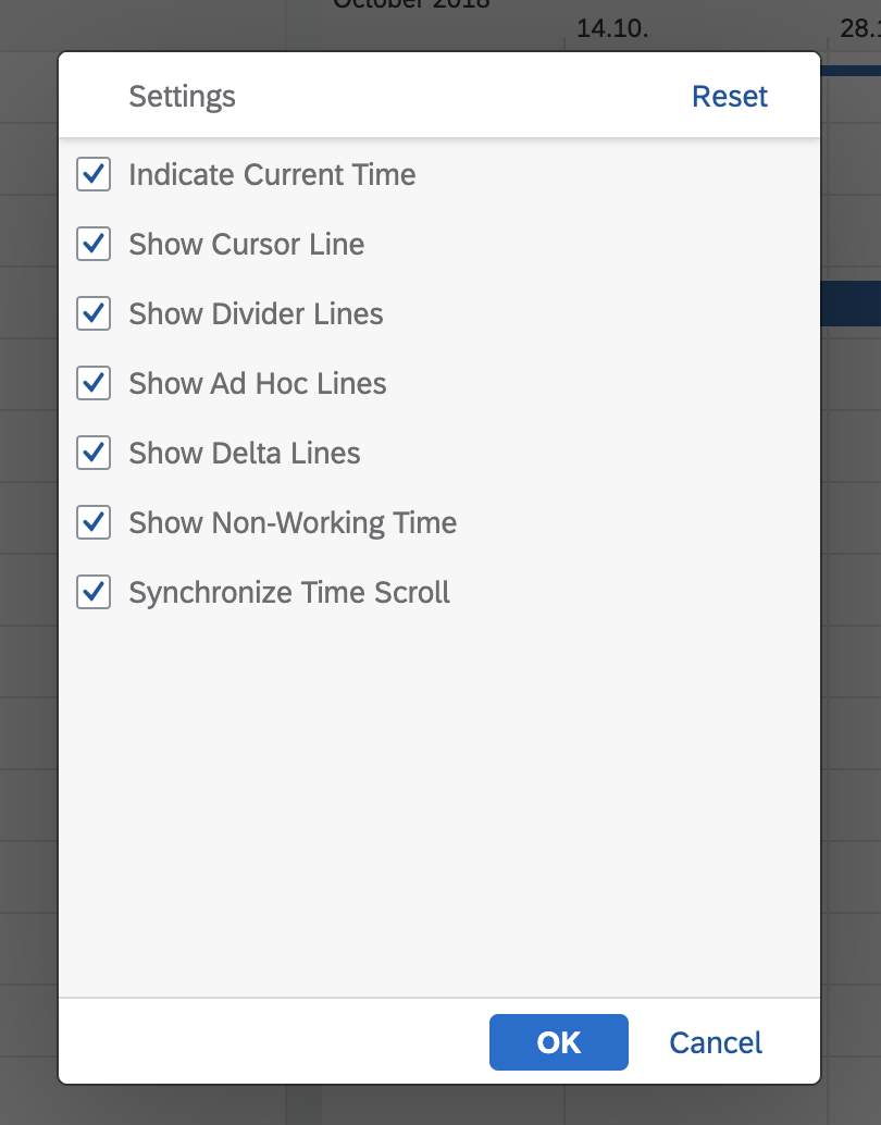
Standard settings
Zooming
The control provides a zooming function for the chart area. It consists of a Zoom In/Zoom Out magnifier buttons and a slider. You can hide the slider if there is not sufficient room for it, for example in size M. The zooming function also controls the labelling of the time axis, which determines whether you see years, months, or days. For more information, see time axis.
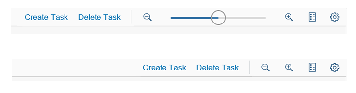
Show or hide the zooming slider
Chart Area
The chart area that includes the Gantt chart comprises a time axis and rows that contain different shapes. The position of a shape on the time axis depends on the dates of the object represented by the shape.
General
The chart area is closely connected to the table area. This means a line in the table corresponds to a line in the chart. Selecting a row in the table also selects this row in the chart. The height of the line is the same in both areas. If the user scrolls in one area, the other area scrolls in exactly the same manner.
Time Axis
The chart control can display the time axis in different time measurements as defined by the consuming application. Every time axis should have two levels. The app team can define the formatting of the labels for the times axis. The formats defined by SAPUI5 are supported. The Gantt control provides a default configuration for the time axis.
For more information, see time axis.
Time axis
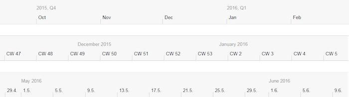
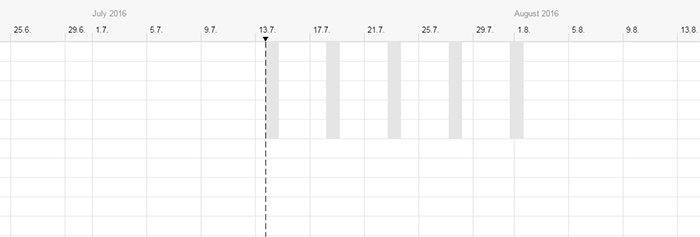
Example of possible timelines
As shown in the above examples, you can display a vertical line indicating the current date. The actual date can be displayed on the axis. It’s also possible to show non-working time frames, such as weekends, by graying out these time frames. These dates can vary from line to line.
Basic Shapes
The Gantt control offers these basic shapes:
- Rectangle
- Polygon
- Line (for example, to show notifications for rectangles)
- Triangle (for example, to represent constraints such as time windows)
- Diamond (for example, to represent milestones)
- Chevron (for example, to represent project phases)
- Cursor (for example, to represent checklist items)
- Image (for example, to place images in the chart)

Basic shapes: rectangle, line, chevron, polygon, cursor, diamond, triangle
These shapes can also be combined. The chart control can render the shapes with different border and fill styles and border and fill colors, and use gradients. For more information, see colors.
App teams can add their own shapes, but they must adhere to the chart guidelines on colors. In general, you should use the qualitative palette, but if you need more colors, use the sequential palette.
When choosing the colors and hues to represent different object types, remember to select those that have a significant contrast.
The most commonly used shape is the rectangle (or bar).
Although it is technically feasible to use two bars above and below each other in one row, we do not recommend this practice. Particularly with high screen resolutions, this can lead to visual crowding so that the user cannot discern between different elements.
For example, if you want to show the degree of completion in a bar, it may be better to superimpose the finished section using a different shade over the original task.
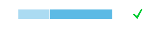
Example of completion in a bar
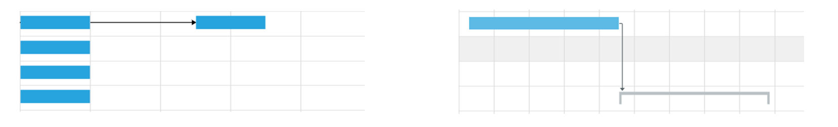
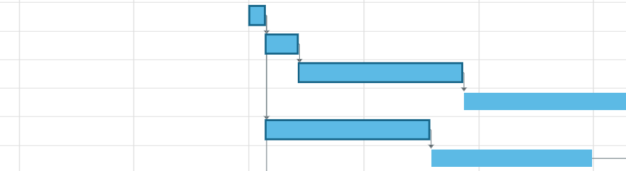
Relationships
You can link two shapes with a line in various styles and colors. The exact meaning of the relationship depends on the use case and the application. However, it usually implies that one activity has to be performed or at least started before the subsequent activity can begin.
- A relationship can begin from the start or end date of a shape.
- A relationship can end at the start or end date of a shape.
- The end of a relationship is shown using an arrow.
- One shape can have multiple relationships.
The app team should define the logic of a relationship, such as rescheduling.
Relationship between shapes
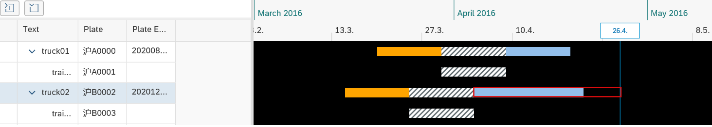
Utilization Chart
The utilization line chart and utilization bar chart enable you to display the level of consumed capacity of a resource at a specific point in time.
The system displays the utilization curve of the selected resource in the chart panel. You are notified of low load utilization and over-capacity by predefined colors. Moreover, the tooltip along the utilization curve displays the utilization of a resource in specific aspects according to your settings. You can customize it to fit your business needs, for example, to display the loading utilization of a vehicle resource in terms of volume or weight.
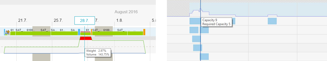
Example of utilization chart
Recommendations
Use line widths large enough for the user to distinctly recognize the line. Avoid using dotted or dashed lines whenever possible.
Table Area
The Gantt control contains a table area that allows you to display and edit details of each line. For example, you may want to edit dates using a date picker rather than dragging a shape into the chart area. The table used in the control is the SAPUI5 tree table.
Behavior and Interaction
Various tooltips can be shown, but you should not use them to show additional information because users cannot access this functionality on touch devices.
The Gantt chart supports various events, allowing you to build rich and interactive applications.
Shape Selection
When a shape (including relationships) is clicked, the shape is highlighted and an event is raised. The application can provide respective event handling to catch the event and perform tasks as needed, such as showing an action sheet, or showing a detailed information popover. A parameter is provided to enable three different selection behaviors for different usage environments:
- Single selection of the shape via clicking
- Multi-selection of the shapes via clicking
- Multi-selection of the shapes by pressing the Ctrl key and clicking
Multi-selection of shapes
Shape Drag and Drop
When you click a shape and hold the mouse in the chart area, a shadow of the shape moves along the mouse. When you release the mouse, an event is raised, and then the application can provide an event handler to catch the event and perform tasks as needed, such as moving the shape to a new position. You can also drag and drop the shape across different views inside the same Gantt chart or even outside the Gantt chart; it’s also possible to drag-and-drop multiple selected shapes.
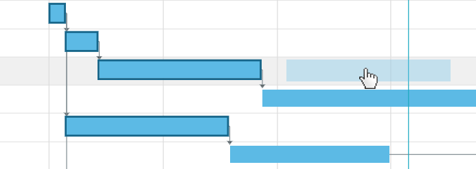
Shape drag and drop
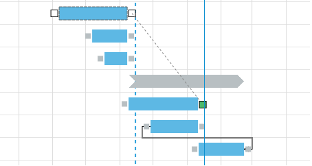
Shape Resize
When you move the mouse icon to a certain border of a shape, the mouse icon changes into a double-headed arrow, pointing left and right. This indicates that you can resize the shape. You can click and hold the mouse and then drag the shape border horizontally. Once the border reaches the expected position, release the mouse. The Gantt chart raises an event when the mouse is released. Your application can use an event handler to catch the event and then perform tasks as needed, such as changing the duration of the shape.
Resizing a shape
Relationship Creation
You can connect shapes in the Gantt chart. This can be used to represent the relationship between two activities.
To connect shapes:
- Click a shape to display its connection points on the shape borders.
- Click the connection point of the shape and then slightly drag it. This displays the connection points of all other connectable shapes.
- Connect the shape to another one by reaching its connection point via drag and drop.
Create a relationship
Row Selection
You can select a row the same way as in a tree table, and the corresponding row in the tree table and chart part is highlighted;
Multi-row selection
Resources
Want to dive deeper? Follow the links below to find out more about related controls, the SAPUI5 implementation, and the visual design.
Elements and Controls
- Charts – Color Palettes (guidelines)
- Colors (guidelines)
- Table Toolbar (guidelines)
- Tree Table (guidelines)
 Your feedback has been sent to the SAP Fiori design team.