
- SAPUI5 Version 1.122
- SAPUI5 Version 1.120
- SAPUI5 Version 1.118
- SAPUI5 Version 1.116
- SAPUI5 Version 1.114
- SAPUI5 Version 1.112
- SAPUI5 Version 1.110
- SAPUI5 Version 1.108
- SAPUI5 Version 1.106
- SAPUI5 Version 1.104
- SAPUI5 Version 1.102
- SAPUI5 Version 1.100
- SAPUI5 Version 1.98
- SAPUI5 Version 1.96
- SAPUI5 Version 1.94
- SAPUI5 Version 1.92
- SAPUI5 Version 1.90
- SAPUI5 Version 1.88
- SAPUI5 Version 1.86
- SAPUI5 Version 1.84
- SAPUI5 Version 1.82
- SAPUI5 Version 1.80
- SAPUI5 Version 1.78
- SAPUI5 Version 1.76
- SAPUI5 Version 1.74
- SAPUI5 Version 1.72
- SAPUI5 Version 1.70
- SAPUI5 Version 1.68
- SAPUI5 Version 1.66
- SAPUI5 Version 1.64
- SAPUI5 Version 1.62
- SAPUI5 Version 1.60
- SAPUI5 Version 1.58
- SAPUI5 Version 1.56
- SAPUI5 Version 1.54
- SAPUI5 Version 1.52
- SAPUI5 Version 1.50
- SAPUI5 Version 1.48
- SAPUI5 Version 1.46
- SAPUI5 Version 1.44
- SAPUI5 Version 1.42
- SAPUI5 Version 1.40
- SAPUI5 Version 1.38
- SAPUI5 Version 1.36
- SAPUI5 Version 1.34
- SAPUI5 Version 1.32
- SAPUI5 Version 1.30
- SAPUI5 Version 1.28
- SAPUI5 Version 1.26
- Latest SAPUI Version 1.124
- SAPUI5 Version 1.122
- SAPUI5 Version 1.120
- SAPUI5 Version 1.118
- SAPUI5 Version 1.116
- SAPUI5 Version 1.114
- SAPUI5 Version 1.112
- SAPUI5 Version 1.110
- SAPUI5 Version 1.108
- SAPUI5 Version 1.106
- SAPUI5 Version 1.104
- SAPUI5 Version 1.102
- SAPUI5 Version 1.100
- SAPUI5 Version 1.98
- SAPUI5 Version 1.96
- SAPUI5 Version 1.94
- SAPUI5 Version 1.92
- SAPUI5 Version 1.90
- SAPUI5 Version 1.88
- SAPUI5 Version 1.86
- SAPUI5 Version 1.84
- SAPUI5 Version 1.82
- SAPUI5 Version 1.80
- SAPUI5 Version 1.78
- SAPUI5 Version 1.76
- SAPUI5 Version 1.74
- SAPUI5 Version 1.72
- SAPUI5 Version 1.70
- SAPUI5 Version 1.68
- SAPUI5 Version 1.66
- SAPUI5 Version 1.64
- SAPUI5 Version 1.62
- SAPUI5 Version 1.60
- SAPUI5 Version 1.58
- SAPUI5 Version 1.56
- SAPUI5 Version 1.54
- SAPUI5 Version 1.52
- SAPUI5 Version 1.50
- SAPUI5 Version 1.48
- SAPUI5 Version 1.46
- SAPUI5 Version 1.44
- SAPUI5 Version 1.42
- SAPUI5 Version 1.40
- SAPUI5 Version 1.38
- SAPUI5 Version 1.36
- SAPUI5 Version 1.34
- SAPUI5 Version 1.32
- SAPUI5 Version 1.30
- SAPUI5 Version 1.28
- SAPUI5 Version 1.26
Message Strip
sap.m.MessageStrip
Intro
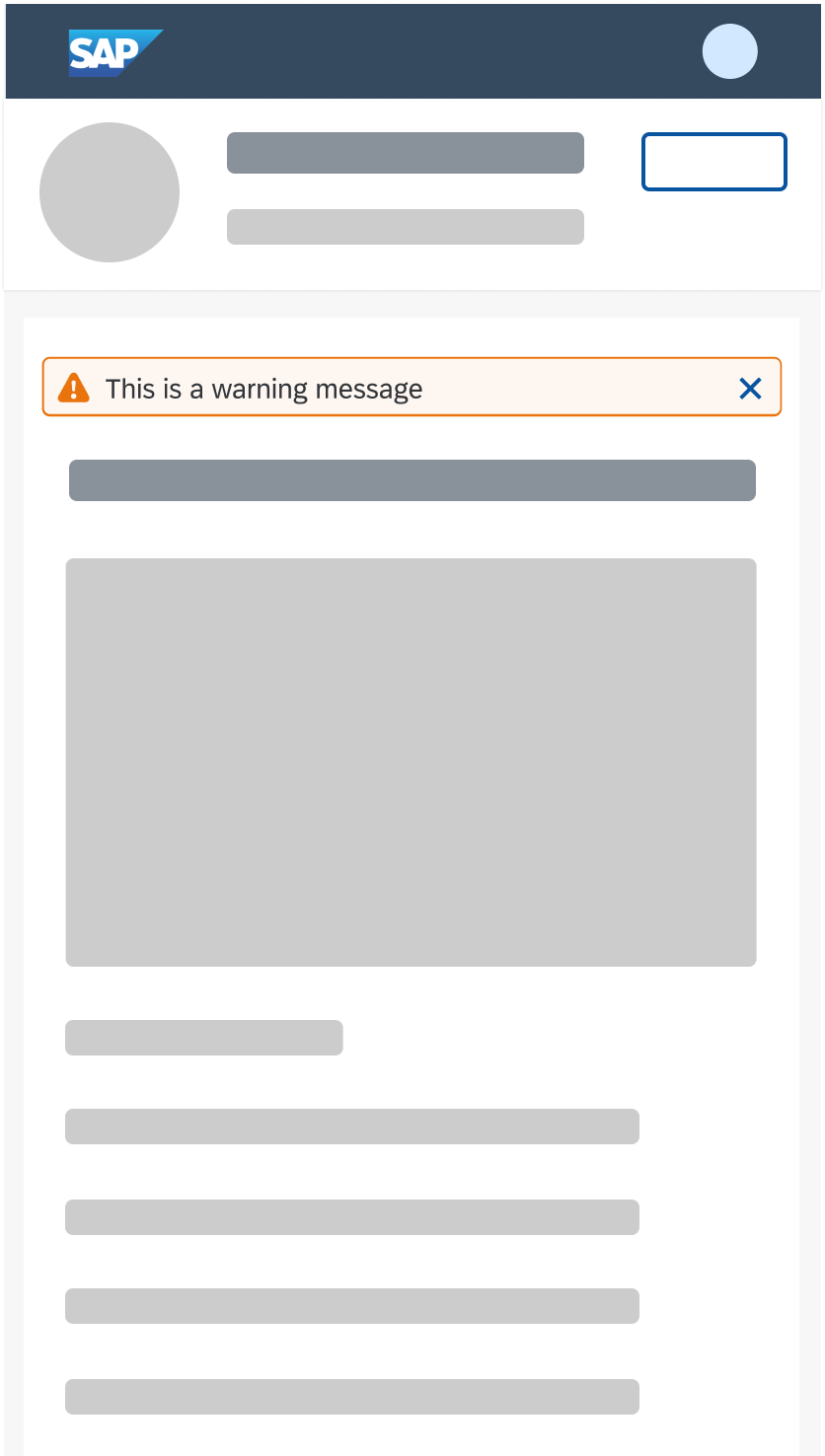
The message strip is a control that is used as an information bar. It contains information about an object or a status and can be embedded within the detail area of an object or page, or in the header of an object page.
Usage
Use the message strip if:
- You want to provide information related to the object as a whole in the object header, such as the object status.
- You want to provide information within the detail area of an object.
- You want to inform your user about a status of an object.
- You want to warn your user about an issue.
Do not use the message strip if:
- You want to display information within a control, in the list of a list-detail layout, or above the page header.
Responsiveness
The message strip is fully responsive. Icons within the message strip are displayed to the left (custom icons) or right (Close action) of the message. Text and links behave differently and wrap.
If you place the control within the detail area, it will always use 100% of the width and react to the responsiveness of the container.
Message strip on a smartphone (size S)

Message strip on a desktop (size L)
Types
The following semantic types are available.
- Information
- Warning
- Error
- Success

Different semantic types and colors
Behavior and Interaction
Static behavior
The message strip acts as an information bar. If you want to display a status related to an object, keep the interaction static and do not show the Close button.

Static behavior used to display a status
Interactive behavior
- The app team can add a link in case more content is useful for the user to understand a situation.
- Clicking the Close button on the right-hand side hides the message strip. The app team can determine whether the message strip comes back on page reload, the next visit or never.

Interactive behavior with 'Close' function
Accessibility
When an application adds a message strip dynamically, also notify screen reader users.
Use the following structure for the screen reader notification text:
“New information bar of type <Error / Warning / Success / Information>: <text of message>”
To avoid an endless screen reader announcement, send a short message summary with only the most relevant information.
Properties
sap.m.MessageStrip is limited to the following properties:
- Property:showIcon – Allows you to display an icon before the text
- Property:customIcon – Allows you to display an icon from the icon library
- Property:type – Changes the semantic color and the icon in front of the message strip
- Property:text – Adds text to the control
- Property:link – Adds a link
- Property:showCloseButton – Adds a Close button
 Your feedback has been sent to the SAP Fiori design team.