
- Version 1.118
- SAPUI5 Version 1.116
- SAPUI5 Version 1.114
- SAPUI5 Version 1.112
- SAPUI5 Version 1.110
- SAPUI5 Version 1.108
- SAPUI5 Version 1.106
- SAPUI5 Version 1.104
- SAPUI5 Version 1.102
- SAPUI5 Version 1.100
- SAPUI5 Version 1.98
- SAPUI5 Version 1.96
- SAPUI5 Version 1.94
- SAPUI5 Version 1.92
- SAPUI5 Version 1.90
- SAPUI5 Version 1.88
- SAPUI5 Version 1.86
- SAPUI5 Version 1.84
- SAPUI5 Version 1.82
- SAPUI5 Version 1.80
- SAPUI5 Version 1.78
- SAPUI5 Version 1.76
- SAPUI5 Version 1.74
- SAPUI5 Version 1.72
- SAPUI5 Version 1.70
- SAPUI5 Version 1.68
- SAPUI5 Version 1.66
- SAPUI5 Version 1.64
- SAPUI5 Version 1.62
- SAPUI5 Version 1.60
- SAPUI5 Version 1.58
- SAPUI5 Version 1.56
- SAPUI5 Version 1.54
- SAPUI5 Version 1.52
- SAPUI5 Version 1.50
- SAPUI5 Version 1.48
- SAPUI5 Version 1.46
- SAPUI5 Version 1.44
- SAPUI5 Version 1.42
- SAPUI5 Version 1.40
- SAPUI5 Version 1.38
- SAPUI5 Version 1.36
- SAPUI5 Version 1.34
- SAPUI5 Version 1.32
- SAPUI5 Version 1.30
- SAPUI5 Version 1.28
- SAPUI5 Version 1.26
- Latest SAPUI5 Version 1.120
- Version 1.118
- SAPUI5 Version 1.116
- SAPUI5 Version 1.114
- SAPUI5 Version 1.112
- SAPUI5 Version 1.110
- SAPUI5 Version 1.108
- SAPUI5 Version 1.106
- SAPUI5 Version 1.104
- SAPUI5 Version 1.102
- SAPUI5 Version 1.100
- SAPUI5 Version 1.98
- SAPUI5 Version 1.96
- SAPUI5 Version 1.94
- SAPUI5 Version 1.92
- SAPUI5 Version 1.90
- SAPUI5 Version 1.88
- SAPUI5 Version 1.86
- SAPUI5 Version 1.84
- SAPUI5 Version 1.82
- SAPUI5 Version 1.80
- SAPUI5 Version 1.78
- SAPUI5 Version 1.76
- SAPUI5 Version 1.74
- SAPUI5 Version 1.72
- SAPUI5 Version 1.70
- SAPUI5 Version 1.68
- SAPUI5 Version 1.66
- SAPUI5 Version 1.64
- SAPUI5 Version 1.62
- SAPUI5 Version 1.60
- SAPUI5 Version 1.58
- SAPUI5 Version 1.56
- SAPUI5 Version 1.54
- SAPUI5 Version 1.52
- SAPUI5 Version 1.50
- SAPUI5 Version 1.48
- SAPUI5 Version 1.46
- SAPUI5 Version 1.44
- SAPUI5 Version 1.42
- SAPUI5 Version 1.40
- SAPUI5 Version 1.38
- SAPUI5 Version 1.36
- SAPUI5 Version 1.34
- SAPUI5 Version 1.32
- SAPUI5 Version 1.30
- SAPUI5 Version 1.28
- SAPUI5 Version 1.26
Multi-Combo Box
ui5-multi-combobox | v1.0
Intro
The multi-combo box component enables users to select options from a predefined list or enter a custom text.
It provides an editable input field to filter the list and a dropdown arrow to open the list of available options. The select options in the list have checkboxes that permit multiple selection.
Multi-combo box – live example
When to Use
Use the multi-combo box:
- To select one or more options from a long list of options (no more than ~200).
- If the values in the option list contain secondary information that doesn’t need to be displayed right away.
Don’t use the multi-combo box:
- To select multiple ranges.
- To select or search multiple business objects.
- To select an item from a short list of items.
- If you want to let users add custom values. Consider using the multi-input field instead.
- If the list contains more than ~200 items.
Anatomy
- Text: Placeholder or typed text
- Input field: Area for displaying tokens and typing text.
- Arrow button: Opens a dropdown list with the values that can be added as tokens.
- Tokens: Show individual selected values.
- Overflow button: Show all selected values.
-
- n More: Appears after the last visible token. The count n indicates how many other values are selected.
-
- n Items: Appears if no tokens fit into the input field. The count n indicates how many values are selected overall.
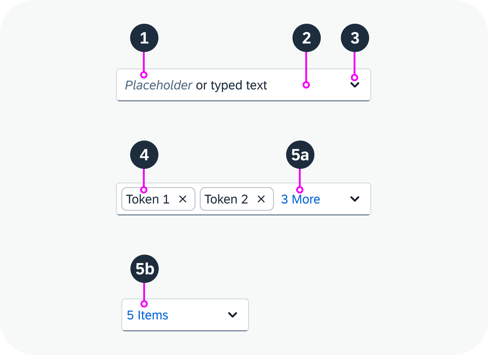
Anatomy of a multi-combo box
Variants
Grouped Items
Multi-combo box with grouped items
Predefined Options Only
The user can only write text that matches a predefined value in the list. The text must start with the first letter of a value. If the user types something that doesn’t match one of the options, the multi-combo box switches to an error state.
Multi-combo box with predefined options only – live example
With Free Text Input
The user also has the option of entering a freestyle text. If the text doesn’t match one of the available options, no token is created and the text is displayed directly in the input field.
Multi-combo box with free text input – live example
Behavior and Interaction
Select
To select values, users can:
- Click the dropdown arrow and select the relevant options from the list.
- Start to type a value and then select the proposed option.
The selected options then appear as tokens in the input field. If there isn’t enough space to display all the tokens, an overflow button appears (n More, or n Items).
Empty multi-combo box – live example
Adjust Selection
To view the selected options, users can:
- Click the arrow button to display the full selection list (both selected and non-selected items).
- Click the overflow button n More or n Items (if shown) to view all the selected items.
To remove an item from the selection, users can
- Click the “X” icon in the token.
- Focus on the token to select it and use the keyboard delete key to remove the token.
Multi-combo box with multiple tokens – live example
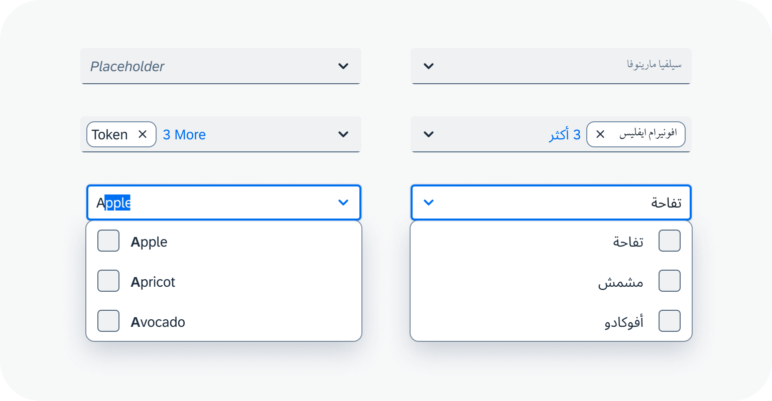
Globalization and Localization
The multi-combo box supports left-to-right (LTR) and right-to-left (RTL) reading directions.
 Your feedback has been sent to the SAP Fiori design team.