
- SAPUI5 Version 1.122
- SAPUI5 Version 1.120
- SAPUI5 Version 1.118
- SAPUI5 Version 1.116
- SAPUI5 Version 1.114
- SAPUI5 Version 1.112
- SAPUI5 Version 1.110
- SAPUI5 Version 1.108
- SAPUI5 Version 1.106
- SAPUI5 Version 1.104
- SAPUI5 Version 1.102
- SAPUI5 Version 1.100
- SAPUI5 Version 1.98
- SAPUI5 Version 1.96
- SAPUI5 Version 1.94
- SAPUI5 Version 1.92
- SAPUI5 Version 1.90
- SAPUI5 Version 1.88
- SAPUI5 Version 1.86
- SAPUI5 Version 1.84
- SAPUI5 Version 1.82
- SAPUI5 Version 1.80
- SAPUI5 Version 1.78
- SAPUI5 Version 1.76
- SAPUI5 Version 1.74
- SAPUI5 Version 1.72
- SAPUI5 Version 1.70
- SAPUI5 Version 1.68
- SAPUI5 Version 1.66
- SAPUI5 Version 1.64
- SAPUI5 Version 1.62
- SAPUI5 Version 1.60
- SAPUI5 Version 1.58
- SAPUI5 Version 1.56
- SAPUI5 Version 1.54
- SAPUI5 Version 1.52
- SAPUI5 Version 1.50
- SAPUI5 Version 1.48
- SAPUI5 Version 1.46
- SAPUI5 Version 1.44
- SAPUI5 Version 1.42
- SAPUI5 Version 1.40
- SAPUI5 Version 1.38
- SAPUI5 Version 1.36
- SAPUI5 Version 1.34
- SAPUI5 Version 1.32
- SAPUI5 Version 1.30
- SAPUI5 Version 1.28
- SAPUI5 Version 1.26
- Latest SAPUI Version 1.124
- SAPUI5 Version 1.122
- SAPUI5 Version 1.120
- SAPUI5 Version 1.118
- SAPUI5 Version 1.116
- SAPUI5 Version 1.114
- SAPUI5 Version 1.112
- SAPUI5 Version 1.110
- SAPUI5 Version 1.108
- SAPUI5 Version 1.106
- SAPUI5 Version 1.104
- SAPUI5 Version 1.102
- SAPUI5 Version 1.100
- SAPUI5 Version 1.98
- SAPUI5 Version 1.96
- SAPUI5 Version 1.94
- SAPUI5 Version 1.92
- SAPUI5 Version 1.90
- SAPUI5 Version 1.88
- SAPUI5 Version 1.86
- SAPUI5 Version 1.84
- SAPUI5 Version 1.82
- SAPUI5 Version 1.80
- SAPUI5 Version 1.78
- SAPUI5 Version 1.76
- SAPUI5 Version 1.74
- SAPUI5 Version 1.72
- SAPUI5 Version 1.70
- SAPUI5 Version 1.68
- SAPUI5 Version 1.66
- SAPUI5 Version 1.64
- SAPUI5 Version 1.62
- SAPUI5 Version 1.60
- SAPUI5 Version 1.58
- SAPUI5 Version 1.56
- SAPUI5 Version 1.54
- SAPUI5 Version 1.52
- SAPUI5 Version 1.50
- SAPUI5 Version 1.48
- SAPUI5 Version 1.46
- SAPUI5 Version 1.44
- SAPUI5 Version 1.42
- SAPUI5 Version 1.40
- SAPUI5 Version 1.38
- SAPUI5 Version 1.36
- SAPUI5 Version 1.34
- SAPUI5 Version 1.32
- SAPUI5 Version 1.30
- SAPUI5 Version 1.28
- SAPUI5 Version 1.26
Table
ui5-table | v1.0
Intro
A table contains a set of data that is structured in rows and columns.
Table cells can contain any kind of data, including interactive controls that allow users to edit the data, navigate, or trigger related actions.
Table – live example
When to Use
Use the table:
- If you need to display tabular data.
- To enable selection of one or more items when details are needed to choose the correct item.
- If rows are independent of each other and no operations are required across columns.
- If you want to have only one implementation for all devices.
Don’t use the table:
- To display content that doesn’t require tabular data, such as text or images.
- To create a layout.
Anatomy
Table
- Column Header: Contains the title for each column.
- Column: Vertical arrangement of data within the table. A column represents a single type of information that is associated with each row in the table.
- Row: Horizontal arrangement of data within the table. A row represents a line item for an entity with multiple data points, organized in columns.
- Cell: A cell can contain any type of component. Each cell can contain one or more lines of text.
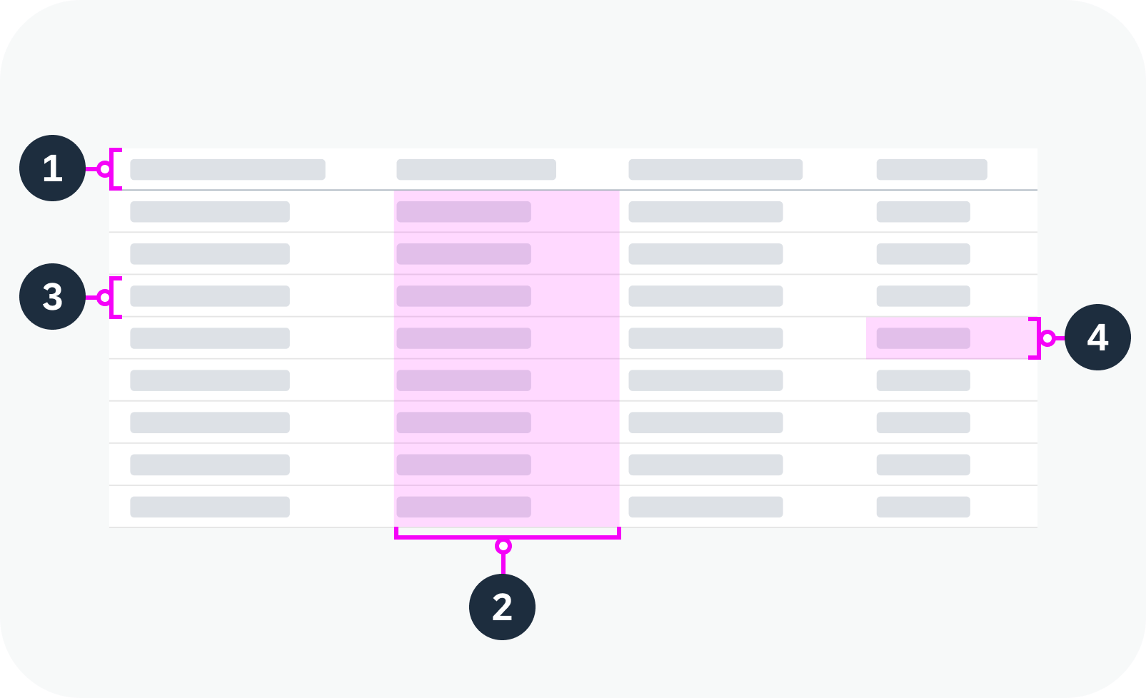
Anatomy of a table
Group Row
A group row is a visual separator between sets of data in the table. It is used to group related data and make it easier to read and understand.
Each group row contains a heading that describes the data below it. To preserve the intended design, we strongly recommend using text only.
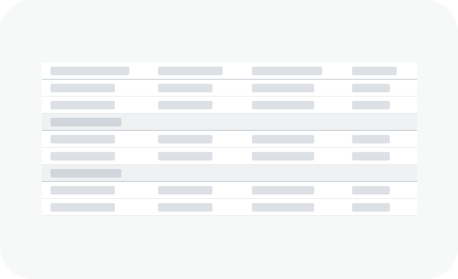
Table with group rows
Variants
You can adapt the following table parameters
Table with Sticky Column Header
You can set the column header of the table to remain fixed at the top of the page during vertical scrolling as long as the table component is in the viewport.
Table Selection Mode
The table supports different types of selection mode:
- None (default)
- Single selection
- Multiple selection
Single selection: Only one row can be selected.
Table in single selection mode
Multiple selection: Multiple rows can be selected. A checkbox appears at the beginning of each row.
Table in multiple selection mode
You can also specify if a visual response is provided upon press when the user clicks on a row or presses Enter.
Growing Behavior
You can let the table grow – either by adding a scrollbar to the table or by showing a More button. By default, the growing capability is switched off.
Scroll: More rows are loaded when the user scrolls to the bottom of the table.
Button: Shows a More button at the bottom of the table. Pressing the button loads more items.
Growing mode with ‘More’ button
You can change the text for the growing button.
In addition, you can display a subtext below the button.
Growing mode with custom button text and subtext
Cells with Additional Components
You can add additional components to a cell. This allows you to provide additional information, include a visual representation, or otherwise increase usability. Only use components that make sense in the context of the table.
Example: Product and product ID in one cell
Table with No Data
If no data is available in the table, a “No Data” text is displayed by default. App teams can customize the text.
Table without data
Busy Indicator
If the table is in the process of fetching data, show the busy indicator. The opacity of the table component is then reduced and the busy indicator is displayed on top of the table content.
Table in a busy state
Behavior and Interaction
Focus
Clicking a row sets the focus on that row.
Focus on a table row – live example
Single Selection Mode
Selecting a row in single selection mode highlights the row.
Table in single selection mode – live example
Multiple Selection Mode
In multiple selection mode, selecting the checkbox for a row selects the row and highlights it.
Selecting the checkbox in the table header selects all the table rows at once.
Table in multiple selection mode – live example
Table with group rows in multiple selection mode – live example
Sticky Column Header
If the column headers are set to “sticky”, they remain in place when the user scrolls down.
Table with sticky column headers – live example
Touch Enablement
The behavior for selecting a row from the table on touch devices is similar to the mouse interaction.
The gesture for selecting a row is a one-finger tap.
Responsive Behavior
You can make tables responsive on smaller screens by hiding columns or by moving some content into the first column.
Use of these responsive features is optional. By default, the table just minimizes all visible columns until they are no longer readable.
If you don’t implement the responsive behavior, ensure that you provide an adaptive solution for smaller screens.
Minimum Width
For each column, you can set the minimum table width that is required for the column to be displayed. In this way, you can determine which columns are shown for different screen sizes. You can also allow the column to “pop in” instead of hiding it (see below).
Pop-In Mode
If the table isn’t wide enough to show all columns, you can opt to let the content of the missing columns “pop in” below the content of the first column.
By default, the pop-in mode is switched off. App teams must activate it explicitly.
For smaller screens, you can pick which columns remain in the one-column or two-column table. All other data is moved to the space between two rows, known as the “pop-in area”.
In this area, data for the corresponding cell is provided as a label/value pair. The label is defined by the column header, and the value is taken from the corresponding cell. Labels can be displayed next to the value or above the value.
Within the pop-in area, multiple label/value pairs can be displayed in two ways:
- Inline: Label/value pairs are listed next to each other.
- Block: Label/value pairs are listed one below the other.
Depending on how the table will be used, we recommend using the last column to show right-aligned content.
Table in pop-in mode
Content Density
The table is available in two different sizes:
- Cozy: Broader spacing for touch devices
- Compact: Regular spacing for desktop devices
Table in cozy mode
Table in compact mode
Globalization and Localization
For right-to-left languages, the table is mirrored. In pop-in mode, the content pops in on the right.
 Your feedback has been sent to the SAP Fiori design team.