
- SAPUI5 Version 1.122
- SAPUI5 Version 1.120
- SAPUI5 Version 1.118
- SAPUI5 Version 1.116
- SAPUI5 Version 1.114
- SAPUI5 Version 1.112
- SAPUI5 Version 1.110
- SAPUI5 Version 1.108
- SAPUI5 Version 1.106
- SAPUI5 Version 1.104
- SAPUI5 Version 1.102
- SAPUI5 Version 1.100
- SAPUI5 Version 1.98
- SAPUI5 Version 1.96
- SAPUI5 Version 1.94
- SAPUI5 Version 1.92
- SAPUI5 Version 1.90
- SAPUI5 Version 1.88
- SAPUI5 Version 1.86
- SAPUI5 Version 1.84
- SAPUI5 Version 1.82
- SAPUI5 Version 1.80
- SAPUI5 Version 1.78
- SAPUI5 Version 1.76
- SAPUI5 Version 1.74
- SAPUI5 Version 1.72
- SAPUI5 Version 1.70
- SAPUI5 Version 1.68
- SAPUI5 Version 1.66
- SAPUI5 Version 1.64
- SAPUI5 Version 1.62
- SAPUI5 Version 1.60
- SAPUI5 Version 1.58
- SAPUI5 Version 1.56
- SAPUI5 Version 1.54
- SAPUI5 Version 1.52
- SAPUI5 Version 1.50
- SAPUI5 Version 1.48
- SAPUI5 Version 1.46
- SAPUI5 Version 1.44
- SAPUI5 Version 1.42
- SAPUI5 Version 1.40
- SAPUI5 Version 1.38
- SAPUI5 Version 1.36
- SAPUI5 Version 1.34
- SAPUI5 Version 1.32
- SAPUI5 Version 1.30
- SAPUI5 Version 1.28
- SAPUI5 Version 1.26
- Latest SAPUI Version 1.124
- SAPUI5 Version 1.122
- SAPUI5 Version 1.120
- SAPUI5 Version 1.118
- SAPUI5 Version 1.116
- SAPUI5 Version 1.114
- SAPUI5 Version 1.112
- SAPUI5 Version 1.110
- SAPUI5 Version 1.108
- SAPUI5 Version 1.106
- SAPUI5 Version 1.104
- SAPUI5 Version 1.102
- SAPUI5 Version 1.100
- SAPUI5 Version 1.98
- SAPUI5 Version 1.96
- SAPUI5 Version 1.94
- SAPUI5 Version 1.92
- SAPUI5 Version 1.90
- SAPUI5 Version 1.88
- SAPUI5 Version 1.86
- SAPUI5 Version 1.84
- SAPUI5 Version 1.82
- SAPUI5 Version 1.80
- SAPUI5 Version 1.78
- SAPUI5 Version 1.76
- SAPUI5 Version 1.74
- SAPUI5 Version 1.72
- SAPUI5 Version 1.70
- SAPUI5 Version 1.68
- SAPUI5 Version 1.66
- SAPUI5 Version 1.64
- SAPUI5 Version 1.62
- SAPUI5 Version 1.60
- SAPUI5 Version 1.58
- SAPUI5 Version 1.56
- SAPUI5 Version 1.54
- SAPUI5 Version 1.52
- SAPUI5 Version 1.50
- SAPUI5 Version 1.48
- SAPUI5 Version 1.46
- SAPUI5 Version 1.44
- SAPUI5 Version 1.42
- SAPUI5 Version 1.40
- SAPUI5 Version 1.38
- SAPUI5 Version 1.36
- SAPUI5 Version 1.34
- SAPUI5 Version 1.32
- SAPUI5 Version 1.30
- SAPUI5 Version 1.28
- SAPUI5 Version 1.26
UI Element States
Overview
Using the correct state or combination of states for a UI element helps users to recognize possible options and see where they need to take action.
Depending on the UI element, different types of state are supported:
- Control states
- Value states
- Visual states
- Additional states
The table shows the possible states for each type.
Control States
A UI element can have only one control state at any given time.
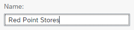
Enabled
“Enabled” is the default state for all UI elements. The UI element is focusable, visible, and – if applicable – editable. The value of the UI element is easy to recognize.

Enabled button

Enabled checkbox
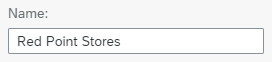
Enabled input field
Use the “enabled” state if:
- A UI element can currently be used.
- A UI element cannot currently be used, but disabling it is not an option because users might not know how to enable it. In this case, keep the UI element enabled and provide a message if it is used incorrectly.
Example: Enable a button even if the corresponding action can only be performed if a setting is made on another page or in a completely different subsection on the same page. - A UI element is a finalizing action, such as Save, Accept, OK, or Cancel. Finalizing actions are placed on the footer toolbar of a page or dialog.
- A button on a table toolbar does not depend on items in the table being selected.
Examples: Column Settings, Sort, Filter, Full Screen, Add - A button on a table toolbar depends on items in the table being selected, and one or more of the items currently selected fulfills the requirements for enabling the button.
Example: Enable Delete on a table toolbar even if the user can delete only some of the items in the current selection. - An action is global, such as Share or Print.
Do not use the “enabled” state if:
- A UI element cannot currently be used and it would be obvious how enable it. Disable it instead.
- A UI element cannot be used at all. Hide it instead.
- A button on a table toolbar depends on items in the table being selected, and none of the items currently selected fulfills the requirements for enabling the button. Disable the button instead.
For more information on enabling actions in a table toolbar, see: Enabling/Disabling Actions.
Disabled
Disabled UI elements are visible, but not focusable or editable. Depending on the theme, the value of the UI element might not be recognizable.

Disabled button

Disabled checkbox
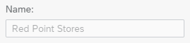
Disabled input field
Use the “disabled” state if:
- A UI element cannot currently be used, and it is obvious how enable it.
Example:
The user must click a checkbox to add a value in an input field. The input field is placed directly next to or directly below the corresponding checkbox. Disable the input field if the checkbox is not selected, and enable it as soon as the checkbox is selected. - A button on a table toolbar depends on items in the table being selected, and the current selection does not include suitable items.
Examples:
- Disable Copy if nothing is selected.
- Disable Compare if fewer than two suitable items are selected.
- Disable Delete if nothing is selected or if the current selection contains only items that cannot be deleted, such as locked items.
Do not use the “disabled” state if:
- The user can never enable the UI element. Hide it instead.
- It would not be clear why a UI element is disabled. In this case, keep the UI element enabled and provide a message if it is used incorrectly.
- The input value of a UI element is relevant, and taken into account if a finalizing action is triggered. In this case, users must also be able to read the value. Use the read-only state instead.
Never disable the checkboxes that are used to select items in a table or list. If an action can’t be executed for some of the selected items, keep the checkbox enabled and display an appropriate message when the action is triggered.
For more information on disabling actions in a table toolbar, see: Enabling/Disabling Actions.
Hidden
Hidden UI elements are not visible, not focusable, and not editable. The UI element doesn’t take up any space. If a UI element is hidden at runtime, the freed space is used by subsequent UI elements.
Use the “hidden” state if:
- A UI element can never be used (for example, because the role or group assigned to the user doesn’t include the necessary authorization).
- Hiding the UI element is a meaningful form of responsive behavior.
Example: A column of a table is not needed on phones. - A UI element is not available in the current mode.
Example: Buttons that are only available in edit mode should be hidden in display mode. - A UI element is not available for the current state.
Examples:
- Hide Delete on a page in an undeletable state, such as “sent”.
- Hide Delete as a line-item action for an undeletable item.
- Parts of the UI are changed based on a setting.
Example: When changing the setting, hide UI elements that are not available for the new setting.
Do not use the “hidden” state if:
- A UI element cannot currently be used, but can be enabled by user actions.
Examples:- A selection does not contain deletable items. In this case, disable Delete.
- A table was filtered down and currently doesn’t contain deletable items. In this case, disable Delete.
Read Only
Read-only UI elements are displayed in edit mode, but are currently not editable. The UI element is visible and focusable. The value can be recognized and selected, but not changed.

Read-only checkbox
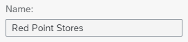
Read-only input field
Use the “read only” state if:
- A page or a part of it is in edit mode, and
- a UI element is currently not editable or changeable.
- an input value is relevant and needs to be taken into account when triggering a finalizing action.
- an input value must be readable.
Do not use the “read only” state if:
Display Only
The display-only state is used for two cases:
- A UI element is used in display mode.
- A UI element is displayed in edit mode, but is never editable.
The visualization of display-only UI elements is optimized for reading. The type of UI element does not necessarily need to be recognized. The UI element is not focusable (exception: links), and not editable. Its value is recognizable and shown in full (not truncated). The UI element might also be displayed in a “compressed” format, where the information is displayed differently to the read-only or editable state.

Display-only checkbox
Use the “display only” state if:
- A page or part of it is in display mode.
- An input value is relevant and needs to be taken into account (for example, it is sent on Submit)
- A page or part of it is in edit mode, and a UI element is never editable (for example, a UI element displaying a generated ID).
- A link cannot be accessed by the user but the link text contains valuable information.
Example: A link to a sales order object page shows the sales order number as link text. If the user doesn’t have access to the object page, show the sales order number as plain text.
Do not use the “display only” state if:
- A page or part of it is editable and a UI element is currently not editable. Use the read-only state instead.
- A link cannot be accessed by the user and the link text doesn’t contain valuable information. Hide the link instead.
Example: A link to a fact sheet shows the link text Fact Sheet (or Details). If the user is not authorized to open the fact sheet, do not show the link at all.
Value Help Only
If the control state is “value help only”, the UI element is displayed in edit mode, and is visible and focusable. The value of the UI element is recognizable. The value can be changed, but only with a value help dialog.
This state is only available for certain user input elements.
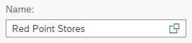
Value-help-only input field
Use the “value help only” state if:
- A UI element can currently be used.
- User input is limited to specific values, and you don’t want to let users type in values directly.
Do not use the “value help only” state if:
- You want to allow free text entry.
- User input should be limited to specific values, but typing them is faster and more efficient. In this case, work with selects, combo boxes, or input fields with suggestions and validation to limit the user input to the permitted values.
- The surrounding page (or part of it) is in display mode.
Value States
Value states are only available for user input elements. A UI element can have only one value state at any given time. The value states make use of the semantic colors. For more information, see How to Use Semantic Colors.
None
“None” (same as “Regular”) is the default state. It means that no value state is applied. Do not change the value state unless you have a reason to do so.
Input field without value state
Use the “none” state if:
- There is no reason to use another value state.
- The user input has not yet been validated.
- Validation of the user input was successful, without any issues.
- A message contains non-critical, additional information for users.
Do not use the “none” state if:
- User input was validated and a problem occurred. Depending on the severity, use the warning or error state instead.
- A message contains information about a warning or error.
Error
The error state marks a UI element if a validation fails with an error. Errors prevent users from continuing their work.

Checkbox with error
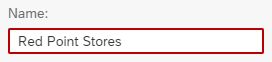
Input field with error
Use the “error state” if:
- Users need to be prevented from finalizing the current mode or page.
- User input failed a validation, and the problem must be fixed before the user can continue.
- A message contains information about an error.
Do not use the “error” state if:
- User input was validated successfully. Do not apply a value state at all.
- User input was validated and only minor problems occurred. Users can still finalize the current mode or page. Use the warning state instead.
- The surrounding page (or part of it) is in display mode.
Warning
The warning state marks a UI element if a validation identifies a minor problem. Users can carry on working, but might run into an error later on.

Checkbox with warning
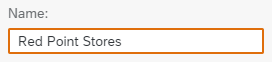
Input field with warning
Use the “warning” state if:
- The current mode or page can be finalized, but doing so might lead to an error later on.
- User input was validated and a minor problem occurred. It is possible to continue without fixing the problem, but doing so might lead to an error later on.
- A message contains information about a warning.
Do not use the “warning” state if:
- User input was validated successfully. Do not apply a value state at all.
- User input was validated and a major problem occurred. Users must fix the problem before finalizing the current mode or page. Use the error state instead.
- The surrounding page (or part of it) is in display mode.
Success
The success state marks a UI element if a validation succeeded without errors or warnings.
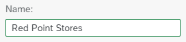
Input field - Success state
Use the “success” state if:
- A message contains information about a process that was finalized without any issues. Users will need this information later on (for example, values that need to be copied to another app).
Do not use the “success” state if:
- A process was finalized successfully and a short notification is enough. In this case, use a message toast instead.
- The surrounding page (or part of it) is in display mode.
Information
The information state marks a UI element to draw attention to the information it provides.
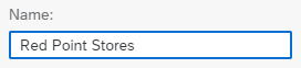
Input field - Information state
Use the “information” state if:
- You want to draw attention to a control, such as highlighting intelligent recommendations.
Do not use the “information” state if:
- The surrounding page (or part of it) is in display mode.
- User input was validated successfully. Do not apply a value state at all.
- User input was validated and a major problem occurred. Users must fix the problem before finalizing the current mode or page. Use the error state instead.
Visual States
Visual states are handled by the corresponding UI element directly. A UI element can have only one visual state at any given time.
Regular
A UI element is shown in the regular visual state if the user is not interacting with it.
Regular button
Regular checkbox
Regular input field
Hovered
The hovered state shows that the cursor of a pointing device (such as a mouse or pen) is currently placed on a UI element that is in an enabled, read-only, or value-help-only state.
The hovered state is not available if the UI element is used with keyboard and touch devices.

Button in hovered state

Checkbox in hovered state
Do not use the “hovered” state if:
- You need to provide additional information for a UI element. The hovered state is only available for some interaction devices. When using other devices, the information gets lost.
Pressed
The pressed state is displayed when a UI element is activated or remains in an activated state (“toggled”). A UI element is activated if a user clicks it.

Pressed button
Additional States
Focused
The focus determines which UI element receives the user input when the user input itself does not supply positioning information (for example, keyboard input).
Only one UI element can have the focus at any given time.
The focus is changed by activating another UI element with an input device that provides positioning information (mouse, pen, touch). Clicking an area without a focusable UI element removes the focus until another UI element gets the focus through a user interaction.
With a keyboard, the focus is changed as follows:
| Key(s) | Change in Focus |
| Tab | Move forward |
| Shift+Tab | Move backward |
| F6 | Move the focus forward to the first element of the next group. |
| Shift+F6 | Move the focus backward to the first element of the previous group. |
| Arrow keys | Move the focus between items (for example, within lists, tables, calendars, or charts). |
When you move the focus using the keyboard, the newly-focused element does not get activated (“pressed”).
Initial Focus Position
When opening a new page, dialog or similar element, make sure that the focus is initially placed at a meaningful element. For example:
- At the first focusable element below the launchpad shell bar
- The first editable field
- The first editable field that requires user input
Or in general: The element that is likely to be the first one used.

Focused button

Focused checkbox
Focused input field
Selected
The “selected” state shows that the UI element is currently selected. This state is only available for selectable controls, such as checkboxes, radio buttons, or items.
Selected checkbox

Unselected check box
Required
The “required” state for a user input element shows that users have to provide an input value. If no value is provided, validation fails.
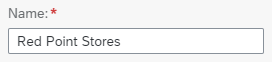
Required input field
Use the “required” state if:
- A UI element must contain user input.
Do not use the “required” state if:
- User input is not mandatory.
- The UI element is not intended for user input, such as a title.
- The surrounding page (or part of it) is in display mode.
Guidelines
Combining States
Control States
Use only one control state at any given time. If several control states need to be combined, use the most restrictive state.
List of control states in edit mode, from the most restrictive to the least restrictive:
- Hidden
- Disabled
- Display only
- Read only
- Value help only
- Enabled
In display mode, use only the following control states:
- Hidden
- Display only
- Enabled (for display controls only)
Visual States
Use only one visual state at any given time. If several visual states need to be combined, use the one that requires the most user interaction.
List of visual states, from the most to least user interaction:
- Pressed
- Hovered
- Toggled
- Regular
Value States
Use only one value state at any given time. If several value states need to be combined, use the most severe state.
List of value states, from the most severe to the least severe:
- Error
- Warning
- Success
- Information
- None
Combining Different Types of State
- Hidden and disabled UI elements cannot be combined with any other state.
- Display-only UI elements can be combined with the pressed state (toggle only) and the selected state.
- Read-only UI elements can be combined with pressed state (toggle only) and with the selected state. In addition, read-only elements can be focused.
- Value-help-only UI elements can be combined with any visual states. In addition, they can be required and focused.
- Enabled UI elements can be combined with any visual state, any value state, and any additional state.
Resources
Want to dive deeper? Follow the links below to find out more about related controls, the SAPUI5 implementation, and the visual design.
Elements and Controls
- How to Use Semantic Colors (guidelines)
- Input Field (guidelines)
- Message Handling (guidelines)
 Your feedback has been sent to the SAP Fiori design team.