
- SAPUI5 Version 1.122
- SAPUI5 Version 1.120
- SAPUI5 Version 1.118
- SAPUI5 Version 1.116
- SAPUI5 Version 1.114
- SAPUI5 Version 1.112
- SAPUI5 Version 1.110
- SAPUI5 Version 1.108
- SAPUI5 Version 1.106
- SAPUI5 Version 1.104
- SAPUI5 Version 1.102
- SAPUI5 Version 1.100
- SAPUI5 Version 1.98
- SAPUI5 Version 1.96
- SAPUI5 Version 1.94
- SAPUI5 Version 1.92
- SAPUI5 Version 1.90
- SAPUI5 Version 1.88
- SAPUI5 Version 1.86
- SAPUI5 Version 1.84
- SAPUI5 Version 1.82
- SAPUI5 Version 1.80
- SAPUI5 Version 1.78
- SAPUI5 Version 1.76
- SAPUI5 Version 1.74
- SAPUI5 Version 1.72
- SAPUI5 Version 1.70
- SAPUI5 Version 1.68
- SAPUI5 Version 1.66
- SAPUI5 Version 1.64
- SAPUI5 Version 1.62
- SAPUI5 Version 1.60
- SAPUI5 Version 1.58
- SAPUI5 Version 1.56
- SAPUI5 Version 1.54
- SAPUI5 Version 1.52
- SAPUI5 Version 1.50
- SAPUI5 Version 1.48
- SAPUI5 Version 1.46
- SAPUI5 Version 1.44
- SAPUI5 Version 1.42
- SAPUI5 Version 1.40
- SAPUI5 Version 1.38
- SAPUI5 Version 1.36
- SAPUI5 Version 1.34
- SAPUI5 Version 1.32
- SAPUI5 Version 1.30
- SAPUI5 Version 1.28
- SAPUI5 Version 1.26
- Latest SAPUI Version 1.124
- SAPUI5 Version 1.122
- SAPUI5 Version 1.120
- SAPUI5 Version 1.118
- SAPUI5 Version 1.116
- SAPUI5 Version 1.114
- SAPUI5 Version 1.112
- SAPUI5 Version 1.110
- SAPUI5 Version 1.108
- SAPUI5 Version 1.106
- SAPUI5 Version 1.104
- SAPUI5 Version 1.102
- SAPUI5 Version 1.100
- SAPUI5 Version 1.98
- SAPUI5 Version 1.96
- SAPUI5 Version 1.94
- SAPUI5 Version 1.92
- SAPUI5 Version 1.90
- SAPUI5 Version 1.88
- SAPUI5 Version 1.86
- SAPUI5 Version 1.84
- SAPUI5 Version 1.82
- SAPUI5 Version 1.80
- SAPUI5 Version 1.78
- SAPUI5 Version 1.76
- SAPUI5 Version 1.74
- SAPUI5 Version 1.72
- SAPUI5 Version 1.70
- SAPUI5 Version 1.68
- SAPUI5 Version 1.66
- SAPUI5 Version 1.64
- SAPUI5 Version 1.62
- SAPUI5 Version 1.60
- SAPUI5 Version 1.58
- SAPUI5 Version 1.56
- SAPUI5 Version 1.54
- SAPUI5 Version 1.52
- SAPUI5 Version 1.50
- SAPUI5 Version 1.48
- SAPUI5 Version 1.46
- SAPUI5 Version 1.44
- SAPUI5 Version 1.42
- SAPUI5 Version 1.40
- SAPUI5 Version 1.38
- SAPUI5 Version 1.36
- SAPUI5 Version 1.34
- SAPUI5 Version 1.32
- SAPUI5 Version 1.30
- SAPUI5 Version 1.28
- SAPUI5 Version 1.26
Avatar
ui5-avatar | v1.0
Intro
The avatar is a component for displaying images. Typically, it represents a person in a user profile, a product on a product page, or items/people in a list.
In addition to images, avatars can also display placeholders, such as icons or user initials.
Avatar variants for a user – live examples
Avatar variants for a product – live examples
When to Use
Use the avatar:
- To display an image, initials, or placeholder icon for a user.
- To display an image or placeholder icon for business-related content, such as products, parts, or a company logo.
Don’t use the avatar:
Anatomy
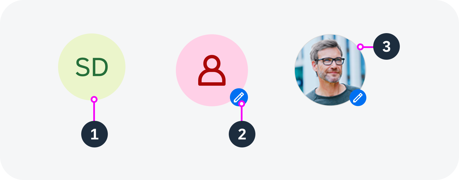
Variants
Avatar Type
An avatar can be visualized in three ways:
- Image: Specific image of a person or business object/entity.
- Icon: Placeholder image for a person or business object/entity.
- Initials: Up to 3 alphabetical characters that usually stand for a person’s first and last name(s). Also see Responsive Behavior – Globalization and Localization.
Avatar Shape
An avatar can be circular or square.
Use a circle for people and a square for product or business-related images.
Background Color
You can specify the background color for avatars with initials or placeholder icons.
User avatars – circular
Business avatars – square
Avatar Size
The avatar component has five predefined sizes. These are the same for both compact and cozy form factors:
- XS – mainly used in table list items, card list items
- Small – mainly used in card headers, card list items
- Medium – mainly used in app headers for small screen sizes
- Large – mainly used in app headers for normal screen sizes
- XL – mainly used in app headers for large screen sizes
- Custom (if required by the use case)
If a display shape is applied, the avatar component acts adaptively based on the defined display sizes. The app developer can set a certain avatar size for particular breakpoints.
Predefined avatar sizes: XS, S, M, L, XL
Badge
If the avatar is clickable, you can show a badge with an icon.
- The badge indicates that the avatar is interactive.
- The icon indicates the action that is triggered by clicking the avatar (for example, edit images, take a picture, zoom in).
Business avatars with badges – live examples
Scale Type
You can specify how the original image fits into the avatar:
- Cover (default): The size of the image is scaled up to completely cover the avatar area. As a result, parts of the image may be outside the avatar shape. Use the “cover” fit type if the focal point is in the center of the image.
- Contain – The image is scaled down to fit into the component area. The entire image is displayed, but might not fully fill the shape. In this case, the avatar displays a default background color. The image itself is always centered inside the shape. Use the “contain” fit type for images that need to be displayed in full.
Scale type – cover
Scale type – contain
Behavior and Interaction
Clicking an avatar or selecting it via the keyboard activates its focus state, visualized with a solid line surrounding the avatar.
Interactive avatars – live examples
Globalization and Localization
Initials
By default, initials are restricted to 3 letters. If more than 3 letters are required for longer names (such as Anna María Agustí Suárez), the gender-neutral placeholder icon is displayed instead. The placeholder is also used if the three letters don’t fit into the circle (for example, WWW).
Some languages are not built on an alphabet or simply don’t use initials at all. In this case, the gender-neutral placeholder icon is used by default.
 Your feedback has been sent to the SAP Fiori design team.