
- SAPUI5 Version 1.122
- SAPUI5 Version 1.120
- SAPUI5 Version 1.118
- SAPUI5 Version 1.116
- SAPUI5 Version 1.114
- SAPUI5 Version 1.112
- SAPUI5 Version 1.110
- SAPUI5 Version 1.108
- SAPUI5 Version 1.106
- SAPUI5 Version 1.104
- SAPUI5 Version 1.102
- SAPUI5 Version 1.100
- SAPUI5 Version 1.98
- SAPUI5 Version 1.96
- SAPUI5 Version 1.94
- SAPUI5 Version 1.92
- SAPUI5 Version 1.90
- SAPUI5 Version 1.88
- SAPUI5 Version 1.86
- SAPUI5 Version 1.84
- SAPUI5 Version 1.82
- SAPUI5 Version 1.80
- SAPUI5 Version 1.78
- SAPUI5 Version 1.76
- SAPUI5 Version 1.74
- SAPUI5 Version 1.72
- SAPUI5 Version 1.70
- SAPUI5 Version 1.68
- SAPUI5 Version 1.66
- SAPUI5 Version 1.64
- SAPUI5 Version 1.62
- SAPUI5 Version 1.60
- SAPUI5 Version 1.58
- SAPUI5 Version 1.56
- SAPUI5 Version 1.54
- SAPUI5 Version 1.52
- SAPUI5 Version 1.50
- SAPUI5 Version 1.48
- SAPUI5 Version 1.46
- SAPUI5 Version 1.44
- SAPUI5 Version 1.42
- SAPUI5 Version 1.40
- SAPUI5 Version 1.38
- SAPUI5 Version 1.36
- SAPUI5 Version 1.34
- SAPUI5 Version 1.32
- SAPUI5 Version 1.30
- SAPUI5 Version 1.28
- SAPUI5 Version 1.26
- Latest SAPUI Version 1.124
- SAPUI5 Version 1.122
- SAPUI5 Version 1.120
- SAPUI5 Version 1.118
- SAPUI5 Version 1.116
- SAPUI5 Version 1.114
- SAPUI5 Version 1.112
- SAPUI5 Version 1.110
- SAPUI5 Version 1.108
- SAPUI5 Version 1.106
- SAPUI5 Version 1.104
- SAPUI5 Version 1.102
- SAPUI5 Version 1.100
- SAPUI5 Version 1.98
- SAPUI5 Version 1.96
- SAPUI5 Version 1.94
- SAPUI5 Version 1.92
- SAPUI5 Version 1.90
- SAPUI5 Version 1.88
- SAPUI5 Version 1.86
- SAPUI5 Version 1.84
- SAPUI5 Version 1.82
- SAPUI5 Version 1.80
- SAPUI5 Version 1.78
- SAPUI5 Version 1.76
- SAPUI5 Version 1.74
- SAPUI5 Version 1.72
- SAPUI5 Version 1.70
- SAPUI5 Version 1.68
- SAPUI5 Version 1.66
- SAPUI5 Version 1.64
- SAPUI5 Version 1.62
- SAPUI5 Version 1.60
- SAPUI5 Version 1.58
- SAPUI5 Version 1.56
- SAPUI5 Version 1.54
- SAPUI5 Version 1.52
- SAPUI5 Version 1.50
- SAPUI5 Version 1.48
- SAPUI5 Version 1.46
- SAPUI5 Version 1.44
- SAPUI5 Version 1.42
- SAPUI5 Version 1.40
- SAPUI5 Version 1.38
- SAPUI5 Version 1.36
- SAPUI5 Version 1.34
- SAPUI5 Version 1.32
- SAPUI5 Version 1.30
- SAPUI5 Version 1.28
- SAPUI5 Version 1.26
Date Picker
ui5-date-picker | v1.0
Intro
The date picker lets users enter a single date and navigate directly from one month or year to another.
Basic date picker- live example
When to Use
Use the date picker:
- If users typically need to enter a single date.
- To navigate directly from one month or year to another.
- Тo enter a lot of data fast or primarily using the keyboard.
Don’t use the date picker:
- If you need a combined date and time input component. In this case, use the date/time picker.
- If you need to keep the calendar visible and prominent. In this case, use the calendar.
- If users typically need to enter a date range. Use the date range picker instead.
Anatomy
- Date input field: The container in which a user enters data. It contains a mask.
- Text: A placeholder or selected/typed text.
- Date picker button: Button that opens the calendar.
- Calendar component
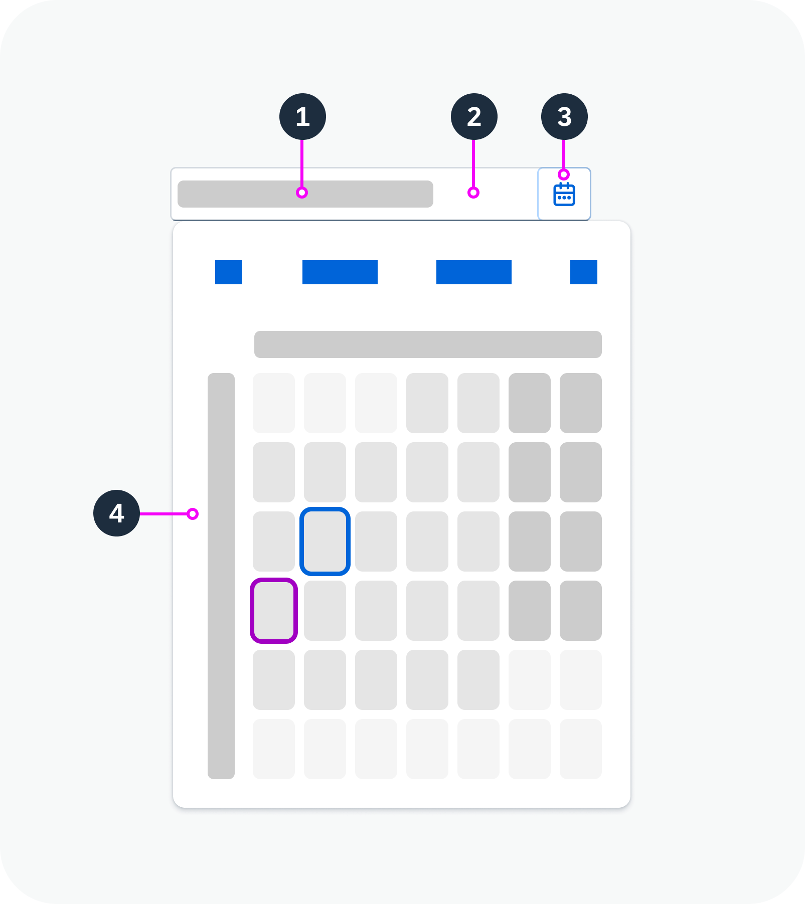
Anatomy of the date picker
Variants
The date picker supports Gregorian, Japanese, Buddhist, Islamic and Persian calendars. You can use a single calendar type only, or show two calendar types – one primary and one secondary.
Single Calendar Type
The date picker supports Gregorian, Japanese, Buddhist, Islamic and Persian calendars.
Two Calendar Types
In addition to the primary calendar, you can add a secondary calendar type.
Date picker with an Islamic calendar- live example
Date picker with a secondary calendar – live example
Custom Placeholder
You can provide a custom placeholder text. By default, the placeholder text shows the specific date format (based on the user’s locale).
Restricted Date Range
You can set minimum and maximum dates. In this case, the user can only select dates within the approved range.
Date picker with a custom placeholder text – live example
Date picker with restricted date range – live example
Behavior and Interaction
Selecting a Date
If the date picker is editable, the user can select a date in two ways:
- By typing in the input field.
- By choosing a date from the calendar. After selection, the calendar closes and the date appears in the date input field.
Navigation
To change the month, the user can either use the Previous/Next arrows or select a specific month in the month view.
To change the year, the user can either scroll through the months with the Previous/Next arrows or select a specific year in the year view.
Shortcuts
The following shortcuts are available for entering specific dates:
- “today”
- “yesterday”
- “in x days”
- “x days ago”
Date picker with shortcuts – live example
Restricted Date Range
If minimum and maximum dates have been set, selection and navigation to dates outside this range is disabled.
Formatting
If the user types the date in the input field, it must fit the required date format. For example, if the format pattern is “yyyy-MM-dd”, a valid user input would be “2015-07-30”.
Supported format options are pattern-based on Unicode Locale Data Markup Language (LDML) date format notation.
 Your feedback has been sent to the SAP Fiori design team.