
- Version 1.118
- SAPUI5 Version 1.116
- SAPUI5 Version 1.114
- SAPUI5 Version 1.112
- SAPUI5 Version 1.110
- SAPUI5 Version 1.108
- SAPUI5 Version 1.106
- SAPUI5 Version 1.104
- SAPUI5 Version 1.102
- SAPUI5 Version 1.100
- SAPUI5 Version 1.98
- SAPUI5 Version 1.96
- SAPUI5 Version 1.94
- SAPUI5 Version 1.92
- SAPUI5 Version 1.90
- SAPUI5 Version 1.88
- SAPUI5 Version 1.86
- SAPUI5 Version 1.84
- SAPUI5 Version 1.82
- SAPUI5 Version 1.80
- SAPUI5 Version 1.78
- SAPUI5 Version 1.76
- SAPUI5 Version 1.74
- SAPUI5 Version 1.72
- SAPUI5 Version 1.70
- SAPUI5 Version 1.68
- SAPUI5 Version 1.66
- SAPUI5 Version 1.64
- SAPUI5 Version 1.62
- SAPUI5 Version 1.60
- SAPUI5 Version 1.58
- SAPUI5 Version 1.56
- SAPUI5 Version 1.54
- SAPUI5 Version 1.52
- SAPUI5 Version 1.50
- SAPUI5 Version 1.48
- SAPUI5 Version 1.46
- SAPUI5 Version 1.44
- SAPUI5 Version 1.42
- SAPUI5 Version 1.40
- SAPUI5 Version 1.38
- SAPUI5 Version 1.36
- SAPUI5 Version 1.34
- SAPUI5 Version 1.32
- SAPUI5 Version 1.30
- SAPUI5 Version 1.28
- SAPUI5 Version 1.26
- Latest SAPUI5 Version 1.120
- Version 1.118
- SAPUI5 Version 1.116
- SAPUI5 Version 1.114
- SAPUI5 Version 1.112
- SAPUI5 Version 1.110
- SAPUI5 Version 1.108
- SAPUI5 Version 1.106
- SAPUI5 Version 1.104
- SAPUI5 Version 1.102
- SAPUI5 Version 1.100
- SAPUI5 Version 1.98
- SAPUI5 Version 1.96
- SAPUI5 Version 1.94
- SAPUI5 Version 1.92
- SAPUI5 Version 1.90
- SAPUI5 Version 1.88
- SAPUI5 Version 1.86
- SAPUI5 Version 1.84
- SAPUI5 Version 1.82
- SAPUI5 Version 1.80
- SAPUI5 Version 1.78
- SAPUI5 Version 1.76
- SAPUI5 Version 1.74
- SAPUI5 Version 1.72
- SAPUI5 Version 1.70
- SAPUI5 Version 1.68
- SAPUI5 Version 1.66
- SAPUI5 Version 1.64
- SAPUI5 Version 1.62
- SAPUI5 Version 1.60
- SAPUI5 Version 1.58
- SAPUI5 Version 1.56
- SAPUI5 Version 1.54
- SAPUI5 Version 1.52
- SAPUI5 Version 1.50
- SAPUI5 Version 1.48
- SAPUI5 Version 1.46
- SAPUI5 Version 1.44
- SAPUI5 Version 1.42
- SAPUI5 Version 1.40
- SAPUI5 Version 1.38
- SAPUI5 Version 1.36
- SAPUI5 Version 1.34
- SAPUI5 Version 1.32
- SAPUI5 Version 1.30
- SAPUI5 Version 1.28
- SAPUI5 Version 1.26
Page
ui5-page | v1.0
Intro
The page is a container component for a full application screen comprising a header, content area, and footer.
Page – live example
When to Use
Use the page as a base for any screen you need for your application.
Anatomy
- Header
- Home icon
- Title
- Button
- Content
- Footer (optional). The footer can float or be fixed at the bottom of the page.
- Button
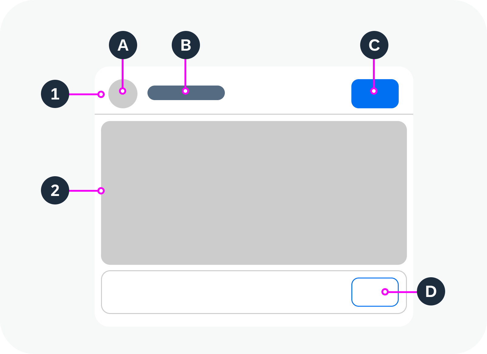
Anatomy of a page
Variants
The page can have a floating or fixed footer bar.
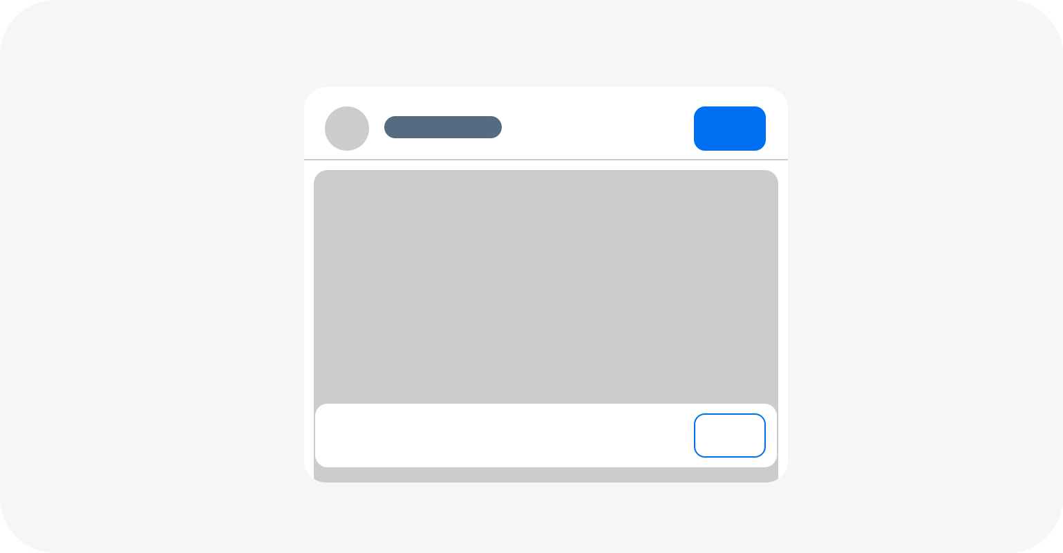
Page with floating footer bar
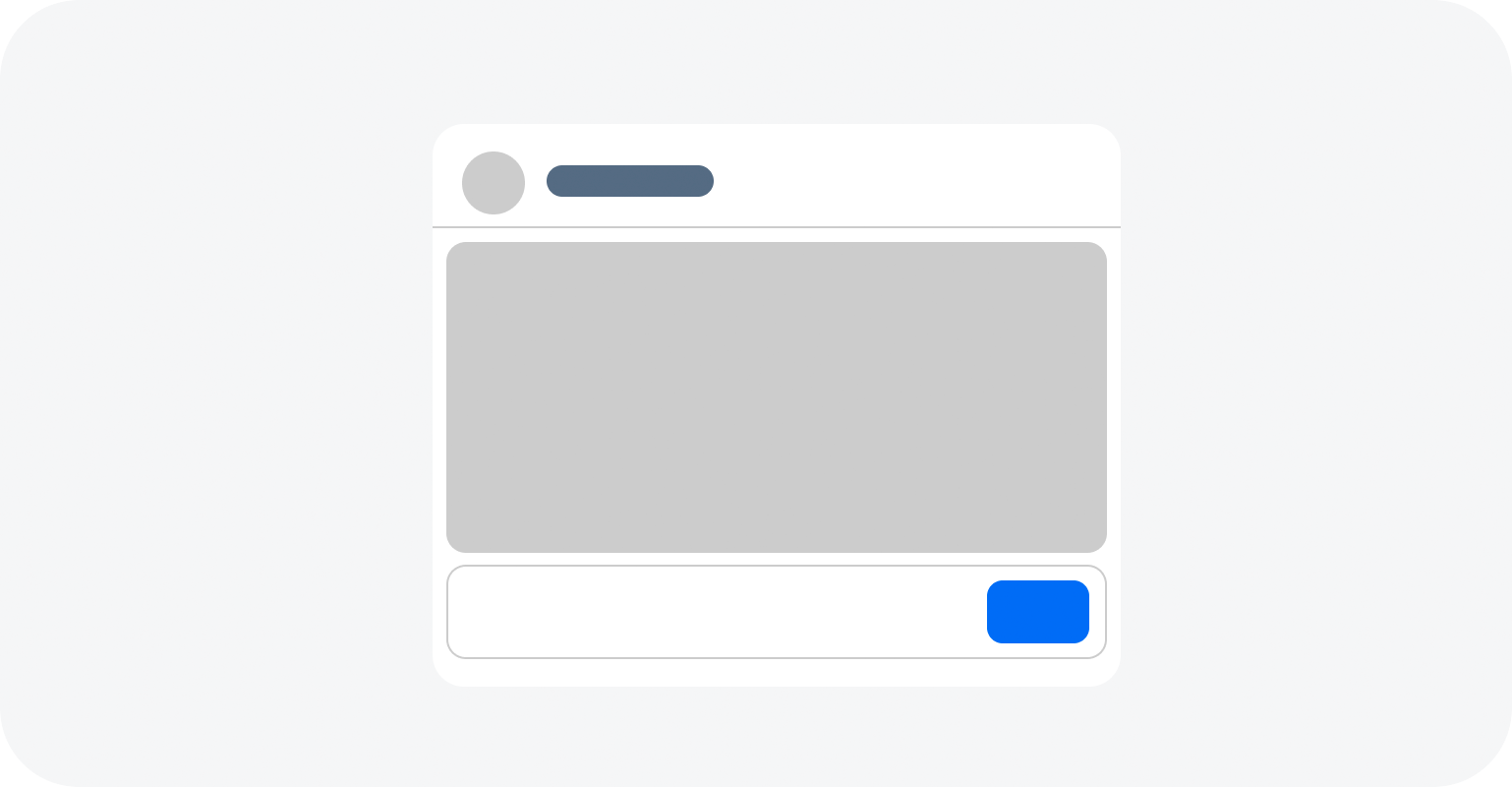
Page with fixed footer bar
Behavior and Interaction
The page itself has no specific interactions. All interactions belong to the components within the page container and depend on the application use case.
For details, see the guidelines for the individual components, such as the button.
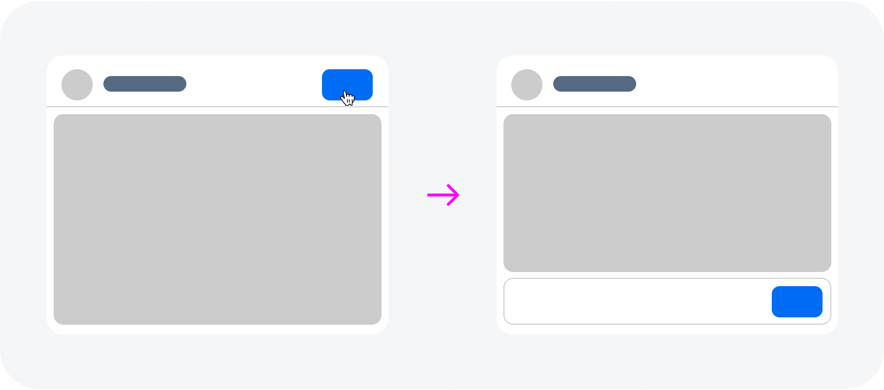
Example: Using a button in the header to navigate between pages
Responsive Behavior
The page offers considerable freedom and flexibility and the page header and the footer are designed to adapt automatically to small, medium, and large screen sizes.
- The title truncates if needed.
- The actions in the header and in the footer should stay as long as possible but when the space is not enough, they should transform to an overflow menu from right to left.
- If a priority is set to the actions, the highest priority button is the last to move to the overflow menu.
- It is also possible to assign one button never to move to the overflow menu.
Letterboxing is used to limit the width of the content area to 1280 px. This prevents the app content from becoming too “stretched” on wide screens, and optimises readability. Letterboxing can be used if the use case requires it. However, most business apps offer so much content that the page is typically shown across the entire screen, without letterboxing.
The page supports both cozy and compact mode.
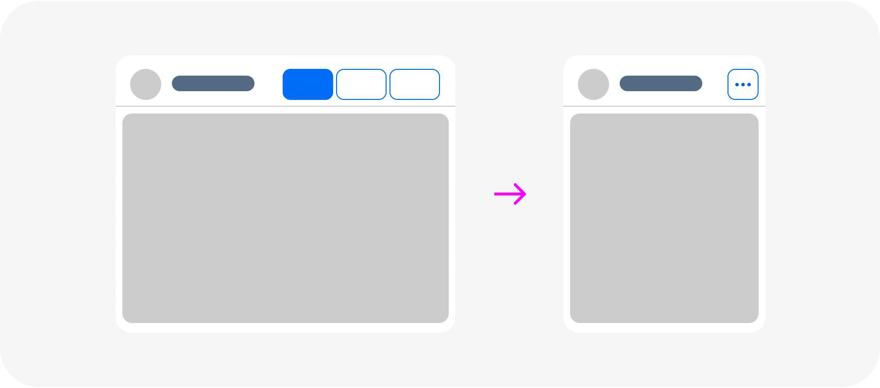
Toolbar actions move to an overflow menu if there is not enough space
Globalization and Localization
When designing an application, have in mind that this component also can be used with languages that use right-to-left direction for writing and reading. In this case the UI should be mirrored in order to be more convenient for the users to interact with it.
 Your feedback has been sent to the SAP Fiori design team.