
- SAPUI5 Version 1.122
- SAPUI5 Version 1.120
- SAPUI5 Version 1.118
- SAPUI5 Version 1.116
- SAPUI5 Version 1.114
- SAPUI5 Version 1.112
- SAPUI5 Version 1.110
- SAPUI5 Version 1.108
- SAPUI5 Version 1.106
- SAPUI5 Version 1.104
- SAPUI5 Version 1.102
- SAPUI5 Version 1.100
- SAPUI5 Version 1.98
- SAPUI5 Version 1.96
- SAPUI5 Version 1.94
- SAPUI5 Version 1.92
- SAPUI5 Version 1.90
- SAPUI5 Version 1.88
- SAPUI5 Version 1.86
- SAPUI5 Version 1.84
- SAPUI5 Version 1.82
- SAPUI5 Version 1.80
- SAPUI5 Version 1.78
- SAPUI5 Version 1.76
- SAPUI5 Version 1.74
- SAPUI5 Version 1.72
- SAPUI5 Version 1.70
- SAPUI5 Version 1.68
- SAPUI5 Version 1.66
- SAPUI5 Version 1.64
- SAPUI5 Version 1.62
- SAPUI5 Version 1.60
- SAPUI5 Version 1.58
- SAPUI5 Version 1.56
- SAPUI5 Version 1.54
- SAPUI5 Version 1.52
- SAPUI5 Version 1.50
- SAPUI5 Version 1.48
- SAPUI5 Version 1.46
- SAPUI5 Version 1.44
- SAPUI5 Version 1.42
- SAPUI5 Version 1.40
- SAPUI5 Version 1.38
- SAPUI5 Version 1.36
- SAPUI5 Version 1.34
- SAPUI5 Version 1.32
- SAPUI5 Version 1.30
- SAPUI5 Version 1.28
- SAPUI5 Version 1.26
- Latest SAPUI Version 1.124
- SAPUI5 Version 1.122
- SAPUI5 Version 1.120
- SAPUI5 Version 1.118
- SAPUI5 Version 1.116
- SAPUI5 Version 1.114
- SAPUI5 Version 1.112
- SAPUI5 Version 1.110
- SAPUI5 Version 1.108
- SAPUI5 Version 1.106
- SAPUI5 Version 1.104
- SAPUI5 Version 1.102
- SAPUI5 Version 1.100
- SAPUI5 Version 1.98
- SAPUI5 Version 1.96
- SAPUI5 Version 1.94
- SAPUI5 Version 1.92
- SAPUI5 Version 1.90
- SAPUI5 Version 1.88
- SAPUI5 Version 1.86
- SAPUI5 Version 1.84
- SAPUI5 Version 1.82
- SAPUI5 Version 1.80
- SAPUI5 Version 1.78
- SAPUI5 Version 1.76
- SAPUI5 Version 1.74
- SAPUI5 Version 1.72
- SAPUI5 Version 1.70
- SAPUI5 Version 1.68
- SAPUI5 Version 1.66
- SAPUI5 Version 1.64
- SAPUI5 Version 1.62
- SAPUI5 Version 1.60
- SAPUI5 Version 1.58
- SAPUI5 Version 1.56
- SAPUI5 Version 1.54
- SAPUI5 Version 1.52
- SAPUI5 Version 1.50
- SAPUI5 Version 1.48
- SAPUI5 Version 1.46
- SAPUI5 Version 1.44
- SAPUI5 Version 1.42
- SAPUI5 Version 1.40
- SAPUI5 Version 1.38
- SAPUI5 Version 1.36
- SAPUI5 Version 1.34
- SAPUI5 Version 1.32
- SAPUI5 Version 1.30
- SAPUI5 Version 1.28
- SAPUI5 Version 1.26
Tree
ui5-tree | v1.0
Intro
Trees provide a way to display and work with basic hierarchical data. They offer a clear representation of structured information and are typically used in the main list for list-detail scenarios, popovers, or dialogs.
Tree – live example
When to Use
Use the tree component:
- To display hierarchically structured items.
- To enable selection of one or more items from a set of hierarchically structured items.
Don’t use the tree component:
- To display items that are not structured hierarchically. In this case, use the list component.
- To select one item from a very small number of non-hierarchical items. A select or combo box might be more appropriate.
- The hierarchy turns out to have only two levels. In this case, use a list with group items.
Anatomy
Tree
- Header (optional): The first item of the tree serves as a header, and contains the title of the tree.
- Node: Item that contains additional items.
- Root: Single topmost node (level 1).
- Leaf: Item that doesn’t contain any other items.
- Expand/collapse icon: An icon for expanding and collapsing the node is provided automatically for each node that has child nodes.
- Footer (optional): The last item of the tree can serve as a footer.
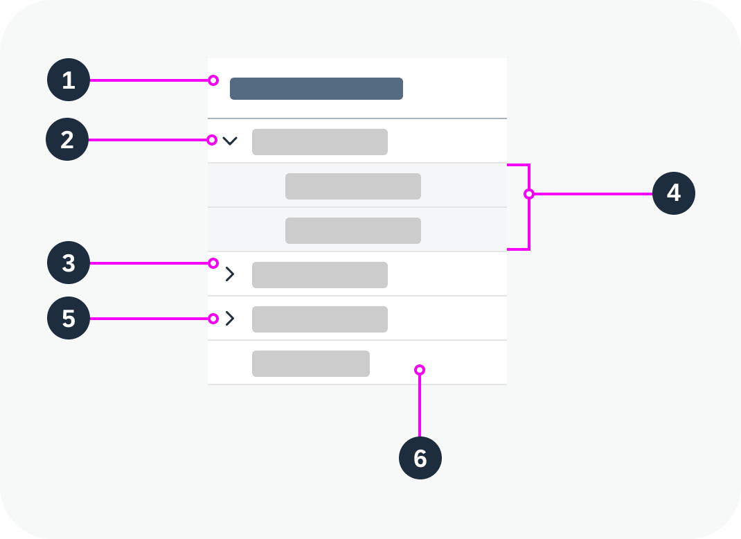
Anatomy of a tree
Standard Tree Item
The standard tree item (ui5-tree-item) is the simplest type of tree item. It provides the most common features, such as text, icon, and a checkbox or radio button.
- Checkbox / radio button:
- In multiple selection mode, a checkbox is displayed.
- In single selection mode, a radio button is displayed.
- Icon (optional): You can place an icon at the beginning of an item (before the text).
- Text
- Additional text (optional): The tree item can have an additional text located on the far right of the row (property: additionalText). You can also apply a semantic value to this text (property: additionalTextState property).
- Delete button
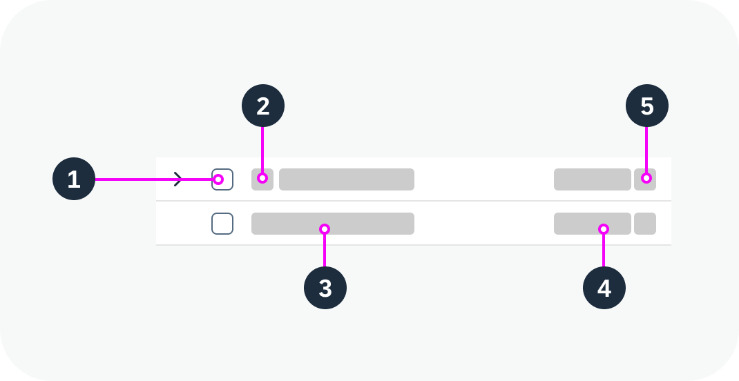
Anatomy of a standard tree item
Custom Tree Item
If additional components are needed, use a custom tree item. The custom tree item allows you to use any combination of components inside the tree.
We recommend sticking with the intended tree design and only inserting additional components within the given tree structure.
Variants
Standard Tree
Use this variant as a starting point.
Standard tree – live example
Single Selection
One item in the tree can be selected. To select an item, you can click anywhere on the item. For single selection, this is the preferred mode.
Always keep one item selected. The basic single selection mode doesn’t add any visual indication to the tree. If no item is selected, it can’t be differentiated from trees without selection.
Single selection – live example
Single Selection with Radio Button
One item in the tree can be selected. For this, the tree provides radio buttons on the left or right side of each line item. Use this selection mode only if clicking on the item triggers something else, such as navigation.
Ideally, always keep one item selected, even in the initial state.
Single selection with radio button – live example
Multiple Selection
Multiple selection – live example
Delete
Delete – live example
Behavior and Interaction
The tree is like a list containing hierarchical data. It acts as a container for items, with the possibility to expand and collapse nodes. In addition, the tree changes the indentation per level dynamically when the user expands a node, based on number of levels currently showing.
See the examples for the following variants:
 Your feedback has been sent to the SAP Fiori design team.