
- SAPUI5 Version 1.122
- SAPUI5 Version 1.120
- SAPUI5 Version 1.118
- SAPUI5 Version 1.116
- SAPUI5 Version 1.114
- SAPUI5 Version 1.112
- SAPUI5 Version 1.110
- SAPUI5 Version 1.108
- SAPUI5 Version 1.106
- SAPUI5 Version 1.104
- SAPUI5 Version 1.102
- SAPUI5 Version 1.100
- SAPUI5 Version 1.98
- SAPUI5 Version 1.96
- SAPUI5 Version 1.94
- SAPUI5 Version 1.92
- SAPUI5 Version 1.90
- SAPUI5 Version 1.88
- SAPUI5 Version 1.86
- SAPUI5 Version 1.84
- SAPUI5 Version 1.82
- SAPUI5 Version 1.80
- SAPUI5 Version 1.78
- SAPUI5 Version 1.76
- SAPUI5 Version 1.74
- SAPUI5 Version 1.72
- SAPUI5 Version 1.70
- SAPUI5 Version 1.68
- SAPUI5 Version 1.66
- SAPUI5 Version 1.64
- SAPUI5 Version 1.62
- SAPUI5 Version 1.60
- SAPUI5 Version 1.58
- SAPUI5 Version 1.56
- SAPUI5 Version 1.54
- SAPUI5 Version 1.52
- SAPUI5 Version 1.50
- SAPUI5 Version 1.48
- SAPUI5 Version 1.46
- SAPUI5 Version 1.44
- SAPUI5 Version 1.42
- SAPUI5 Version 1.40
- SAPUI5 Version 1.38
- SAPUI5 Version 1.36
- SAPUI5 Version 1.34
- SAPUI5 Version 1.32
- SAPUI5 Version 1.30
- SAPUI5 Version 1.28
- SAPUI5 Version 1.26
- Latest SAPUI Version 1.124
- SAPUI5 Version 1.122
- SAPUI5 Version 1.120
- SAPUI5 Version 1.118
- SAPUI5 Version 1.116
- SAPUI5 Version 1.114
- SAPUI5 Version 1.112
- SAPUI5 Version 1.110
- SAPUI5 Version 1.108
- SAPUI5 Version 1.106
- SAPUI5 Version 1.104
- SAPUI5 Version 1.102
- SAPUI5 Version 1.100
- SAPUI5 Version 1.98
- SAPUI5 Version 1.96
- SAPUI5 Version 1.94
- SAPUI5 Version 1.92
- SAPUI5 Version 1.90
- SAPUI5 Version 1.88
- SAPUI5 Version 1.86
- SAPUI5 Version 1.84
- SAPUI5 Version 1.82
- SAPUI5 Version 1.80
- SAPUI5 Version 1.78
- SAPUI5 Version 1.76
- SAPUI5 Version 1.74
- SAPUI5 Version 1.72
- SAPUI5 Version 1.70
- SAPUI5 Version 1.68
- SAPUI5 Version 1.66
- SAPUI5 Version 1.64
- SAPUI5 Version 1.62
- SAPUI5 Version 1.60
- SAPUI5 Version 1.58
- SAPUI5 Version 1.56
- SAPUI5 Version 1.54
- SAPUI5 Version 1.52
- SAPUI5 Version 1.50
- SAPUI5 Version 1.48
- SAPUI5 Version 1.46
- SAPUI5 Version 1.44
- SAPUI5 Version 1.42
- SAPUI5 Version 1.40
- SAPUI5 Version 1.38
- SAPUI5 Version 1.36
- SAPUI5 Version 1.34
- SAPUI5 Version 1.32
- SAPUI5 Version 1.30
- SAPUI5 Version 1.28
- SAPUI5 Version 1.26
Combo Box
ui5-combobox | v1.0
Intro
The combo box allows users to select an item from a predefined list.
It provides an editable input field for filtering the list, and a dropdown menu with a list of the available options.
If the entries are not validated by the application, users can also enter a custom value.
Combo box – live example
When to Use
Use the combo box:
- If users need to select a single item from a long list of items.
- If the list items are secondary information and do not need to be displayed right away.
Don’t use the combo box:
Anatomy
- Input field: Displays the selected value.
- Value/text: The content the user has entered into the field.
- Dropdown button: Expands and collapses the option list.
- Option list: Contains values from which the user can choose.
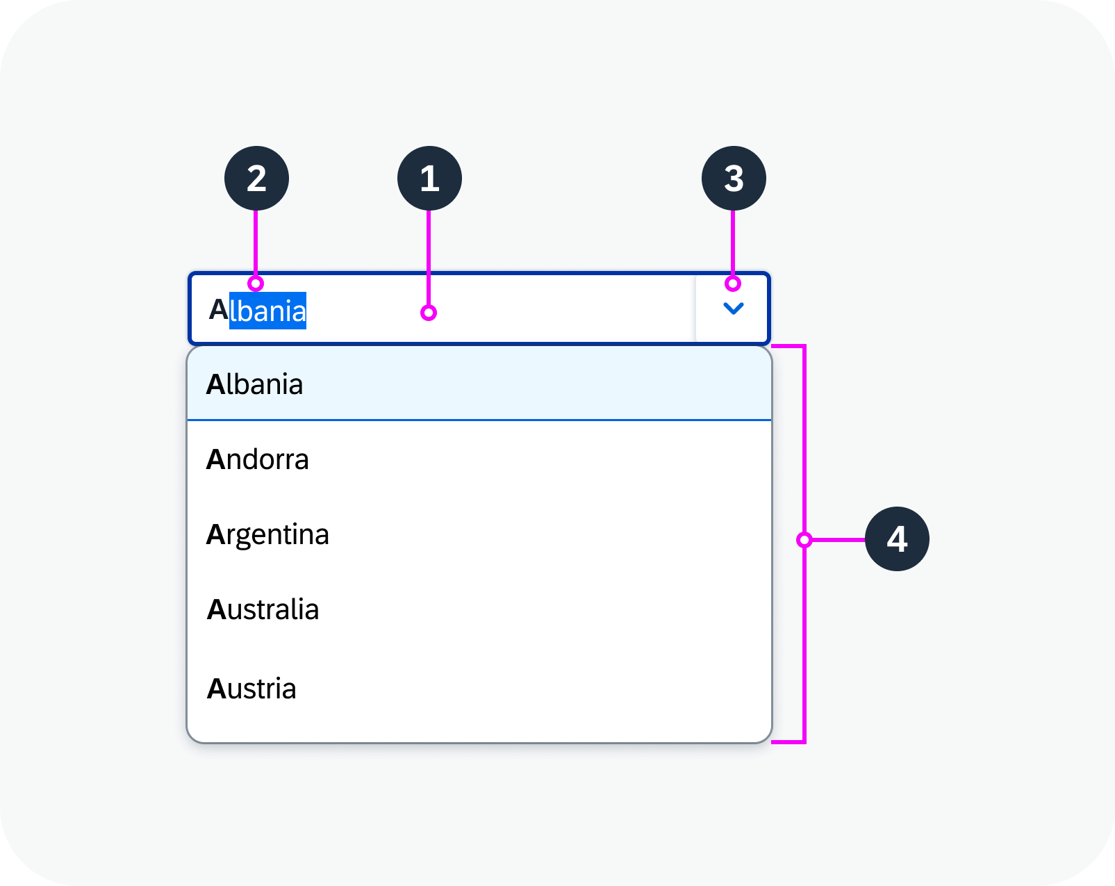
Anatomy of a combo box
Variants
List Layouts
Use the two-column layout if you need to display additional information for each option.
You can group items in the option list.
Two-column layout – live example
Grouped items
Filters
When the user starts typing in the input field, the option list is filtered. Only items that match the characters entered are shown in the dropdown list. The following filter variants are available:
Starts with per term (default): Filters for items where the beginning of any word in in the label matches the query entered.
Starts with: Filters only for items where the beginning of the label matches the query entered.
Contains: Searches the full label for a match.
‘Starts with per term’ filter variant – live example
‘Starts with’ filter variant – live example
‘Contains’ filter variant – live example
Behavior and Interaction
Choose from List
- Clicking the dropdown button opens the suggestion list.
- Selecting an item from the list enters it in the input field.
Type or Paste Text
- The component responds as the user types or pastes in text:
- Suggestions are filtered based on the typed text (see Filter Variants).
- The autocomplete feature proposes matching labels. The autocompleted part of the text is highlighted.
- To enter a value in the input field, the user can:
- Press Enter to accept the autocompleted text.
- Click an item in the suggestion list.
Combo box – live example
Handling of Incorrect Values
- If the user pastes or types a text that doesn’t match one of the selection options, it remains in place by default.
- If data validation is implemented, entering an incorrect text triggers an error message and the field displays in an error state.
Data validation – error state for incorrect value
Responsive Behavior
On mobile phones, the selection list is displayed as a full screen dialog.
 Your feedback has been sent to the SAP Fiori design team.