
- SAPUI5 Version 1.122
- SAPUI5 Version 1.120
- SAPUI5 Version 1.118
- SAPUI5 Version 1.116
- SAPUI5 Version 1.114
- SAPUI5 Version 1.112
- SAPUI5 Version 1.110
- SAPUI5 Version 1.108
- SAPUI5 Version 1.106
- SAPUI5 Version 1.104
- SAPUI5 Version 1.102
- SAPUI5 Version 1.100
- SAPUI5 Version 1.98
- SAPUI5 Version 1.96
- SAPUI5 Version 1.94
- SAPUI5 Version 1.92
- SAPUI5 Version 1.90
- SAPUI5 Version 1.88
- SAPUI5 Version 1.86
- SAPUI5 Version 1.84
- SAPUI5 Version 1.82
- SAPUI5 Version 1.80
- SAPUI5 Version 1.78
- SAPUI5 Version 1.76
- SAPUI5 Version 1.74
- SAPUI5 Version 1.72
- SAPUI5 Version 1.70
- SAPUI5 Version 1.68
- SAPUI5 Version 1.66
- SAPUI5 Version 1.64
- SAPUI5 Version 1.62
- SAPUI5 Version 1.60
- SAPUI5 Version 1.58
- SAPUI5 Version 1.56
- SAPUI5 Version 1.54
- SAPUI5 Version 1.52
- SAPUI5 Version 1.50
- SAPUI5 Version 1.48
- SAPUI5 Version 1.46
- SAPUI5 Version 1.44
- SAPUI5 Version 1.42
- SAPUI5 Version 1.40
- SAPUI5 Version 1.38
- SAPUI5 Version 1.36
- SAPUI5 Version 1.34
- SAPUI5 Version 1.32
- SAPUI5 Version 1.30
- SAPUI5 Version 1.28
- SAPUI5 Version 1.26
- Latest SAPUI Version 1.124
- SAPUI5 Version 1.122
- SAPUI5 Version 1.120
- SAPUI5 Version 1.118
- SAPUI5 Version 1.116
- SAPUI5 Version 1.114
- SAPUI5 Version 1.112
- SAPUI5 Version 1.110
- SAPUI5 Version 1.108
- SAPUI5 Version 1.106
- SAPUI5 Version 1.104
- SAPUI5 Version 1.102
- SAPUI5 Version 1.100
- SAPUI5 Version 1.98
- SAPUI5 Version 1.96
- SAPUI5 Version 1.94
- SAPUI5 Version 1.92
- SAPUI5 Version 1.90
- SAPUI5 Version 1.88
- SAPUI5 Version 1.86
- SAPUI5 Version 1.84
- SAPUI5 Version 1.82
- SAPUI5 Version 1.80
- SAPUI5 Version 1.78
- SAPUI5 Version 1.76
- SAPUI5 Version 1.74
- SAPUI5 Version 1.72
- SAPUI5 Version 1.70
- SAPUI5 Version 1.68
- SAPUI5 Version 1.66
- SAPUI5 Version 1.64
- SAPUI5 Version 1.62
- SAPUI5 Version 1.60
- SAPUI5 Version 1.58
- SAPUI5 Version 1.56
- SAPUI5 Version 1.54
- SAPUI5 Version 1.52
- SAPUI5 Version 1.50
- SAPUI5 Version 1.48
- SAPUI5 Version 1.46
- SAPUI5 Version 1.44
- SAPUI5 Version 1.42
- SAPUI5 Version 1.40
- SAPUI5 Version 1.38
- SAPUI5 Version 1.36
- SAPUI5 Version 1.34
- SAPUI5 Version 1.32
- SAPUI5 Version 1.30
- SAPUI5 Version 1.28
- SAPUI5 Version 1.26
Dynamic Side Content
ui5-dynamic-side-content | v1.0
Intro
The dynamic side content is a layout component that allows you to display additional content in a way that adapts flexibly to different screen sizes. The side content appears in a container next to or directly below the main content. The width or height of the main content area adapts accordingly.
Dynamic side content
When to Use
Use the dynamic side content to display information that:
- Enriches the main content and helps users perform their tasks
- Only makes sense when displayed next to the main content (side by side)
- Influences the main content (such as a filter for list, settings for chart, or details for map)
Important: Ensure that users have access to all of the key functions and critical information even if they don’t see the side content. It might not be easy for users to access the side content on smaller screens.
Don’t use dynamic side content:
- If you want to display navigation or critical information that prevents users from completing a task when they have no access to the side content.
- If the content doesn’t relate to the main content.
Anatomy
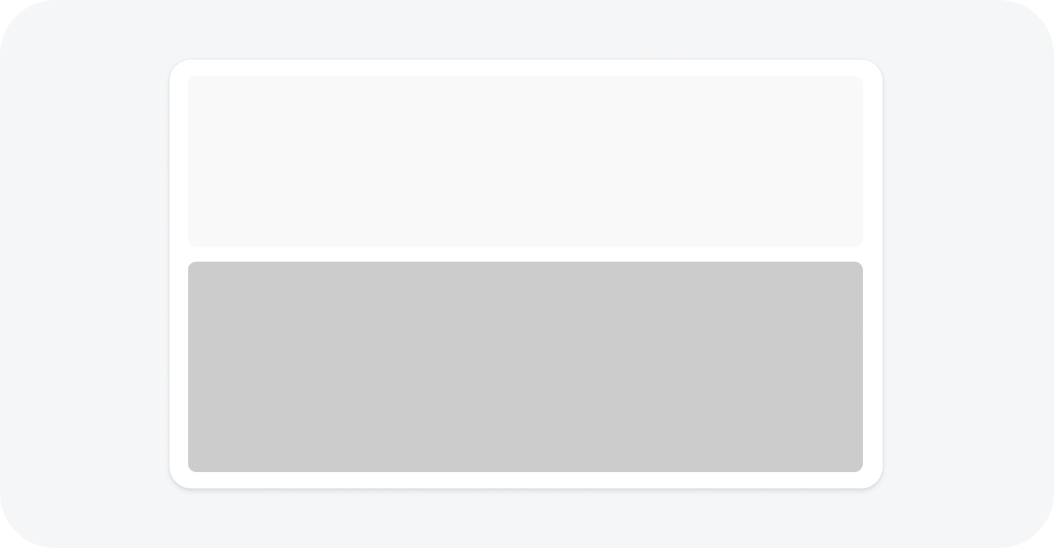
Dynamic side content is a layout container that can contain any type of component, such as lists, tables, form fields, and more.
- Dynamic side content
- Main content*
* The main content is not part of the dynamic side content component. It is included here to illustrate how the side content appears in relation to the rest of the page.
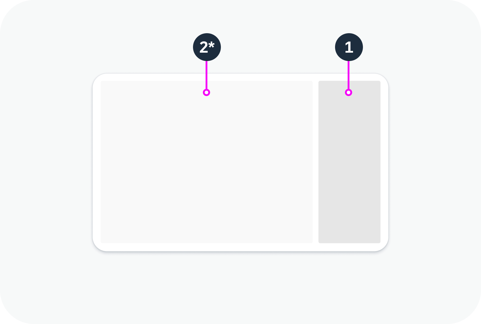
Layout with dynamic side content
Variants
The size and position of the dynamic side content depend on the configuration and the available screen width. The following variants are available:
Size
Default split – 25% or 30% of the total screen width, depending on the resolution.
Equal split – 50% of the total screen width.
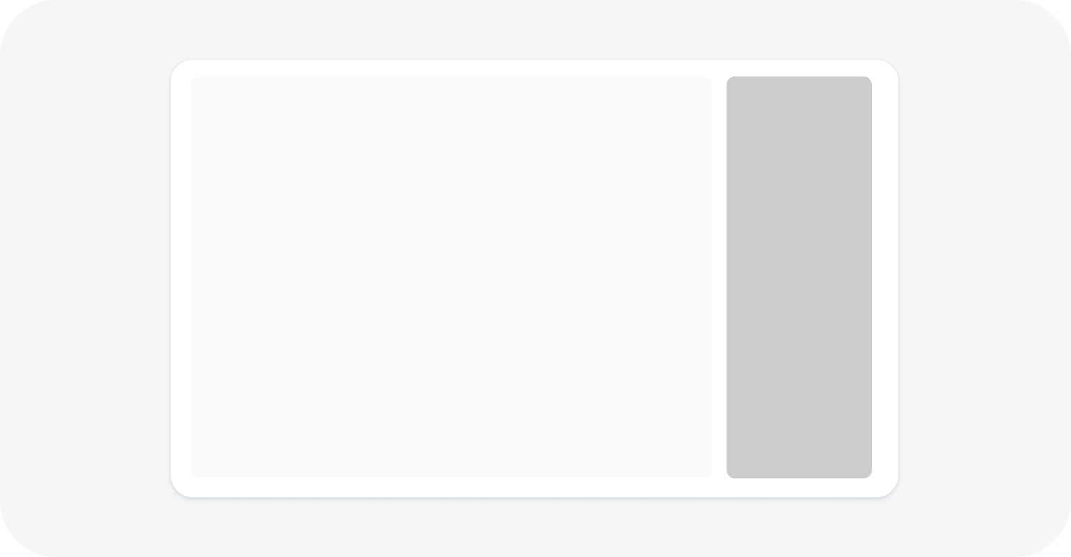
Default split
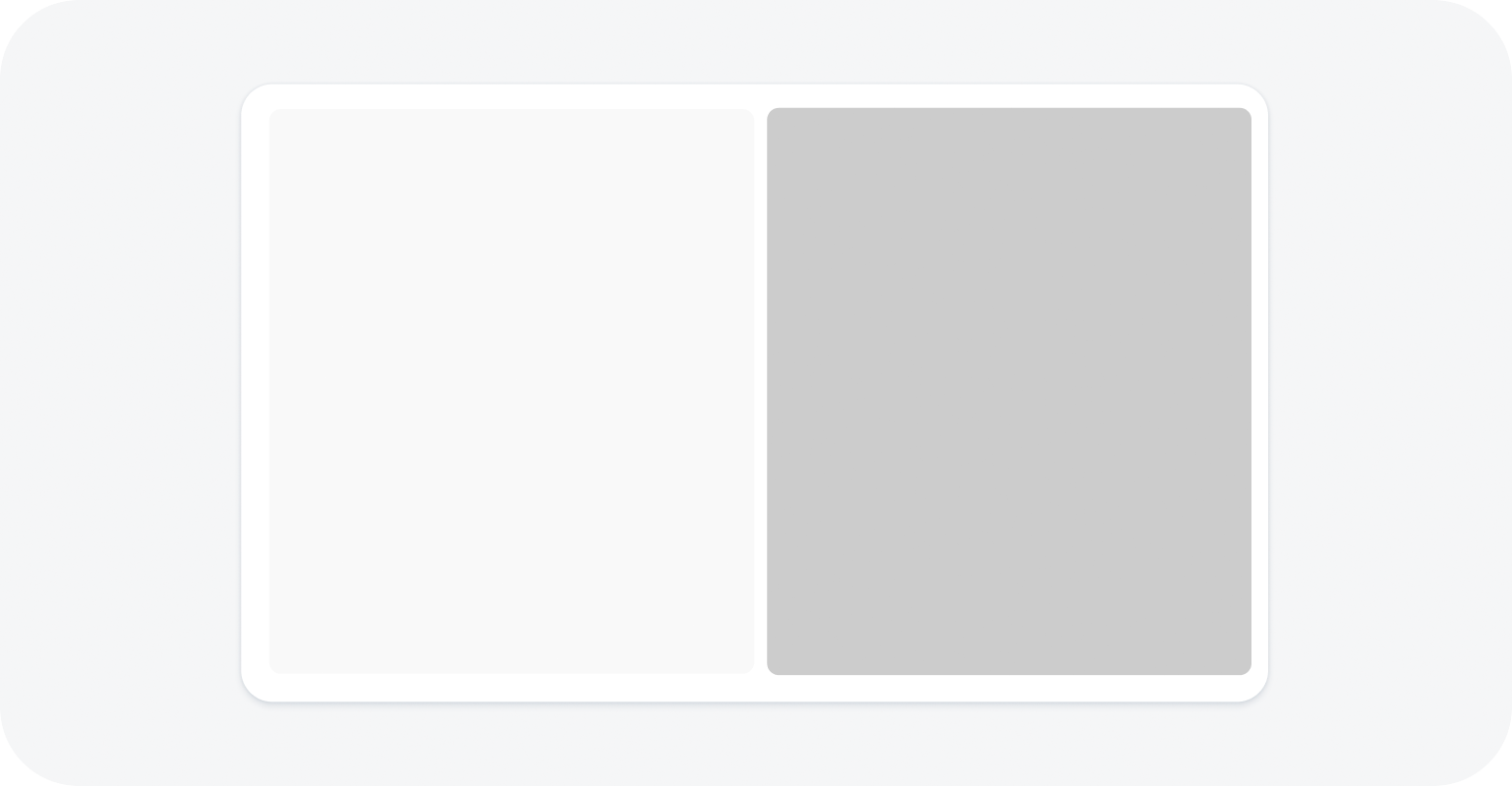
Equal split
Position
You can specify whether the side content is shown on the right or on the left. At certain breakpoints, the side content slides below the main content (see Responsive Behavior).
Left
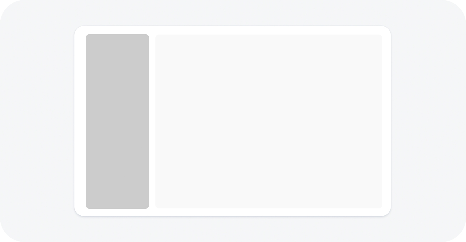
Dynamic side content on the left
Right
Dynamic side content on the right
Below main content
Dynamic side content below the main content
Behavior and Interaction
Whether the side content is displayed or hidden depends on the current visibility setting and the screen size (see Responsive Behavior). To enable users to display the supplementary content as needed, it is important to provide options for opening and closing the side content.
Default State
By default, the side content is initially visible, but you can opt to hide it.
Opening the Dynamic Side Content
Add a trigger for opening the side content. This is typically a button in the main content area with a meaningful label. We recommend that you always place the trigger for the side content in the same location.
Closing the Dynamic Side Content
Enable users to close the side panel from the side panel header. Since the dynamic side panel doesn’t have a built-in header, we strongly recommend adding a toolbar with a title, a transparent Close button, and a spacer in between.
Responsive Behavior
Screen width > 1440 px
- The ratio of the main content to side content is 3:1 (with a minimum of 320 px each).
- If you define a trigger, the side content can be hidden.
Screen width <= 1440 px and > 1024 px
- The ratio of the main content to side content is 2:1 (with a minimum of 320 px each). If the width of the side content falls below 320 px, it automatically slides under the main content, unless you specify that it should disappear.
Screen width <= 1024 px and > 720 px
- The side content ratio is fixed at 340 px and the remaining width is used for the main content.
- If you opt to move the component below the main content, and screen width is <= 960 px and >720 px, the side content drops below the main content.
Screen width <= 720 px (for example, on a mobile device)
- The side content automatically disappears from the screen, unless you specify that it should stay below the main content. The side content is opened by the trigger you offer in the main content. When the side content is triggered, it replaces the main content. For the triggering action, use a label that indicates the type of content shown in the side panel.
Special case: comparison mode
If you opt to split the screen equally for comparisons (50% each for the main and side content), the responsive behaviour is the same as for the standard view. If the screen width falls below 720 px, the side content disappears and can only be viewed if it’s actively triggered.
 Your feedback has been sent to the SAP Fiori design team.