
- SAPUI5 Version 1.122
- SAPUI5 Version 1.120
- SAPUI5 Version 1.118
- SAPUI5 Version 1.116
- SAPUI5 Version 1.114
- SAPUI5 Version 1.112
- SAPUI5 Version 1.110
- SAPUI5 Version 1.108
- SAPUI5 Version 1.106
- SAPUI5 Version 1.104
- SAPUI5 Version 1.102
- SAPUI5 Version 1.100
- SAPUI5 Version 1.98
- SAPUI5 Version 1.96
- SAPUI5 Version 1.94
- SAPUI5 Version 1.92
- SAPUI5 Version 1.90
- SAPUI5 Version 1.88
- SAPUI5 Version 1.86
- SAPUI5 Version 1.84
- SAPUI5 Version 1.82
- SAPUI5 Version 1.80
- SAPUI5 Version 1.78
- SAPUI5 Version 1.76
- SAPUI5 Version 1.74
- SAPUI5 Version 1.72
- SAPUI5 Version 1.70
- SAPUI5 Version 1.68
- SAPUI5 Version 1.66
- SAPUI5 Version 1.64
- SAPUI5 Version 1.62
- SAPUI5 Version 1.60
- SAPUI5 Version 1.58
- SAPUI5 Version 1.56
- SAPUI5 Version 1.54
- SAPUI5 Version 1.52
- SAPUI5 Version 1.50
- SAPUI5 Version 1.48
- SAPUI5 Version 1.46
- SAPUI5 Version 1.44
- SAPUI5 Version 1.42
- SAPUI5 Version 1.40
- SAPUI5 Version 1.38
- SAPUI5 Version 1.36
- SAPUI5 Version 1.34
- SAPUI5 Version 1.32
- SAPUI5 Version 1.30
- SAPUI5 Version 1.28
- SAPUI5 Version 1.26
- Latest SAPUI Version 1.124
- SAPUI5 Version 1.122
- SAPUI5 Version 1.120
- SAPUI5 Version 1.118
- SAPUI5 Version 1.116
- SAPUI5 Version 1.114
- SAPUI5 Version 1.112
- SAPUI5 Version 1.110
- SAPUI5 Version 1.108
- SAPUI5 Version 1.106
- SAPUI5 Version 1.104
- SAPUI5 Version 1.102
- SAPUI5 Version 1.100
- SAPUI5 Version 1.98
- SAPUI5 Version 1.96
- SAPUI5 Version 1.94
- SAPUI5 Version 1.92
- SAPUI5 Version 1.90
- SAPUI5 Version 1.88
- SAPUI5 Version 1.86
- SAPUI5 Version 1.84
- SAPUI5 Version 1.82
- SAPUI5 Version 1.80
- SAPUI5 Version 1.78
- SAPUI5 Version 1.76
- SAPUI5 Version 1.74
- SAPUI5 Version 1.72
- SAPUI5 Version 1.70
- SAPUI5 Version 1.68
- SAPUI5 Version 1.66
- SAPUI5 Version 1.64
- SAPUI5 Version 1.62
- SAPUI5 Version 1.60
- SAPUI5 Version 1.58
- SAPUI5 Version 1.56
- SAPUI5 Version 1.54
- SAPUI5 Version 1.52
- SAPUI5 Version 1.50
- SAPUI5 Version 1.48
- SAPUI5 Version 1.46
- SAPUI5 Version 1.44
- SAPUI5 Version 1.42
- SAPUI5 Version 1.40
- SAPUI5 Version 1.38
- SAPUI5 Version 1.36
- SAPUI5 Version 1.34
- SAPUI5 Version 1.32
- SAPUI5 Version 1.30
- SAPUI5 Version 1.28
- SAPUI5 Version 1.26
Multi Input
ui5-multi-input | v1.0
Intro
A multi-input field allows the user to enter multiple values, which are displayed as tokens.
To help the user enter a valid value, you can enable the suggestions feature and the value help option.
Multi-input – live example
When to Use
Use the multi-input field:
- To provide the value help option to help users select or search for multiple business objects.
- To let users select multiple ranges (with the value help).
- To enable users to add custom values.
Don’t use the multi-input field:
- To choose multiple options from a large list.
- If there is not enough space available on the screen.
- To choose only one option from a list.
Anatomy
- Tokens: Show individual selected values.
- Input field: Area for displaying tokens and typing text.
- Value help icon: Trigger for opening a value help dialog.
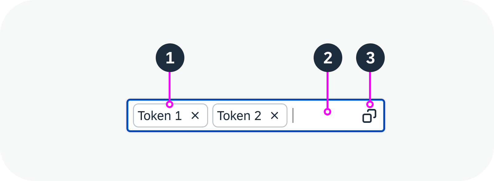
Anatomy of a multi-input field
Variants
With Tokens
Predefined Tokens Only
The user can write text in the input field that does not correspond with the predefined values in the list, but a token isn’t created and the text just appears in the input field.
Multi-Input with predefined tokens – live example
Including Token Creation
The user can write text in the input field that does not correspond with the predefined values in the list and create tokens with this text.
Create token from value entered – live example
With Value Help Icon
You can add a value help icon in the input field to trigger a separate value help dialog for selecting the values. The dialog must be implemented separately.
Basic multi-input field with value help icon
Behavior and Interaction
Select/Enter Values
To add values to the multi-input field, users can:
- Start typing and select a value from the dropdown list. The selected values appear as tokens.
- Type a text and press Enter to add a new value. This creates a new token with the typed text.
If there isn’t enough space to display all the tokens, an overflow button appears (n More, or n Items).
The user can only enter a value once. The multi-input field displays an error if the same token is selected twice.
Empty multi-input field – live example
View/Adjust Selection
If tokens are hidden in the overflow, clicking n More or n Items displays all the selected values.
To remove an item from the selection, users can
- Click the “X” icon in the token.
- Focus on the token to select it and use the keyboard delete key to remove the token.
Multi-combo box with multiple tokens – live example
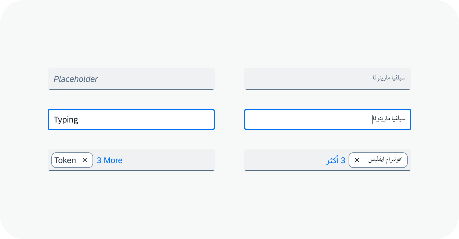
Globalization and Localization
The multi-input field supports left-to-right (LTR) and right-to-left (RTL) reading directions.
 Your feedback has been sent to the SAP Fiori design team.