
- SAPUI5 Version 1.122
- SAPUI5 Version 1.120
- SAPUI5 Version 1.118
- SAPUI5 Version 1.116
- SAPUI5 Version 1.114
- SAPUI5 Version 1.112
- SAPUI5 Version 1.110
- SAPUI5 Version 1.108
- SAPUI5 Version 1.106
- SAPUI5 Version 1.104
- SAPUI5 Version 1.102
- SAPUI5 Version 1.100
- SAPUI5 Version 1.98
- SAPUI5 Version 1.96
- SAPUI5 Version 1.94
- SAPUI5 Version 1.92
- SAPUI5 Version 1.90
- SAPUI5 Version 1.88
- SAPUI5 Version 1.86
- SAPUI5 Version 1.84
- SAPUI5 Version 1.82
- SAPUI5 Version 1.80
- SAPUI5 Version 1.78
- SAPUI5 Version 1.76
- SAPUI5 Version 1.74
- SAPUI5 Version 1.72
- SAPUI5 Version 1.70
- SAPUI5 Version 1.68
- SAPUI5 Version 1.66
- SAPUI5 Version 1.64
- SAPUI5 Version 1.62
- SAPUI5 Version 1.60
- SAPUI5 Version 1.58
- SAPUI5 Version 1.56
- SAPUI5 Version 1.54
- SAPUI5 Version 1.52
- SAPUI5 Version 1.50
- SAPUI5 Version 1.48
- SAPUI5 Version 1.46
- SAPUI5 Version 1.44
- SAPUI5 Version 1.42
- SAPUI5 Version 1.40
- SAPUI5 Version 1.38
- SAPUI5 Version 1.36
- SAPUI5 Version 1.34
- SAPUI5 Version 1.32
- SAPUI5 Version 1.30
- SAPUI5 Version 1.28
- SAPUI5 Version 1.26
- Latest SAPUI Version 1.124
- SAPUI5 Version 1.122
- SAPUI5 Version 1.120
- SAPUI5 Version 1.118
- SAPUI5 Version 1.116
- SAPUI5 Version 1.114
- SAPUI5 Version 1.112
- SAPUI5 Version 1.110
- SAPUI5 Version 1.108
- SAPUI5 Version 1.106
- SAPUI5 Version 1.104
- SAPUI5 Version 1.102
- SAPUI5 Version 1.100
- SAPUI5 Version 1.98
- SAPUI5 Version 1.96
- SAPUI5 Version 1.94
- SAPUI5 Version 1.92
- SAPUI5 Version 1.90
- SAPUI5 Version 1.88
- SAPUI5 Version 1.86
- SAPUI5 Version 1.84
- SAPUI5 Version 1.82
- SAPUI5 Version 1.80
- SAPUI5 Version 1.78
- SAPUI5 Version 1.76
- SAPUI5 Version 1.74
- SAPUI5 Version 1.72
- SAPUI5 Version 1.70
- SAPUI5 Version 1.68
- SAPUI5 Version 1.66
- SAPUI5 Version 1.64
- SAPUI5 Version 1.62
- SAPUI5 Version 1.60
- SAPUI5 Version 1.58
- SAPUI5 Version 1.56
- SAPUI5 Version 1.54
- SAPUI5 Version 1.52
- SAPUI5 Version 1.50
- SAPUI5 Version 1.48
- SAPUI5 Version 1.46
- SAPUI5 Version 1.44
- SAPUI5 Version 1.42
- SAPUI5 Version 1.40
- SAPUI5 Version 1.38
- SAPUI5 Version 1.36
- SAPUI5 Version 1.34
- SAPUI5 Version 1.32
- SAPUI5 Version 1.30
- SAPUI5 Version 1.28
- SAPUI5 Version 1.26
Range Slider
ui5-range-slider | v1.0
Intro
A range slider enables the user to select a value range within a given numeric interval.
Range slider – live example
When to Use
Use the range slider:
- To provide graphical support for selecting a value range within a given numeric interval.
Don’t use the range slider:
- If the user only needs to select a single value within a predefined range. Use the slider instead.
Anatomy
1. Start point: Minimum value of the slider range.
2. Track (active or inactive)
3. Focused slider handle: Active handle for setting the value in focus.
4. Non-focused slider handle: Inactive handle indicating the other selected value.
5. Tooltip (optional): Displays a tooltip with the current value above the handle.
6. Tick marks (optional): Visualize the value intervals (steps). Each tick mark represents a selectable value.
7. Labels (optional): Labels some or all of the tick marks with their values.
8. End point: Maximum value of the slider range.
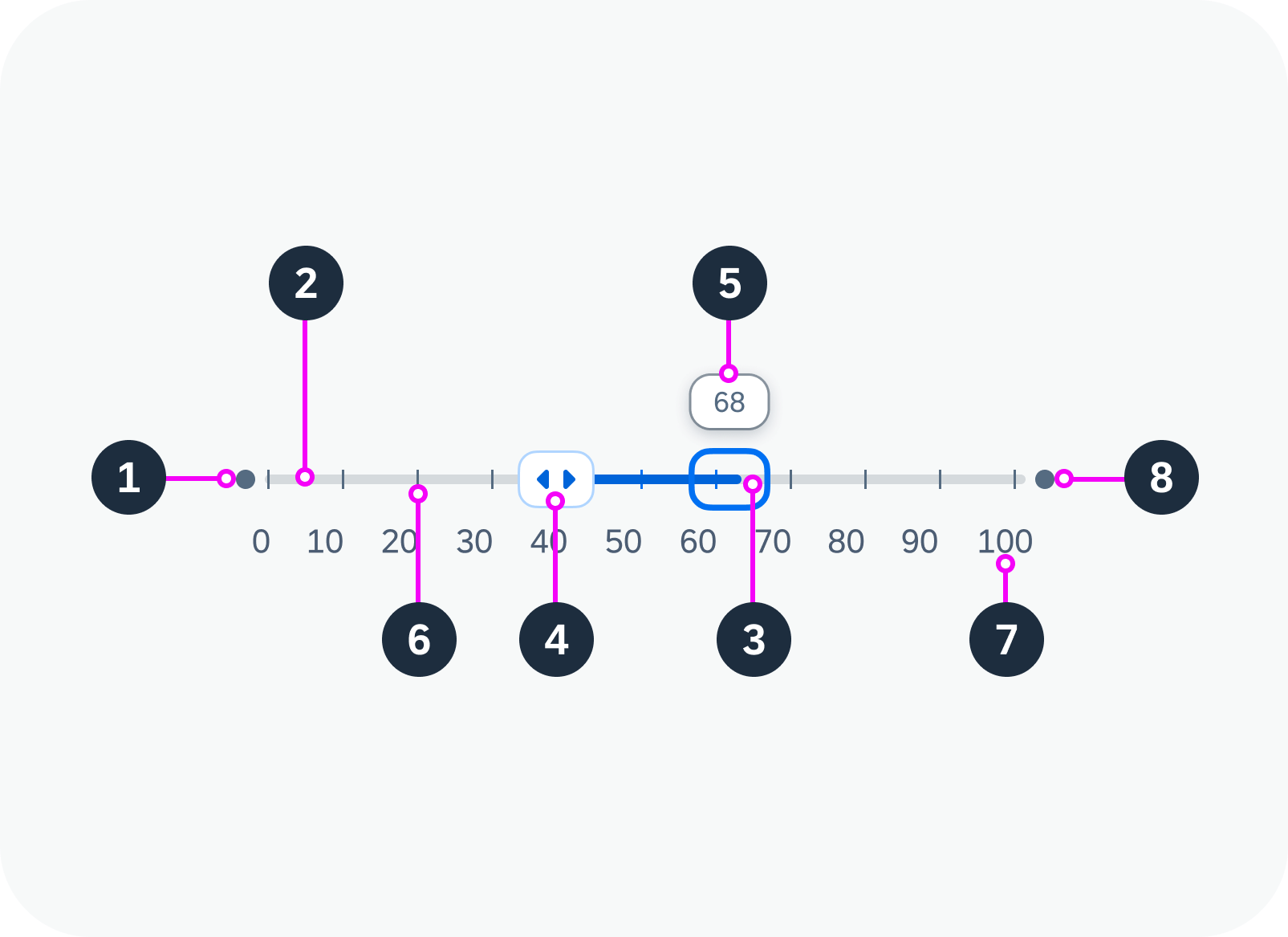
Anatomy of a range slider
Variants
The following range slider variants are available:
Basic range slider
Disabled range slider
Range slider with tooltip
Range slider with tooltip, tick marks, and labels
Behavior and Interaction
Changing the Value Range
If the range slider is editable, the hand cursor appears when the user hovers over the range slider. If tooltips have been activated, hovering over the slider also displays tooltips showing the current values for each handle. The handles move together with the corresponding tooltips.
The user can change the value range on the slider:
- By using drag and drop to adjust the handles. The handle snaps to the nearest incremental value.
- By clicking the track outside the selected value range. The corresponding handle then moves to the new position.
- By using the key combination Ctrl/Cmd + Arrow keys.
Range slider with tooltip, tick marks, and labels – live example
Moving the Entire Range
Users can move the entire value range by dragging and dropping the active segment of the track.
Equal Values
The handles of the range slider can be positioned on the same value.
Overlapping
The handles of the range slider can be moved across each other. The minimum can become the maximum, and vice versa.
Responsive Behavior
The range slider itself is not responsive. It adjusts to the responsiveness of its parent container by recalculating and resizing the width of the component.
 Your feedback has been sent to the SAP Fiori design team.