
- SAPUI5 Version 1.122
- SAPUI5 Version 1.120
- SAPUI5 Version 1.118
- SAPUI5 Version 1.116
- SAPUI5 Version 1.114
- SAPUI5 Version 1.112
- SAPUI5 Version 1.110
- SAPUI5 Version 1.108
- SAPUI5 Version 1.106
- SAPUI5 Version 1.104
- SAPUI5 Version 1.102
- SAPUI5 Version 1.100
- SAPUI5 Version 1.98
- SAPUI5 Version 1.96
- SAPUI5 Version 1.94
- SAPUI5 Version 1.92
- SAPUI5 Version 1.90
- SAPUI5 Version 1.88
- SAPUI5 Version 1.86
- SAPUI5 Version 1.84
- SAPUI5 Version 1.82
- SAPUI5 Version 1.80
- SAPUI5 Version 1.78
- SAPUI5 Version 1.76
- SAPUI5 Version 1.74
- SAPUI5 Version 1.72
- SAPUI5 Version 1.70
- SAPUI5 Version 1.68
- SAPUI5 Version 1.66
- SAPUI5 Version 1.64
- SAPUI5 Version 1.62
- SAPUI5 Version 1.60
- SAPUI5 Version 1.58
- SAPUI5 Version 1.56
- SAPUI5 Version 1.54
- SAPUI5 Version 1.52
- SAPUI5 Version 1.50
- SAPUI5 Version 1.48
- SAPUI5 Version 1.46
- SAPUI5 Version 1.44
- SAPUI5 Version 1.42
- SAPUI5 Version 1.40
- SAPUI5 Version 1.38
- SAPUI5 Version 1.36
- SAPUI5 Version 1.34
- SAPUI5 Version 1.32
- SAPUI5 Version 1.30
- SAPUI5 Version 1.28
- SAPUI5 Version 1.26
- Latest SAPUI Version 1.124
- SAPUI5 Version 1.122
- SAPUI5 Version 1.120
- SAPUI5 Version 1.118
- SAPUI5 Version 1.116
- SAPUI5 Version 1.114
- SAPUI5 Version 1.112
- SAPUI5 Version 1.110
- SAPUI5 Version 1.108
- SAPUI5 Version 1.106
- SAPUI5 Version 1.104
- SAPUI5 Version 1.102
- SAPUI5 Version 1.100
- SAPUI5 Version 1.98
- SAPUI5 Version 1.96
- SAPUI5 Version 1.94
- SAPUI5 Version 1.92
- SAPUI5 Version 1.90
- SAPUI5 Version 1.88
- SAPUI5 Version 1.86
- SAPUI5 Version 1.84
- SAPUI5 Version 1.82
- SAPUI5 Version 1.80
- SAPUI5 Version 1.78
- SAPUI5 Version 1.76
- SAPUI5 Version 1.74
- SAPUI5 Version 1.72
- SAPUI5 Version 1.70
- SAPUI5 Version 1.68
- SAPUI5 Version 1.66
- SAPUI5 Version 1.64
- SAPUI5 Version 1.62
- SAPUI5 Version 1.60
- SAPUI5 Version 1.58
- SAPUI5 Version 1.56
- SAPUI5 Version 1.54
- SAPUI5 Version 1.52
- SAPUI5 Version 1.50
- SAPUI5 Version 1.48
- SAPUI5 Version 1.46
- SAPUI5 Version 1.44
- SAPUI5 Version 1.42
- SAPUI5 Version 1.40
- SAPUI5 Version 1.38
- SAPUI5 Version 1.36
- SAPUI5 Version 1.34
- SAPUI5 Version 1.32
- SAPUI5 Version 1.30
- SAPUI5 Version 1.28
- SAPUI5 Version 1.26
Input
ui5-input | v1.0
Intro
An input field allows users to enter and edit text or numeric values in one line.
Input – live examples
When to Use
Use the input component:
- To enter a short, single-line text or number.
- To enter a password, URL, phone number, or email address.
- To select a single item from a large amount of data (for example, more than 200 items).
- To find an object by searching for more than one attribute, such as an ID, city, and customer name.
Don’t use the input component:
- To enter dates and times. Instead, use the date picker, date range selection, or date/time picker.
- To enter long texts. Use the text area component instead.
- To select multiple values. In this case, use the multi-combo box (for fewer than 200 items) or the multi-input component (for more than 200 items).
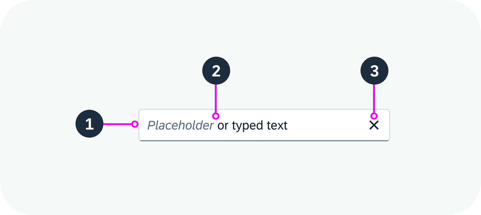
Anatomy
An input usually consists of a field that contains a text.
1. Field: Field container
2. Text: Placeholder or typed text
3. Icon (optional): For example, you can enable a Clear icon to remove the text that has been typed into the field.
Dropdown Areas
The input component provides two types of dropdown area:
- An area for suggestions, which is triggered by typing.
- An area for value help, which is triggered by the respective icon button.
Anatomy of an input field
Variants
Value Help
To help the user find the correct value, you can add a value help option. A small value help icon ( ) is then displayed in the input field on the right. To give a better indication of the type of data that can be selected, you can exchange the value help icon.
Input field with value help
Input with a Label
Always provide a meaningful label for any input field. Labels are necessary to indicate the meaning of the input fields when the placeholders are no longer visible.
To indicate that a particular field is mandatory, set the “Required” indicator for the label. This displays an asterisk (*) next to the label associated with the field.
Input field with a label
Input as a Search
An input component can be used as a search field (free text search). You can also use the search field to filter a set of data.
Input as a search field
Behavior and Interaction
Enabled, Read-Only, and Disabled States
An input field can have three states:
Enabled
The input field is currently active and allows user interaction. It can be empty, contain a placeholder text, or contain a value entered or selected by the user.
Input field – enabled
Read Only
The input field contains valid values and is visualized differently to indicate that editing isn’t possible. The read-only state is similar to the disabled state in that interactive functions are removed. However, a read-only input field can still be focused on and recognized by screen readers. It also complies with visual contrast standards for readability.
Input field – read only
Disabled
All interactive functions have been removed and the user is unable to interact with the input field. The field can’t be focused on or recognized by screen readers, and doesn’t need to meet visual contrast requirements.
Input field – disabled
Suggestions and Autocomplete
Using suggestions and autocomplete is the quickest way for users to discover and select relevant input terms and values.
- The current typed term is always highlighted with bold text.
- Only the characters entered in the input field are highlighted, not the whole word.
- All relevant instances are highlighted, even if they occur in one line item.
Input field with suggestions
Clear
You can enable a Clear icon ( ) in the input field. It appears as soon as the input field has a value. Clicking the Clear icon removes the value from the field. If you use this option, make sure that the input field is wide enough to show the Clear icon in addition to the value.
Input field with ‘Clear’ icon – live example
Responsive Behavior
If the user clicks the input field on mobile device in cozy mode, a new full screen dialog opens.
Globalization and Localization
The input component supports left-to-right (LTR) and right-to-left (RTL) reading directions.
 Your feedback has been sent to the SAP Fiori design team.