
- SAPUI5 Version 1.122
- SAPUI5 Version 1.120
- SAPUI5 Version 1.118
- SAPUI5 Version 1.116
- SAPUI5 Version 1.114
- SAPUI5 Version 1.112
- SAPUI5 Version 1.110
- SAPUI5 Version 1.108
- SAPUI5 Version 1.106
- SAPUI5 Version 1.104
- SAPUI5 Version 1.102
- SAPUI5 Version 1.100
- SAPUI5 Version 1.98
- SAPUI5 Version 1.96
- SAPUI5 Version 1.94
- SAPUI5 Version 1.92
- SAPUI5 Version 1.90
- SAPUI5 Version 1.88
- SAPUI5 Version 1.86
- SAPUI5 Version 1.84
- SAPUI5 Version 1.82
- SAPUI5 Version 1.80
- SAPUI5 Version 1.78
- SAPUI5 Version 1.76
- SAPUI5 Version 1.74
- SAPUI5 Version 1.72
- SAPUI5 Version 1.70
- SAPUI5 Version 1.68
- SAPUI5 Version 1.66
- SAPUI5 Version 1.64
- SAPUI5 Version 1.62
- SAPUI5 Version 1.60
- SAPUI5 Version 1.58
- SAPUI5 Version 1.56
- SAPUI5 Version 1.54
- SAPUI5 Version 1.52
- SAPUI5 Version 1.50
- SAPUI5 Version 1.48
- SAPUI5 Version 1.46
- SAPUI5 Version 1.44
- SAPUI5 Version 1.42
- SAPUI5 Version 1.40
- SAPUI5 Version 1.38
- SAPUI5 Version 1.36
- SAPUI5 Version 1.34
- SAPUI5 Version 1.32
- SAPUI5 Version 1.30
- SAPUI5 Version 1.28
- SAPUI5 Version 1.26
- Latest SAPUI Version 1.124
- SAPUI5 Version 1.122
- SAPUI5 Version 1.120
- SAPUI5 Version 1.118
- SAPUI5 Version 1.116
- SAPUI5 Version 1.114
- SAPUI5 Version 1.112
- SAPUI5 Version 1.110
- SAPUI5 Version 1.108
- SAPUI5 Version 1.106
- SAPUI5 Version 1.104
- SAPUI5 Version 1.102
- SAPUI5 Version 1.100
- SAPUI5 Version 1.98
- SAPUI5 Version 1.96
- SAPUI5 Version 1.94
- SAPUI5 Version 1.92
- SAPUI5 Version 1.90
- SAPUI5 Version 1.88
- SAPUI5 Version 1.86
- SAPUI5 Version 1.84
- SAPUI5 Version 1.82
- SAPUI5 Version 1.80
- SAPUI5 Version 1.78
- SAPUI5 Version 1.76
- SAPUI5 Version 1.74
- SAPUI5 Version 1.72
- SAPUI5 Version 1.70
- SAPUI5 Version 1.68
- SAPUI5 Version 1.66
- SAPUI5 Version 1.64
- SAPUI5 Version 1.62
- SAPUI5 Version 1.60
- SAPUI5 Version 1.58
- SAPUI5 Version 1.56
- SAPUI5 Version 1.54
- SAPUI5 Version 1.52
- SAPUI5 Version 1.50
- SAPUI5 Version 1.48
- SAPUI5 Version 1.46
- SAPUI5 Version 1.44
- SAPUI5 Version 1.42
- SAPUI5 Version 1.40
- SAPUI5 Version 1.38
- SAPUI5 Version 1.36
- SAPUI5 Version 1.34
- SAPUI5 Version 1.32
- SAPUI5 Version 1.30
- SAPUI5 Version 1.28
- SAPUI5 Version 1.26
Popover
ui5-popover | v1.0
Intro
A popover is a small overlay window that appears on top of the existing content. It is used to provide additional information and options without requiring the user to navigate away from the current page or interrupt their workflow.
Popover – live example
When to Use
Use a popover:
- If you need to define your own structure.
- If you have very little content.
Don’t use a popover:
- If the content takes up more than a third of the screen real estate on phones. Use the responsive popover instead.
- To show details for a list item in list-detail layouts.
- If a user action or confirmation is required before processing can continue. In this case, use a dialog.
Anatomy
- Title (optional): Including a title also improves accessibility for screen reader users.
- Content area: Can contain any component. Ensure that the content has a basic design and shows only the most important information.
- Arrow (optional): By default, the popover has an arrow that connects it visually to the triggering component. You can opt to hide the arrow.
- Footer (optional): Contains one or more actions.
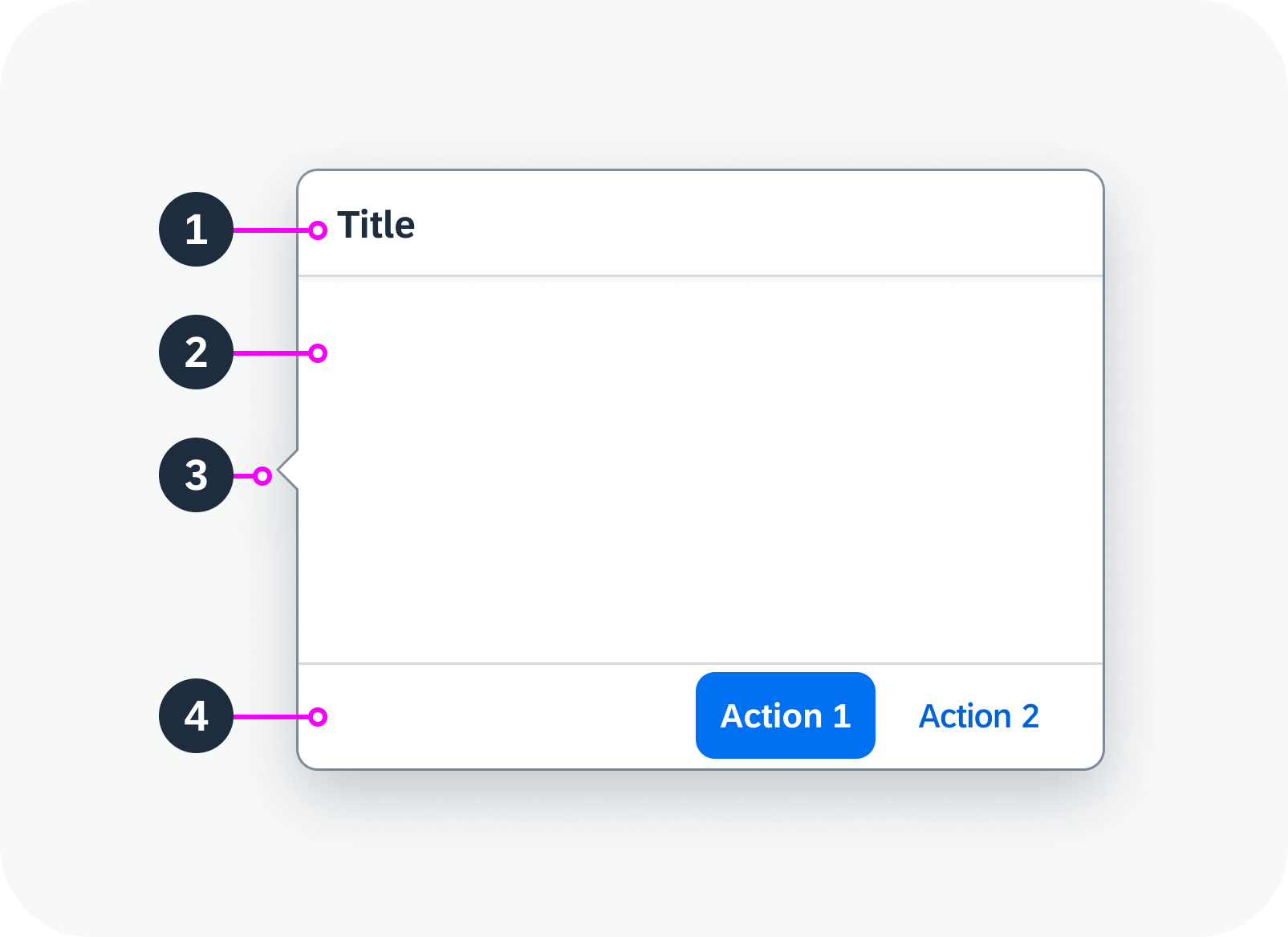
Anatomy of a popover
Behavior and Interaction
Opening and Closing a Popover
The popover opens when the user clicks on a triggering text link or button. The popover appears next to the trigger component, but doesn’t obscure it.
The popover closes when the user clicks outside the popover or selects an action within the popover.
Opening and closing a popover – live example
Placement Types
You can define how the popover is positioned in relation to its trigger.
Available options:
- Left
- Right (default)
- Top
- Bottom
The position and direction of the arrow adapt to the placement type.
Popover to the right of the trigger (default), arrow hidden – live example
Popover beneath the trigger, with arrow – live example
Responsive Behavior
The popover component always shows a popover, regardless of the form factor. Only use a non-responsive popover if it has very little content. On smartphones, the popover should not use more than a third of the phone’s real estate. If you need to include more content, use a responsive popover.
 Your feedback has been sent to the SAP Fiori design team.