
- SAPUI5 Version 1.122
- SAPUI5 Version 1.120
- SAPUI5 Version 1.118
- SAPUI5 Version 1.116
- SAPUI5 Version 1.114
- SAPUI5 Version 1.112
- SAPUI5 Version 1.110
- SAPUI5 Version 1.108
- SAPUI5 Version 1.106
- SAPUI5 Version 1.104
- SAPUI5 Version 1.102
- SAPUI5 Version 1.100
- SAPUI5 Version 1.98
- SAPUI5 Version 1.96
- SAPUI5 Version 1.94
- SAPUI5 Version 1.92
- SAPUI5 Version 1.90
- SAPUI5 Version 1.88
- SAPUI5 Version 1.86
- SAPUI5 Version 1.84
- SAPUI5 Version 1.82
- SAPUI5 Version 1.80
- SAPUI5 Version 1.78
- SAPUI5 Version 1.76
- SAPUI5 Version 1.74
- SAPUI5 Version 1.72
- SAPUI5 Version 1.70
- SAPUI5 Version 1.68
- SAPUI5 Version 1.66
- SAPUI5 Version 1.64
- SAPUI5 Version 1.62
- SAPUI5 Version 1.60
- SAPUI5 Version 1.58
- SAPUI5 Version 1.56
- SAPUI5 Version 1.54
- SAPUI5 Version 1.52
- SAPUI5 Version 1.50
- SAPUI5 Version 1.48
- SAPUI5 Version 1.46
- SAPUI5 Version 1.44
- SAPUI5 Version 1.42
- SAPUI5 Version 1.40
- SAPUI5 Version 1.38
- SAPUI5 Version 1.36
- SAPUI5 Version 1.34
- SAPUI5 Version 1.32
- SAPUI5 Version 1.30
- SAPUI5 Version 1.28
- SAPUI5 Version 1.26
- Latest SAPUI Version 1.124
- SAPUI5 Version 1.122
- SAPUI5 Version 1.120
- SAPUI5 Version 1.118
- SAPUI5 Version 1.116
- SAPUI5 Version 1.114
- SAPUI5 Version 1.112
- SAPUI5 Version 1.110
- SAPUI5 Version 1.108
- SAPUI5 Version 1.106
- SAPUI5 Version 1.104
- SAPUI5 Version 1.102
- SAPUI5 Version 1.100
- SAPUI5 Version 1.98
- SAPUI5 Version 1.96
- SAPUI5 Version 1.94
- SAPUI5 Version 1.92
- SAPUI5 Version 1.90
- SAPUI5 Version 1.88
- SAPUI5 Version 1.86
- SAPUI5 Version 1.84
- SAPUI5 Version 1.82
- SAPUI5 Version 1.80
- SAPUI5 Version 1.78
- SAPUI5 Version 1.76
- SAPUI5 Version 1.74
- SAPUI5 Version 1.72
- SAPUI5 Version 1.70
- SAPUI5 Version 1.68
- SAPUI5 Version 1.66
- SAPUI5 Version 1.64
- SAPUI5 Version 1.62
- SAPUI5 Version 1.60
- SAPUI5 Version 1.58
- SAPUI5 Version 1.56
- SAPUI5 Version 1.54
- SAPUI5 Version 1.52
- SAPUI5 Version 1.50
- SAPUI5 Version 1.48
- SAPUI5 Version 1.46
- SAPUI5 Version 1.44
- SAPUI5 Version 1.42
- SAPUI5 Version 1.40
- SAPUI5 Version 1.38
- SAPUI5 Version 1.36
- SAPUI5 Version 1.34
- SAPUI5 Version 1.32
- SAPUI5 Version 1.30
- SAPUI5 Version 1.28
- SAPUI5 Version 1.26
Avatar Group
ui5-avatar-group | v1.0
Intro
The avatar group displays several avatars together, indicating that more than one person or business entity is associated with an item.
Avatar group (group view) – live example
Avatar group (individual view) – live example
When to Use
Use the avatar group:
- To display a group of at least two people or items.
- To display several people or items that have something in common (such as people in the same team or project).
Don’t use the avatar group:
- To display a gallery for simple images. Use the carousel instead.
- To display a single avatar.
- To show visual content other than avatars.
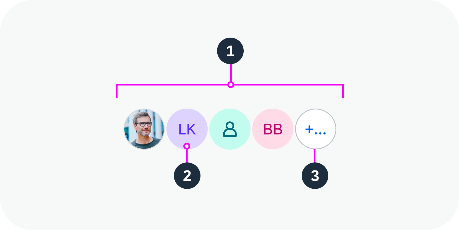
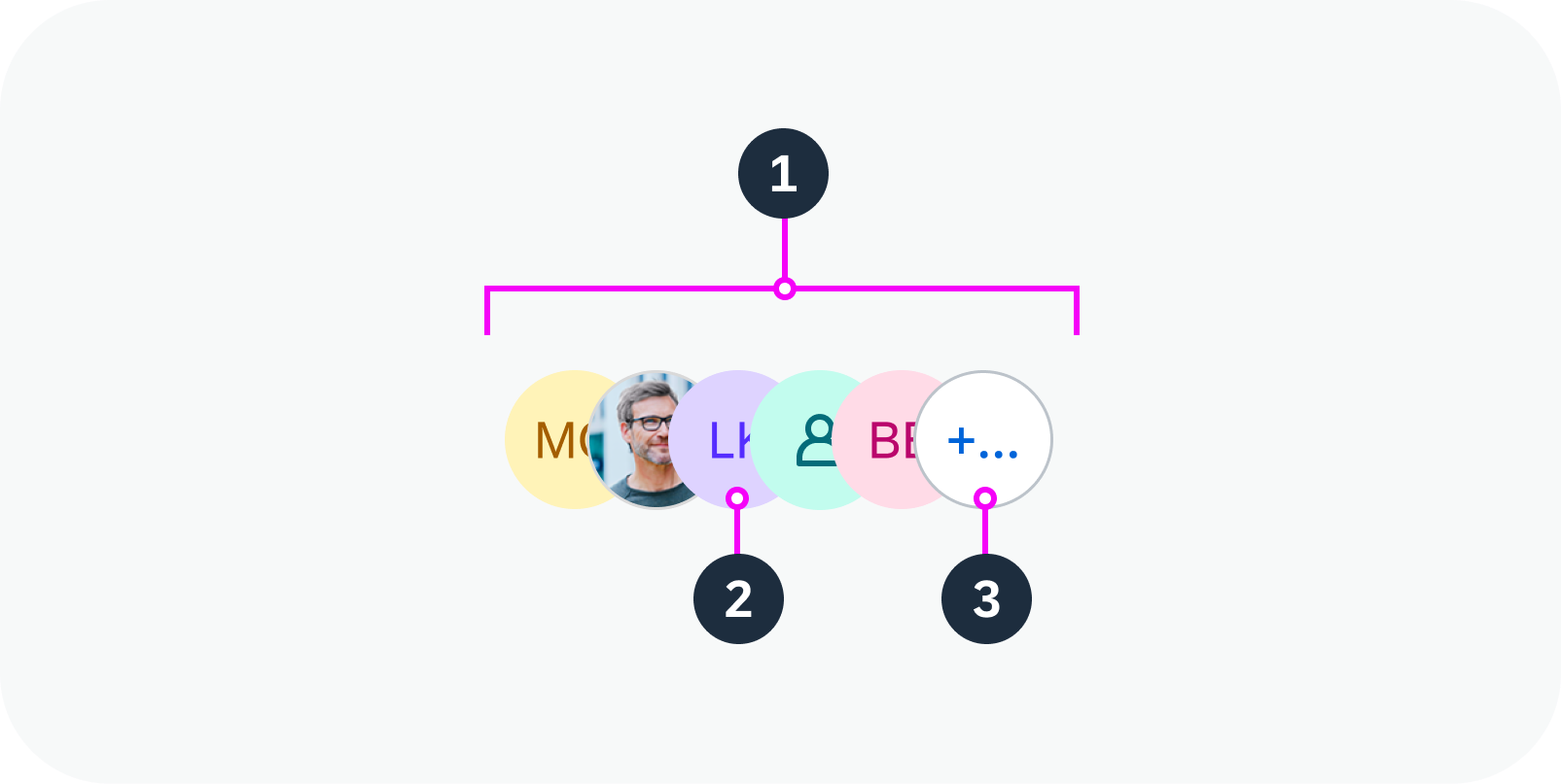
Anatomy
- Avatar group (type: individual or group)
- Avatar
- Overflow button
Anatomy of an avatar group (type: individual)
Anatomy of an avatar group (type: group)
Variants
There are two types of avatar group:
- Group: Combined focus for all avatars in the group (default)
- Individual: Focus on each avatar
Both types are always displayed horizontally.
You can adjust the order of the avatars. For example, the sequence can be alphabetical, history-based, or random.
Note: The avatar group reuses the avatar component and its logic. If a person’s image isn’t available, the avatar displays the person’s initials. If there are more than 3 initials or the language system doesn’t support initials, the avatar displays a gender-neutral person icon.
Avatar group (type: group) – live example with slider
Avatar group (type: individual) – live example with slider
Behavior and Interaction
The avatar and avatar group support click events.
Individual type (focus on one avatar):
- Clicking an avatar displays a popover with the details for that avatar.
- Clicking the overflow icon displays a popover showing the avatars hidden in the overflow.
Details for an individual avatar / avatars in the overflow – live example
Group type (focus on the entire avatar group):
- Clicking the group displays a popover showing all the individual avatars.
Details for a group of avatars (“group” type) – live example
Responsive Behavior
Content Density
The avatar group supports the different sizes of the avatar component.
Avatar group sizes (XS, S, M, L, XL)
Overflow Button
If there is not enough space to display all the avatars in a group, an overflow button appears and one or more avatars move into the overflow popover.
The overflow displays as a shape containing a count. The count indicates how many avatars can’t be displayed on the screen. If the number is too large to fit into the shape, the shape grows to accommodate the number.
It is possible to have a custom overflow.
Avatar group overflow – live example
Globalization and Localization
The avatar group supports left-to-right (LTR) and right-to-left (RTL) reading directions.
 Your feedback has been sent to the SAP Fiori design team.