
- SAPUI5 Version 1.122
- SAPUI5 Version 1.120
- SAPUI5 Version 1.118
- SAPUI5 Version 1.116
- SAPUI5 Version 1.114
- SAPUI5 Version 1.112
- SAPUI5 Version 1.110
- SAPUI5 Version 1.108
- SAPUI5 Version 1.106
- SAPUI5 Version 1.104
- SAPUI5 Version 1.102
- SAPUI5 Version 1.100
- SAPUI5 Version 1.98
- SAPUI5 Version 1.96
- SAPUI5 Version 1.94
- SAPUI5 Version 1.92
- SAPUI5 Version 1.90
- SAPUI5 Version 1.88
- SAPUI5 Version 1.86
- SAPUI5 Version 1.84
- SAPUI5 Version 1.82
- SAPUI5 Version 1.80
- SAPUI5 Version 1.78
- SAPUI5 Version 1.76
- SAPUI5 Version 1.74
- SAPUI5 Version 1.72
- SAPUI5 Version 1.70
- SAPUI5 Version 1.68
- SAPUI5 Version 1.66
- SAPUI5 Version 1.64
- SAPUI5 Version 1.62
- SAPUI5 Version 1.60
- SAPUI5 Version 1.58
- SAPUI5 Version 1.56
- SAPUI5 Version 1.54
- SAPUI5 Version 1.52
- SAPUI5 Version 1.50
- SAPUI5 Version 1.48
- SAPUI5 Version 1.46
- SAPUI5 Version 1.44
- SAPUI5 Version 1.42
- SAPUI5 Version 1.40
- SAPUI5 Version 1.38
- SAPUI5 Version 1.36
- SAPUI5 Version 1.34
- SAPUI5 Version 1.32
- SAPUI5 Version 1.30
- SAPUI5 Version 1.28
- SAPUI5 Version 1.26
- Latest SAPUI Version 1.124
- SAPUI5 Version 1.122
- SAPUI5 Version 1.120
- SAPUI5 Version 1.118
- SAPUI5 Version 1.116
- SAPUI5 Version 1.114
- SAPUI5 Version 1.112
- SAPUI5 Version 1.110
- SAPUI5 Version 1.108
- SAPUI5 Version 1.106
- SAPUI5 Version 1.104
- SAPUI5 Version 1.102
- SAPUI5 Version 1.100
- SAPUI5 Version 1.98
- SAPUI5 Version 1.96
- SAPUI5 Version 1.94
- SAPUI5 Version 1.92
- SAPUI5 Version 1.90
- SAPUI5 Version 1.88
- SAPUI5 Version 1.86
- SAPUI5 Version 1.84
- SAPUI5 Version 1.82
- SAPUI5 Version 1.80
- SAPUI5 Version 1.78
- SAPUI5 Version 1.76
- SAPUI5 Version 1.74
- SAPUI5 Version 1.72
- SAPUI5 Version 1.70
- SAPUI5 Version 1.68
- SAPUI5 Version 1.66
- SAPUI5 Version 1.64
- SAPUI5 Version 1.62
- SAPUI5 Version 1.60
- SAPUI5 Version 1.58
- SAPUI5 Version 1.56
- SAPUI5 Version 1.54
- SAPUI5 Version 1.52
- SAPUI5 Version 1.50
- SAPUI5 Version 1.48
- SAPUI5 Version 1.46
- SAPUI5 Version 1.44
- SAPUI5 Version 1.42
- SAPUI5 Version 1.40
- SAPUI5 Version 1.38
- SAPUI5 Version 1.36
- SAPUI5 Version 1.34
- SAPUI5 Version 1.32
- SAPUI5 Version 1.30
- SAPUI5 Version 1.28
- SAPUI5 Version 1.26
Label
sap.m.Label
Intro
A label is the name or title of a control or group of related controls.
Every field needs a label. If you use one label for a group of fields, use a combined label and invisible text to label the single fields.
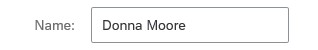
Label 'Name'
Usage
Use the label control if:
- You need a label for a control.
- Always use labels for form controls.
Do not use the label control if:
- You want to insert a heading in the column header of a table.
- You want to use it as an alternative for the text control. Do not use the label control to display the data (for example, in display-only forms).
Required/Optional Fields
In edit mode, the label indicates whether an entry is mandatory (“required”) or optional.
If a field is required, an asterisk is shown after the label text. The asterisk is only visible in edit mode, and not in display mode.
In the image:
- Required, edit mode
- Required, display mode
- Optional, edit mode
- Optional, display mode
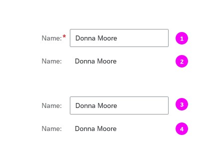
Label for required and optional fields
Label Placement
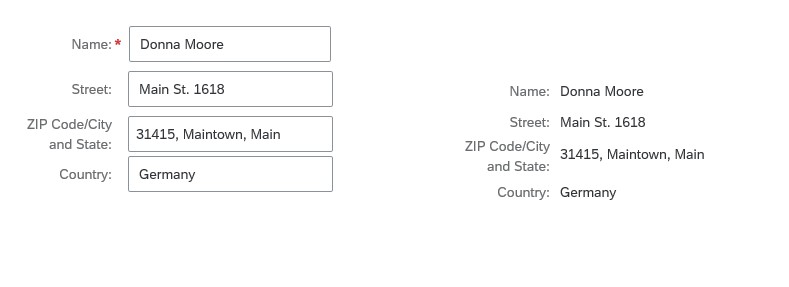
In forms, you can place the label above the field value (recommended), or right-align the label next to the field value. For more information, see Label Alignment.
The position of a label can depend on the screen size. For example, the labels in a form can appear next to the input fields on larger screens, but move above the input fields when the screen size is reduced.
Labels next to the field and labels above the field (recommended)
Styles
For better differentiation of labels and values, labels are displayed differently in a display-only environment than in an editable environment.
Wrapping
Automatic wrap only applies to labels within forms to avoid truncation.
Do not use wrapping to enable long labels. Instead, keep your labels short: a label is not a help text. It must be meaningful, succinct, short, and descriptive. For more information about the responsive behavior of text, see Wrapping and Truncating Text.
Labels in a form (edit and read-only modes, horizontal alignment)
Hyphenation
The label control also supports hyphenation for wrapped texts (property: wrappingtype = Hyphenated). Switching on hyphenation activates it for all languages that have hyphenation support.
Guidelines
- Always use a label for form controls.
- Always set the vertical alignment for labels that display outside a form and flex box (property: VAlign). You can set the vertical alignment in tables and object page header facets, for example.
- Use title case for labels.
- Do not use a placeholder (input prompt) instead of a label.
- You can display labels in bold text, but we recommend using the regular font weight.
- A label is not a help text: it must be meaningful, succinct, short, and descriptive.
- Reserve space for translation. For more information, see UI Text Space Calculator.
Exceptions
The layout can sometimes be simplified by using a placeholder instead of the label control. This exception can be applied in the following cases:
- In search fields. For more information, see Search.
Resources
Want to dive deeper? Follow the links below to find out more about related controls, the SAPUI5 implementation, and the visual design.
Elements and Controls
- Form (guidelines)
- Text (guidelines)
- Wrapping and Truncating Text (guidelines)
- UI Text Guidelines for SAP Fiori Apps (guidelines)
- UI Text Space Calculator (guidelines)
Implementation
- Label (SAPUI5 samples)
- Label (SAPUI5 API reference)
- Hyphenation for Text Controls (SAPUI5 documentation)
 Your feedback has been sent to the SAP Fiori design team.