
- SAPUI5 Version 1.122
- SAPUI5 Version 1.120
- SAPUI5 Version 1.118
- SAPUI5 Version 1.116
- SAPUI5 Version 1.114
- SAPUI5 Version 1.112
- SAPUI5 Version 1.110
- SAPUI5 Version 1.108
- SAPUI5 Version 1.106
- SAPUI5 Version 1.104
- SAPUI5 Version 1.102
- SAPUI5 Version 1.100
- SAPUI5 Version 1.98
- SAPUI5 Version 1.96
- SAPUI5 Version 1.94
- SAPUI5 Version 1.92
- SAPUI5 Version 1.90
- SAPUI5 Version 1.88
- SAPUI5 Version 1.86
- SAPUI5 Version 1.84
- SAPUI5 Version 1.82
- SAPUI5 Version 1.80
- SAPUI5 Version 1.78
- SAPUI5 Version 1.76
- SAPUI5 Version 1.74
- SAPUI5 Version 1.72
- SAPUI5 Version 1.70
- SAPUI5 Version 1.68
- SAPUI5 Version 1.66
- SAPUI5 Version 1.64
- SAPUI5 Version 1.62
- SAPUI5 Version 1.60
- SAPUI5 Version 1.58
- SAPUI5 Version 1.56
- SAPUI5 Version 1.54
- SAPUI5 Version 1.52
- SAPUI5 Version 1.50
- SAPUI5 Version 1.48
- SAPUI5 Version 1.46
- SAPUI5 Version 1.44
- SAPUI5 Version 1.42
- SAPUI5 Version 1.40
- SAPUI5 Version 1.38
- SAPUI5 Version 1.36
- SAPUI5 Version 1.34
- SAPUI5 Version 1.32
- SAPUI5 Version 1.30
- SAPUI5 Version 1.28
- SAPUI5 Version 1.26
- Latest SAPUI Version 1.124
- SAPUI5 Version 1.122
- SAPUI5 Version 1.120
- SAPUI5 Version 1.118
- SAPUI5 Version 1.116
- SAPUI5 Version 1.114
- SAPUI5 Version 1.112
- SAPUI5 Version 1.110
- SAPUI5 Version 1.108
- SAPUI5 Version 1.106
- SAPUI5 Version 1.104
- SAPUI5 Version 1.102
- SAPUI5 Version 1.100
- SAPUI5 Version 1.98
- SAPUI5 Version 1.96
- SAPUI5 Version 1.94
- SAPUI5 Version 1.92
- SAPUI5 Version 1.90
- SAPUI5 Version 1.88
- SAPUI5 Version 1.86
- SAPUI5 Version 1.84
- SAPUI5 Version 1.82
- SAPUI5 Version 1.80
- SAPUI5 Version 1.78
- SAPUI5 Version 1.76
- SAPUI5 Version 1.74
- SAPUI5 Version 1.72
- SAPUI5 Version 1.70
- SAPUI5 Version 1.68
- SAPUI5 Version 1.66
- SAPUI5 Version 1.64
- SAPUI5 Version 1.62
- SAPUI5 Version 1.60
- SAPUI5 Version 1.58
- SAPUI5 Version 1.56
- SAPUI5 Version 1.54
- SAPUI5 Version 1.52
- SAPUI5 Version 1.50
- SAPUI5 Version 1.48
- SAPUI5 Version 1.46
- SAPUI5 Version 1.44
- SAPUI5 Version 1.42
- SAPUI5 Version 1.40
- SAPUI5 Version 1.38
- SAPUI5 Version 1.36
- SAPUI5 Version 1.34
- SAPUI5 Version 1.32
- SAPUI5 Version 1.30
- SAPUI5 Version 1.28
- SAPUI5 Version 1.26
Message Strip
ui5-message-strip | v1.0
Intro
The message strip component allows you to embed application-related messages on the UI. It draws the user’s attention to information that is important in the context of the page content. This could be a warning or a change of state that might otherwise be easy to miss.
Message strip – live example
When to Use
Use the message strip:
- To provide information related to the object as a whole in the object header, such as the object status.
- To provide information within the detail area of an object.
- To inform the user about a status of an object.
- To warn the user about an issue.
Don’t use the message strip:
- To display information within a component.
- In the list of a list-detail layout.
- Above the page header.
Anatomy
- Container: Holds the icon, message text, and Close button.
- Icon (optional): Visual indication of the message type. By default, the message strip uses standard icons for error, warning, success, and information messages.
We strongly recommend displaying an icon. If you decide to remove it, include an additional text to indicate the message type. - Text: Message text. To preserve the intended design, we strongly recommend using only text for the message itself.
- Close button (optional): Allows the user to remove the message strip from the UI.
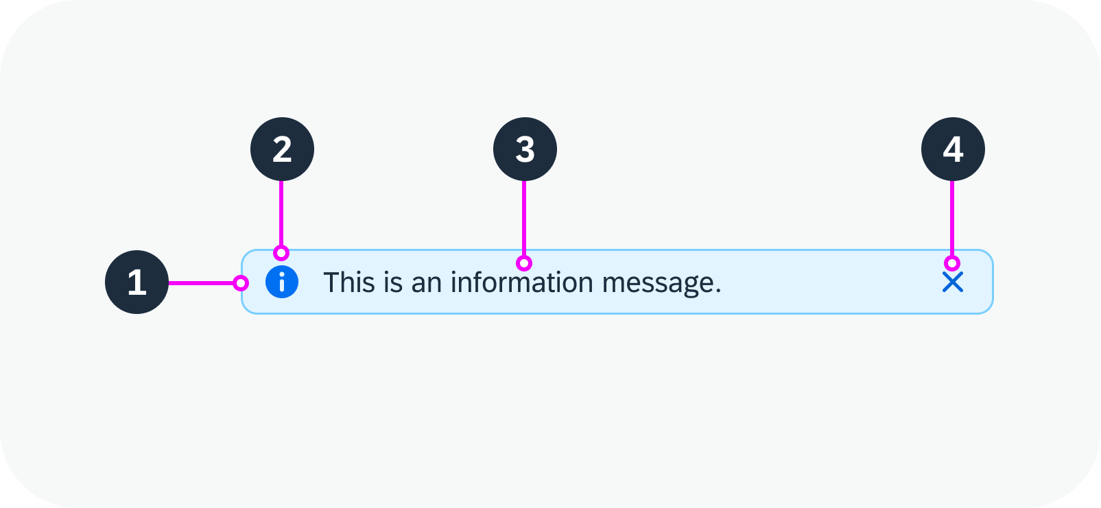
Anatomy of a message strip
Variants
You can use the message strip with or without an icon or Close button. If necessary, you can also configure a custom message strip.
With Icon and Close Button
Message strip with icon and ‘Close’ button
With Icon, Without Close Button
Message strip with icon, without ‘Close’ button
Without Icon, With Close Button
Message strip without icon, with ‘Close’ button
Without Icon or Close Button
Message strip without an icon or ‘Close’ button
Custom MessageStrip
If the application needs a custom message strip, other than the standard semantic variations, use the colors defined for the inverted object status tag. You can use both sets of indication colors.
See all the available icons in the Icon Explorer (Horizon).
Custom message strip
Behavior and Interaction
Clicking or tapping the Close button removes the message strip from the UI.
Message strip – live example
Responsive Behavior
The message strip is fully responsive. Message type icons always display on the left, while the Close icon always displays on the right. Text that exceeds the available width wraps to the next line.
If you place the message within the detail area for an object, it always uses 100% of the available width and reacts to the responsiveness of the container.
Message strip examples with wrapped text
Content Density
Globalization and Localization
For right-to-left languages, such as Arabic or Hebrew, the message strip is mirrored.
 Your feedback has been sent to the SAP Fiori design team.