
- SAPUI5 Version 1.122
- SAPUI5 Version 1.120
- SAPUI5 Version 1.118
- SAPUI5 Version 1.116
- SAPUI5 Version 1.114
- SAPUI5 Version 1.112
- SAPUI5 Version 1.110
- SAPUI5 Version 1.108
- SAPUI5 Version 1.106
- SAPUI5 Version 1.104
- SAPUI5 Version 1.102
- SAPUI5 Version 1.100
- SAPUI5 Version 1.98
- SAPUI5 Version 1.96
- SAPUI5 Version 1.94
- SAPUI5 Version 1.92
- SAPUI5 Version 1.90
- SAPUI5 Version 1.88
- SAPUI5 Version 1.86
- SAPUI5 Version 1.84
- SAPUI5 Version 1.82
- SAPUI5 Version 1.80
- SAPUI5 Version 1.78
- SAPUI5 Version 1.76
- SAPUI5 Version 1.74
- SAPUI5 Version 1.72
- SAPUI5 Version 1.70
- SAPUI5 Version 1.68
- SAPUI5 Version 1.66
- SAPUI5 Version 1.64
- SAPUI5 Version 1.62
- SAPUI5 Version 1.60
- SAPUI5 Version 1.58
- SAPUI5 Version 1.56
- SAPUI5 Version 1.54
- SAPUI5 Version 1.52
- SAPUI5 Version 1.50
- SAPUI5 Version 1.48
- SAPUI5 Version 1.46
- SAPUI5 Version 1.44
- SAPUI5 Version 1.42
- SAPUI5 Version 1.40
- SAPUI5 Version 1.38
- SAPUI5 Version 1.36
- SAPUI5 Version 1.34
- SAPUI5 Version 1.32
- SAPUI5 Version 1.30
- SAPUI5 Version 1.28
- SAPUI5 Version 1.26
- Latest SAPUI Version 1.124
- SAPUI5 Version 1.122
- SAPUI5 Version 1.120
- SAPUI5 Version 1.118
- SAPUI5 Version 1.116
- SAPUI5 Version 1.114
- SAPUI5 Version 1.112
- SAPUI5 Version 1.110
- SAPUI5 Version 1.108
- SAPUI5 Version 1.106
- SAPUI5 Version 1.104
- SAPUI5 Version 1.102
- SAPUI5 Version 1.100
- SAPUI5 Version 1.98
- SAPUI5 Version 1.96
- SAPUI5 Version 1.94
- SAPUI5 Version 1.92
- SAPUI5 Version 1.90
- SAPUI5 Version 1.88
- SAPUI5 Version 1.86
- SAPUI5 Version 1.84
- SAPUI5 Version 1.82
- SAPUI5 Version 1.80
- SAPUI5 Version 1.78
- SAPUI5 Version 1.76
- SAPUI5 Version 1.74
- SAPUI5 Version 1.72
- SAPUI5 Version 1.70
- SAPUI5 Version 1.68
- SAPUI5 Version 1.66
- SAPUI5 Version 1.64
- SAPUI5 Version 1.62
- SAPUI5 Version 1.60
- SAPUI5 Version 1.58
- SAPUI5 Version 1.56
- SAPUI5 Version 1.54
- SAPUI5 Version 1.52
- SAPUI5 Version 1.50
- SAPUI5 Version 1.48
- SAPUI5 Version 1.46
- SAPUI5 Version 1.44
- SAPUI5 Version 1.42
- SAPUI5 Version 1.40
- SAPUI5 Version 1.38
- SAPUI5 Version 1.36
- SAPUI5 Version 1.34
- SAPUI5 Version 1.32
- SAPUI5 Version 1.30
- SAPUI5 Version 1.28
- SAPUI5 Version 1.26
Step Input
ui5-step-input | v1.0
Intro
The step input component allows the user to change the input value in predefined increments (steps).
Step input – live example
When to Use
Use the step input component:
- To adjust amounts, quantities, or other values quickly.
- To adjust values for a specific step (for example, in a shopping cart).
Don’t use the step input component:
- To enter a static number (for example, postal code, phone number, or ID).
- To display a value that rarely needs to be adjusted and does not pertain to a particular step.
- To enter dates or times.
Anatomy
The step input component consists of:
- Icon buttons to decrease or increase the value
- An input field
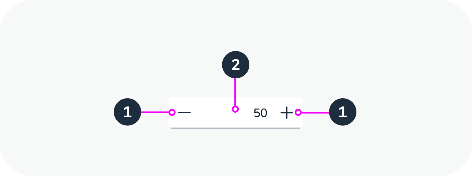
Step input anatomy
Variants
The value in the input field can be aligned left, centered, or aligned right (default). To make it easier to compare numbers, we recommend using right alignment.
You can also use a label with the step input component.
Step input with right-aligned value (default) – live example
Step input with centered value – live example
Step input with label
Behavior and Interaction
The user changes the value by clicking the increase/decrease buttons, by typing a number, or by scrolling. The buttons increase or decrease the value by the increment (step) you specify.
Initial Value
The input field always contains a value. You can set the initial value or leave the default initial value of 0.
You can also add a placeholder text, which is visible when the value is deleted and the step input is active.
Step input with initial value set to 1 and placeholder – live example
Value Precision
The step input component supports decimal values. You can specify the number of digits displayed after the decimal point.
Step input with value precision set to 1 decimal place – live example
Minimum and Maximum Values
You can specify minimum and maximum values. When the minimum or maximum value is reached, the corresponding increase/decrease button and up/down keyboard navigation are disabled.
If the user manually enters a value that is outside the permitted range, the step input component displays an error state and message.
 Your feedback has been sent to the SAP Fiori design team.