- SAPUI5 Version 1.122
- SAPUI5 Version 1.120
- SAPUI5 Version 1.118
- SAPUI5 Version 1.116
- SAPUI5 Version 1.114
- SAPUI5 Version 1.112
- SAPUI5 Version 1.110
- SAPUI5 Version 1.108
- SAPUI5 Version 1.106
- SAPUI5 Version 1.104
- SAPUI5 Version 1.102
- SAPUI5 Version 1.100
- SAPUI5 Version 1.98
- SAPUI5 Version 1.96
- SAPUI5 Version 1.94
- SAPUI5 Version 1.92
- SAPUI5 Version 1.90
- SAPUI5 Version 1.88
- SAPUI5 Version 1.86
- SAPUI5 Version 1.84
- SAPUI5 Version 1.82
- SAPUI5 Version 1.80
- SAPUI5 Version 1.78
- SAPUI5 Version 1.76
- SAPUI5 Version 1.74
- SAPUI5 Version 1.72
- SAPUI5 Version 1.70
- SAPUI5 Version 1.68
- SAPUI5 Version 1.66
- SAPUI5 Version 1.64
- SAPUI5 Version 1.62
- SAPUI5 Version 1.60
- SAPUI5 Version 1.58
- SAPUI5 Version 1.56
- SAPUI5 Version 1.54
- SAPUI5 Version 1.52
- SAPUI5 Version 1.50
- SAPUI5 Version 1.48
- SAPUI5 Version 1.46
- SAPUI5 Version 1.44
- SAPUI5 Version 1.42
- SAPUI5 Version 1.40
- SAPUI5 Version 1.38
- SAPUI5 Version 1.36
- SAPUI5 Version 1.34
- SAPUI5 Version 1.32
- SAPUI5 Version 1.30
- SAPUI5 Version 1.28
- SAPUI5 Version 1.26
- Latest SAPUI Version 1.124
- SAPUI5 Version 1.122
- SAPUI5 Version 1.120
- SAPUI5 Version 1.118
- SAPUI5 Version 1.116
- SAPUI5 Version 1.114
- SAPUI5 Version 1.112
- SAPUI5 Version 1.110
- SAPUI5 Version 1.108
- SAPUI5 Version 1.106
- SAPUI5 Version 1.104
- SAPUI5 Version 1.102
- SAPUI5 Version 1.100
- SAPUI5 Version 1.98
- SAPUI5 Version 1.96
- SAPUI5 Version 1.94
- SAPUI5 Version 1.92
- SAPUI5 Version 1.90
- SAPUI5 Version 1.88
- SAPUI5 Version 1.86
- SAPUI5 Version 1.84
- SAPUI5 Version 1.82
- SAPUI5 Version 1.80
- SAPUI5 Version 1.78
- SAPUI5 Version 1.76
- SAPUI5 Version 1.74
- SAPUI5 Version 1.72
- SAPUI5 Version 1.70
- SAPUI5 Version 1.68
- SAPUI5 Version 1.66
- SAPUI5 Version 1.64
- SAPUI5 Version 1.62
- SAPUI5 Version 1.60
- SAPUI5 Version 1.58
- SAPUI5 Version 1.56
- SAPUI5 Version 1.54
- SAPUI5 Version 1.52
- SAPUI5 Version 1.50
- SAPUI5 Version 1.48
- SAPUI5 Version 1.46
- SAPUI5 Version 1.44
- SAPUI5 Version 1.42
- SAPUI5 Version 1.40
- SAPUI5 Version 1.38
- SAPUI5 Version 1.36
- SAPUI5 Version 1.34
- SAPUI5 Version 1.32
- SAPUI5 Version 1.30
- SAPUI5 Version 1.28
- SAPUI5 Version 1.26
UI Text Guidelines for SAP Fiori Apps
Intro
This page contains product-specific UI text guidelines for SAP Fiori. It is split into two parts:
- General guidelines that affect multiple floorplans or UI elements
- Guidelines for specific floorplans or UI elements
About this guideline
The SAP Fiori UI text guidelines are not exhaustive. They build on the other writing guidelines at SAP, and cover only specific conventions for SAP Fiori applications. The guidelines have evolved on an as-needed basis to clarify questions that have arisen during SAP Fiori app development, or to reiterate points that recur in SAP Fiori app design reviews.
The guidelines are based on US English, the primary source language at SAP. There are no specific SAP Fiori text guidelines for other languages.
Finding your way
See the content overview at the beginning of each section to navigate. You can also return to the start of each section at any time using the anchors in the header area.
General Guidelines
Content Overview
Abbreviations
Using abbreviations
Limit the use of abbreviations as much as possible to avoid unnecessary abbreviations appearing on the desktop, where space is often sufficient.
Test your screens on all three device types (smartphone, tablet, and desktop) to ensure that you see the labels live in each case. Optimize as required and as far as space allows.
Abbreviating “Quantity”
Do not use the abbreviated form Qty. Abbreviations in other languages do not work. If there is enough space on the screen, spell out the full word.
Application names
General rules
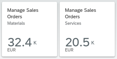
Ensure that the title of the app (initial screen) matches the title on the tile.
Do not use the tile subtitle for explanations. Use the subtitle only for differentiating information.
Background: Explanations are often redundant, and will typically be truncated in some target languages.
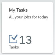
Don't use the tile subtitles for hints or explanations
Transactional or hybrid apps
If the user can make changes to the data on the database, start the app name with a verb.
Exceptions:
For employee self-service apps, start the name with My.
If the key focus of the app is to process items assigned to the user, start the name with My.
Choose a verb that best fits the main purpose of the app:
- For approval apps, start the name with Approve.
- If the app is used primarily for CRUD actions (create, update, delete), start the name with Manage.
- If the main focus of the app is on processing documents, start the name with Process.
Use the plural for the business object, as the user can generally process more than one object within the app.
Examples:
Create Billing Documents
My Timesheet
My Open Worklists
Approve Supplier Invoices
Manage Purchase Orders
Process Sales Orders
Analytical apps
Use a noun-based name and avoid the word “analysis” (to avoid unnecessary repetition across all analytical apps).
Exception: If your app offers analytical data that is specific to the current user, you may start the name with My.
Use the plural for the business object where it makes sense.
Examples:
Journal Entries
Liquidity Forecast
Cash Flow
Cash Flow Analysis
If your app also allows users to take action after analyzing the data (hybrid app), use the naming guidelines for transactional/hybrid apps.
Overview page
Use a noun-based name.
Do not use the term “Overview Page”. This is just the name of the floorplan. However, it’s fine to use “Overview” on its own.
Examples:
Quality Engineer Overview
My Sales Overview
Quality Technician Overview Page
Formatting
Currencies
Use the three-letter currency code instead of the currency symbol. This prevents ambiguity when multiple currencies share the same symbol.
Example:
EUR
USD
€
$
Case
Unless otherwise specified for individual UI elements, use title case for all SAP Fiori user interface short texts (labels, headings, value help texts, and so on), and sentence case for all messages and explanations.
Exceptions:
Use sentence case for:
- Relative times
- Values and statuses that start with a number
Examples:
4 days ago
4 items left
Consider using sentence case if a text is very long, making it difficult to read in title case.
For example, you might have a long status text, or long subtitles in the cards on an overview page.
Examples:
Material damaged in transit (status)
Sorted by turnover and region (card subtitle)
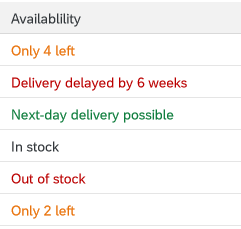
Status texts in a table column
If you opt to use sentence case for a certain text type, use it consistently in your context (for example, all subtitles for the cards on an overview page, or all the labels for a set of radio buttons or checkboxes).
Hyphenation
Do not use a hyphen for email.
OData service
Hyphenate OData service in German.
Example:
DE: OData-Service
Text wrap
Do not add manual hyphens to wrap texts (for example, on tiles or in column headings).
Punctuation
Colon
Colons after field labels
Place a colon after the field label if the field label and value are visually separate and do not form a running phrase or sentence.
Examples:
Description: Laser Jet Printer
Valid From: 09/13/2013
Forwarded by Joe Bloggs
For form fields, the colon is added automatically by the UI control. For other field labels, the colon must be added manually by the app development team.
Do not add a colon after titles (for example, in an object page header).
Colon as a separator
Use a colon to separate concatenated texts that would otherwise be hard to translate.
Note: If possible, avoid concatenated texts in the first place.
Example:
Search In: Sales Orders
Here, this format ensures that the verb comes at the beginning in all languages, and is never truncated.
Ellipsis (…)
Use the ellipsis (…) if a menu item leads to a set of further menu options.
Do not use the ellipsis:
- In placeholders (input prompts) in entry fields.
These are texts that show for empty field values, but disappear as soon as the user starts typing or selects a value. - In menu buttons.
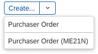
Here, the dropdown arrow already indicates that there are multiple selection options. - In labels for actions that open a follow-on dialog or screen.
Exception: Consider using an ellipsis if it’s standard practice to do so (for example, Browse… to select files). - To indicate a busy state. SAP Fiori normally uses a graphical busy state rather than a text. If a text is used, check with your UX designer.
Exception: If a text is required, add an ellipsis at the end to indicate that the user has to wait (for example, Loading…).
Period
Many SAP Fiori apps use texts from back-end systems that were written without an ending period, based on the ABAP guidelines. To avoid changing (and retranslating) a large number of legacy texts, we have adopted the following approach for SAP Fiori:
Use periods at the end of complete sentences:
- If your sentence is written out in full with all its grammatical components, use a period.
Rule of thumb: Add a period if your text is obviously incorrect without one.
Examples:
You don’t have authorization to view this page.
To start, enter your filter settings.
- If your sentence is incomplete, written in short form (implicit sentence), or very short, leave out the period.
Rule of thumb: The text does not look “wrong” without a period.
Examples:
Leave request created
No matching items found
Exceptions
- Placeholders: Do not use a period for placeholders (input prompt texts).
Reason: This avoids a mixture of prompt texts with and without periods on one page.
Examples:
Enter an alphanumeric key
Enter a 3-digit code.
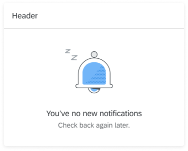
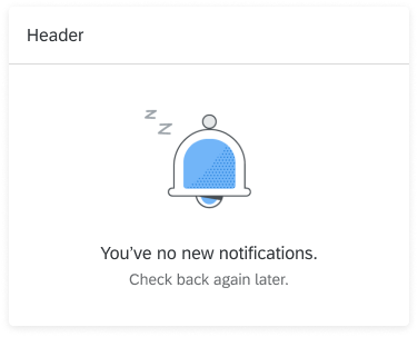
- Illustrated messages: Never use an ending period in the headline for an illustrated message, even if it’s a complete sentence.
For more information, see Illustrated Message – Headline.
Punctuation in buttons and labels
Avoid using hyphens, colons, or parentheses in button texts. Use a preposition instead.
Examples:
Material Number for Receipt
Material Number – Receipt
Quotation marks
If you need to set off a text in quotes, use double quotation marks.
Messages / Descriptions
Use quotation marks if:
- Your message or description refers to a text on the screen.
Example:
To start, set the relevant filters and choose “Go”.
- The string contains a dynamic text variable for a customer text, such as a product name.
Without quotes, text variables can result in incorrect grammar and make the text difficult to read.
Examples:
Material “Soft copper pipe 10 mm” is out of stock.
Staffing requirements have changed for project “Quartz”.
- The string cites a value selected or entered by the user. This can be a text string, date, or number.
Quotes help to highlight the user’s entry.
Examples:
“December 25, 2020” is not a working day.
“2026” is not in the current planning cycle.
- Your string contains any other variable that may cause grammatical or legibility issues without quotes.
Do not use quotation marks if:
- The string contains a variable for a system-generated object ID.
IDs are typically numeric or alphanumeric and do not affect the grammar of the text.
Example:
Purchase order 12345678 was deleted.
- The string contains a variable for an absolute date that is provided by the system.
Example:
Your license is due to expire on May 2, 2021.
- Your string contains a variable that can be inserted without compromising the grammar or legibility of the text in any language.
Other considerations:
- If your string contains multiple variables that all need to be set off with quotes, texts can become difficult to read. Consider alternative formats, such as listing the variables in parentheses or below the main text.
- Do not use text variables at all for system parameters, such as object types or categories. Use a generic term or write separate messages for each case.
Titles
Avoid using quotation marks for concatenated title texts with text variables. Use a colon instead. If in doubt, check with your translation team.
Note: If possible, avoid concatenated texts in the first place.
Example:
Select: Products
Select “Products”
Slash
If you are using a slash to separate distinct concepts, include a space before and after the slash. In this case, all the text before the slash belongs to one concept, and all the text after the slash belongs to another.
Example:
Insurance Type / Tax Rate
Amount in Local Currency / Due Date
Amount in Local Currency/Due Date
This is typically the case in SAP Fiori if:
- You have two adjacent field labels in a form.
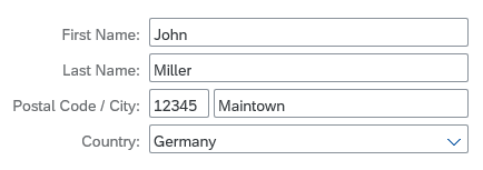
Adjacent field labels in a form ('Postal Code' and 'City')
- You have two labels in a table column header.
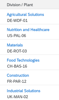
Two values in one column ('Division' and 'Plant')
- You are using the slash to separate items shown on one line.
Note: This is an exception. Normally, SAP Fiori uses commas to separate listed items.
If all the texts separated by a slash (or slashes) qualify a term that precedes or follows, do not include a space before and after the slash
Example:
Plan/Actual Costs (both Plan and Actual relate to costs)
Configure Rules and Approved List of Suppliers/Manufacturers (list contains both suppliers and manufacturers)
Configure Rules and Approved List of Suppliers / Manufacturers (Manufacturers is not a standalone concept here)
Note: Even if you can use a slash to avoid redundancy (as in First/Last Name), we still recommend writing out both labels in full in forms and column headers (First Name / Last Name) – space permitting.
Exception: Tile Subtitles
In tile subtitles, space is very limited. You may need to leave out spaces before and after a slash even if the concepts are distinct.
However, you should be sure that the text can’t be misunderstood, especially if you are using compound terms.
Also bear in mind that if space is already tight in English, there may still not be space for the translated text.
Symbols
Do not use ampersands (&) in SAP Fiori apps or app names.
You can use other common symbols, such as %, but avoid more technical or mathematical symbols, such as ∑, <, >, =.
Exception: The use of an ampersand or other symbol is a widely-accepted standard in your business domain. For example, the short form S&OP is commonly used for sales and operations planning.
Avoid using symbols that can have multiple meanings (for example # can be a number, a metadata tag, or a phone extension number).
Bear in mind that symbols can be difficult to translate.
Examples:
% Confirmed
Due in less than 5 days
SWIFT Code: DEUTDE8L875
Due in < 5 days
SWIFT # DEUTDE8L875
Singular and Plural
Messages, descriptions
If messages or descriptions contain a number variable, differentiate between singular and plural cases, depending on the value.
Don’t use parentheses “(s)” to express the plural. This won’t work in all languages.
Examples:
Your subscription is due to expire in 1 day.
Your subscription is due to expire in 3 days.
Your subscription is due to expire in 1 day(s).
Labels for number values (count)
If a label describes a number value (count), write the label as follows:
Where appropriate, indicate the type of value in the label text.
Examples:
Number of Purchase Orders
Order Quantity
If space is limited, and the label contains only the name of the object or item, use the plural to cover all possible values (0, 1, or more).
Examples:
Word Choice
Actions for requests
| Action | Description |
| Approve | Grant permission (for example, for budget or vacation). |
| Reject | Refuse permission. |
| Accept | Accept invitations. |
| Decline | Decline invitations. |
| Forward | Forward a request to a manager or decision-maker. |
Completing an action
(Finalizing action on the footer toolbar)
| Action | Description |
| Create | Save a new object to the database. It doesn’t matter how the object was created (from scratch, or by adapting a copy of an existing object). Create is used in both cases. |
| OK | Confirm settings that may or may not have been changed (for example, filter settings for a table). |
| Save | Standard action for saving changes to existing objects when no workflow is being triggered. |
| Save and Next <Qualifier> | Continue to the next screen or object (for example, in a workflow with sequence of activities).
Include a qualifier. While “Next” works as a standalone label in English, this is not the case for many other languages. Examples: |
| Submit | Submit to a workflow (for example, for manager approval). |
| Send | Send a request to another person, especially in employee apps (for example, a vacation request). |
| Next <Qualifier> | Continue to the next screen or object (for example, in a workflow with sequence of activities).
Include a qualifier. While “Next” works as a standalone label in English, this is not the case for many other languages. Examples: |
| Finish | Trigger the completion of a workflow or process.
Examples: |
Terminating an action
| Action | Description |
| Cancel | Standard term for terminating an action without saving any changes. |
Cancel as a business action
| Action | Description |
| Cancel <Object> | If Cancel is a standard business term, include the object type.
Examples: |
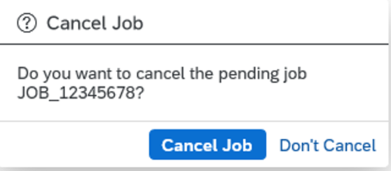
| Don’t Cancel | In confirmation dialogs, for terminating “Cancel <Object>”. |
Navigation actions
| Action | Description |
| Back | Go back to the previous screen. |
| Next <Qualifier> | Continue to the next screen or object (for example, in a workflow with a sequence of activities, or when navigating to the next image in a carousel).
Include a qualifier. While “Next” works as a standalone label in English, this is not the case for many other languages. Examples: |
| Previous <Qualifier> | Navigate back to the last object or image (for example, the previous image in a carousel).
Include a qualifier. While “Previous” works as a standalone label in English, this is not the case for many other languages. Examples: |
Contact details
| Label | Description |
| Phone | Landline phone |
| Mobile | Cell phone |
| Email address |
Creating an object or item
(also see the naming guidelines on the Object Handling page)
| Action | Description |
| Add | Add an existing item to a list.
Example: |
| Create | Create a new object (either from scratch, or by adapting a copy of an existing object).
Example: |
| Create and New | Create an object from scratch and return to the create screen to add another new object. |
| New <Object> | Title of an object until the name has been defined (for example, on an object page or “create” dialog).
Example: |
| Copy |
Create a new object or item based on an existing one. In this case, the user adapts the core data copied from an existing object.
Do not use Duplicate. |
| Copy of <Object> | Title of new object until the name has been defined.
Example: |
Country
Do not use the label Country for politically controversial territories or special regions. This affects all values or selection lists that may contain such territories. An alternative label might be Country/Region, depending on your context.
Exporting content
Use the following standard labels for download icons in a toolbar:
- Export to PDF
- Export to Spreadsheet
Do not refer to specific products.
Example:
Export to Excel
Global actions
Use the following standard labels for the global actions toolbar:
| Action | Description |
| Copy | Copy the current object to create a new object. |
| Edit | Make changes to an existing object. |
| Delete | Delete the current object. |
| Share | Tooltip text for the share icon. |
Local actions – Table toolbar
Use the following labels for standard actions in the table toolbar:
| Action | Description |
| Add | Add an existing object or item to a list. |
| Copy | Copy the selected object to create a new object. |
| Create | Create a new object or item. |
| Edit | Make changes to the selected object. |
| Delete | Delete the selected object. |
| Sort | Tooltip text for the icon. |
| Filter | Tooltip text for the icon. |
| Group | Tooltip text for the icon. |
Navigation
| Action | Description |
| Back | Go back to the previous screen. |
| Open [app] | Open an SAP Fiori app. Note: In the SAP Fiori environment, use the term “open” rather than “launch”. |
| Open in <App Name> | Open the current item in another app. |
| Open In… | Show a list of apps in which the current item can be opened. |
“No data” texts
When no data is available for the selection or filter criteria entered by the user, SAPUI5 displays a “No data” text by default. Replace the “No data” text with a more specific text:
- Where appropriate, refer to the business object handled by your app.
- If the user needs to change a setting to see data, offer a hint.
There are no rigid standard texts, since the the exact formulation you use will depend on where the “No data” text appears, and the logic of your application.
Examples:
No matching products found (for example, in the list of a list-detail app)
No products found. Try adjusting your search and filter settings. (for example, when no items are found for the selected filter criteria in a list report table)
Object administration
For object admin data, use the following standard labels:
- Created By
- Created On
- Changed By
- Changed On
Exceptions:
- If your app family has consistently used different labels (such as Last Changed By or Last Changed On), consider using the existing labels for new apps to avoid inconsistencies.
- If you are showing a relative date (such as Today or Yesterday), or a mixture of relative and absolute dates, use the labels Created and Changed instead of Created On and Changed On.
Translation
To ensure translatability, the label and value placeholder must be in one text string.
Example:
“Created By: <variable for name>”
What about combined date/time fields?
- In many apps, the date is the main reference point, even if both the date and time are shown. In this case, use the field labels Created On and Changed On.
- If the time is an important reference point for users, include both elements in the label:
Created On / Created At (or shorten to Created On/At)
Changed On / Changed At (or shorten to Changed On/At) - Do not use Created At and Changed At as labels for joint fields where the date comes first.
- If users need to scan the exact times, consider using a separate field for the time to make scanning easier:
Created At
Changed At
Do not use separate fields for the date and time in SAP S/4HANA apps. Always use the combined date/time time stamp for the relevant time zone (for example, Operation Start: 06.02.2022, 19:47:25 America/Chicago).
“Please”
Use “please” judiciously:
- Do not use “please” unless you would also use it naturally in a spoken conversation.
- Consider using “please” if you are inconveniencing the user.
- Base your decision on your target group and language.
Removing and deleting items
| Action | Description |
| Delete | Delete the object or item itself. Use “Delete” if the object or item has already been actively saved.
Example: |
| Discard | Discard a draft for a new object, or a draft version containing changes to an existing object. Use “Discard” if the object or item has not yet been actively saved by the user.
Example: |
| Remove | Remove the reference to an item.
Example: |
Setting favorites
The tooltip label for the Favorite icon ( ) depends on how the app handles favorites:
| Action | Description |
| Mark as Favorite | Flag an item as a favorite without adding it to a list of favorites. |
| Add to Favorites | Flag an item as a favorite and add it to a list of favorites that the user can call up independently. |
For more information, see Flag and Favorite and Object Marker.
Showing more information
| Action | Description |
| Show Details | Show more information within the same page or dialog (for example, a message long text within a message dialog). |
| View Details (Charts) | Display additional information about a chart. |
| Show More | Expand a list or screen area. |
| Show Less | Collapse a list or screen area. |
| Show All | Show all the items in a list. |
Signing in and out
With SAP Fiori 2.0 (SAPUI5 version 1.40), Log On and Log Out were replaced by Sign In and Sign Out on the SAP Fiori launchpad.
Validity period
For a validity period, use the labels Valid From and Valid To.
If you have only one label for both values, use the label Valid From/To.
Writing for SAP CoPilot
As we develop more and more applications with built-in intelligence, the language we use to support and guide users takes on even greater significance. The voice of our digital assistant, SAP CoPilot, is key to making explanations and recommendations helpful and easy to consume.
Follow the guidelines below whenever you write texts for SAP CoPilot.
- Use conversational language (write as you would speak).
This makes it easier for the users to relate to SAP CoPilot. Conversational style is easier for most users to understand and conveys messages better. Conversational style can also include acknowledging phrases, such as OK, Thanks, Got it. They help to make a conversation more fluid and natural. - Use active voice and address the user directly.
- Use brief, precise, clear, and simple language.
- Be relevant.
- Don’t state the obvious.
- Avoid ambiguity.
- Use familiar and consistent words.
- Do not use abbreviations.
- Be polite, positive, and helpful.
- Never penalize the user.
- Take care with humor. Remember that we are talking to business users who need to get a job done. Do not upset them with amusing answers, especially when they make mistakes. Humorous expressions may not be understood in all cultures and do not translate well.
Guidelines for Specific Floorplans or UI Elements
Content Overview
Action
Button
Formulate button texts as actions, starting with a verb, and keep them as short as possible.
Examples:
Approve Order
Simulate Payment Run
Payment Run
Display Elements
Tooltip
Use tooltips only to show the labels for elements that have no text, such as icons.
Use title case.
Icon Buttons
If the icon represents an action, formulate the tooltip as an action, starting with a verb.
Exception: Standard labels used across the IT industry, such as Settings.
Describe the action that will be triggered by pressing the button. For example, Expand Header, Collapse Header.
If the icon button is a toggle button that merely changes its state (same icon button, “on” or “off” state), always use the positive action for the label. For example, Pin Header for both pinned and unpinned states.
Do not use tooltips if:
- A text label already exists. Do not create (redundant) tooltips for field labels that are written out in full and visible on the desktop.
- You want to abbreviate a text label. Instead, write the label out in full and ask development/UX to allow enough space for texts in all languages to avoid truncation. Always aim for a responsive solution that will allow users to view the full text on all devices.
- You want to provide an explanation. For embedded help, use the SAP Companion instead.
Examples:
Share
Export to Spreadsheet
Maximize
Minimize
Displays the orders you have already processed (Additional tooltip for “Completed” label)
For more information, see Using Tooltips.
Messages
SAP Fiori uses a variety of messaging elements for different purposes. This section covers general guidelines for SAP Fiori messages, as well as text guidelines for specific message types.
General message guidelines
| Topic | Guideline |
| “Please” | Avoid overusing “please” in message texts. For example, it’s often not necessary when asking users to correct their entries.
Examples: |
| Singular/plural | Use separate strings for singular and plural cases. Do not use “(s)”. |
| Semicolons | Do not use semicolons to separate phrases in a message text. Instead, use two separate sentences ending with periods.
Although semicolons are not incorrect, you are unlikely to see semicolons in modern mobile app interfaces. |
| Variables | Use a single string for messages, including variables. This is necessary to enable translators to change the word order for other languages.
If you need to set off text variables in messages, use double quotation marks. Do not use text variables. This can lead to grammatical errors in other languages. Examples: Before using variables, consider using distinct error messages for each use case. This often allows you to write a friendlier text that is easier to read and translate than a text designed for reuse. |
Form field validation
Instruct the user what to do to correct the error. Avoid generic error messages.
Examples:
Select a supplier
Invalid entry
Enter a valid value
If a value for a required field is missing, use the standard formulation:
<Field Label> is a required field (*).
Example:
Email is a required field (*).
For more information, see Form Field Validation.
Message box
(message/confirmation prompt)
| Topic | Guideline |
| Heading | For message dialogs, use only the standard headings: Error, Warning, Information, Success
For confirmation dialogs, use the imperative of the action being confirmed. If the verb alone would be ambiguous, add a qualifier. Special Case: Confirming Deletion |
| Message text | Avoid showing system or configuration details in a message short text. Move technical information to the long text.
Do not repeat the short text in the long text. Otherwise, the text shows twice when the long text is expanded. Confirmation prompts: If your target user is likely to see the message frequently, use a short form that’s easy to scan. Examples: Confirmation prompts: If the confirmation dialog allows the user to enter a note, use sentence style for the input prompt. Success messages: Do not use “successfully.” |
| Buttons | Use action verbs for buttons in all dialogs that involve a decision with a specific action.
Exception: If naming the action takes up too much space, formulate the message as a statement, and use the OK/Cancel buttons. Also consider translation. If the mobile use case is critical for your application, always test on a mobile device. Error messages: Use Close instead of OK as the button text for closing an error message.Use OK if the user is just acknowledging a piece of information or a group of settings. Do not combine questions with OK/Cancel buttons. Avoid Yes/No buttons. |
For more information, see Message Box.
Object Page
Headings
Use title case for the headings in anchors or tabs.
Avoid repeating the section/anchor heading in a subsection heading.
Exception: If you need explicit subsection headers, and the only meaningful term for a subsection is the same as the overall section name, use the same term. Do not use different terms for exactly the same concept. Instead, think about framing your content differently so that the concept for an overall section doesn’t overlap too much with the concept for an individual subsection.
If different apps in your app family group data in similar ways, consider aligning the section headings.
Tables
Column headings
| Topic | Guideline |
| Column headings with multiple labels | If a table column contains multiple values, use a slash to separate the labels in the column heading. Include a space before and after the slash.
Examples: |
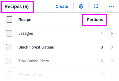
| Singular vs. plural | Use the singular in the column heading if there is only one entry per table row.
Examples: |
Table content
| Topic | Guideline |
| Blank/empty fields | Leave fields without a value blank.
Examples: |
| Table fields with “null” values | If the back end returns a “null” value for a table field, also leave the field blank. In most use cases, it will not be critical for end users to know exactly why a field is not filled (“null” value that is never supplied by the back-end system, or “empty” value that might be filled later).
In exceptional cases only: If it is critical for your use case to distinguish between “null” and “empty” values, you can consider showing a text for either “null” values or “empty” values. Examples:
If you are likely to have several “empty” and “null” value fields in your table, we strongly recommend leaving all the fields blank. This makes the table much easier to scan and helps users recognize fields that are actually populated. |
User Input
Input field
| Topic | Guideline |
| Placeholder |
Only offer placeholder text (input prompt) if you need to provide an additional hint. Do not repeat the label in the placeholder text. Never use placeholders instead of labels. Use sentence case. Do not use a period or ellipsis at the end of the text. Use a consistent style for all input prompts on one page (the style may vary, depending on your use case). For URL or email address placeholders, use the domain example.com. Examples: |
| Showing a previous value | If you need to indicate the previous value for a field, add the following text after the field value:
Previously: <Old Value> Note: This is not a standard feature for forms, but may be required for some use cases. Example: |
Selection list options
| Topic | Guideline |
| No options selected | Relevant for: Select, Select Dialog, Table Select Dialog, Radio Button
If you need to indicate that none of the options in a list are selected, provide a corresponding text. Show the text at the beginning of the list and place it in parentheses to distinguish it from the other values. Do not leave the entry blank. Use a text that best fits your use case and the content of your list, such as (Not Selected), (Not Assigned), or an app-specific text such as (No Supplier Selected). Do not use (None). Although “None” works in English, it is difficult to translate correctly into languages with gendered nouns. Examples: |
| All options selected | If a list is used for filtering, and you need to indicate that all values are included, offer an All option it at the beginning of the list.
Example: Here, All indicates that no filters have been set. France, Germany, Italy, and Spain are all included. Relevant for: Select, Select Dialog, Table Select Dialog, Radio Button |
Wizard Floorplan
Wizard steps
If you are using the wizard floorplan, formulate the texts for each step as follows:
Use a noun for the name of the step (for example, Customer). This text appears in 3 places:
- The header of the walkthrough screen (showing all steps)
- The heading for each step on the walkthrough screen
- The heading for each section on the summary screen
Offer an explanatory text for each step in the walkthrough screen (sap.m.text). Phrase this text as an instruction (for example, Enter the payment details.)
Note: This explanatory text does not show in the wizard summary.




 Your feedback has been sent to the SAP Fiori design team.