
- SAPUI5 Version 1.122
- SAPUI5 Version 1.120
- SAPUI5 Version 1.118
- SAPUI5 Version 1.116
- SAPUI5 Version 1.114
- SAPUI5 Version 1.112
- SAPUI5 Version 1.110
- SAPUI5 Version 1.108
- SAPUI5 Version 1.106
- SAPUI5 Version 1.104
- SAPUI5 Version 1.102
- SAPUI5 Version 1.100
- SAPUI5 Version 1.98
- SAPUI5 Version 1.96
- SAPUI5 Version 1.94
- SAPUI5 Version 1.92
- SAPUI5 Version 1.90
- SAPUI5 Version 1.88
- SAPUI5 Version 1.86
- SAPUI5 Version 1.84
- SAPUI5 Version 1.82
- SAPUI5 Version 1.80
- SAPUI5 Version 1.78
- SAPUI5 Version 1.76
- SAPUI5 Version 1.74
- SAPUI5 Version 1.72
- SAPUI5 Version 1.70
- SAPUI5 Version 1.68
- SAPUI5 Version 1.66
- SAPUI5 Version 1.64
- SAPUI5 Version 1.62
- SAPUI5 Version 1.60
- SAPUI5 Version 1.58
- SAPUI5 Version 1.56
- SAPUI5 Version 1.54
- SAPUI5 Version 1.52
- SAPUI5 Version 1.50
- SAPUI5 Version 1.48
- SAPUI5 Version 1.46
- SAPUI5 Version 1.44
- SAPUI5 Version 1.42
- SAPUI5 Version 1.40
- SAPUI5 Version 1.38
- SAPUI5 Version 1.36
- SAPUI5 Version 1.34
- SAPUI5 Version 1.32
- SAPUI5 Version 1.30
- SAPUI5 Version 1.28
- SAPUI5 Version 1.26
- Latest SAPUI Version 1.124
- SAPUI5 Version 1.122
- SAPUI5 Version 1.120
- SAPUI5 Version 1.118
- SAPUI5 Version 1.116
- SAPUI5 Version 1.114
- SAPUI5 Version 1.112
- SAPUI5 Version 1.110
- SAPUI5 Version 1.108
- SAPUI5 Version 1.106
- SAPUI5 Version 1.104
- SAPUI5 Version 1.102
- SAPUI5 Version 1.100
- SAPUI5 Version 1.98
- SAPUI5 Version 1.96
- SAPUI5 Version 1.94
- SAPUI5 Version 1.92
- SAPUI5 Version 1.90
- SAPUI5 Version 1.88
- SAPUI5 Version 1.86
- SAPUI5 Version 1.84
- SAPUI5 Version 1.82
- SAPUI5 Version 1.80
- SAPUI5 Version 1.78
- SAPUI5 Version 1.76
- SAPUI5 Version 1.74
- SAPUI5 Version 1.72
- SAPUI5 Version 1.70
- SAPUI5 Version 1.68
- SAPUI5 Version 1.66
- SAPUI5 Version 1.64
- SAPUI5 Version 1.62
- SAPUI5 Version 1.60
- SAPUI5 Version 1.58
- SAPUI5 Version 1.56
- SAPUI5 Version 1.54
- SAPUI5 Version 1.52
- SAPUI5 Version 1.50
- SAPUI5 Version 1.48
- SAPUI5 Version 1.46
- SAPUI5 Version 1.44
- SAPUI5 Version 1.42
- SAPUI5 Version 1.40
- SAPUI5 Version 1.38
- SAPUI5 Version 1.36
- SAPUI5 Version 1.34
- SAPUI5 Version 1.32
- SAPUI5 Version 1.30
- SAPUI5 Version 1.28
- SAPUI5 Version 1.26
Date Range Selection
sap.m.DateRangeSelection
Intro
The control for selecting the date range is a single-field input control. Users can enter a localized date range using touch, mouse, or keyboard input, or by selecting a date range in the calendar. They can also navigate directly from one month or year to another.
Usage
Use the date range selection if:
- You need a time range and know that your user is a power user who has to input lots of data. If the keyboard is the primary device used for navigating the app, use two input fields. This allows the user to quickly jump from field to field. By selecting a date in one of the fields, the other field should recognize the information and jump to the same selection.
Do not use the date range selection if:
- You want to enter a date and a time. In this case, use the date picker or time picker instead.
- The user’s primary goal is not to select ranges. If this is the case, use the simple date picker.
- You want to let users choose from a flexible set of absolute and relative dates and date ranges. In this case, use the dynamic date range.
Responsiveness
The date range selection is fully responsive. It is smaller in compact mode and provides a touch-friendly size in cozy mode. For more information about cozy and compact modes, see the article on content density.
Date range selection (size S)
Date range selection (size L)
Components
The date range selection consists of two components:
- Date range input field
- Date range picker
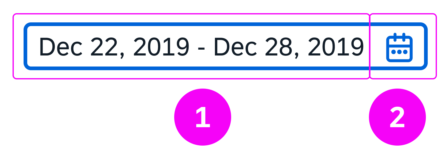
The two clickable areas of the date range selection on all devices
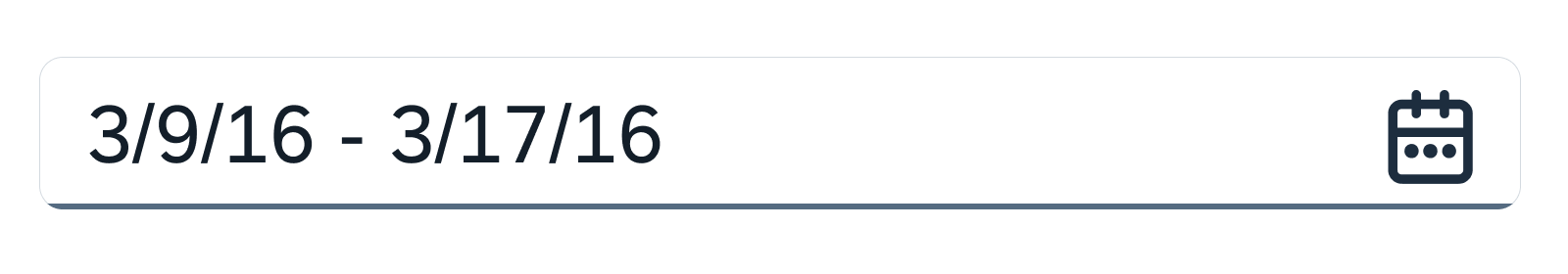
Date Range Input Field
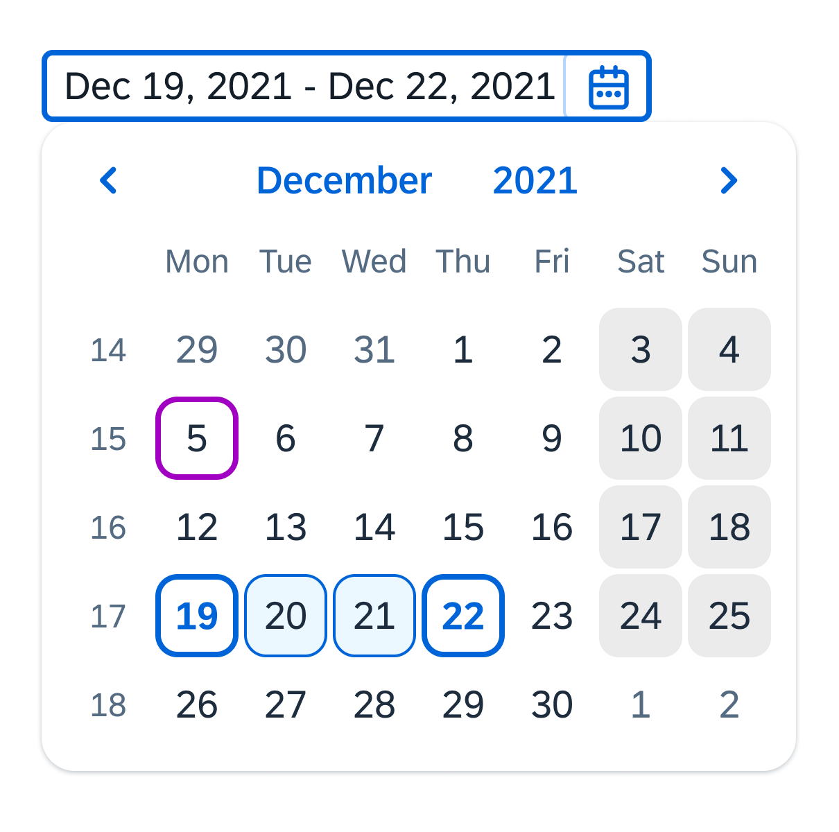
The user can type the date directly into the input field, or use the date picker. You can also show a prompt text in the field (property: placeholder). The system validates the date and gives the user feedback.
- Current day
- Currently selected date range
It is possible to add additional descriptive texts to the input field (a unit of measurement, for example) by using a new association in the sap.m.InputBase control called ariaDescribedBy. The association is responsible for referencing the elements that describe the control.
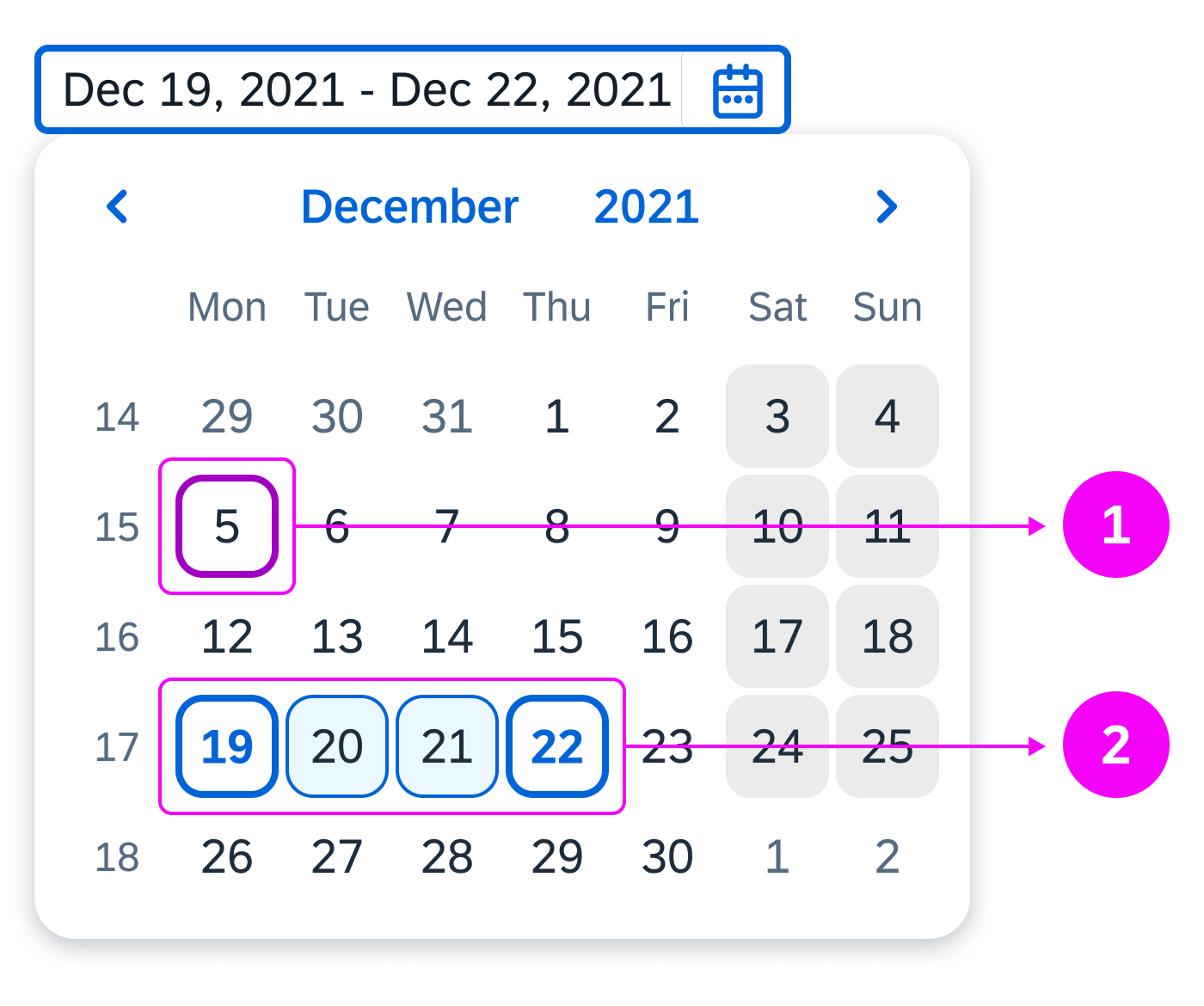
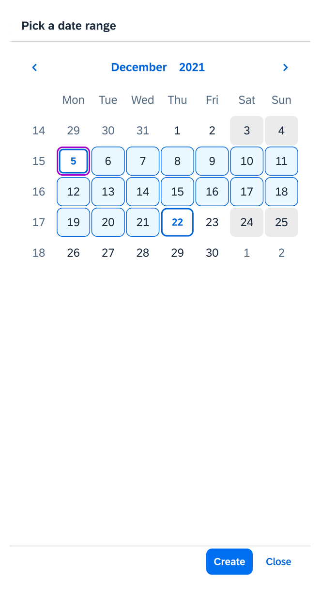
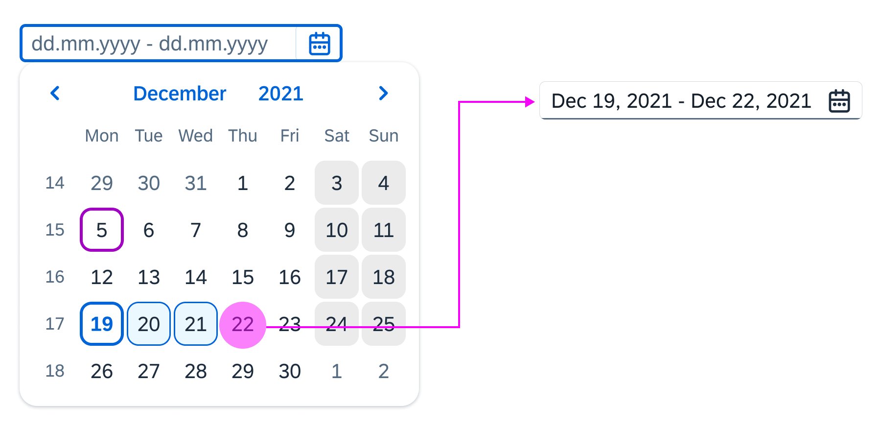
The current day is December 5 and December 19–22 are selected
Date Range Picker
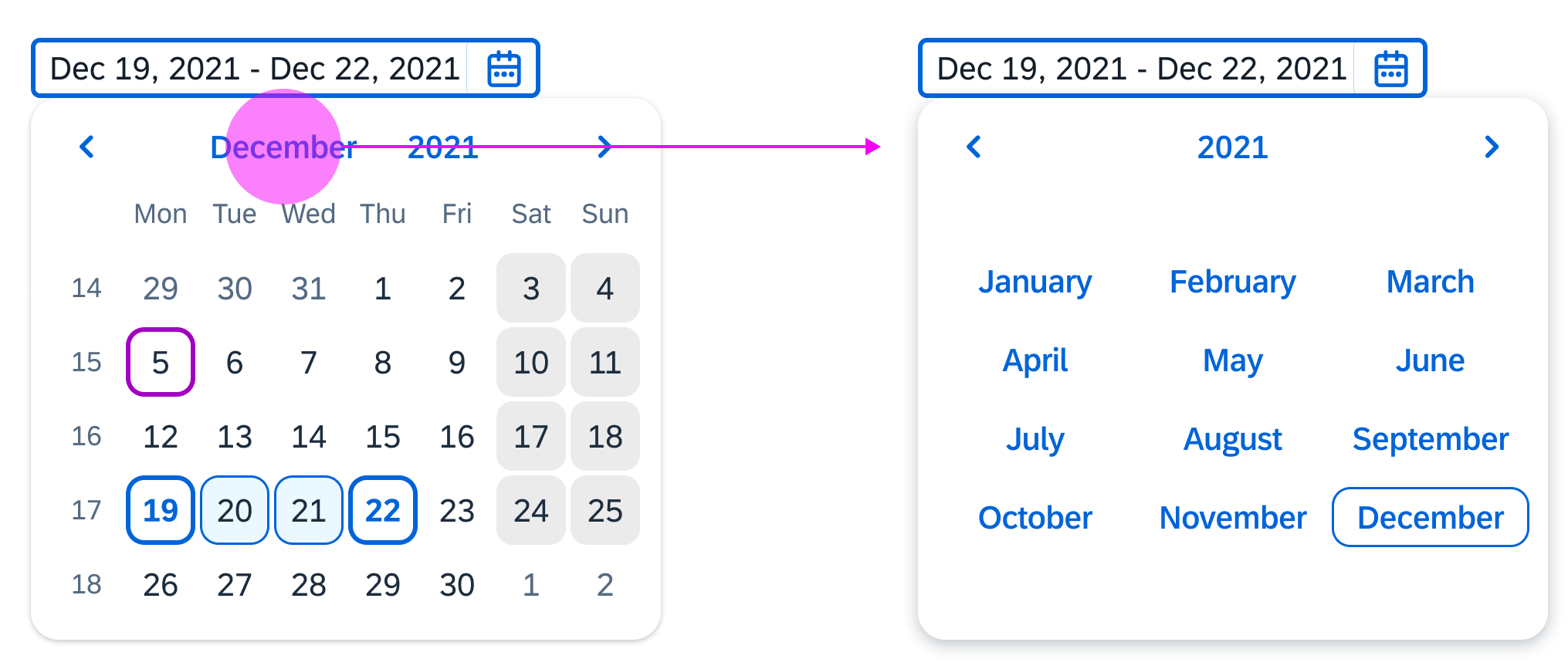
With the date range picker, the user can see a day view, month view, or year view. The current day and the selected date are highlighted. The calendar week is also visible in the day view. The calendar closes when a final day is selected. The user can click the arrows to view the previous and next days, months, or years (depending on the current view).
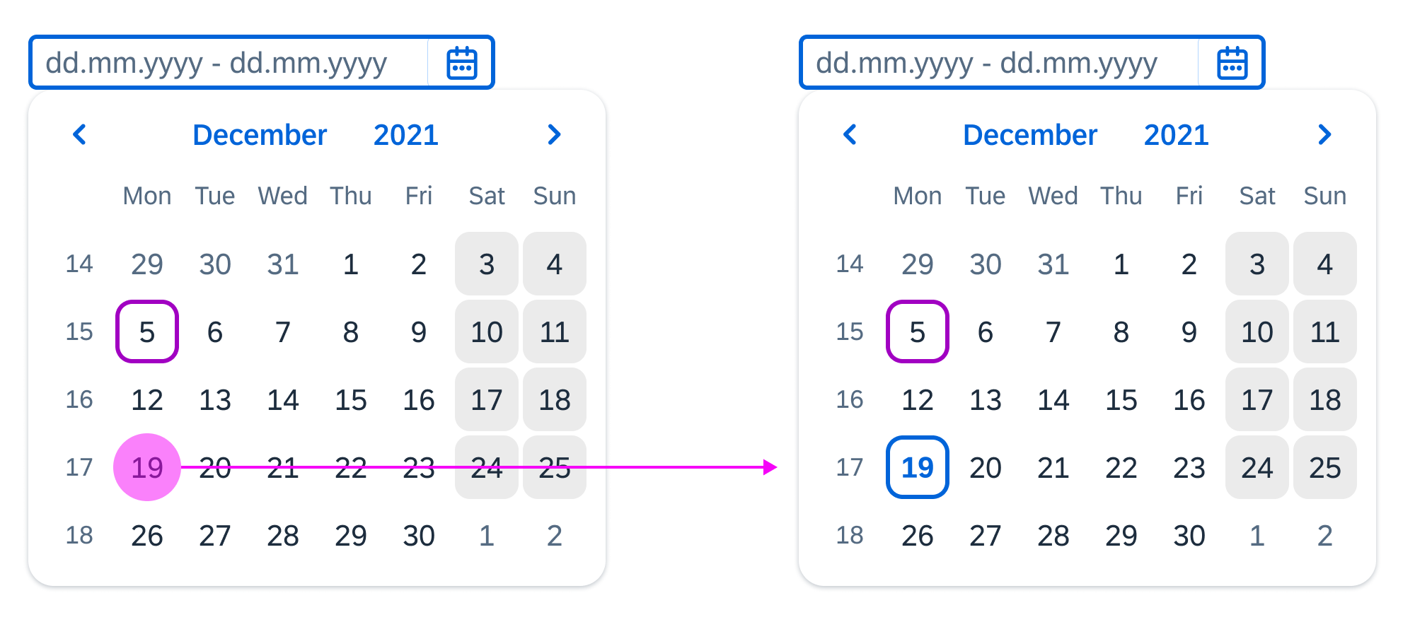
The selected date is shown with a blue background. The current day is indicated with a purple border in the calendar.
1. Previous month
2. Quick month selection
3. Quick year selection
4. Next month
5. Day selection
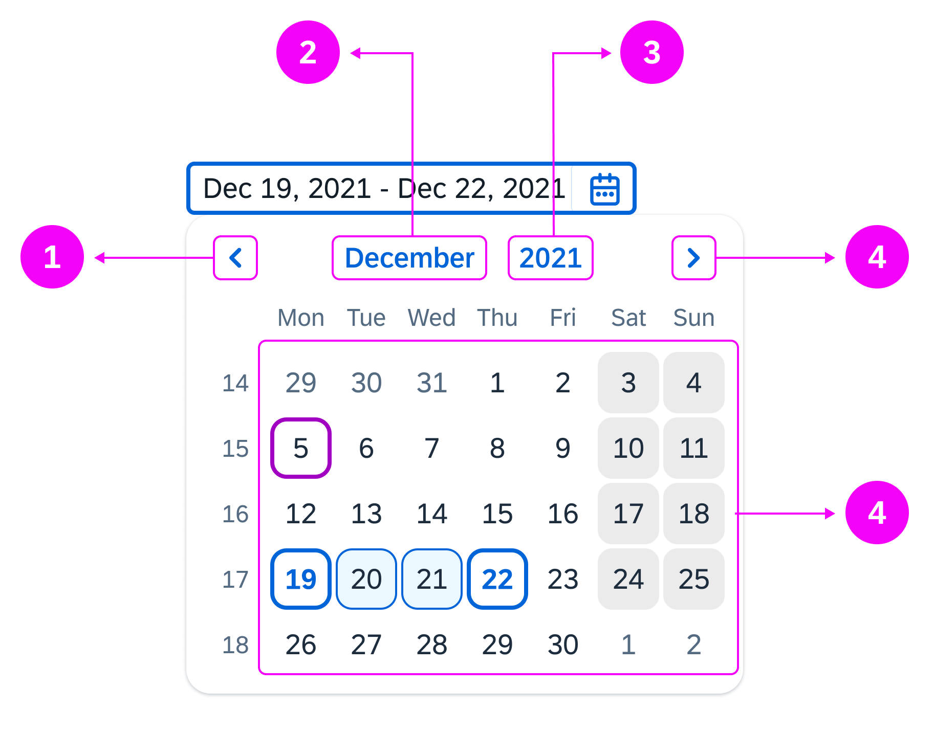
Clickable areas of the date range selection
Optionally, you can offer a footer with OK and Cancel buttons. This gives users an alternative way of confirming the selected date range.
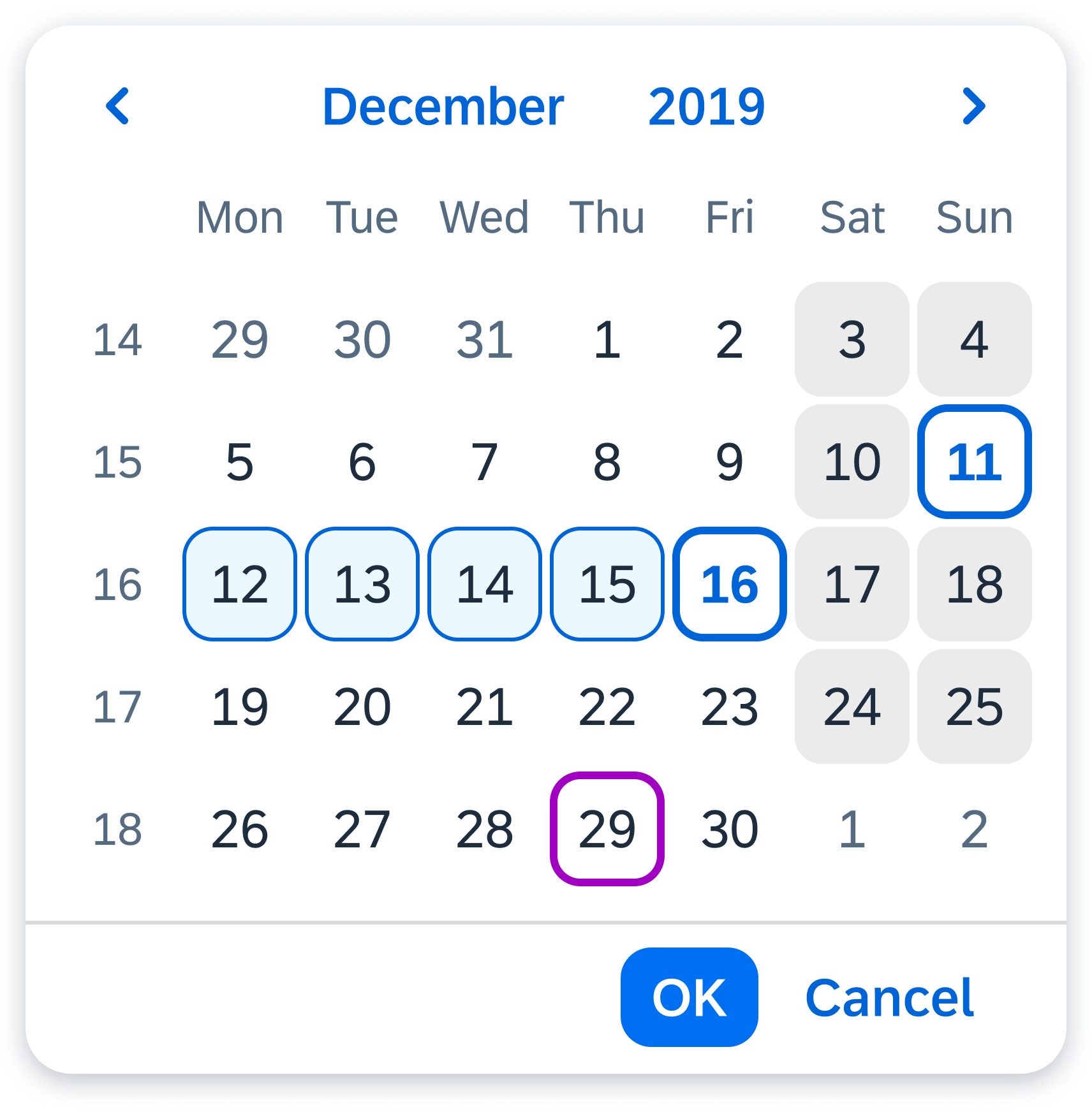
Date range picker with 'OK' and 'Cancel'
Alternative triggers for the Date Range Selection
In addition to the date range input field, you can set one of the following to trigger the date range selection popover:
- A button
- A link
Button and link triggers for the date range selection popover
Behavior and Interaction
Selecting a Date Range
The users can type two dates into the date range input field or click the calendar icon to open the calendar and select a date. These two possibilities work for all devices – desktops, tablets, and smartphones.
Switch View
Users can click an arrow to shows the next or previous day, month, or year.
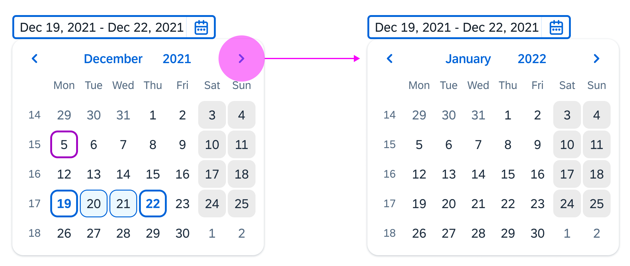
Navigating to the next month
When they click the month the month picker is displayed.
Opening the month picker
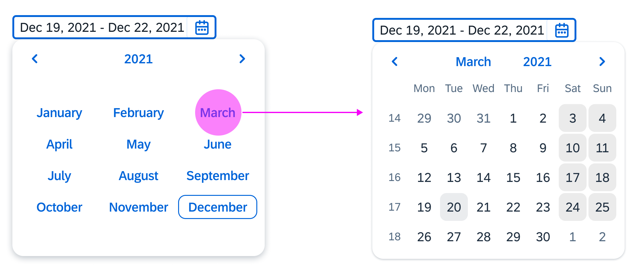
In the month picker, after the users click a month to select it, the day picker is displayed with the focus on the last selected start date.
Navigation from the month picker to the date picker
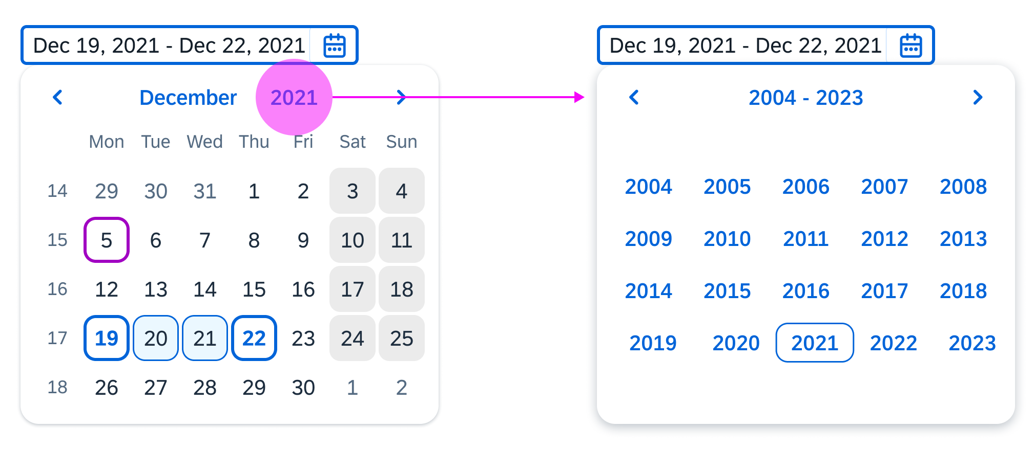
When the users click the current year, the year picker is displayed. After selecting a year, they navigate back to the day picker.
Opening the year picker
Selecting a Range
After the users select a start date, the dates that they hover over turn light blue to indicate they are selected for the range. When the users select an end date, the calendar closes. The range appears in the date input field.
Selecting the start date
Selecting the end date
Entering Single Dates
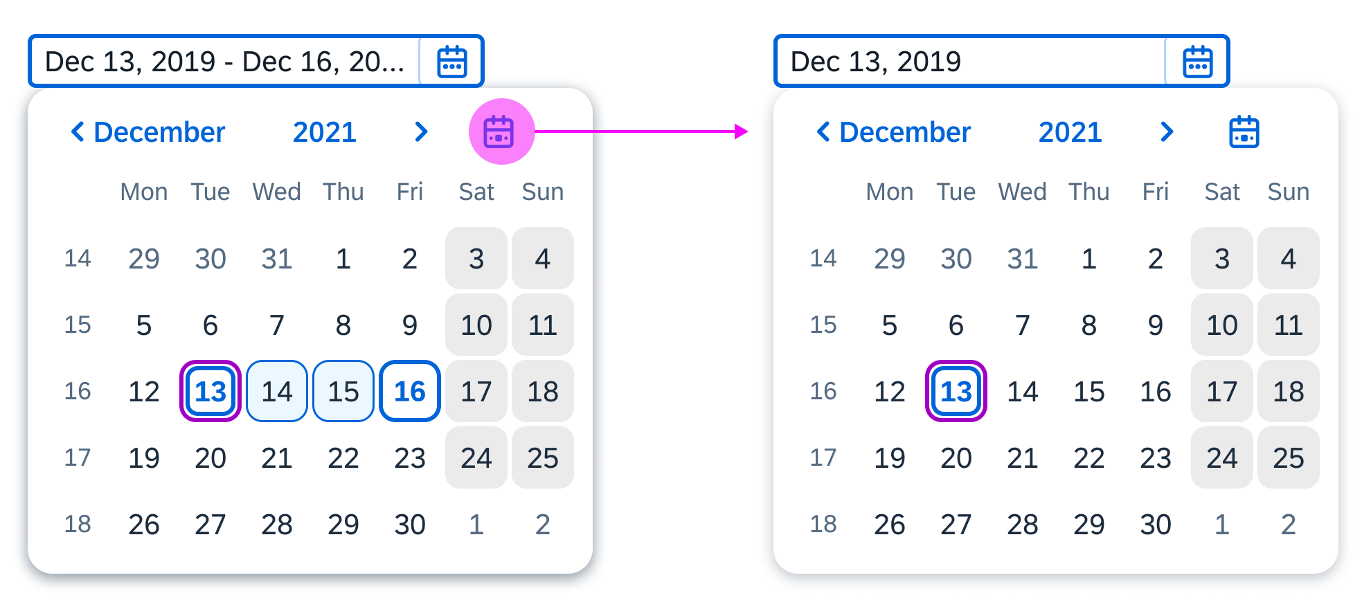
The date range selection also allows the users to input single dates. They can type one date into the input field, or select the same day as a start and end date in the calendar.
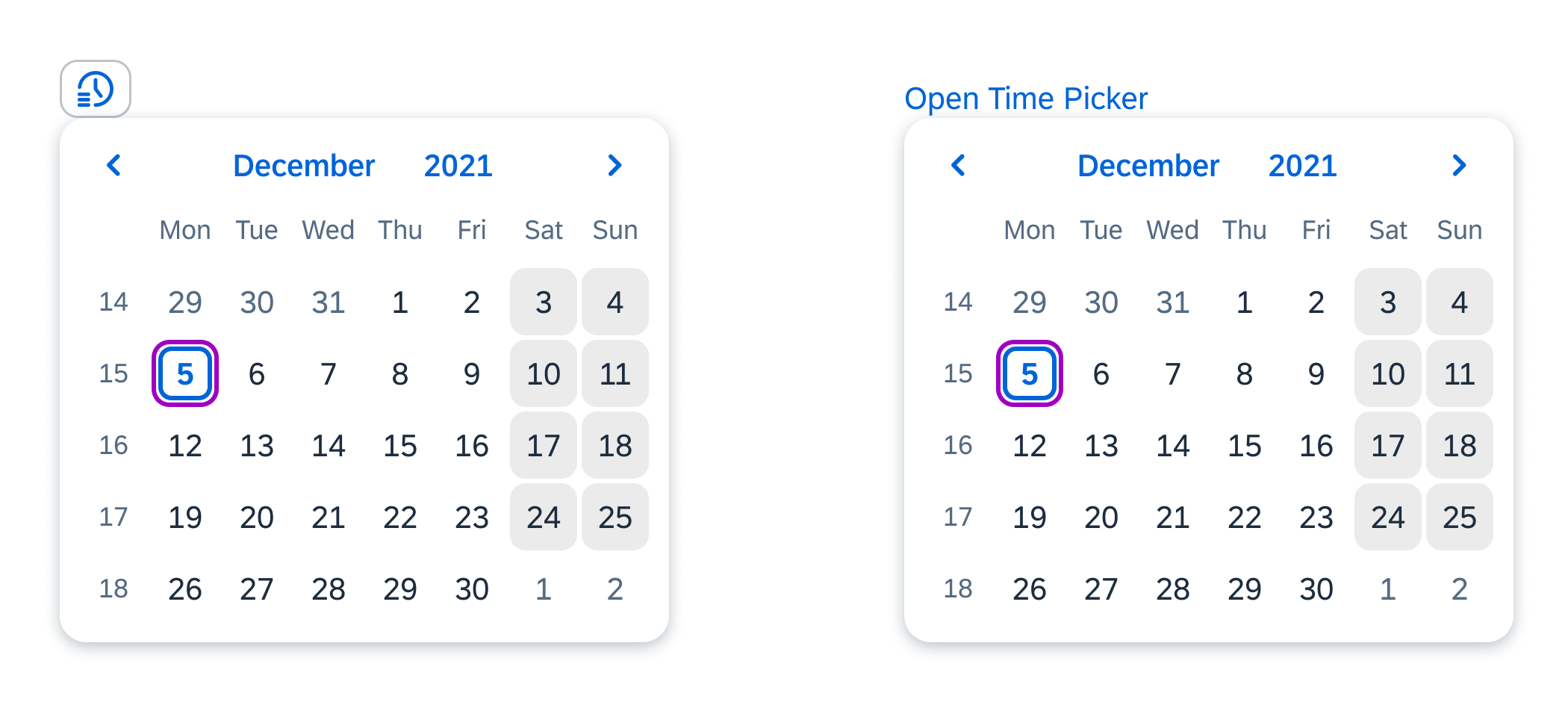
“Today” Button
You can offer a shortcut for navigating to the current date (sap.m.DateRangeSelection, property: showCurrentDateButton). This displays an additional Today icon button ( ) in the navigation part of the calendar.
When the user clicks the Today button, the system automatically makes the current date the starting date for the new date range.
If the user has already selected the first date in the date range and then clicks the Today button, the focus is set to the current date. The system cancels the previous selection and makes the current day the starting date for the new selection.
This feature is available for pickers that enable selection of individual days. For the others, the property has no effect.
Selecting current date with the 'Today' button
Styles
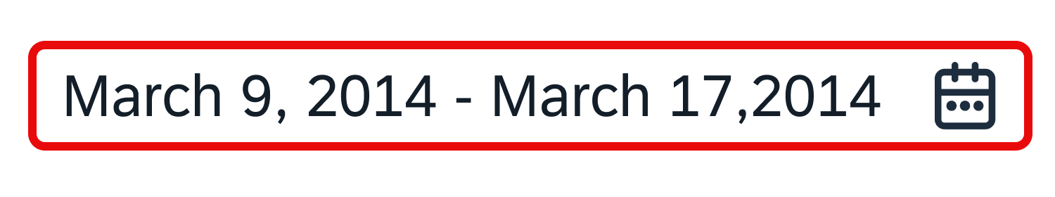
Delimiter
The delimiter visualizes the start and end date. If no delimiter is given, the app uses the one defined for the used locale.
Placeholder
If no range is selected, show a placeholder text to indicate the correct format. If no placeholder is defined, the control shows the default locale placeholder format. You can define your own placeholder, but you must also take localized versions into account.
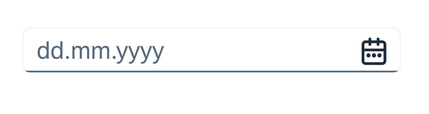
Date range selection with default placeholder
Validation
Use inline validation to give the user feedback, especially for errors and warnings. Possible validation states are warning, error, success, and information. The date range input field in question is highlighted by a frame in the corresponding color. If the focus is inside the field, an explanation is shown. Ensure that this explanation is as specific as possible.
For more information on how to use the different semantic states, see How to Use Semantic Colors.
Visible frame that shows an error when the field is out of focus
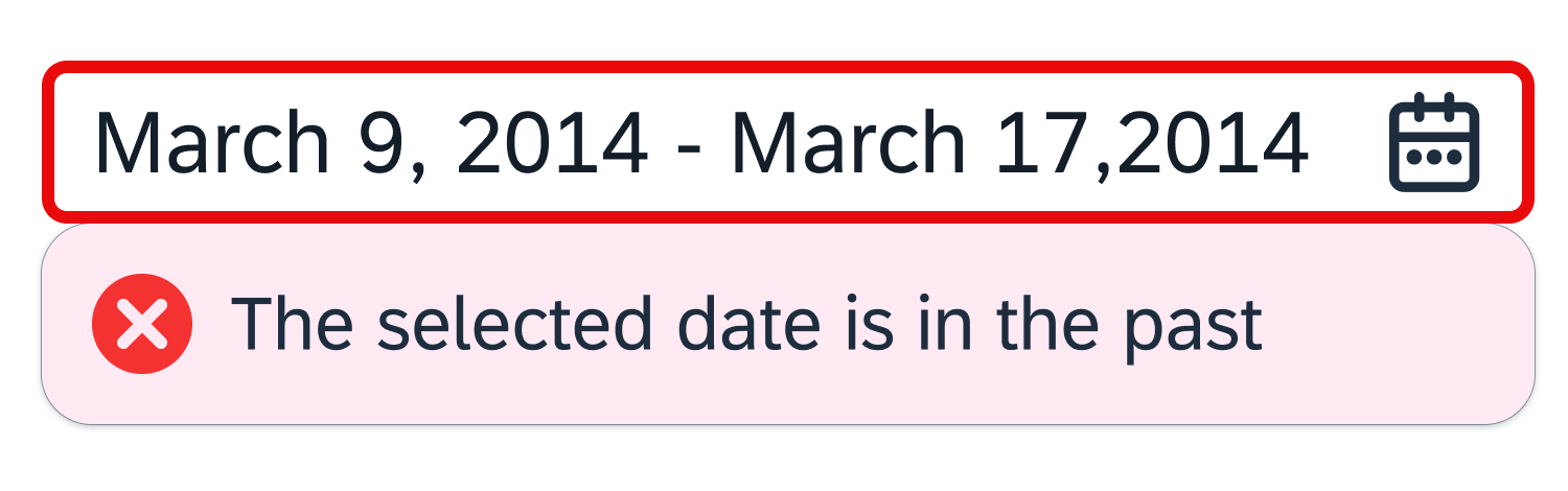
Error state with meaningful text; the date range input field is focused

Visible frame that shows a warning when the field is out of focus
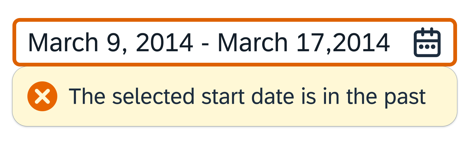
Warning state with meaningful text; the date range input field is focused

Visible frame that shows that additional information is available
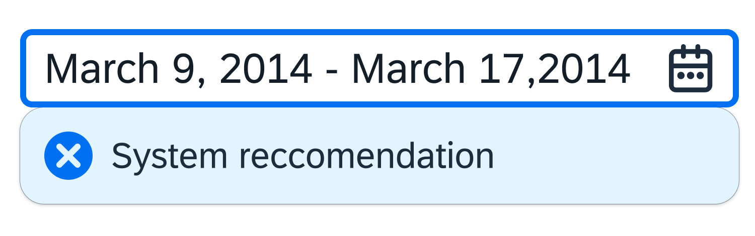
Information state with additional information, such as a recommendation
Guidelines
Display Format
You can choose whether the displayed texts are to be shown in short, medium, or long format, or in another date format like dd–MM–yyyy. However, other date formats (besides short, medium, and long) should be used carefully due to local dependencies.

Long display format
Medium display format
Short display format
Input Types
The following input types are available. (Note: these examples show German date formats for January 14, 2014.)
- Unicode CLDR short format: 14.01.14
- Unicode CLDR medium format: 14.01.2014
- ISO date format: 2014-01-14
- ISO date format without delimiters: 20140114
- Unicode CLDR short format without delimiters: 140114
- Unicode CLDR medium format: 14012014
Date Formats
Long Date Format
Use the long date format for a list in a list-detail layout / object list item / title and object header / title. Here are some examples:
- English (US): January 16, 2022
- German (DE): 16. Januar 2022
- Danish (DK): 16. Jan. 2022
Short Date Format
Use the short date format for a list in a list-detail layout / object list item / list of object attributes if space is a concern. For example, you might need to save space if there is a label with the date. Here are some examples of the short date format:
- English (US): 1/16/22
- German (DE): 16.01.22
- Japanese (JP): 22/01/16
Relative and Medium Date Format
If appropriate, use a relative format for a list in a list-detail layout / object list item / list of object status. For example: today, 1 day ago, 2 days ago, and so on up to 6 days ago. After 6 days, use an absolute date with the medium format.
Use the absolute date with medium format in the corresponding object header in the details area. Do not use the relative format here.
If screen space is at a premium (for example, if there are too many columns), use the short date format within table cells. Otherwise, use the medium format.
If you need to display the weekday, use the full format. For example:
- English (US): Sunday, January 16, 2022
- German (DE): Sonntag, 16. Januar 2022
- French (FR): dimanche 16 janvier 2022
Resources
Want to dive deeper? Follow the links below to find out more about related controls, the SAPUI5 implementation, and the visual design.
Implementation
- Date Range Selection (SAPUI5 samples)
- Date Picker (SAPUI5 samples)
- Date Range Selection (SAPUI5 API reference)
- Date Picker (SAPUI5 API reference)
 Your feedback has been sent to the SAP Fiori design team.