
- SAPUI5 Version 1.122
- SAPUI5 Version 1.120
- SAPUI5 Version 1.118
- SAPUI5 Version 1.116
- SAPUI5 Version 1.114
- SAPUI5 Version 1.112
- SAPUI5 Version 1.110
- SAPUI5 Version 1.108
- SAPUI5 Version 1.106
- SAPUI5 Version 1.104
- SAPUI5 Version 1.102
- SAPUI5 Version 1.100
- SAPUI5 Version 1.98
- SAPUI5 Version 1.96
- SAPUI5 Version 1.94
- SAPUI5 Version 1.92
- SAPUI5 Version 1.90
- SAPUI5 Version 1.88
- SAPUI5 Version 1.86
- SAPUI5 Version 1.84
- SAPUI5 Version 1.82
- SAPUI5 Version 1.80
- SAPUI5 Version 1.78
- SAPUI5 Version 1.76
- SAPUI5 Version 1.74
- SAPUI5 Version 1.72
- SAPUI5 Version 1.70
- SAPUI5 Version 1.68
- SAPUI5 Version 1.66
- SAPUI5 Version 1.64
- SAPUI5 Version 1.62
- SAPUI5 Version 1.60
- SAPUI5 Version 1.58
- SAPUI5 Version 1.56
- SAPUI5 Version 1.54
- SAPUI5 Version 1.52
- SAPUI5 Version 1.50
- SAPUI5 Version 1.48
- SAPUI5 Version 1.46
- SAPUI5 Version 1.44
- SAPUI5 Version 1.42
- SAPUI5 Version 1.40
- SAPUI5 Version 1.38
- SAPUI5 Version 1.36
- SAPUI5 Version 1.34
- SAPUI5 Version 1.32
- SAPUI5 Version 1.30
- SAPUI5 Version 1.28
- SAPUI5 Version 1.26
- Latest SAPUI Version 1.124
- SAPUI5 Version 1.122
- SAPUI5 Version 1.120
- SAPUI5 Version 1.118
- SAPUI5 Version 1.116
- SAPUI5 Version 1.114
- SAPUI5 Version 1.112
- SAPUI5 Version 1.110
- SAPUI5 Version 1.108
- SAPUI5 Version 1.106
- SAPUI5 Version 1.104
- SAPUI5 Version 1.102
- SAPUI5 Version 1.100
- SAPUI5 Version 1.98
- SAPUI5 Version 1.96
- SAPUI5 Version 1.94
- SAPUI5 Version 1.92
- SAPUI5 Version 1.90
- SAPUI5 Version 1.88
- SAPUI5 Version 1.86
- SAPUI5 Version 1.84
- SAPUI5 Version 1.82
- SAPUI5 Version 1.80
- SAPUI5 Version 1.78
- SAPUI5 Version 1.76
- SAPUI5 Version 1.74
- SAPUI5 Version 1.72
- SAPUI5 Version 1.70
- SAPUI5 Version 1.68
- SAPUI5 Version 1.66
- SAPUI5 Version 1.64
- SAPUI5 Version 1.62
- SAPUI5 Version 1.60
- SAPUI5 Version 1.58
- SAPUI5 Version 1.56
- SAPUI5 Version 1.54
- SAPUI5 Version 1.52
- SAPUI5 Version 1.50
- SAPUI5 Version 1.48
- SAPUI5 Version 1.46
- SAPUI5 Version 1.44
- SAPUI5 Version 1.42
- SAPUI5 Version 1.40
- SAPUI5 Version 1.38
- SAPUI5 Version 1.36
- SAPUI5 Version 1.34
- SAPUI5 Version 1.32
- SAPUI5 Version 1.30
- SAPUI5 Version 1.28
- SAPUI5 Version 1.26
Image
sap.m.Image
Intro
Images are a powerful way to capture the user’s attention and to communicate your message. You can use the image control to integrate images into your apps for dedicated purposes.
When to Use
Use the image control if:
- You want to display decorative images. Decorative images serve as a visual eyecatcher and are useful to transport the brand identity. Usually, decorative images are used as hero images, headers, or background images.
- You want to display images to support or enhance the page content (for example, visual representations of an object’s design, functions, or features).
- You want to display images in a gallery.
Do not use the image control if:
- You want to display an image, initials, or a placeholder for a person. Use the avatar instead.
- You want to display standardized images for business-related content (such as products, parts, product and company logos, or ad campaign images). Use the avatar instead.
- You want to display icons. Use the avatar instead.
- You want to display images with a transparent background. Use the avatar instead.
- You want to display a placeholder image. Use the avatar instead.
- You want to display pictures in a carousel. Use the carousel control instead.
Behavior and Interaction
Images can be non-interactive or interactive. Most commonly, clicking an image opens a lightbox or new tab/window and displays a larger version of the image. If you plan to open a popover or dialog, ensure that this information is announced by the screen reader beforehand (property: ariaHasPopup).
The control also offers an image map option, where one image can have several click areas. Don’t use this option. It’s a relic of past times and has the potential to cause usability issues.
Guidelines
Screen Reader Details
- Provide an alternative text for each image for screen reader users. Use the alternative text to describe the visual content specifically for blind or visually impaired users. Only decorative images don’t require an alternative text. The alternative text can also be helpful for sighted users if the image is not available or cannot be displayed.
- An image can be decorative only. Images are considered as decorative if the same information is also conveyed in another content element and the image content is secondary. In other words, if the image doesn’t provide any additional value, it’s decorative. Decorative images are not announced by screen readers.
- In addition to the alternative text, you can also provide screen reader users with more details about an image (property: ariaDetails). For example, images that display technical or scientific content may require background knowledge to understand the image. In the image details, you can include this background knowledge in in text form. For example, if an image shows the construction of a turbine, and certain formulas are required to understand it, the details would describe the formulas first and then relate them to the displayed image content.
Image File and Quality
- It is extremely important that you choose the right file format when saving your images. Four image formats are used consistently in browsers – PNG, JPG, GIF, and SVG.
- When choosing the format for your image, always be conscious of the image quality and file size.
- Optimize high-resolution images to avoid unnecessarily large files. Large image files can severely impede page performance.

Good quality

Poor quality
Responsiveness
The image size adapts responsively to the screen size.
You can also set a fixed width and/or height for an image.
Images on size S
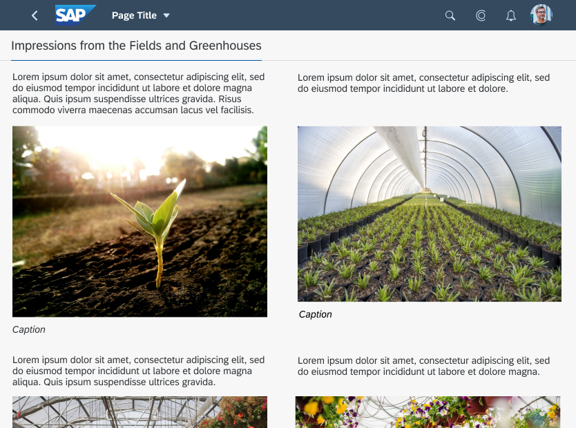
Images on size M
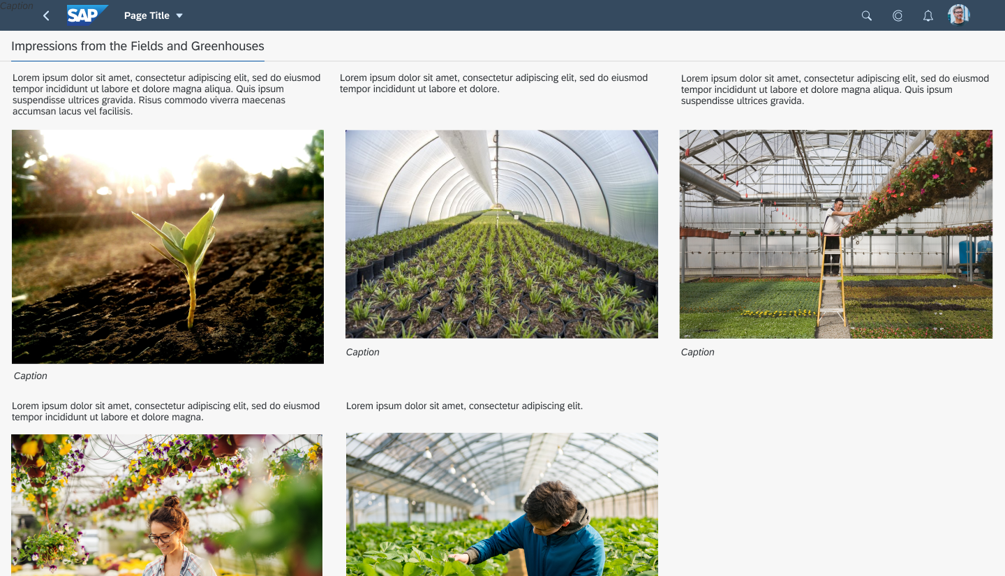
Images on size L
Examples
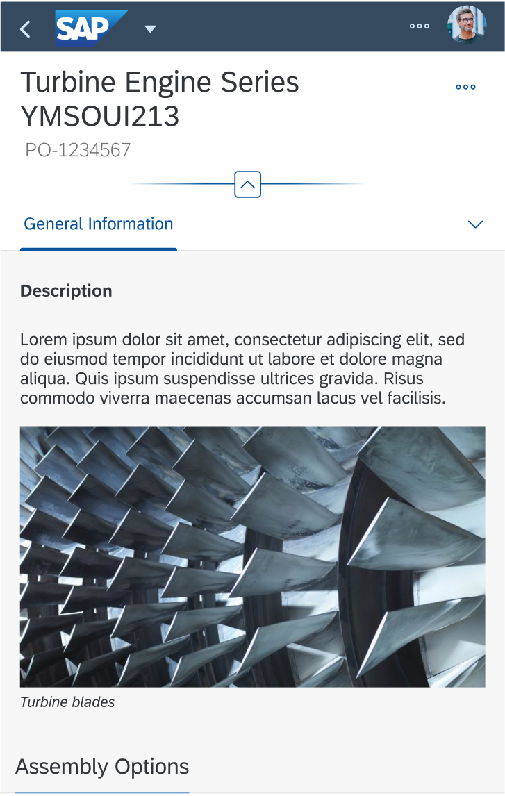
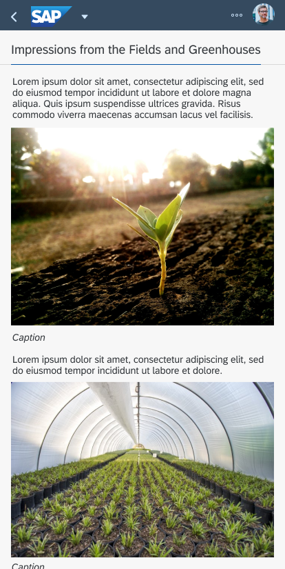
Image on a small screen
 Your feedback has been sent to the SAP Fiori design team.