
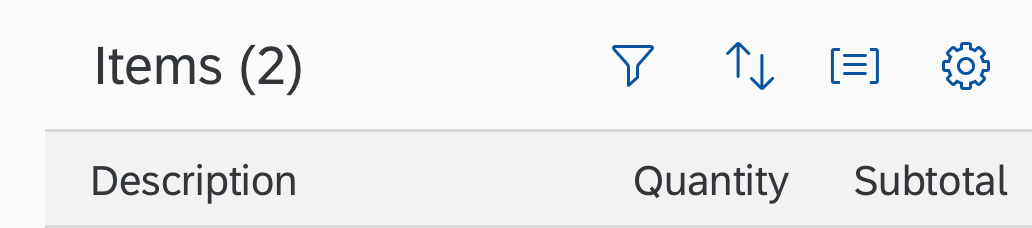
Views (Variant Management)
Intro
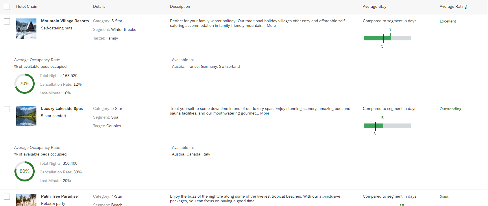
Variants store view settings, such as filter settings or control parameters.
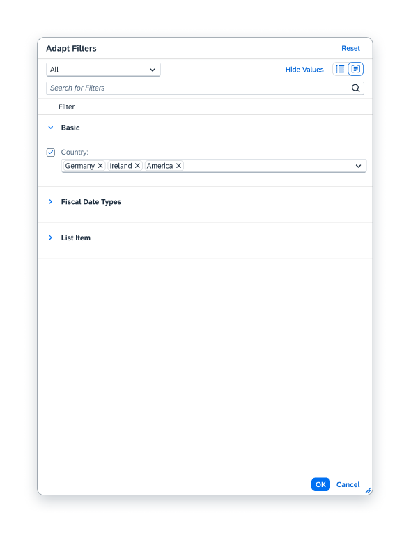
The filter settings consist of filter parameters, selection fields, and the layout of filters. They are set within the filter bar.
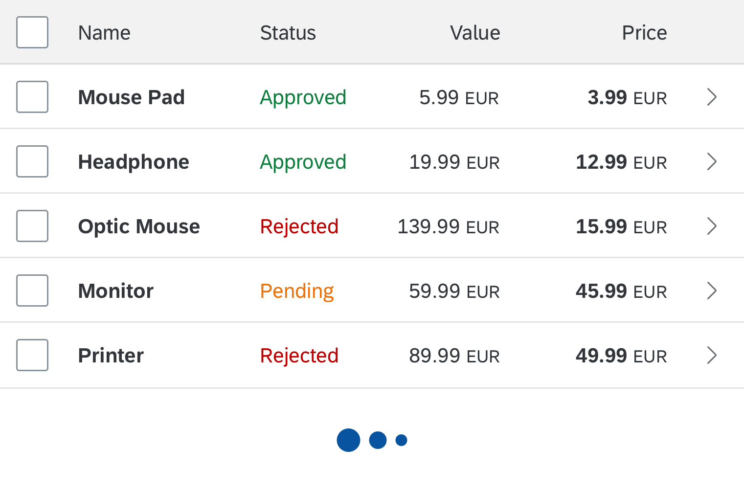
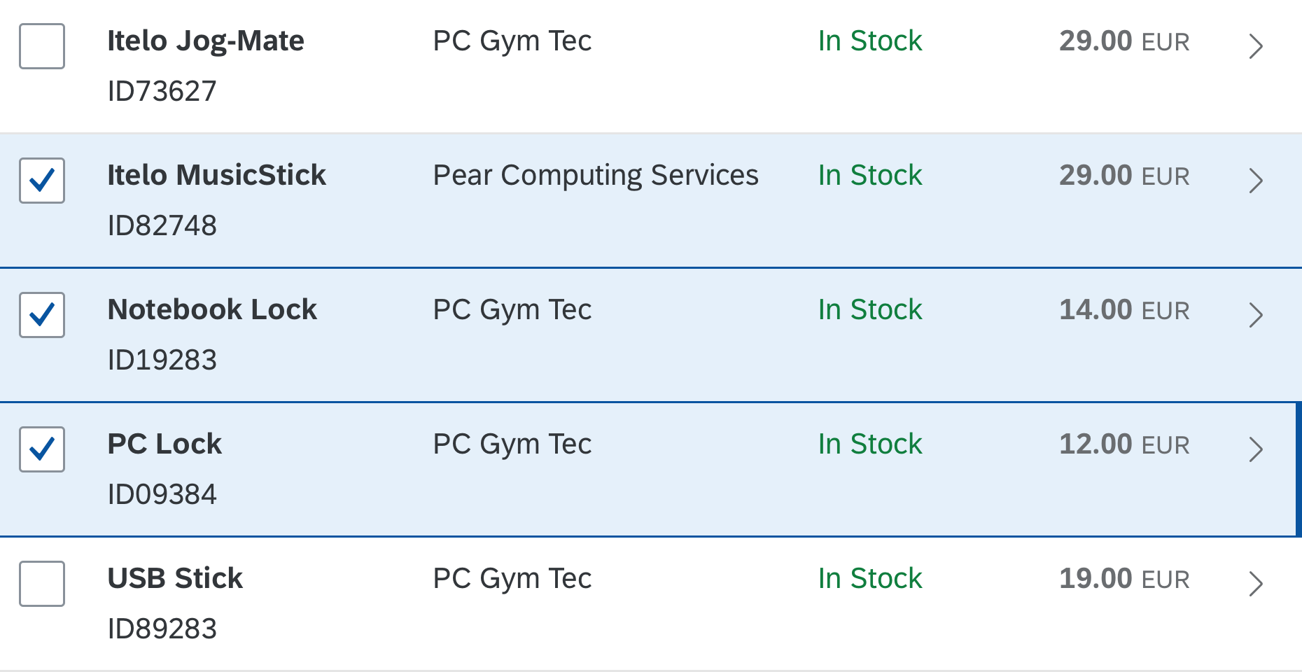
Control parameters are the sort order, filter and group settings, column visibility, and the layout of a table or chart. They are set within the toolbar of the control.
The variant management control enables the user to load, save, change, and maintain variants.
Usage
Use the variant management control if:
- The user needs to save and load different filter settings to find the relevant data.
- The user needs to save and load different layouts (for example, a table) to display data in different views.
- The user needs to save the settings for the whole page, including the filter settings and table layout.
Responsiveness
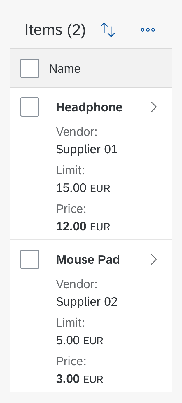
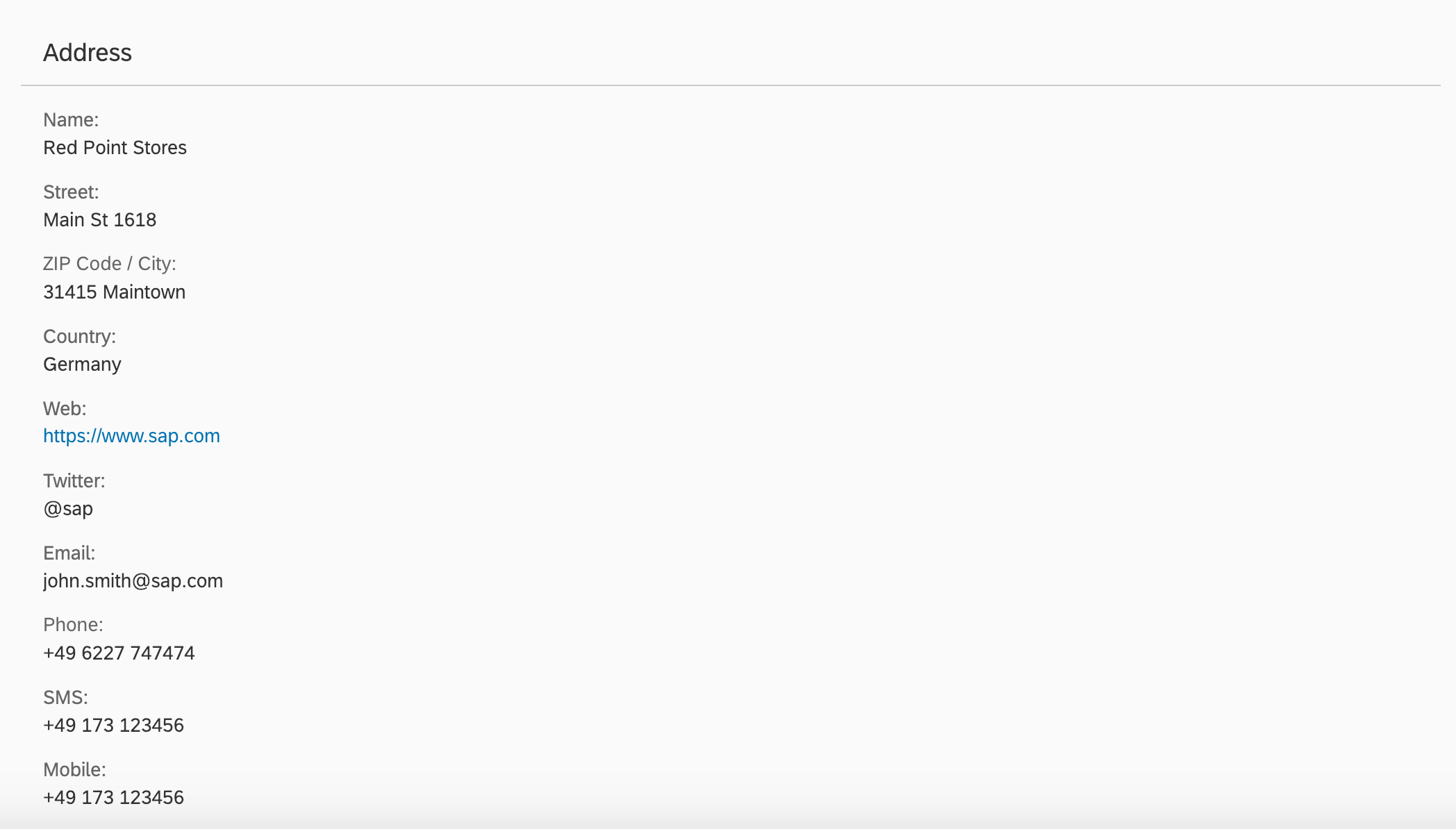
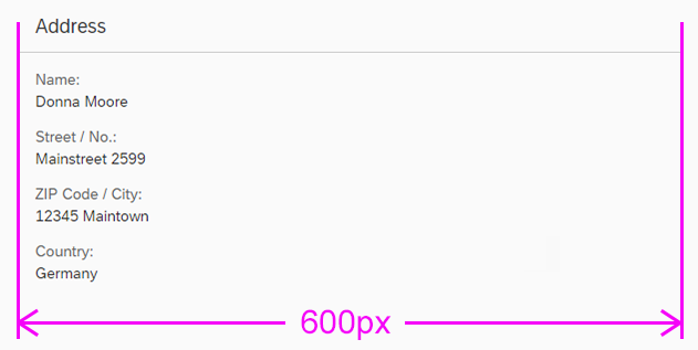
Size S (Smartphone)
On phones, the My Views dialog for selecting variants, the Manage Views dialog, and the Save View dialog open in full screen mode.
My Views
Manage Views
Save View
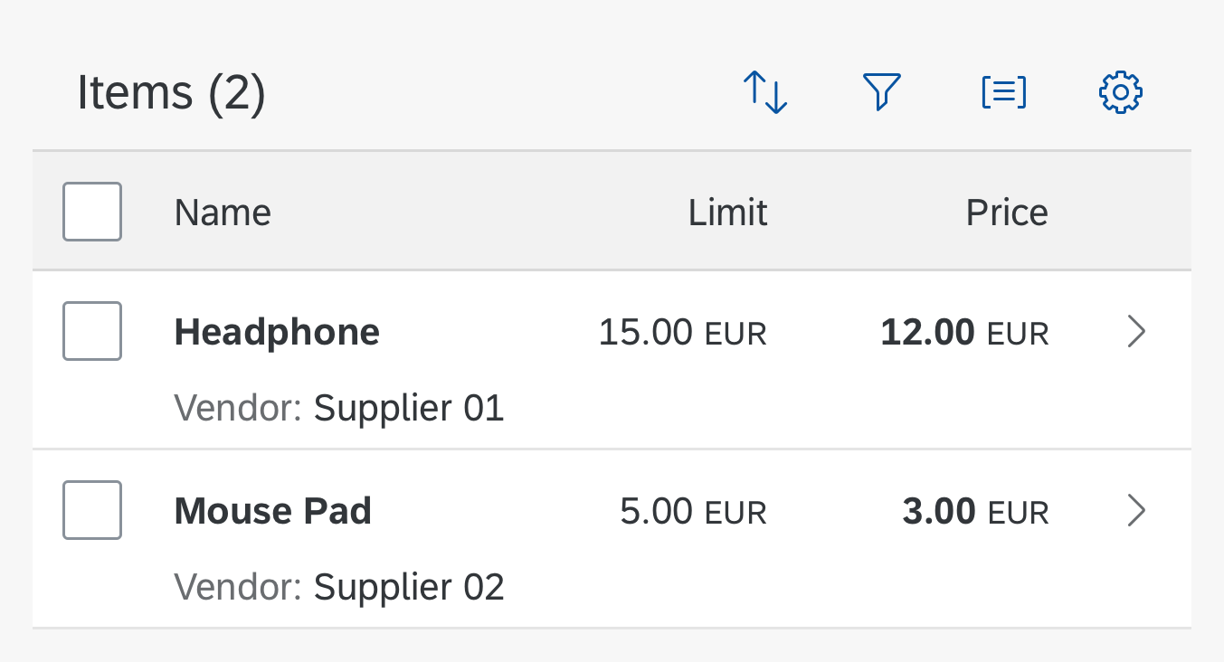
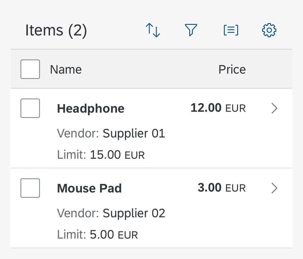
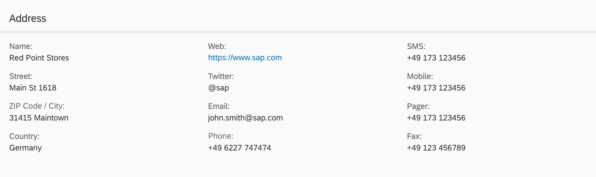
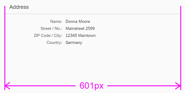
Size M (Tablet)
My Views
Manage Views
Save View
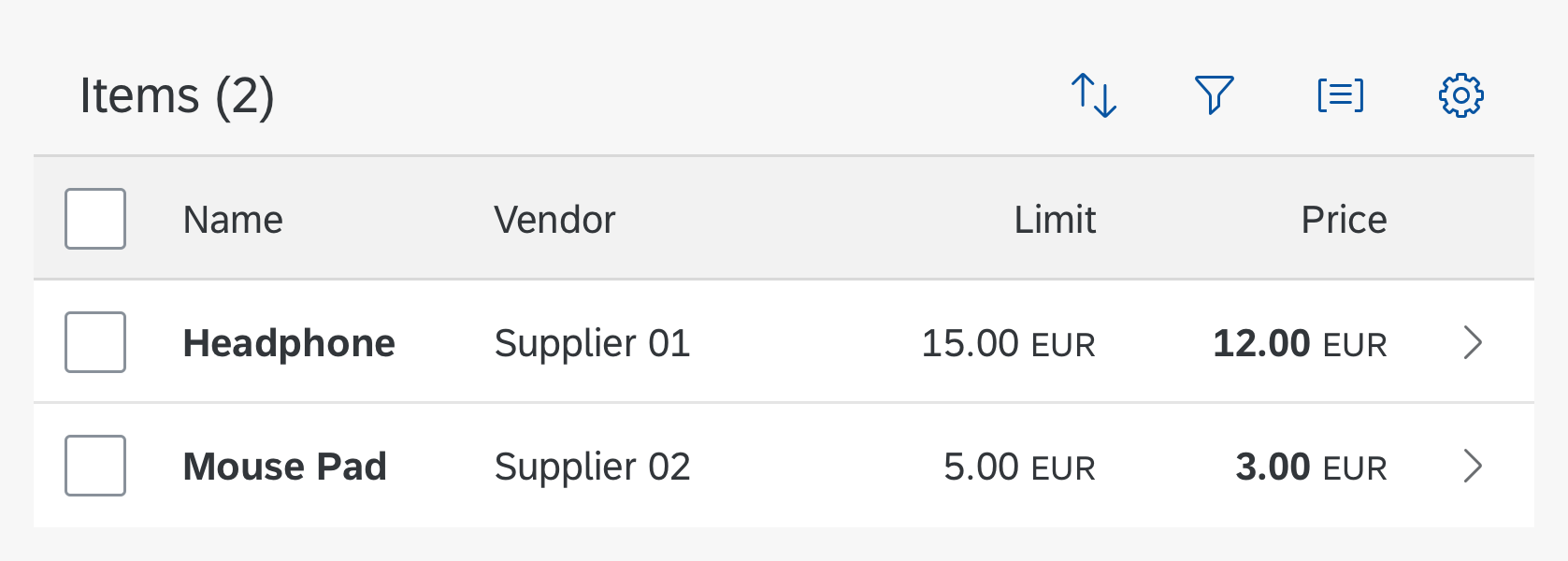
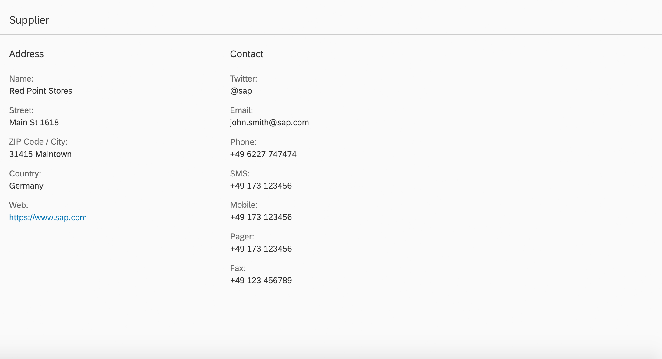
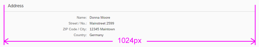
Size L (Desktop)

My Views
Manage Views
Save View
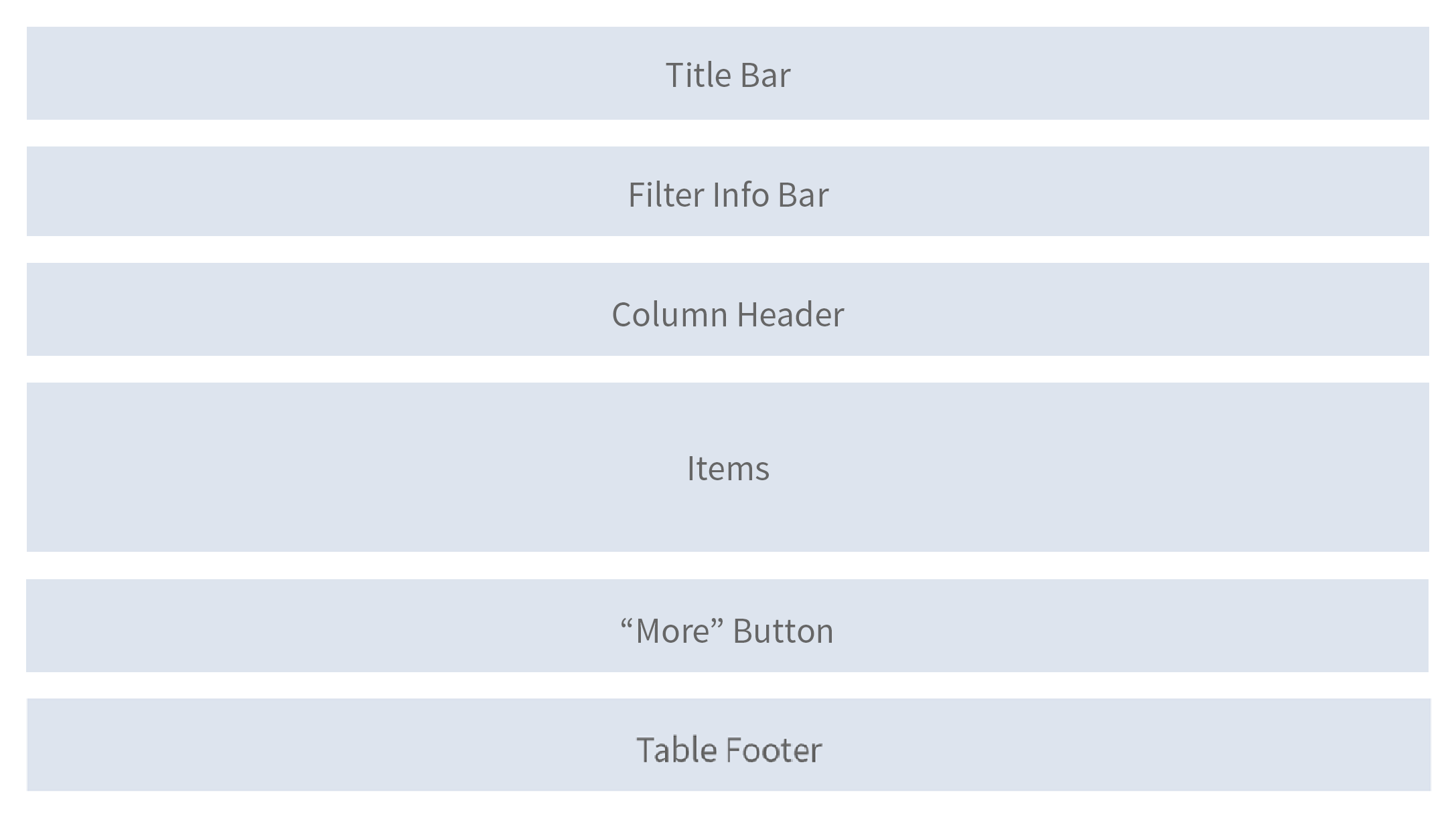
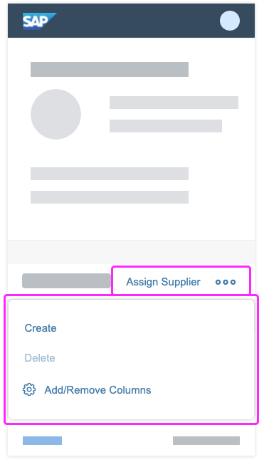
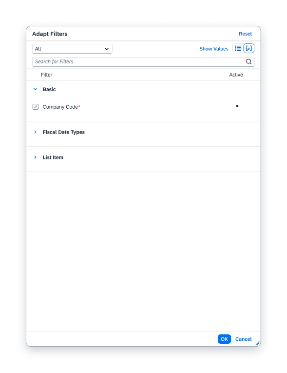
Components
Variant management come with several components:
- A clickable title with an icon
- The My Views dialog for selecting variants
- The Manage Views dialog for setting view parameters and deleting views
- The Save View dialog for creating a new view
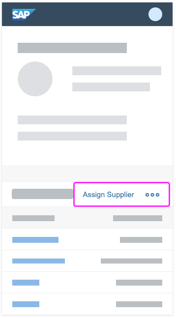
Name of View
The view name is the entry point for opening the My Views, Manage Views, and Save View dialogs.
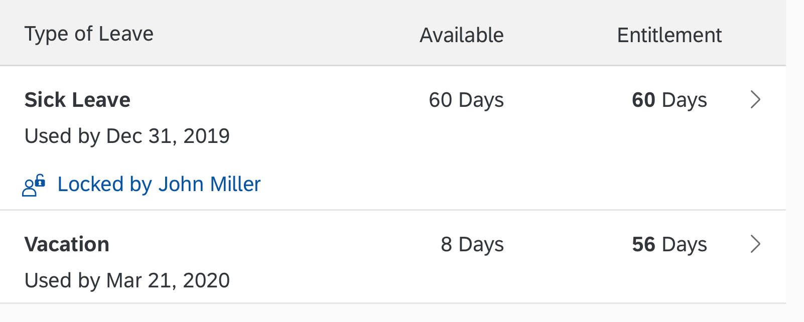
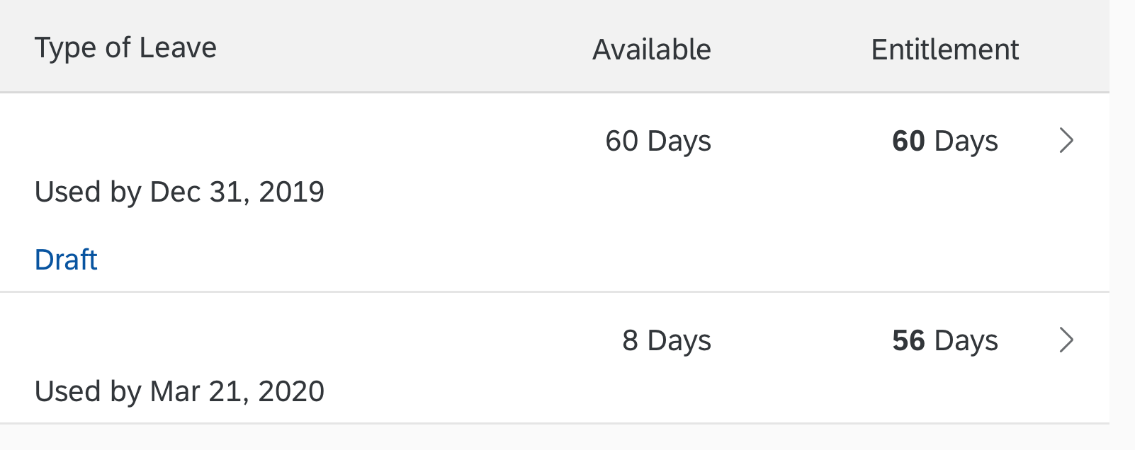
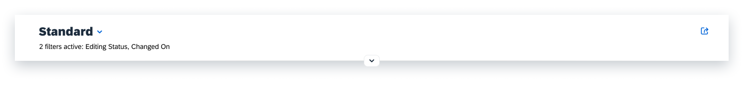
If the user has made changes to the user interface that affect the saved view, the view is marked with an asterisk (*) to indicate the unsaved changes. This happens when the user deletes or adds a filter to the filter bar, for example.

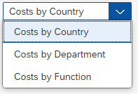
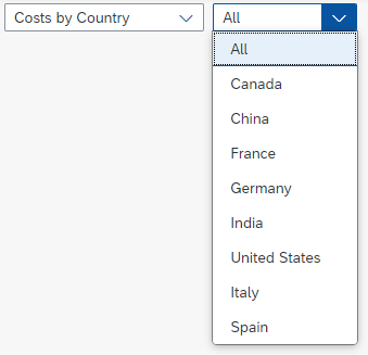
Selecting a view
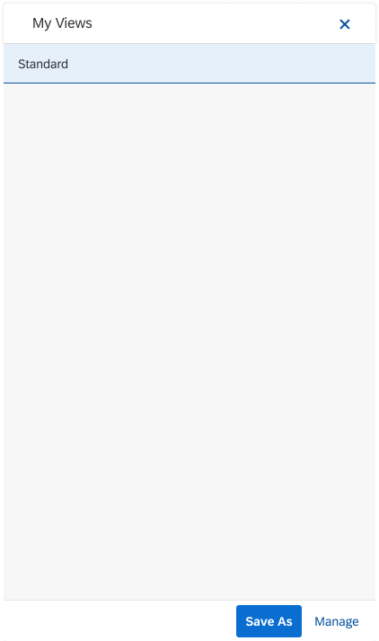
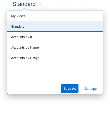
My Views Dialog
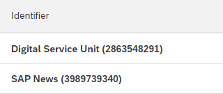
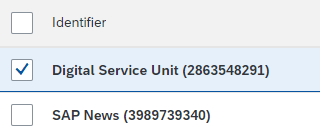
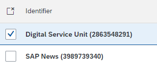
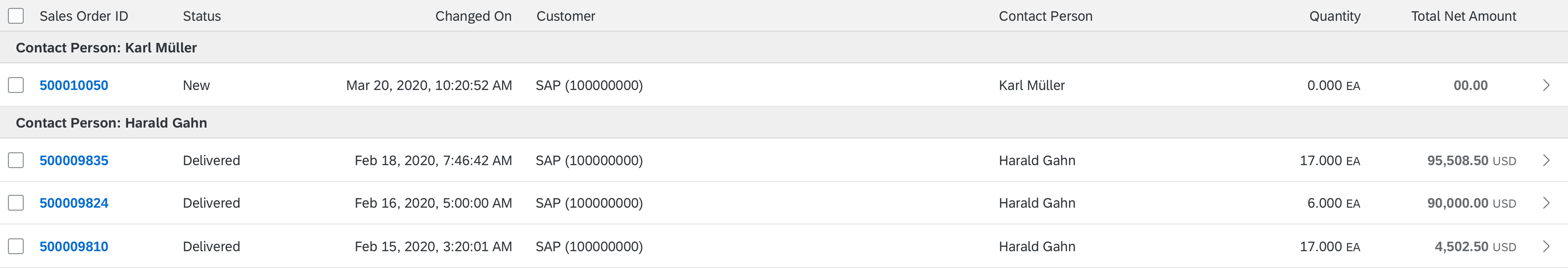
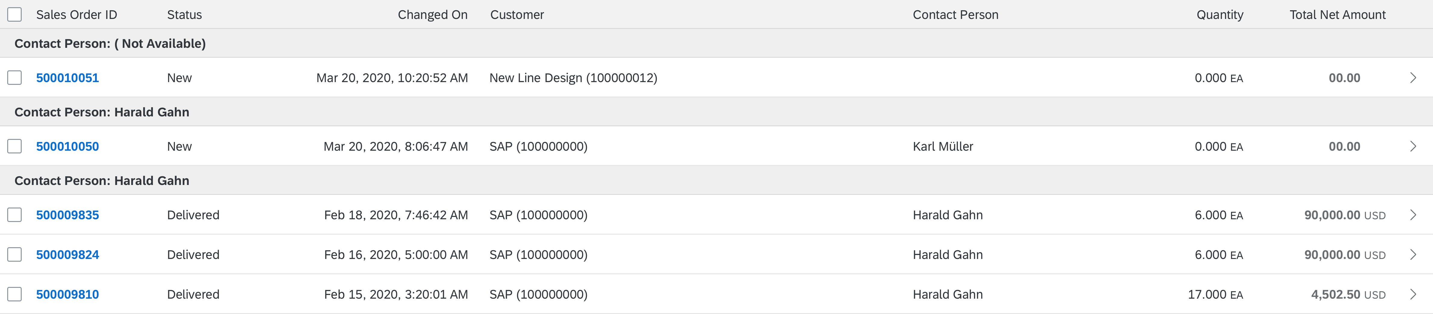
The My Views dialog contains all favorite views, including the default view, the pre-shipped standard views, and the views marked as favorites by the user. The default view and the pre-shipped standard views are marked as favorites automatically.
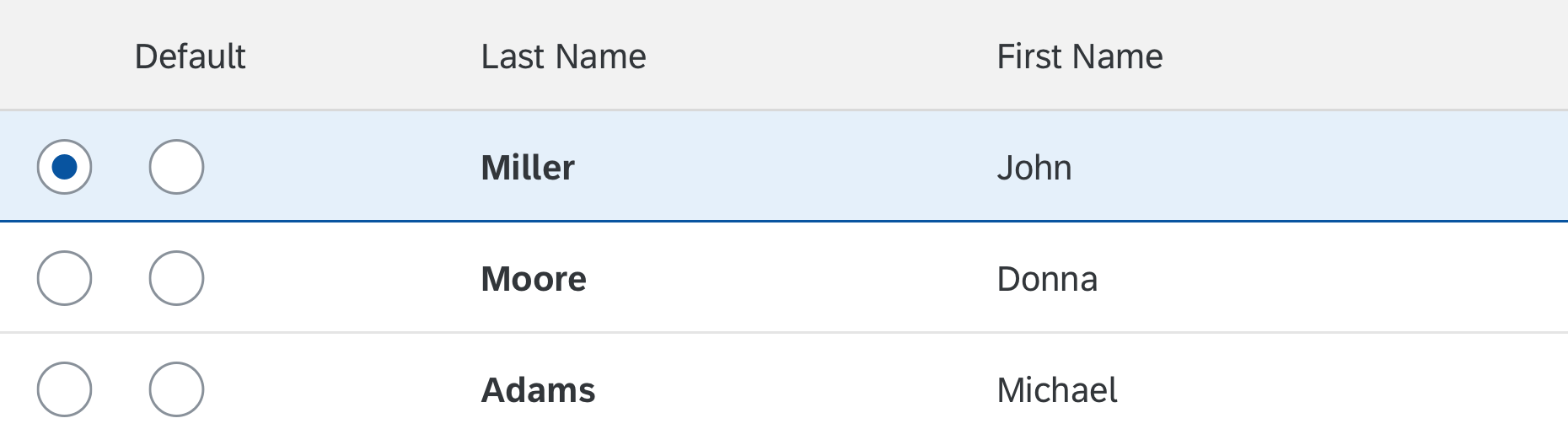
Default View
There can only be one default view, which the user can change in the Manage Views dialog. If the user sets a new default view, the last view remains as a favorite. The user can explicitly unfavorite the last view in the Manage Views dialog.
Pre-Shipped Standard Views
The standard view is the minimum set of filters delivered by SAP, and cannot be modified or deleted. It is flagged as a favorite and cannot be removed. There can be several pre-shipped standard views, depending on the use case.
Favorite Views
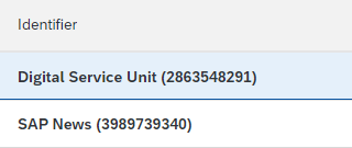
Users can mark views as favorites (or unfavorite them) in the Manage Views dialog. If more than 10 favorite views exist, a search option is displayed.
The views created by users themselves are favorited automatically, while views created by other users are unfavorited by default. This prevents the My Views popover from becoming overcrowded with public variants that are not relevant for the user.
The user can also mark public views as favourites.
Public Views
Public views are visible to all users who have access to the app. A view can be set to Public by individual users, key users, SAP (default delivery), or partners. All views that are set to Public are available within the Manage Views dialog.
A public view can be edited by the user who created it and by key users. All other users can only display the public view.
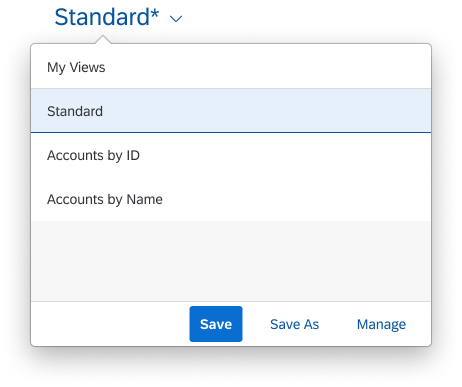
Actions in the My Views Dialog
Users can open the Manage Views dialog using the Manage button in the footer bar of the My Views dialog. From this dialog, users can Save changes to the current view, or choose Save As to create a new view, which opens the Save View dialog.
'My Views' dialog with a few views
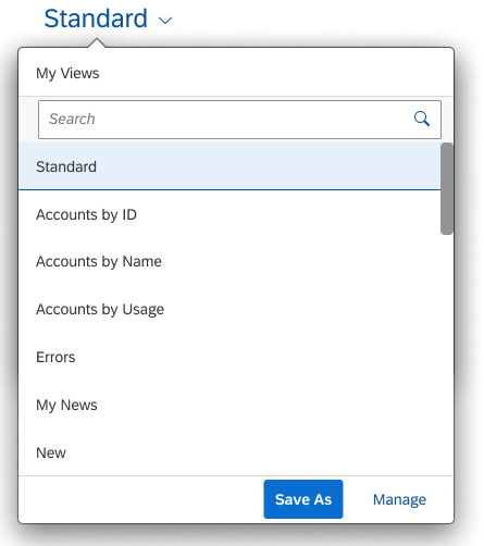
'My Views' dialog with more than 10 views and a search option
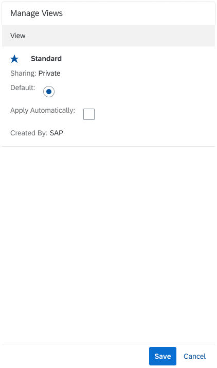
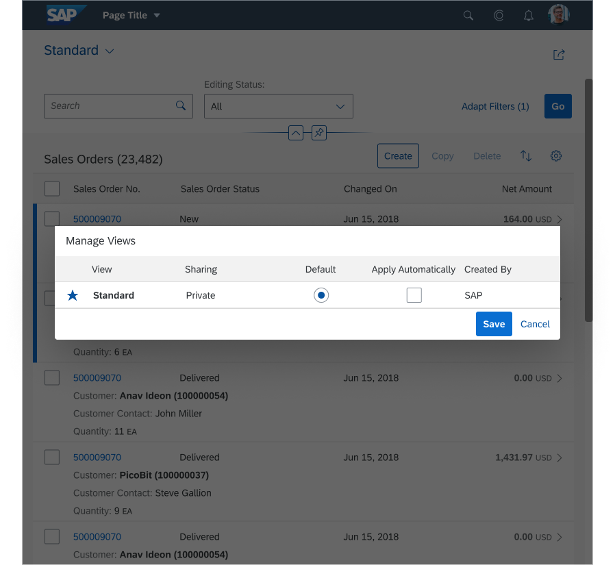
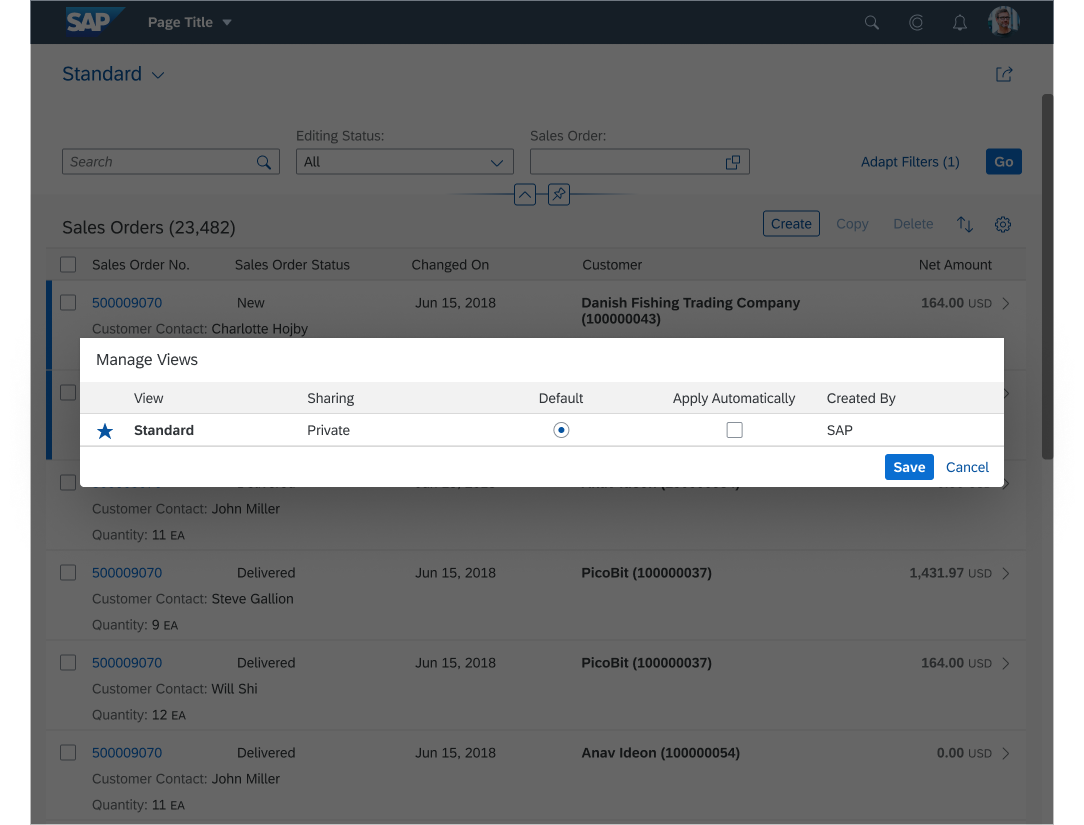
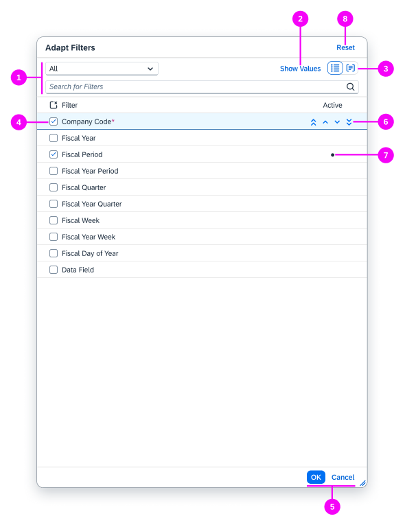
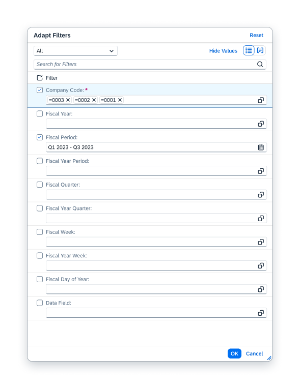
Manage Views Dialog
In the Manage Views dialog, users can make the following changes:
- Mark a view as a favorite
- Change the name of a self-created view
- Set a view as the default
- Apply the view automatically
- View the Sharing and Created By information of each view
- Delete a self-created view
In addition to the personal views users create for themselves, they can also see the pre-shipped and public views. A user can only modify his or her own views, and not public, pre-shipped, or third-party views created by other users.
Exception: Key users can also change and delete views created by others.
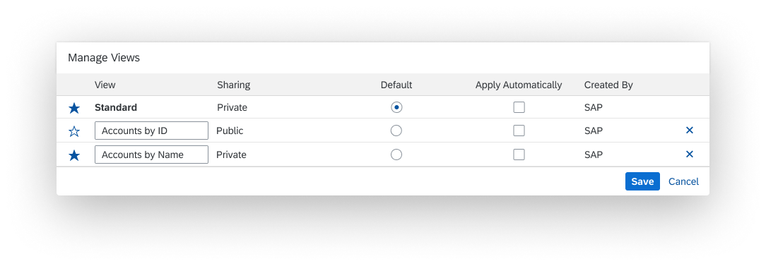
'Manage Views' dialog
Apply View Automatically
Users can select or deselect this option. The control allows app teams to add an optional text next to the checkbox. This can be useful if you apply filter exceptions that overwrite the standard behavior.
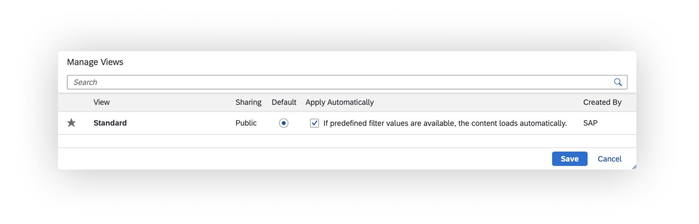
'Manage Views' dialog with additional text in "Apply Automatically" set
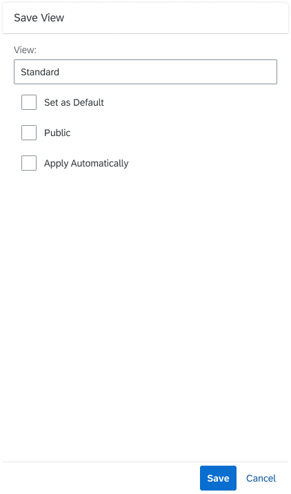
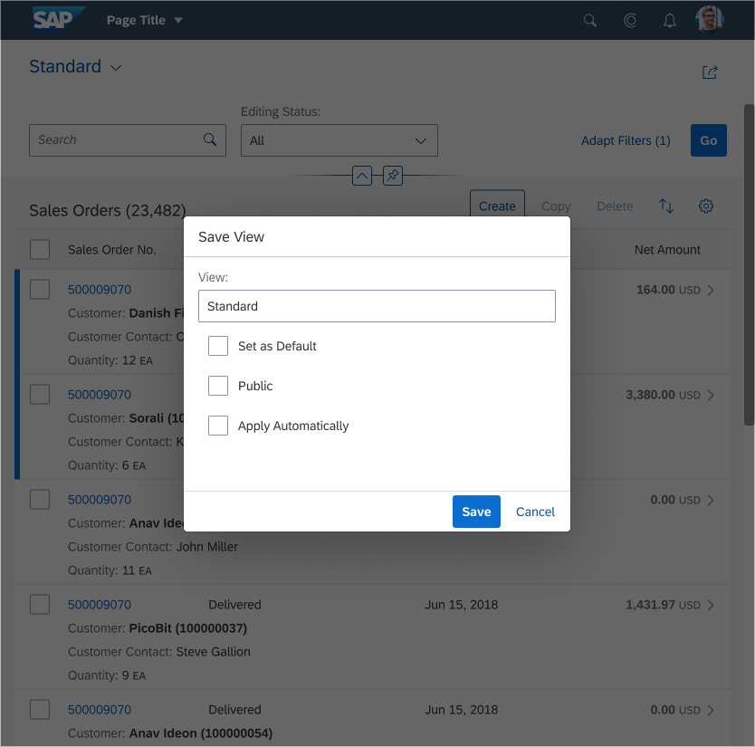
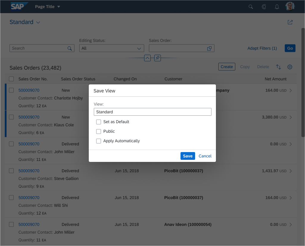
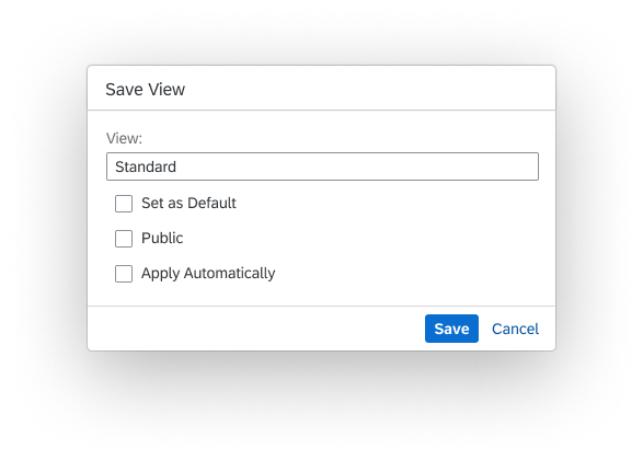
Save View Dialog
The Save View dialog is for creating a new view. For each view, you can make the following settings:
- View: Name of the new view (required field)
- Set as Default: If checked, the new view is the new default view.
- Public: If checked, the new view is available to everyone who has access to the app.
- Apply Automatically: If checked, the view is applied immediately whenever it is selected. The user does not need to click the Go button in the filter bar.
We do not recommend checking this option if the selection is likely to cause long loading times.
'Save View' dialog
Layout
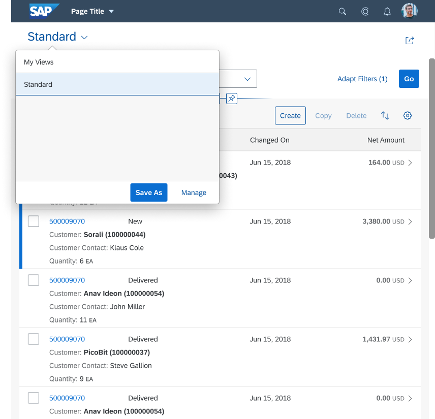
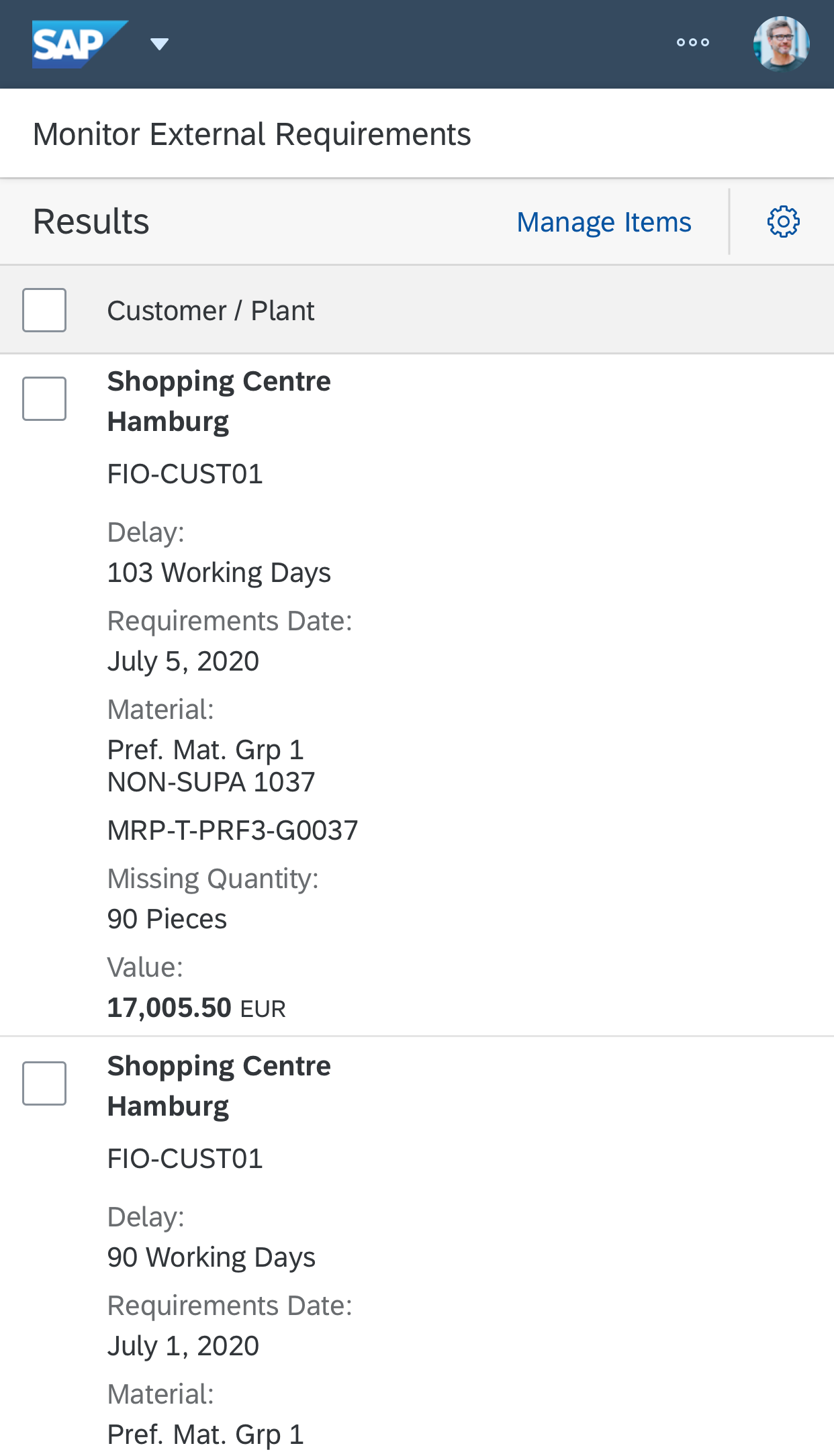
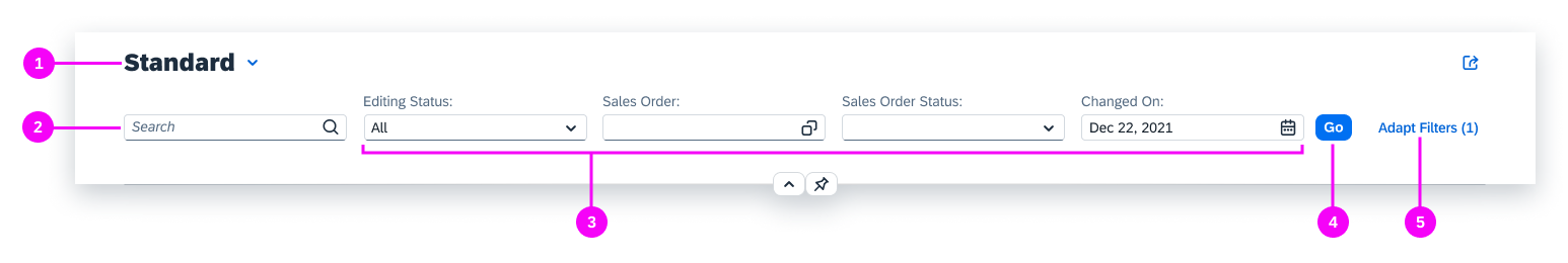
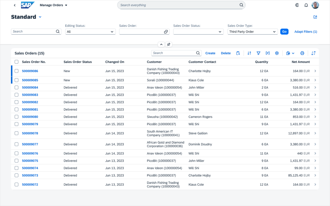
Filter Bar (Page Title)
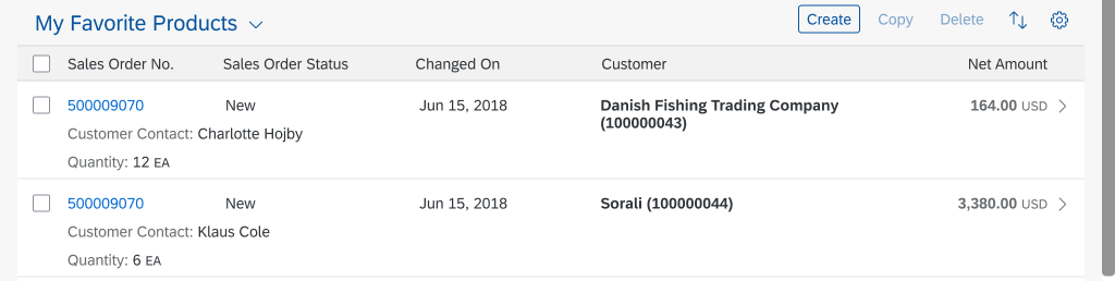
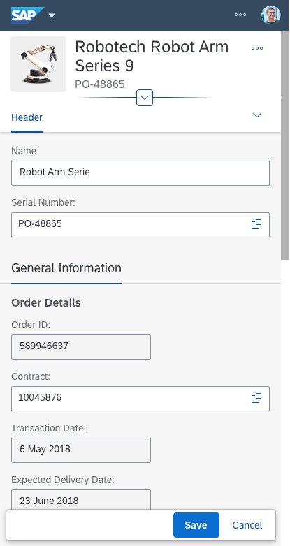
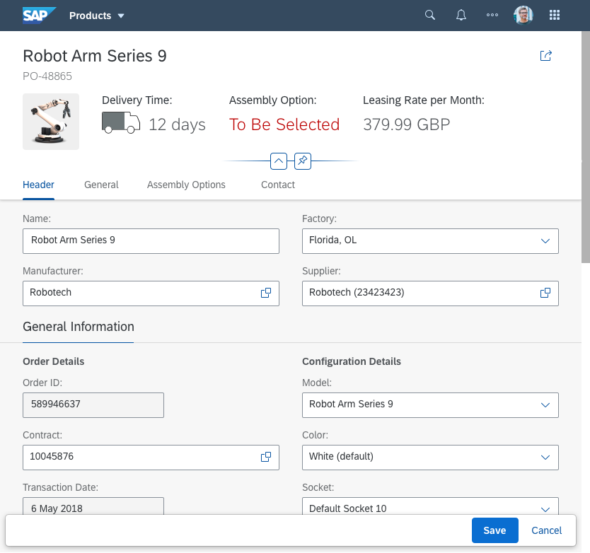
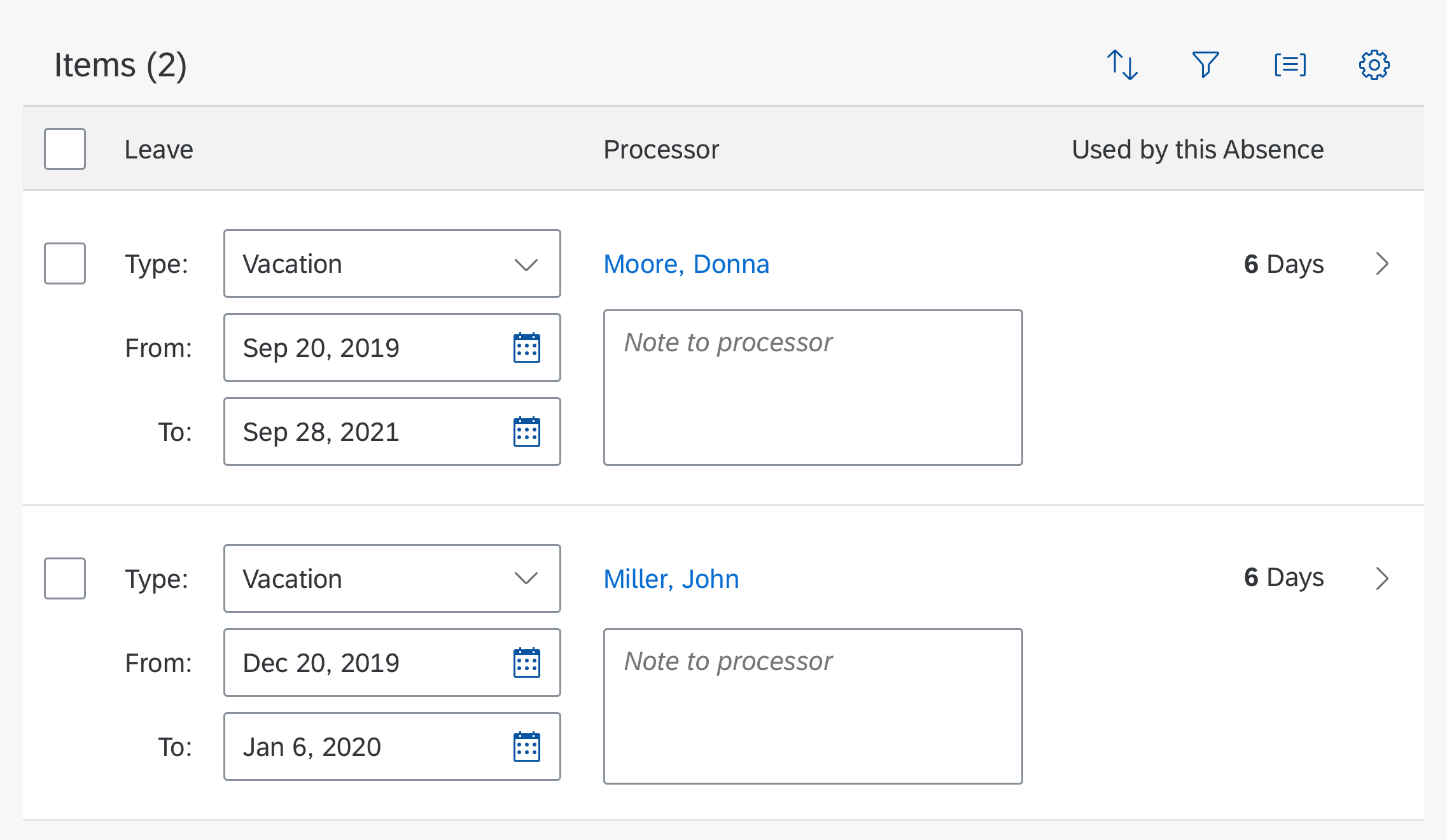
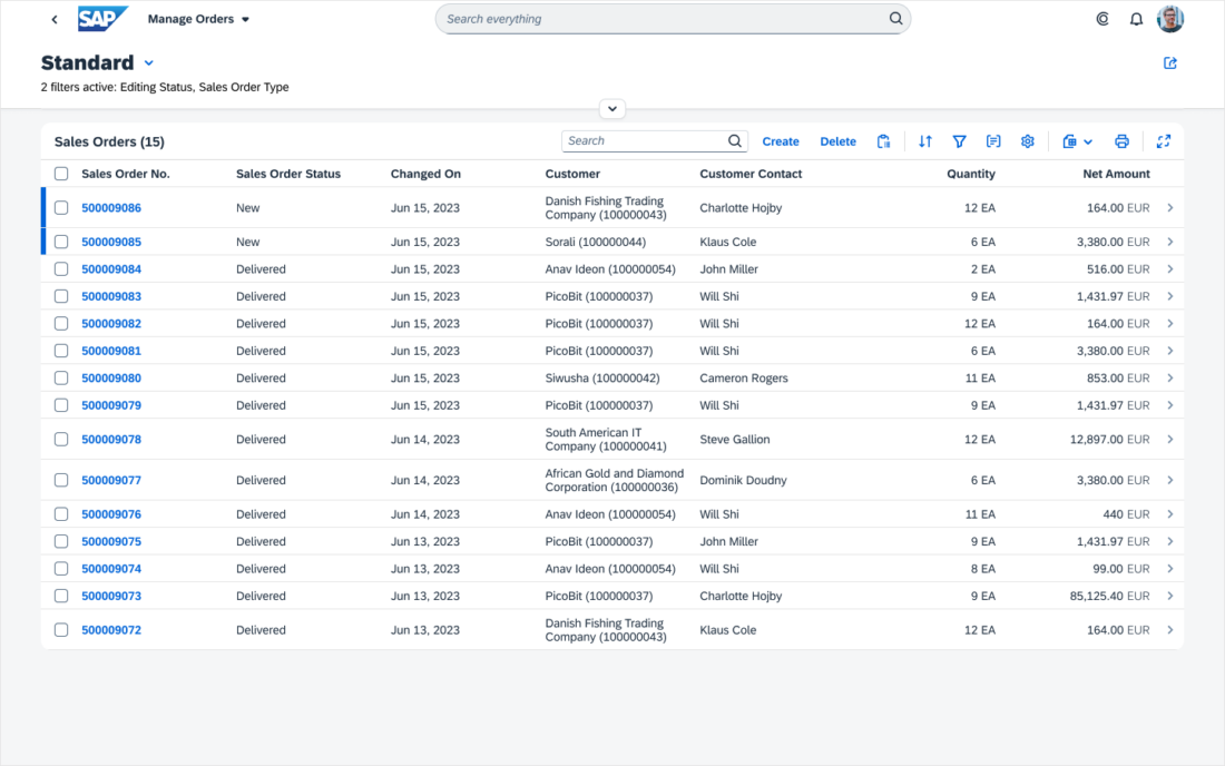
The variant management control is merged with the page title within the page header container, and saves the stored filter settings or both the filter and control settings.

Variant management within the filter bar, merged with the page title
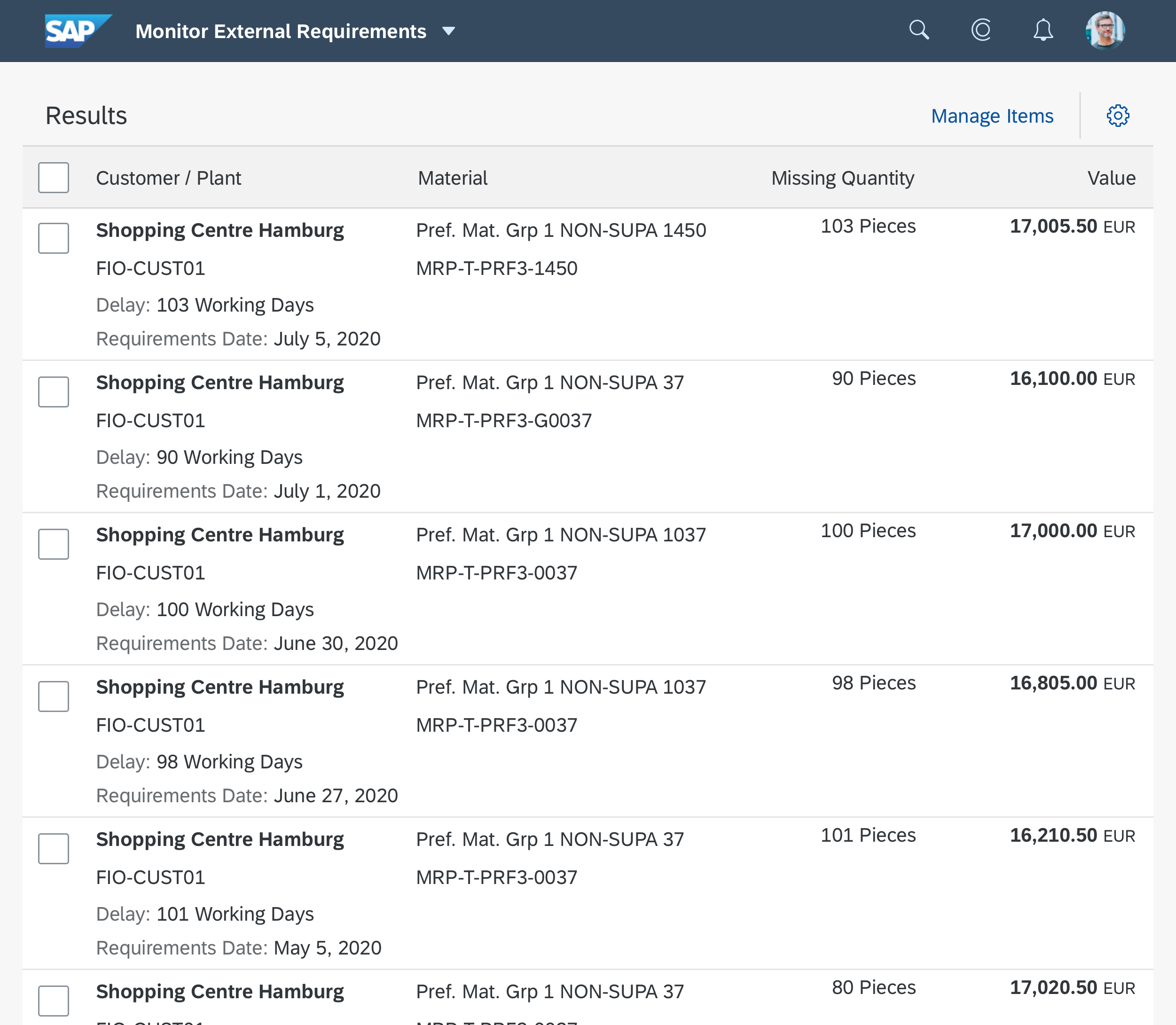
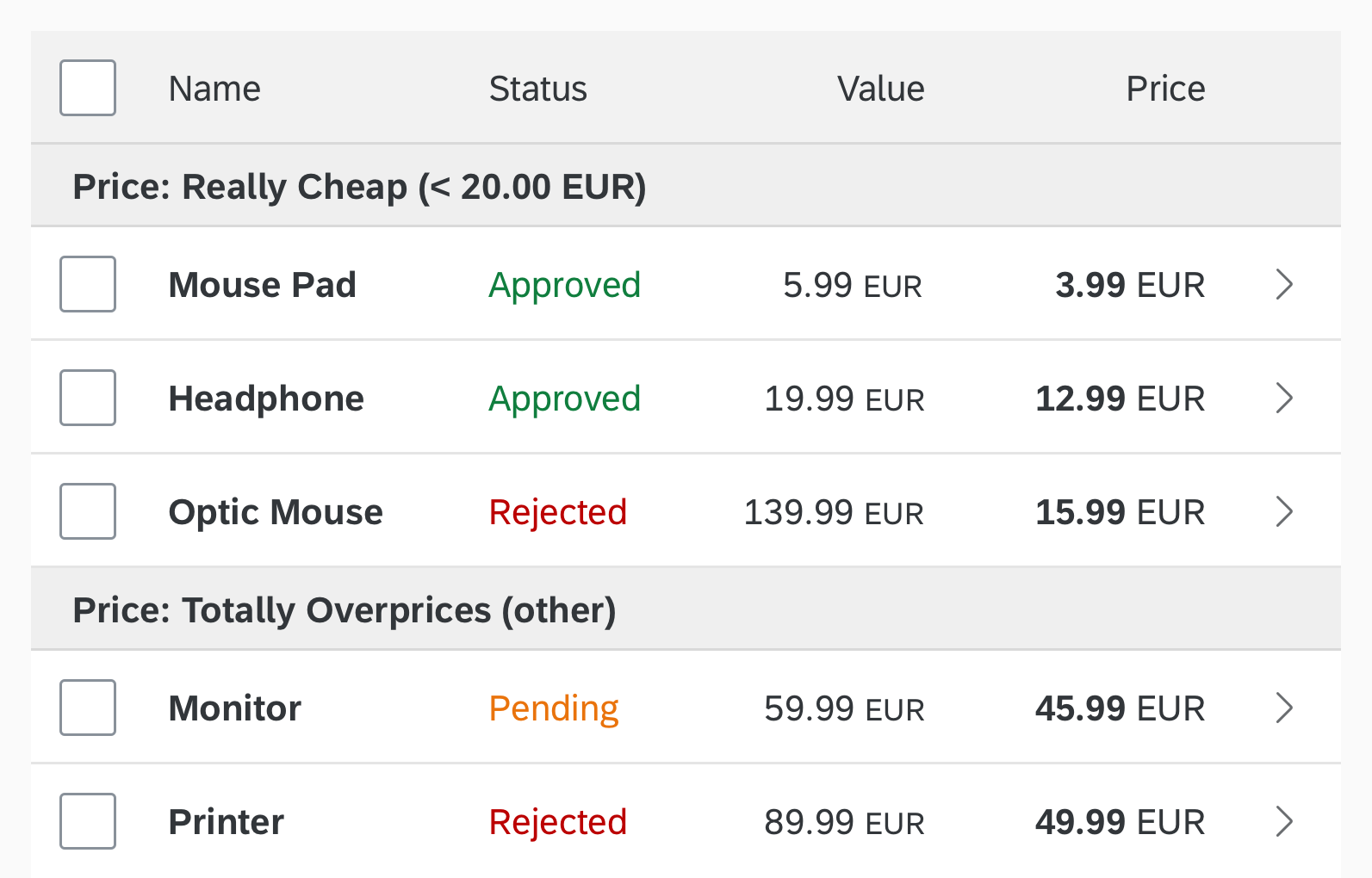
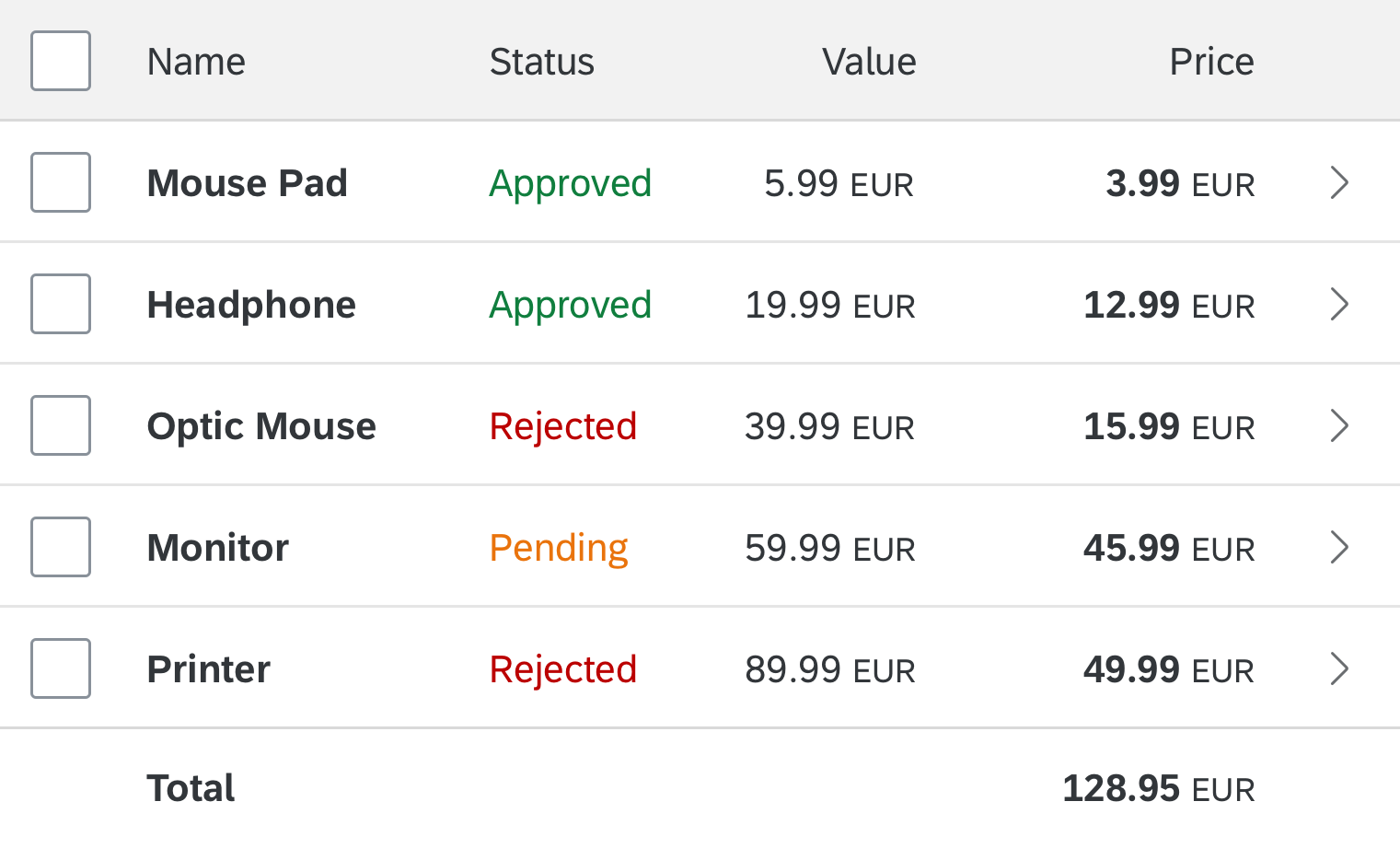
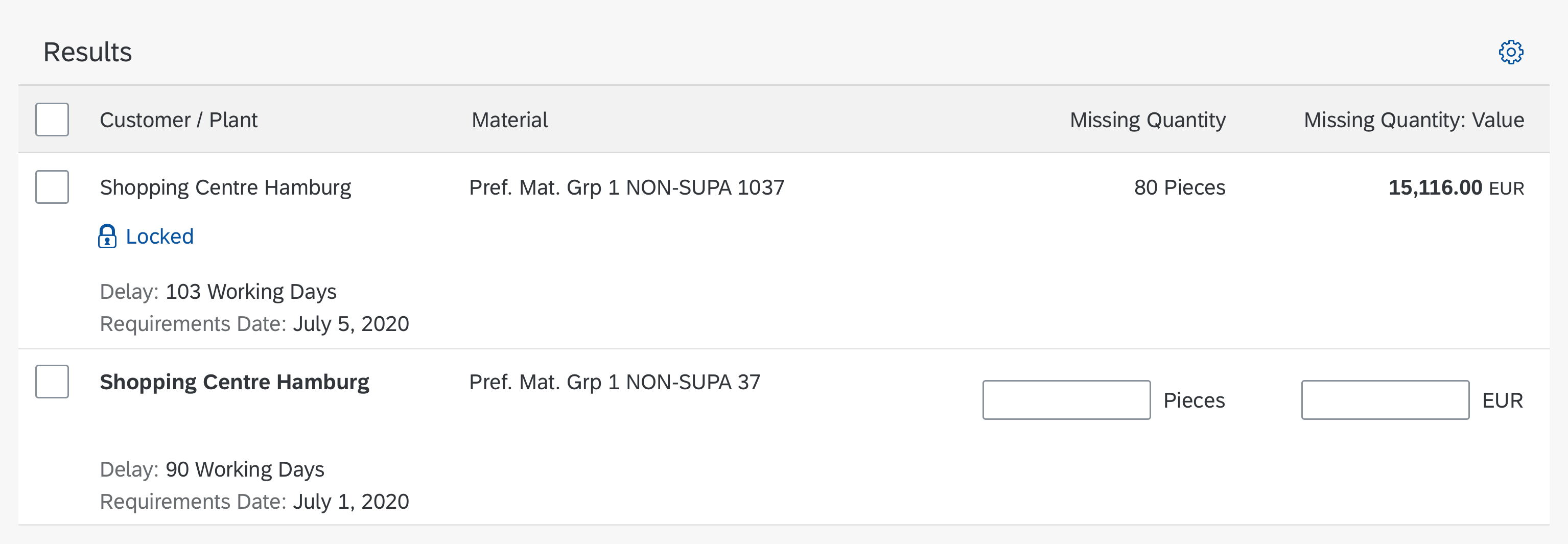
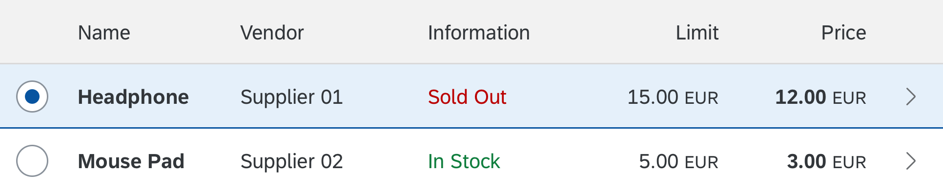
Table
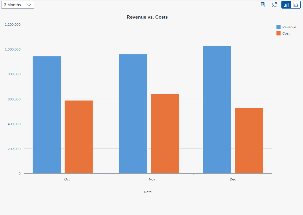
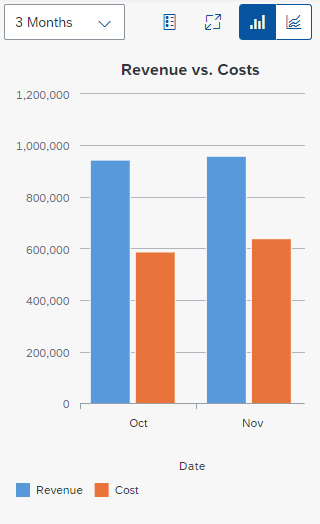
The variant management control can also store control settings like layout, table column visibility, sorting, or grouping independently of the filter settings.
It is either merged with the control title or placed next to it.
If you place the title or variant management control inside a toolbar, apply the following styles:
- Set the toolbar height to 3 rem.
- Use a transparent toolbar.
- Use the title class “sapMH4Fontsize”.
Variant management within the table toolbar
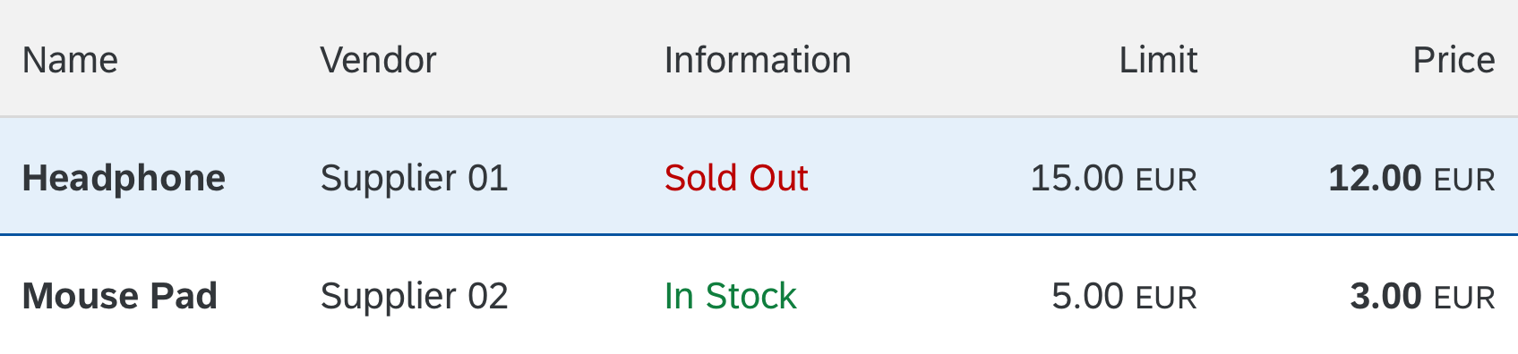
If the table has a separate title, place the title first.
Variant management with table title
Behavior and Interaction
This control allows the user to select, create, update, and delete variants for filter settings and control parameters such as layout, table column visibility, sorting and grouping.
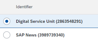
My Views dialog: Selecting a View
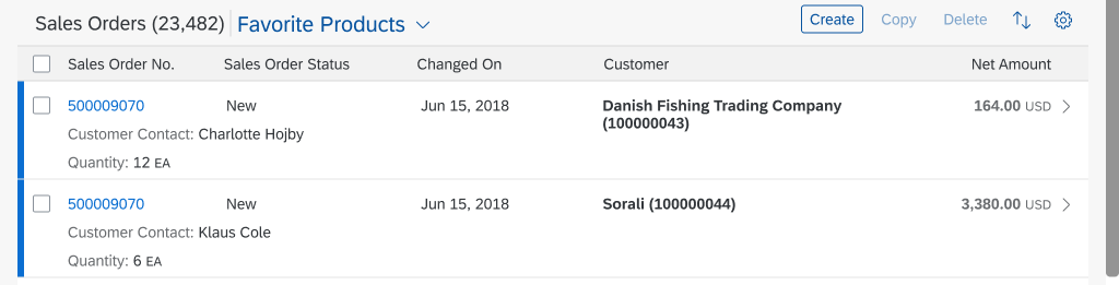
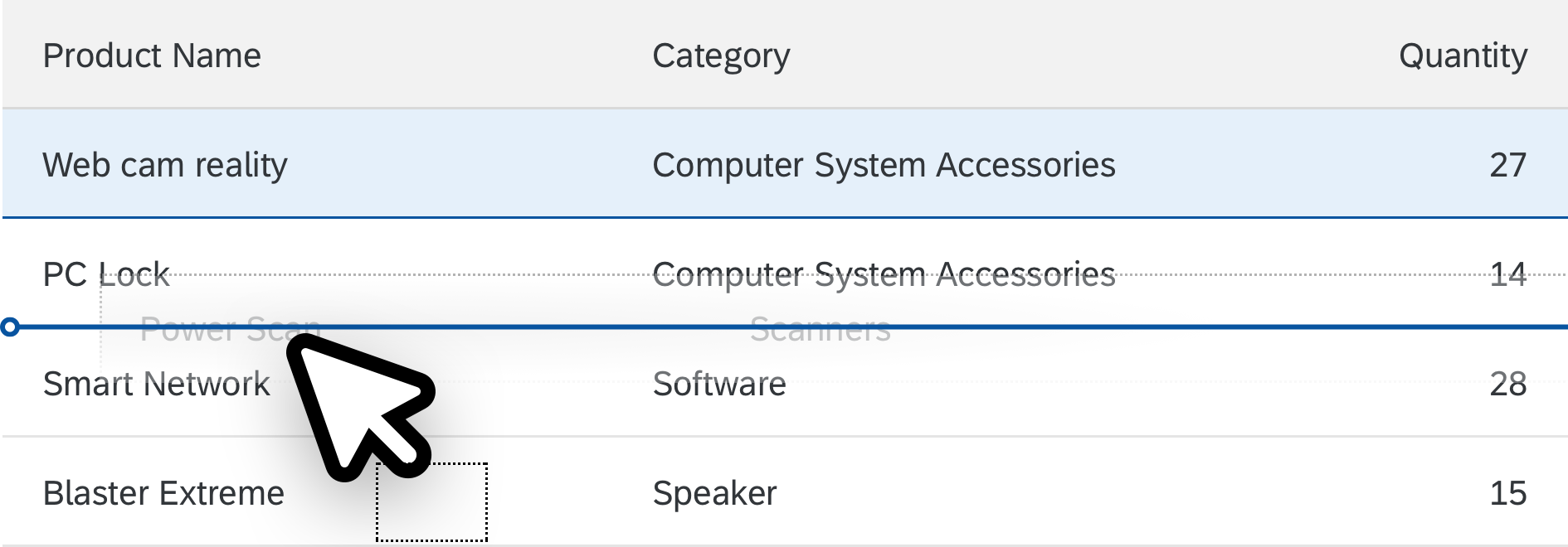
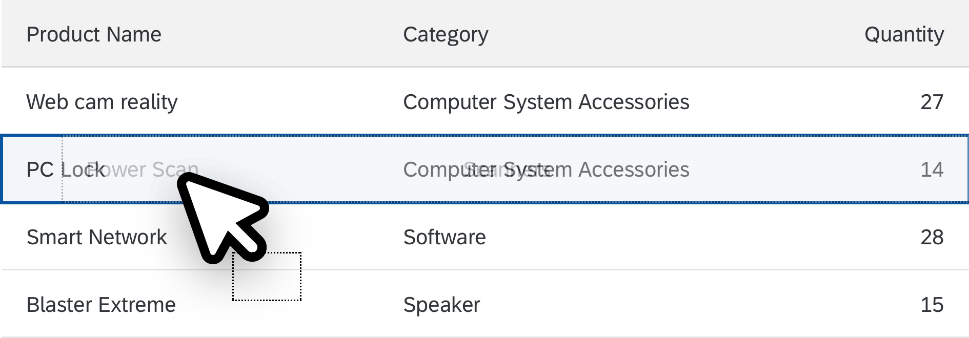
The page title displays the active variant. Clicking the title dropdown opens a popover that displays all available variants. The currently active variant is highlighted. To load another variant, the user simply selects one from the list.
Save
Save can only be applied to variants that the user is allowed to save. Otherwise, this button is disabled. Save overwrites the active variant.
Save As
Save As enables the user to save the current filter settings as a new view. The Save As function can also be used to duplicate existing variants for later modification.
Manage
Manage opens the Manage Views dialog that allows the user to update, delete or favorite/unfavorite existing variants.
Selecting a view
Save View dialog
The Save View dialog is for creating new views. Providing a name for the new view is mandatory. Clicking OK saves the new view.
Save View
Manage Views dialog
In the Manage Views dialog, the user can rename, delete, and change properties of existing views.
Users can only modify or delete entries if they have the necessary permissions. By default, variants that a user has created can also be modified and deleted.
Manage Views
Save as Tile
The user can save the currently selected variant as a tile on the launchpad using the Save as Tile action in the Share menu.
In the Save as Tile dialog, the user can define the tile title and subtitle, a description, and the launchpad group in which the tile should appear.
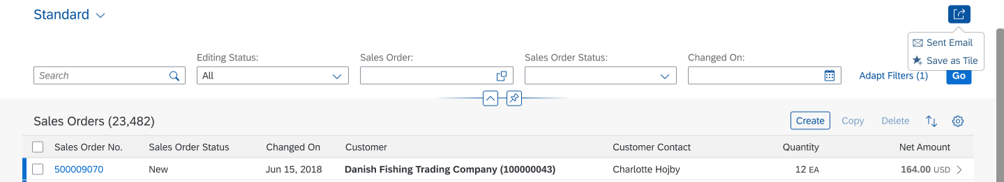
Save as tile via 'Share' button

'Save as Tile' dialog
Guidelines
Save as Tile
Use the name of a variant as the title of the application tile. Map this as a preset title that cannot be edited by the user. In this case, whenever the variant is updated, the tile is updated accordingly.
Exception: If the variant cannot be referenced directly due to technical limitations, offer the standard tile creation option where filter parameters and settings are only saved within the URL.
Resources
Want to dive deeper? Follow the links below to find out more about related controls, the SAPUI5 implementation, and the visual design.
Elements and Controls
- Responsive Table (guidelines)
- Table Toolbar (guidelines)
- Filter Bar (guidelines)


 Your feedback has been sent to the SAP Fiori design team.