
- SAPUI5 Version 1.120
- SAPUI5 Version 1.118
- SAPUI5 Version 1.116
- SAPUI5 Version 1.114
- SAPUI5 Version 1.112
- SAPUI5 Version 1.110
- SAPUI5 Version 1.108
- SAPUI5 Version 1.106
- SAPUI5 Version 1.104
- SAPUI5 Version 1.102
- SAPUI5 Version 1.100
- SAPUI5 Version 1.98
- SAPUI5 Version 1.96
- SAPUI5 Version 1.94
- SAPUI5 Version 1.92
- SAPUI5 Version 1.90
- SAPUI5 Version 1.88
- SAPUI5 Version 1.86
- SAPUI5 Version 1.84
- SAPUI5 Version 1.82
- SAPUI5 Version 1.80
- SAPUI5 Version 1.78
- SAPUI5 Version 1.76
- SAPUI5 Version 1.74
- SAPUI5 Version 1.72
- SAPUI5 Version 1.70
- SAPUI5 Version 1.68
- SAPUI5 Version 1.66
- SAPUI5 Version 1.64
- SAPUI5 Version 1.62
- SAPUI5 Version 1.60
- SAPUI5 Version 1.58
- SAPUI5 Version 1.56
- SAPUI5 Version 1.54
- SAPUI5 Version 1.52
- SAPUI5 Version 1.50
- SAPUI5 Version 1.48
- SAPUI5 Version 1.46
- SAPUI5 Version 1.44
- SAPUI5 Version 1.42
- SAPUI5 Version 1.40
- SAPUI5 Version 1.38
- SAPUI5 Version 1.36
- SAPUI5 Version 1.34
- SAPUI5 Version 1.32
- SAPUI5 Version 1.30
- SAPUI5 Version 1.28
- SAPUI5 Version 1.26
- Latest SAPUI5 Version 1.122
- SAPUI5 Version 1.120
- SAPUI5 Version 1.118
- SAPUI5 Version 1.116
- SAPUI5 Version 1.114
- SAPUI5 Version 1.112
- SAPUI5 Version 1.110
- SAPUI5 Version 1.108
- SAPUI5 Version 1.106
- SAPUI5 Version 1.104
- SAPUI5 Version 1.102
- SAPUI5 Version 1.100
- SAPUI5 Version 1.98
- SAPUI5 Version 1.96
- SAPUI5 Version 1.94
- SAPUI5 Version 1.92
- SAPUI5 Version 1.90
- SAPUI5 Version 1.88
- SAPUI5 Version 1.86
- SAPUI5 Version 1.84
- SAPUI5 Version 1.82
- SAPUI5 Version 1.80
- SAPUI5 Version 1.78
- SAPUI5 Version 1.76
- SAPUI5 Version 1.74
- SAPUI5 Version 1.72
- SAPUI5 Version 1.70
- SAPUI5 Version 1.68
- SAPUI5 Version 1.66
- SAPUI5 Version 1.64
- SAPUI5 Version 1.62
- SAPUI5 Version 1.60
- SAPUI5 Version 1.58
- SAPUI5 Version 1.56
- SAPUI5 Version 1.54
- SAPUI5 Version 1.52
- SAPUI5 Version 1.50
- SAPUI5 Version 1.48
- SAPUI5 Version 1.46
- SAPUI5 Version 1.44
- SAPUI5 Version 1.42
- SAPUI5 Version 1.40
- SAPUI5 Version 1.38
- SAPUI5 Version 1.36
- SAPUI5 Version 1.34
- SAPUI5 Version 1.32
- SAPUI5 Version 1.30
- SAPUI5 Version 1.28
- SAPUI5 Version 1.26
Time Picker
ui5-time-picker | v1.0
Intro
The time picker allows the user to select a localized time. It can be used with touch, mouse, or keyboard input.
When to Use
Use the time picker:
- To select a time.
- To select a time range. In this case, one time picker can be used to set the starting time and a second one to set the end time.
- To select a specific duration, such as 1 minute and 30 seconds.
Don’t use the time picker:
- If users need to select a standard duration, such as 15 minutes, 30 minutes, 1 hour, or 2 hours. In this case, use the select control instead.
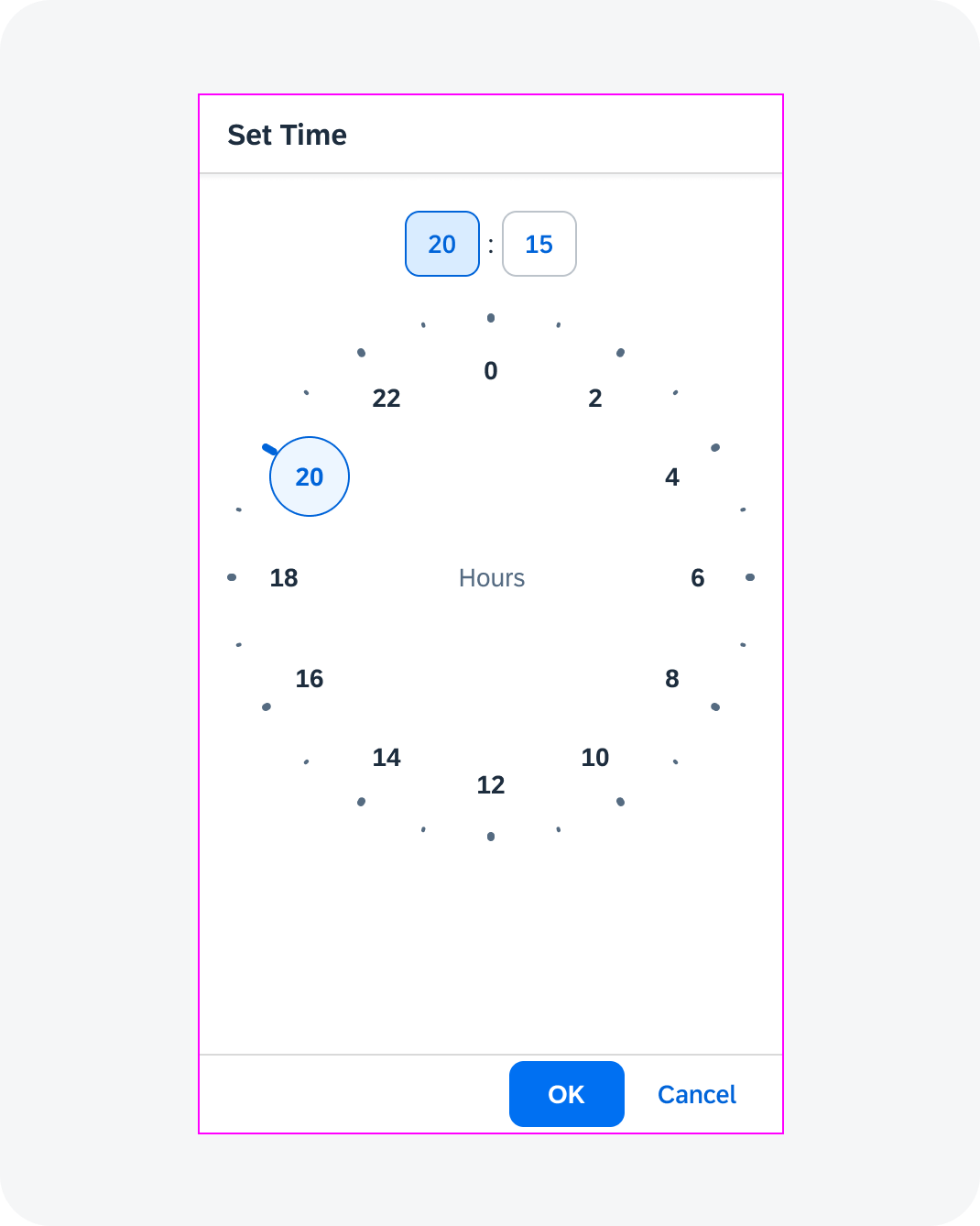
Anatomy
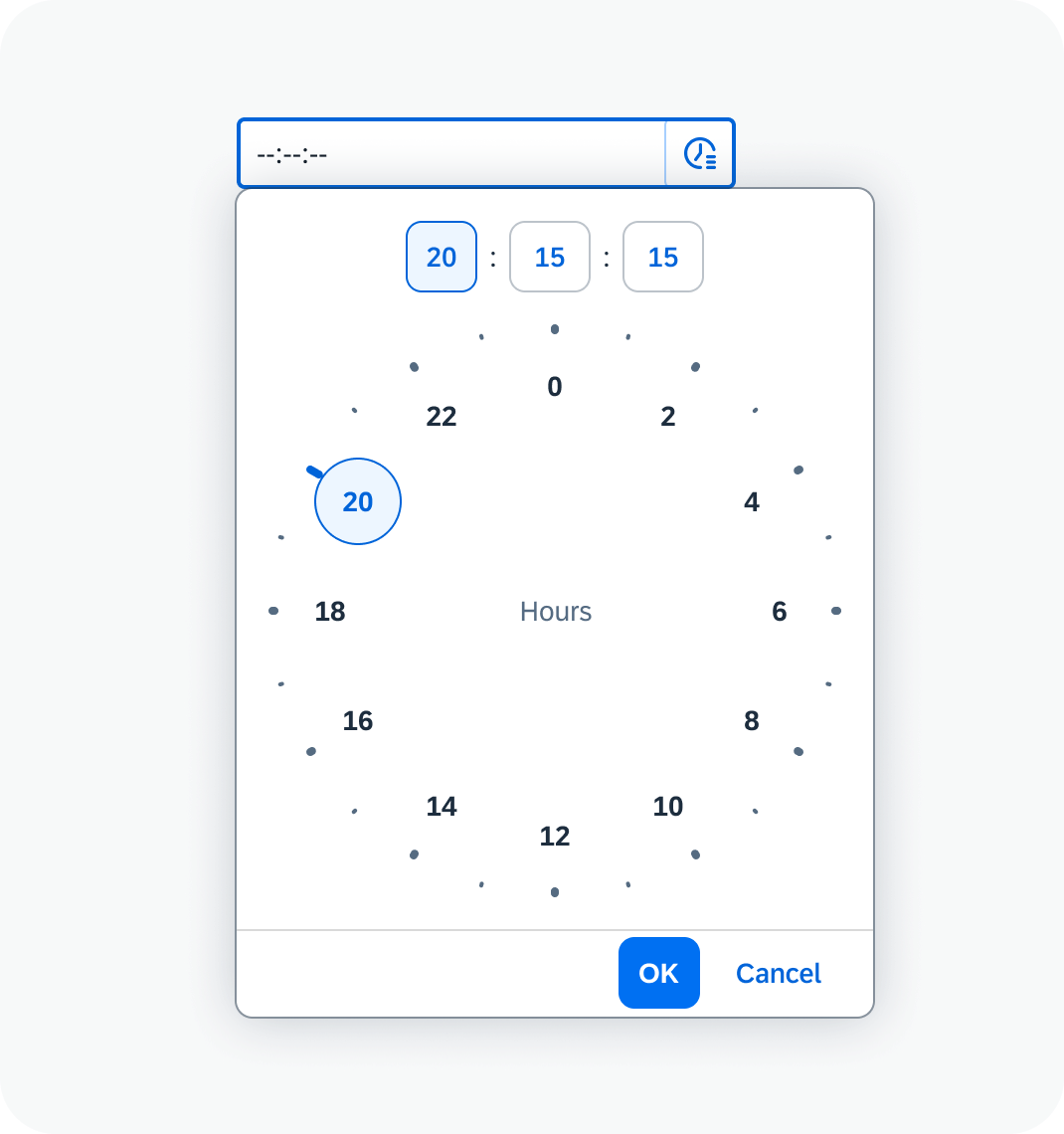
Time Picker
- Time picker input field: The container in which a user enters data. It contains a mask.
- Time picker button: The button that opens the time picker popover-.
- Time picker popover
- Hours field: Displays the hour entered or selected.
- Minutes field: Displays the minutes entered or selected.
- Seconds field (optional): Displays the seconds entered or selected. You can add the seconds field if it’s relevant for your use case. The recommended display format doesn’t include seconds.
- AM/PM switch. The switch is displayed if the user has opted for the 12-hour format.
- Clock face for selecting the time: The appearance of the clock face depends on the focus (hours, minutes, or seconds) and the time format (12-hour or 24-hour clock).
- Footer: With OK and Cancel buttons.
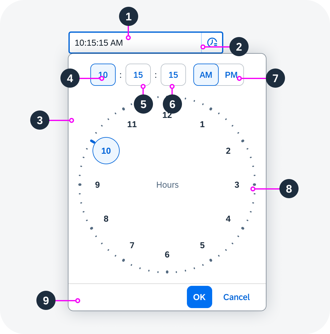
Anatomy of the time picker
Clock Face
- Tick marks
- Clock face circle
- Number selector
- Selected hours/minutes/seconds
- Hours/minutes/seconds label
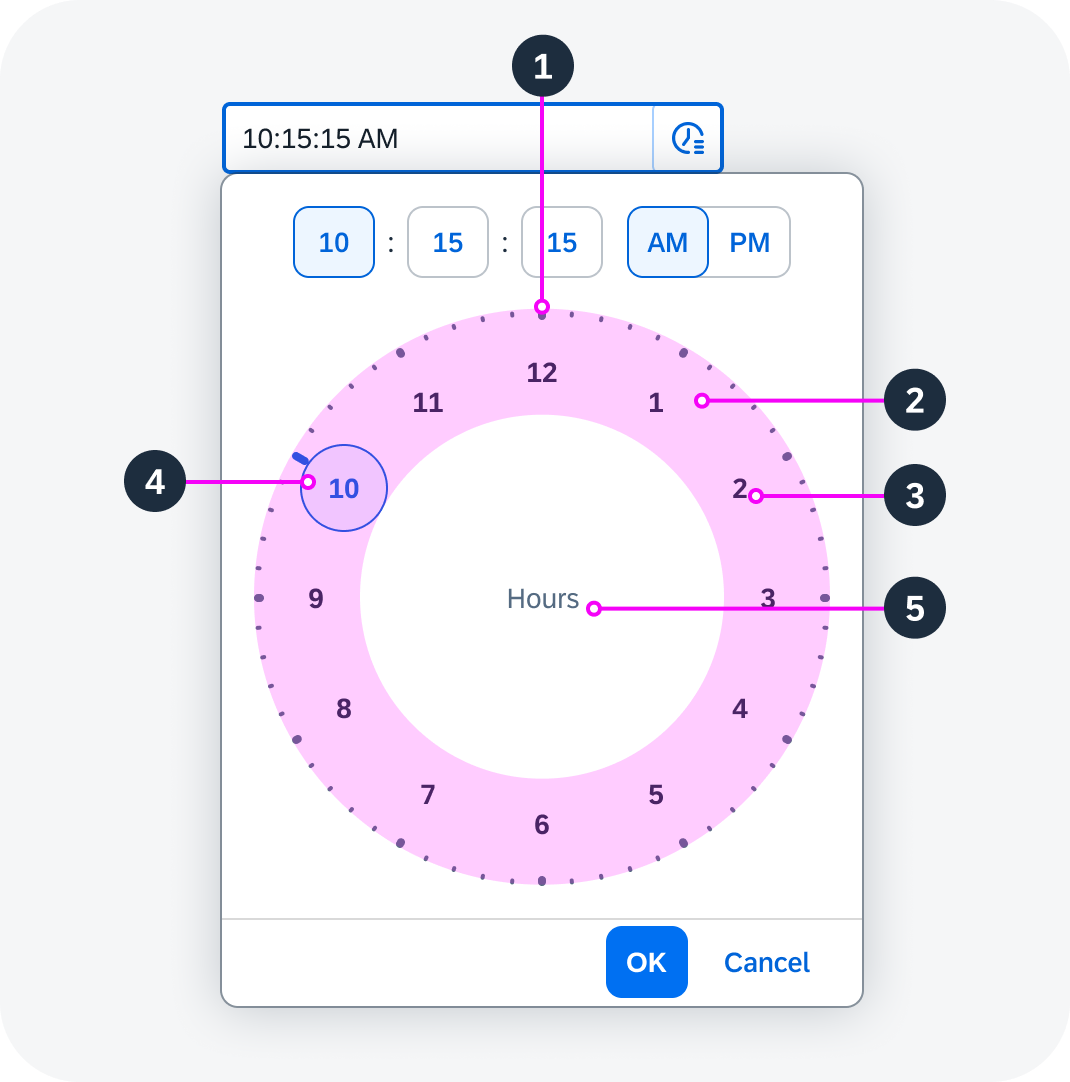
Anatomy of the clock face
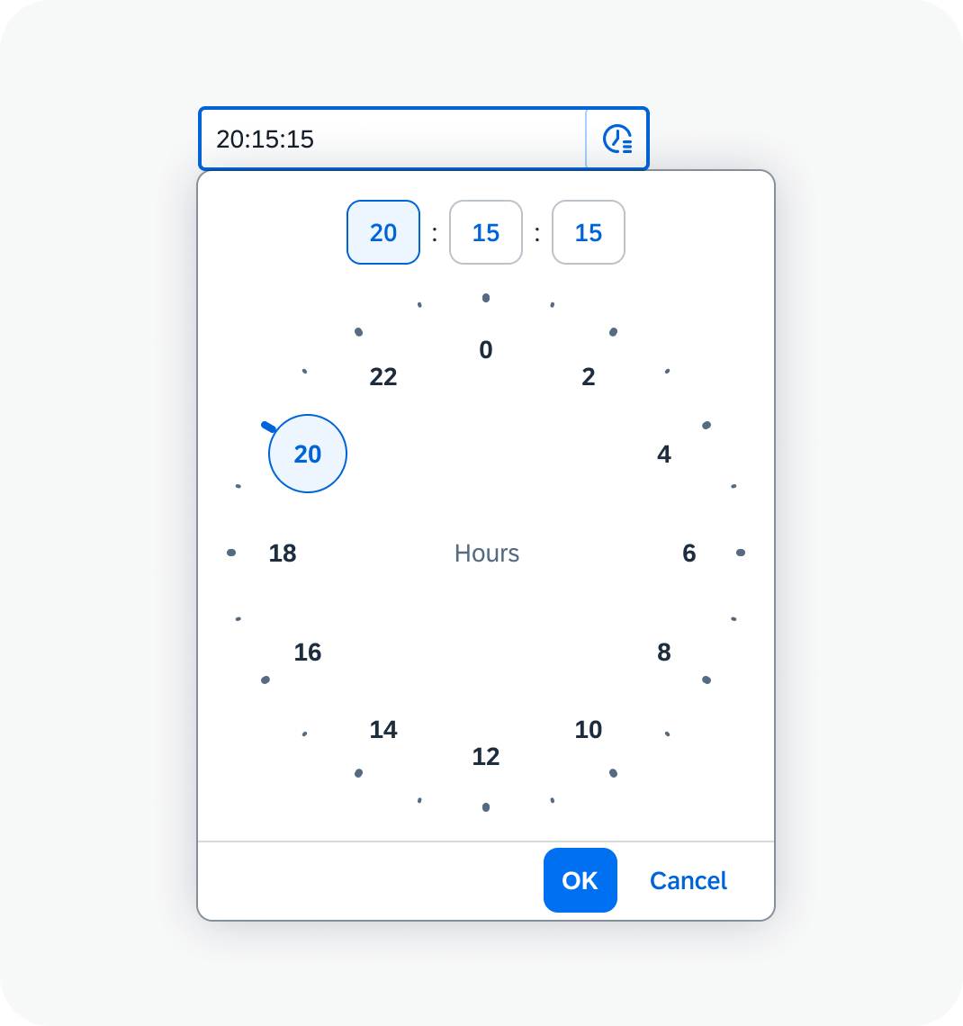
Variants
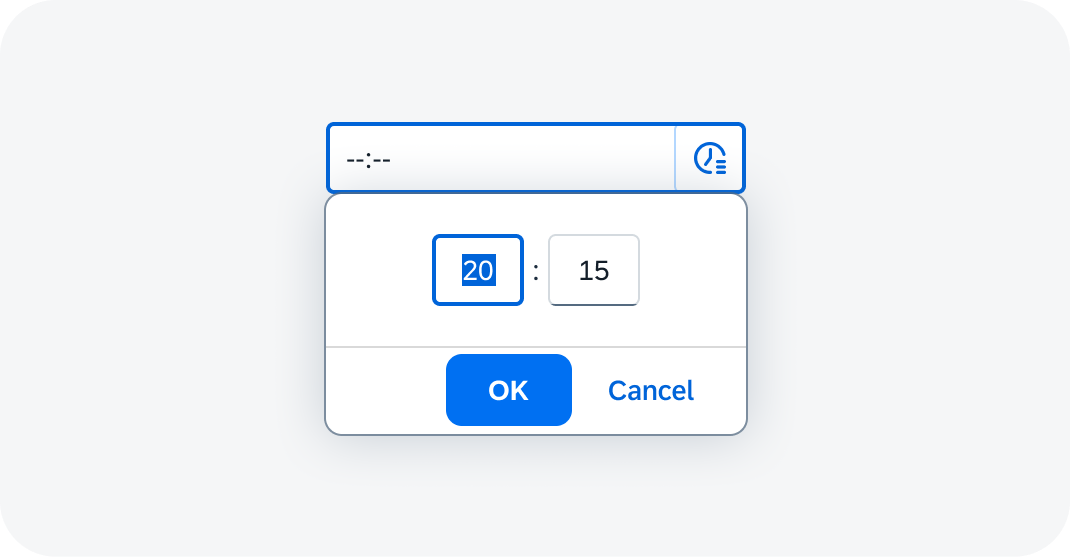
24-Hour Clock Face
12-Hour Clock Face

Time picker with 24-hour clock face
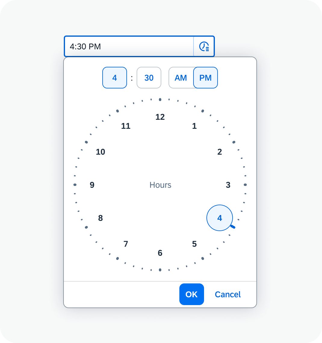
Time picker with 12-hour clock face
Selection of Seconds
Input Placeholder
Time picker with selection of seconds
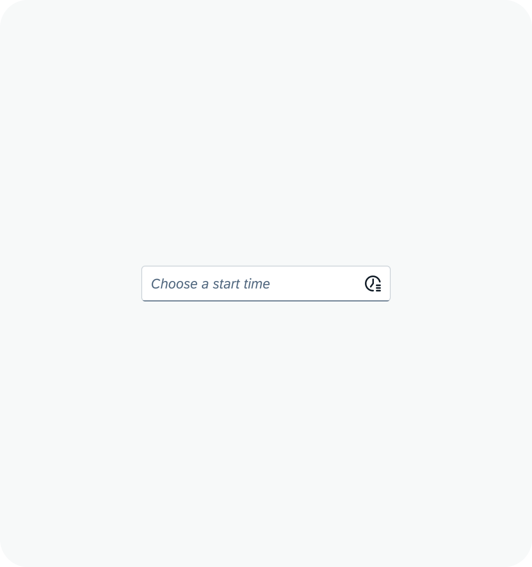
Time picker with a placeholder in the input field
Value States
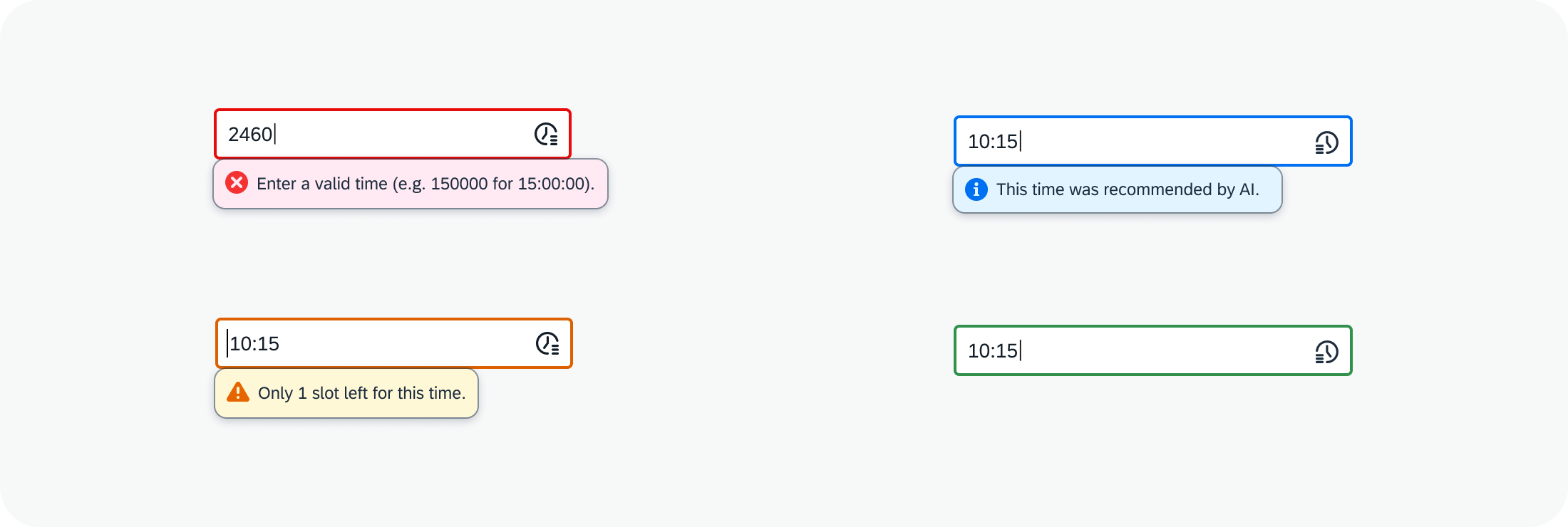
Time picker with different value states
Behavior and Interaction
Selecting a Time
To enter a time, the user can either type the value in the input field or choose the values from the time picker popover and built-in clock interface. By default, the time fields in the time picker popover show the current time. Users can edit this value in the time picker popover in two ways:
- By clicking on a value or tick mark on the clock face to select the corresponding time value. Even if the time doesn’t initially display a number, it becomes visible upon hover or click.
- By dragging the mouse round the clock face for more precision.
Once a value has been selected, the focus automatically moves to the next time field in the sequence (for example, from hours to minutes). The clock face shows the current value for this field (for example 30 minutes). Once the value for the last time field has been selected, the focus remains unchanged.
To change a time value, the user can click on the corresponding time field (for example, hours) and choose a different value on the clock face.
Clicking the OK button confirms the selected time. Clicking Cancel or clicking anywhere outside the popover discards the changes.
Selecting a time in the time picker popover
Shortcuts
You can use the following shortcuts to enter a specific time.
- “now”
- “in 1 hour” / “in x hours”
- “1 hour ago” / “x hours ago”
The system calculates the time automatically and enters it in the input field.
Responsive Behavior
On a tablet or mobile device, tapping the input field opens a popover. To set the value, the user enters the desired value in each input field within the popover.
Popover with inputs on touch devices
Tapping the time picker button within the input field opens the time picker popover.
On smartphones, the popover is displayed as a full screen dialog.
 Your feedback has been sent to the SAP Fiori design team.