Chart – Time Axis

The time axis is compatible with a number of charts and is designed to show the variation of values through time. It can display years, quarters, months, weeks, days, hours, minutes, and seconds.

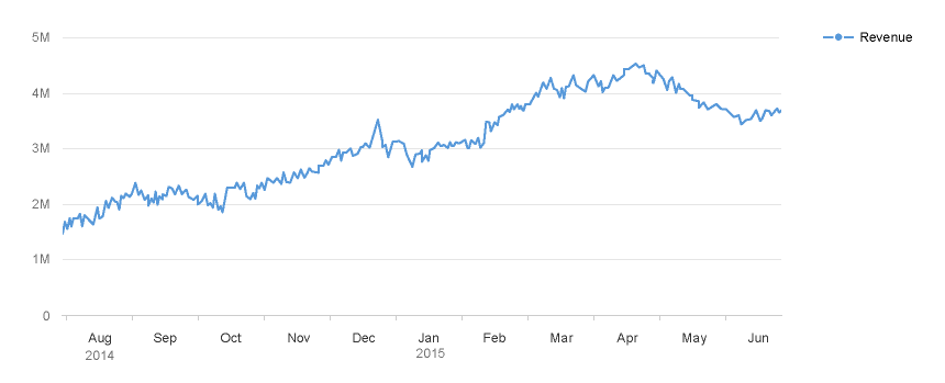
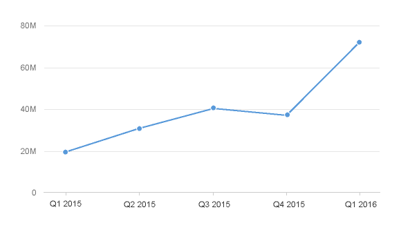
Time axis applied to a line chart

The time axis incorporates three valuable features:

  1. All the complexity involved with formatting the labels – including localization – is taken care of automatically
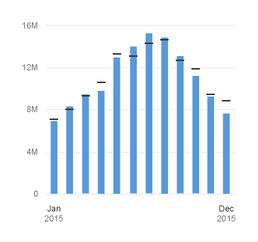
  2. The time unit labels behave responsively according to the zoom factor. As you can see below, the time unit labels in the top row change as the zoom increases, while the time unit label in the row below is only displayed once to prevent unnecessary repetition.
Fully zoomed out
Fully zoomed out
Medium zoom
Medium zoom
Fully zoomed in
Fully zoomed in

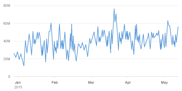
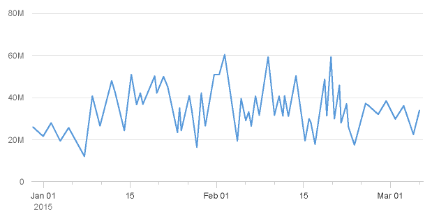
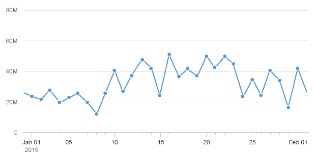
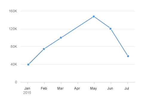
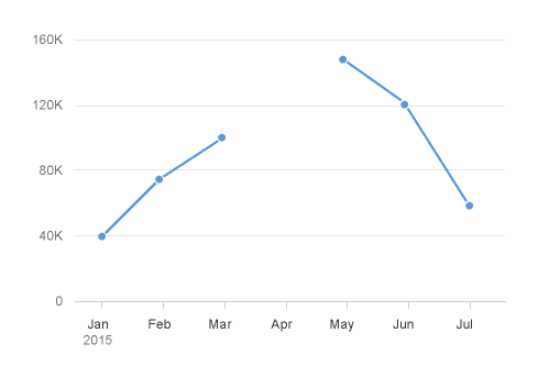
3. For certain chart types, the physical spacing between your data points accurately respects the time scale being displayed, as opposed to just rendering all your data points equidistantly. We can see what a difference this makes by comparing the charts below. The chart to the left uses the categorical axis and the chart to the right uses the time axis. Even though both charts were generated from exactly the same dataset; they tell completely different stories with respect to how the values have increased over time due to the high concentration of early data points.

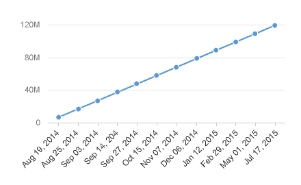
Categorical axis (misleading)
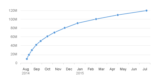
Time axis (accurate)

Compatible Chart Types

A number of SAP Fiori charts can accommodate the time axis, such as the bubble chart, scatter chart, line chart, column chart, and more.

You can find the full list of charts that can accommodate the time axis in the chart types article.

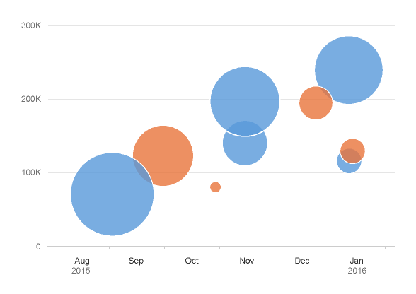
Bubble chart with time axis
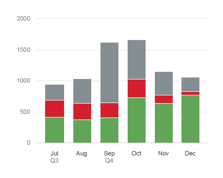
Column chart with time axis

Customization

Choosing Which Time Units are Displayed

By default, the time axis displays day, month, year. However, you can display different time units to suit your dataset using one of 18 recommended combinations:

  • Second, minute, hour
  • Second, minute, hour, day, month
  • Second, minute, hour, day, month, year
  • Minute, hour
  • Minute, hour, day, month
  • Minute, hour, day, month, year
  • Day, month
  • Day, month, quarter
  • Day, month, year
  • Week, year
  • Week
  • Month, year
  • Month, quarter, year
  • Month, quarter
  • Month
  • Quarter, year
  • Quarter
  • Year

Any other custom combinations will likely lead to undesirable results.

Developer Hint
Define which time units are displayed using the timeAxis.levels property.

Define the Layout of Your Time Unit Labels

By default, your time unit labels will be displayed in one or two rows depending on the zoom factor that is applied to the time axis at any given time. You will notice below that the time unit labels are not repeated in the bottom row so there is no unnecessary repetition of time unit labels.

Time axis with two rows of time unit labels

It is technically possible to force the labels so that they are displayed in just one row as illustrated below, although this will only work in a satisfactory way for two time unit combinations: “year, month” and “quarter, year”.

Time axis with just one row of time unit labels

If your chart is going to be displayed in a small space, you can choose to display the first date and the last date in your dataset as illustrated below.

Time axis displaying first date and last date only
Developer Hint
Define the number of time unit label rows using the timeAxis.levelConfig property. 

Just display the first date/time and the last date/time using the timeAxis.label.showFirstLastDateOnly property.

Formatting the Time Units

By default, the date unit labels follow SAP UI5 medium date formats which localizes the order of the time unit labels e.g. “7 Aug, 2016” (British) or “Aug 7, 2016” (American). However, three combinations will always be displayed in the same order: “year, quarter”, “year, week” and “quarter, week”. This is because these combinations are not supported by CLDR (Common Local Data Repository) localization standards.

You can use any of the other formats available in SAPUI5 such as “August”, “A” and “08”. However, due to the responsive behavior of the time axis, the zoom factor will affect the way that your time units are displayed.  Therefore, you must create and register a format for all potential permutations. For example; if you want to display ‘year, month, day’ you need to create and register separate formats for “year, month, day”, “month, day” and “year”.

Developer Hint
In order to apply standard SAPUI5 formatting to your dates and times, you must use the ChartFormatter and include the following lines of code:

var formatterInstance = sap.viz.ui5.format.ChartFormatter.getInstance(); sap.viz.ui5.api.env.Format.numericFormatter(formatterInstance).

This will apply the SAPUI5 Medium Time Format to your dates and times, for example Aug 7, 2017.

If you do not want to use the MediumTime Format, you need to create a custom format and register it using registerCustomFormatter and then apply it in timeAxis.levelConfig or timeAxis.CombinationConfig.

Defining the Initial View

By default, the time axis will render your chart from your first data point, with a scrollbar if necessary. However, you can decide which data points (or a specific time period) is initially displayed.

Developer Hint
In order to define the initial view, you must:

  • Set the window.start property to a specific date or time, or you can simply set it to firstDataPoint.
  • Set thewindow.end property to a specific date or time, or you can simply set it to lastDataPoint.

Managing Null or Missing Values in a Line Chart

If there are going to be null or missing values in your dataset, you can connect the available data points, or create a clear break between them.

Ignore missing values
Break missing values
Developer Hint
Set the plotArea.dataPoint.invalidity property to:

  •  Ignore, so it connects the data points that are available.
  • Break, so the line is broken between data points.

Resources

Want to dive deeper? Follow the links below to find out more about related controls, the SAPUI5 implementation, and the visual design.

Elements and Controls

Implementation

Mobile Integration

SAP Fiori applications can also use native mobile qualities, such as camera or GPS.

Guidelines

Here, we use the term “native mobile qualities” to refer to native device features that cannot be accessed using standard HTML or JavaScript code.

Examples of such features include:

  • Phone camera
  • Voice recording
  • Phone contacts
  • Phone calendar
  • Accelerometer
  • Compass
  • Vibration

In SAP Fiori, the general approach for embedding these features is to use native user interfaces triggered by an SAPUI5 control, wherever possible.

Advantages of using the native interfaces:

  • Any new features from native controls will be available immediately upon release.
  • Version maintenance for SAPUI5 controls is avoided.
  • Users are familiar with their respective platform interfaces.
  • Browsers will improve their access to mobile functionalities, making mobile features easier to access directly.

Although the use of native UI interfaces for mobile qualities should be the general direction for SAP Fiori apps, there will be cases where a specific custom user interface might be needed.

These exceptions should be discussed on a case-by-case basis to ensure as much consistency as possible across SAP Fiori interfaces.

Barcode Scanning

Information
Barcode scanning via the SAP Fiori Client is no longer supported. For details, see SAP Note 2992772.

Intro

This section contains guidelines for the mobile integration of a barcode scanner API in SAP Fiori applications. The general approach for dealing with native app capabilities is to use native user interfaces triggered by an SAPUI5 control whenever possible.

For more information, see mobile integration concept.

Usage

Only use the barcode button to read barcodes. For OCR, RFID, and other scanning methods, use independent controllers.

Behavior and interaction

Main Action

If the main interaction of the app is to scan, highlight the button as the main action.

Scan button in the header toolbar as the main interaction for an inventory app

Secondary Action

If scanning is not the main feature of the app, do not highlight the button.

 Scan button in the header toolbar as a secondary interaction
Scan button in the header toolbar as a secondary interaction
Scan button in a custom list item, available as an individual action for each item

Scanner Unavailable

The barcode cannot be read if:

  • The scanner is disabled, not functioning, disconnected, or damaged.
  • The app is running in a “simple” browser (instead of the SAP Fiori client).
  • The SAP Mobile Platform server rendered the scan feature unavailable for the application.

Style

Icon

Font family: SAP icons (icon-bar-code). Unicode ID: e08d.

Barcode icon
Barcode icon

Guidelines

Guidelines for the Scan Button

  • Show the barcode button as a standalone button. Do not bundle it with input fields.
  • On the button, show an icon. Do not show a text.
  • Place the button in the header toolbar, or in the table toolbar for app-specific business actions. Only place the button in the content area if the scan action is available for individual items in the list.

Handling When the Barcode Cannot Be Read

Scanning Is the Main Action

Default to an alternative manual input option:

  • Offer a placeholder (input prompt) in the input field. For example: Enter barcode
  • Below the input field, explain the reason for the manual default: Scanner not available
  • Button for affirmative action: OK.
  • If the default is presented in a dialog box, offer a Cancel button.
 Scanner is not available - Users can enter the barcode manually
Scanner is not available - Users can enter the barcode manually

Scanning Is a Secondary Action

If scanning is not a main feature of the app and the barcode cannot be read, do not display the buttons. No warning is required, and a manual default input method is optional. This is also the case if the SAP Mobile Platform server has rendered the scan feature unavailable for the app.

Do
Barcode scanning is not the main interaction - Scan button is hidden when scanning is not available
Don't
Do not show the scan button if scanning is not the main interaction

Resources

Want to dive deeper? Follow the links below to find out more about related controls, the SAPUI5 implementation, and the visual design.

Elements and Controls

Implementation